


下面的这些东西,用到了可以去菜鸟教程查,不用刻意去记
一、HTML5新增标签
1.新增语义标签

2.新增多媒体标签
视频标签:
<video src="./images/what.MP4" autoplay="autoplay" muted="muted"></video>
音频标签:
<audio src="./images/what.MP3" controls="controls"></audio>
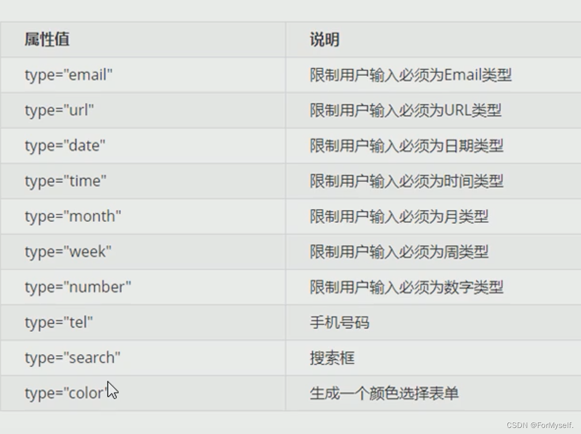
3.新增的input类型
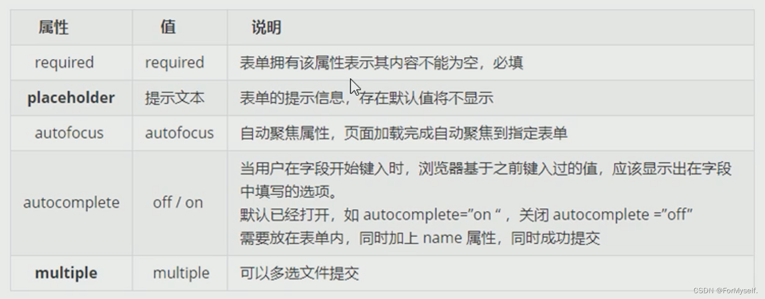
4.新增的input属性
二、CSS3新增
属性选择器,伪类选择器,权重都是10
1.属性选择器
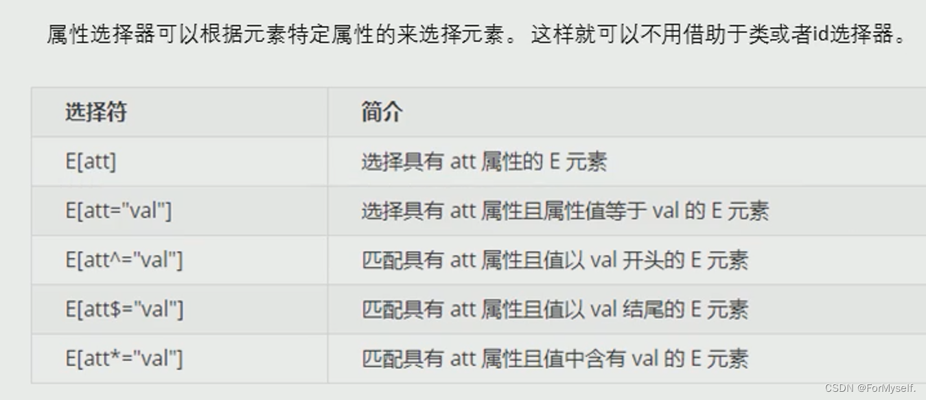
举个例子:
利用属性选择器就可以不借助类或者id选择器
 input[value] {
            /* 必须是input,且具有value这个属性,那么就可以直接选中,使用[]操作 */
            color: red;
        }
<input type="text" value="请输入用户名">
属性选择器还可以选择属性=什么值的元素
  input[type=text] {
            color: pink;
        }
<input type="text" value="what">
    <input type="password" name="" id="">
结果是text里面的字变成粉色
剩下的如果忘了去查文档吧:http://css.doyoe.com/
2.结构伪类选择器
(1)nth-child
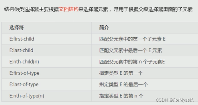
比如我们要去选择ul的里面的第一个小li,那就是ul lu:first-child; 最后一个li就是ul li:last-child,任意一个li就是ul li:nth-child(n),其中n是第几个孩子(第几个li)
  /* 选择ul里的第一个li */
        ul li:first-child {
            background-color: pink;
        }

        /* 选择ul里的最后一个li */
        ul li:last-child {
            background-color: pink;
        }

        /* 选择ul里的任意一个li */
        ul li:nth-child(3) {
            background-color: red;
        }
当然啊,nth-child(n)也是可以选择多个的
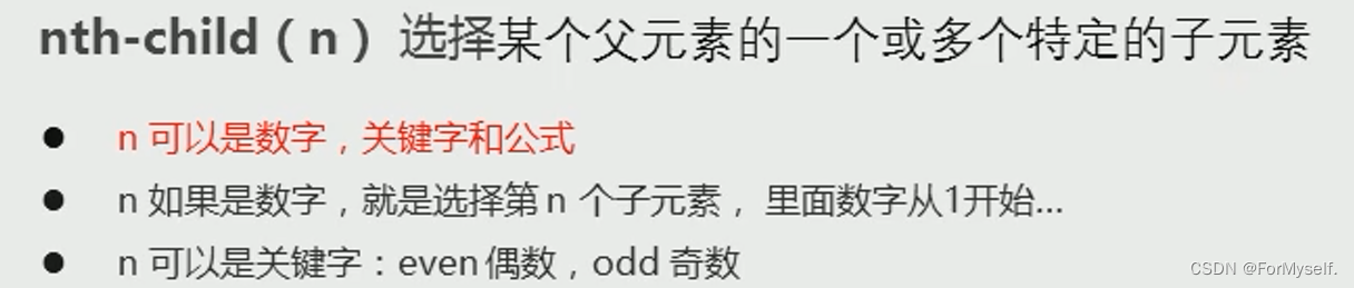
比如选择所有的偶数孩子:
 ul li:nth-child(even) {
            background-color: blue;
        }
比如选择所有的奇数孩子:
ul li:nth-child(odd) {
            background-color: skyblue;
        }
除此之外,n也可以是公式,其中n是从0到正无穷的正整数

 /* 使用n的公式选择全部 */
        ul li:nth-child(n) {
            background-color: #ccc;
        }

        /* 使用n的公式选择偶数 */
        ul li:nth-child(2n) {
            background-color: purple;
        }

        /* 使用n的公式选择奇数 */
        ul li:nth-child(2n+1) {
            background-color: green;
        }

        /* 使用n的公式选择从第三个开始到最后,必须n+3,不能3+n */
        ul li:nth-child(n+3) {
            background-color: yellow;
        }
(2)nth-child和nth-of-type的区别
nth-child会把所有的孩子排序号,执行时先看nth-child(1)然后再往前看找div标签,下面这种情况是选不出来的
 ul div:nth-child(1) {
            background-color: red;
        }
nth-of-type则是把指定的孩子排列序号,执行时先看div标签,然后再回去看nth-of-type是第几个孩子,下面这样就可以选出来
ul div:nth-of-type(1) {
            background-color: green;
        }
<ul>
        <p>1</p>
        <div>2</div>
        <div>3</div>
</ul>
属性选择器,伪类选择器,权重都是10,和类选择器一样的
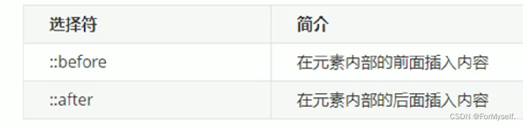
3.伪元素选择器(重点)
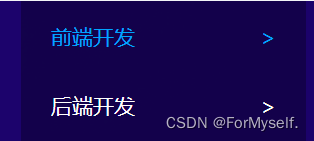
伪元素选择器可以帮助我们利用CSS创建新的标签元素,而不需要html标签,从而简化html结构
比如之前学成在线的那个小箭头,可以不用在里面再加span然后右浮动,直接伪元素就ok
注意:
例如:
 div {
            background-color: skyblue;
            width: 200px;
            height: 200px;
        }
	/* 这个权重是2 */
        div::before {
            /* 这个content是必须要写的 */
            content: "丫";
        }

        div::after {
            content: "丫";
        }
<div>
      奥里给
</div>
这里伪元素是不能给宽高的,因为是行内元素,所以我们要转化为行内块或块才行
(1)应用:字体图标
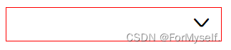
<!DOCTYPE html>
<html lang="en">

<head>
    <meta charset="UTF-8">
    <meta http-equiv="X-UA-Compatible" content="IE=edge">
    <meta name="viewport" content="width=device-width, initial-scale=1.0">
    <title>伪元素选择器的使用</title>
    <link rel="stylesheet" href="http://at.alicdn.com/t/font_3407739_kh9lttatt0n.css">
    <style>
        div {
            position: relative;
            width: 200px;
            height: 30px;
            border: 1px solid red;
        }

        div::after {
            position: absolute;
            top: 5px;
            right: 10px;
            content: '\e62d';
            font-family: 'iconfont';
        }
    </style>
</head>

<body>
    <div></div>
</body>
</html>
(2)应用:土豆案例遮罩层
之前搞得那个土豆案例,如果使用类选择器,那么html中只要出现一次类似的盒子,就要加一个div标签,这是很麻烦的,所以我们这时候如果用到伪元素选择器,就很奶思
		.tudou::before {
            /* 这个千万不能丢 */
            content: '';
            /* 先隐藏遮罩层 */
            display: none;
            position: absolute;
            top: 0;
            left: 0;
            width: 100%;
            height: 100%;
            background: rgba(0, 0, 0, .3) url(./images/1.png) no-repeat center;
        }

        /* 当鼠标经过土豆盒子的时候,盒子里面的遮罩层就显示出来,这样写: */
        .tudou:hover::before {
            display: block;
        }
注意:content一定不要丢,然后鼠标经过这个写法一定要注意
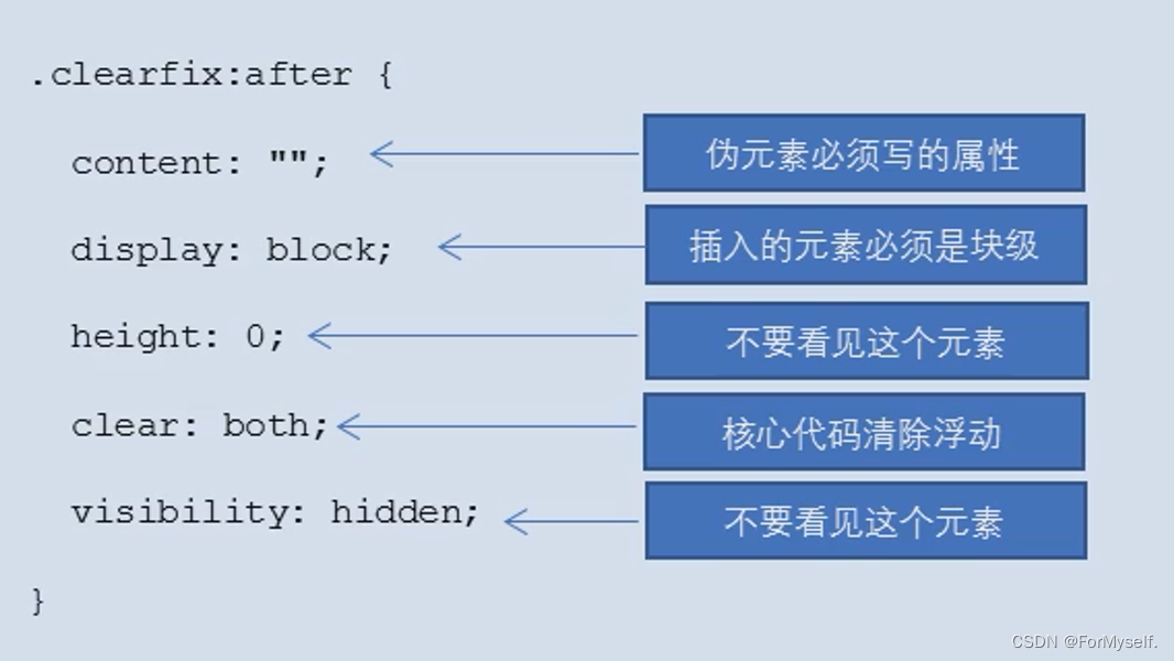
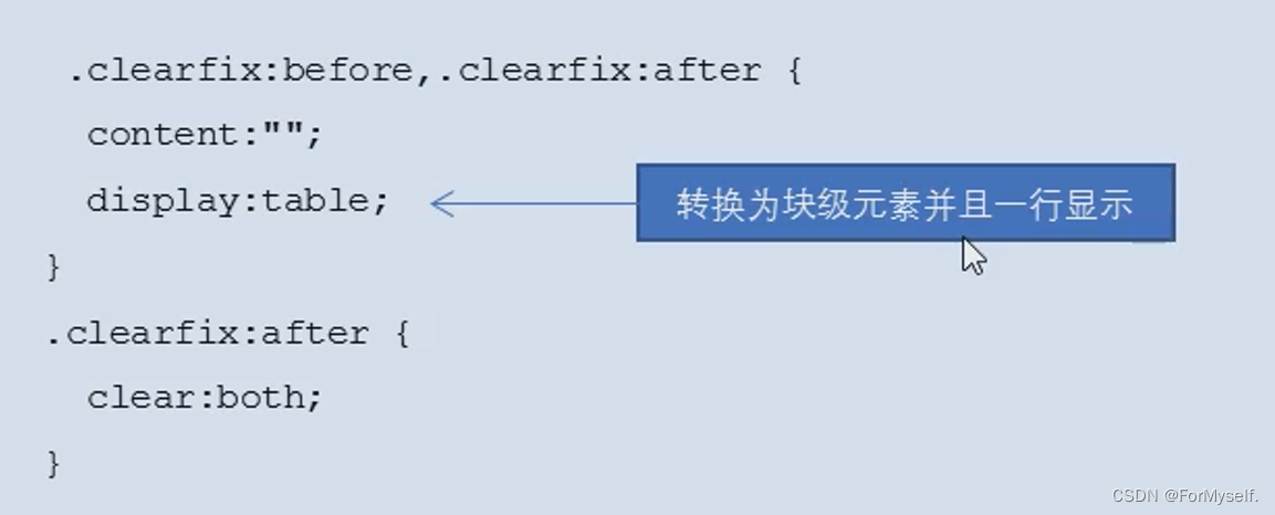
(3)应用:清除浮动
还记得之前讲的清除浮动吗,伪元素清除浮动相当于是额外标签法的升级
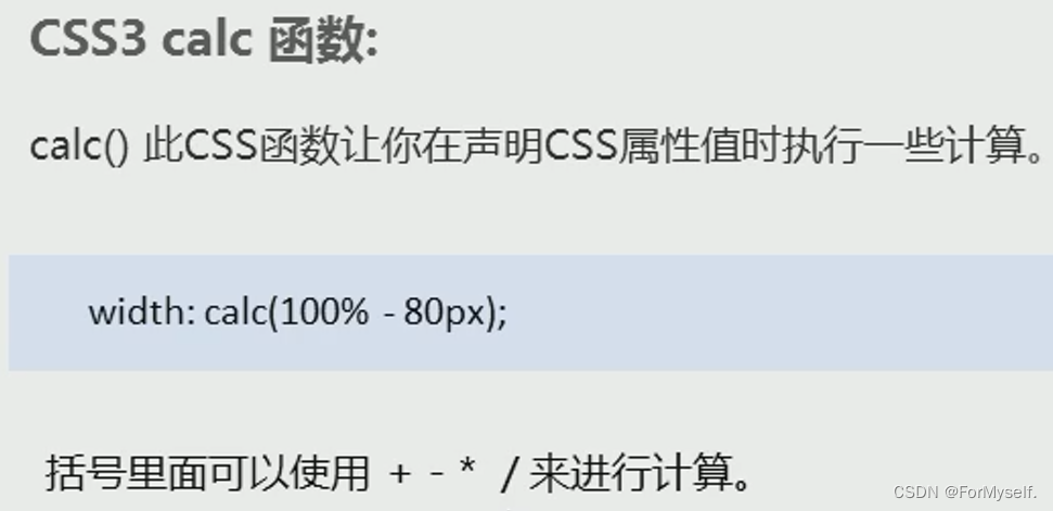
4.padding不再撑开盒子:box-sizing:border-box;
如果盒子指定了宽高,那么给padding会撑开盒子,以前我们都是减去padding的值,现在有了这个属性,就不用再减去了,这个强大的属性就是box-sizing
div {
            width: 200px;
            height: 200px;
            background-color: pink;
            padding: 20px;
            /* 此时padding已经撑大了盒子,但是如果我来个 */
            box-sizing: border-box;
            /* 就欧了 */
        }
所以以后我们在css的开头就可以加上这个
* {
            margin: 0;
            padding: 0;
            box-sizing: border-box;
        }
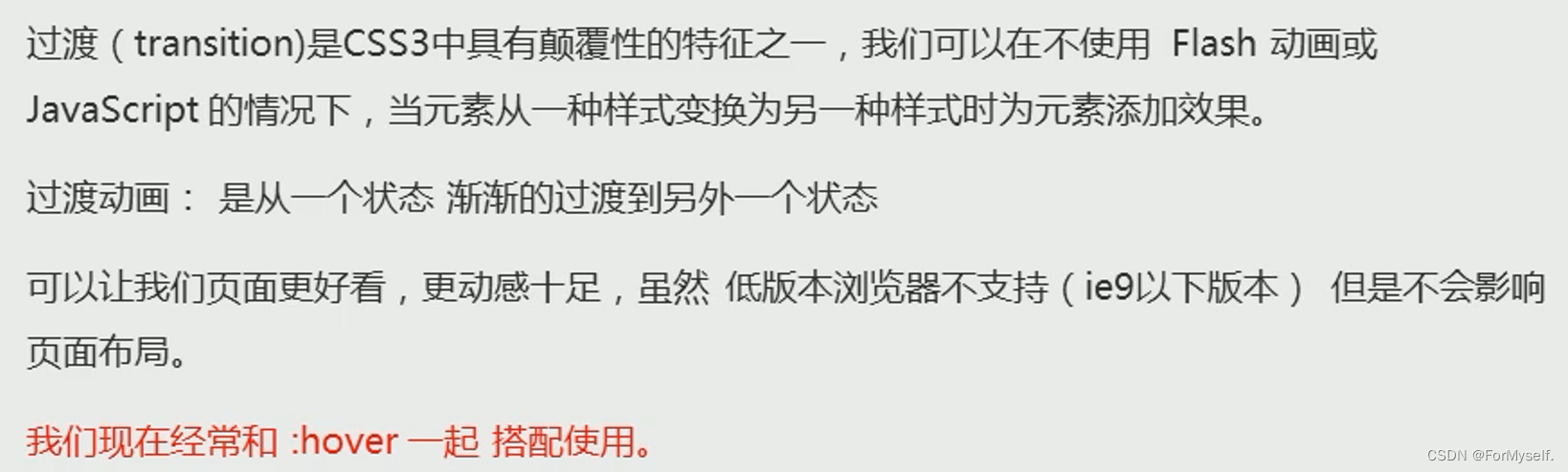
5.CSS3过渡(重点)
类似ppt里的平滑效果
语法:
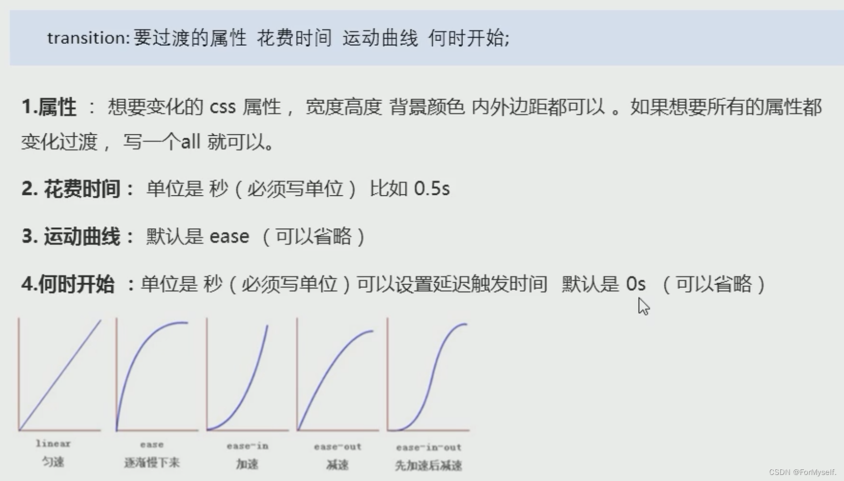
注意时间必须加单位s
举例
div {
            width: 200px;
            height: 100px;
            background-color: pink;
            /* transition: 变化的属性,变化时间,变化曲线,延迟时间 */
            transition: width 1s ease-out 1s;
        }

        div:hover {
            width: 400px;
        }
这里要记住一个原则,谁动给谁加,也就是谁要过渡,就把transition放在谁里面
当然啊,如果想同时变换多个属性,可以直接这么写:
transition: width 1s, height 1s, background-color 1s;
我们最常用的是这么写,直接变化所有:
transition: all 1s;
举例:
 .bar {
            padding: 1px;
            margin-top: 10px;
            width: 300px;
            height: 14px;
            border: 1px solid red;
            border-radius: 7px;
        }

        .bar .bar1 {
            width: 60%;
            height: 100%;
            background-color: red;
            border-radius: 7px;
            transition: all 1s;
        }

        .bar:hover .bar1 {
            width: 300px;
            height: 14px;
            background-color: red;
            border-radius: 7px;
        }
 <div class="bar">
        <div class="bar1"></div>
    </div>
6.其他特性


 2500
2500


 被折叠的 条评论
为什么被折叠?
被折叠的 条评论
为什么被折叠?
 到【灌水乐园】发言


