


动态视图(Dynamic Views)
Repeater元素适合有限的静态数据,但是在真正使用时,模型通常更加复杂和庞大,我们需要一个更加智能的解决方案。QtQuick提供了ListView和GridView元素,这两个都是基于Flickable(可滑动) 区域的元素,因此用户可以放入更大的数据。
同时,它们限制了同时实例化的代理数量。对于一个大型的模型,这意味着在同一个场景下只会加载有限的元素。
ListView
ListView与Repeater元素像素,它使用了一个model,使用delegate来实例化,并且在两个delegate之间能够设置间隔sapcing。下面的列表显示了怎样设置一个简单的链表。
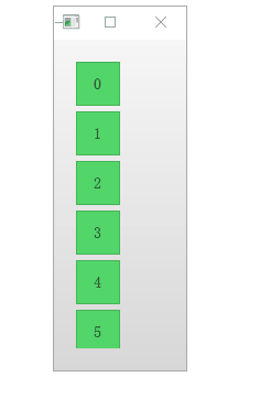
创建Background.qml
Rectangle {
    width: 320
    height: 320
    gradient: Gradient {
        GradientStop { position: 0.0; color: "#f6f6f6" }
        GradientStop { position: 1.0; color: "#d7d7d7" }
    }
}
创建GreenBox.qml
import QtQuick 2.5

Box {
    color: "#53d769"
}
basic.qml
Background {
    width: 80
    height: 300

    ListView{
        anchors.fill: parent
        anchors.margins: 20

        clip: true
        model: 100

        delegate: numberDelegate
        spacing: 5

    }

    Component{     //调用组件   不调用不出现
        id: numberDelegate
        GreenBox{
            width: 40
            height: 40
            text: index
        }
    }

}
如果模型包含的数据比屏幕上显示的更多,ListView元素只会显示部分的链表内容。然后由于QtQuick的默认行为导致的问题,列表视图不会限制被显示的代理项(delegates) 只在限制区域内显示。这意味着代理项可以在列表视图外显示,用户
可以看见在列表视图外动态的创建和销毁这些代理项(delegates) 。为了防止这个问题,ListView通过设置clip属性为true,来激活裁剪功能。下面的图片展示了这个结果,左边是clip属性设置为false的对比。
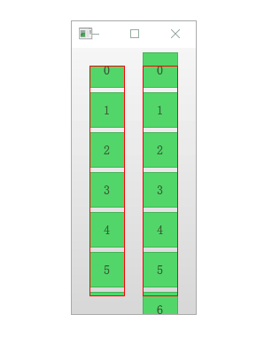
代码:
import QtQuick 2.0

Background {
    width: 140
    height: 300

    ListView {
        id: lv1

        anchors.top: parent.top
        anchors.bottom: parent.bottom
        anchors.left: parent.left
        anchors.margins: 20
        width: 40

        clip: true

        model: 100

        delegate: numberDelegate
        spacing: 5
        Tracer {}
    }

    ListView {
        id: lv2

        anchors.top: parent.top
        anchors.bottom: parent.bottom
        anchors.right: parent.right
        anchors.margins: 20
        width: 40

        model: 100

        delegate: numberDelegate
        spacing: 5
        Tracer {}
    }

    Component {
        id: numberDelegate

        GreenBox {
            width: 40
            height: 40
            text: index
        }
    }

    Component.onCompleted: {
        lv1.contentY = 15;
        lv2.contentY = 15;
    }
}
方向(Orientation)
默认的链表视图只提供了一个垂直方向的滚动条,但是水平滚动条也是需要的。链表视图的方向由属性orientation控制。它能够被设置为默认值ListView.Vertical或者ListView.Horizontal。下面是一个水平链表视图.
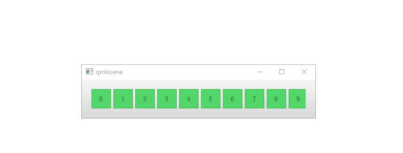
Background {
width: 480
height: 80
ListView{
anchors.fill: parent
anchors.margins: 20
clip: true //切割
model: 100
orientation: ListView.Horizontal //方向
// layoutDirection: Qt.RightToLeft //改变数据的方向
delegate: numberDelegate //代理
spacing: 5
}
Component {
id: numberDelegate
GreenBox {
width: 40
height: 40
text: index
}
}
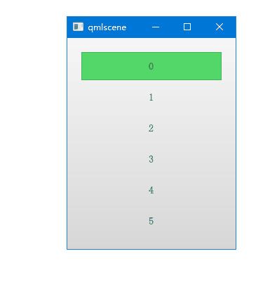
}键盘导航和高亮
当使用基于触摸方式的链表视图时,默认提供的视图已经足够使用。在使用键盘甚至仅仅通过方向键选择一个元素的场景下,需要有标识当前选中元素的机制。在QML中,这被叫做高亮。
视图支持设置一个当前视图中显示代理元素中的高亮代理。它是一个附加的代理元素,这个元素仅仅只实例化一次,并移动到与当前元素相同的位置。
在下面例子的演示中,有两个属性来完成这个工作。首先是focus属性设置为true,它设置链表视图能够获得键盘焦点。然后是highlight属性,指出使用的高亮代理元素。高亮代理元素的x,y与height属性由当前元素指定。如果宽度没有特别指定,当前元素的宽度也可以用于高亮代理元素。
import QtQuick 2.0
Background {

    width: 240
    height: 300


    ListView{
        id:view
        anchors.fill: parent
        anchors.margins: 20

        clip: true

        model: 100

        delegate: numberDelegate
        spacing: 5

        highlight: highlightComponent
        focus: true
    }
    //设置高量的属性
    Component {
        id: highlightComponent

        GreenBox {
            width: ListView.view.width
        }
    }

    Component{
        id: numberDelegate
        Item {
            width: ListView.view.width
            height: 40

            Text {
                anchors.centerIn: parent

                font.pixelSize: 10

                text: index
            }
        }
    }
}
当使用高亮与链表视图(ListView) 结合时,一些属性可以用来控制它的行为。highlightRangeMode控制了高亮如何影响视图中当前的显示。默认设置ListView.NoHighLighRange意味着高亮与视图中的元素距离不相关。
ListView.StrictlyEnforceRnage确保了高亮始终可见,如果某个动作尝试将高亮移出当前视图可见范围,当前元素将会自动切换,确保了高亮始终可见。
ListView.ApplyRange,它尝试保持高亮代理始终可见,但是不会强制切换当前元素始终可见。如果在需要的情况下高亮代理允许被移出当前视图。
在默认配置下,视图负责高亮移动到指定位置,移动的速度与大小的改变能够被控制,使用一个速度值或者一个动作持续时间来完成它。这些属性包括highlightMoveSpeed,highlightMoveDuration,highlightResizeSpeed和highlightResizeDuration。默认下速度被设置为每秒400像素,动作持续时间为-1,表明速度和距离控制了动作的持续时间。如果速度与动作持续时间都被设置,动画将会采用速度较快的结果来完成。
为了更加详细的控制高亮的移动,highlightFollowCurrentItem属性设置为false。这意味着视图将不再负责高亮代理的移动。取而代之可以通过一个行为(Bahavior)或者一个动画来控制它。
在下面的例子中,高亮代理的y坐标属性与ListView.view.currentItem.y属性绑定。这确保了高亮始终跟随当前元素。然而,由于我们没有让视图来移动这个高亮代理,我们需要控制这个元素如何移动,通过Behavior on y来完成这个操作,在下面的例子中,移动分为三步完成:淡出,移动,淡入。注意怎样使用SequentialAnimation和PropertyAnimation元素与NumberAnimation结合创建更加复杂的移动效果。
import QtQuick 2.0

Background {
    width: 240
    height: 300

    ListView{
        id:view
        anchors.fill: parent
        anchors.margins: 20

        clip: true

        model: 100

        delegate: numberDelegate
        spacing: 4

        highlight: highlightComponent
        highlightFollowsCurrentItem: false
        focus: true
    }

    //设置高量的属性
    Component {
        id: highlightComponent

        Item{
            width: ListView.view.width
            height: ListView.view.currentItem.height

            y:ListView.view.currentItem.y

            Behavior on y{
                SequentialAnimation{
                    PropertyAnimation{target:highlightRectangle;
                        property: "opacity"; to: 0; duration: 200 } //不透明
                    NumberAnimation { duration: 1 }
                    PropertyAnimation { target: highlightRectangle;
                        property: "opacity"; to: 1; duration: 200 }

                }
            }

            GreenBox {
                id: highlightRectangle
                anchors.fill: parent
            }
        }
    }

    Component {
        id: numberDelegate

        Item {
            width: ListView.view.width
            height: 40

            Text {
                anchors.centerIn: parent
                font.pixelSize: 14
                text: index
            }
        }
    }
}
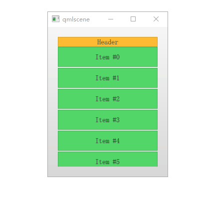
页眉与页脚(Header and Footer)
这一节是链表视图最后的内容,我们能够向链表视图中插入一个页眉(header) 元素和一个页脚(footer) 元素。这部分是链表的开始或者结尾处被作为代理元素特殊的区域。对于一个水平链表视图,不会存在页眉或者页脚,但是也有开始和结尾处,这取决于layoutDirection的设置。
import QtQuick 2.0


Background {
    width: 240
    height: 300


    ListView {
        anchors.fill: parent
        anchors.margins: 20

        clip: true

        model: 10

        delegate: numberDelegate
        spacing: 2

        header: headerComponent
        footer: footerComponent
    }

    Component {
        id: headerComponent

        YellowBox {
            width: ListView.view.width
            height: 20
            text: 'Header'

        }
    }

    Component {
        id: footerComponent

        YellowBox {
            width: ListView.view.width
            height: 20
            text: 'Footer'
        }
    }

    Component {
        id: numberDelegate

        GreenBox {
            width: ListView.view.width
            height: 40
            text: 'Item #' + index
        }
    }
}
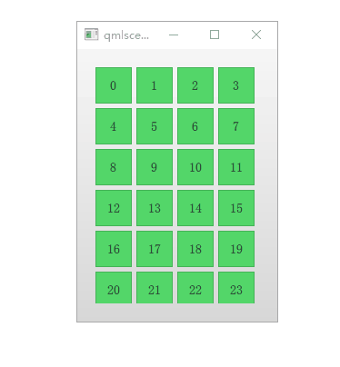
网格视图(The GridView)
使用网格视图(GridView) 与使用链表视图(ListView) 的方式非常类似。真正不同的地方是网格视图(GridView) 使用了一个二维数组来存放元素,而链表视图(ListView) 是使用的线性链表来存放元素。
import QtQuick 2.0
Background {
    width: 220
    height: 300

    GridView{
        id: view
        anchors.fill: parent
        anchors.margins: 20

        clip: true

        model: 100

        //每个格子的大小
        cellWidth: 45
        cellHeight: 45

        delegate: numberDelegate

    }

    Component {
        id: numberDelegate

        GreenBox {
            width: 40
            height: 40
            text: index
        }
    }
}


 1427
1427


 被折叠的 条评论
为什么被折叠?
被折叠的 条评论
为什么被折叠?
 到【灌水乐园】发言


