


 本文介绍了如何使用Bootstrap工具包创建不同样式的表单,包括基本表单、水平排列的表单以及各种表单控件的使用方法。同时,还讲解了如何调整表单控件的尺寸。
一、简介
介绍如何使用 Bootstrap 工具包来创建表单。
二、表单
基本实例
单独的表单控件会被自动赋予一些全局样式。所有设置了 .form-control 类的 <input>、<textarea> 和 <select> 元素都将被默认设置宽度属性为 width: 100%;。 将 label 元素和前面提到的控件包裹在 .form-group 中可以获得最好的排列。
<!DOCTYPE html>
<html>
<head>
<title></title>
<meta name="viewport" content="width=device-width, initial-scale=1">
<link rel="stylesheet" type="text/css" href="css/bootstrap.min.css">
</head>
<body>
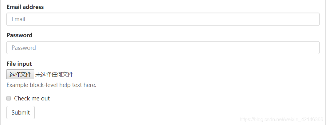
<form>
<div class="form-group">
<label>Email address</label>
<input type="email" class="form-control" placeholder="Email">
</div>
<div class="form-group">
<label>Password</label>
<input type="password" class="form-control" placeholder="Password">
</div>
<div class="form-group">
<label>File input</label>
<input type="file">
<p class="help-block">Example block-level help text here.</p>
</div>
<div class="checkbox">
<label>
<input type="checkbox"> Check me out
</label>
</div>
<button type="submit" class="btn btn-default">Submit</button>
</form>
</body>
</html>
效果图如下:
注意:一定要添加 label 标签:如果你没有为每个输入控件设置 label 标签,屏幕阅读器将无法正确识别。对于这些内联表单,你可以通过为 label 设置 .sr-only 类将其隐藏。还有一些辅助技术提供label标签的替代方案,比如 aria-label、aria-labelledby 或 title 属性。如果这些都不存在,屏幕阅读器可能会采取使用 placeholder 属性,如果存在的话,使用占位符来替代其他的标记,但要注意,这种方法是不妥当的。
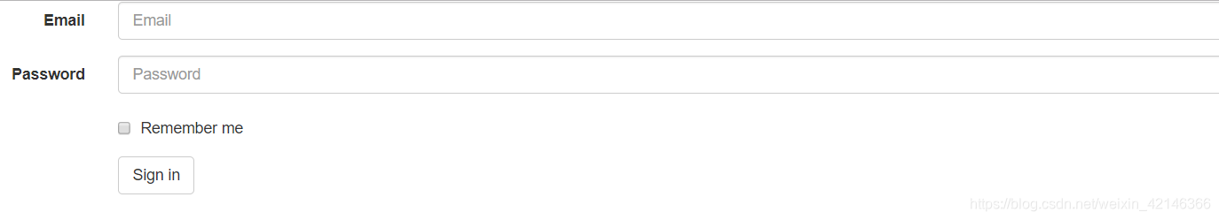
水平排列的表单
通过为表单添加 .form-horizontal 类,并联合使用 Bootstrap 预置的栅格类,可以将 label 标签和控件组水平并排布局。这样做将改变 .form-group 的行为,使其表现为栅格系统中的行(row),因此就无需再额外添加 .row 了。
<!DOCTYPE html>
<html>
<head>
	<title></title>
	<meta name="viewport" content="width=device-width, initial-scale=1">
	<link rel="stylesheet" type="text/css" href="css/bootstrap.min.css">
</head>
<body>
	<form class="form-horizontal">
		<div class="form-group">
		<label class="col-sm-2 control-label">Email</label>
			<div class="col-sm-10">
				<input type="email" class="form-control"  placeholder="Email">
			</div>
		</div>
		<div class="form-group">
			<label  class="col-sm-2 control-label">Password</label>
			<div class="col-sm-10">
				<input type="password" class="form-control"  placeholder="Password">
			</div>
		</div>
		<div class="form-group">
			<div class="col-sm-offset-2 col-sm-10">
				<div class="checkbox">
					<label>
						<input type="checkbox"> Remember me
					</label>
				</div>
			</div>
		</div>
		<div class="form-group">
			<div class="col-sm-offset-2 col-sm-10">
				<button type="submit" class="btn btn-default">Sign in</button>
			</div>
		</div>
	</form>
</body>
</html>
效果图如下:
被支持的控件
表单布局实例中展示了其所支持的标准表单控件。
【1】输入框
包括大部分表单控件、文本输入域控件,还支持所有 HTML5 类型的输入控件: text、password、datetime、datetime-local、date、month、time、week、number、email、url、search、tel 和 color。
<input type="text" class="form-control" placeholder="Text input">
效果图如下:

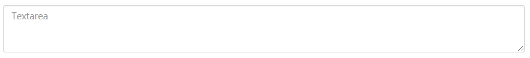
【2】文本域
支持多行文本的表单控件。可根据需要改变 rows 属性。
<textarea class="form-control" rows="3"></textarea>
效果图如下:
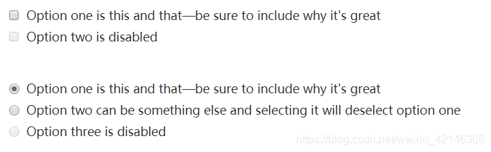
【3】多选和单选框
多选框(checkbox)用于选择列表中的一个或多个选项,而单选框(radio)用于从多个选项中只选择一个。
<div class="checkbox">
<label>
<input type="checkbox" value="">
Option one is this and that—be sure to include why it's great
</label>
</div>
<div class="checkbox disabled">
<label>
<input type="checkbox" value="" disabled>
Option two is disabled
</label>
</div>
<div class="radio">
<label>
<input type="radio" name="optionsRadios" id="optionsRadios1" value="option1" checked>
Option one is this and that—be sure to include why it's great
</label>
</div>
<div class="radio">
<label>
<input type="radio" name="optionsRadios" id="optionsRadios2" value="option2">
Option two can be something else and selecting it will deselect option one
</label>
</div>
<div class="radio disabled">
<label>
<input type="radio" name="optionsRadios" id="optionsRadios3" value="option3" disabled>
Option three is disabled
</label>
</div>
效果图如下:
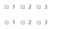
【4】内联单选和多选框
通过将 .checkbox-inline 或 .radio-inline 类应用到一系列的多选框(checkbox)或单选框(radio)控件上,可以使这些控件排列在一行。
<label class="checkbox-inline">
  <input type="checkbox" id="inlineCheckbox1" value="option1"> 1
</label>
<label class="checkbox-inline">
  <input type="checkbox" id="inlineCheckbox2" value="option2"> 2
</label>
<label class="checkbox-inline">
  <input type="checkbox" id="inlineCheckbox3" value="option3"> 3
</label>

<label class="radio-inline">
  <input type="radio" name="inlineRadioOptions" id="inlineRadio1" value="option1"> 1
</label>
<label class="radio-inline">
  <input type="radio" name="inlineRadioOptions" id="inlineRadio2" value="option2"> 2
</label>
<label class="radio-inline">
  <input type="radio" name="inlineRadioOptions" id="inlineRadio3" value="option3"> 3
</label>
效果图如下:
【5】下拉列表
注意,很多原生选择菜单 - 即在 Safari 和 Chrome 中 - 的圆角是无法通过修改 border-radius 属性来改变的。
<select class="form-control">
  <option>1</option>
  <option>2</option>
  <option>3</option>
  <option>4</option>
  <option>5</option>
</select>
效果图如下:

禁用状态
为输入框设置 disabled 属性可以禁止其与用户有任何交互(焦点、输入等)。被禁用的输入框颜色更浅,并且还添加了 not-allowed 鼠标状态。
<input class="form-control" id="disabledInput" type="text" placeholder="Disabled input here..." disabled>
效果图如下:

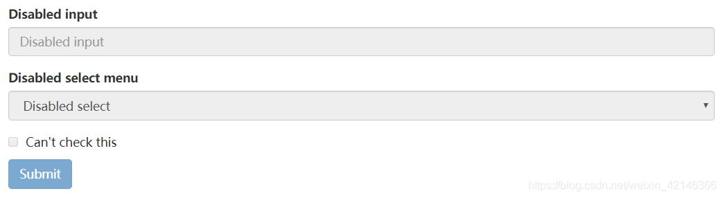
被禁用的 fieldset
为<fieldset> 设置 disabled 属性,可以禁用 <fieldset> 中包含的所有控件。
<form>
  <fieldset disabled>
    <div class="form-group">
      <label for="disabledTextInput">Disabled input</label>
      <input type="text" id="disabledTextInput" class="form-control" placeholder="Disabled input">
    </div>
    <div class="form-group">
      <label for="disabledSelect">Disabled select menu</label>
      <select id="disabledSelect" class="form-control">
        <option>Disabled select</option>
      </select>
    </div>
    <div class="checkbox">
      <label>
        <input type="checkbox"> Can't check this
      </label>
    </div>
    <button type="submit" class="btn btn-primary">Submit</button>
  </fieldset>
</form>
效果图如下:
只读状态
为输入框设置 readonly 属性可以禁止用户修改输入框中的内容。处于只读状态的输入框颜色更浅(就像被禁用的输入框一样),但是仍然保留标准的鼠标状态。
<input class="form-control" type="text" placeholder="Readonly input here…" readonly>
效果图如下:

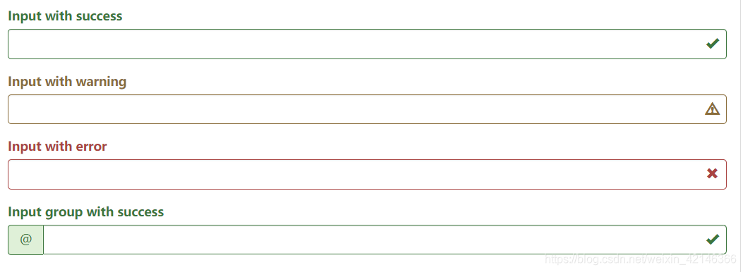
添加额外的图标
还可以针对校验状态为输入框添加额外的图标。只需设置相应的 .has-feedback 类并添加正确的图标即可。
反馈图标(feedback icon)只能使用在文本输入框 <input class="form-control"> 元素上。
【1】图标、label 和输入控件组
对于不带有 label 标签的输入框以及右侧带有附加组件的输入框组,需要手动为其图标定位。为了让所有用户都能访问你的网站,我们强烈建议为所有输入框添加 label 标签。如果你不希望将 label 标签展示出来,可以通过添加 .sr-only 类来实现。如果的确不能添加 label 标签,请调整图标的 top 值。对于输入框组,请根据你的实际情况调整 right 值。
【2】向辅助技术设备传递图标的含义
为了确保辅助技术- 如屏幕阅读器 - 正确传达一个图标的含义,额外的隐藏的文本应包含在 .sr-only 类中,并明确关联使用了 aria-describedby 的表单控件。或者,以某些其他形式(例如,文本输入字段有一个特定的警告信息)传达含义,例如改变与表单控件实际相关联的 <label> 的文本。
<div class="form-group has-success has-feedback">
  <label class="control-label" for="inputSuccess2">Input with success</label>
  <input type="text" class="form-control" id="inputSuccess2" aria-describedby="inputSuccess2Status">
  <span class="glyphicon glyphicon-ok form-control-feedback" aria-hidden="true"></span>
  <span id="inputSuccess2Status" class="sr-only">(success)</span>
</div>
<div class="form-group has-warning has-feedback">
  <label class="control-label" for="inputWarning2">Input with warning</label>
  <input type="text" class="form-control" id="inputWarning2" aria-describedby="inputWarning2Status">
  <span class="glyphicon glyphicon-warning-sign form-control-feedback" aria-hidden="true"></span>
  <span id="inputWarning2Status" class="sr-only">(warning)</span>
</div>
<div class="form-group has-error has-feedback">
  <label class="control-label" for="inputError2">Input with error</label>
  <input type="text" class="form-control" id="inputError2" aria-describedby="inputError2Status">
  <span class="glyphicon glyphicon-remove form-control-feedback" aria-hidden="true"></span>
  <span id="inputError2Status" class="sr-only">(error)</span>
</div>
<div class="form-group has-success has-feedback">
  <label class="control-label" for="inputGroupSuccess1">Input group with success</label>
  <div class="input-group">
    <span class="input-group-addon">@</span>
    <input type="text" class="form-control" id="inputGroupSuccess1" aria-describedby="inputGroupSuccess1Status">
  </div>
  <span class="glyphicon glyphicon-ok form-control-feedback" aria-hidden="true"></span>
  <span id="inputGroupSuccess1Status" class="sr-only">(success)</span>
</div>
效果图如下:
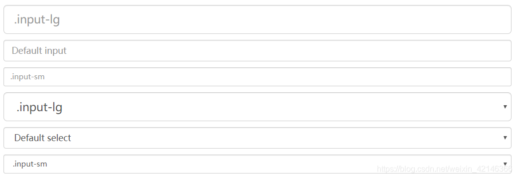
控件尺寸
通过 .input-lg 类似的类可以为控件设置高度,通过 .col-lg-* 类似的类可以为控件设置宽度。
【1】高度尺寸
创建大一些或小一些的表单控件以匹配按钮尺寸。
<input class="form-control input-lg" type="text" placeholder=".input-lg">
<input class="form-control" type="text" placeholder="Default input">
<input class="form-control input-sm" type="text" placeholder=".input-sm">

<select class="form-control input-lg">...</select>
<select class="form-control">...</select>
<select class="form-control input-sm">...</select>
效果图如下:
【2】调整列尺寸
用栅格系统中的列(column)包裹输入框或其任何父元素,都可很容易的为其设置宽度。
<div class="row">
  <div class="col-xs-2">
    <input type="text" class="form-control" placeholder=".col-xs-2">
  </div>
  <div class="col-xs-3">
    <input type="text" class="form-control" placeholder=".col-xs-3">
  </div>
  <div class="col-xs-4">
    <input type="text" class="form-control" placeholder=".col-xs-4">
  </div>
</div>
效果图如下:

三、总结
要记的有点多,不过一般结果练习和实战都能快速掌握。


 扫一扫
扫一扫


 324
324

 被折叠的 条评论
为什么被折叠?
被折叠的 条评论
为什么被折叠?
 到【灌水乐园】发言


