


 本文介绍如何使用Flexbox布局技术,在移动端创建一个顶部导航栏固定、中部内容区域可滚动、底部菜单固定的页面结构,适合响应式设计。通过实例代码演示了HTML、CSS的配合应用。
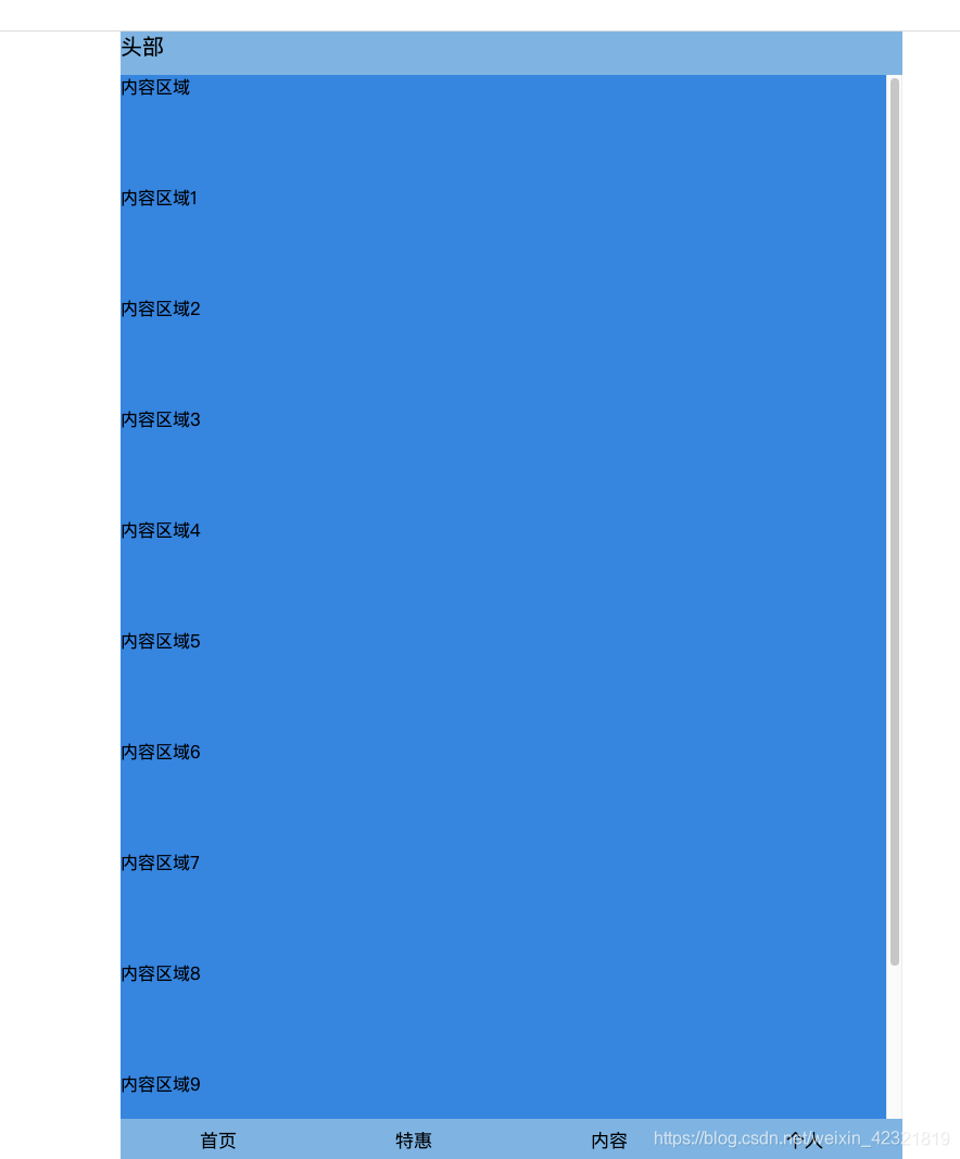
效果如下:
代码如下:
<!DOCTYPE html>
<html>

<head>
  <meta http-equiv="Content-Type" content="text/html;charset=utf-8">
  <meta name="viewport" content="width=device-width; initial-scale=1; user-scalable=no;">
  <title>使用Flex布局实现移动端顶部、底部固定,中间内容滚动效果</title>
  <style>
    * {
      padding: 0;
      margin: 0;
    }

    html,
    body {
      width: 100%;
      height: 100%;
    }

    .page {
      display: flex;
      flex-direction: column;
      height: 100%;
      max-width: 720px;
      margin: 0 auto;
    }

    .header {
      height: 40px;
      background: #72b4e7;
      font-size: 20px;
    }

    .content {
      flex: 1;
      background: #1183e6;
      overflow: auto;
    }

    .content p {
      margin: 80px 0;
    }

    .footer {
      height: 40px;
      background: #72b4e7;
      font-size: 17px;
      display: flex;
      text-align: center;
      line-height: 40px;
    }

    .footer * {
      flex: 1;
    }
  </style>
</head>

<body>
  <div class="page">
    <div class="header">
      头部
    </div>
    <div class="content">
      内容区域
      <p>内容区域1</p>
      <p>内容区域2</p>
      <p>内容区域3</p>
      <p>内容区域4</p>
      <p>内容区域5</p>
      <p>内容区域6</p>
      <p>内容区域7</p>
      <p>内容区域8</p>
      <p>内容区域9</p>
      <p>内容区域10</p>
    </div>
    <div class="footer">
      <div>首页</div>
      <div>特惠</div>
      <div>内容</div>
      <div>个人</div>
    </div>
  </div>
</body>

</html>


 扫一扫
扫一扫


 2619
2619

 被折叠的 条评论
为什么被折叠?
被折叠的 条评论
为什么被折叠?
 到【灌水乐园】发言


