


在项目中,会出现圆形静态饼图或进度条的形式展现当前的进度;或者根据倒计时的进度,展示进度条的剩余比例;这里使用css的变量,结合css的样式来展示进度的情况,也可结合javascript给该css的变量赋值;
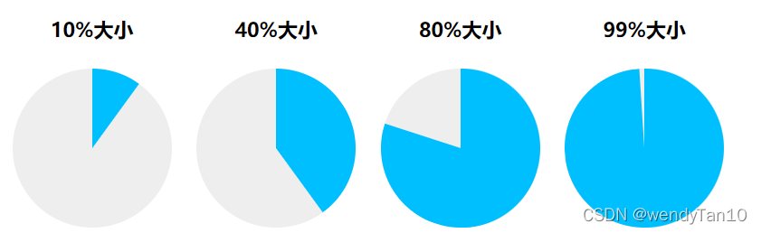
案例一:静态饼图的应用
静态饼图的效果示意图如下:
实现的代码如下:
<style>
.pie-simple {
   width: 128px; height: 128px;
    background-color: #eee;
    border-radius: 50%;
    text-align: left;
    overflow: hidden;
}
.pie-left,
.pie-right {
    width: 50%; height: 100%;
    float: left;
    position: relative;
    overflow: hidden;
}
// 创建左半圆
.pie-left::before {
    content: "";
    position: absolute;
    width: 100%; height: 100%;
    background-color: deepskyblue;
}
// 创建右半圆
.pie-right::before {
    content: "";
    position: absolute;
    width: 100%; height: 100%;
    background-color: deepskyblue;
}
//  不旋转,作为右覆盖半圆
.pie-right::after {
    content: "";
    position: absolute;
    width: 100%; height: 100%;
    background-color: deepskyblue;
}
.pie-left::before {
    left: 100%;
    transform-origin: left;
    transform: rotate(calc(3.6deg * (var(--percent) - 50)));
    // 比例小于或等于50的时候 - 左半圆隐藏;
    opacity: calc(99999 * (var(--percent) - 50));
}
.pie-right::before {
    right: 100%;
    transform-origin: right;
    transform: rotate(calc(3.6deg * var(--percent)));
}
.pie-right::after {
	// 比例大于50时 - 右半圆一直显示
    opacity: calc(99999 * (var(--percent) - 50));
}
</style>
<div class="pie-simple" style="--percent: 10;">
    <div class="pie-left"></div>
    <div class="pie-right"></div>
</div>
<h4>40%大小</h4>
<div class="pie-simple" style="--percent: 40;">
    <div class="pie-left"></div>
    <div class="pie-right"></div>
</div>
<h4>80%大小</h4>
<div class="pie-simple" style="--percent: 80;">
    <div class="pie-left"></div>
    <div class="pie-right"></div>
</div>
<h4>99%大小</h4>
<div class="pie-simple" id="percent" style="--percent: 99;">
    <div class="pie-left"></div>
    <div class="pie-right"></div>
</div>
主要应用的是:opacity属性的边界特性控制元素的显隐;即:
.example {
	opacity: -999; // 解析为0,完全透明
	opacity: -9; // 解析为0,完全透明
	opacity: 2; // 解析为1,完全展示
	opacity: 999; // 解析为1,完全展示
}
可通过js设置其percent的大小:
$('#percent').css('--percent'); // 获取当前进度的大小
$('#percent').css('--percent', '20'); // 设置当前进度的大小
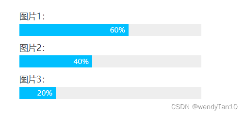
案例二:加载进度条的应用
进度条的效果示意图如下:
代码如下所示:
<style>
.bar {
    line-height: 20px;
    background-color: #eee;
}
.bar::before {
    counter-reset: progress var(--percent);
    content: counter(progress) "%\2002";
    display: block;
    width: calc(100% * var(--percent) / 100);
    font-size: 12px;
    color: #fff;
    background-color: deepskyblue;
    text-align: right;
    white-space: nowrap;
    overflow: hidden;
}
</style>
<label>图片1:</label>
<div class="bar" style="--percent: 60;"></div>
<label>图片2:</label>
<div class="bar" style="--percent: 40;"></div>
<label>图片3:</label>
<div class="bar" style="--percent: 20;"></div>
该示例引用了css变量与伪元素的content的计数器counter结合一起使用展示进度;
并使用calc()函数;在现代的浏览器中,calc()函数还支持嵌套使用:
.list {
	--size: calc(100% - 2rem);
	width: calc(var(--size) / 6);
}
// 等同于
.list {
	width: calc(calc(100% - 2rem) / 6);
}
这里是引用:张鑫旭作者的《css新世界》书中的案例;点击进入
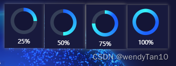
案例二:渐变进度条
引用conic-gradient锥形渐变实现半圆的渐变进度效果;展示如下:
代码如下所示:
// 该实例用的是vue3的组件模式书写
<script setup lang="ts">
import { onMounted, ref, watchEffect} from 'vue';
    interface percentData {
        percent: number,
		icon: string
    };
    // 百分比与icon的默认值`在这里插入代码片`
    const props = withDefaults(defineProps<percentData>(), {
        percent: 0,
		icon: 'icon'
    });
	const percentRef = ref<HTMLElement>();
	onMounted(() => {
	});
	watchEffect(() => {
		percentRef.value?.style.setProperty('--percent', props.percent.toString());
	});
</script>

<template>
	<div class="percent" ref="percentRef">
		<div :class="['per__icon', icon]"></div>
	</div>
</template>

<style scoped lang="scss">
	.percent {
		position: relative;
		width: 100%;
		height: 100%;
		border-radius: 50%;
		margin: 0 auto;
		overflow: hidden;
		background: conic-gradient(#37f7f8, #1d61fe,#1d61fe calc(var(--percent ) * 1% - 50%), #37f7f8 calc(var(--percent) * 1%), #364058 calc(var(--percent) * 1%));
		.per__icon {
			position: absolute;
			top: 20px;
			left: 20px;
			right: 20px;
			bottom: 20px;
			border-radius: 50%;
			background: #141535;
			display: flex;
			justify-content: center;
			align-items: center;
			&::before {
				content: '\3000';
				width: 90px;
				height: 90px;
				position: absolute;
			}
			// 根据添加类名添加中心的icon
			&.icon::before {
				background: url('../assets/img/classroom.png');
				background-size: 100% 100%;
			}
		}
	}
</style>


 1242
1242


 被折叠的 条评论
为什么被折叠?
被折叠的 条评论
为什么被折叠?
 到【灌水乐园】发言


