


前段时间看书看到了CSS伪元素这个东西,当时就感觉很神奇,上周敲JD静态的时候正好实践了下,记录下伪元素常见用法和CSS巧妙之处。(伪类和伪元素定义之类的这里就不贴了,可以去MDN/W3C中查看)
京东的shortcut导航栏中有这样一个东西: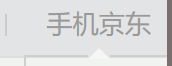 可以看到这个导航下方有一个小三角,这个小三角难道是通过修改元素边框实现的吗?不对,好像没法修改成中间凹进去一块的border啊?这里就可以利用我们的伪元素,“伪装”插入一定的内容来实现这个小三角了。
先上代码:
HTML:
    <nav id="shortcut">
        <ul>
            <!-- ~~~~~中间的li省略掉了~~~~~~ -->
            <li>
               <a href="#">手机京东</a>
             </li>
        </ul>
    </nav>

CSS:
    	#shortcut {
		    position: relative;
		    height: 30px;
		    background-color: #e3e4e5;
		    border-bottom: 1 solid #dededf;
		    font-size: 12px;
		    line-height: 30px;
		    color: #999;
		}
		li {
			float: left;
			position: relative;
		}
		ul {
		    list-style: none;
		    margin: 0;
		    padding: 0;
		    border-style: none;
		}
		#shortcut a {
		    color: #999;
		    height: 10px;
		    border-color: #999;
		    text-decoration: none;
		}
		#shortcut li+li a {
		    margin-left : 15px;
		    padding-right: 15px;
		}

        /*这里是主要部分伪元素,前面的都是为了美化*/
		#shortcut li:last-child::before {
		    content: "";
		    position: absolute;
		    border: 5px solid;
		    border-color: transparent transparent white transparent;/*transparent:透明*/
		    bottom: 0; left: 45%;
		    height: 0; width: 0;
		}
最终实现效果: 是不是和京东原版的差不多了呢?
对于content的内容为什么一定要是空字符串"",MDN上有这样的一段描述:
On elements, always computes to normal. On ::beforeand ::after, if normal is specified, computes to none. Otherwise, for URI values, the absolute URI; for attr()values, the resulting string; for other keywords, as specified. 大概意思就是content不设置的默认值为normal,而伪元素after和before比较特殊,content: normal == content: none,也就是相当于没有内容,就相当于没有插入伪元素,自然就不会显示了,所以伪元素content的内容至少应是一个空的字符串。
还有一道师傅博客的面试题,我写了写,也贴到这里吧。
题:CSS实现矩形按钮右边缘的中间有个往里凹的小半圆,如图:
代码如下:
<!DOCTYPE html>
<html lang="en">
<head>
    <meta charset="UTF-8">
    <title>Document</title>
    <style type="text/css">
        body {
            text-align: center;
        }
        .div1 {
            position: relative;
            width: 60px;
            height: 30px;
            background-color: black;
            color: #fff;
            border: none;
            text-align: left;
            outline: none;
        }
        .div1::after {
            content: "";
            position: absolute;
            right: 0;
            top: 50%;
            background-color: #fff;
            width: 10px;
            height: 20px;
            border-radius: 10px 0 0 10px;
            transform: translateY(-50%);
        }
    </style>
</head>
<body>
    <button class="div1">
        button
    </button>
</body>
</html>
实现效果: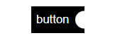
这里的伪元素居中也用到了个定位小技巧:top: 50%; translateY(-50%);将伪元素“先下后上”是一种常用的block居中方法。
还有是用border-radius生成半圆形图案。
要注意的一点是《CSS权威指南》中指出:生成内容(::before, ::after) 生成的位置都在元素框内部,在CSS2.1中除了列表标志,无法把生成内容放在元素框外。所以要通过absolute或其他方法来对生成内容进行定位,书上还说CSS2和CSS2.1明确禁止伪元素浮动/定位,不过我估计在CSS3中废除了,虽然我没查到相关信息,但他确实可以定位了。。。


 485
485


 被折叠的 条评论
为什么被折叠?
被折叠的 条评论
为什么被折叠?
 到【灌水乐园】发言


