


组件— 文字提示
基础用法
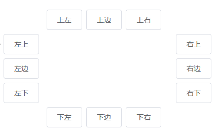
上左
上边
上右
左上
左边
左下
右上
右边
右下
下左
下边
下右
.box {
width: 400px;
.top {
text-align: center;
}
.left {
float: left;
width: 60px;
}
.right {
float: right;
width: 60px;
}
.bottom {
clear: both;
text-align: center;
}
.item {
margin: 4px;
}
.left .el-tooltip__popper,
.right .el-tooltip__popper {
padding: 8px 10px;
}
}
主题
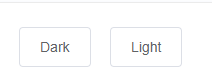
Dark
Light
更多 Content
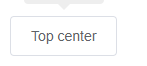
多行信息
第二行信息
第二行信息
Top center
高级扩展
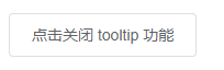
点击{{disabled ? '开启' : '关闭'}} tooltip 功能
export default {
data() {
return {
disabled: false
};
}
};
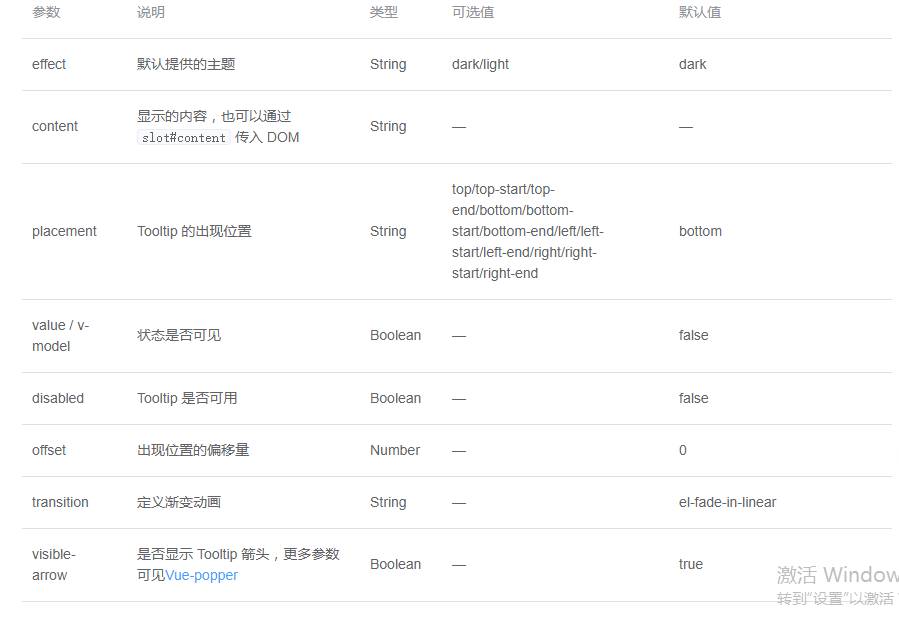
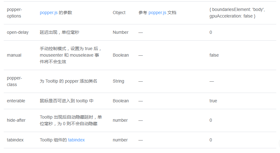
Attributes
到此这篇关于Element Tooltip 文字提示的使用示例的文章就介绍到这了,更多相关Element Tooltip 文字提示内容请搜索脚本之家以前的文章或继续浏览下面的相关文章希望大家以后多多支持脚本之家!


 409
409


 被折叠的 条评论
为什么被折叠?
被折叠的 条评论
为什么被折叠?
 到【灌水乐园】发言


