


转载自:http://blog.csdn.net/xieyali/archive/2009/09/15/4555579.aspx
第六章
使用基本的
Widget
每一个
GUI工具包都有一些基本的
widget: fields, labels, buttons
等等。
Android
的工具包也不例外,想要了解
widget
如何在
Android Activity
中工作,使用基本
widget
将会是很好的入门。
Lable
最简单的
widget就是
label,在
Android中就是一个
TextView。和大多数
GUI工具包中的
label一样,
Android 的
label 也是一小段不能被用户直接修改的文字。通常,他用来表明相邻的
widget(比如一个
field前面的“
Name:”
label表明
field需要填写的内容
)。
在
Java中,你可以通过创建一个
TextView的实例来创建一个
label。更常见的是通过添加一
TextView元素到布局文件来创建一
label,使用一个
android:text属性设置
label的值。如果你需要因为某些需求改变
label的值,比如国际化之类,你可能会使用
XML的资源引用,这些在本书后面章节介绍。
TextView有许多的和
lable相关的属性,例如:
android:typeface
用来设定
label
的字体(例如,
monospace
)
android:textStyle
用来设置字体应该是
加黑
(
bold
),
斜体
(
italic
),
或者加黑并且斜体
(
bold_italic
)
android:textColor
用来设置
label
文字的颜色,用
RGB
十六进制表示(例如:
#FF0000
是红色)
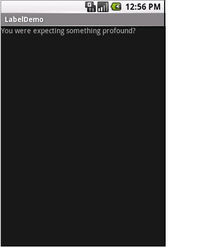
例如:在
Label
工程中,你可以看到如下的布局文件:
version="1.0" encoding="utf-8"?>
xmlns:android="http://schemas.android.com/apk/res/android"
android:layout_width="fill_parent"
android:layout_height="wrap_content"
android:text="You were
expecting something profound?"
/>
仅仅这个布局文件,和
Android的工程生成的代码,可以得到结果如下图:
Button
我们已经在前两章看到了按钮
widget的使用。
Button类是
TextView的子类,所以前面几节讨论的一些属性仍然起作用。
使用
Image
Android有两种
widget来帮助
Activity嵌入图片:
ImageView和
ImageButton。顾名思义,可以和
TextView和
Button类比。
每个
widget都有一个
Android:src属性(在布局文件里)来指定使用那个图片。图片通常存放在
drawable资源里,会在后面资源一章详细描述。你也可以通过使用
content
provider的
setImageURI()方法来设置图片内容。
ImageButton是
ImageView的子类,他还有标准按钮的行为,比如响应点击等。
例如,
ImageView实例工程的布局文件:
version="1.0" encoding="utf-8"?>
xmlns:android="http://schemas.android.com/apk/res/android"
android:id="@+id/icon"
android:layout_width="fill_parent"
android:layout_height="fill_parent"
android:adjustViewBounds="true"
android:src="@drawable/molecule"
/>
结果如下:
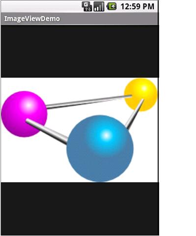
图
6. ImageViewDemo示例工程
Field
在
button和
label之后,
field是多数
GUI工具包的基本元素。在
Android里,
field是通过
EditText widget实现的,它是
TextView的子类。
除了标准
TextView的属性(例如,
android:textStyle),
EditText还有许多有用的属性,包括:
·
android:autoText
,用来控制
field
是否需要拼写检查
android:capitalize
,用来控制
field
是否自动把输入单词的第一个字母大写
android:digits
,用来配置
field
只能输入某些数字
android:singleLine
,用来控制
field
是单行输入还是多行输入(例如,回车键是移动到下一个
widget
还是添加新的一行)
除了这些,你还可以配置
field
使用一些特殊的输入法,比如
android:numeric
只能输入数字,
android:password
用来屏蔽密码,
android:phoneNumber
输入电话号码。如果你想要创建自己的输入方案(例如:邮编,社保号码),你需要创建自己的
InputMethod
接口的实现,然后通过
android:inputMethod
配置
field
区使用它。你可以在附录看到
TourIt
示例工程如果实现。
例如,从
Field
工程,下面是布局
XML
文件:
encoding="utf-8"?>
xmlns:android="http://schemas.android.com/apk/res/android"
android:id="@+id/field"
android:layout_width="fill_parent"
android:layout_height="fill_parent"
android:singleLine="false"
/>
注意,
android:singleLine
设置为
false
,所以用户可以输入多行。
工程中,
Field.java
文件为
Field
填充了一些文字:
package
com
.
commonsware
.
android
.
basic
;
import
android
.
app
.
Activity
;
import
android
.
os
.
Bundle
;
import
android
.
widget
.
EditText
;
public class
FieldDemo
extends
Activity
{
@Override
public
void
onCreate
(
Bundle icicle
)
{
super
.
onCreate
(
icicle
);
setContentView
(
R
.
layout
.
main
);
EditText fld
=(
EditText
)
findViewById
(
R
.
id
.
field
);
fld
.
setText
(
"Licensed under the Apache License, Version 2.0 "
+
"(the
""
License
""
); you may not use this file "
+
"except
in compliance with the License. You may "
+
"obtain
a copy of the License at "
+
"http://www.apache.org/licenses/LICENSE-2.0"
);
}
}
结果如下:
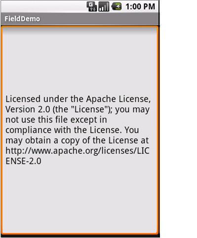
图
7. FieldDemo
示例工程
注意:
Android
模拟器仅能装载一个
Java
包里面的一个应用程序。因为本章所有的实例程序共享
com.commonsware.android.basic
包,所以,你只能在同一时间运行一个程序。
Field
的另一个特色是他的自动补全功能,这个功能帮助用户不需要输入全部的文字。
AutoCompleteTextView
widget
提供这个功能,本书后面会详细讨论。
CheckBox
经典的
checkbox
有两种状态,选中和没有选中。点击
checkbox
,会在这两种状态之间转变。
Android
里,有一个
CheckBox widget
符合你的要求。他以
TextView
作为父类,所以你可以使用
TextView
的属性,比如
android:textColor
来设置这个
widget
。
在
Java
里,你可以调用:
·
isChecked()
检查
checkbox
是否被选中
·
setChecked()
设置
chechbox
为选中状态或者未选中状态
·
toggle()
标志
checkbox
被用户选中
你也可以注册一
listener
对象(一个
OnCheckedChangeListener
实例)来监听
checkbox
状态的改变。
例如,下面是
CheckBox
工程的布局文件:
encoding="utf-8"?>
xmlns:android="http://schemas.android.com/apk/res/android"
android:id="@+id/check"
android:layout_width="wrap_content"
android:layout_height="wrap_content"
android:text="This
checkbox is: unchecked" />
相应的
CheckBoxDemo.java
如下所示:
public class
CheckBoxDemo
extends
Activity
implements
CompoundButton
.
OnCheckedChangeListener
{
CheckBox cb
;
@Override
public
void
onCreate
(
Bundle icicle
)
{
super
.
onCreate
(
icicle
);
setContentView
(
R
.
layout
.
main
);
cb
=(
CheckBox
)
findViewById
(
R
.
id
.
check
);
cb
.
setOnCheckedChangeListener
(
this
);
}
public
void
onCheckedChanged
(
CompoundButton buttonView
,
boolean
isChecked
)
{
if
(
isChecked
)
{
cb
.
setText
(
"This
checkbox is: checked"
);
}
else
{
cb
.
setText
(
"This
checkbox is: unchecked"
);
}
}
}
注意,因为实现了
OnCheckedChangeListener
接口,
activity
自己作为
checkbox
的
listener
(通过
cb.setOnCheckedChangeListener(this)
)。
Listener
的回调函数是
onCheckedChanged()
,这个函数接收
checkbox
的变化。在本例中,我们用改变
checkbox
的文字信息来反映
checkbox
的变化。
结果就是点击
checkbox
,他的文字就会更新,如下所示:
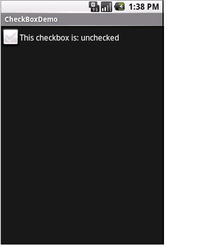
图
8. CheckBoxDemo
示例工程,
checkbox
没有选中
图
9.
示例工程,
checkbox
被选中
Radio
和其他
GUI
工具箱的
Radio
按钮一样,
Android
的
radio
按钮有两种状态,像
checkbox
,但是在一组的
radio
中,只有一能在同一时间选定。
和
CheckBox
一样,
RadioButton
也是
CompoundButton
的子类,而
CompoundButton
是
TextView
的子类。因此,所有的标准
TextView
的属性比如
face, style, color
等等都可以用来控制
RadioButton
的外观。同样,你可以调用
isChecked()
方法去检查是否被选中,调用
toggle()
选中他,就像是用
CheckBox
一样。
大多数情况,你会把
RadioButton
放在一个
RadioGroup
里面。
RadioGroup
表明一组
RadioButton
的状态捆绑在一起,这样这些
RadioButton
在同一时间内只能由一个被选中。如果你在布局文件里面给你的
RadioButton
设置了
android:id
,你可以通过
Java
代码来访问
Group
,同时可以调用:
·
Check()
,通过
ID
去检查一个制定的
Radio
按钮(例如:
group.check(R.id.radio1)
)
·
clearCheck()
,清除一个组里面所有的
Radio
按钮,所以一个组里面没有被选中的
RadioButton
·
getCheckedRadioButtonId()
,得到当前选中的
RadioButton
的
ID(
没有选中的返回
-1)
例如,在
RadioButton
示例工程中,
XML
布局文件展示了一个
RadioGroup
中有一组
RadioButton:
encoding="utf-8"?>
xmlns:android="http://schemas.android.com/apk/res/android"
android:orientation="vertical"
android:layout_width="fill_parent"
android:layout_height="fill_parent"
>
android:id="@+id/radio1"
android:layout_width="wrap_content"
android:layout_height="wrap_content"
android:text="Rock"
/>
android:id="@+id/radio2"
android:layout_width="wrap_content"
android:layout_height="wrap_content"
android:text="Scissors"
/>
android:id="@+id/radio3"
android:layout_width="wrap_content"
android:layout_height="wrap_content"
android:text="Paper"
/>
运行结果如下:
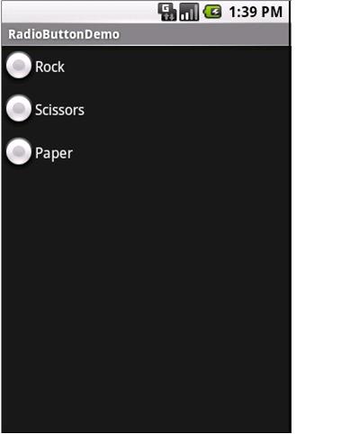
图
10. RadioButtonDemo
示例程序
注意,
RadioButton
组默认状态是所有的按钮没有选中。想要预先设置某个按钮被选中,在
Activity
的
onCreate
方法中使用
RadioButton
的
setChecked()
方法,或者
RadioGroup
的
check()
方法。
View
所有的
widget
,包括本章已经介绍过的全部
widget
都是
View
的子类,这样,所有的
widget
就有一组有用的属性和方法供我们使用。
有用的属性
View
类经常会用到的属性:
·
控制焦点的顺序:
·
android:nextFocusDown
·
android:nextFocusLeft
·
android:nextFocusRight
·
android:nextFocusUp
·
android:visibility
,控制
widget
是否可见
·
android:background
,设置
widget
的
background
有用的方法
你可以通过
setEnable()
切换
widget
是否可用,通过
isEnable()
方法查看
widget
是否可用。一种常见的使用方式是通过
CheckBox
或者
RadioButton
的选择来决定某些
widget
是否可用。
一个
widget
可以通过
requestFocus()
方法得到焦点,可以通过
isFocused()
方法检查是否得到焦点。你可以使用这两个方法和上面的
setEnable()
方法配合,来确定党仅用一个
widget
时,一个合适的
widget
拥有焦点。
为了帮助导航树
widget
和容器,你可以使用:
getParent()
,来找到父
widget
或者容器
findViewById()
,用一个确定的
id
来找到一个子
widget
getRootView()
,得到树的根(例如:通过
setContentView()
设置的
Activity
的
View
)


 扫一扫
扫一扫
 1089
1089

 被折叠的 条评论
为什么被折叠?
被折叠的 条评论
为什么被折叠?
 到【灌水乐园】发言


