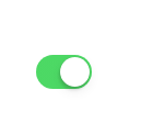
效果
CSS代码
.uiswitch {
    -webkit-box-sizing: border-box;
    -moz-box-sizing: border-box;
    box-sizing: border-box;
    -webkit-appearance: none;
    -moz-appearance: none;
    -ms-appearance: none;
    -o-appearance: none;
    appearance: none;
    -webkit-user-select: none;
    -moz-user-select: none;
    -ms-user-select: none;
    user-select: none;
    height: 31px;
    width: 51px;
    position: relative;
    border-radius: 16px;
    cursor: pointer;
    outline: 0;
    z-index: 0;
    margin: 0;
    padding: 0;
    border: none;
    background-color: #e5e5e5;
    -webkit-transition-duration: 600ms;
    -moz-transition-duration: 600ms;
    transition-duration: 600ms;
    -webkit-transition-timing-function: ease-in-out;
    -moz-transition-timing-function: ease-in-out;
    transition-timing-function: ease-in-out;
    -webkit-touch-callout: none;
    -webkit-text-size-adjust: none;
    -webkit-tap-highlight-color: transparent;
    -webkit-user-select: none;
}

    .uiswitch::before {
        -webkit-box-sizing: border-box;
        -moz-box-sizing: border-box;
        box-sizing: border-box;
        height: 27px;
        width: 47px;
        content: ' ';
        position: absolute;
        left: 2px;
        top: 2px;
        background-color: #ffffff;
        border-radius: 16px;
        z-index: 1;
        -webkit-transition-duration: 300ms;
        -moz-transition-duration: 300ms;
        transition-duration: 300ms;
        -webkit-transform: scale(1);
        -moz-transform: scale(1);
        -ms-transform: scale(1);
        -o-transform: scale(1);
        transform: scale(1);
    }

    .uiswitch::after {
        -webkit-box-sizing: border-box;
        -moz-box-sizing: border-box;
        box-sizing: border-box;
        height: 27px;
        width: 27px;
        content: ' ';
        position: absolute;
        border-radius: 27px;
        background: #ffffff;
        z-index: 2;
        top: 2px;
        left: 2px;
        box-shadow: 0px 0px 1px 0px rgba(0, 0, 0, 0.25), 0px 4px 11px 0px rgba(0, 0, 0, 0.08), -1px 3px 3px 0px rgba(0, 0, 0, 0.14);
        -webkit-transition: -webkit-transform 300ms, width 280ms;
        -moz-transition: -moz-transform 300ms, width 280ms;
        transition: transform 300ms, width 280ms;
        -webkit-transform: translate3d(0, 0, 0);
        -moz-transform: translate3d(0, 0, 0);
        -ms-transform: translate3d(0, 0, 0);
        -o-transform: translate3d(0, 0, 0);
        transform: translate3d(0, 0, 0);
        -webkit-transition-timing-function: cubic-bezier(0.42, 0.8, 0.58, 1.2);
        -moz-transition-timing-function: cubic-bezier(0.42, 0.8, 0.58, 1.2);
        transition-timing-function: cubic-bezier(0.42, 0.8, 0.58, 1.2);
    }

    .uiswitch:checked {
        background-color: #4CD964;
        background-image: -webkit-linear-gradient(-90deg, #4CD964 0%, #4dd865 100%);
        background-image: linear-gradient(-180deg, #4CD964 0%, #4dd865 100%);
    }

    .uiswitch:checked::after {
        -webkit-transform: translate3d(16px, 0, 0);
        -moz-transform: translate3d(16px, 0, 0);
        -ms-transform: translate3d(16px, 0, 0);
        -o-transform: translate3d(16px, 0, 0);
        transform: translate3d(16px, 0, 0);
        right: 18px;
        left: inherit;
    }

    .uiswitch:active::after {
        width: 35px;
    }

    .uiswitch:checked::before,
    .uiswitch:active::before {
        -webkit-transform: scale(0);
        -moz-transform: scale(0);
        -ms-transform: scale(0);
        -o-transform: scale(0);
        transform: scale(0);
    }

    .uiswitch:disabled {
        opacity: 0.5;
        cursor: default;
        -webkit-transition: none;
        -moz-transition: none;
        transition: none;
    }

    .uiswitch:disabled:active::before,
    .uiswitch:disabled:active::after,
    .uiswitch:disabled:checked:active::before,
    .uiswitch:disabled:checked::before {
        width: 27px;
        -webkit-transition: none;
        -moz-transition: none;
        transition: none;
    }

    .uiswitch:disabled:active::before {
        height: 27px;
        width: 41px;
        -webkit-transform: translate3d(6px, 0, 0);
        -moz-transform: translate3d(6px, 0, 0);
        -ms-transform: translate3d(6px, 0, 0);
        -o-transform: translate3d(6px, 0, 0);
        transform: translate3d(6px, 0, 0);
    }

    .uiswitch:disabled:checked:active::before {
        height: 27px;
        width: 27px;
        -webkit-transform: scale(0);
        -moz-transform: scale(0);
        -ms-transform: scale(0);
        -o-transform: scale(0);
        transform: scale(0);
    }
html代码
<input type="checkbox" onclick="homes(this,1)" class="uiswitch" checked />
JS代码
<script>
    function homes(checkbox, id) {
        // 检查复选框是否被选中
        if (checkbox.checked) {
            console.log('打开')
        } else {
            console.log('关闭')
        }
    }
</script>


 740
740

 被折叠的 条评论
为什么被折叠?
被折叠的 条评论
为什么被折叠?
 到【灌水乐园】发言


