


前言
今天给大家介绍下如何在Vue+ElementUI中使用Echarts绘制圆环图 折线图 饼图 柱状图 (全局引用组件后,代码放入可直接运行)。
环境配置
安装
//npm也一样
cnpm install echarts --save
全局引用
main.js中配置
//引入 echarts
import echarts from 'echarts'
//注册组件
Vue.prototype.$echarts = echarts
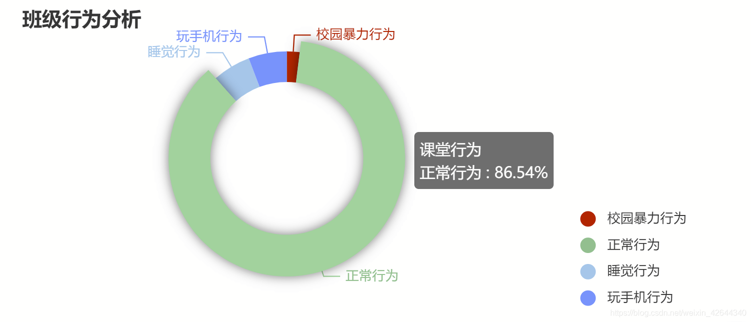
圆环图
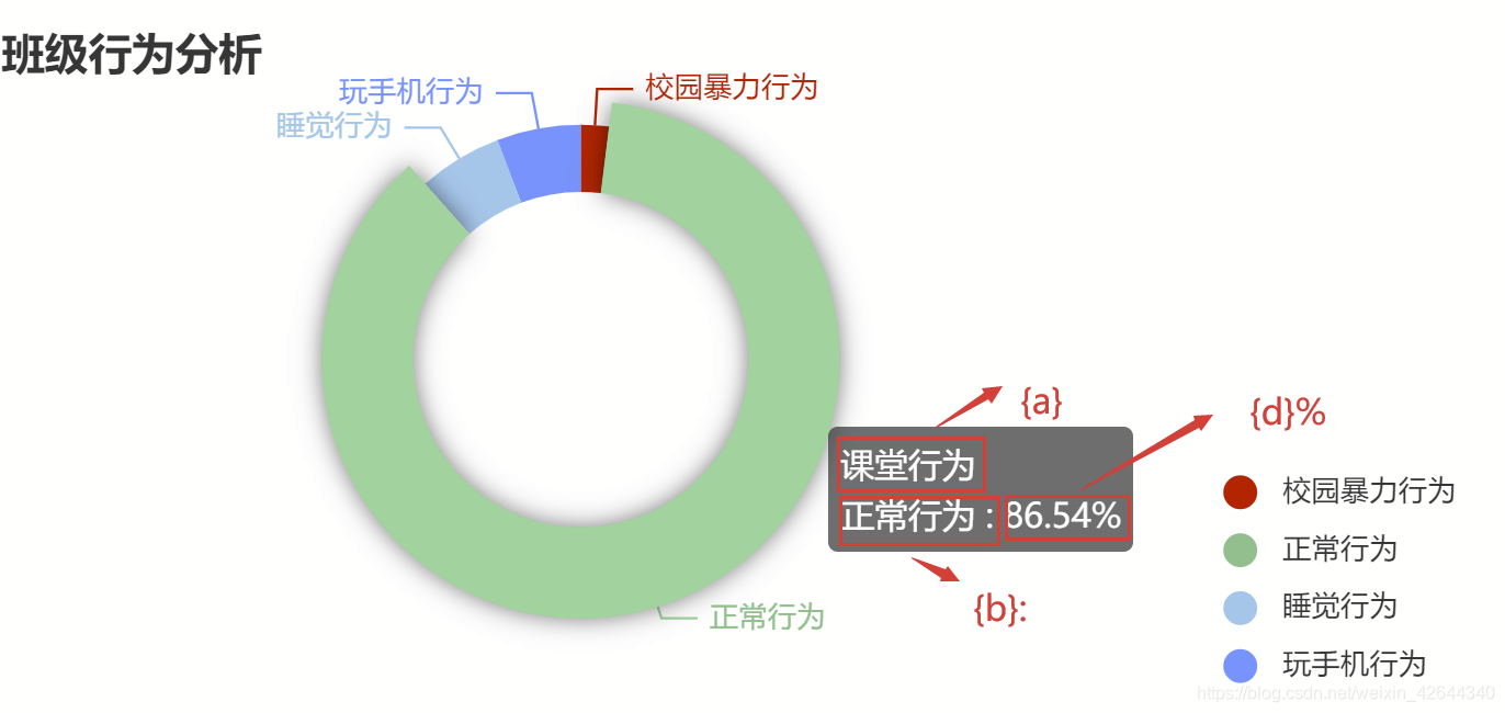
全局注册好组件之后就让我们进入正题吧,第一步先绘制圆环图吧。先上结果图:
在HTML部分先创建一个容器存放
<template>
  <div class="test2" style="width:600px;height:400px;">
      <div id="myChart" style="width:100%;height:278px;float:left;"></div>
  </div>
</template>
JS部分
<script>
export default {
  name: 'test2',
  data () {
    return {
      myChart: '',
      opinionData2: [
        { value: 1, name: '校园暴力行为', itemStyle: 'red' },
        { value: 45, name: '正常行为', itemStyle: '#1FC48D' },
        { value: 3, name: '睡觉行为', itemStyle: '#6DC8EC' },
        { value: 3, name: '玩手机行为', itemStyle: '#3F8FFF' }
      ]
    }
  },
  mounted: function () {
    this.drawLine()
  },
  methods: {
    drawLine () {
      this.myChart = this.$echarts.init(document.getElementById('myChart'))
      this.myChart.setOption({
        title: {
          text: '班级行为分析', // 主标题
          subtext: '', // 副标题
          x: 'left' // x轴方向对齐方式
        },
        grid: { containLabel: true },
        tooltip: {
          trigger: 'item',
          formatter: '{a} <br/>{b} : {d}%'
        },
        // color: ['#1FC48D', '#F5A60A', '#6DC8EC', '#3F8FFF'],
        color: ['red', '#1FC48D', '#6DC8EC', '#3F8FFF'],
        // backgroundColor: '#ffffff',
        legend: {
          orient: 'vertical',
          icon: 'circle',
          align: 'left',
          x: 'right',
          y: 'bottom',
          data: ['校园暴力行为', '正常行为', '睡觉行为', '玩手机行为']
        },
        series: [
          {
            name: '课堂行为',
            type: 'pie',
            radius: ['50%', '70%'],
            avoidLabelOverlap: false,
            center: ['40%', '50%'],
            itemStyle: {
              emphasis: {
                shadowBlur: 10,
                shadowOffsetX: 0,
                shadowColor: 'rgba(0, 0, 0, 0.5)'
              },
              color: function (params) {
                // 自定义颜色
                var colorList = ['red', '#1FC48D', '#6DC8EC', '#3F8FFF']
                return colorList[params.dataIndex]
              }
            },
            data: this.opinionData2
          }
        ]
      })
    }
  }
}
</script>
这里稍微帮助小白们解释下其中的几部分
第一部分 legend:{}这里面的x,y是用来控制图注的位置的比如x: ‘right’,y: ‘bottom’,说明将图注放在右下角的位置。
第二部分 series:[] 这部分是echarts绘制图形的主体里面的data是你想在图中显示出什么内容。
{ value: 1, name: ‘校园暴力行为’, itemStyle: ‘red’ },说明你想在图中显示出校园暴力出现了一次(它会自己计算百分比),颜色为红色
tooltip部分我放在结尾对比着将,你们会更容易理解
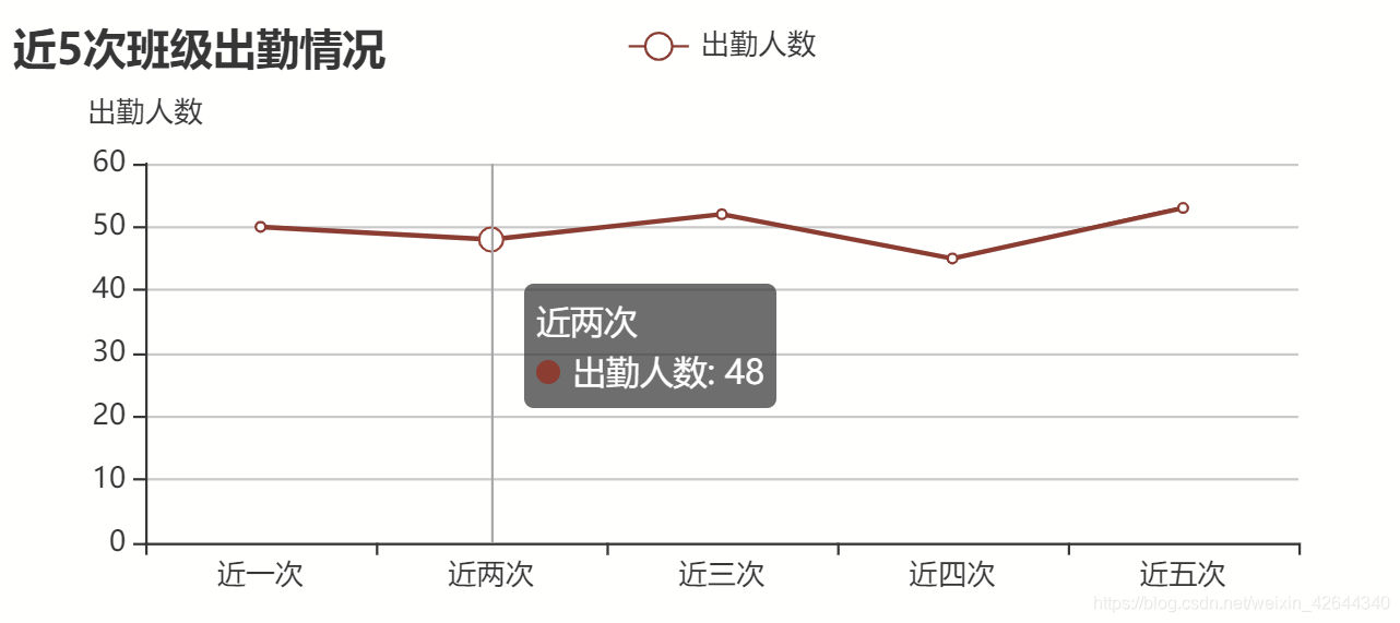
折线图
老规矩先上图
HTML部分
<template>
  <div class="test2" style="width:600px;height:400px;">
      <div id="myChart2" style="width:100%;height:278px;float:left;"></div>
  </div>
</template>
JS部分
<script>
export default {
  name: 'test2',
  data () {
    return {
      myChart2: ''
    }
  },
  mounted: function () {
    this.drawLine1()
  },
  methods: {
    drawLine1 () {
      // 基于准备好的dom,初始化echarts实例
      this.myChart2 = this.$echarts.init(document.getElementById('myChart2'))
      // 绘制图表
      this.myChart2.setOption({
        title: {
          text: '近5次班级出勤情况', // 主标题
          subtext: '', // 副标题
          x: 'left' // x轴方向对齐方式
        },
        tooltip: {
          trigger: 'axis' // axis   item   none三个值
        },
        xAxis: {
          type: 'category', // 还有其他的type,可以去官网喵两眼哦
          data: ['近一次', '近两次', '近三次', '近四次', '近五次'], // x轴数据
          name: '' // x轴名称
          // x轴名称样式
          // nameTextStyle: {
          //   fontWeight: 600,
          //   fontSize: 18
          // }
        },
        yAxis: {
          type: 'value',
          name: '出勤人数' // y轴名称
          // y轴名称样式
          // nameTextStyle: {
          //   fontWeight: 600,
          //   fontSize: 18
          // }
        },
        legend: {
          orient: 'vertical',
          x: 'center',
          y: 'top',
          data: ['出勤人数']
        },
        series: [
          {
            name: '出勤人数',
            data: [50, 48, 52, 45, 53],
            type: 'line'
          }
        ]
      })
    }
  }
}
</script>
legend与series依然表述图注和主题部分不再解释。
xAxis:代表X轴的内容,data表述X轴显示内容。
yAxis:代表Y轴内容。
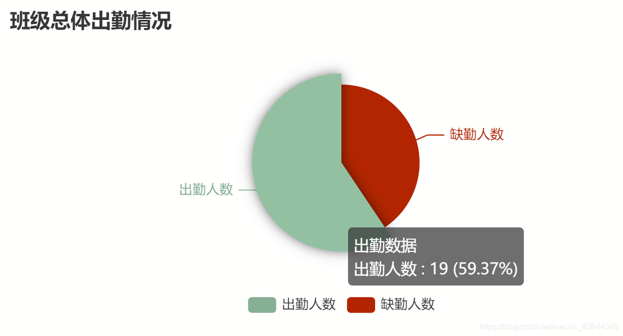
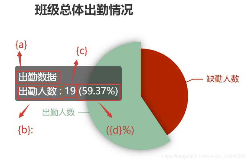
饼图
HTML部分
<template>
  <div class="test2" style="width:600px;height:400px;">
      <div id="myChart3" style="width:100%;height:278px;float:left;"></div>
  </div>
</template>
JS部分
<script>
export default {
  name: 'test2',
  data () {
    return {
      myChart3: '',
      opinion3: ['出勤人数', '缺勤人数'],
      opinionData3: [
        { value: 13, name: '缺勤人数', itemStyle: 'red' },
        { value: 19, name: '出勤人数', itemStyle: '#1ab394' }
      ]
    }
  },
  mounted: function () {
    this.drawLine2()
  },
  methods: {
    drawLine2 () {
      // console.log("开始画饼图")
      // 基于准备好的dom,初始化echarts实例
      this.myChart3 = this.$echarts.init(document.getElementById('myChart3'))
      // 绘制图表
      this.myChart3.setOption({
        title: {
          text: '班级总体出勤情况', // 主标题
          subtext: '', // 副标题
          x: 'left' // x轴方向对齐方式
        },
        tooltip: {
          trigger: 'item',
          formatter: '{a} <br/>{b} : {c} ({d}%)'
        },
        legend: {
          orient: 'vertical',

          bottom: 'bottom',
          data: this.opinion3
        },
        series: [
          {
            name: '出勤数据',
            type: 'pie',
            radius: '50%',
            center: ['50%', '50%'],
            data: this.opinionData3,
            itemStyle: {
              emphasis: {
                shadowBlur: 10,
                shadowOffsetX: 0,
                shadowColor: 'rgba(0, 0, 0, 0.5)'
              },
              color: function (params) {
                // 自定义颜色
                var colorList = ['red', '#1ab394']
                return colorList[params.dataIndex]
              }
            }
          }
        ]
      })
    }
  }
}
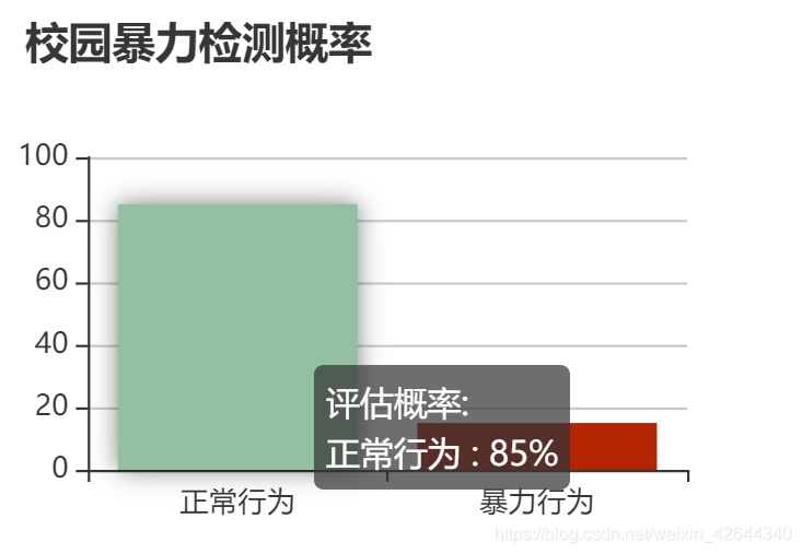
柱状图
 HTML部分
<template>
  <div class="test2" style="width:600px;height:400px;">
      <div id="myChart4" style="width:100%;height:250px;float:left;"></div>
  </div>
</template>
JS部分
<script>
export default {
  name: 'test2',
  data () {
    return {
      myChart4: '',
      opinion: ['正常行为', '暴力行为'],
      opinionData: [
        { value: 85, itemStyle: '#1ab394' },
        { value: 15, itemStyle: 'red' }
      ]
    }
  },
  mounted: function () {
    this.drawLine4()
  },
  methods: {
    drawLine4 () {
      this.myChart4 = this.$echarts.init(document.getElementById('myChart4'))
      this.myChart4.setOption({
        title: {
          text: '校园暴力检测概率'
        },
        tooltip: {
          trigger: 'item',
          formatter: '{a} <br/>{b} : {c}%'
        },
        legend: {
          orient: 'vertical',
          x: 'right',
          y: 'top',
          data: ['评估概率']
        },
        xAxis: {
          data: this.opinion
        },
        yAxis: {},
        series: [{
          name: '评估概率',
          type: 'bar',
          data: this.opinionData,
          itemStyle: {
            emphasis: {
              shadowBlur: 10,
              shadowOffsetX: 0,
              shadowColor: 'rgba(0, 0, 0, 0.5)'
            },
            color: function (params) {
              // 自定义颜色
              var colorList = ['#1ab394', 'red']
              return colorList[params.dataIndex]
            }
          }
        }]
      })
    }
  }
}
</script>
最后给大家介绍下
tooltip: {
          trigger: 'item',
          formatter: '{a} <br/>{b} : {c}%'
        },
这个tooltip其实是控制鼠标移到图像上面的提示信息的输出格式。其中br表示换行因此按照上面的格式应该输出为
a
b : c%
接下来我们来对比下:
在圆形图中采用格式为
{a} <br/>{b} : {d}%
结果:c不输出
 饼图采用格式为
{a} <br/>{b} : {c} ({d}%)
 以上就是《vue+elementUI中使用Echarts绘制圆环图 折线图 饼图 柱状图》的全部内容了。


 2590
2590

 被折叠的 条评论
为什么被折叠?
被折叠的 条评论
为什么被折叠?
 到【灌水乐园】发言


