


一、前言
milligram 是我在 20 年接触并使用的一个 CSS 库,他的出现时间已经无法溯源了,根据 npm 上的发布时间最早是 2015 年,而在国内名气起来的时间大概就是 2020 年了,同时 milligram 最后的更新也停在了那一年。
由于当时只需要做一些简单的页面,只需要一些简单的布局及美观的样式足可以满足我的需求,所以在 CSS 库的选择上排除了当时 Bootstrap、 Bulma、Foundation 这些相对笨重,且功能复杂的库,也因此喜欢上了这个小巧简洁的 css 库。
时至今日,前端三大框架几乎统治整个前端界,从而带来了各类强大的 UI 组件库,这也导致这类简洁的样式库存在感越来越低了。
二、Milligram 介绍
Milligram 是一个简洁、小巧 CSS 库,它专注于提供一个轻量级的样式库,使得在网页项目中添加样式变得非常简单。Milligram 的设计理念是尽可能少地干预你的设计,只提供了一些基础的样式和组件,使得你可以更容易地构建自己的定制化界面。
Milligram 具有一下几个特点:
- 轻量级:Milligram 非常小巧,通过 gzip 压缩后仅有 2KB 大小。
- 现代化:Milligram 采用了现代化的 CSS特性 和响应式设计,适用于各类设备显示。
- 基本样式:Milligram 直接对常见的HTML元素(如表格、按钮)提供了基本样式,从而使用时无须记住很多类名,同时也更容易复写样式。
- 网格系统:Milligram包含了一个简单的网格系统,可以快速构建响应式的布局。
虽然 Milligram 自称是一个功能简单的CSS框架,但我认为他更偏向于是一个 CSS 库,不过但正是由于其轻量级和现代化的设计,它非常适合那些希望从零开始构建自己定制样式的开发者。我当时选择的原因正是因为足够简单、同时含有网格系统和简约的 UI 设计,如果仅仅做一些简单的网页,我还是推荐使用的。
三、源码浅析
这篇文章不对使用方法进行讲解了,一是需要手动添加的类其实很少,二是官网写的也足够详细了,三则是现在大概对其感兴趣、想要真正使用的人可能并不多,所有我也不必大废笔墨去介绍用法,直接进入正题。
其实 Milligram 并没有特别复杂的设计,实际代码更是没有多少行,否则也不可能压缩后仅仅 2kb, 我们也只是欣赏一下代码。
目录设计
Milligram 的目录很干净,除了根目录的配置文件,只剩下 test 单元测试、.github github 仓库的一些配置、dist 打包输出目录、以及核心的 src 源码目录。
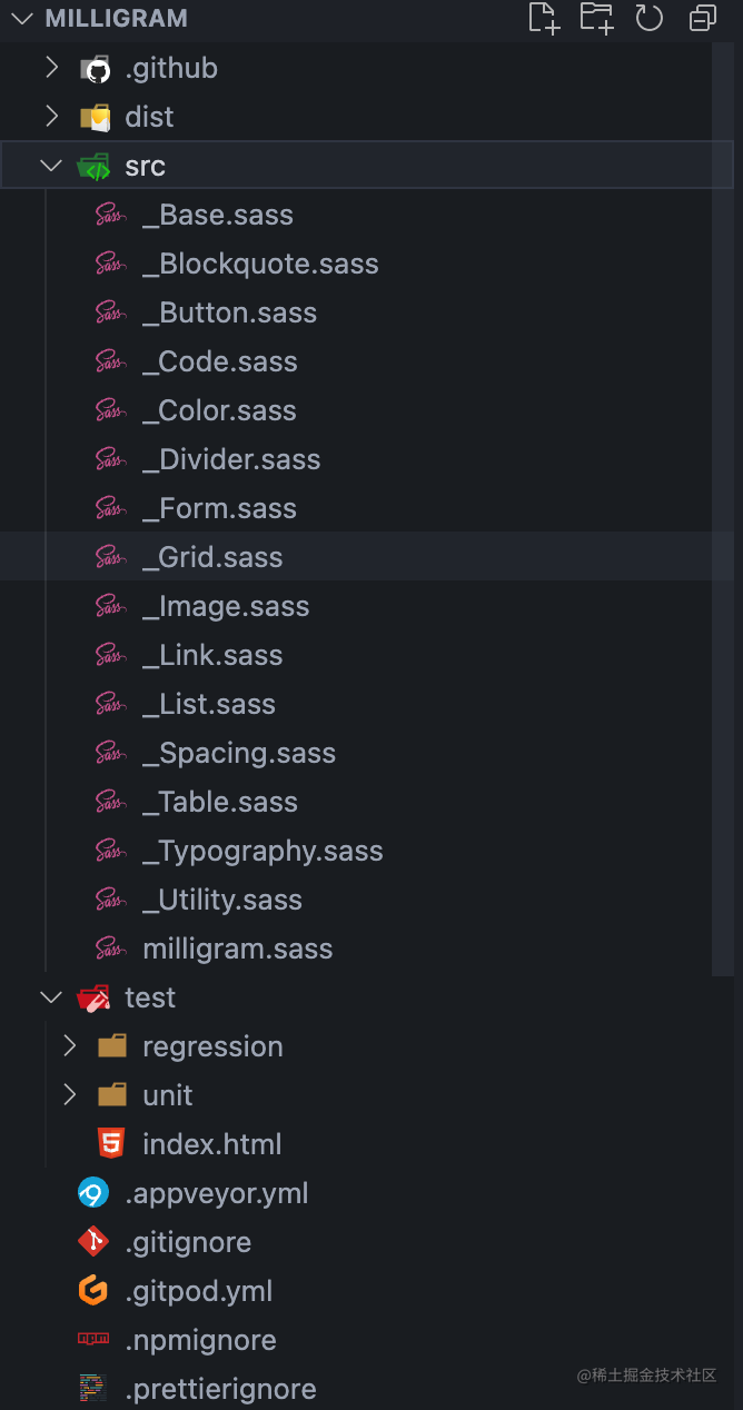
通过目录我们便能大概看出/推测出许多东西:
- 首先 milligram 的整个源码由 sass 编写
- 其次 milligram.sass 应该就是整个目录的主文件
- 其他所有
_前缀开头的都是组件样式,在 Bootstrap 的源码中,也是使用_的命名方式。
通过文件名称,我们也能很清晰的看出各个文件的作用。
milligram.sass 源码
可以看到 milligram.sass 只做了一件事,就是将所有组件样式文件导入。
@import _Color
@import _Base
@import _Blockquote
@import _Button
@import _Code
@import _Divider
@import _Form
@import _Grid
@import _Link
@import _List
@import _Spacing
@import _Table
@import _Typography
@import _Image
@import _Utility
_Color.sass
color.sass 中,定义了几个全局的主题颜色变量,如果想修改样式的主题色,只需要改动这里就可以了。
$color-initial: #fff !default
$color-primary: #9b4dca !default
$color-secondary: #606c76 !default
$color-tertiary: #f4f5f6 !default
$color-quaternary: #d1d1d1 !default
$color-quinary: #e1e1e1 !default
_Base.sass 源码
base.sass 主要是一些基础的全局设置。
// Set box-sizing globally to handle padding and border widths
*,
*:after,
*:before
  box-sizing: inherit

// The base font-size is set at 62.5% for having the convenience
// of sizing rems in a way that is similar to using px: 1.6rem = 16px
html
  box-sizing: border-box
  font-size: 62.5%

// Default body styles
body
  color: $color-secondary
  font-family: 'Roboto', 'Helvetica Neue', 'Helvetica', 'Arial', sans-serif
  font-size: 1.6em // Currently ems cause chrome bug misinterpreting rems on body element
  font-weight: 300
  letter-spacing: .01em
  line-height: 1.6
这里就涉及到一些基础知识:为什么 html 标签要设置为 62.5% ?
根据注释的解释是:基本字体大小设置为62.5%,以便以类似于使用 px 的方式调整 rems 的大小:1.6rem=16px。
px、rem、em
先简单介绍一下这 px, em, 和 rem ,这个三个都是用于设置元素尺寸的CSS单位:
- px(像素):
px是绝对单位,表示屏幕上的像素点。1个px相当于屏幕上的一个物理像素。当使用px设置元素尺寸时,它的大小将保持固定,不会随着用户调整浏览器的缩放或设备的分辨率而改变。因此,使用px来设置元素尺寸可以确保大小始终保持不变。
例如:
font-size: 16px;将文字大小设置为16像素。
- em:
em是相对单位,它是相对于父元素的字体大小来计算的。如果没有设置父元素的字体大小,那么em将相对于浏览器默认的字体大小(通常是16px)来计算。如果父元素的字体大小是12px,那么1em相当于12px,2em相当于24px,依此类推。
例如:
font-size: 1.5em;将文字大小设置为父元素字体大小的1.5倍。
- rem:
rem也是相对单位,但它是相对于根元素(通常是HTML元素)的字体大小来计算的。与em不同,rem的参考点始终是根元素的字体大小,因此它对于构建响应式布局非常有用。
例如:如果根元素的字体大小是16px,
font-size: 2rem;将文字大小设置为32px。
那么为什么要这里要设置为 62.5% 呢?
这是因为浏览器的默认字体一般都是 16px, 那么所有浏览器都符合就是 1em = 16px 换算设定,
根据 1em = 16px 的设定,我们可以得出 12px = 0.75em, 10px = 0.625em。 为了简化 rem、em 的换算,只需要在 html 选择器中声明 font-size: 62.5%,就能使 em 值变为 16px * 62.5% = 10px, 这样 12px=1.2em, 10px=1em。
为什么选择 10px ?因为这个值便于计算和转换。当我们使用rem单位时,1rem 等于根元素的字体大小。所以,将HTML的字体大小设置为10px之后,我们只需要将原来的 px 数值除以 10, 然后换成 em 作为单位就行了。
举个🌰子,如果想要一个元素的宽度是30px,只需要使用 3rem(30px / 10 = 3rem)来表示。这也就解释了代码注释中,为什么 1.6rem=16px。
这样做的好处是,使得我们在使用rem单位时更加直观,不需要频繁进行计算和换算,提高了代码的可读性和维护性。
_Button.sass
button.sass 文件下的都是 Button 的一些样式。
.button,
button,
input[type='button'],
input[type='reset'],
input[type='submit']
  background-color: $color-primary
  border: .1rem solid $color-primary
  border-radius: .4rem
  color: $color-initial
  cursor: pointer
  display: inline-block
  font-size: 1.1rem
  font-weight: 700
  height: 3.8rem
  letter-spacing: .1rem
  line-height: 3.8rem
  padding: 0 3.0rem
  text-align: center
  text-decoration: none
  text-transform: uppercase
  white-space: nowrap

  &:focus,
  &:hover
    background-color: $color-secondary
    border-color: $color-secondary
    color: $color-initial
    outline: 0

  &[disabled]
    cursor: default
    opacity: .5

    &:focus,
    &:hover
      background-color: $color-primary
      border-color: $color-primary

  &.button-outline
    background-color: transparent
    color: $color-primary

    &:focus,
    &:hover
      background-color: transparent
      border-color: $color-secondary
      color: $color-secondary

    &[disabled]

      &:focus,
      &:hover
        border-color: inherit
        color: $color-primary

  &.button-clear
    background-color: transparent
    border-color: transparent
    color: $color-primary

    &:focus,
    &:hover
      background-color: transparent
      border-color: transparent
      color: $color-secondary

    &[disabled]

      &:focus,
      &:hover
        color: $color-primary
从这段代码可以看的出来,milligram 通过 type 属性将各类表单按钮都获取到了,同时通过 [disabled] 属性设置禁用后的样式。
使用 input[type='color'] 这样 标签 + 属性 的 CSS选择器来修改特定类型的表单元素样式有几个优点:
- 精确选择:这些选择器允许你非常精确地选择特定类型的表单元素。通过指定
type属性值,你可以选择到你需要修改的具体表单元素,而不影响其他类型的表单元素。 - 无需添加额外的类或ID:通过这种方式,无需为每个表单元素添加额外的类名或ID,可以直接通过属性选择器选择到它们。这样可以减少HTML代码的冗余,使代码更简洁。
- 代码易读性:这种方式可以使CSS代码更具有可读性,特别是在涉及多个不同类型的表单元素样式修改时。通过选择器的名字,可以清楚地了解你正在针对哪种类型的表单元素进行样式调整。
同时,我们可以看到源码中,对所有类样式都添加了 :hover, :focus 伪类, 进一步提升了用户的交互体验,当我们在实际业务中 需要手写组件时,也应该充分考虑用户的交互体验。
_Form.sass
form.sass 是对各类表单元素的样式设置
input[type='color'],
input[type='date'],
input[type='datetime'],
input[type='datetime-local'],
input[type='email'],
input[type='month'],
input[type='number'],
input[type='password'],
input[type='search'],
input[type='tel'],
input[type='text'],
input[type='url'],
input[type='week'],
input:not([type]),
textarea,
select
  -webkit-appearance: none // sass-lint:disable-line no-vendor-prefixes
  background-color: transparent
  border: .1rem solid $color-quaternary
  border-radius: .4rem
  box-shadow: none
  box-sizing: inherit // Forced to replace inherit values of the normalize.css
  height: 3.8rem
  padding: .6rem 1.0rem .7rem // This vertically centers text on FF, ignored by Webkit
  width: 100%

  &:focus
    border-color: $color-primary
    outline: 0

select
  background: url('data:image/svg+xml;utf8,<svg xmlns="http://www.w3.org/2000/svg" viewBox="0 0 30 8" width="30"><path fill="%23' + str-slice(inspect($color-quaternary), 2) + '" d="M0,0l6,8l6-8"/></svg>') center right no-repeat
  padding-right: 3.0rem

  &:focus
    background-image: url('data:image/svg+xml;utf8,<svg xmlns="http://www.w3.org/2000/svg" viewBox="0 0 30 8" width="30"><path fill="%23' + str-slice(inspect($color-primary), 2) + '" d="M0,0l6,8l6-8"/></svg>')

  &[multiple]
    background: none
    height: auto

textarea
  min-height: 6.5rem

label,
legend
  display: block
  font-size: 1.6rem
  font-weight: 700
  margin-bottom: .5rem

fieldset
  border-width: 0
  padding: 0

input[type='checkbox'],
input[type='radio']
  display: inline

.label-inline
  display: inline-block
  font-weight: normal
  margin-left: .5rem
通过源码可以清晰的看到,通过 input[type='xxx'] 方式初始化了所有的表单样式,为什么这里不直接对 input 标签进行修改,反而将所有的都写出来? 别忘了 input 标签是有 Button 类型的。
从源码中我们还能学习到一些有趣的用法:
-
input:not([type]):通过not([type])获取没有显性声明 type 的 input 输入框 -
-webkit-appearance:设置为 none 可以隐藏部件的某些特性,例如 select 元素中显示的指示列表可以展开的箭头。 -
通过对 select 标签设置 background-image, 显示自定义的下拉箭头
_Grid.sass
grid.sass 是网格布局的核心代码
// .container is main centered wrapper with a max width of 112.0rem (1120px)
.container
  margin: 0 auto
  max-width: 112.0rem
  padding: 0 2.0rem
  position: relative
  width: 100%

// Using flexbox for the grid, inspired by Philip Walton:
// http://philipwalton.github.io/solved-by-flexbox/demos/grids/
// By default each .column within a .row will evenly take up
// available width, and the height of each .column with take
// up the height of the tallest .column in the same .row
.row
  display: flex
  flex-direction: column
  padding: 0
  width: 100%

  &.row-no-padding
    padding: 0

    &> .column
      padding: 0

  &.row-wrap
    flex-wrap: wrap

  // Vertically Align Columns
  // .row-* vertically aligns every .col in the .row
  &.row-top
    align-items: flex-start

  &.row-bottom
    align-items: flex-end

  &.row-center
    align-items: center

  &.row-stretch
    align-items: stretch

  &.row-baseline
    align-items: baseline

  .column
    display: block
    // IE 11 required specifying the flex-basis otherwise it breaks mobile
    flex: 1 1 auto
    margin-left: 0
    max-width: 100%
    width: 100%

    // Column Offsets
    &.column-offset-10
      margin-left: 10%

    //... 省略 10 - 90 之间的代码

    &.column-offset-90
      margin-left: 90%

    // Explicit Column Percent Sizes
    // By default each grid column will evenly distribute
    // across the grid. However, you can specify individual
    // columns to take up a certain size of the available area
    &.column-10
      flex: 0 0 10%
      max-width: 10%

    //... 省略 10 - 90 之间的代码

    &.column-90
      flex: 0 0 90%
      max-width: 90%

    // .column-* vertically aligns an individual .column
    .column-top
      align-self: flex-start

    .column-bottom
      align-self: flex-end

    .column-center
      align-self: center

// Larger than mobile screen
@media (min-width: 40.0rem) // Safari desktop has a bug using `rem`, but Safari mobile works

  .row
    flex-direction: row
    margin-left: -1.0rem
    width: calc(100% + 2.0rem)

    .column
      margin-bottom: inherit
      padding: 0 1.0rem
可以看出来,milligram 是通过 flex 实现网格系统的,根据注释中所言,是参考了 Philip Walton
通过 Flexbox 实现布局有以下优点:
- 简单易用:Flexbox 是一种简单、直观的布局模型,相对于传统的浮动布局来说,语法更易理解和使用。它提供了一组直观的CSS属性,使得创建网格布局变得非常简单。
- 灵活性:Flexbox 允许容器内的子元素自由伸缩,根据可用空间自动调整其大小和位置。
- 自适应能力:Flexbox 布局可以根据容器的大小和内容自动调整,无需指定具体的像素宽度。
- 简化嵌套:使用 Flexbox 可以减少网格布局中的嵌套层级,从而简化HTML结构和CSS代码。相较于传统的网格布局方法,使用 Flexbox 可以减少样板代码,提高代码的可读性和可维护性。
- 方便的对齐和排序:Flexbox提供了丰富的对齐和排序选项,使得子元素可以轻松地在容器内进行对齐和排序。这在创建复杂布局时非常有用,可以很方便地调整子元素的排列方式。
这里我其实有些疑惑的,我不太明白为什么 column-offset 和 column 的代码是通过手写的,而不是通过 sass 中的 @each 进行循环,只能当做为了代码更清晰明了吧。
结语
本篇只提取了关键几个源码文件进行讲解,类似于 Image、Code、Blockquote 过于简单的没有再拿出来看的必要了,感兴趣的可以自行查阅
虽然这个库已经停更了,但是可以从源码就能看出来如此简洁的库,即便不再维护也并不影响使用,而且由于代码目录的良好设计,如果需要自行维护扩展也很容易。
milligram 资料
- Github 仓库地址: https://github.com/milligram/milligram
- milligram 官网:https://milligram.io/
- npm 仓库地址:https://www.npmjs.com/package/milligram?activeTab=versions


 459
459


 被折叠的 条评论
为什么被折叠?
被折叠的 条评论
为什么被折叠?
 到【灌水乐园】发言


