


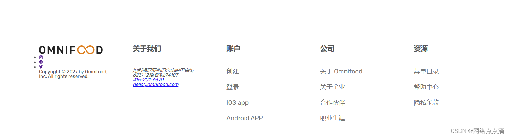
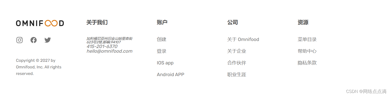
上个文章我们的页脚部分完成页面如下:

● 这节课我们来添加样式
.footer-heading {
  font-size: 1.8rem;
  font-weight: 600;
  margin-bottom: 3.2rem;
}

.footer-nav {
  list-style: none;
}

.footer-link:link,
.footer-link:visited {
  text-decoration: none;
  font-size: 1.6rem;
  color: #767676;
}

● 之后我们再设置一下访问的样式,以及通过flex的方式来调整间距
.footer-link:hover,
.footer-link:active {
  color: #555;
}
.footer-nav {
  list-style: none;
  display: flex;
  flex-direction: column;
  gap: 2.4rem;
}
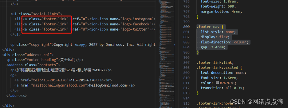
● 接着我们设置社交图标这一块
.logo-col {
  display: flex;
  flex-direction: column;
}

.social-links {
  list-style:none;
  display: flex;
  gap: 2.4rem;
}

.social-icon {
  height: 2.4rem;
  width: 2.4rem;
}

.copyright {
  font-size: 1.4rem;
  line-height: 1.6;
  color: #767676;
  margin-top: auto;
}

.footer-logo {
  display: block;
  margin-bottom: 3.2rem;
}
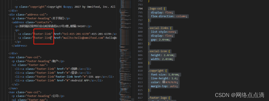
● 接着我们就设置一下关于我们的这个样式
.contacts {
  font-style: normal;
  font-size: 1.6rem;
  line-height: 1.6;
}

.address {
  margin-bottom: 2.4rem;
}
急着调整一下间距,然后给一个线条分层
.footer {
  padding: 12.8rem 0;
  border-top: 1px solid #ddd;
}

.grid--footer {
  grid-template-columns: 1.5fr 1.5fr 1fr 1fr 1fr;
}

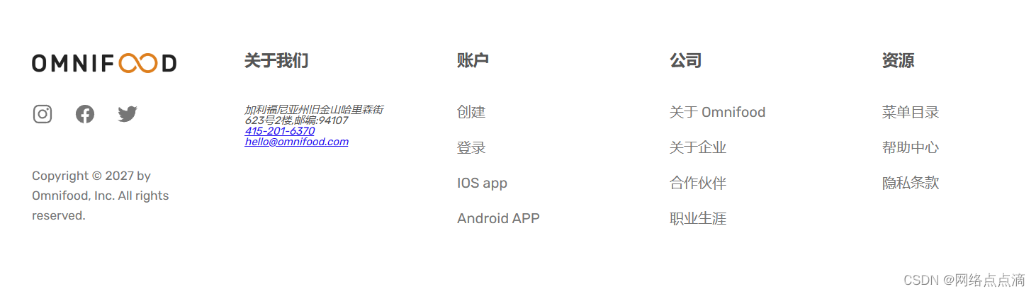
● 之后再替换我们的导航部分,我们整个页面就完成啦!!!
下面的章节我们将介绍如何把这样的网站变成响应式的!!!


 265
265


 被折叠的 条评论
为什么被折叠?
被折叠的 条评论
为什么被折叠?
 到【灌水乐园】发言


