


目录
本文详细介绍了Vue 3项目中利用组件实现动态时钟效果的单文件组件,使用了<script setup>语法,并且样式部分使用了SCSS。
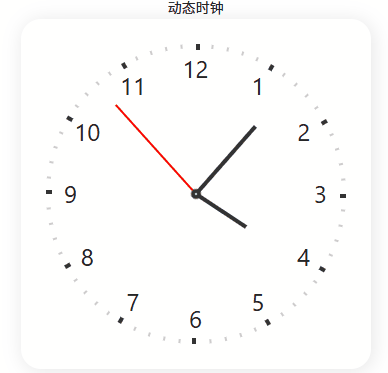
动态的模拟时钟,包括表盘、刻度、数字以及时针、分针和秒针。
先上效果如下:
1、整体思路
代码通过CSS动画实现时钟指针的连续旋转,使用Vue响应式变量存储当前时间,通过计算动画延迟使指针从当前时间位置开始旋转。
2、实现过程
2.1、模板部分(Template)
-
有两个
view,第一个显示“动态时钟”文字,第二个是时钟本身。 -
时钟的容器(class为clock)通过绑定样式的方式,将秒、分、时的值作为CSS自定义属性(--ds, --dm, --dh)传递,用于后续的动画延迟计算。
-
表盘上有12个数字(1-12),使用
v-for循环生成,每个数字通过CSS的offset-path属性沿着圆形路径排列。 -
有60个刻度,同样使用
v-for生成,其中每5个刻度(5的倍数)会加粗显示,代表小时刻度。 -
有时针、分针和秒针三个元素,它们分别通过CSS动画实现旋转。
<template>
  <view class="clock-box">动态时钟</view>
  <view class="clock-box">
    <view class="clock" :style="{ '--ds': ds, '--dm': dm, '--dh': dh }">
      <view class="clock-pane">
        <text class="clock-num" :style="{ '--i': n }" v-for="n in 12" :key="n">{{ n }}</text>
      </view>
      <view class="clock-scales">
        <text class="clock-scale" :style="{ '--i': n }" v-for="n in 60" :key="n"></text>
      </view>

      <view class="clock-hour"></view>
      <view class="clock-min"></view>
      <view class="clock-sec"></view>
    </view>
  </view>
</template>
2.2、脚本部分(Script)
-
使用
setup语法,在组件初始化时获取当前时间,并计算出秒、分、时的值,但是注意,这里计算出的值用于初始设置动画的延迟。 -
使用
ref创建了响应式变量ds、dm、dh,分别代表秒、分、时(注意,分和时都包含了秒的小数部分,以便更精确地定位指针)。
<script lang="ts" setup>
const d = new Date();
const h = d.getHours();
const m = d.getMinutes();
const s = d.getSeconds();
const ds = ref(s);
const dm = ref(m + s / 60);
const dh = ref(h + m / 60 + s / 3600);
</script>
2.3、样式部分(Style)
-
使用了SCSS语法,包含了一些嵌套规则和循环。
-
时钟的容器设置了固定的宽高,圆角,阴影等。
-
表盘(.clock-pane)和刻度容器(.clock-scales)绝对定位,并且刻度容器做了偏移调整。
-
刻度的生成:通过SCSS的
@for循环生成60个刻度,每个刻度旋转6度(360度/60)。 -
数字的排列:使用CSS的offset-path属性,让12个数字沿着一个圆形路径(circle)排列,通过offset-distance调整每个数字的位置。
-
指针的样式:分别设置了时针、分针和秒针的长度、颜色和宽度。它们都使用了同一个动画
clock,但是动画的周期不同,并且通过动画延迟(animation-delay)来设置初始位置。-
时针动画周期为12小时(--step * 60 * 12),其中--step是60秒,即720分钟,也就是12小时。
-
分针动画周期为60分钟(--step * 60),即1小时。
-
秒针动画周期为60秒(--step),即1分钟。
-
-
秒针的动画使用了
steps(60),这样秒针会一跳一跳的,每分钟跳60次,即每秒一跳。 -
动画延迟的计算:通过当前时间(时、分、秒)计算出动画应该开始的点,这样当时钟显示时,指针就能指向正确的时间。
<style lang="scss">
.clock-box {
  display: flex;
  align-items: center;
  justify-content: center;
}

.clock {
  position: relative;
  display: flex;
  align-items: center;
  justify-content: center;
  width: 350px;
  height: 350px;
  font-size: 24px;
  border-radius: 20px;
  box-shadow: 2px 2px 20px #0000001a;
  --step: 60s;
}

.clock-pane {
  position: absolute;
  width: 250px;
  height: 250px;
  transform: translateX(0px);
}

.clock-scales {
  position: absolute;
  width: 250px;
  height: 250px;
  transform: translate(125px, -25px);
}

.clock-scale {
  position: absolute;
  top: 0;
  left: 0;
  width: 2px;
  height: 4px;
  background: #ccc;
  transform-origin: 0 150px;

  &:nth-child(5n + 1) {
    width: 4px;
    height: 6px;
    background: #333;
  }
}

@for $i from 1 through 60 {
  .clock-scale:nth-child(#{$i}) {
    transform: rotate(#{($i - 1) * 6deg});
  }
}

.clock-num {
  position: absolute;
  offset-path: path("M250 125c0 69.036-55.964 125-125 125S0 194.036 0 125 55.964 0 125 0s125 55.964 125 125z");
  offset-distance: calc(var(--i) * 10% / 1.2 - 25%);
  offset-rotate: 0deg;
}

.clock-hour {
  position: absolute;
  width: 4px;
  height: 60px;
  background: #333;
  transform: translateY(-50%) rotate(0);
  transform-origin: center bottom;
  animation: clock calc(var(--step) * 60 * 12) infinite linear;
  animation-delay: calc(-1 * var(--step) * var(--dh) * 60);
}

.clock-min {
  position: absolute;
  width: 4px;
  height: 90px;
  background: #333;
  transform: translateY(-50%) rotate(0);
  transform-origin: center bottom;
  animation: clock calc(var(--step) * 60) infinite linear;
  animation-delay: calc(-1 * var(--step) * var(--dm));
}

.clock-sec {
  position: absolute;
  width: 2px;
  height: 120px;
  background: red;
  transform: translateY(-50%) rotate(0);
  transform-origin: center bottom;
  animation: clock var(--step) infinite steps(60);
  animation-delay: calc(-1 * var(--step) * var(--ds) / 60);
}

.clock-sec::after {
  position: absolute;
  bottom: 0;
  left: 50%;
  width: 10px;
  height: 10px;
  content: "";
  background: #fff;
  border: 4px solid #333;
  border-radius: 50%;
  transform: translate(-50%, 50%);
}

@keyframes clock {
  to {
    transform: translateY(-50%) rotate(360deg);
  }
}
</style>
3、关键点解析
-
时针的动画周期是12小时,分针是1小时,秒针是1分钟。
-
动画延迟的计算:
秒针:-1 * var(--step) * var(--ds) / 60
注意:--step是60秒,--ds是当前秒数(0-59),所以延迟是 -1 * 60s * 当前秒数 / 60 = -当前秒数 秒。
例如,当前30秒,那么延迟就是-30秒,即动画从30秒前开始,现在就会指向30秒的位置。
分针:-1 * var(--step) * var(--dm)
--dm是当前分钟数(加上秒的小数部分,例如30.5分钟),所以延迟是 -1 * 60s * 当前分钟数 = -当前分钟数 分钟。
时针:-1 * var(--step) * var(--dh) * 60
--dh是当前小时数(加上分钟和秒的小数部分,例如2.5小时),乘以60将小时转换为分钟,再乘以60秒,得到秒数。
这样,通过负的延迟,让动画从过去某个时间点开始,从而立即指向当前时间。
4、样式实现详解
4.1. 所需依赖
    "sass": "^1.67.0",
    "sass-loader": "^13.3.2",
4.2. 基础容器
.clock {
  width: 350px; height: 350px;
  --step: 60s; // CSS变量,定义动画基础周期
}-
定义了正方形时钟容器
-
--step: 60s是CSS自定义属性,作为动画计算的基础单位
4.3. 数字排列(创新点)
.clock-num {
  offset-path: path("M250 125c0 69.036..."); // 圆形路径
  offset-distance: calc(var(--i) * 10% / 1.2 - 25%);
}
使用CSS offset-path让数字沿圆形路径排列,比传统定位方式更优雅。
4.4. 刻度生成
// 生成60个刻度
@for $i from 1 through 60 {
  .clock-scale:nth-child(#{$i}) {
    transform: rotate(#{($i - 1) * 6deg}); // 每个刻度旋转6度
  }
}-
每个刻度旋转角度 = (序号-1) × 6°
-
每5个刻度加粗显示(小时刻度)
4.5. 指针动画(核心)
.clock-sec {
  animation: clock var(--step) infinite steps(60);
  animation-delay: calc(-1 * var(--step) * var(--ds) / 60);
}

@keyframes clock {
  to {
    transform: translateY(-50%) rotate(360deg);
  }
}动画逻辑:
-
周期:
--step(60秒) 旋转360° -
延迟:
-1 * 周期 * 当前秒数/60-
负延迟让动画从当前时间位置开始
-
例如:当前30秒 → 延迟-30秒 → 从30秒位置开始
-
三个指针的区别:
| 指针 | 动画周期 | 动画延迟 | 步进方式 |
|---|---|---|---|
| 秒针 | 60秒 | calc(-1 * var(--step) * var(--ds) / 60) | steps(60) 模拟跳秒 |
| 分针 | 60分钟 | calc(-1 * var(--step) * var(--dm)) | linear 平滑移动 |
| 时针 | 12小时 | calc(-1 * var(--step) * var(--dh) * 60) | linear 平滑移动 |
5、完整代码
<template>
  <!-- 外层容器 -->
  <view class="clock-box">动态时钟</view>
  <view class="clock-box">
    <!-- 时钟主体,通过CSS变量传递时间值 -->
    <view class="clock" :style="{ '--ds': ds, '--dm': dm, '--dh': dh }">
      <!-- 12个数字 -->
      <view class="clock-pane">
        <text class="clock-num" :style="{ '--i': n }" v-for="n in 12" :key="n">{{ n }}</text>
      </view>
      <!-- 60个刻度 -->
      <view class="clock-scales">
        <text class="clock-scale" :style="{ '--i': n }" v-for="n in 60" :key="n"></text>
      </view>

      <!-- 时钟指针 -->
      <view class="clock-hour"></view>
      <!-- 时针 -->
      <view class="clock-min"></view>
      <!-- 分针 -->
      <view class="clock-sec"></view>
      <!-- 秒针 -->
    </view>
  </view>
</template>

<script lang="ts" setup>
// 获取当前时间
const d = new Date();
const h = d.getHours(); // 小时 (0-23)
const m = d.getMinutes(); // 分钟 (0-59)
const s = d.getSeconds(); // 秒 (0-59)

// 转换为响应式变量
const ds = ref(s); // 秒数
const dm = ref(m + s / 60); // 分钟 + 秒的小数部分
const dh = ref(h + m / 60 + s / 3600); // 小时 + 分和秒的小数部分
</script>

<style lang="scss">
.clock-box {
  display: flex;
  align-items: center;
  justify-content: center;
}

.clock {
  position: relative;
  display: flex;
  align-items: center;
  justify-content: center;
  width: 350px;
  height: 350px;
  font-size: 24px;
  border-radius: 20px;
  box-shadow: 2px 2px 20px #0000001a;
  --step: 60s; // CSS变量,定义动画基础周期
}

.clock-pane {
  position: absolute;
  width: 250px;
  height: 250px;
  transform: translateX(0px);
}

.clock-scales {
  position: absolute;
  width: 250px;
  height: 250px;
  transform: translate(125px, -25px);
}

.clock-scale {
  position: absolute;
  top: 0;
  left: 0;
  width: 2px;
  height: 4px;
  background: #ccc;
  transform-origin: 0 150px;

  &:nth-child(5n + 1) {
    width: 4px;
    height: 6px;
    background: #333;
  }
}
// 生成60个刻度
@for $i from 1 through 60 {
  .clock-scale:nth-child(#{$i}) {
    transform: rotate(#{($i - 1) * 6deg}); // 每个刻度旋转6度
  }
}

.clock-num {
  position: absolute;
  offset-path: path("M250 125c0 69.036-55.964 125-125 125S0 194.036 0 125 55.964 0 125 0s125 55.964 125 125z"); // 圆形路径
  offset-distance: calc(var(--i) * 10% / 1.2 - 25%);
  offset-rotate: 0deg;
}

.clock-hour {
  position: absolute;
  width: 4px;
  height: 60px;
  background: #333;
  transform: translateY(-50%) rotate(0);
  transform-origin: center bottom;
  animation: clock calc(var(--step) * 60 * 12) infinite linear;
  animation-delay: calc(-1 * var(--step) * var(--dh) * 60);
}

.clock-min {
  position: absolute;
  width: 4px;
  height: 90px;
  background: #333;
  transform: translateY(-50%) rotate(0);
  transform-origin: center bottom;
  animation: clock calc(var(--step) * 60) infinite linear;
  animation-delay: calc(-1 * var(--step) * var(--dm));
}

.clock-sec {
  position: absolute;
  width: 2px;
  height: 120px;
  background: red;
  transform: translateY(-50%) rotate(0);
  transform-origin: center bottom;
  animation: clock var(--step) infinite steps(60);
  animation-delay: calc(-1 * var(--step) * var(--ds) / 60);
}

.clock-sec::after {
  position: absolute;
  bottom: 0;
  left: 50%;
  width: 10px;
  height: 10px;
  content: "";
  background: #fff;
  border: 4px solid #333;
  border-radius: 50%;
  transform: translate(-50%, 50%);
}

@keyframes clock {
  to {
    transform: translateY(-50%) rotate(360deg);
  }
}
</style>
6、最终实现效果


 扫一扫
扫一扫


 484
484

 被折叠的 条评论
为什么被折叠?
被折叠的 条评论
为什么被折叠?
 到【灌水乐园】发言


