


目录
前言
微信小程序横向瀑布流式设计初衷
因为设计时小程序主要是分享自己摄影作品等图片,需要制作个照片墙来显示作品图片
想法是类似百度图片等横向的瀑布流布局,但是寻找半天资料并没有发现小程序的横向瀑布流布局
没有办法只能参考设计思路与布局来自己实现一个
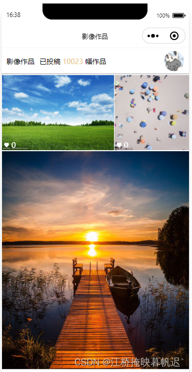
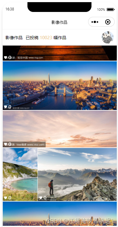
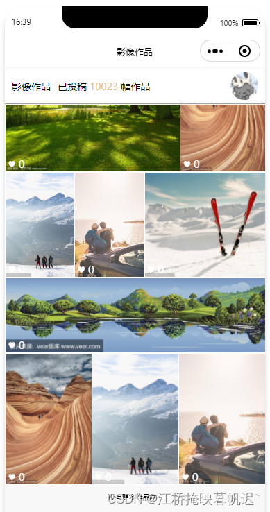
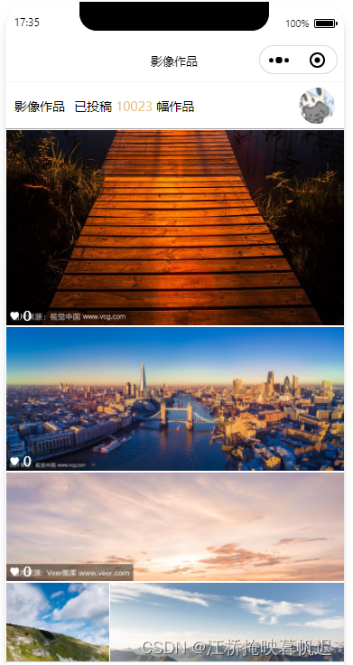
实现效果展示:
一、数据格式
首先图片js的数据格式需要几个必备字段
你图片的链接和图片的分辨率大小。宽和高。以及获取到的屏幕宽度。
示例: index.js
var app = getApp()
Page({

  /**
   * 页面的初始数据
   */
  data: {
    // 屏幕宽度
    screenWidth: '',
    // 图片list数据
    photos: [{
        id: 1,
        src: 'https://t7.baidu.com/it/u=2604797219,1573897854&fm=193&f=GIF',
        width: 1200,
        height: 800
      },
      {
        id: 2,
        src: 'https://t7.baidu.com/it/u=3670538358,232632699&fm=193&f=GIF',
        width: 800,
        height: 800
      },
      {
        id: 3,
        src: 'https://t7.baidu.com/it/u=768965319,3021743516&fm=193&f=GIF',
        width: 534,
        height: 800
      },
      {
        id: 1,
        src: 'https://t7.baidu.com/it/u=3567079227,3570202573&fm=193&f=GIF',
        width: 1200,
        height: 510
      },
      {
        id: 1,
        src: 'https://t7.baidu.com/it/u=3300048064,3563288376&fm=193&f=GIF',
        width: 2000,
        height: 640
      }, {
        id: 1,
        src: 'https://t7.baidu.com/it/u=1090084826,556269836&fm=193&f=GIF',
        width: 534,
        height: 800
      },
      {
        id: 1,
        src: 'https://t7.baidu.com/it/u=1154116680,3139389481&fm=193&f=GIF',
        width: 1200,
        height: 800
      },
      {
        id: 1,
        src: 'https://t7.baidu.com/it/u=3567079227,3570202573&fm=193&f=GIF',
        width: 1200,
        height: 510
      },
      {
        id: 1,
        src: 'https://t7.baidu.com/it/u=1136931208,1127353095&fm=193&f=GIF',
        width: 1096,
        height: 800
      },
      {
        id: 1,
        src: 'https://t7.baidu.com/it/u=4106883051,3074550050&fm=193&f=GIF',
        width: 534,
        height: 800
      }, {
        id: 1,
        src: 'https://t7.baidu.com/it/u=3478158899,44026045&fm=193&f=GIF',
        width: 534,
        height: 800
      },
      {
        id: 1,
        src: 'https://t7.baidu.com/it/u=510121825,3098003545&fm=193&f=GIF',
        width: 467,
        height: 700
      },
      {
        id: 1,
        src: 'https://t7.baidu.com/it/u=2407061975,3231294911&fm=193&f=GIF',
        width: 929,
        height: 800
      },
      {
        id: 1,
        src: 'https://t7.baidu.com/it/u=3629714453,780123474&fm=193&f=GIF',
        width: 2000,
        height: 570
      }, {
        id: 1,
        src: 'https://t7.baidu.com/it/u=4106883051,3074550050&fm=193&f=GIF',
        width: 534,
        height: 800
      }, {
        id: 1,
        src: 'https://t7.baidu.com/it/u=3478158899,44026045&fm=193&f=GIF',
        width: 534,
        height: 800
      },
      {
        id: 1,
        src: 'https://t7.baidu.com/it/u=510121825,3098003545&fm=193&f=GIF',
        width: 467,
        height: 700
      },
    ]
  },


  /**
   * 生命周期函数--监听页面加载
   */
  onLoad(options) {
    // 获取屏幕宽度
    var size = wx.getSystemInfoSync();

    // size.screenHeight 屏幕高度

    this.setData({
      screenWidth: size.screenWidth // 屏幕宽度
    })

  }
})
数据格式已经获取,然后就可以开始写布局样式了
二、wxml布局
图片只是个示例,图片内容中的 已投稿 等文本就不展示在代码里。只实现图片的布局
示例: index.wxml
1.设置元素宽高(我这里全部是100)以及scroll-view滚动列表组件等
记住image的mode要设置成widthFix
<view class="viewbox">
    // 滑动视图
  <scroll-view style="height: 100%;" scroll-y="true">
    // 所有图片的box
    <view class="sectionbox">
        // 循环图片的box
      <view class="img-wrapper" wx:for="{{photos}}" style="width:{{item.width}}px;flex-grow: {{item.width / item.height}};" wx:key="index">
        // 图片
        <image style="width: {{item.width}}px;padding: 1rpx;background-color: white;" class="img" src="{{item.src}}" mode="widthFix" />
        图片上的做下内容
        <view class="info">♥ 0</view>

      </view>

    </view>
    // 以及最底下的提示文本
    <view style="width: 100%;text-align: center;margin-top: 20rpx;font-size: 10px;height: 60rpx;">
      没有更多作品啦~
    </view>
  </scroll-view>
</view>
其中循环图片的box写的style,需要图片的宽高运算flex-grow,其他的都按照图片的宽高去设置
就按照代码复制粘贴即可。样式自行更改
css: index.wxss
page {
  width: 100%;
  height: 100%;
  background: #f8f8f8;
}

.viewbox {
  width: 100%;
  height: 100vh; // 设置的高度,可自行定义
}

.sectionbox {
  display: flex;    // 一定要横向,换行
  flex-wrap: wrap;
}

.sectionbox::after {    // 这个一定要加上
  content: "";
  flex-grow: 999999999;
}

.img-wrapper {
  position: relative;    // 设置定位
}

.img-wrapper .img {    // 图片和图片box的样式
  max-width: 100%;
  object-fit: cover;
  min-width: 100%;
  vertical-align: bottom;
  // background-color: violet;  可不要,显示背景的作用
}

.info {    // 图片左下角文本样式
  position: absolute;
  bottom: 0px;
  color: #ffffff;
  left: 0;
  z-index: 999;
  padding: 5rpx 10rpx 5rpx 10rpx;
  font-size: 15px;
}
二、根据布局自适应图片大小
1.js设置图片宽高
代码如下:index.js
var app = getApp()
Page({

  /**
   * 页面的初始数据
   */
  data: {
    // 屏幕宽度
    screenWidth: '',
    // 图片list数据
    photos: [{
        id: 1,
        src: 'https://t7.baidu.com/it/u=2604797219,1573897854&fm=193&f=GIF',
        width: 1200,
        height: 800
      },
      {
        id: 2,
        src: 'https://t7.baidu.com/it/u=3670538358,232632699&fm=193&f=GIF',
        width: 800,
        height: 800
      },
      {
        id: 3,
        src: 'https://t7.baidu.com/it/u=768965319,3021743516&fm=193&f=GIF',
        width: 534,
        height: 800
      },
        ······
    ]
  },


  /**
   * 生命周期函数--监听页面加载
   */
  onLoad(options) {
    // 获取屏幕宽度
    var size = wx.getSystemInfoSync();

    // size.screenHeight 屏幕高度

    this.setData({
      screenWidth: size.screenWidth // 屏幕宽度
    })

    // ========================循环设置宽高=================

    // 屏幕宽度
    const screenWidth = this.data.screenWidth;
    // 每行高度
    const rowHeight = 140;
    // 图片list
    const photos = this.data.photos


    // 1.循环图片按照比例缩小

    for (var i = 0; i < photos.length; i++) {
      var photo = photos[i]
      const scale = Math.min(screenWidth / photo.width, rowHeight / photo.height);
      photo.width *= scale;
      photo.height *= scale;
    }

    // 分组处理图片,确保每行宽度之和为屏幕宽度
    const rows = [[]];
    // 一行的总计宽度
    let currentRowWidth = 0;

    // 循环图片
    for (var j = 0; j < photos.length; j++) {
        var photo = photos[j]
        // 存放上一行图片
        const row = rows[rows.length - 1];
        // 如果加上这个图片大于屏幕宽度就进入。小于就加进这一行
        if (currentRowWidth + photo.width > screenWidth) {
            // 计算数组元素宽度之和
            let sumWidth = 0;
            for (var a = 0; a < row.length; a++) {
              sumWidth += row[a].width;
            }
            // 等比例缩放数组元素宽度和高度
            const scale = screenWidth / sumWidth;
            for (let c = 0; c < row.length; c++) {
              row[c].width *= scale;
              row[c].height *= scale;
              // 如果缩放的高度小于120就再次进行缩放
              if (row[c].height < rowHeight) {
                // 如果一行只有一个,就直接按照屏幕宽度缩放
                if (row.length === 1) {
                  const scale = screenWidth / row[c].width;
                  // 等比例缩放宽度和高度
                  photo.width *= scale;
                  photo.height *= scale;
                } else {
                  // 否则按照每行最低高度缩放
                  const heightScale = rowHeight / row[c].height;
                  row[c].height *= heightScale;
                  row[c].width *= heightScale;
                  console.log(row[c].height)
                  console.log(row[c].width)
                }
              }
            }
            // 加进该图片
            rows.push([photo]);
            // 重新计算该行宽度
            currentRowWidth = photo.width;
          } else {
            // 直接把图片加进这一行
            row.push(photo);
            // 合计宽度
            currentRowWidth += photo.width;
          }
    }


    // 对最后一行进行尺寸调整
    const lastRow = rows[rows.length - 1];
    if (lastRow.length > 0) {
      // 计算数组元素宽度之和
      let sumWidth = 0;
      for (let a = 0; a < lastRow.length; a++) {
        sumWidth += lastRow[a].width;
      }
      // 缩放比例
      const scale = screenWidth / sumWidth;

      // 等比例缩放数组元素宽度和高度
      for (let c = 0; c < lastRow.length; c++) {
        lastRow[c].width *= scale;
        lastRow[c].height *= scale;

        if (lastRow[c].height < rowHeight) {
          const heightScale = rowHeight / lastRow[c].height;
          lastRow[c].height *= heightScale;
          lastRow[c].width *= heightScale;
        }
      }
    }

    // 输出每行的图片数量和尺寸
    rows.forEach((row, rowIndex) => {
      console.log(`第${rowIndex + 1}行:`);
      row.forEach(photo => {
        console.log(`  图片${photo.id},宽度:${photo.width.toFixed(2)}px,高度:${photo.height.toFixed(2)}px`);
      });
    });

    // 最后把该运算后的数据set到list里
    this.setData({
      photos: photos
    })

})
代码可以不用修改直接用,可根据自身需要修改。
到这里就已经成功
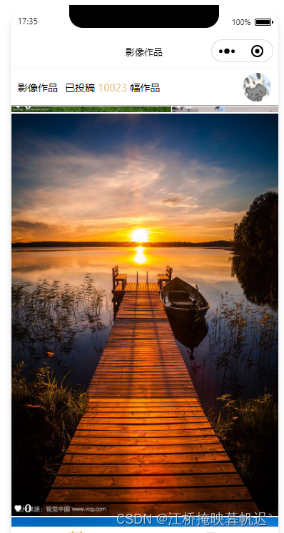
图片效果:如果你的图片太宽放不下两个图片,就会按照最宽的比例去缩放图片大小。
类似:
总结
这个布局可以叫做横向 瀑布流式布局 或 等高瀑布流式布局
简单来说就是根据屏幕的宽度和图片的宽高比计算每行能排下多少张图片,同时高度控制在一定范围内
如果下一个图片在这一行排不下,就放到下一行,并且把这个一行已经排列的图片重新按照比例缩放,拉伸到屏幕宽度。


 3397
3397


 被折叠的 条评论
为什么被折叠?
被折叠的 条评论
为什么被折叠?
 到【灌水乐园】发言


