


Flex布局
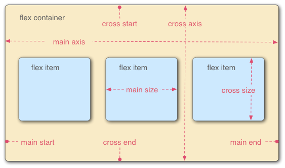
运用在flex container上的属性
- flex-direction: 确定主轴方向
- flex-wrap: 设置是否换行
- flex-flow: 设置主轴方向和是否换行
- justify-content:延主轴方向的布局方式
- align-item: 延交叉轴方向的布局方式
- align-content: 多根轴线的布局方式
运用在Flex items上的属性
- order: item的排序,可以为负值
- flex-basis: 设置item基础宽度
- flex-grow: 设置计算后如果存在剩余空间,扩大的倍数
- flex-shrink: 设置如果空间不足,缩小的倍数
- flex:
<flex-grow> || <flex-shrink> || <flex-basis> - align-self: 设置当前item的布局方式
.son{
width: 50px;
}
.son:nth-of-type(1){
height: 40px;
background-color: blue;
/*align-self: flex-end;*/
}
.son:nth-of-type(2){
height: 60px;
background-color: #d3d3d3;
}
.son:nth-of-type(3){
height: 30px;
background-color: #ff7777;
}
.son:nth-of-type(4){
height: 50px;
background-color: #345343;
}
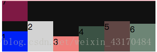
.parent{
width: 200px;
height: 100px;
background-color: #111111;
display: flex;
}
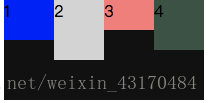
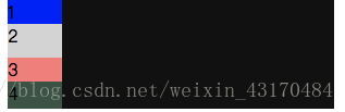
flex-direction
- row:
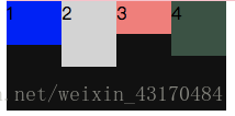
flex-direction: row;
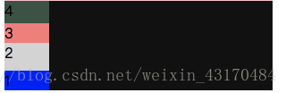
- row-reverse:
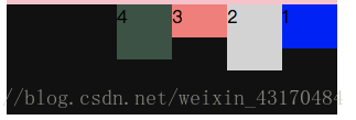
flex-direction: row-reverse;
- column:
flex-direction: column;
- column-reverse:
flex-direction: column-reverse;
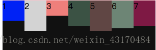
flex-wrap
-nowrap:
不存在折行
.son:nth-of-type(5){
    height: 60px;
    background-color: #654543;
}
.son:nth-of-type(6){
    height: 55px;
    background-color: #678674;
}
.son:nth-of-type(7){
    height: 50px;
    background-color: #890344;
}
.parent{
    width: 300px;
    height: 100px;
    background-color: #111111;
    display: flex;
    flex-direction: row;
    flex-wrap: nowrap;
}
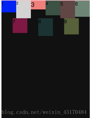
- wrap
多余内容折行显示
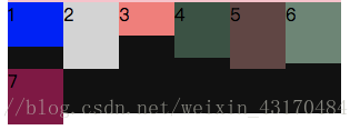
flex-wrap: wrap;
- wrap-reverse
折行为反向
flex-wrap: wrap-reverse;
flex-flow
flex-flow: <flex-direction> || <flex-wrap>
flex-direction和flex-wrap的组合使用,以上情况组合即可
justify-content
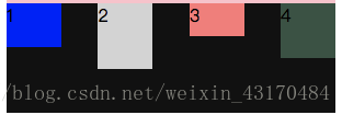
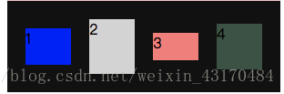
- flex-start:
以主轴(这里是水平方向)测试,此时为左对齐
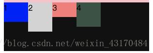
justify-content: flex-start;
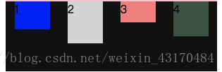
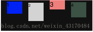
- flex-end:
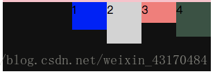
justify-content: flex-end;
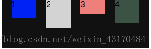
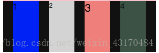
-center:
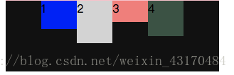
justify-content: center;
- space-between:
第一个靠最左,最后一个靠最右,中间的均匀分布
justify-content: space-between
- space-around:
每个flex item左右两侧的距离都一样,也就是说上例中1与2的距离是1到左边框的两倍
justify-content: space-around
- space-evenly:
每个元素之间距离都相等,包括距边框距离
justify-content: space-evenly
align-item
- flex-start

align-items: flex-start;
- flex-end:
align-items: flex-end
- center:
align-items: center;
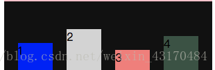
- baseline:
以文字底部为基线对齐
align-items: baseline;
- stretch:
在flex items不设置高度的情况下会拉伸到父级div的高度
align-items: stretch;
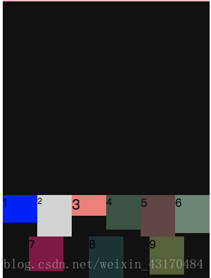
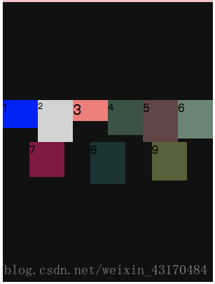
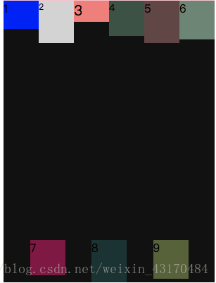
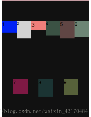
align-content
需要先设置:
flex-wrap: wrap;
- flex-start:
主轴集中在上半部分
align-content: flex-start;
- flex-end:
主轴集中在下半部分
align-content: flex-end;
- center:
align-content: center;
- space-between:
类似于justify-content的space-between属性
align-content: space-between;
- space-around:
align-content: space-around;
- space-evenly:
align-content: space-evenly;
- stretch:
这里由于每个子div设置了高度,所以会这样显示
align-content: stretch;


 28万+
28万+


 被折叠的 条评论
为什么被折叠?
被折叠的 条评论
为什么被折叠?
 到【灌水乐园】发言


