


先看效果图:
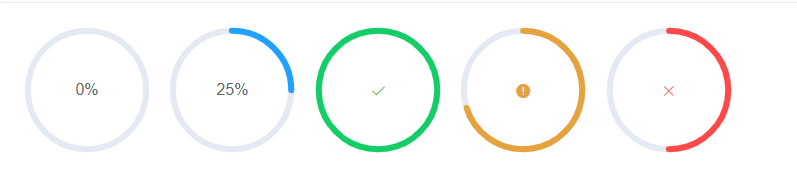
Element UI 官网示例:
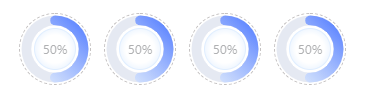
更改后效果:
引入el- progress
                <el-progress
                    type="circle"
                    class="load-factor"
                    :width="70"
                    :stroke-width="10"
                    :color="circolor"   //通过配置该color,来设置进度条的颜色,此次的渐变色就是通过color实现的
                    :percentage="50"
                    :format="format"
                ></el-progress>
该color中为strike属性,直接按照普通渐变色设置无效
因此:
				<svg>
                    <defs>
                        <linearGradient id="colors" x1="0%" y1="100%" x2="100%" y2="0%">
                            <stop offset="0%" style="stop-color:#E5F1FF" stop-opacity="0.8"></stop>
                            <stop offset="100%" style="stop-color:#567FFF" stop-opacity="1"></stop>
                        </linearGradient>
                    </defs>
                </svg>
    mounted() {
        this.circolor = 'url(#colors)'
    },
通过以上步骤可直接实现进度条渐变色,接下来为背景内外边框的设置
在element中没有该属性,因此决定曲线救国
        <div class="peak-load-ratio">
            <div
                class="peak-load"
                :class="{ active: current == item.id }"
                v-for="(item, index) in peakLoadData"
                :key="index"
                @click="peakLoadHandle(item, index)"
            >
                <el-progress
                    type="circle"
                    class="load-factor"
                    :width="70"
                    :stroke-width="10"
                    :color="circolor"
                    :percentage="50"
                    :format="format"
                ></el-progress>
                <p class="cir-status">充电中</p>
                <p class="cir-number">254</p>
                <div class="set-in-cir"></div>
                <svg>
                    <defs>
                        <linearGradient id="colors" x1="0%" y1="100%" x2="100%" y2="0%">
                            <stop offset="0%" style="stop-color:#E5F1FF" stop-opacity="0.8"></stop>
                            <stop offset="100%" style="stop-color:#567FFF" stop-opacity="1"></stop>
                        </linearGradient>
                    </defs>
                </svg>
            </div>
        </div>
CSS
    .peak-load-ratio {
        position: absolute;
        // top: 250px;
        // margin: 10px 20px;
        bottom: 20px;
        margin: 0 29px 10px;
        .title-text {
            // margin-bottom: 18px;
            font-weight: 700;
        }
        .set-in-cir {   //设置的内边框
            width: 42px;
            height: 42px;
            border: 1px solid #bfdcff;
            position: absolute;
            border-radius: 50%;
            margin-left: 15px;
            top: 15px;
            background: radial-gradient(at center, #ffffff 50%, #bcdbff 100%);
            opacity: 0.5;
        }
        .peak-load {
            // display: inline-block;
            float: left;
            width: 80px;
            margin-right: 5px;
            height: 112px;
            cursor: pointer;
            .load-factor {
                width: 72px;
                height: 72px;
                border: 1px dashed #c4c1c1;  //设置的外边框
                border-radius: 50%;
                /deep/ .el-progress-circle {
                    padding: 1px;
                }
                /deep/ .el-progress--circle .el-progress__text {
                    left: 5px;
                }
            }
            .cir-status {
                font-family: PingFangSC-Regular;
                font-size: 12px;
                color: #333333;
                letter-spacing: 0.29px;
                text-align: center;
                margin: 5px 0;
            }
            .cir-number {
                font-family: PingFangSC-Semibold;
                font-size: 16px;
                color: #333333;
                text-align: center;
                font-weight: bolder;
            }
            // p {
            //     width: 88px;
            //     // height: 18px;
            //     text-align: center;
            // }
        }
        // .active {
        //     // opacity: 0.6;
        //     background: rgba(24, 144, 255, 0.11);
        //     border-radius: 4px;
        // }
    }
修改其背景颜色:
/* .el-progress-circle__track {
    stroke: #ffffff;
} */
到这,基本上问题都解决了,完美完成需求。


 5526
5526


 被折叠的 条评论
为什么被折叠?
被折叠的 条评论
为什么被折叠?
 到【灌水乐园】发言


