


 本文介绍如何使用Python的pandas和matplotlib模块从Excel表格中读取数据并创建折线图进行可视化。首先,通过pandas模块读取Excel文件中的数据,然后使用matplotlib绘制两个不同属性(money1和money2)随时间变化的折线图。文章提供了完整的代码示例,展示了如何设置图表样式、添加标题和图例。
Python读取excel表格并通过折线图可视化显示
本文是通过pandas和matplotlib模块实现可视化的。如有不足请指正。
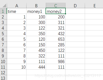
excel表格为
第一步
导入模块:
import pandas as pd
import matplotlib.pyplot as plt
第二步
使用pandas读取excel文件:
df = pd.read_excel("C:\\Users\\ASUS\\Desktop\\test.xlsx")
然后我们print读取的数据看一下
print(df)
结果如下: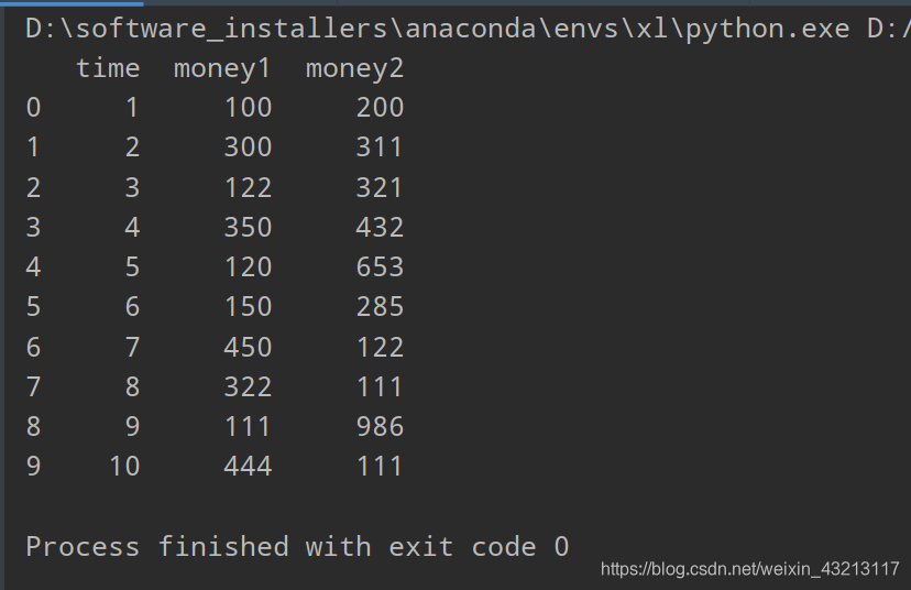
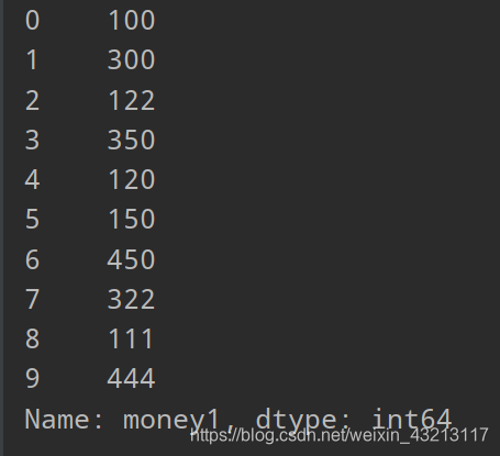
导出money1这一列的数据:
print(df["money1"])
第三步:
plt显示:
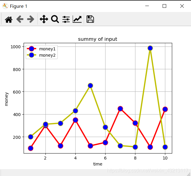
横坐标为df[“time”],纵坐标1为df[“money1”],纵坐标2为df[“money2”],markerfacecolor='blue’为填充的颜色
plt.plot(df["time"],df["money1"],label='money1',linewidth=3,color='r',marker='o',
markerfacecolor='blue',markersize=12)
plt.plot(df["time"],df["money2"],label='money2',linewidth=3,color='y',marker='o',
markerfacecolor='blue',markersize=12)
标题显示
plt.xlabel("time")
plt.ylabel('money')
plt.title("summy of input")
plt.legend()
plt.grid()
plt.show()
折线图如下:
完整代码:
import pandas as pd
import matplotlib.pyplot as plt
df = pd.read_excel("C:\\Users\\ASUS\\Desktop\\test.xlsx")
print(df)
print(df["money1"])

plt.plot(df["time"],df["money1"],label='money1',linewidth=3,color='r',marker='o',
markerfacecolor='blue',markersize=12)
plt.plot(df["time"],df["money2"],label='money2',linewidth=3,color='y',marker='o',
markerfacecolor='blue',markersize=12)
plt.xlabel("time")
plt.ylabel('money')
plt.title("summy of input")
plt.legend()
plt.grid()
plt.show()


 1万+
1万+

 被折叠的 条评论
为什么被折叠?
被折叠的 条评论
为什么被折叠?
 到【灌水乐园】发言


