


ArkUI组件(续)
文本组件
在HarmonyOS中,Text/Span组件是文本控件中的一个关键部分。Text控件可以用来显示文本内容,而Span只能作为Text组件的子组件显示文本内容。
Text/Span组件的用法非常简单和直观。我们可以通过Text组件来显示普通文本,也可以通过Span组件来实现。
Text/Span

创建文本
语法:Text(content?: string | Resource)
文本内容。包含子组件Span时不生效,显示Span内容,并且此时text组件的样式不生效。
@Entry
  @Component
  struct Index {
    build() {
      Column() {
        // string类型的参数
        Text('我是一段文本')
        // 无参数形式
        // Text()
        // $r形式引入应用资源,可应用于多语言场景
        Text($r('app.string.module_desc'))
          .baselineOffset(0)
          .fontSize(30)
          .border({ width: 1 })
          .padding(10)
          .width(300)
      }.width('100%').height('100%')
    }
}- 变量或表达式也可以用于参数赋值,其中表达式返回的结果类型必须满足参数类型要求。
例如,设置变量或表达式来构造Image和Text组件的参数。
Image(this.imagePath) // Image组件的必选参数src。
Image('https://' + this.imageUrl) // Image组件的必选参数src。
Text(`count: ${this.count}`)
引用Resource资源
源引用类型可以通过$r创建Resource类型对象,文件位置为/resources/base/element/string.json
Text($r('app.string.module_desc'))
  .baselineOffset(0)
  .fontSize(30)
  .border({ width: 1 })
  .padding(10)
  .width(300)
添加子组件
Span
在文本处理中,Span通常用于表示文本中的一部分。例如,在一个字符串中找到一个单词,可以使用Span表示这个单词在字符串中的位置和大小。
Span还可以用于对文本进行修改,例如替换一个单词或插入新的文本。
HarmonyOS中的Span也表示文本不过是嵌入Text中的
@Entry
@Component
struct Index {
  build() {
    Column() {
      Text('我是Text') {
        Span('我是Span')
      }
      .padding(10)
      .borderWidth(1)
    }.width('100%').height('100%')
  }
}
设置文本装饰线及颜色
Text() {
 Span('我是Span1,').fontSize(16).fontColor(Color.Grey)
   .decoration({ type: TextDecorationType.LineThrough, color: Color.Red })
 Span('我是Span2').fontColor(Color.Blue).fontSize(16)
   .fontStyle(FontStyle.Italic)
   .decoration({ type: TextDecorationType.Underline, color: Color.Black })
 Span(',我是Span3').fontSize(16).fontColor(Color.Grey)
   .decoration({ type: TextDecorationType.Overline, color: Color.Green })
}
.borderWidth(1)
.padding(10)
decoration
Span的decoration属性用于设置文字的装饰效果,可以取以下值:
- Underline:下划线
- LineThrough:删除线
- Overline:上划线
@Entry
@Component
struct Index {
  build() {
    Column() {
      Text() {
        Span('我是Span1,').fontSize(16).fontColor(Color.Grey)
          .decoration({ type: TextDecorationType.LineThrough, color: Color.Red })
        Span('我是Span2').fontColor(Color.Blue).fontSize(16)
          .fontStyle(FontStyle.Italic)
          .decoration({ type: TextDecorationType.Underline, color: Color.Black })
        Span(',我是Span3').fontSize(16).fontColor(Color.Grey)
          .decoration({ type: TextDecorationType.Overline, color: Color.Green })
      }
      .borderWidth(1)
      .padding(10)
    }.width('100%').height('100%')
  }
}
textCase
textCase设置文字一直保持大写或者小写状态
@Entry
@Component
struct Index {
  build() {
    Column() {
      Text() {
        Span('I am Upper-span').fontSize(12)
          .textCase(TextCase.UpperCase).onClick(()=>{
            console.info('我是Span——onClick')
          })
      }
      .borderWidth(1)
      .padding(10)
    }.width('100%').height('100%')
  }
}
自定义文本样式
textAlign
textAlign属性用于设置文本在其容器中的水平对齐方式。
@Entry
@Component
struct Index {
  build() {
    Column() {
      Text('左对齐')
        .width(300)
        .textAlign(TextAlign.Start)
        .border({ width: 1 })
        .padding(10)
      Text('中间对齐')
        .width(300)
        .textAlign(TextAlign.Center)
        .border({ width: 1 })
        .padding(10)
      Text('右对齐')
        .width(300)
        .textAlign(TextAlign.End)
        .border({ width: 1 })
        .padding(10)
    }.width('100%').height('100%')
  }
}
textOverflow
textOverflow属性是添加的一个文本溢出属性,用于标识当元素的文本溢出其指定大小的容器时如何处理。textOverflow需配合maxLines一起使用(默认情况下文本自动折行)
@Entry
@Component
struct Index {
  build() {
    Column() {
      Text('This is the setting of textOverflow to Clip text content This is the setting of textOverflow to None text content. This is the setting of textOverflow to Clip text content This is the setting of textOverflow to None text content.')
        .width(250)
        .textOverflow({ overflow: TextOverflow.None })
        .maxLines(1)
        .fontSize(12)
        .border({ width: 1 }).padding(10)
      Text('我是超长文本,超出的部分显示省略号。I am an extra long text, with ellipses displayed for any excess。')
        .width(250)
        .textOverflow({ overflow: TextOverflow.Ellipsis })
        .maxLines(1)
        .fontSize(12)
        .border({ width: 1 }).padding(10)
    }.width('100%').height('100%')
  }
}
lineHeight
lineHeight属性用于设置行高,即每行文本的高度。它可以用于任何元素,包括块级元素、行内元素和表格单元
@Entry
@Component
struct Index {
  build() {
    Column() {
      Text('This is the text with the line height set. This is the text with the line height set.')
        .width(300).fontSize(12).border({ width: 1 }).padding(10)
      Text('This is the text with the line height set. This is the text with the line height set.')
        .width(300).fontSize(12).border({ width: 1 }).padding(10)
        .lineHeight(20)
    }.width('100%').height('100%')
  }
}
decoration
decoration属性设置文本装饰线样式及其颜色,前面span介绍过就不介绍了
@Entry
@Component
struct Index {
  build() {
    Column() {
      Text('This is the text')
        .decoration({
          type: TextDecorationType.LineThrough,
          color: Color.Red
        })
        .borderWidth(1).padding(10).margin(5)
      Text('This is the text')
        .decoration({
          type: TextDecorationType.Overline,
          color: Color.Red
        })
        .borderWidth(1).padding(10).margin(5)
      Text('This is the text')
        .decoration({
          type: TextDecorationType.Underline,
          color: Color.Red
        })
        .borderWidth(1).padding(10).margin(5)
    }.width('100%').height('100%')
  }
}
baselineOffset
baselineOffset属性是用于控制行内元素基线位置的属性。它可以将元素相对于其父元素的基线位置向上或向下移动指定的距离,以满足垂直对齐的需求。该属性接受长度或百分比值作为参数。正值会将元素向上移动,负值会将元素向下移动。当使用百分比值时,该值会相对于元素自身的 fontSize 计算。
@Entry
@Component
struct Index {
  build() {
    Column() {
      Text('This is the text content with baselineOffset 0.')
        .baselineOffset(0)
        .fontSize(12)
        .border({ width: 1 })
        .padding(10)
        .width('100%')
        .margin(5)
      Text('This is the text content with baselineOffset 30.')
        .baselineOffset(30)
        .fontSize(12)
        .border({ width: 1 })
        .padding(10)
        .width('100%')
        .margin(5)

      Text('This is the text content with baselineOffset -20.')
        .baselineOffset(-20)
        .fontSize(12)
        .border({ width: 1 })
        .padding(10)
        .width('100%')
        .margin(5)
    }.width('100%').height('100%')
  }
}
letterSpacing
letterSpacing属性用于设置文本中字母之间的间距。它可以接受一个值,这个值可以是小于或大于0的数字,也可以是正负百分比数值。正值会增加字符之间的距离,而负值则会减小它们之间的距离。如果没有使用该属性,字母之间的默认间距将由系统决定。
@Entry
@Component
struct Index {
  build() {
    Column() {
      Text('This is the text content with letterSpacing 0.')
        .letterSpacing(0)
        .fontSize(12)
        .border({ width: 1 })
        .padding(10)
        .width('100%')
        .margin(5)
      Text('This is the text content with letterSpacing 3.')
        .letterSpacing(3)
        .fontSize(12)
        .border({ width: 1 })
        .padding(10)
        .width('100%')
        .margin(5)
      Text('This is the text content with letterSpacing -1.')
        .letterSpacing(-1)
        .fontSize(12)
        .border({ width: 1 })
        .padding(10)
        .width('100%')
        .margin(5)
    }.width('100%').height('100%')
  }
}
minFontSize与maxFontSize
minFontSize和maxFontSize是用于设置文本字体大小的属性。这两个属性指定了一个范围,使得当文本的尺寸调整时,字体大小的最小值不会小于minFontSize,最大值不会大于maxFontSize。这些属性通常与viewport相关,因为文本大小可能需要在不同的屏幕尺寸和分辨率下进行调整。
@Entry
@Component
struct Index {
  build() {
    Column() {
      Text('我的最大字号为30,最小字号为5,宽度为250,maxLines为1')
        .width(250)
        .maxLines(1)
        .maxFontSize(30)
        .minFontSize(5)
        .border({ width: 1 })
        .padding(10)
        .margin(5)
      Text('我的最大字号为30,最小字号为5,宽度为250,maxLines为2')
        .width(250)
        .maxLines(2)
        .maxFontSize(30)
        .minFontSize(5)
        .border({ width: 1 })
        .padding(10)
        .margin(5)
      Text('我的最大字号为30,最小字号为15,宽度为250,高度为50')
        .width(250)
        .height(50)
        .maxFontSize(30)
        .minFontSize(15)
        .border({ width: 1 })
        .padding(10)
        .margin(5)
      Text('我的最大字号为30,最小字号为15,宽度为250,高度为100')
        .width(250)
        .height(100)
        .maxFontSize(30)
        .minFontSize(15)
        .border({ width: 1 })
        .padding(10)
        .margin(5)
    }.width('100%').height('100%')
  }
}
textCase
同Span
@Entry
@Component
struct Index {
  build() {
    Column() {
      Text('This is the text content with textCase set to Normal.')
        .textCase(TextCase.Normal)
        .padding(10)
        .border({ width: 1 })
        .padding(10)
        .margin(5)

      // 文本全小写展示
      Text('This is the text content with textCase set to LowerCase.')
        .textCase(TextCase.LowerCase)
        .border({ width: 1 })
        .padding(10)
        .margin(5)

      // 文本全大写展示
      Text('This is the text content with textCase set to UpperCase.')
        .textCase(TextCase.UpperCase)
        .border({ width: 1 })
        .padding(10)
        .margin(5)
    }.width('100%').height('100%')
  }
}
copyOption
copyOption属性设置文本是否可复制粘贴
@Entry
@Component
struct Index {
  build() {
    Column() {
      Text("这是一段可复制文本")
        .fontSize(30)
        .copyOption(CopyOptions.InApp)
    }.width('100%').height('100%')
  }
}
添加事件
由于Span组件无尺寸信息,事件仅支持点击事件onClick
示例1:
Text() {
 Span('I am Upper-span').fontSize(12)
   .textCase(TextCase.UpperCase)
   .onClick(()=>{
   console.info('我是Span——onClick')
   })
}
示例2:
@Entry
@Component
struct Index {
  build() {
    Column() {
      Text('点我')
        .onClick(()=>{
          console.info('我是Text的点击响应事件');
        })
    }.width('100%').height('100%')
  }
}
优化提取
import { router } from '@kit.ArkUI';
import { BusinessError } from '@kit.BasicServicesKit';

@Entry
@Component
struct Index {
  @State message: string = 'Hello World';

  // 跳转
  goToAbout = () => {
    router.pushUrl({
      url: 'pages/About'
    }).then(() => {
      console.info('跳转成功')
    }).catch((error: BusinessError) => {
      console.info('跳转失败',`Code is ${error.code}, message is ${error.message}`)
    })
  }

  build() {
    Row() {
      Column() {
        // 文本
        Text(this.message)
          .fontSize(50)
          .fontWeight(FontWeight.Bold)
          .textAlign(TextAlign.Center)
        // 按钮
        Button() {
          Text('Next')
            .fontSize(30)
            .fontWeight(FontWeight.Medium)
            .padding(10)
            .fontColor(Color.White)
        }
        .type(ButtonType.Capsule)
        .margin({
          top: 30
        })
        .backgroundColor('#0D9FFB')
        .width('40%')
        .height('10%')
        .onClick(() => this.goToAbout())
      }
      .width('100%')
    }
    .height('100%')
  }
}
在上面这个案例中,我们将事件 goToAbout 提取到了外面
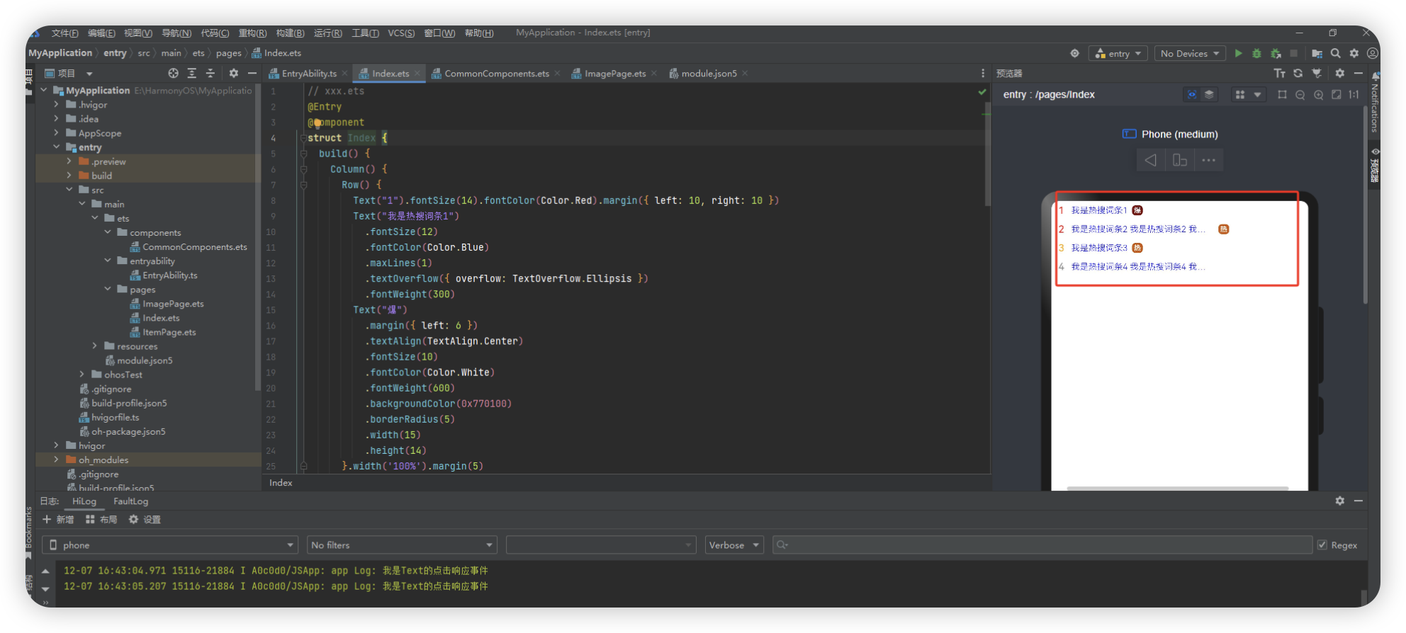
热搜词条案例
热搜词条是指在某一特定时间内,搜索引擎或网站等平台上,被用户频繁搜索的关键词。通常这些关键词涵盖当下流行的话题、热门事件、名人八卦、产品销售等各方面,反映了当前社会热点和大众关注度的变化。热搜词条可以帮助我们了解当前社会舆论的走向、人们关注的焦点以及市场需求等。
// xxx.ets
@Entry
@Component
struct Index {
  build() {
    Column() {
      Row() {
        Text("1").fontSize(14).fontColor(Color.Red).margin({ left: 10, right: 10 })
        Text("我是热搜词条1")
          .fontSize(12)
          .fontColor(Color.Blue)
          .maxLines(1)
          .textOverflow({ overflow: TextOverflow.Ellipsis })
          .fontWeight(300)
        Text("爆")
          .margin({ left: 6 })
          .textAlign(TextAlign.Center)
          .fontSize(10)
          .fontColor(Color.White)
          .fontWeight(600)
          .backgroundColor(0x770100)
          .borderRadius(5)
          .width(15)
          .height(14)
      }.width('100%').margin(5)

      Row() {
        Text("2").fontSize(14).fontColor(Color.Red).margin({ left: 10, right: 10 })
        Text("我是热搜词条2 我是热搜词条2 我是热搜词条2 我是热搜词条2 我是热搜词条2")
          .fontSize(12)
          .fontColor(Color.Blue)
          .fontWeight(300)
          .constraintSize({ maxWidth: 200 })
          .maxLines(1)
          .textOverflow({ overflow: TextOverflow.Ellipsis })
        Text("热")
          .margin({ left: 6 })
          .textAlign(TextAlign.Center)
          .fontSize(10)
          .fontColor(Color.White)
          .fontWeight(600)
          .backgroundColor(0xCC5500)
          .borderRadius(5)
          .width(15)
          .height(14)
      }.width('100%').margin(5)

      Row() {
        Text("3").fontSize(14).fontColor(Color.Orange).margin({ left: 10, right: 10 })
        Text("我是热搜词条3")
          .fontSize(12)
          .fontColor(Color.Blue)
          .fontWeight(300)
          .maxLines(1)
          .constraintSize({ maxWidth: 200 })
          .textOverflow({ overflow: TextOverflow.Ellipsis })
        Text("热")
          .margin({ left: 6 })
          .textAlign(TextAlign.Center)
          .fontSize(10)
          .fontColor(Color.White)
          .fontWeight(600)
          .backgroundColor(0xCC5500)
          .borderRadius(5)
          .width(15)
          .height(14)
      }.width('100%').margin(5)

      Row() {
        Text("4").fontSize(14).fontColor(Color.Grey).margin({ left: 10, right: 10 })
        Text("我是热搜词条4 我是热搜词条4 我是热搜词条4 我是热搜词条4 我是热搜词条4")
          .fontSize(12)
          .fontColor(Color.Blue)
          .fontWeight(300)
          .constraintSize({ maxWidth: 200 })
          .maxLines(1)
          .textOverflow({ overflow: TextOverflow.Ellipsis })
      }.width('100%').margin(5)
    }.width('100%')
  }
}
文本输入
TextInput、TextArea是输入框组件,通常用于响应用户的输入操作,比如评论区的输入、聊天框的输入、表格的输入等,也可以结合其它组件构建功能页面,例如登录注册页面
创建输入框
TextInput为单行输入框、TextArea为多行输入框
TextInput()
TextArea()
多行输入框文字超出一行时会自动折行
TextArea({text:"我是TextArea我是TextArea我是TextArea我是TextArea"}).width(300)设置输入框类型
TextInput有9种可选类型,分别为Normal基本输入模式、Password密码输入模式、Email邮箱地址输入模式、Number纯数字输入模式、PhoneNumber电话号码输入模式、USER_NAME用户名输入模式、NEW_PASSWORD新密码输入模式、NUMBER_PASSWORD纯数字密码输入模式、NUMBER_DECIMAL带小数点的数字输入模式。通过type属性进行设置:
TextInput().type(InputType.Normal)
TextInput().type(InputType.Password)
自定义样式
设置无输入时的提示文本。TextInput({placeholder:'我是提示文本'})
TextInput({placeholder:'我是提示文本'})设置输入框当前的文本内容
TextInput({placeholder:'我是提示文本',text:'我是当前文本内容'})添加backgroundColor改变输入框的背景颜色
TextInput({placeholder:'我是提示文本',text:'我是当前文本内容'})
 .backgroundColor(Color.Pink)
 .margin(10)
 .padding({left:20})
添加事件
文本框主要用于获取用户输入的信息,把信息处理成数据进行上传,绑定onChange事件可以获取输入框内改变的内容。用户也可以使用通用事件来进行相应的交互操作
TextInput()
   .onChange((value: string) => {
  console.info(value);
})
   .onFocus(() => {
  console.info('获取焦点');
})
   .onBlur(() =>{
  console.info("失去焦点")
})
.onSubmit(() => {})
键盘避让
键盘抬起后,具有滚动能力的容器组件在横竖屏切换时,才会生效键盘避让,若希望无滚动能力的容器组件也生效键盘避让,建议在组件外嵌套一层具有滚动能力的容器组件,比如Scroll、List、Grid。
// xxx.ets
@Entry
@Component
struct Index {
  placeHolderArr: string[] = ['1', '2', '3', '4', '5', '6', '7']

  build() {
    Scroll() {
      Column() {
        ForEach(this.placeHolderArr, (placeholder: string) => {
          TextInput({ placeholder: 'TextInput ' + placeholder })
            .margin(30)
        })
      }
    }
    .height('100%')
    .width('100%')
  }
}
按钮组件

Button是按钮组件,通常用于响应用户的点击操作,其类型包括胶囊按钮、圆形按钮、普通按钮。Button当做为容器使用时可以通过添加子组件实现包含文字、图片等元素的按钮
Button 按钮
创建按钮
Button("OK").width(90).height(40).margin(10)
Button(){
  Row(){
    Image($r('app.media.loading')).width(30).height(30)
    Text("loading").fontColor(Color.White).margin({left:10})
   }.alignItems(VerticalAlign.Center).margin(10)
}.margin(10)
Button("点击",{ stateEffect:false }).width(90).height(40).margin(10)
设置按钮类型
Button有三种可选类型,分别为Capsule(胶囊类型)、Circle(圆形按钮)和Normal(普通按钮),通过type进行设置
Button("OK1",{ type:ButtonType.Capsule }).width(90).height(40).margin(10)
Button("OK2",{ type:ButtonType.Circle }).width(90).height(60).margin(10)
Button("OK3",{ type:ButtonType.Normal }).width(90).height(40).margin(10).borderRadius(10)
自定义样式
Button("OK4",{ type:ButtonType.Normal })
 .width(120)
 .height(70)
 .margin(10)
 .borderRadius(10)
 .fontSize(30)
 .fontColor(Color.White)
 .backgroundColor(Color.Orange)
 .onClick(() =>{
 console.log("点击事件")
 })
添加事件
Button组件通常用于触发某些操作,可以绑定onClick事件来响应点击操作后的自定义行为。
Button('Ok', { type: ButtonType.Normal, stateEffect: true })
  .onClick(()=>{
    console.info('Button onClick')
  })
单选按钮

Radio是单选框组件,通常用于提供相应的用户交互选择项,同一组的Radio中只有一个可以被选中
创建单选框
Radio仅支持选中和未选中两种样式,不支持自定义颜色和形状。
Row() {
 Radio({ value: 'Radio1', group: 'radioGroup' }).checked(false)
 Radio({ value: 'Radio2', group: 'radioGroup' }).checked(true)
 }
添加事件
除支持通用事件外,Radio通常用于选中后触发某些操作,可以绑定onChange事件来响应选中操作后的自定义行为。
Row() {
  Radio({ value: 'Radio1', group: 'radioGroup' })
    .height(50)
    .width(50)
    .checked(false)
    .onChange((isChecked:boolean) =>{
      if(isChecked){
        console.log("选中了")
      }else{
        console.log("未选中")
      }
    })
  Radio({ value: 'Radio2', group: 'radioGroup' })
    .height(50)
    .width(50)
    .checked(true)
    .onChange((isChecked:boolean) =>{
      if(isChecked){
        console.log("选中了")
      }else{
        console.log("未选中")
      }
    })
}
切换按钮
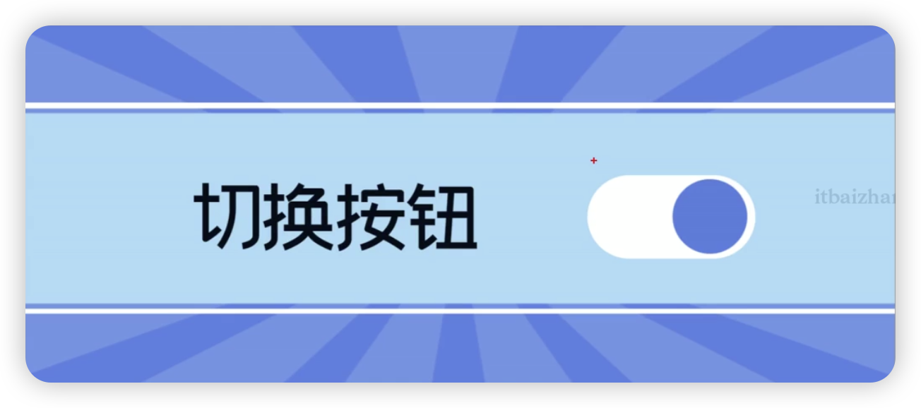
Toggle组件提供状态按钮样式,勾选框样式及开关样式,一般用于两种状态之间的切换
创建切换按钮
Toggle支持两种创建形式,不包含子组件的Toggle和包含子组件的Toggle
Toggle(options: { type: ToggleType, isOn?: boolean })ToggleType为开关类型,包括Button、Checkbox和Switch,isOn为切换按钮的状态
创建不包含子组件的Toggle
当ToggleType为Checkbox或者Switch时,用于创建不包含子组件的Toggle
Row() {
  Toggle({ type: ToggleType.Checkbox, isOn: false })
  Toggle({ type: ToggleType.Checkbox, isOn: true })
  Toggle({ type: ToggleType.Switch, isOn: false })
  Toggle({ type: ToggleType.Switch, isOn: true })
}
创建包含子组件的Toggle
当ToggleType为Button时,只能包含一个子组件,如果子组件有文本设置,则相应的文本内容会显示在按钮内部
Row() {
  Toggle({ type: ToggleType.Button, isOn: false }) {
    Text('status button')
       .fontColor('#000')
       .fontSize(12)
   }.width(100)
  Toggle({ type: ToggleType.Button, isOn: true }) {
    Text('status button')
       .fontColor('#000')
       .fontSize(12)
   }.width(100)
}
自定义样式
通过selectedColor属性设置Toggle打开选中后的背景颜色
Toggle({ type: ToggleType.Button, isOn: true }) {
 Text('status button')
  .fontColor('#182431')
  .fontSize(12)
}.width(100).selectedColor(Color.Pink)
Toggle({ type: ToggleType.Checkbox, isOn: true })
  .selectedColor(Color.Pink)
Toggle({ type: ToggleType.Switch, isOn: true })
  .selectedColor(Color.Pink)
通过switchPointColor属性设置Switch类型的圆形滑块颜色,仅对type为ToggleType.Switch生效
Toggle({ type: ToggleType.Switch, isOn: false })
  .switchPointColor(Color.Pink)
Toggle({ type: ToggleType.Switch, isOn: true })
  .switchPointColor(Color.Pink)
添加事件
除支持通用事件外,Toggle通常用于选中和取消选中后触发某些操作,可以绑定onChange事件来响应操作后的自定义行为
Row() {
  Toggle({ type: ToggleType.Switch, isOn: false })
     .onChange((isOn: boolean) => {
    if(isOn) {
      // 需要执行的操作
     }
   })
     .onClick(() =>{
    console.log("点击")
   })
}
显示图片

开发者经常需要在应用中显示[''一些图片,例如:按钮中的icon、网络图片、本地图片等。在应用中显示图片需要使用Image组件实现,Image支持多种图片格式,包括png、jpg、bmp、svg和gif
加载图片资源
存档图类型数据源
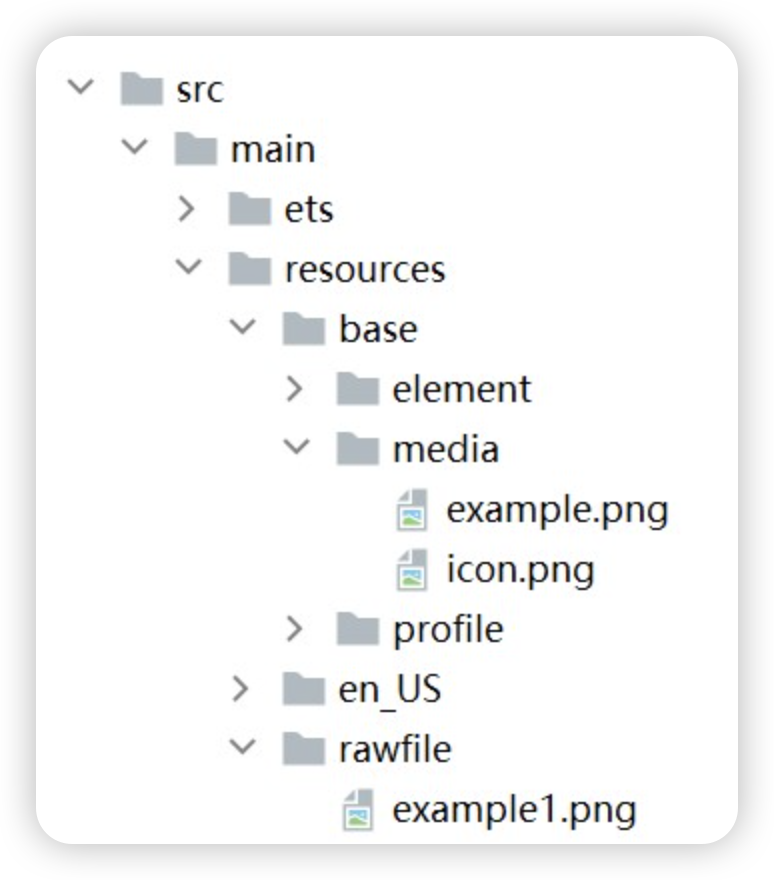
- 本地资源
创建文件夹,将本地图片放入ets文件夹下的任意位置。
Image('images/view.jpg')
.width(200)- 网络资源
引入网络图片需申请权限ohos.permission.INTERNET,具体申请方式请参考声明权限。此时,Image组件的src参数为网络图片的链接。
Image组件首次加载网络图片时,需要请求网络资源,非首次加载时,默认从缓存中直接读取图片,更多图片缓存设置请参考setImageCacheCount、setImageRawDataCacheSize、setImageFileCacheSize。
Image("https://iwenwiki.com:3001/images/goods/1.webp")- Resource资源
使用资源格式可以跨包/跨模块引入图片,resources文件夹下的图片都可以通过$r资源接口读取到并转换到Resource格式
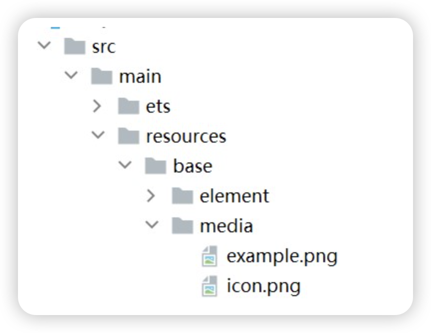
Image($r("app.media.icon"))还可以将图片放在rawfile文件夹下
Image($rawfile('example1.png'))- 媒体库file://data/storage
支持file://路径前缀的字符串,用于访问通过媒体库提供的图片路径。
调用接口获取图库的照片url。
import { picker } from '@kit.CoreFileKit';
import { BusinessError } from '@kit.BasicServicesKit';

@Entry
@Component
struct Index {
  @State imgDatas: string[] = [];
  // 获取照片url集
  getAllImg() {
    try {
      let PhotoSelectOptions:picker.PhotoSelectOptions = new picker.PhotoSelectOptions();
      PhotoSelectOptions.MIMEType = picker.PhotoViewMIMETypes.IMAGE_TYPE;
      PhotoSelectOptions.maxSelectNumber = 5;
      let photoPicker:picker.PhotoViewPicker = new picker.PhotoViewPicker();
      photoPicker.select(PhotoSelectOptions).then((PhotoSelectResult:picker.PhotoSelectResult) => {
        this.imgDatas = PhotoSelectResult.photoUris;
        console.info('PhotoViewPicker.select successfully, PhotoSelectResult uri: ' + JSON.stringify(PhotoSelectResult));
      }).catch((err:Error) => {
        let message = (err as BusinessError).message;
        let code = (err as BusinessError).code;
        console.error(`PhotoViewPicker.select failed with. Code: ${code}, message: ${message}`);
      });
    } catch (err) {
      let message = (err as BusinessError).message;
      let code = (err as BusinessError).code;
      console.error(`PhotoViewPicker failed with. Code: ${code}, message: ${message}`);    }
  }

  // aboutToAppear中调用上述函数,获取图库的所有图片url,存在imgDatas中
  async aboutToAppear() {
    this.getAllImg();
  }
  // 使用imgDatas的url加载图片。
  build() {
    Column() {
      Grid() {
        ForEach(this.imgDatas, (item:string) => {
          GridItem() {
            Image(item)
              .width(200)
          }
        }, (item:string):string => JSON.stringify(item))
      }
    }.width('100%').height('100%')
  }
}
从媒体库获取的url格式通常如下
Image('file://media/Photos/5')
.width(200)- base64
路径格式为data:image/[png|jpeg|bmp|webp];base64,[base64 data],其中[base64 data]为Base64字符串数据。
Base64格式字符串可用于存储图片的像素数据,在网页上使用较为广泛。
多媒体像素图
PixelMap是图片解码后的像素图,具体用法请参考图片开发指导。以下示例将加载的网络图片返回的数据解码成PixelMap格式,再显示在Image组件上,
- 创建PixelMap状态变量。
@State image: PixelMap | undefined = undefined;- 引用多媒体。
请求网络图片,解码编码PixelMap。
-
- 引用网络权限与媒体库权限。
import { http } from '@kit.NetworkKit';
import { image } from '@kit.ImageKit';
import { BusinessError } from '@kit.BasicServicesKit';-
- 填写网络图片地址。
let OutData: http.HttpResponse
http.createHttp().request("https://www.example.com/xxx.png",
  (error: BusinessError, data: http.HttpResponse) => {
    if (error) {
      console.error(`http request failed with. Code: ${error.code}, message: ${error.message}`);
    } else {
      OutData = data
    }
  }
)-
- 将网络地址成功返回的数据,编码转码成pixelMap的图片格式。
let code: http.ResponseCode | number = OutData.responseCode
if (http.ResponseCode.OK === code) {
  let imageData: ArrayBuffer = OutData.result as ArrayBuffer;
  let imageSource: image.ImageSource = image.createImageSource(imageData);


  class tmp {
    height: number = 100
    width: number = 100
  }


  let si: tmp = new tmp()
  let options: Record<string, number | boolean | tmp> = {
    'alphaType': 0, // 透明度
    'editable': false, // 是否可编辑
    'pixelFormat': 3, // 像素格式
    'scaleMode': 1, // 缩略值
    'size': { height: 100, width: 100 }
  } // 创建图片大小


  class imagetmp {
    image: PixelMap | undefined = undefined
    set(val: PixelMap) {
      this.image = val
    }
  }


  imageSource.createPixelMap(options).then((pixelMap: PixelMap) => {
    let im = new imagetmp()
    im.set(pixelMap)
  })
}-
- 显示图片。
class htp{
 httpRequest: Function | undefined = undefined
 set(){
   if(this.httpRequest){
     this.httpRequest()
   }
 }
}
Button("获取网络图片")
  .onClick(() => {
    let sethtp = new htp()
    sethtp.set()
  })
Image(this.image).height(100).width(100)
显示矢量图
Image组件可显示矢量图(svg格式的图片),支持的svg标签为:svg、rect、circle、ellipse、path、line、polyline、polygon和animate
svg格式的图片可以使用fillColor属性改变图片的绘制颜色
Image($r('app.media.cloud'))
  .width(50)
.fillColor(Color.Blue) 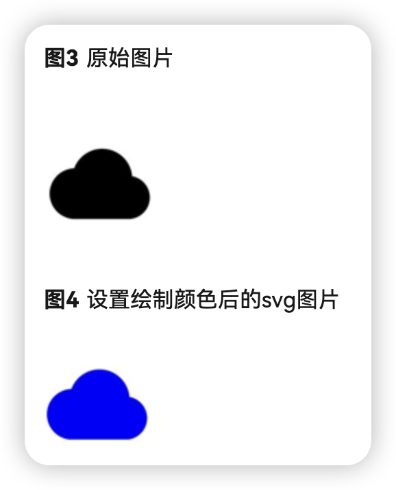
添加属性
给Image组件设置属性可以使图片显示更灵活,达到一些自定义的效果。以下是几个常用属性的使用示例,完整属性信息详见Image。
设置图片缩放类型
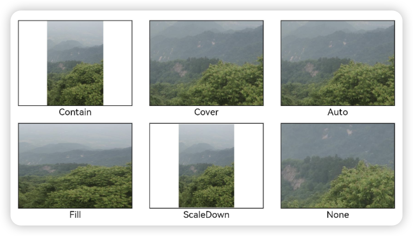
通过objectFit属性使图片缩放到高度和宽度确定的框,可选值Contain、Cover、Auto、Fill、ScaleDown、None
Image($r("app.media.1")).width(200).height(500)
 .border({width:1})
 .objectFit(ImageFit.Contain).margin(15)
图片插值
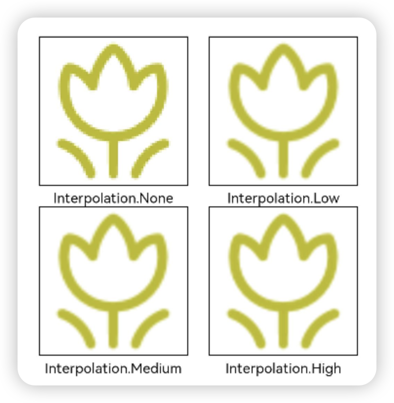
当原图分辨率较低并且放大显示时,图片会模糊出现锯齿。这时可以使用interpolation属性对图片进行插值,使图片显示得更清晰。
@Entry
@Component
struct Index {
  build() {
    Column() {
      Row() {
        Image($r('app.media.grass'))
          .width('40%')
          .interpolation(ImageInterpolation.None)
          .borderWidth(1)
          .overlay("Interpolation.None", { align: Alignment.Bottom, offset: { x: 0, y: 20 } })
          .margin(10)
        Image($r('app.media.grass'))
          .width('40%')
          .interpolation(ImageInterpolation.Low)
          .borderWidth(1)
          .overlay("Interpolation.Low", { align: Alignment.Bottom, offset: { x: 0, y: 20 } })
          .margin(10)
      }.width('100%')
      .justifyContent(FlexAlign.Center)

      Row() {
        Image($r('app.media.grass'))
          .width('40%')
          .interpolation(ImageInterpolation.Medium)
          .borderWidth(1)
          .overlay("Interpolation.Medium", { align: Alignment.Bottom, offset: { x: 0, y: 20 } })
          .margin(10)
        Image($r('app.media.grass'))
          .width('40%')
          .interpolation(ImageInterpolation.High)
          .borderWidth(1)
          .overlay("Interpolation.High", { align: Alignment.Bottom, offset: { x: 0, y: 20 } })
          .margin(10)
      }.width('100%')
      .justifyContent(FlexAlign.Center)
    }
    .height('100%')
  }
}
设置图片重复样式
通过objectRepeat属性设置图片的重复样式方式,水平或垂直,水平垂直同时设置,重复样式请参考ImageRepeat枚举说明。

@Entry
@Component
struct MyComponent {
  build() {
    Column({ space: 10 }) {
      Row({ space: 5 }) {
        Image($r('app.media.ic_public_favor_filled_1'))
          .width(110)
          .height(115)
          .border({ width: 1 })
          .objectRepeat(ImageRepeat.XY)
          .objectFit(ImageFit.ScaleDown)
          // 在水平轴和竖直轴上同时重复绘制图片
          .overlay('ImageRepeat.XY', { align: Alignment.Bottom, offset: { x: 0, y: 20 } })
        Image($r('app.media.ic_public_favor_filled_1'))
          .width(110)
          .height(115)
          .border({ width: 1 })
          .objectRepeat(ImageRepeat.Y)
          .objectFit(ImageFit.ScaleDown)
          // 只在竖直轴上重复绘制图片
          .overlay('ImageRepeat.Y', { align: Alignment.Bottom, offset: { x: 0, y: 20 } })
        Image($r('app.media.ic_public_favor_filled_1'))
          .width(110)
          .height(115)
          .border({ width: 1 })
          .objectRepeat(ImageRepeat.X)
          .objectFit(ImageFit.ScaleDown)
          // 只在水平轴上重复绘制图片
          .overlay('ImageRepeat.X', { align: Alignment.Bottom, offset: { x: 0, y: 20 } })
      }
    }.height(150).width('100%').padding(8)
  }
}
设置图片渲染模式
通过renderMode属性设置图片的渲染模式为原色或黑白。

@Entry
@Component
struct MyComponent {
  build() {
    Column({ space: 10 }) {
      Row({ space: 50 }) {
        Image($r('app.media.example'))
          // 设置图片的渲染模式为原色
          .renderMode(ImageRenderMode.Original)
          .width(100)
          .height(100)
          .border({ width: 1 })
            // overlay是通用属性,用于在组件上显示说明文字
          .overlay('Original', { align: Alignment.Bottom, offset: { x: 0, y: 20 } })
        Image($r('app.media.example'))
          // 设置图片的渲染模式为黑白
          .renderMode(ImageRenderMode.Template)
          .width(100)
          .height(100)
          .border({ width: 1 })
          .overlay('Template', { align: Alignment.Bottom, offset: { x: 0, y: 20 } })
      }
    }.height(150).width('100%').padding({ top: 20,right: 10 })
  }
}
设置图片解码尺寸
通过sourceSize属性设置图片解码尺寸,降低图片的分辨率。
原图尺寸为1280*960,该示例将图片解码为40*40和90*90。
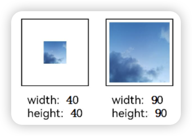
@Entry
@Component
struct Index {
  build() {
    Column() {
      Row({ space: 50 }) {
        Image($r('app.media.example'))
          .sourceSize({
            width: 40,
            height: 40
          })
          .objectFit(ImageFit.ScaleDown)
          .aspectRatio(1)
          .width('25%')
          .border({ width: 1 })
          .overlay('width:40 height:40', { align: Alignment.Bottom, offset: { x: 0, y: 40 } })
        Image($r('app.media.example'))
          .sourceSize({
            width: 90,
            height: 90
          })
          .objectFit(ImageFit.ScaleDown)
          .width('25%')
          .aspectRatio(1)
          .border({ width: 1 })
          .overlay('width:90 height:90', { align: Alignment.Bottom, offset: { x: 0, y: 40 } })
      }.height(150).width('100%').padding(20)
    }
  }
}
为图片添加滤镜效果
通过colorFilter修改图片的像素颜色,为图片添加滤镜。

@Entry
@Component
struct Index {
  build() {
    Column() {
      Row() {
        Image($r('app.media.example'))
          .width('40%')
          .margin(10)
        Image($r('app.media.example'))
          .width('40%')
          .colorFilter(
            [1, 1, 0, 0, 0,
             0, 1, 0, 0, 0,
             0, 0, 1, 0, 0,
             0, 0, 0, 1, 0])
          .margin(10)
      }.width('100%')
      .justifyContent(FlexAlign.Center)
    }
  }
}
同步加载图片
一般情况下,图片加载流程会异步进行,以避免阻塞主线程,影响UI交互。但是特定情况下,图片刷新时会出现闪烁,这时可以使用syncLoad属性,使图片同步加载,从而避免出现闪烁。不建议图片加载较长时间时使用,会导致页面无法响应
Image($r('app.media.1')).syncLoad(true)事件调用
通过在Image组件上绑定onComplete事件,图片加载成功后可以获取图片的必要信息。如果图片加载失败,也可以通过绑定onError回调来获得结果
@Entry
@Component
struct Index {


 @State widthValue: number = 0
 @State heightValue: number = 0


 build() {
  Column() {
   Image($r("app.media.1")).width(200)
     .onComplete(msg => {
     if(msg){
      this.widthValue = msg.width
      this.heightValue = msg.height
      }
     })
     // 图片获取失败,打印结果
     .onError(() => {
     console.info('load image fail')
     })
   Text(this.widthValue + "." + this.heightValue)
   }
  }
}
进度条
Progress是进度条显示组件,显示内容通常为某次目标操作的当前进度
创建进度条
build() {
  Column() {
    Progress({ value: 24, total: 100, type: ProgressType.Linear })
   }.height("100%").width("100%").justifyContent(FlexAlign.Center)
}
设置进度条样式
Progress有5种可选类型,在创建时通过设置ProgressType枚举类型给type可选项指定Progress类型。其分别为:ProgressType.Linear(线性样式)、 ProgressType.Ring(环形无刻度样式)、ProgressType.ScaleRing(环形有刻度样式)、ProgressType.Eclipse(圆形样式)和ProgressType.Capsule(胶囊样式)
线性样式进度条(默认类型)
温馨提示
从API version9开始,组件高度大于宽度的时候自适应垂直显示,相等时仍然保持水平显示。
Progress({ value: 20, total: 100, type: ProgressType.Linear }).width(200).height(50)
Progress({ value: 20, total: 100, type: ProgressType.Linear }).width(50).height(200)
环形无刻度样式进度条
// 从左往右,1号环形进度条,默认前景色为蓝色,默认strokeWidth进度条宽度为2.0vp
   Progress({ value: 40, total: 150, type: ProgressType.Ring }).width(100).height(100)
   // 从左往右,2号环形进度条
   Progress({ value: 40, total: 150, type: ProgressType.Ring }).width(100).height(100)
     .color(Color.Grey)  // 进度条前景色为灰色
     .style({ strokeWidth: 15})  // 设置strokeWidth进度条宽度为15.0vp
环形有刻度样式进度条
Progress({ value: 20, total: 150, type: ProgressType.ScaleRing }).width(100).height(100)
   .backgroundColor(Color.Black)
   .style({ scaleCount: 20, scaleWidth: 5 })  // 设置环形有刻度进度条总刻度数为20,刻度宽度为5vp
Progress({ value: 20, total: 150, type: ProgressType.ScaleRing }).width(100).height(100)
   .backgroundColor(Color.Black)
   .style({ strokeWidth: 15, scaleCount: 20, scaleWidth: 5 })  // 设置环形有刻度进度条宽度15,总刻度数为20,刻度宽度为5vp
Progress({ value: 20, total: 150, type: ProgressType.ScaleRing }).width(100).height(100)
   .backgroundColor(Color.Black)
   .style({ strokeWidth: 15, scaleCount: 20, scaleWidth: 3 })  // 设置环形有刻度进度条宽度15,总刻度数为20,刻度宽度为3vp
圆形样式进度条
// 从左往右,1号圆形进度条,默认前景色为蓝色
Progress({ value: 10, total: 150, type: ProgressType.Eclipse }).width(100).height(100)
// 从左往右,2号圆形进度条,指定前景色为灰色
Progress({ value: 20, total: 150, type: ProgressType.Eclipse }).color(Color.Grey).width(100).height(100)
胶囊样式进度条
温馨提示
- 头尾两端圆弧处的进度展示效果与ProgressType.Eclipse样式相同;
- 中段处的进度展示效果为矩形状长条,与ProgressType.Linear线性样式相似;
- 组件高度大于宽度的时候自适应垂直显示。
Progress({ value: 10, total: 150, type: ProgressType.Capsule }).width(100).height(50)
Progress({ value: 20, total: 150, type: ProgressType.Capsule }).width(50).height(100).color(Color.Grey)
Progress({ value: 50, total: 150, type: ProgressType.Capsule }).width(50).height(100).backgroundColor(Color.Black)
场景示例
更新当前进度值,如应用安装进度条。可通过点击Button增加progressValue,value属性将progressValue设置给Progress组件,进度条组件即会触发刷新,更新当前进度。

@Entry
@Component
struct ProgressCase1 {
  @State progressValue: number = 0    // 设置进度条初始值为0
  build() {
    Column() {
      Column() {
        Progress({value:0, total:100, type:ProgressType.Capsule}).width(200).height(50).value(this.progressValue)
        Row().width('100%').height(5)
        Button("进度条+5")
          .onClick(()=>{
            this.progressValue += 5
            if (this.progressValue > 100){
              this.progressValue = 0
            }
          })
      }
    }.width('100%').height('100%')
  }
}
自定义弹窗

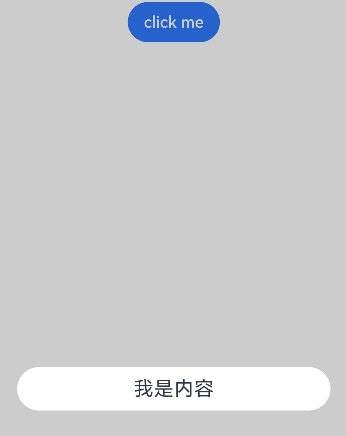
CustomDialog是自定义弹窗,可用于广告、中奖、警告、软件更新等与用户交互响应操作。开发者可以通过CustomDialogController类显示自定义弹窗。具体用法请参考自定义弹窗。
创建自定义弹窗
- 使用@CustomDialog装饰器装饰自定义弹窗。
- @CustomDialog装饰器用于装饰自定义弹框,此装饰器内进行自定义内容(也就是弹框内容)。
@CustomDialog
  struct CustomDialogExample {
    controller: CustomDialogController = new CustomDialogController({
      builder: CustomDialogExample({}),
    })


    build() {
      Column() {
        Text('我是内容')
          .fontSize(20)
          .margin({ top: 10, bottom: 10 })
      }
    }
}- 创建构造器,与装饰器呼应相连。
@Entry
  @Component
  struct CustomDialogUser {
    dialogController: CustomDialogController = new CustomDialogController({
      builder: CustomDialogExample(),
    })
}- 点击与onClick事件绑定的组件使弹窗弹出。
@Entry
  @Component
  struct CustomDialogUser {
    dialogController: CustomDialogController = new CustomDialogController({
      builder: CustomDialogExample(),
    })


    build() {
      Column() {
        Button('click me')
          .onClick(() => {
            this.dialogController.open()
          })
      }.width('100%').margin({ top: 5 })
    }
  }
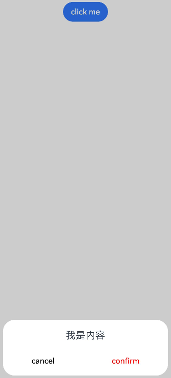
弹窗的交互
弹窗可用于数据交互,完成用户一系列响应操作。
- 在@CustomDialog装饰器内添加按钮,同时添加数据函数。
@CustomDialog
  struct CustomDialogExample {
    cancel?: () => void
    confirm?: () => void
    controller: CustomDialogController


    build() {
      Column() {
        Text('我是内容').fontSize(20).margin({ top: 10, bottom: 10 })
        Flex({ justifyContent: FlexAlign.SpaceAround }) {
          Button('cancel')
            .onClick(() => {
              this.controller.close()
              if (this.cancel) {
                this.cancel()
              }
            }).backgroundColor(0xffffff).fontColor(Color.Black)
          Button('confirm')
            .onClick(() => {
              this.controller.close()
              if (this.confirm) {
                this.confirm()
              }
            }).backgroundColor(0xffffff).fontColor(Color.Red)
        }.margin({ bottom: 10 })
      }
    }
}- 页面内需要在构造器内进行接收,同时创建相应的函数操作。
@Entry
  @Component
  struct CustomDialogUser {
    dialogController: CustomDialogController = new CustomDialogController({
      builder: CustomDialogExample({
        cancel: ()=> { this.onCancel() },
        confirm: ()=> { this.onAccept() },
      }),
    })


    onCancel() {
      console.info('Callback when the first button is clicked')
    }


    onAccept() {
      console.info('Callback when the second button is clicked')
    }


    build() {
      Column() {
        Button('click me')
          .onClick(() => {
            this.dialogController.open()
          })
      }.width('100%').margin({ top: 5 })
    }
  }
3.可通过弹窗中的按钮实现路由跳转,同时获取跳转页面向当前页传入的参数。
// Index.ets
import { router } from '@kit.ArkUI';


@CustomDialog
  struct CustomDialogExample {
    @Link textValue: string
    controller?: CustomDialogController
    cancel: () => void = () => {
    }
    confirm: () => void = () => {
    }


    build() {
      Column({ space: 20 }) {
        if (this.textValue != '') {
          Text(`第二个页面的内容为:${this.textValue}`)
            .fontSize(20)
        } else {
          Text('是否获取第二个页面的内容')
            .fontSize(20)
        }
        Flex({ justifyContent: FlexAlign.SpaceAround }) {
          Button('cancel')
            .onClick(() => {
              if (this.controller != undefined) {
                this.controller.close()
                this.cancel()
              }
            }).backgroundColor(0xffffff).fontColor(Color.Black)
          Button('confirm')
            .onClick(() => {
              if (this.controller != undefined && this.textValue != '') {
                this.controller.close()
              } else if (this.controller != undefined) {
                router.pushUrl({
                  url: 'pages/Index2'
                })
                this.controller.close()
              }
            }).backgroundColor(0xffffff).fontColor(Color.Red)
        }.margin({ bottom: 10 })
      }.borderRadius(10).padding({ top: 20 })
    }
  }


@Entry
  @Component
  struct CustomDialogUser {
    @State textValue: string = ''
    dialogController: CustomDialogController | null = new CustomDialogController({
      builder: CustomDialogExample({
        cancel: () => {
          this.onCancel()
        },
        confirm: () => {
          this.onAccept()
        },
        textValue: $textValue
      })
    })


    // 在自定义组件即将析构销毁时将dialogController置空
    aboutToDisappear() {
      this.dialogController = null // 将dialogController置空
    }


    onPageShow() {
      const params = router.getParams() as Record<string, string>; // 获取传递过来的参数对象
      if (params) {
        this.dialogController?.open()
        this.textValue = params.info as string; // 获取info属性的值
      }
    }


    onCancel() {
      console.info('Callback when the first button is clicked')
    }


    onAccept() {
      console.info('Callback when the second button is clicked')
    }


    exitApp() {
      console.info('Click the callback in the blank area')
    }


    build() {
      Column() {
        Button('click me')
          .onClick(() => {
            if (this.dialogController != null) {
              this.dialogController.open()
            }
          }).backgroundColor(0x317aff)
      }.width('100%').margin({ top: 5 })
    }
  }
// Index2.ets
import { router } from '@kit.ArkUI';
@Entry
@Component
struct Index2 {
@State message: string = '点击返回';
build() {
Column() {
Button(this.message)
.fontSize(50)
.fontWeight(FontWeight.Bold).onClick(() => {
router.back({
url: 'pages/Index',
params: {
info: 'Hello World'
}
});
})
}.width('100%').height('100%').margin({ top: 20 })
}
}
弹窗的动画
弹窗通过定义openAnimation控制弹窗出现动画的持续时间,速度等参数。
@CustomDialog
  struct CustomDialogExample {
    controller?: CustomDialogController


    build() {
      Column() {
        Text('Whether to change a text?').fontSize(16).margin({ bottom: 10 })
      }
    }
  }


@Entry
  @Component
  struct CustomDialogUser {
    @State textValue: string = ''
    @State inputValue: string = 'click me'
    dialogController: CustomDialogController | null = new CustomDialogController({
      builder: CustomDialogExample(),
      openAnimation: {
        duration: 1200,
        curve: Curve.Friction,
        delay: 500,
        playMode: PlayMode.Alternate,
        onFinish: () => {
          console.info('play end')
        }
      },
      autoCancel: true,
      alignment: DialogAlignment.Bottom,
      offset: { dx: 0, dy: -20 },
      gridCount: 4,
      customStyle: false,
      backgroundColor: 0xd9ffffff,
      cornerRadius: 10,
    })


    // 在自定义组件即将析构销毁时将dialogController置空
    aboutToDisappear() {
      this.dialogController = null // 将dialogController置空
    }


    build() {
      Column() {
        Button(this.inputValue)
          .onClick(() => {
            if (this.dialogController != null) {
              this.dialogController.open()
            }
          }).backgroundColor(0x317aff)
      }.width('100%').margin({ top: 5 })
    }
  }
弹窗的样式
弹窗通过定义宽度、高度、背景色、阴影等参数来控制样式。
@CustomDialog
  struct CustomDialogExample {
    controller?: CustomDialogController


    build() {
      Column() {
        Text('我是内容').fontSize(16).margin({ bottom: 10 })
      }
    }
  }


@Entry
  @Component
  struct CustomDialogUser {
    @State textValue: string = ''
    @State inputValue: string = 'click me'
    dialogController: CustomDialogController | null = new CustomDialogController({
      builder: CustomDialogExample(),
      autoCancel: true,
      alignment: DialogAlignment.Center,
      offset: { dx: 0, dy: -20 },
      gridCount: 4,
      customStyle: false,
      backgroundColor: 0xd9ffffff,
      cornerRadius: 20,
      width: '80%',
      height: '100px',
      borderWidth: 1,
      borderStyle: BorderStyle.Dashed,//使用borderStyle属性,需要和borderWidth属性一起使用
      borderColor: Color.Blue,//使用borderColor属性,需要和borderWidth属性一起使用
      shadow: ({ radius: 20, color: Color.Grey, offsetX: 50, offsetY: 0}),
    })


    // 在自定义组件即将析构销毁时将dialogController置空
    aboutToDisappear() {
      this.dialogController = null // 将dialogController置空
    }


    build() {
      Column() {
        Button(this.inputValue)
          .onClick(() => {
            if (this.dialogController != null) {
              this.dialogController.open()
            }
          }).backgroundColor(0x317aff)
      }.width('100%').margin({ top: 5 })
    }
  }
嵌套自定义弹窗
通过第一个弹窗打开第二个弹窗时,最好将第二个弹窗定义在第一个弹窗的父组件处,通过父组件传给第一个弹窗的回调来打开第二个弹窗。
@CustomDialog
  struct CustomDialogExampleTwo {
    controllerTwo?: CustomDialogController
    @State message: string = "I'm the second dialog box."
    @State showIf: boolean = false;
    build() {
      Column() {
        if (this.showIf) {
          Text("Text")
            .fontSize(30)
            .height(100)
        }
        Text(this.message)
          .fontSize(30)
          .height(100)
        Button("Create Text")
          .onClick(()=>{
            this.showIf = true;
          })
        Button ('Close Second Dialog Box')
          .onClick(() => {
            if (this.controllerTwo != undefined) {
              this.controllerTwo.close()
            }
          })
          .margin(20)
      }
    }
  }
@CustomDialog
  struct CustomDialogExample {
    openSecondBox?: ()=>void
    controller?: CustomDialogController


    build() {
      Column() {
        Button ('Open Second Dialog Box and close this box')
          .onClick(() => {
            this.controller!.close();
            this.openSecondBox!();
          })
          .margin(20)
      }.borderRadius(10)
    }
  }
@Entry
  @Component
  struct CustomDialogUser {
    @State inputValue: string = 'Click Me'
    dialogController: CustomDialogController | null = new CustomDialogController({
      builder: CustomDialogExample({
        openSecondBox: ()=>{
          if (this.dialogControllerTwo != null) {
            this.dialogControllerTwo.open()
          }
        }
      }),
      cancel: this.exitApp,
      autoCancel: true,
      alignment: DialogAlignment.Bottom,
      offset: { dx: 0, dy: -20 },
      gridCount: 4,
      customStyle: false
    })
    dialogControllerTwo: CustomDialogController | null = new CustomDialogController({
      builder: CustomDialogExampleTwo(),
      alignment: DialogAlignment.Bottom,
      offset: { dx: 0, dy: -25 } })


    aboutToDisappear() {
      this.dialogController = null
      this.dialogControllerTwo = null
    }


    onCancel() {
      console.info('Callback when the first button is clicked')
    }


    onAccept() {
      console.info('Callback when the second button is clicked')
    }


    exitApp() {
      console.info('Click the callback in the blank area')
    }
    build() {
      Column() {
        Button(this.inputValue)
          .onClick(() => {
            if (this.dialogController != null) {
              this.dialogController.open()
            }
          }).backgroundColor(0x317aff)
      }.width('100%').margin({ top: 5 })
    }
  }
由于自定义弹窗在状态管理侧有父子关系,如果将第二个弹窗定义在第一个弹窗内,那么当父组件(第一个弹窗)被销毁(关闭)时,子组件(第二个弹窗)内无法再继续创建新的组件。
视频播放

Video组件用于播放视频文件并控制其播放状态,常用于为短视频和应用内部视频的列表页面。当视频完整出现时会自动播放,用户点击视频区域则会暂停播放,同时显示播放进度条,通过拖动播放进度条指定视频播放到具体位置。具体用法请参考Video。
创建视频组件
Video通过调用接口来创建,接口调用形式如下:
Video(value: VideoOptions)
VideoOptions对象包含参数src、currentProgressRate、previewUri、controller。其中,src指定视频播放源的路径,加载方式请参考加载视频资源,currentProgressRate用于设置视频播放倍速,previewUri指定视频未播放时的预览图片路径,controller设置视频控制器,用于自定义控制视频。具体用法请参考VideoOptions对象说明。
加载视频资源
Video组件支持加载本地视频和网络视频。
加载本地视频
- 普通本地视频。
加载本地视频时,首先在本地rawfile目录指定对应的文件,如下图所示。
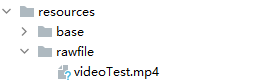
再使用资源访问符$rawfile()引用视频资源。
@Component
  export struct VideoPlayer{
    private controller:VideoController | undefined;
    private previewUris: Resource = $r ('app.media.preview');
    private innerResource: Resource = $rawfile('videoTest.mp4');
    build(){
      Column() {
        Video({
          src: this.innerResource,
          previewUri: this.previewUris,
          controller: this.controller
        })
      }
    }
}- Data Ability提供的视频路径带有dataability://前缀,使用时确保对应视频资源存在即可。
@Component
  export struct VideoPlayer{
    private controller:VideoController | undefined;
    private previewUris: Resource = $r ('app.media.preview');
    private videoSrc: string = 'dataability://device_id/com.domainname.dataability.videodata/video/10'
    build(){
      Column() {
        Video({
          src: this.videoSrc,
          previewUri: this.previewUris,
          controller: this.controller
        })
      }
    }
  }
加载沙箱路径视频
支持file:///data/storage路径前缀的字符串,用于读取应用沙箱路径内的资源,需要保证应用沙箱目录路径下的文件存在并且有可读权限。
@Component
  export struct VideoPlayer {
    private controller: VideoController | undefined;
    private videoSrc: string = 'file:///data/storage/el2/base/haps/entry/files/show.mp4'


    build() {
      Column() {
        Video({
          src: this.videoSrc,
          controller: this.controller
        })
      }
    }
  }
加载网络视频
加载网络视频时,需要申请权限ohos.permission.INTERNET,具体申请方式请参考声明权限。此时,Video的src属性为网络视频的链接。
@Component
export struct VideoPlayer{
  private controller:VideoController | undefined;
  private previewUris: Resource = $r ('app.media.preview');
  private videoSrc: string= 'https://www.example.com/example.mp4' // 使用时请替换为实际视频加载网址
  build(){
    Column() {
      Video({
        src: this.videoSrc,
        previewUri: this.previewUris,
       controller: this.controller
      })
    }
  }
}
添加属性
Video组件属性主要用于设置视频的播放形式。例如设置视频播放是否静音、播放是否显示控制条等。
@Component
  export struct VideoPlayer {
    private controller: VideoController | undefined;


    build() {
      Column() {
        Video({
          controller: this.controller
        })
          .muted(false) //设置是否静音
          .controls(false) //设置是否显示默认控制条
          .autoPlay(false) //设置是否自动播放
          .loop(false) //设置是否循环播放
          .objectFit(ImageFit.Contain) //设置视频适配模式
      }
    }
  }
事件调用
Video组件回调事件主要为播放开始、暂停结束、播放失败、播放停止、视频准备和操作进度条等事件,除此之外,Video组件也支持通用事件的调用,如点击、触摸等事件的调用。详细事件请参考事件说明。
@Entry
  @Component
  struct VideoPlayer{
    private controller:VideoController | undefined;
    private previewUris: Resource = $r ('app.media.preview');
    private innerResource: Resource = $rawfile('videoTest.mp4');
    build(){
      Column() {
        Video({
          src: this.innerResource,
          previewUri: this.previewUris,
          controller: this.controller
        })
          .onUpdate((event) => {   //更新事件回调
            console.info("Video update.");
          })
          .onPrepared((event) => {  //准备事件回调
            console.info("Video prepared.");
          })
          .onError(() => {          //失败事件回调
            console.info("Video error.");
          })
          .onStop(() => {          //停止事件回调
            console.info("Video stoped.");
          })
      }
    }
  }
Video控制器使用
Video控制器主要用于控制视频的状态,包括播放、暂停、停止以及设置进度等,详细使用请参考VideoController使用说明。
- 默认控制器
默认的控制器支持视频的开始、暂停、进度调整、全屏显示四项基本功能。
@Entry
  @Component
  struct VideoGuide {
    @State videoSrc: Resource = $rawfile('videoTest.mp4')
    @State previewUri: string = 'common/videoIcon.png'
    @State curRate: PlaybackSpeed = PlaybackSpeed.Speed_Forward_1_00_X
    build() {
      Row() {
        Column() {
          Video({
            src: this.videoSrc,
            previewUri: this.previewUri,
            currentProgressRate: this.curRate
          })
        }
        .width('100%')
      }
      .height('100%')
    }
}- 自定义控制器
使用自定义的控制器,先将默认控制器关闭掉,之后可以使用button以及slider等组件进行自定义的控制与显示,适合自定义较强的场景下使用。
@Entry
  @Component
  struct VideoGuide1 {
    @State videoSrc: Resource = $rawfile('videoTest.mp4')
    @State previewUri: string = 'common/videoIcon.png'
    @State curRate: PlaybackSpeed = PlaybackSpeed.Speed_Forward_1_00_X
    @State isAutoPlay: boolean = false
    @State showControls: boolean = true
    @State sliderStartTime: string = '';
    @State currentTime: number = 0;
    @State durationTime: number = 0;
    @State durationStringTime: string ='';
    controller: VideoController = new VideoController()


    build() {
      Row() {
        Column() {
          Video({
            src: this.videoSrc,
            previewUri: this.previewUri,
            currentProgressRate: this.curRate,
            controller: this.controller
          }).controls(false).autoPlay(true)
            .onPrepared((event)=>{
              if(event){
                this.durationTime = event.duration
              }
            })
            .onUpdate((event)=>{
              if(event){
                this.currentTime =event.time
              }
            })
          Row() {
            Text(JSON.stringify(this.currentTime) + 's')
            Slider({
              value: this.currentTime,
              min: 0,
              max: this.durationTime
            })
              .onChange((value: number, mode: SliderChangeMode) => {
                this.controller.setCurrentTime(value);
              }).width("90%")
            Text(JSON.stringify(this.durationTime) + 's')
          }
          .opacity(0.8)
            .width("100%")
        }
        .width('100%')
      }
      .height('40%')
    }
  }
其他说明
Video组件已经封装好了视频播放的基础能力,开发者无需进行视频实例的创建,视频信息的设置获取,只需要设置数据源以及基础信息即可播放视频,相对扩展能力较弱。如果开发者想自定义视频播放,请参考媒体系统播放音视频。
图标小符号
SymbolGlyph是图标小符号组件,便于使用精美的图标,如渲染多色图标。具体用法请参考SymbolGlyph。
创建图标
SymbolGlyph通过引用Resource资源来创建,资源引用类型可以通过$r创建Resource类型对象。
SymbolGlyph($r('sys.symbol.ohos_folder_badge_plus'))
  .fontSize(96)
  .renderingStrategy(SymbolRenderingStrategy.SINGLE)
  .fontColor([Color.Black, Color.Green, Color.White])
添加到文本中
SymbolSpan能作为Text的子组件显示图标小符号。可以在一个Text内添加多个SymbolSpan来显示一串图标。
- 创建SymbolSpan。
SymbolSpan组件需要写到Text组件内,单独的SymbolSpan组件不会显示。
Text() {
  SymbolSpan($r('sys.symbol.ohos_trash'))
    .fontWeight(FontWeight.Normal)
    .fontSize(96)
}
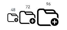
- 通过fontSize属性设置SymbolSpan的大小。
Row() {
  Column() {
    Text("48")
    Text() {
      SymbolSpan($r('sys.symbol.ohos_folder_badge_plus'))
        .fontSize(48)
        .renderingStrategy(SymbolRenderingStrategy.SINGLE)
        .fontColor([Color.Black, Color.Green, Color.White])
    }
  }


  Column() {
    Text("72")
    Text() {
      SymbolSpan($r('sys.symbol.ohos_folder_badge_plus'))
        .fontSize(72)
        .renderingStrategy(SymbolRenderingStrategy.SINGLE)
        .fontColor([Color.Black, Color.Green, Color.White])
    }
  }


  Column() {
    Text("96")
    Text() {
      SymbolSpan($r('sys.symbol.ohos_folder_badge_plus'))
        .fontSize(96)
        .renderingStrategy(SymbolRenderingStrategy.SINGLE)
        .fontColor([Color.Black, Color.Green, Color.White])
    }
  }
}
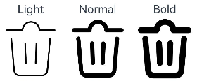
- 通过fontWeight属性设置SymbolSpan组件的粗细。
Row() {
  Column() {
    Text("Light")
    Text() {
      SymbolSpan($r('sys.symbol.ohos_trash'))
        .fontWeight(FontWeight.Lighter)
        .fontSize(96)
    }
  }


  Column() {
    Text("Normal")
    Text() {
      SymbolSpan($r('sys.symbol.ohos_trash'))
        .fontWeight(FontWeight.Normal)
        .fontSize(96)
    }
  }


  Column() {
    Text("Bold")
    Text() {
      SymbolSpan($r('sys.symbol.ohos_trash'))
        .fontWeight(FontWeight.Bold)
        .fontSize(96)
    }
  }
}
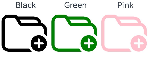
- 通过fontColor属性设置SymbolSpan的颜色。
Row() {
  Column() {
    Text("Black")
    Text() {
      SymbolSpan($r('sys.symbol.ohos_folder_badge_plus'))
        .fontSize(96)
        .fontColor([Color.Black])
    }
  }


  Column() {
    Text("Green")
    Text() {
      SymbolSpan($r('sys.symbol.ohos_folder_badge_plus'))
        .fontSize(96)
        .fontColor([Color.Green])
    }
  }


  Column() {
    Text("Pink")
    Text() {
      SymbolSpan($r('sys.symbol.ohos_folder_badge_plus'))
        .fontSize(96)
        .fontColor([Color.Pink])
    }
  }
}
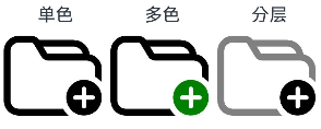
- 通过renderingStrategy属性设置SymbolSpan的渲染策略。
Row() {
  Column() {
    Text("单色")
    Text() {
      SymbolSpan($r('sys.symbol.ohos_folder_badge_plus'))
        .fontSize(96)
        .renderingStrategy(SymbolRenderingStrategy.SINGLE)
        .fontColor([Color.Black, Color.Green, Color.White])
    }
  }


  Column() {
    Text("多色")
    Text() {
      SymbolSpan($r('sys.symbol.ohos_folder_badge_plus'))
        .fontSize(96)
        .renderingStrategy(SymbolRenderingStrategy.MULTIPLE_COLOR)
        .fontColor([Color.Black, Color.Green, Color.White])
    }
  }


  Column() {
    Text("分层")
    Text() {
      SymbolSpan($r('sys.symbol.ohos_folder_badge_plus'))
        .fontSize(96)
        .renderingStrategy(SymbolRenderingStrategy.MULTIPLE_OPACITY)
        .fontColor([Color.Black, Color.Green, Color.White])
    }
  }
}
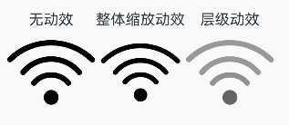
- 通过effectStrategy属性设置SymbolSpan的动效策略。
Row() {
  Column() {
    Text("无动效")
    Text() {
      SymbolSpan($r('sys.symbol.ohos_wifi'))
        .fontSize(96)
        .effectStrategy(SymbolEffectStrategy.NONE)
    }
  }


  Column() {
    Text("整体缩放动效")
    Text() {
      SymbolSpan($r('sys.symbol.ohos_wifi'))
        .fontSize(96)
        .effectStrategy(SymbolEffectStrategy.SCALE)
    }
  }


  Column() {
    Text("层级动效")
    Text() {
      SymbolSpan($r('sys.symbol.ohos_wifi'))
        .fontSize(96)
        .effectStrategy(SymbolEffectStrategy.HIERARCHICAL)
    }
  }
}
- SymbolSpan不支持通用事件。
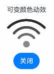
自定义图标动效
相较于effectStrategy属性启动即触发动效,可以通过以下两种方式控制动效的播放状态以及更多样的动效策略选择。
关于effectStrategy属性与symbolEffect属性多种动态属性使用生效原则,详见SymbolGlyph.symbolEffect属性说明。
- 通过symbolEffect属性同时设置SymbolGlyph的动效策略及动效播放状态。
@State isActive: boolean = true;
Column() {
  Text("可变颜色动效")
  SymbolGlyph($r('sys.symbol.ohos_wifi'))
    .fontSize(96)
    .symbolEffect(new HierarchicalSymbolEffect(EffectFillStyle.ITERATIVE), this.isActive)
  Button(this.isActive ? '关闭' : '播放').onClick(() => {
    this.isActive = !this.isActive;
  })
}
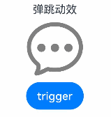
- 通过symbolEffect属性同时设置SymbolGlyph的动效策略及播放触发器。
@State triggerValueReplace: number = 0;
Column() {
  Text("弹跳动效")
  SymbolGlyph($r('sys.symbol.ellipsis_message_1'))
    .fontSize(96)
    .fontColor([Color.Gray])
    .symbolEffect(new BounceSymbolEffect(EffectScope.WHOLE, EffectDirection.UP), this.triggerValueReplace)
  Button('trigger').onClick(() => {
    this.triggerValueReplace = this.triggerValueReplace + 1;
  })
}
添加事件
SymbolGlyph组件可以添加通用事件,例如绑定onClick、onTouch等事件来响应操作。
@State wifiColor: ResourceColor = Color.Black;
SymbolGlyph($r('sys.symbol.ohos_wifi'))
  .fontSize(96)
  .fontColor([this.wifiColor])
  .onClick(()=>{
    this.wifiColor = Color.Gray
  })
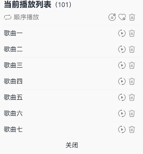
场景示例
// xxx.ets
@Entry
  @Component
  struct Index {
    @State triggerValueReplace: number = 0;
    @State symbolSources: Resource[] = [$r('sys.symbol.repeat'), $r('sys.symbol.repeat_1'), $r('sys.symbol.arrow_left_arrow_right')]
    @State symbolSourcesIndex: number = 0;
    @State symbolText: string[] = ['顺序播放', '单曲循环', '随机播放']
    @State symbolTextIndex: number = 0;
    @State fontColorValue:ResourceColor = Color.Grey;
    @State fontColorValue1:ResourceColor = '#E8E8E8';


    build() {
      Column( { space: 10 }) {
        Row() {
          Text(){
            Span('当前播放列表')
              .fontSize(20)
              .fontWeight(FontWeight.Bolder)
            Span('(101)')
          }
        }
        Row() {
          Row({ space: 5 }) {
            SymbolGlyph(this.symbolSources[this.symbolSourcesIndex])
              .symbolEffect(new ReplaceSymbolEffect(EffectScope.WHOLE), this.triggerValueReplace)
              .fontSize(20)
              .fontColor([this.fontColorValue])
            Text(this.symbolText[this.symbolTextIndex])
              .fontColor(this.fontColorValue)
          }
          .onClick(()=>{
            this.symbolTextIndex++;
            this.symbolSourcesIndex++;
            this.triggerValueReplace++;
            if (this.symbolSourcesIndex > (this.symbolSources.length - 1)) {
              this.symbolSourcesIndex = 0;
              this.triggerValueReplace = 0;
            }
            if (this.symbolTextIndex > (this.symbolText.length - 1)) {
              this.symbolTextIndex = 0;
            }
          })
            .width('75%')


          Row({ space: 5 }) {
            Text(){
              SymbolSpan($r('sys.symbol.arrow_down_circle_badge_vip_circle_filled'))
                .fontColor([this.fontColorValue])
                .fontSize(20)
            }
            Text(){
              SymbolSpan($r('sys.symbol.heart_badge_plus'))
                .fontColor([this.fontColorValue])
                .fontSize(20)
            }
            Text(){
              SymbolSpan($r('sys.symbol.ohos_trash'))
                .fontColor([this.fontColorValue])
                .fontSize(20)
            }
          }
          .width('25%')
        }
        Divider().width(5).color(this.fontColorValue1).width('98%')
        Row(){
          Row(){
            Text("歌曲一")
          }.width('82%')
          Row({ space: 5}) {
            SymbolGlyph($r('sys.symbol.play_arrow_triangle_2_circlepath'))
              .fontColor([this.fontColorValue])
              .fontSize(20)
            SymbolGlyph($r('sys.symbol.trash'))
              .fontColor([this.fontColorValue])
              .fontSize(20)
          }
        }
        Divider().width(5).color(this.fontColorValue1).width('98%')
        Row(){
          Row(){
            Text("歌曲二")
          }.width('82%')
          Row({ space: 5}) {
            SymbolGlyph($r('sys.symbol.play_arrow_triangle_2_circlepath'))
              .fontColor([this.fontColorValue])
              .fontSize(20)
            SymbolGlyph($r('sys.symbol.trash'))
              .fontColor([this.fontColorValue])
              .fontSize(20)
          }
        }
        Divider().width(5).color(this.fontColorValue1).width('98%')
      Row(){
        Row(){
          Text("歌曲三")
        }.width('82%')
        Row({ space: 5}) {
          SymbolGlyph($r('sys.symbol.play_arrow_triangle_2_circlepath'))
            .fontColor([this.fontColorValue])
            .fontSize(20)
          SymbolGlyph($r('sys.symbol.trash'))
            .fontColor([this.fontColorValue])
            .fontSize(20)
        }
      }
      Divider().width(5).color(this.fontColorValue1).width('98%')
      Row(){
        Row(){
          Text("歌曲四")
        }.width('82%')
        Row({ space: 5}) {
          SymbolGlyph($r('sys.symbol.play_arrow_triangle_2_circlepath'))
            .fontColor([this.fontColorValue])
            .fontSize(20)
          SymbolGlyph($r('sys.symbol.trash'))
            .fontColor([this.fontColorValue])
            .fontSize(20)
        }
      }
      Divider().width(5).color(this.fontColorValue1).width('98%')
      Row(){
        Row(){
          Text("歌曲五")
        }.width('82%')
        Row({ space: 5}) {
          SymbolGlyph($r('sys.symbol.play_arrow_triangle_2_circlepath'))
            .fontColor([this.fontColorValue])
            .fontSize(20)
          SymbolGlyph($r('sys.symbol.trash'))
            .fontColor([this.fontColorValue])
            .fontSize(20)
        }
      }
      Divider().width(5).color(this.fontColorValue1).width('98%')
      Row(){
        Row(){
          Text("歌曲六")
        }.width('82%')
        Row({ space: 5}) {
          SymbolGlyph($r('sys.symbol.play_arrow_triangle_2_circlepath'))
            .fontColor([this.fontColorValue])
            .fontSize(20)
          SymbolGlyph($r('sys.symbol.trash'))
            .fontColor([this.fontColorValue])
            .fontSize(20)
        }
      }
      Divider().width(5).color(this.fontColorValue1).width('98%')
      Row(){
        Row(){
          Text("歌曲七")
        }.width('82%')
        Row({ space: 5}) {
          SymbolGlyph($r('sys.symbol.play_arrow_triangle_2_circlepath'))
            .fontColor([this.fontColorValue])
            .fontSize(20)
          SymbolGlyph($r('sys.symbol.trash'))
            .fontColor([this.fontColorValue])
            .fontSize(20)
        }
      }
      Divider().width(5).color(this.fontColorValue1).width('98%')
      Column(){
        Text("关闭")
      }
      .alignItems(HorizontalAlign.Center)
      .width('98%')
    }
    .alignItems(HorizontalAlign.Start)
    .width('100%')
    .height(400)
    .padding({
      left:10,
      top:10
    })
  }
}
气泡提示

Popup属性可绑定在组件上显示气泡弹窗提示,设置弹窗内容、交互逻辑和显示状态。主要用于屏幕录制、信息弹出提醒等显示状态。
气泡分为两种类型,一种是系统提供的气泡PopupOptions,一种是开发者可以自定义的气泡CustomPopupOptions。其中PopupOptions为系统提供的气泡,通过配置primaryButton、secondaryButton来设置带按钮的气泡。CustomPopupOptions通过配置builder参数来设置自定义的气泡。
文本提示气泡
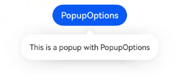
文本提示气泡常用于只展示带有文本的信息提示,不带有任何交互的场景。Popup属性需绑定组件,当bindPopup属性中参数show为true时会弹出气泡提示。
在Button组件上绑定Popup属性,每次点击Button按钮,handlePopup会切换布尔值,当值为true时,触发bindPopup弹出气泡。
@Entry
  @Component
  struct PopupExample {
    @State handlePopup: boolean = false

    build() {
      Column() {
        Button('PopupOptions')
          .onClick(() => {
            this.handlePopup = !this.handlePopup
          })
          .bindPopup(this.handlePopup, {
            message: 'This is a popup with PopupOptions',
          })
      }.width('100%').padding({ top: 5 })
    }
  }
添加气泡状态变化的事件
通过onStateChange参数为气泡添加状态变化的事件回调,可以判断当前气泡的显示状态。
@Entry
  @Component
  struct PopupExample {
    @State handlePopup: boolean = false


    build() {
      Column() {
        Button('PopupOptions')
          .onClick(() => {
            this.handlePopup = !this.handlePopup
          })
          .bindPopup(this.handlePopup, {
            message: 'This is a popup with PopupOptions',
            onStateChange: (e)=> { // 返回当前的气泡状态
              if (!e.isVisible) {
                this.handlePopup = false
              }
            }
          })
      }.width('100%').padding({ top: 5 })
    }
  }
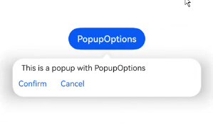
带按钮的提示气泡
通过primaryButton、secondaryButton属性为气泡最多设置两个Button按钮,通过此按钮进行简单的交互,开发者可以通过配置action参数来设置想要触发的操作。
@Entry
  @Component
  struct PopupExample22 {
    @State handlePopup: boolean = false


    build() {
      Column() {
        Button('PopupOptions').margin({ top: 200 })
          .onClick(() => {
            this.handlePopup = !this.handlePopup
          })
          .bindPopup(this.handlePopup, {
            message: 'This is a popup with PopupOptions',
            primaryButton: {
              value: 'Confirm',
              action: () => {
                this.handlePopup = !this.handlePopup
                console.info('confirm Button click')
              }
            },
            secondaryButton: {
              value: 'Cancel',
              action: () => {
                this.handlePopup = !this.handlePopup
              }
            },
            onStateChange: (e) => {
              if (!e.isVisible) {
                this.handlePopup = false
              }
            }
          })
      }.width('100%').padding({ top: 5 })
    }
  }
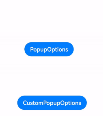
气泡的动画
气泡通过定义transition控制气泡的进场和出场动画效果。
// xxx.ets
@Entry
  @Component
  struct PopupExample {
    @State handlePopup: boolean = false
    @State customPopup: boolean = false


    // popup构造器定义弹框内容
    @Builder popupBuilder() {
      Row() {
        Text('Custom Popup with transitionEffect').fontSize(10)
      }.height(50).padding(5)
    }


    build() {
      Flex({ direction: FlexDirection.Column }) {
        // PopupOptions 类型设置弹框内容
        Button('PopupOptions')
          .onClick(() => {
            this.handlePopup = !this.handlePopup
          })
          .bindPopup(this.handlePopup, {
            message: 'This is a popup with transitionEffect',
            placementOnTop: true,
            showInSubWindow: false,
            onStateChange: (e) => {
              console.info(JSON.stringify(e.isVisible))
              if (!e.isVisible) {
                this.handlePopup = false
              }
            },
            // 设置弹窗显示动效为透明度动效与平移动效的组合效果,无退出动效
            transition:TransitionEffect.asymmetric(
              TransitionEffect.OPACITY.animation({ duration: 1000, curve: Curve.Ease }).combine(
                TransitionEffect.translate({ x: 50, y: 50 })),
              TransitionEffect.IDENTITY)
          })
          .position({ x: 100, y: 150 })


        // CustomPopupOptions 类型设置弹框内容
        Button('CustomPopupOptions')
          .onClick(() => {
            this.customPopup = !this.customPopup
          })
          .bindPopup(this.customPopup, {
            builder: this.popupBuilder,
            placement: Placement.Top,
            showInSubWindow: false,
            onStateChange: (e) => {
              if (!e.isVisible) {
                this.customPopup = false
              }
            },
            // 设置弹窗显示动效与退出动效为缩放动效
            transition:TransitionEffect.scale({ x: 1, y: 0 }).animation({ duration: 500, curve: Curve.Ease })
          })
          .position({ x: 80, y: 300 })
      }.width('100%').padding({ top: 5 })
    }
  }
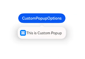
自定义气泡
开发者可以使用构建器CustomPopupOptions创建自定义气泡,@Builder中可以放自定义的内容。除此之外,还可以通过popupColor等参数控制气泡样式。
@Entry
  @Component
  struct Index {
    @State customPopup: boolean = false
    // popup构造器定义弹框内容
    @Builder popupBuilder() {
      Row({ space: 2 }) {
        Image($r("app.media.icon")).width(24).height(24).margin({ left: 5 })
        Text('This is Custom Popup').fontSize(15)
      }.width(200).height(50).padding(5)
    }
    build() {
      Column() {
        Button('CustomPopupOptions')
          .position({x:100,y:200})
          .onClick(() => {
            this.customPopup = !this.customPopup
          })
          .bindPopup(this.customPopup, {
            builder: this.popupBuilder, // 气泡的内容
            placement:Placement.Bottom, // 气泡的弹出位置
            popupColor:Color.Pink, // 气泡的背景色
            onStateChange: (e) => {
              console.info(JSON.stringify(e.isVisible))
              if (!e.isVisible) {
                this.customPopup = false
              }
            }
          })
      }
      .height('100%')
    }
  }
使用者通过配置placement参数将弹出的气泡放到需要提示的位置。弹窗构造器会触发弹出提示信息,来引导使用者完成操作,也让使用者有更好的UI体验。
菜单
Menu是菜单接口,一般用于鼠标右键弹窗、点击弹窗等。具体用法请参考Menu控制。
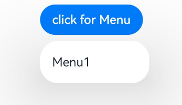
创建默认样式的菜单
菜单需要调用bindMenu接口来实现。bindMenu响应绑定组件的点击事件,绑定组件后手势点击对应组件后即可弹出。
Button('click for Menu')
  .bindMenu([
    {
      value: 'Menu1',
      action: () => {
        console.info('handle Menu1 select')
      }
    }
  ])
创建自定义样式的菜单
当默认样式不满足开发需求时,可使用@Builder自定义菜单内容,通过bindMenu接口进行菜单的自定义。
@Builder开发菜单内的内容
class Tmp {
  iconStr2: ResourceStr = $r("app.media.view_list_filled")


  set(val: Resource) {
    this.iconStr2 = val
  }
}


@Entry
  @Component
  struct menuExample {
    @State select: boolean = true
    private iconStr: ResourceStr = $r("app.media.view_list_filled")
    private iconStr2: ResourceStr = $r("app.media.view_list_filled")


    @Builder
    SubMenu() {
      Menu() {
        MenuItem({ content: "复制", labelInfo: "Ctrl+C" })
        MenuItem({ content: "粘贴", labelInfo: "Ctrl+V" })
      }
    }


    @Builder
    MyMenu() {
      Menu() {
        MenuItem({ startIcon: $r("app.media.icon"), content: "菜单选项" })
        MenuItem({ startIcon: $r("app.media.icon"), content: "菜单选项" }).enabled(false)
        MenuItem({
          startIcon: this.iconStr,
          content: "菜单选项",
          endIcon: $r("app.media.arrow_right_filled"),
          // 当builder参数进行配置时,表示与menuItem项绑定了子菜单。鼠标hover在该菜单项时,会显示子菜单。
          builder: this.SubMenu
        })
        MenuItemGroup({ header: '小标题' }) {
          MenuItem({ content: "菜单选项" })
            .selectIcon(true)
            .selected(this.select)
            .onChange((selected) => {
              console.info("menuItem select" + selected);
              let Str: Tmp = new Tmp()
              Str.set($r("app.media.icon"))
            })
          MenuItem({
            startIcon: $r("app.media.view_list_filled"),
            content: "菜单选项",
            endIcon: $r("app.media.arrow_right_filled"),
            builder: this.SubMenu
          })
        }


        MenuItem({
          startIcon: this.iconStr2,
          content: "菜单选项",
          endIcon: $r("app.media.arrow_right_filled")
        })
      }
    }


    build() {
      // ...
    }
  }
bindMenu属性绑定组件
Button('click for Menu')
  .bindMenu(this.MyMenu)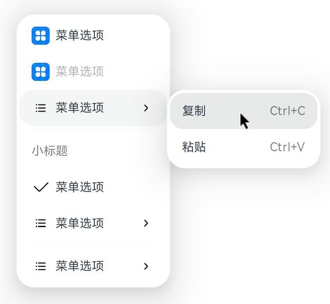
创建支持右键或长按的菜单
通过bindContextMenu接口自定义菜单,设置菜单弹出的触发方式,触发方式为右键或长按。使用bindContextMenu弹出的菜单项是在独立子窗口内的,可显示在应用窗口外部。
- @Builder开发菜单内的内容与上文写法相同。
- 确认菜单的弹出方式,使用bindContextMenu属性绑定组件。示例中为右键弹出菜单。
Button('click for Menu')
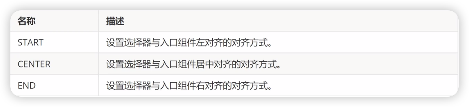
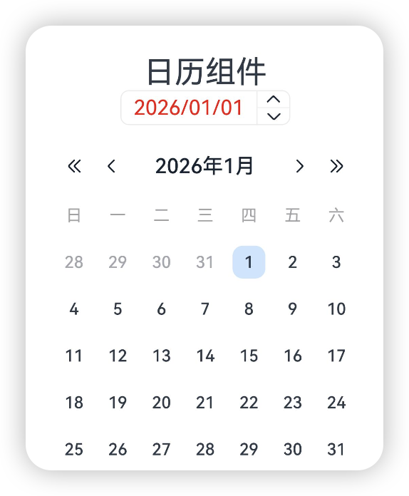
.bindContextMenu(this.MyMenu, ResponseType.RightClick)CalendarPicker组件

日历选择器组件,提供下拉日历弹窗,可以让用户选择日期
CalendarPicker(options?:CalendarOptions)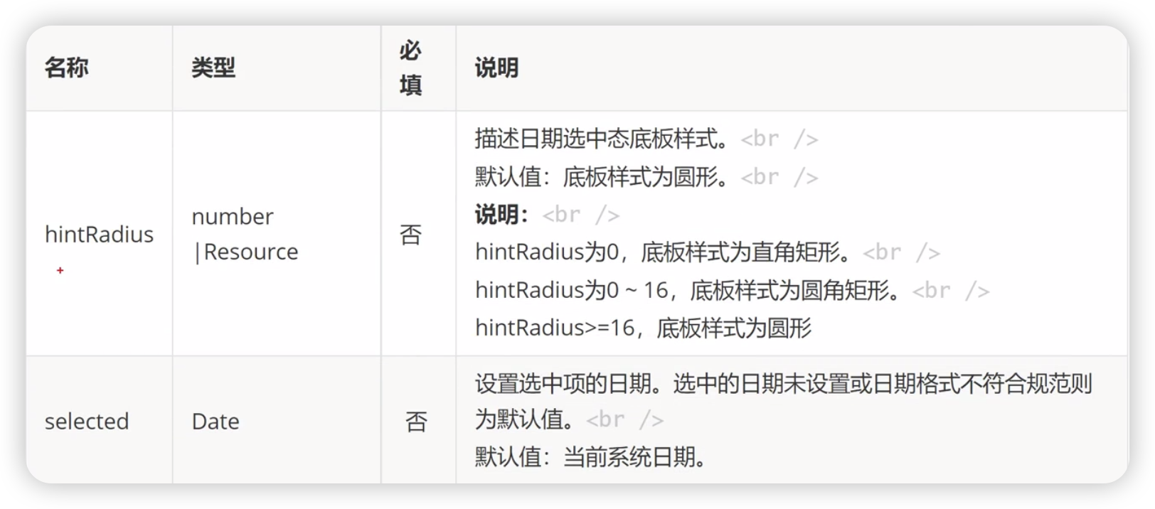
基本使用
CalendaAlign枚举类型
@Entry
@Component
struct  Index {
  private selectedDate:Date = new Date("2026-01-01");

  build() {
    Column() {
      Text('日历组件').fontSize(30)
      Column() {
        CalendarPicker({hintRadius: 10,selected: this.selectedDate})
          .edgeAlign(CalendarAlign.CENTER)
      }
    }
  }
}
textStyle 入口区的文本颜色、字号、字体粗细
@Entry
@Component
struct  Index {
  private selectedDate:Date = new Date("2026-01-01");

  build() {
    Column() {
      Text('日历组件').fontSize(30)
      Column() {
        CalendarPicker({hintRadius: 10,selected: this.selectedDate})
          .edgeAlign(CalendarAlign.CENTER)
          .textStyle({
            color: 'red',
            font: {size: 20, weight: FontWeight.Normal}
          })
      }
      .width('100%')
    }
  }
}
事件
除支持通用事件外,还支持以下事件
onChange
选择日期时触发该事件
@Entry
@Component
struct Index {
private selectedDate:Date = new Date("2026-01-01");
build() {
Column() {
Text('日历组件').fontSize(30)
Column() {
CalendarPicker({hintRadius: 10,selected: this.selectedDate})
.edgeAlign(CalendarAlign.CENTER)
.textStyle({
color: 'red',
font: {size: 20, weight: FontWeight.Normal}
})
.onChange(value => {
console.log('当前选中时间', JSON.stringify(value))
})
}
.width('100%')
}
}
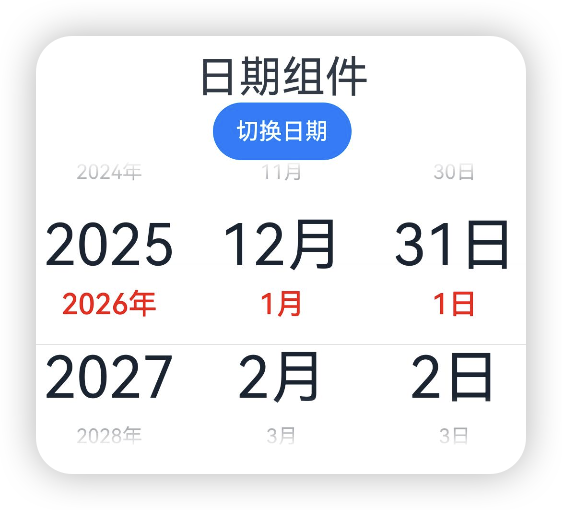
}DatePicker组件

日期选择组件,用于根据指定日期范围创建日期滑动选择器
基本使用
DatePicker({options?: DatePickerOptions})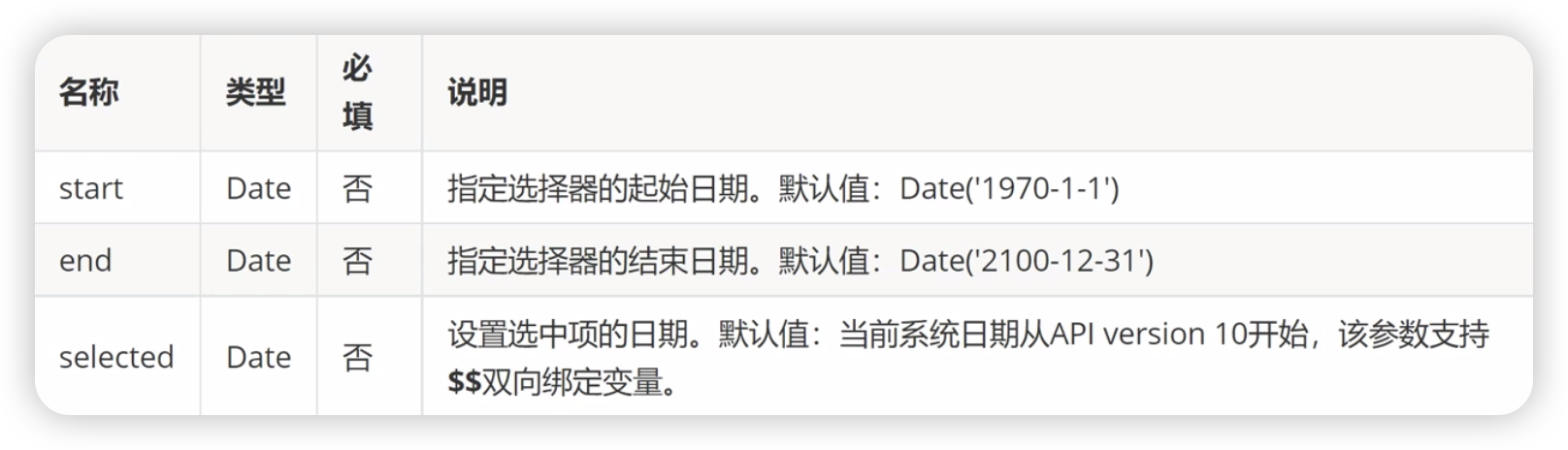

@Entry
@Component
struct  Index {
  private selectedDate:Date = new Date("2026-01-01");

  build() {
    Column() {
      Text('日期组件').fontSize(30)
      Column() {
        DatePicker({
          start: new Date('2010-01-01'),
          end: new Date('2060-01-01'),
          selected: this.selectedDate
        })
      }
      .width('100%')
    }
  }
}
属性
除支持通用属性外,还支持以下属性
lunar

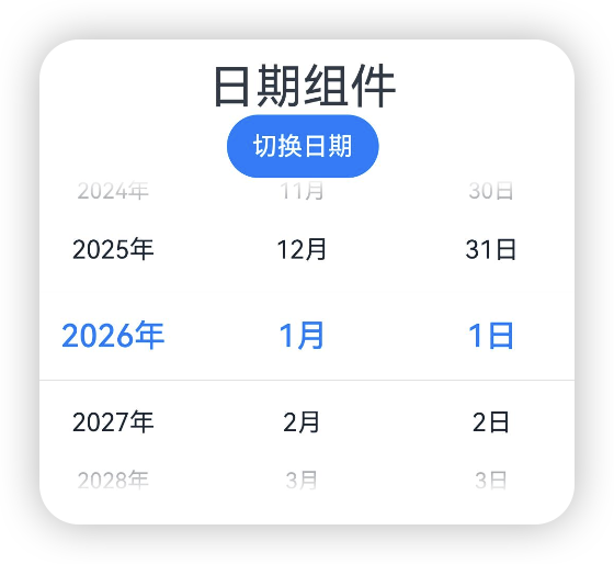
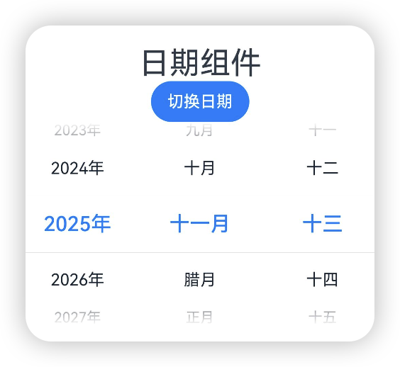
@Entry
@Component
struct  Index {
  private selectedDate:Date = new Date("2026-01-01");
  @State isLunar:boolean = false;

  build() {
    Column() {
      Text('日期组件').fontSize(30)
      Button('切换日期')
        .onClick(() => {
            this.isLunar = !this.isLunar;
        })
      Column() {
        DatePicker({
          start: new Date('2010-01-01'),
          end: new Date('2060-01-01'),
          selected: this.selectedDate
        })
          .lunar(this.isLunar)
      }
      .width('100%')
    }
  }
}
disappearTextStyle[10+]
设置所有选项中最上和最下两个选项的文本样式

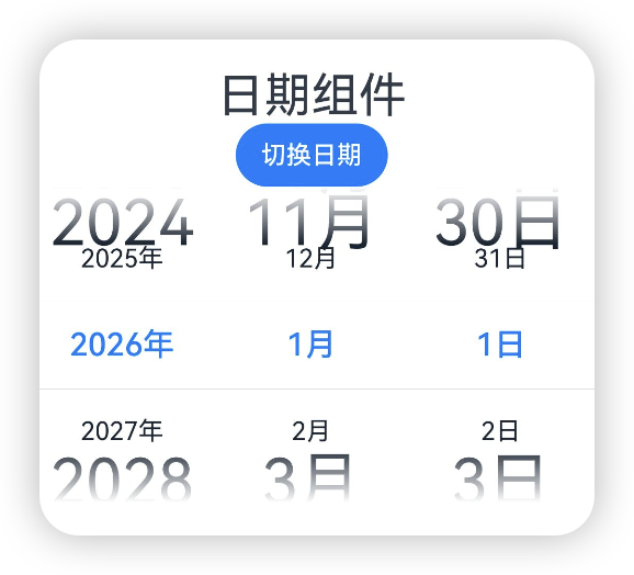
@Entry
@Component
struct  Index {
  private selectedDate:Date = new Date("2026-01-01");
  @State isLunar:boolean = false;

  build() {
    Column() {
      Text('日期组件').fontSize(30)
      Button('切换日期')
        .onClick(() => {
            this.isLunar = !this.isLunar;
        })
      Column() {
        DatePicker({
          start: new Date('2010-01-01'),
          end: new Date('2060-01-01'),
          selected: this.selectedDate
        })
          .lunar(this.isLunar)
          .disappearTextStyle({color: '#ff182431', font: {size: '40fp', weight: FontWeight.Regular}})
      }
      .width('100%')
    }
  }
}
textStyle[10+]
设置所有选项中除了最上和最下及选中以外的文本样式
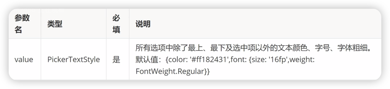
@Entry
@Component
struct Index {
private selectedDate:Date = new Date("2026-01-01");
@State isLunar:boolean = false;
build() {
Column() {
Text('日期组件').fontSize(30)
Button('切换日期')
.onClick(() => {
this.isLunar = !this.isLunar;
})
Column() {
DatePicker({
start: new Date('2010-01-01'),
end: new Date('2060-01-01'),
selected: this.selectedDate
})
.lunar(this.isLunar)
.textStyle({color: '#ff182431', font: {size: '40fp', weight: FontWeight.Regular}})
}
.width('100%')
}
}
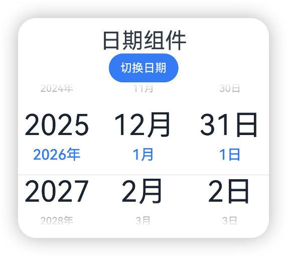
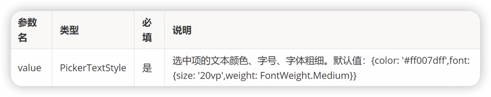
}selectedTextStyle[10+]
设置选中项的文本样式
@Entry
@Component
struct  Index {
  private selectedDate:Date = new Date("2026-01-01");
  @State isLunar:boolean = false;

  build() {
    Column() {
      Text('日期组件').fontSize(30)
      Button('切换日期')
        .onClick(() => {
            this.isLunar = !this.isLunar;
        })
      Column() {
        DatePicker({
          start: new Date('2010-01-01'),
          end: new Date('2060-01-01'),
          selected: this.selectedDate
        })
          .lunar(this.isLunar)
          .textStyle({color: '#ff182431', font: {size: '40fp', weight: FontWeight.Regular}})
          .selectedTextStyle({color: 'red', font: {size: '20vp', weight: FontWeight.Medium}})
      }
      .width('100%')
    }
  }
}
事件
除了支持通用事件外,还支持以下事件
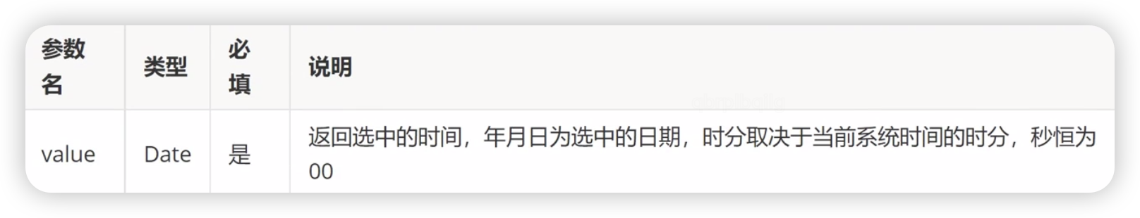
onDateChange[10+]
选择日期时触发该事件
TextPicker组件

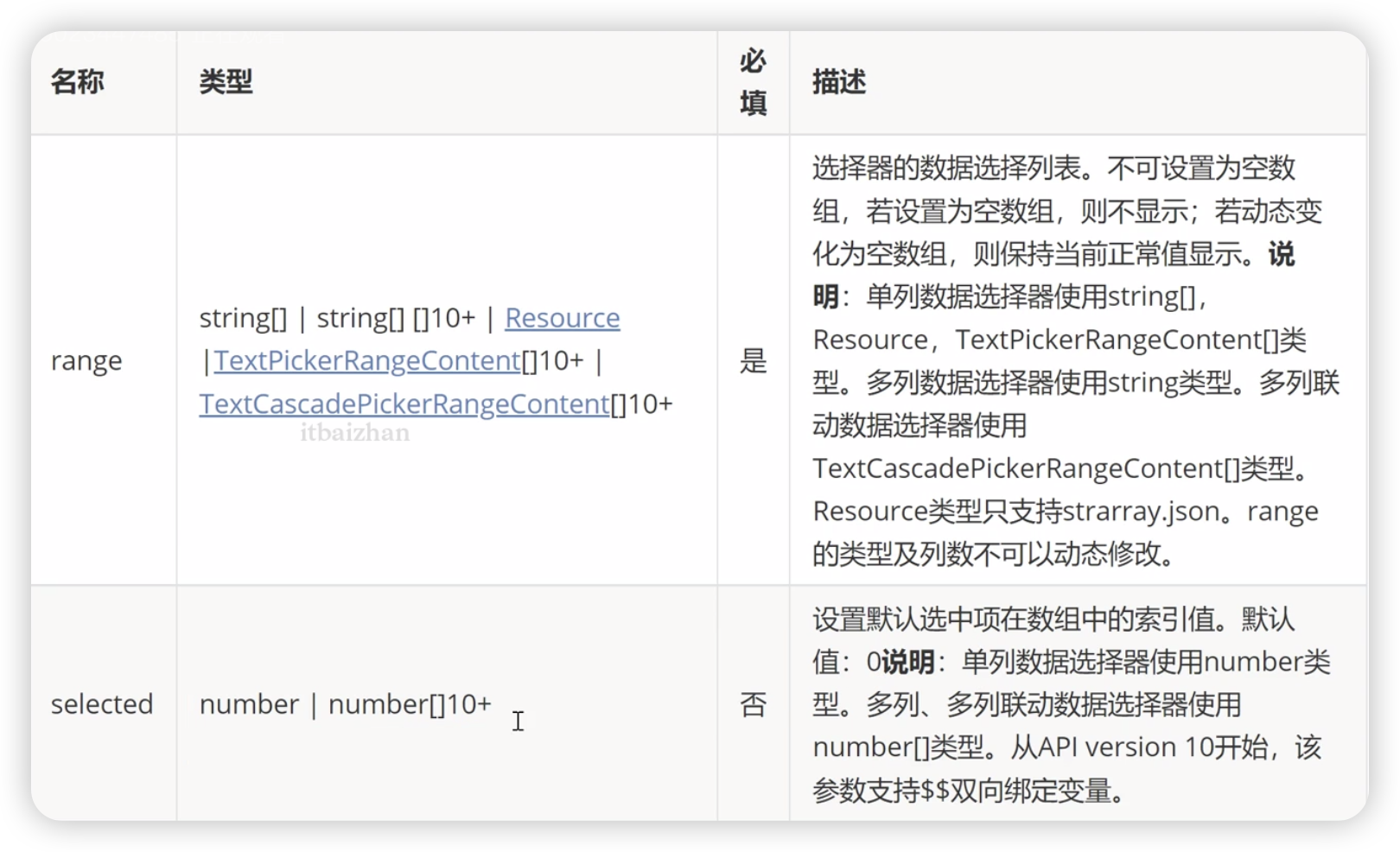
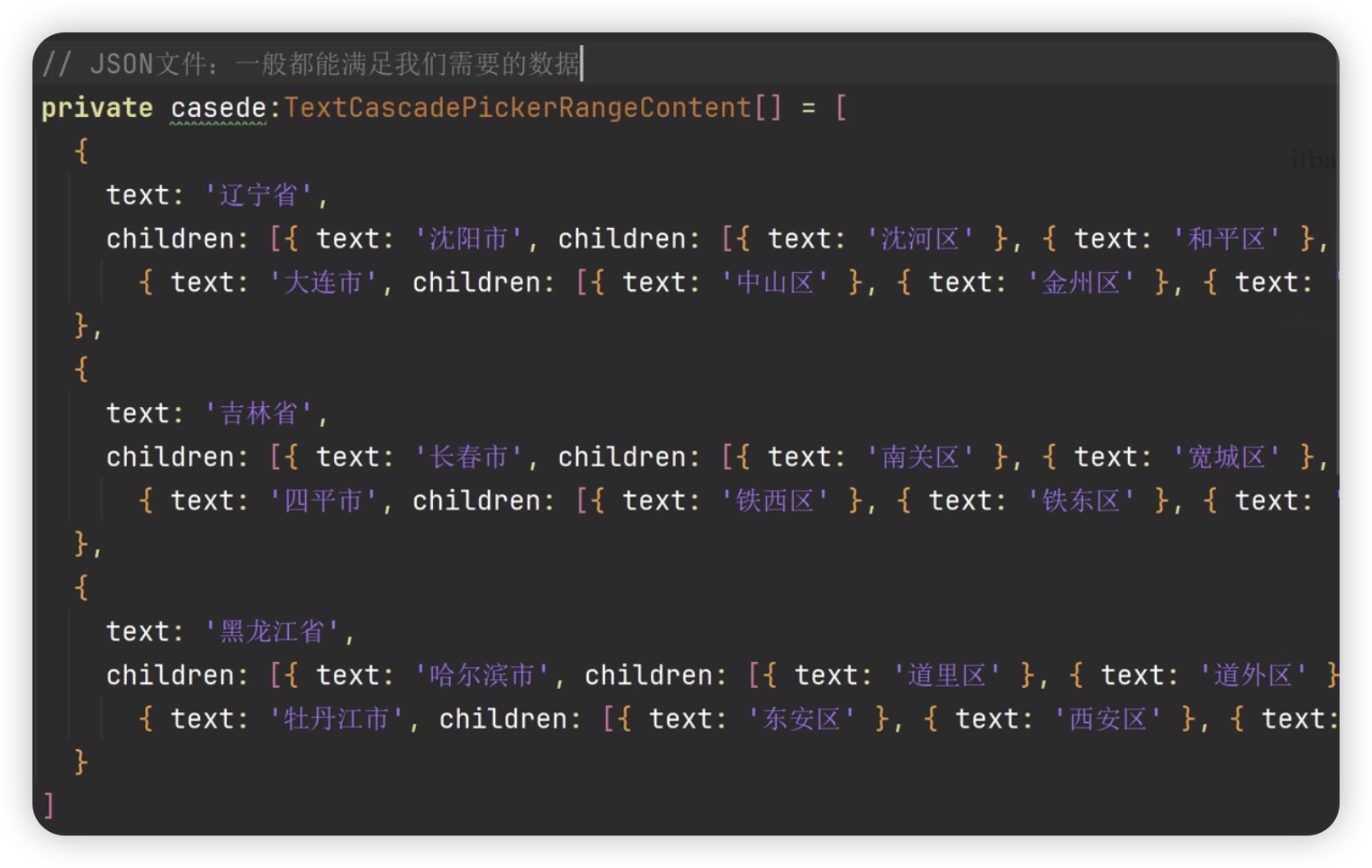
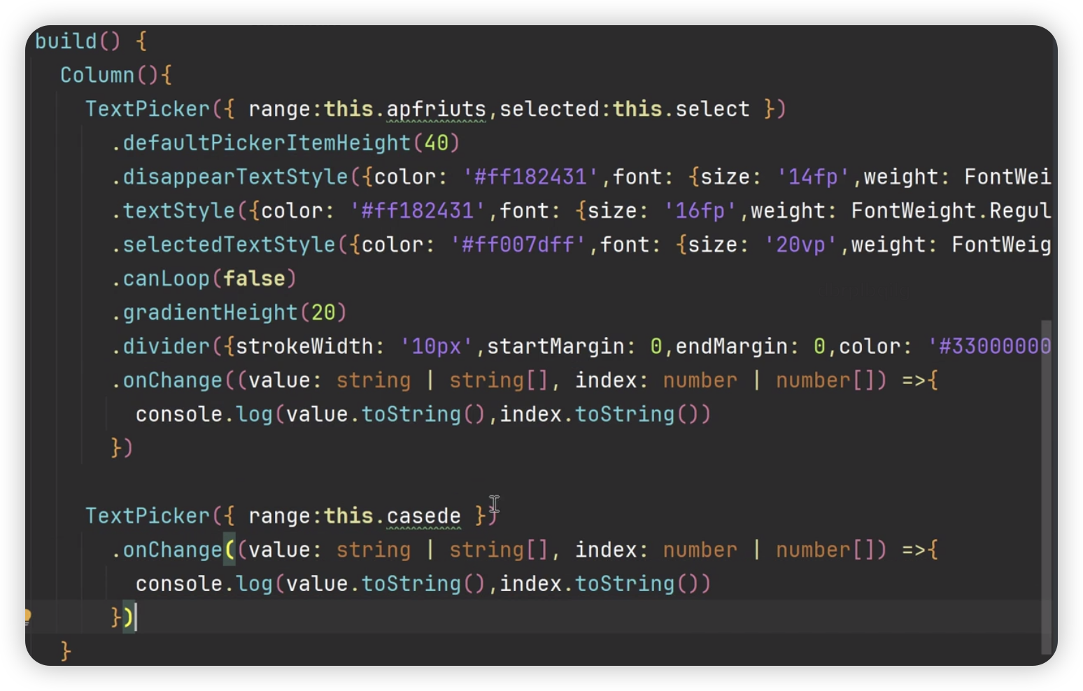
滑动选择文本内容的组件,根据range指定的选择范围创建文本选择器
TextPicker(options?:TextPickerOprions)基本使用
@Entry
@Component
struct Index {
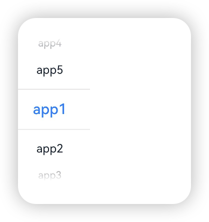
private apfriuts:string[] = ['app1', 'app2', 'app3', 'app4', 'app5'];
private select:number = 0
build() {
Column() {
TextPicker({range: this.apfriuts, selected: this.select})
}
}
}属性
除了支持通用属性外还支持以下属性
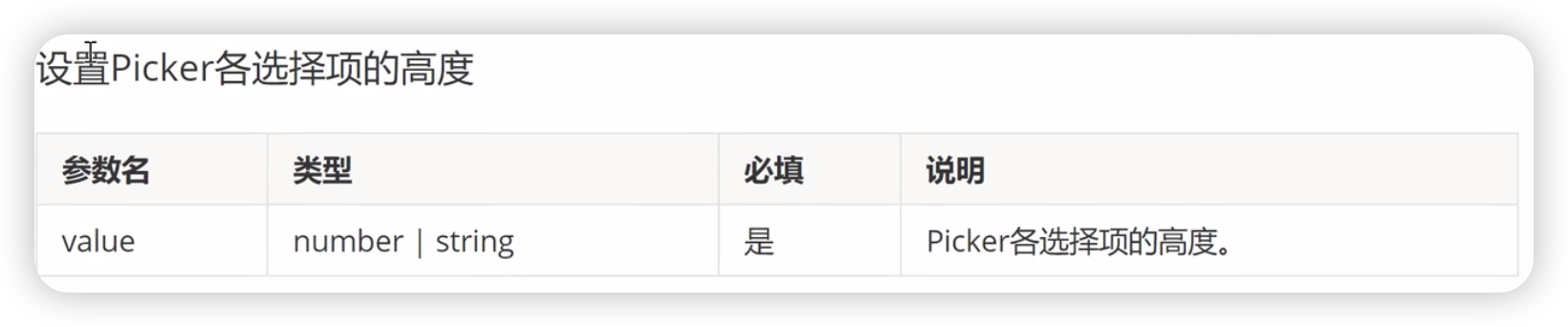
defaultPickerItemHeight
disappearTextStyle[10+]

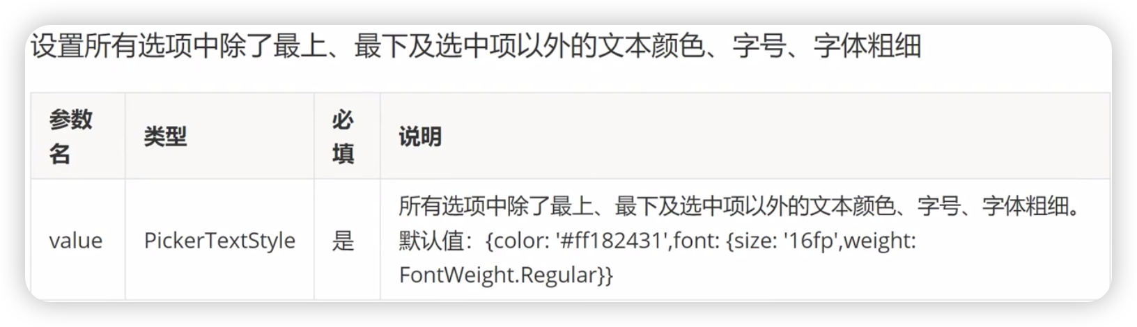
textStyle[10+]
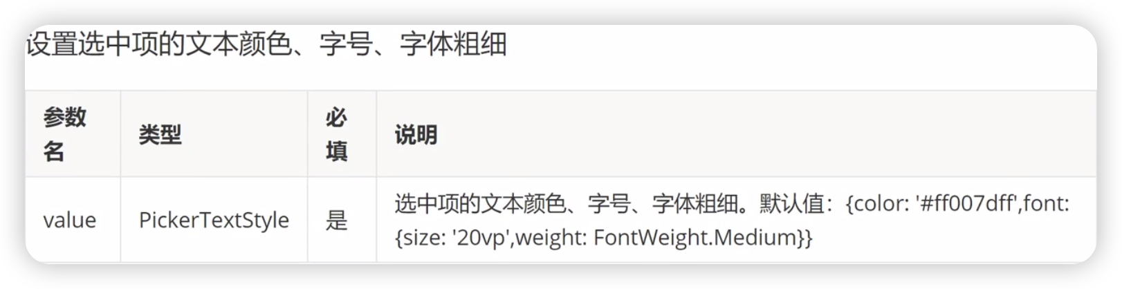
selectedTextStyle[10+]
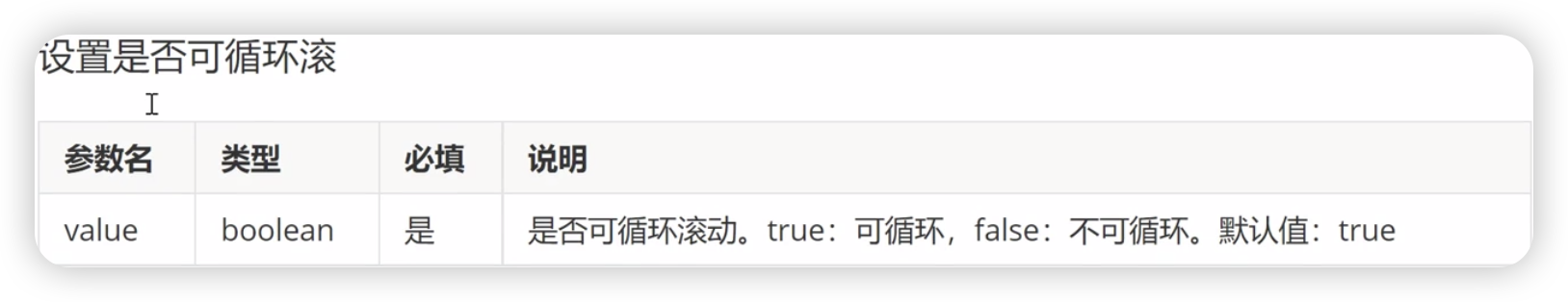
canLoop[10+]
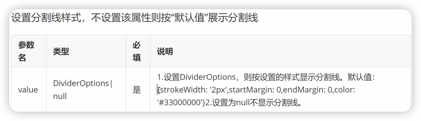
divider[12+]
gradientHieght[12+]

事件
除了支持通用事件外,还支持以下事件
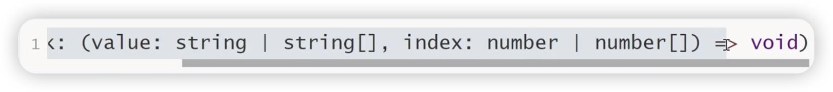
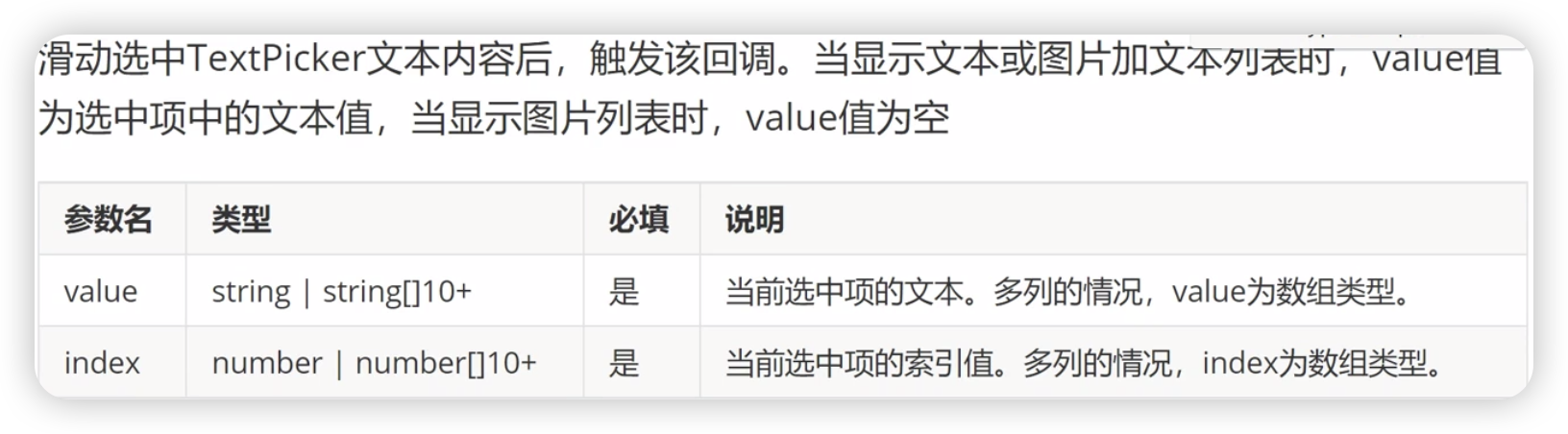
onChange

TimePicker组件

时间选择组件,根据指定参数创建选择器,支持选择小时及分钟,默认以24小时的时间区间创建滑动选择器
TimePicker(options?:TimePickerOptions)基本使用
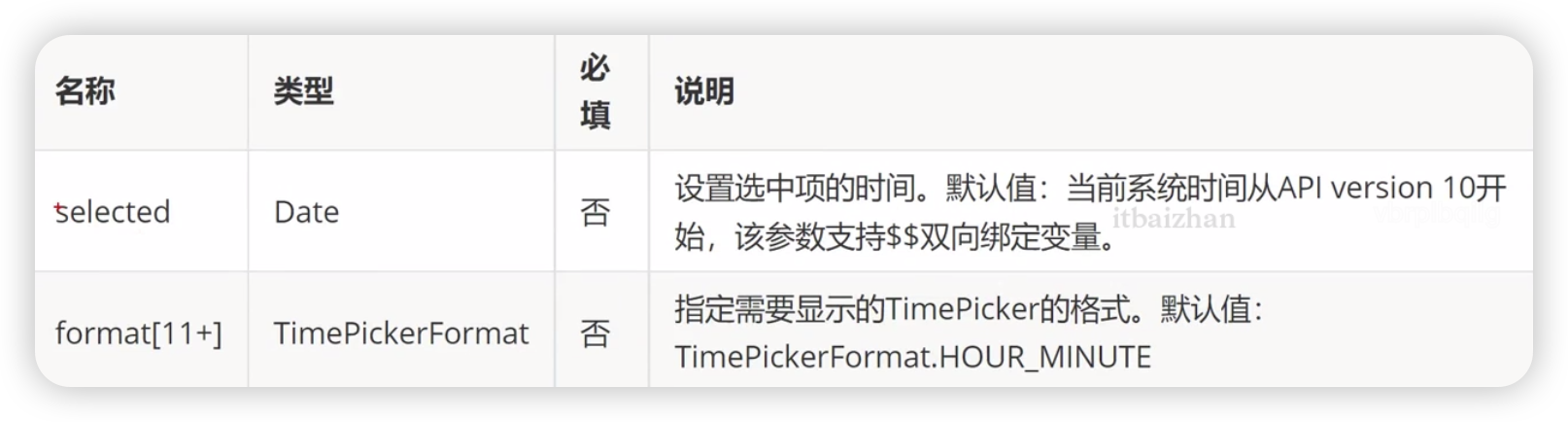
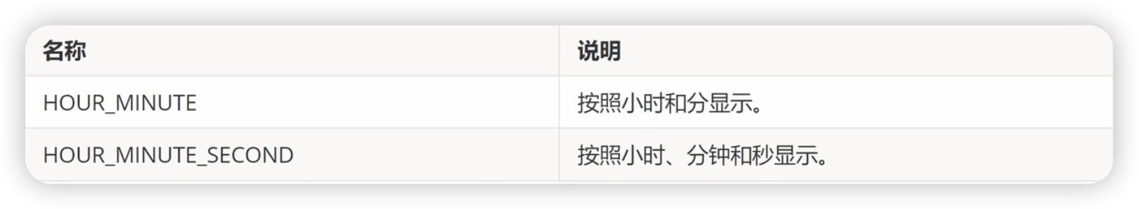
TimePickerFormat[11+]枚举说明
属性
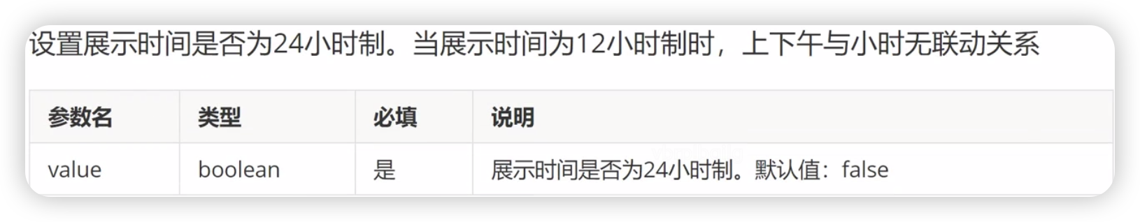
useMilitaryTime
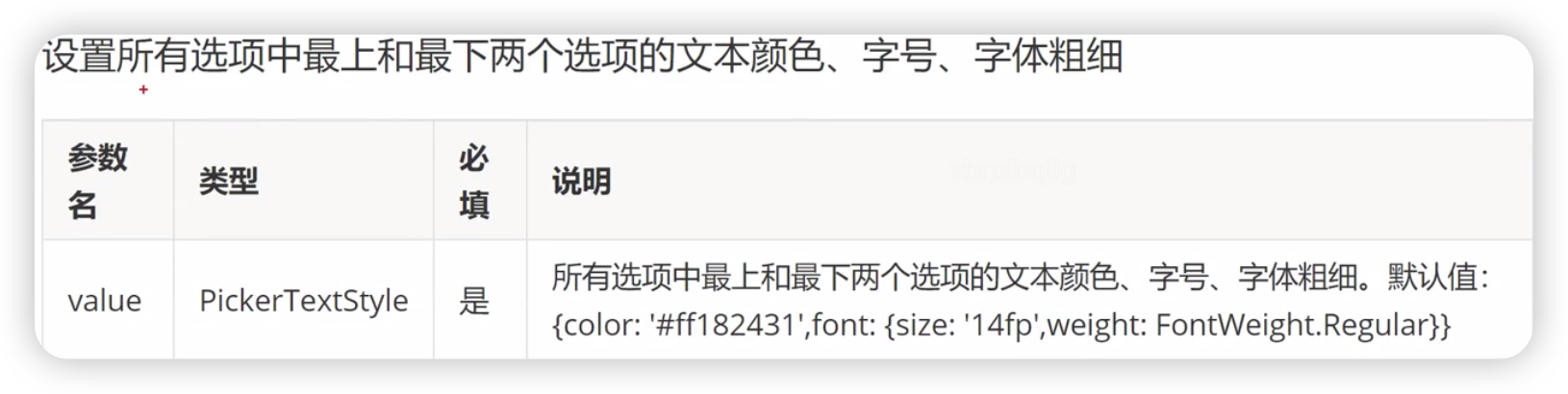
disappearTextStyle[10+]
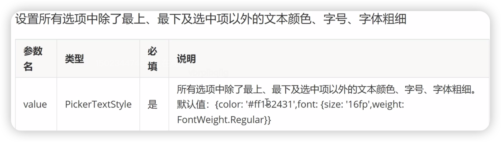
textStyle[10+]
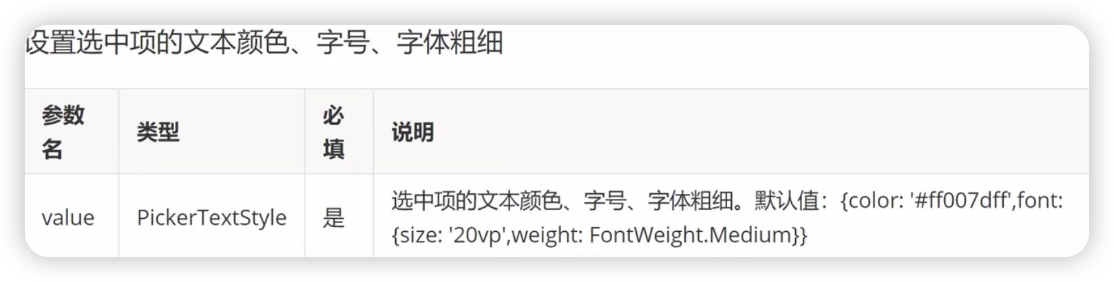
selectedTextStyle[10+]
loop[11+]

事件
除了支持通用事件外还支持以下事件
onChange

Marquee组件

跑马灯组件,用于滚动展示一段单行文本。仅当文本内容宽度超过组件宽度时滚动,不超过时不滚动。
基本使用

除支持通用属性外,还支持如下属性:
| 名称 | 类型 | 默认值 | 必填 | 描述 |
| scrollamount | number | 6 | 否 | 跑马灯每次滚动时移动的最大长度。 |
| loop | number | -1 | 否 | 跑马灯滚动的次数。如果未指定,则默认值为-1,当该值小于等于零时表示marquee将连续滚动。 |
| direction | string | left | 否 | 设置跑马灯的文字滚动方向,可选值为left和right。 |
样式
除支持通用样式外,还支持如下样式:
| 名称 | 类型 | 默认值 | 必填 | 描述 |
| color | <color> | #e5000000 | 否 | 设置跑马灯中文字的文本颜色。 |
| font-size | <length> | 37.5 | 否 | 设置跑马灯中文字的文本尺寸。 |
| allow-scale | boolean | true | 否 | 设置跑马灯中文字的文本尺寸是否跟随系统设置字体缩放尺寸进行放大缩小。 如果在config描述文件中针对ability配置了fontSize的config-changes标签,则应用不会重启而直接生效。 |
| font-weight | number | string | normal | 否 | 设置跑马灯中文字的字体的粗细,见text组件font-weight的样式属性 。 |
| font-family | string | sans-serif | 否 | 设置跑马灯中文字的字体列表,用逗号分隔,每个字体用字体名或者字体族名设置。列表中第一个系统中存在的或者通过自定义字体 指定的字体,会被选中作为文本的字体。 |
事件
除支持通用事件外,还支持如下事件:
| 名称 | 参数 | 描述 |
| bounce | - | 当文本滚动到末尾时触发该事件。 |
| finish | - | 当完成滚动次数时触发该事件。需要在 loop 属性值大于 0 时触发。 |
| start | - | 当文本滚动开始时触发该事件。 |
方法
除支持通用方法外,还支持如下方法:
| 名称 | 参数 | 描述 |
| start | - | 开始滚动。 |
| stop | - | 停止滚动。 |
示例
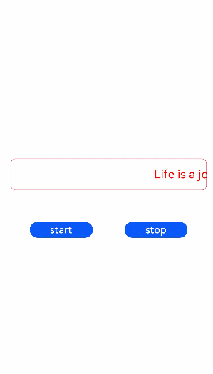
<!-- xxx.hml -->
  <div class="tutorial-page">
    <div class="mymarquee">
  <marquee  style="color: {{color1}}" loop="{{loopval}}" scrollamount="{{scroll}}" direction="{{isleft}}" class="marqueetext"
id="testmarquee" onfinish="setfinish">
  Life is a journey, not the destination.
  </marquee>
  </div>
  <div style="width: 600px;height: 150px;flex-direction: row;justify-content: space-around;">
    <button onclick="makestart"  value="start"></button>
  <button onclick="makestop" value="stop"></button>
  </div>
  </div>
/* xxx.css */
.tutorial-page {
width: 750px;
height: 100%;
flex-direction: column;
align-items: center;
justify-content: center;
}
.marqueetext {
font-size: 37px;
}
.mymarquee {
margin-top: 20px;
width:100%;
height: 100px;
margin-left: 50px;
margin-right: 50px;
border: 1px solid #dc0f27;
border-radius: 15px;
align-items: center;
}
button{
width: 200px;
height: 80px;
margin-top: 100px;
}// xxx.js
export default {
private: {
loopval: 1,
scroll: 8,
color1: 'red'
},
onInit(){
},
setfinish(e) {
this.loopval= this.loopval + 1,
this.r = Math.floor(Math.random()*255),
this.g = Math.floor(Math.random()*255),
this.b = Math.floor(Math.random()*255),
this.color1 = 'rgba('+ this.r +','+ this.g +','+ this.b +',0.8)',
this.$element('testmarquee').start(),
this.loopval= this.loopval - 1
},
makestart(e) {
this.$element('testmarquee').start()
},
makestop(e) {
this.$element('testmarquee').stop()
}
}
Stepper组件

步骤导航器组件,适用于引导用户按照步骤完成任务的导航场景。
说明
- 该组件从API Version 8开始支持。后续版本如有新增内容,则采用上角标单独标记该内容的起始版本。
子组件
仅能包含子组件StepperItem。
接口
Stepper(value?: { index?: number })
元服务API: 从API version 11开始,该接口支持在元服务中使用。
参数:
| 参数名 | 参数类型 | 必填 | 参数描述 |
| value | { index?: number } | 否 | 设置步骤导航器当前显示StepperItem的索引值。 默认值:0 从API version 10开始,该参数支持$$双向绑定变量。 |
属性
无
事件
onFinish
onFinish(callback: () => void)
步骤导航器最后一个StepperItem的nextLabel被点击时,并且ItemState属性为Normal时,触发该回调。
元服务API: 从API version 11开始,该接口支持在元服务中使用。
系统能力: SystemCapability.ArkUI.ArkUI.Full
onSkip
onSkip(callback: () => void)
当前显示的StepperItem状态为ItemState.Skip时,nextLabel被点击时触发该回调。
元服务API: 从API version 11开始,该接口支持在元服务中使用。
系统能力: SystemCapability.ArkUI.ArkUI.Full
onChange
onChange(callback: (prevIndex: number, index: number) => void)
点击当前StepperItem的prevLabel进行步骤切换时触发该回调;或点击当前StepperItem的nextLabel,当前页面不为步骤导航器最后一个StepperItem且ItemState属性为Normal时,触发该回调。
元服务API: 从API version 11开始,该接口支持在元服务中使用。
系统能力: SystemCapability.ArkUI.ArkUI.Full
参数:
| 参数名 | 类型 | 必填 | 说明 |
| prevIndex | number | 是 | 切换前的步骤页索引值。 |
| index | number | 是 | 切换后的步骤页(前一页或者下一页)索引值。 |
onNext
onNext(callback: (index: number, pendingIndex: number) => void)
点击StepperItem的nextLabel切换下一步骤时,当前页面不为步骤导航器最后一个StepperItem且ItemState属性为Normal时,触发该回调。
元服务API: 从API version 11开始,该接口支持在元服务中使用。
系统能力: SystemCapability.ArkUI.ArkUI.Full
参数:
| 参数名 | 类型 | 必填 | 说明 |
| index | number | 是 | 当前步骤页索引值。 |
| pendingIndex | number | 是 | 下一步骤页索引值。 |
onPrevious
onPrevious(callback: (index: number, pendingIndex: number) => void)
点击StepperItem的prevLabel切换上一步骤时触发该回调。
元服务API: 从API version 11开始,该接口支持在元服务中使用。
系统能力: SystemCapability.ArkUI.ArkUI.Full
参数:
| 参数名 | 类型 | 必填 | 说明 |
| index | number | 是 | 当前步骤页索引值。 |
| pendingIndex | number | 是 | 上一步骤页索引值。 |
示例
// xxx.ets
@Styles function itemStyle () {
  .width(336)
    .height(621)
    .margin({ top: 48, left: 12 })
    .borderRadius(24)
    .backgroundColor('#FFFFFF')
}


@Extend(Text) function itemTextStyle () {
  .fontColor('#182431')
    .fontSize(36)
    .fontWeight(500)
    .opacity(0.4)
    .margin({ top: 82, bottom: 40 })
}


@Entry
  @Component
  struct StepperExample {
    @State currentIndex: number = 0
    @State firstState: ItemState = ItemState.Normal
    @State secondState: ItemState = ItemState.Normal
    @State thirdState: ItemState = ItemState.Normal


    build() {
      Stepper({
        index: this.currentIndex
      }) {
        // 第一个步骤页
        StepperItem() {
          Column() {
            Text('Page One')
              .itemTextStyle()
            Button('change status:' + this.firstState)
              .backgroundColor('#007dFF')
              .onClick(() => {
                this.firstState = this.firstState === ItemState.Skip ? ItemState.Normal : ItemState.Skip
              })
          }.itemStyle()
        }
        .nextLabel('Next')
          .status(this.firstState)
        // 第二个步骤页
        StepperItem() {
          Column() {
            Text('Page Two')
              .itemTextStyle()
            Button('change status:' + this.secondState)
              .backgroundColor('#007dFF')
              .onClick(() => {
                this.secondState = this.secondState === ItemState.Disabled ? ItemState.Normal : ItemState.Disabled
              })
          }.itemStyle()
        }
        .nextLabel('Next')
          .prevLabel('Previous')
          .status(this.secondState)
        // 第三个步骤页
        StepperItem() {
          Column() {
            Text('Page Three')
              .itemTextStyle()
            Button('change status:' + this.thirdState)
              .backgroundColor('#007dFF')
              .onClick(() => {
                this.thirdState = this.thirdState === ItemState.Waiting ? ItemState.Normal : ItemState.Waiting
              })
          }.itemStyle()
        }
        .status(this.thirdState)
        // 第四个步骤页
        StepperItem() {
          Column() {
            Text('Page Four')
              .itemTextStyle()
          }.itemStyle()
        }
      }
      .backgroundColor('#F1F3F5')
        .onFinish(() => {
          // 此处可处理点击最后一页的Finish时的逻辑,例如路由跳转等
          console.info('onFinish')
        })
        .onSkip(() => {
          // 此处可处理点击跳过时的逻辑,例如动态修改Stepper的index值使其跳转到某一步骤页等
          console.info('onSkip')
        })
        .onChange((prevIndex?: number, index?: number) => {
          if(index){
            this.currentIndex = index
          }
        })
    }
  }
StepperItem
用作Stepper组件的页面子组件。
说明
- 该组件从API Version 8开始支持。后续版本如有新增内容,则采用上角标单独标记该内容的起始版本。
子组件
支持单个子组件。
接口
StepperItem()
元服务API: 从API version 11开始,该接口支持在元服务中使用。
属性
prevLabel
prevLabel(value: string)
设置左侧文本按钮内容,第一页没有左侧文本按钮,当步骤导航器大于一页时,除第一页外默认值都为“返回”。
元服务API: 从API version 11开始,该接口支持在元服务中使用。
系统能力: SystemCapability.ArkUI.ArkUI.Full
参数:
| 参数名 | 类型 | 必填 | 说明 |
| value | string | 是 | 左侧文本按钮内容。 |
nextLabel
nextLabel(value: string)
设置右侧文本按钮内容,最后一页默认值为“开始”,其余页默认值为“下一步”。
元服务API: 从API version 11开始,该接口支持在元服务中使用。
系统能力: SystemCapability.ArkUI.ArkUI.Full
参数:
| 参数名 | 类型 | 必填 | 说明 |
| value | string | 是 | 右侧文本按钮内容。 |
status
status(value?: ItemState)
设置步骤导航器nextLabel的显示状态。
元服务API: 从API version 11开始,该接口支持在元服务中使用。
系统能力: SystemCapability.ArkUI.ArkUI.Full
参数:
| 参数名 | 类型 | 必填 | 说明 |
| value | 否 | 步骤导航器nextLabel的显示状态。 默认值:ItemState.Normal |
说明
- StepperItem组件不支持设置通用宽度属性,其宽度默认撑满Stepper父组件。
- StepperItem组件不支持设置通用高度属性,其高度由Stepper父组件高度减去label按钮组件高度。
- StepperItem组件不支持设置aspectRadio/constrainSize影响长宽的属性。
ItemState枚举说明
元服务API: 从API version 11开始,该接口支持在元服务中使用。
| 名称 | 描述 |
| Normal | 正常状态,右侧文本按钮正常显示,可点击进入下一个StepperItem。 |
| Disabled | 不可用状态,右侧文本按钮灰度显示,不可点击进入下一个StepperItem。 |
| Waiting | 等待状态,右侧文本按钮不显示,显示等待进度条,不可点击进入下一个StepperItem。 |
| Skip | 跳过状态,右侧文本按钮默认显示“跳过”,此时可在Stepper的onSkip回调中自定义相关逻辑。 |
SymbolSpan
作为Text组件的子组件,用于显示图标小符号的组件。
说明
- 该组件从API Version 11开始支持。后续版本如有新增内容,则采用上角标单独标记该内容的起始版本。
- 该组件支持继承父组件Text的属性,即如果子组件未设置属性且父组件设置属性,则继承父组件设置的全部属性。
- SymbolSpan拖拽不会置灰显示。
子组件
不支持子组件。
接口
SymbolSpan(value: Resource)
元服务API: 从API version 12开始,该接口支持在元服务中使用。
参数:
| 参数名 | 参数类型 | 必填 | 参数描述 |
| value | 是 | SymbolSpan组件的资源名,如 $r('sys.symbol.ohos_wifi')。 |
说明
- $r('sys.symbol.ohos_wifi')中引用的资源为系统预置,SymbolSpan仅支持系统预置的symbol资源名,引用非symbol资源将显示异常。
属性
不支持通用属性,支持以下属性:
fontColor
fontColor(value: Array<ResourceColor>)
设置SymbolSpan组件颜色。
元服务API: 从API version 12开始,该接口支持在元服务中使用。
系统能力: SystemCapability.ArkUI.ArkUI.Full
参数:
| 参数名 | 类型 | 必填 | 说明 |
| value | Array<ResourceColor > | 是 | SymbolSpan组件颜色。 默认值:不同渲染策略下默认值不同。 |
fontSize
fontSize(value: number | string | Resource)
设置SymbolSpan组件大小。
元服务API: 从API version 12开始,该接口支持在元服务中使用。
系统能力: SystemCapability.ArkUI.ArkUI.Full
参数:
| 参数名 | 类型 | 必填 | 说明 |
| value | number | string | Resource | 是 | SymbolSpan组件大小。 默认值:系统默认值。 |
fontWeight
fontWeight(value: number | FontWeight | string)
设置SymbolSpan组件粗细。number类型取值[100,900],取值间隔为100,默认为400,取值越大,字体越粗。string类型仅支持number类型取值的字符串形式,例如“400”,以及“bold”、“bolder”、“lighter”、“regular” 、“medium”分别对应FontWeight中相应的枚举值。
sys.symbol.ohos_lungs图标不支持设置fontWeight。
元服务API: 从API version 12开始,该接口支持在元服务中使用。
系统能力: SystemCapability.ArkUI.ArkUI.Full
参数:
| 参数名 | 类型 | 必填 | 说明 |
| value | number | string | FontWeight | 是 | SymbolSpan组件粗细。 默认值:FontWeight.Normal |
renderingStrategy
renderingStrategy(value: SymbolRenderingStrategy)
设置SymbolSpan渲染策略。
元服务API: 从API version 12开始,该接口支持在元服务中使用。
系统能力: SystemCapability.ArkUI.ArkUI.Full
参数:
| 参数名 | 类型 | 必填 | 说明 |
| value | 是 | SymbolSpan渲染策略。 默认值:SymbolRenderingStrategy.SINGLE |
不同渲染策略效果可参考以下示意图。
effectStrategy
effectStrategy(value: SymbolEffectStrategy)
设置SymbolSpan动效策略。
元服务API: 从API version 12开始,该接口支持在元服务中使用。
系统能力: SystemCapability.ArkUI.ArkUI.Full
参数:
| 参数名 | 类型 | 必填 | 说明 |
| value | 是 | SymbolSpan动效策略。 默认值:SymbolEffectStrategy.NONE |
事件
不支持通用事件。
示例
// xxx.ets
@Entry
  @Component
  struct Index {
    build() {
      Column() {
        Row() {
          Column() {
            Text("Light")
            Text() {
              SymbolSpan($r('sys.symbol.ohos_trash'))
                .fontWeight(FontWeight.Lighter)
                .fontSize(96)
            }
          }


          Column() {
            Text("Normal")
            Text() {
              SymbolSpan($r('sys.symbol.ohos_trash'))
                .fontWeight(FontWeight.Normal)
                .fontSize(96)
            }
          }


          Column() {
            Text("Bold")
            Text() {
              SymbolSpan($r('sys.symbol.ohos_trash'))
                .fontWeight(FontWeight.Bold)
                .fontSize(96)
            }
          }
        }


        Row() {
          Column() {
            Text("单色")
            Text() {
              SymbolSpan($r('sys.symbol.ohos_folder_badge_plus'))
                .fontSize(96)
                .renderingStrategy(SymbolRenderingStrategy.SINGLE)
                .fontColor([Color.Black, Color.Green, Color.White])
            }
          }


          Column() {
            Text("多色")
            Text() {
              SymbolSpan($r('sys.symbol.ohos_folder_badge_plus'))
                .fontSize(96)
                .renderingStrategy(SymbolRenderingStrategy.MULTIPLE_COLOR)
                .fontColor([Color.Black, Color.Green, Color.White])
            }
          }


          Column() {
            Text("分层")
            Text() {
              SymbolSpan($r('sys.symbol.ohos_folder_badge_plus'))
                .fontSize(96)
                .renderingStrategy(SymbolRenderingStrategy.MULTIPLE_OPACITY)
                .fontColor([Color.Black, Color.Green, Color.White])
            }
          }
        }


        Row() {
          Column() {
            Text("无动效")
            Text() {
              SymbolSpan($r('sys.symbol.ohos_wifi'))
                .fontSize(96)
                .effectStrategy(SymbolEffectStrategy.NONE)
            }
          }


          Column() {
            Text("整体缩放动效")
            Text() {
              SymbolSpan($r('sys.symbol.ohos_wifi'))
                .fontSize(96)
                .effectStrategy(1)
            }
          }


          Column() {
            Text("层级动效")
            Text() {
              SymbolSpan($r('sys.symbol.ohos_wifi'))
                .fontSize(96)
                .effectStrategy(2)
            }
          }
        }
      }
    }
  }
SymbolGlyph
显示图标小符号的组件。
说明
- 该组件从API Version 11开始支持。后续版本如有新增内容,则采用上角标单独标记该内容的起始版本。
子组件
不支持子组件。
接口
SymbolGlyph(value?: Resource)
元服务API: 从API version 12开始,该接口支持在元服务中使用。
参数:
| 参数名 | 参数类型 | 必填 | 参数描述 |
| value | 否 | SymbolGlyph组件的资源名,如 $r('sys.symbol.ohos_wifi')。 |
说明
- $r('sys.symbol.ohos_wifi')中引用的资源为系统预置,SymbolGlyph仅支持系统预置的symbol资源名,引用非symbol资源将显示异常。
属性
支持通用属性,不支持文本通用属性,仅支持以下特有属性:
fontColor
fontColor(value: Array<ResourceColor>)
设置SymbolGlyph组件颜色。
元服务API: 从API version 12开始,该接口支持在元服务中使用。
系统能力: SystemCapability.ArkUI.ArkUI.Full
参数:
| 参数名 | 类型 | 必填 | 说明 |
| value | Array<ResourceColor > | 是 | SymbolGlyph组件颜色。 默认值:不同渲染策略下默认值不同。 |
fontSize
fontSize(value: number | string | Resource)
设置SymbolGlyph组件大小。
组件的图标显示大小由fontSize控制,设置width或height后,其他通用属性仅对组件的占位大小生效。
元服务API: 从API version 12开始,该接口支持在元服务中使用。
系统能力: SystemCapability.ArkUI.ArkUI.Full
参数:
| 参数名 | 类型 | 必填 | 说明 |
| value | number | string | Resource | 是 | SymbolGlyph组件大小。 默认值:系统默认值。 |
fontWeight
fontWeight(value: number | FontWeight | string)
设置SymbolGlyph组件粗细。number类型取值[100,900],取值间隔为100,默认为400,取值越大,字体越粗。string类型仅支持number类型取值的字符串形式,例如“400”,以及“bold”、“bolder”、“lighter”、“regular” 、“medium”分别对应FontWeight中相应的枚举值。
sys.symbol.ohos_lungs图标不支持设置fontWeight。
元服务API: 从API version 12开始,该接口支持在元服务中使用。
系统能力: SystemCapability.ArkUI.ArkUI.Full
参数:
| 参数名 | 类型 | 必填 | 说明 |
| value | number | string | FontWeight | 是 | SymbolGlyph组件粗细。 默认值:FontWeight.Normal |
renderingStrategy
renderingStrategy(value: SymbolRenderingStrategy)
设置SymbolGlyph组件渲染策略。
元服务API: 从API version 12开始,该接口支持在元服务中使用。
系统能力: SystemCapability.ArkUI.ArkUI.Full
参数:
| 参数名 | 类型 | 必填 | 说明 |
| value | 是 | SymbolGlyph组件渲染策略。 默认值:SymbolRenderingStrategy.SINGLE |
不同渲染策略效果可参考以下示意图。
effectStrategy
effectStrategy(value: SymbolEffectStrategy)
设置SymbolGlyph组件动效策略。
元服务API: 从API version 12开始,该接口支持在元服务中使用。
系统能力: SystemCapability.ArkUI.ArkUI.Full
参数:
| 参数名 | 类型 | 必填 | 说明 |
| value | 是 | SymbolGlyph组件动效策略。 默认值:SymbolEffectStrategy.NONE |
symbolEffect12+
symbolEffect(symbolEffect: SymbolEffect, isActive?: boolean)
设置SymbolGlyph组件动效策略及播放状态。
元服务API: 从API version 12开始,该接口支持在元服务中使用。
系统能力: SystemCapability.ArkUI.ArkUI.Full
参数:
| 参数名 | 类型 | 必填 | 说明 |
| symbolEffect | 是 | SymbolGlyph组件动效策略。 默认值:SymbolEffect | |
| isActive | boolean | 否 | SymbolGlyph组件动效播放状态。 默认值:false |
symbolEffect12+
symbolEffect(symbolEffect: SymbolEffect, triggerValue?: number)
设置SymbolGlyph组件动效策略及播放触发器。
元服务API: 从API version 12开始,该接口支持在元服务中使用。
系统能力: SystemCapability.ArkUI.ArkUI.Full
参数:
| 参数名 | 类型 | 必填 | 说明 |
| symbolEffect | 是 | SymbolGlyph组件动效策略。 默认值:SymbolEffect | |
| triggerValue | number | 否 | SymbolGlyph组件动效播放触发器,在数值变更时触发动效。 如果首次不希望触发动效,设置-1。 |
说明
- 动效属性,仅支持使用effectStrategy属性或单个symbolEffect属性,不支持多种动效属性混合使用。
SymbolEffect12+对象说明
定义SymbolEffect类。
卡片能力: 从API version 12开始,该接口支持在ArkTS卡片中使用。
元服务API: 从API version 12开始,该接口支持在元服务中使用。
系统能力: SystemCapability.ArkUI.ArkUI.Full
constructor12+
constructor()
SymbolEffect的构造函数,无动效。
ScaleSymbolEffect12+对象说明
ScaleSymbolEffect继承自父类SymbolEffect。
卡片能力: 从API version 12开始,该接口支持在ArkTS卡片中使用。
元服务API: 从API version 12开始,该接口支持在元服务中使用。
系统能力: SystemCapability.ArkUI.ArkUI.Full
属性
| 名称 | 参数类型 | 必填 | 描述 |
| scope | 否 | 动效范围。 默认值:EffectScope.LAYER | |
| direction | 否 | 动效方向。 默认值:EffectDirection.DOWN |
constructor12+
constructor(scope?: EffectScope, direction?: EffectDirection)
ScaleSymbolEffect的构造函数,缩放动效。
卡片能力: 从API version 12开始,该接口支持在ArkTS卡片中使用。
元服务API: 从API version 12开始,该接口支持在元服务中使用。
系统能力: SystemCapability.ArkUI.ArkUI.Full
参数:
| 参数名 | 参数类型 | 必填 | 参数描述 |
| scope | 否 | 动效范围。 默认值:EffectScope.LAYER | |
| direction | 否 | 动效方向。 默认值:EffectDirection.DOWN |
HierarchicalSymbolEffect12+对象说明
HierarchicalSymbolEffect继承自父类SymbolEffect。
卡片能力: 从API version 12开始,该接口支持在ArkTS卡片中使用。
元服务API: 从API version 12开始,该接口支持在元服务中使用。
系统能力: SystemCapability.ArkUI.ArkUI.Full
属性
| 名称 | 参数类型 | 必填 | 描述 |
| fillStyle | 否 | 动效模式。 默认值:EffectFillStyle.CUMULATIVE |
constructor12+
constructor(fillStyle?: EffectFillStyle)
HierarchicalSymbolEffect的构造函数,层级动效。
卡片能力: 从API version 12开始,该接口支持在ArkTS卡片中使用。
元服务API: 从API version 12开始,该接口支持在元服务中使用。
系统能力: SystemCapability.ArkUI.ArkUI.Full
参数:
| 参数名 | 参数类型 | 必填 | 参数描述 |
| fillStyle | 否 | 动效模式。 默认值:EffectFillStyle.CUMULATIVE |
AppearSymbolEffect12+对象说明
AppearSymbolEffect继承自父类SymbolEffect。
卡片能力: 从API version 12开始,该接口支持在ArkTS卡片中使用。
元服务API: 从API version 12开始,该接口支持在元服务中使用。
系统能力: SystemCapability.ArkUI.ArkUI.Full
属性
| 名称 | 参数类型 | 必填 | 描述 |
| scope | 否 | 动效范围。 默认值:EffectScope.LAYER |
constructor12+
constructor(scope?: EffectScope)
AppearSymbolEffect的构造函数,出现动效。
卡片能力: 从API version 12开始,该接口支持在ArkTS卡片中使用。
元服务API: 从API version 12开始,该接口支持在元服务中使用。
系统能力: SystemCapability.ArkUI.ArkUI.Full
参数:
| 参数名 | 参数类型 | 必填 | 参数描述 |
| scope | 否 | 动效范围。 默认值:EffectScope.LAYER |
DisappearSymbolEffect12+对象说明
DisappearSymbolEffect继承自父类SymbolEffect。
卡片能力: 从API version 12开始,该接口支持在ArkTS卡片中使用。
元服务API: 从API version 12开始,该接口支持在元服务中使用。
系统能力: SystemCapability.ArkUI.ArkUI.Full
属性
| 名称 | 参数类型 | 必填 | 描述 |
| scope | 否 | 动效范围。 默认值:EffectScope.LAYER |
constructor12+
constructor(scope?: EffectScope)
DisappearSymbolEffect的构造函数,消失动效。
卡片能力: 从API version 12开始,该接口支持在ArkTS卡片中使用。
元服务API: 从API version 12开始,该接口支持在元服务中使用。
系统能力: SystemCapability.ArkUI.ArkUI.Full
参数:
| 参数名 | 参数类型 | 必填 | 参数描述 |
| scope | 否 | 动效范围。 默认值:EffectScope.LAYER |
BounceSymbolEffect12+对象说明
BounceSymbolEffect继承自父类SymbolEffect。
卡片能力: 从API version 12开始,该接口支持在ArkTS卡片中使用。
元服务API: 从API version 12开始,该接口支持在元服务中使用。
系统能力: SystemCapability.ArkUI.ArkUI.Full
属性
| 名称 | 参数类型 | 必填 | 描述 |
| scope | 否 | 动效范围。 默认值:EffectScope.LAYER | |
| direction | 否 | 动效方向。 默认值:EffectDirection.DOWN |
constructor12+
constructor(scope?: EffectScope, direction?: EffectDirection)
BounceSymbolEffect的构造函数,弹跳动效。
卡片能力: 从API version 12开始,该接口支持在ArkTS卡片中使用。
元服务API: 从API version 12开始,该接口支持在元服务中使用。
系统能力: SystemCapability.ArkUI.ArkUI.Full
参数:
| 参数名 | 参数类型 | 必填 | 参数描述 |
| scope | 否 | 动效范围。 默认值:EffectScope.LAYER | |
| direction | 否 | 动效方向。 默认值:EffectDirection.DOWN |
ReplaceSymbolEffect12+对象说明
ReplaceSymbolEffect继承自父类SymbolEffect。
卡片能力: 从API version 12开始,该接口支持在ArkTS卡片中使用。
元服务API: 从API version 12开始,该接口支持在元服务中使用。
系统能力: SystemCapability.ArkUI.ArkUI.Full
属性
| 名称 | 参数类型 | 必填 | 描述 |
| scope | 否 | 动效范围。 默认值:EffectScope.LAYER |
constructor12+
constructor(scope?: EffectScope)
ReplaceSymbolEffect的构造函数,替换动效。
卡片能力: 从API version 12开始,该接口支持在ArkTS卡片中使用。
元服务API: 从API version 12开始,该接口支持在元服务中使用。
系统能力: SystemCapability.ArkUI.ArkUI.Full
参数:
| 参数名 | 参数类型 | 必填 | 参数描述 |
| scope | 否 | 动效范围。 默认值:EffectScope.LAYER |
PulseSymbolEffect12+对象说明
constructor12+
constructor()
PulseSymbolEffect的构造函数,脉冲动效。
EffectDirection12+枚举说明
卡片能力: 从API version 12开始,该接口支持在ArkTS卡片中使用。
元服务API: 从API version 12开始,该接口支持在元服务中使用。
系统能力: SystemCapability.ArkUI.ArkUI.Full
| 名称 | 值 | 说明 |
| DOWN | 0 | 图标缩小再复原。 |
| UP | 1 | 图标放大再复原。 |
EffectScope12+枚举说明
卡片能力: 从API version 12开始,该接口支持在ArkTS卡片中使用。
元服务API: 从API version 12开始,该接口支持在元服务中使用。
系统能力: SystemCapability.ArkUI.ArkUI.Full
| 名称 | 值 | 说明 |
| LAYER | 0 | 分层模式。 |
| WHOLE | 1 | 整体模式。 |
EffectFillStyle12+枚举说明
卡片能力: 从API version 12开始,该接口支持在ArkTS卡片中使用。
元服务API: 从API version 12开始,该接口支持在元服务中使用。
系统能力: SystemCapability.ArkUI.ArkUI.Full
| 名称 | 值 | 说明 |
| CUMULATIVE | 0 | 累加模式。 |
| ITERATIVE | 1 | 迭代模式。 |
SymbolEffectStrategy11+枚举说明
动效类型的枚举值。设置动效后启动即生效,无需触发。
元服务API: 从API version 12开始,该接口支持在元服务中使用。
系统能力: SystemCapability.ArkUI.ArkUI.Full
| 名称 | 描述 |
| NONE | 无动效(默认值)。 |
| SCALE | 整体缩放动效。 |
| HIERARCHICAL | 层级动效。 |
SymbolRenderingStrategy11+枚举说明
渲染模式的枚举值。
卡片能力: 从API version 12开始,该接口支持在ArkTS卡片中使用。
元服务API: 从API version 12开始,该接口支持在元服务中使用。
系统能力: SystemCapability.ArkUI.ArkUI.Full
| 名称 | 描述 |
| SINGLE | 单色模式(默认值)。 默认为黑色,可以设置一个颜色。 当用户设置多个颜色时,仅生效第一个颜色。 |
| MULTIPLE_COLOR | 多色模式。 最多可以设置三个颜色。当用户只设置一个颜色时,修改第一层颜色,其他颜色保持默认颜色。 颜色设置顺序与图标分层顺序匹配,当颜色数量大于图标分层时,多余的颜色不生效。 仅支持设置颜色,不透明度设置不生效。 |
| MULTIPLE_OPACITY | 分层模式。 默认为黑色,可以设置一个颜色。当用户设置多个颜色时,仅生效第一个颜色。 不透明度与图层相关,第一层100%、第二层50%、第三层20%。 |
事件
支持通用事件。
示例
示例1
// xxx.ets
@Entry
  @Component
  struct Index {
    build() {
      Column() {
        Row() {
          Column() {
            Text("Light")
            SymbolGlyph($r('sys.symbol.ohos_trash'))
              .fontWeight(FontWeight.Lighter)
              .fontSize(96)
          }


          Column() {
            Text("Normal")
            SymbolGlyph($r('sys.symbol.ohos_trash'))
              .fontWeight(FontWeight.Normal)
              .fontSize(96)
          }


          Column() {
            Text("Bold")
            SymbolGlyph($r('sys.symbol.ohos_trash'))
              .fontWeight(FontWeight.Bold)
              .fontSize(96)
          }
        }


        Row() {
          Column() {
            Text("单色")
            SymbolGlyph($r('sys.symbol.ohos_folder_badge_plus'))
              .fontSize(96)
              .renderingStrategy(SymbolRenderingStrategy.SINGLE)
              .fontColor([Color.Black, Color.Green, Color.White])
          }


          Column() {
            Text("多色")
            SymbolGlyph($r('sys.symbol.ohos_folder_badge_plus'))
              .fontSize(96)
              .renderingStrategy(SymbolRenderingStrategy.MULTIPLE_COLOR)
              .fontColor([Color.Black, Color.Green, Color.White])
          }


          Column() {
            Text("分层")
            SymbolGlyph($r('sys.symbol.ohos_folder_badge_plus'))
              .fontSize(96)
              .renderingStrategy(SymbolRenderingStrategy.MULTIPLE_OPACITY)
              .fontColor([Color.Black, Color.Green, Color.White])
          }
        }


        Row() {
          Column() {
            Text("无动效")
            SymbolGlyph($r('sys.symbol.ohos_wifi'))
              .fontSize(96)
              .effectStrategy(SymbolEffectStrategy.NONE)
          }


          Column() {
            Text("整体缩放动效")
            SymbolGlyph($r('sys.symbol.ohos_wifi'))
              .fontSize(96)
              .effectStrategy(1)
          }


          Column() {
            Text("层级动效")
            SymbolGlyph($r('sys.symbol.ohos_wifi'))
              .fontSize(96)
              .effectStrategy(2)
          }
        }
      }
    }
  }
示例2
SymbolGlyph使用symbolEffect属性实现可变颜色动效和替换动效。
// xxx.ets
@Entry
  @Component
  struct Index {
    @State isActive: boolean = true;
    @State triggerValueReplace: number = 0;
    replaceFlag: boolean = true;


    build() {
      Column() {
        Row() {
          Column() {
            Text("可变颜色动效")
            SymbolGlyph($r('sys.symbol.ohos_wifi'))
              .fontSize(96)
              .symbolEffect(new HierarchicalSymbolEffect(EffectFillStyle.ITERATIVE), this.isActive)
            Button(this.isActive ? '关闭' : '播放').onClick(() => {
              this.isActive = !this.isActive;
            })
          }.margin({right:20})


          Column() {
            Text("替换动效")
            SymbolGlyph(this.replaceFlag ? $r('sys.symbol.checkmark_circle') : $r('sys.symbol.repeat_1'))
              .fontSize(96)
              .symbolEffect(new ReplaceSymbolEffect(EffectScope.WHOLE), this.triggerValueReplace)
            Button('trigger').onClick(() => {
              this.replaceFlag = !this.replaceFlag;
              this.triggerValueReplace = this.triggerValueReplace + 1;
            })
          }
        }
      }.margin({
        left:30,
        top:50
      })
    }
  }


 扫一扫
扫一扫
 447
447

 被折叠的 条评论
为什么被折叠?
被折叠的 条评论
为什么被折叠?
 到【灌水乐园】发言


