


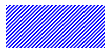
通过线性渐变,控制背景为白色-透明-白色-透明,然后控制背景大小,让背景background-repeat:repeat重复,就能实现斑马条纹
代码示例:
div {
    width: 400px;
    background-color: blue;
}

div::before {
    position: absolute;
    content: "";
    top: 0;
    left: 0;
    right: 0;
    bottom: 0;
    background-image: linear-gradient(-45deg, #fff 0%, #fff 25%, transparent 25%, transparent 50%, #fff 50%, #fff 75%, transparent 75%, transparent 100%);
    background-size: 3px 3px;	//默认background-repeat为repeat
    z-index: 1;
}
效果图:


 1610
1610


 被折叠的 条评论
为什么被折叠?
被折叠的 条评论
为什么被折叠?
 到【灌水乐园】发言


