


通常解决方案
.ellipsis {
	 display: -webkit-box;
	 -webkit-line-clamp: 2;
	 -webkit-box-orient: vertical;
	 overflow: hidden;
}
- 缺点:
- 兼容性
- 无法自定义省略内容表现
自定义省略内容方案
<!DOCTYPE html>
<html lang="en">

<head>
    <meta charset="UTF-8">
    <meta http-equiv="X-UA-Compatible" content="IE=edge">
    <meta name="viewport" content="width=device-width, initial-scale=1.0">
    <title>Document</title>
    <style>
        .box__text {
            width: 100%;
            line-height: 20px;
            background-color: pink;
            float: right;
        }

        .box__placeholder {
            width: 60px;
            height: 60px;
            background-color: gray;
            opacity: 0.8;
            float: right;
        }

        .box__more {
            width: 60px;
            text-align: right;
            background: yellow;
            float: right;
        }
    </style>
</head>

<body>
    <div class="box">
        <!-- 文字盒子 -->
        <div class="box__text">腾讯以技术丰富互联网用户的生活。通过通信及社交软件微信和 QQ 促进用户联系,并助其连接数字内容和生活服务,尽在弹指间。</div>
        <!-- 占位盒子 -->
        <div class="box__placeholder"></div>
        <!-- 自定义省略盒子 -->
        <div class="box__more">...展开</div>
    </div>
</body>

</html>
.box__text {
    width: 100%;
    line-height: 20px;
    background-color: pink;
    float: right;
    margin-left: -60px;
}
.box__placeholder {
    width: 60px;
	//...
}

.box__more {
    width: 60px;
	//...
}
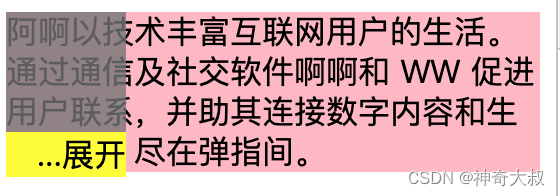
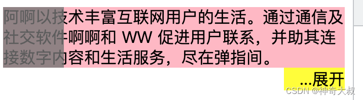
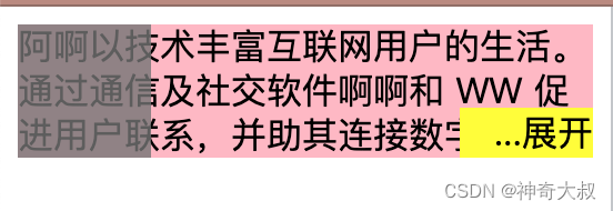
- 通过定位,使得未到三行时省略盒子隐藏,超过三行显示在末尾
.box {
    position: relative;
    width: 100%;
    max-height: 60px;
    overflow: hidden;
}

.box__more {
    width: 60px;
    text-align: right;
    background: yellow;
    float: right;
    position: relative;
    //100%是父元素的宽度,未超过三行时,会定位在盒子外面,所以会隐藏
    //当超过三行时,省略盒子在最左边,再通过100%+translate刚好能定位到末尾
    left: 100%;
    transform: translate(-100%, -100%);
}
代码示例:
<!DOCTYPE html>
<html lang="en">
<head>
<meta charset="UTF-8">
<meta http-equiv="X-UA-Compatible" content="IE=edge">
<meta name="viewport" content="width=device-width, initial-scale=1.0">
<title>Document</title>
<style>
.box {
position: relative;
width: 100%;
max-height: 60px;
overflow: hidden;
}
.box__text {
width: 100%;
line-height: 20px;
background-color: pink;
float: right;
margin-left: -60px;
overflow: hidden;
}
.box__placeholder {
width: 60px;
height: 60px;
background-color: gray;
opacity: 0.8;
float: right;
}
.box__more {
width: 60px;
text-align: right;
background: yellow;
float: right;
position: relative;
left: 100%;
transform: translate(-100%, -100%);
}
</style>
</head>
<body>
<div class="box">
<!-- 文字盒子 -->
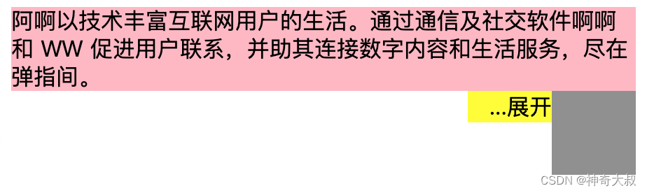
<div class="box__text">阿啊以技术丰富互联网用户的生活。通过通信及社交软件啊啊和 WW 促进用户联系,并助其连接数字内容和生活服务,尽在弹指间。</div>
<!-- 占位盒子 -->
<div class="box__placeholder"></div>
<!-- 自定义省略盒子 -->
<div class="box__more">...展开</div>
</div>
<script>
</script>
<script src="./1.js"></script>
</body>
</html>


 229
229


 被折叠的 条评论
为什么被折叠?
被折叠的 条评论
为什么被折叠?
 到【灌水乐园】发言


