


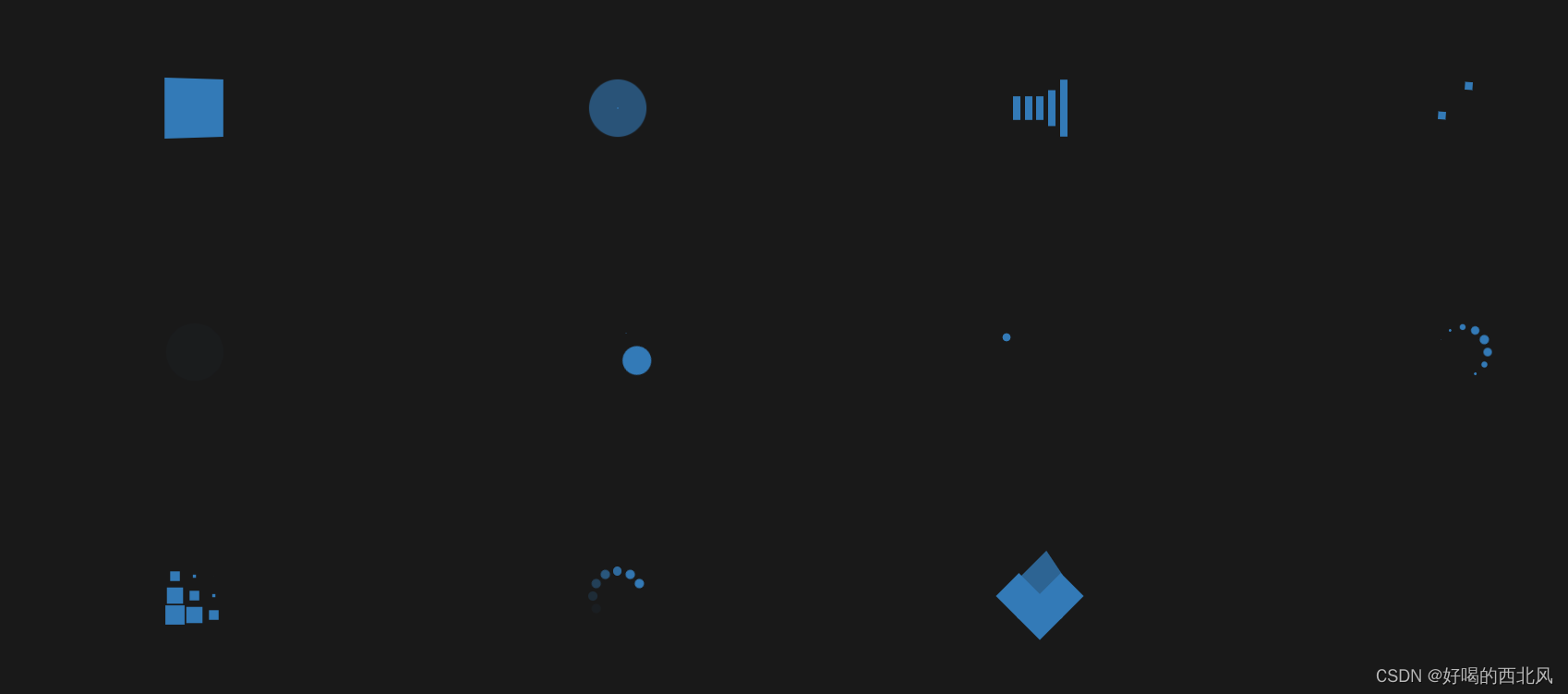
先看一下简单的效果图
线上预览
https://code.juejin.cn/pen/7278511766991339579
代码
HTML
 <!-- / 1 -->
    <section>
      <div class="sk-rotating-plane"></div>
    </section>
    <!-- / 2 -->
    <section>
      <div class="sk-double-bounce">
        <div class="sk-child sk-double-bounce-1"></div>
        <div class="sk-child sk-double-bounce-2"></div>
      </div>
    </section>
    <!-- / 3 -->
    <section>
      <div class="sk-wave">
        <div class="sk-rect sk-rect-1"></div>
        <div class="sk-rect sk-rect-2"></div>
        <div class="sk-rect sk-rect-3"></div>
        <div class="sk-rect sk-rect-4"></div>
        <div class="sk-rect sk-rect-5"></div>
      </div>
    </section>
    <!-- / 4 -->
    <section>
      <div class="sk-wandering-cubes">
        <div class="sk-cube sk-cube-1"></div>
        <div class="sk-cube sk-cube-2"></div>
      </div>
    </section>
    <!-- / 5 -->
    <section>
      <div class="sk-spinner sk-spinner-pulse"></div>
    </section>
    <!-- / 6 -->
    <section>
      <div class="sk-chasing-dots">
        <div class="sk-child sk-dot-1"></div>
        <div class="sk-child sk-dot-2"></div>
      </div>
    </section>
    <!-- / 7 -->
    <section>
      <div class="sk-three-bounce">
        <div class="sk-bounce-1 sk-child"></div>
        <div class="sk-bounce-2 sk-child"></div>
        <div class="sk-bounce-3 sk-child"></div>
      </div>
    </section>
    <!-- / 8 -->
    <section>
      <div class="sk-circle-bounce">
        <div class="sk-child sk-circle-1"></div>
        <div class="sk-child sk-circle-2"></div>
        <div class="sk-child sk-circle-3"></div>
        <div class="sk-child sk-circle-4"></div>
        <div class="sk-child sk-circle-5"></div>
        <div class="sk-child sk-circle-6"></div>
        <div class="sk-child sk-circle-7"></div>
        <div class="sk-child sk-circle-8"></div>
        <div class="sk-child sk-circle-9"></div>
        <div class="sk-child sk-circle-10"></div>
        <div class="sk-child sk-circle-11"></div>
        <div class="sk-child sk-circle-12"></div>
      </div>
    </section>
    <!-- / 9 -->
    <section>
      <div class="sk-cube-grid">
        <div class="sk-cube sk-cube-1"></div>
        <div class="sk-cube sk-cube-2"></div>
        <div class="sk-cube sk-cube-3"></div>
        <div class="sk-cube sk-cube-4"></div>
        <div class="sk-cube sk-cube-5"></div>
        <div class="sk-cube sk-cube-6"></div>
        <div class="sk-cube sk-cube-7"></div>
        <div class="sk-cube sk-cube-8"></div>
        <div class="sk-cube sk-cube-9"></div>
      </div>
    </section>
    <!-- / 10 -->
    <section>
      <div class="sk-fading-circle">
        <div class="sk-circle sk-circle-1"></div>
        <div class="sk-circle sk-circle-2"></div>
        <div class="sk-circle sk-circle-3"></div>
        <div class="sk-circle sk-circle-4"></div>
        <div class="sk-circle sk-circle-5"></div>
        <div class="sk-circle sk-circle-6"></div>
        <div class="sk-circle sk-circle-7"></div>
        <div class="sk-circle sk-circle-8"></div>
        <div class="sk-circle sk-circle-9"></div>
        <div class="sk-circle sk-circle-10"></div>
        <div class="sk-circle sk-circle-11"></div>
        <div class="sk-circle sk-circle-12"></div>
      </div>
    </section>
    <!-- / 11 -->
    <section>
      <div class="sk-folding-cube">
        <div class="sk-cube sk-cube-1"></div>
        <div class="sk-cube sk-cube-2"></div>
        <div class="sk-cube sk-cube-4"></div>
        <div class="sk-cube sk-cube-3"></div>
      </div>
    </section>
    <section></section>
css
 body {
    background-color: rgba(0, 0, 0, 0.9);
    min-height: 95vh;
    display: flex;
    flex-wrap: wrap;
    justify-content: space-around;
    align-content: space-around;
  }

  section {
    flex: 1 1 25%;
  }

  .sk-rotating-plane {
    width: 4em;
    height: 4em;
    margin: auto;
    background-color: #337ab7;
    -webkit-animation: sk-rotating-plane 1.2s infinite ease-in-out;
    animation: sk-rotating-plane 1.2s infinite ease-in-out;
  }

  @-webkit-keyframes sk-rotating-plane {
    0% {
      -webkit-transform: perspective(120px) rotateX(0deg) rotateY(0deg);
      transform: perspective(120px) rotateX(0deg) rotateY(0deg);
    }
    50% {
      -webkit-transform: perspective(120px) rotateX(-180.1deg) rotateY(0deg);
      transform: perspective(120px) rotateX(-180.1deg) rotateY(0deg);
    }
    100% {
      -webkit-transform: perspective(120px) rotateX(-180deg) rotateY(-179.9deg);
      transform: perspective(120px) rotateX(-180deg) rotateY(-179.9deg);
    }
  }

  @keyframes sk-rotating-plane {
    0% {
      -webkit-transform: perspective(120px) rotateX(0deg) rotateY(0deg);
      transform: perspective(120px) rotateX(0deg) rotateY(0deg);
    }
    50% {
      -webkit-transform: perspective(120px) rotateX(-180.1deg) rotateY(0deg);
      transform: perspective(120px) rotateX(-180.1deg) rotateY(0deg);
    }
    100% {
      -webkit-transform: perspective(120px) rotateX(-180deg) rotateY(-179.9deg);
      transform: perspective(120px) rotateX(-180deg) rotateY(-179.9deg);
    }
  }
  .sk-double-bounce {
    width: 4em;
    height: 4em;
    position: relative;
    margin: auto;
  }
  .sk-double-bounce .sk-child {
    width: 100%;
    height: 100%;
    border-radius: 50%;
    background-color: #337ab7;
    opacity: 0.6;
    position: absolute;
    top: 0;
    left: 0;
    -webkit-animation: sk-double-bounce 2s infinite ease-in-out;
    animation: sk-double-bounce 2s infinite ease-in-out;
  }
  .sk-double-bounce .sk-double-bounce-2 {
    -webkit-animation-delay: -1s;
    animation-delay: -1s;
  }

  @-webkit-keyframes sk-double-bounce {
    0%,
    100% {
      -webkit-transform: scale(0);
      transform: scale(0);
    }
    50% {
      -webkit-transform: scale(1);
      transform: scale(1);
    }
  }

  @keyframes sk-double-bounce {
    0%,
    100% {
      -webkit-transform: scale(0);
      transform: scale(0);
    }
    50% {
      -webkit-transform: scale(1);
      transform: scale(1);
    }
  }
  .sk-wave {
    width: 6em;
    height: 4em;
    margin: auto;
    text-align: center;
    font-size: 1em;
  }
  .sk-wave .sk-rect {
    background-color: #337ab7;
    height: 100%;
    width: 0.5em;
    display: inline-block;
    -webkit-animation: sk-wave-stretch-delay 1.2s infinite ease-in-out;
    animation: sk-wave-stretch-delay 1.2s infinite ease-in-out;
  }
  .sk-wave .sk-rect-1 {
    -webkit-animation-delay: -1.2s;
    animation-delay: -1.2s;
  }
  .sk-wave .sk-rect-2 {
    -webkit-animation-delay: -1.1s;
    animation-delay: -1.1s;
  }
  .sk-wave .sk-rect-3 {
    -webkit-animation-delay: -1s;
    animation-delay: -1s;
  }
  .sk-wave .sk-rect-4 {
    -webkit-animation-delay: -0.9s;
    animation-delay: -0.9s;
  }
  .sk-wave .sk-rect-5 {
    -webkit-animation-delay: -0.8s;
    animation-delay: -0.8s;
  }

  @-webkit-keyframes sk-wave-stretch-delay {
    0%,
    40%,
    100% {
      -webkit-transform: scaleY(0.4);
      transform: scaleY(0.4);
    }
    20% {
      -webkit-transform: scaleY(1);
      transform: scaleY(1);
    }
  }

  @keyframes sk-wave-stretch-delay {
    0%,
    40%,
    100% {
      -webkit-transform: scaleY(0.4);
      transform: scaleY(0.4);
    }
    20% {
      -webkit-transform: scaleY(1);
      transform: scaleY(1);
    }
  }
  .sk-wandering-cubes {
    width: 4em;
    height: 4em;
    position: relative;
    margin: auto;
  }
  .sk-wandering-cubes .sk-cube {
    background-color: #337ab7;
    width: 1em;
    height: 1em;
    position: absolute;
    top: 0;
    left: 0;
    -webkit-animation: sk-wandering-cubes 1.8s ease-in-out -1.8s infinite both;
    animation: sk-wandering-cubes 1.8s ease-in-out -1.8s infinite both;
  }
  .sk-wandering-cubes .sk-cube-2 {
    -webkit-animation-delay: -0.9s;
    animation-delay: -0.9s;
  }

  @-webkit-keyframes sk-wandering-cubes {
    0% {
      -webkit-transform: rotate(0deg);
      transform: rotate(0deg);
    }
    25% {
      -webkit-transform: translateX(2em) rotate(-90deg) scale(0.5);
      transform: translateX(2em) rotate(-90deg) scale(0.5);
    }
    50% {
      /* Hack to make FF rotate in the right direction */
      -webkit-transform: translateX(2em) translateY(2em) rotate(-179deg);
      transform: translateX(2em) translateY(2em) rotate(-179deg);
    }
    50.1% {
      -webkit-transform: translateX(2em) translateY(2em) rotate(-180deg);
      transform: translateX(2em) translateY(2em) rotate(-180deg);
    }
    75% {
      -webkit-transform: translateX(0) translateY(2em) rotate(-270deg)
        scale(0.5);
      transform: translateX(0) translateY(2em) rotate(-270deg) scale(0.5);
    }
    100% {
      -webkit-transform: rotate(-360deg);
      transform: rotate(-360deg);
    }
  }

  @keyframes sk-wandering-cubes {
    0% {
      -webkit-transform: rotate(0deg);
      transform: rotate(0deg);
    }
    25% {
      -webkit-transform: translateX(2em) rotate(-90deg) scale(0.5);
      transform: translateX(2em) rotate(-90deg) scale(0.5);
    }
    50% {
      /* Hack to make FF rotate in the right direction */
      -webkit-transform: translateX(2em) translateY(2em) rotate(-179deg);
      transform: translateX(2em) translateY(2em) rotate(-179deg);
    }
    50.1% {
      -webkit-transform: translateX(2em) translateY(2em) rotate(-180deg);
      transform: translateX(2em) translateY(2em) rotate(-180deg);
    }
    75% {
      -webkit-transform: translateX(0) translateY(2em) rotate(-270deg)
        scale(0.5);
      transform: translateX(0) translateY(2em) rotate(-270deg) scale(0.5);
    }
    100% {
      -webkit-transform: rotate(-360deg);
      transform: rotate(-360deg);
    }
  }
  .sk-spinner-pulse {
    width: 4em;
    height: 4em;
    margin: auto;
    background-color: #337ab7;
    border-radius: 100%;
    -webkit-animation: sk-spinner-pulse 1s infinite ease-in-out;
    animation: sk-spinner-pulse 1s infinite ease-in-out;
  }

  @-webkit-keyframes sk-spinner-pulse {
    0% {
      -webkit-transform: scale(0);
      transform: scale(0);
    }
    100% {
      -webkit-transform: scale(1);
      transform: scale(1);
      opacity: 0;
    }
  }

  @keyframes sk-spinner-pulse {
    0% {
      -webkit-transform: scale(0);
      transform: scale(0);
    }
    100% {
      -webkit-transform: scale(1);
      transform: scale(1);
      opacity: 0;
    }
  }
  .sk-chasing-dots {
    width: 4em;
    height: 4em;
    position: relative;
    margin: auto;
    text-align: center;
    -webkit-animation: sk-chasing-dots-rotate 2s infinite linear;
    animation: sk-chasing-dots-rotate 2s infinite linear;
  }
  .sk-chasing-dots .sk-child {
    width: 2em;
    height: 2em;
    display: inline-block;
    position: absolute;
    top: 0;
    background-color: #337ab7;
    border-radius: 100%;
    -webkit-animation: sk-chasing-dots-bounce 2s infinite ease-in-out;
    animation: sk-chasing-dots-bounce 2s infinite ease-in-out;
  }
  .sk-chasing-dots .sk-dot-2 {
    top: auto;
    bottom: 0;
    -webkit-animation-delay: -1s;
    animation-delay: -1s;
  }

  @-webkit-keyframes sk-chasing-dots-rotate {
    100% {
      -webkit-transform: rotate(360deg);
      transform: rotate(360deg);
    }
  }

  @keyframes sk-chasing-dots-rotate {
    100% {
      -webkit-transform: rotate(360deg);
      transform: rotate(360deg);
    }
  }
  @-webkit-keyframes sk-chasing-dots-bounce {
    0%,
    100% {
      -webkit-transform: scale(0);
      transform: scale(0);
    }
    50% {
      -webkit-transform: scale(1);
      transform: scale(1);
    }
  }
  @keyframes sk-chasing-dots-bounce {
    0%,
    100% {
      -webkit-transform: scale(0);
      transform: scale(0);
    }
    50% {
      -webkit-transform: scale(1);
      transform: scale(1);
    }
  }
  .sk-three-bounce {
    width: 8em;
    margin: auto;
    text-align: center;
  }
  .sk-three-bounce .sk-child {
    width: 2em;
    height: 2em;
    background-color: #337ab7;
    border-radius: 100%;
    display: inline-block;
    -webkit-animation: sk-three-bounce 1.4s ease-in-out 0s infinite both;
    animation: sk-three-bounce 1.4s ease-in-out 0s infinite both;
  }
  .sk-three-bounce .sk-bounce-1 {
    -webkit-animation-delay: -0.32s;
    animation-delay: -0.32s;
  }
  .sk-three-bounce .sk-bounce-2 {
    -webkit-animation-delay: -0.16s;
    animation-delay: -0.16s;
  }

  @-webkit-keyframes sk-three-bounce {
    0%,
    80%,
    100% {
      -webkit-transform: scale(0);
      transform: scale(0);
    }
    40% {
      -webkit-transform: scale(1);
      transform: scale(1);
    }
  }

  @keyframes sk-three-bounce {
    0%,
    80%,
    100% {
      -webkit-transform: scale(0);
      transform: scale(0);
    }
    40% {
      -webkit-transform: scale(1);
      transform: scale(1);
    }
  }
  .sk-circle-bounce {
    width: 4em;
    height: 4em;
    position: relative;
    margin: auto;
  }
  .sk-circle-bounce .sk-child {
    width: 100%;
    height: 100%;
    position: absolute;
    left: 0;
    top: 0;
  }
  .sk-circle-bounce .sk-child:before {
    content: "";
    display: block;
    margin: 0 auto;
    width: 15%;
    height: 15%;
    background-color: #337ab7;
    border-radius: 100%;
    -webkit-animation: sk-circle-bounce-delay 1.2s infinite ease-in-out both;
    animation: sk-circle-bounce-delay 1.2s infinite ease-in-out both;
  }
  .sk-circle-bounce .sk-circle-2 {
    -webkit-transform: rotate(30deg);
    transform: rotate(30deg);
  }
  .sk-circle-bounce .sk-circle-3 {
    -webkit-transform: rotate(60deg);
    transform: rotate(60deg);
  }
  .sk-circle-bounce .sk-circle-4 {
    -webkit-transform: rotate(90deg);
    transform: rotate(90deg);
  }
  .sk-circle-bounce .sk-circle-5 {
    -webkit-transform: rotate(120deg);
    transform: rotate(120deg);
  }
  .sk-circle-bounce .sk-circle-6 {
    -webkit-transform: rotate(150deg);
    transform: rotate(150deg);
  }
  .sk-circle-bounce .sk-circle-7 {
    -webkit-transform: rotate(180deg);
    transform: rotate(180deg);
  }
  .sk-circle-bounce .sk-circle-8 {
    -webkit-transform: rotate(210deg);
    transform: rotate(210deg);
  }
  .sk-circle-bounce .sk-circle-9 {
    -webkit-transform: rotate(240deg);
    transform: rotate(240deg);
  }
  .sk-circle-bounce .sk-circle-10 {
    -webkit-transform: rotate(270deg);
    transform: rotate(270deg);
  }
  .sk-circle-bounce .sk-circle-11 {
    -webkit-transform: rotate(300deg);
    transform: rotate(300deg);
  }
  .sk-circle-bounce .sk-circle-12 {
    -webkit-transform: rotate(330deg);
    transform: rotate(330deg);
  }
  .sk-circle-bounce .sk-circle-2:before {
    -webkit-animation-delay: -1.1s;
    animation-delay: -1.1s;
  }
  .sk-circle-bounce .sk-circle-3:before {
    -webkit-animation-delay: -1s;
    animation-delay: -1s;
  }
  .sk-circle-bounce .sk-circle-4:before {
    -webkit-animation-delay: -0.9s;
    animation-delay: -0.9s;
  }
  .sk-circle-bounce .sk-circle-5:before {
    -webkit-animation-delay: -0.8s;
    animation-delay: -0.8s;
  }
  .sk-circle-bounce .sk-circle-6:before {
    -webkit-animation-delay: -0.7s;
    animation-delay: -0.7s;
  }
  .sk-circle-bounce .sk-circle-7:before {
    -webkit-animation-delay: -0.6s;
    animation-delay: -0.6s;
  }
  .sk-circle-bounce .sk-circle-8:before {
    -webkit-animation-delay: -0.5s;
    animation-delay: -0.5s;
  }
  .sk-circle-bounce .sk-circle-9:before {
    -webkit-animation-delay: -0.4s;
    animation-delay: -0.4s;
  }
  .sk-circle-bounce .sk-circle-10:before {
    -webkit-animation-delay: -0.3s;
    animation-delay: -0.3s;
  }
  .sk-circle-bounce .sk-circle-11:before {
    -webkit-animation-delay: -0.2s;
    animation-delay: -0.2s;
  }
  .sk-circle-bounce .sk-circle-12:before {
    -webkit-animation-delay: -0.1s;
    animation-delay: -0.1s;
  }

  @-webkit-keyframes sk-circle-bounce-delay {
    0%,
    80%,
    100% {
      -webkit-transform: scale(0);
      transform: scale(0);
    }
    40% {
      -webkit-transform: scale(1);
      transform: scale(1);
    }
  }

  @keyframes sk-circle-bounce-delay {
    0%,
    80%,
    100% {
      -webkit-transform: scale(0);
      transform: scale(0);
    }
    40% {
      -webkit-transform: scale(1);
      transform: scale(1);
    }
  }
  .sk-cube-grid {
    width: 4em;
    height: 4em;
    margin: auto;
    /*
     * Spinner positions
     * 1 2 3
     * 4 5 6
     * 7 8 9
     */
  }
  .sk-cube-grid .sk-cube {
    width: 33%;
    height: 33%;
    background-color: #337ab7;
    float: left;
    -webkit-animation: sk-cube-grid-scale-delay 1.3s infinite ease-in-out;
    animation: sk-cube-grid-scale-delay 1.3s infinite ease-in-out;
  }
  .sk-cube-grid .sk-cube-1 {
    -webkit-animation-delay: 0.2s;
    animation-delay: 0.2s;
  }
  .sk-cube-grid .sk-cube-2 {
    -webkit-animation-delay: 0.3s;
    animation-delay: 0.3s;
  }
  .sk-cube-grid .sk-cube-3 {
    -webkit-animation-delay: 0.4s;
    animation-delay: 0.4s;
  }
  .sk-cube-grid .sk-cube-4 {
    -webkit-animation-delay: 0.1s;
    animation-delay: 0.1s;
  }
  .sk-cube-grid .sk-cube-5 {
    -webkit-animation-delay: 0.2s;
    animation-delay: 0.2s;
  }
  .sk-cube-grid .sk-cube-6 {
    -webkit-animation-delay: 0.3s;
    animation-delay: 0.3s;
  }
  .sk-cube-grid .sk-cube-7 {
    -webkit-animation-delay: 0s;
    animation-delay: 0s;
  }
  .sk-cube-grid .sk-cube-8 {
    -webkit-animation-delay: 0.1s;
    animation-delay: 0.1s;
  }
  .sk-cube-grid .sk-cube-9 {
    -webkit-animation-delay: 0.2s;
    animation-delay: 0.2s;
  }

  @-webkit-keyframes sk-cube-grid-scale-delay {
    0%,
    70%,
    100% {
      -webkit-transform: scale3D(1, 1, 1);
      transform: scale3D(1, 1, 1);
    }
    35% {
      -webkit-transform: scale3D(0, 0, 1);
      transform: scale3D(0, 0, 1);
    }
  }

  @keyframes sk-cube-grid-scale-delay {
    0%,
    70%,
    100% {
      -webkit-transform: scale3D(1, 1, 1);
      transform: scale3D(1, 1, 1);
    }
    35% {
      -webkit-transform: scale3D(0, 0, 1);
      transform: scale3D(0, 0, 1);
    }
  }
  .sk-fading-circle {
    width: 4em;
    height: 4em;
    position: relative;
    margin: auto;
  }
  .sk-fading-circle .sk-circle {
    width: 100%;
    height: 100%;
    position: absolute;
    left: 0;
    top: 0;
  }
  .sk-fading-circle .sk-circle:before {
    content: "";
    display: block;
    margin: 0 auto;
    width: 15%;
    height: 15%;
    background-color: #337ab7;
    border-radius: 100%;
    -webkit-animation: sk-fading-circle-delay 1.2s infinite ease-in-out both;
    animation: sk-fading-circle-delay 1.2s infinite ease-in-out both;
  }
  .sk-fading-circle .sk-circle-2 {
    -webkit-transform: rotate(30deg);
    transform: rotate(30deg);
  }
  .sk-fading-circle .sk-circle-3 {
    -webkit-transform: rotate(60deg);
    transform: rotate(60deg);
  }
  .sk-fading-circle .sk-circle-4 {
    -webkit-transform: rotate(90deg);
    transform: rotate(90deg);
  }
  .sk-fading-circle .sk-circle-5 {
    -webkit-transform: rotate(120deg);
    transform: rotate(120deg);
  }
  .sk-fading-circle .sk-circle-6 {
    -webkit-transform: rotate(150deg);
    transform: rotate(150deg);
  }
  .sk-fading-circle .sk-circle-7 {
    -webkit-transform: rotate(180deg);
    transform: rotate(180deg);
  }
  .sk-fading-circle .sk-circle-8 {
    -webkit-transform: rotate(210deg);
    transform: rotate(210deg);
  }
  .sk-fading-circle .sk-circle-9 {
    -webkit-transform: rotate(240deg);
    transform: rotate(240deg);
  }
  .sk-fading-circle .sk-circle-10 {
    -webkit-transform: rotate(270deg);
    transform: rotate(270deg);
  }
  .sk-fading-circle .sk-circle-11 {
    -webkit-transform: rotate(300deg);
    transform: rotate(300deg);
  }
  .sk-fading-circle .sk-circle-12 {
    -webkit-transform: rotate(330deg);
    transform: rotate(330deg);
  }
  .sk-fading-circle .sk-circle-2:before {
    -webkit-animation-delay: -1.1s;
    animation-delay: -1.1s;
  }
  .sk-fading-circle .sk-circle-3:before {
    -webkit-animation-delay: -1s;
    animation-delay: -1s;
  }
  .sk-fading-circle .sk-circle-4:before {
    -webkit-animation-delay: -0.9s;
    animation-delay: -0.9s;
  }
  .sk-fading-circle .sk-circle-5:before {
    -webkit-animation-delay: -0.8s;
    animation-delay: -0.8s;
  }
  .sk-fading-circle .sk-circle-6:before {
    -webkit-animation-delay: -0.7s;
    animation-delay: -0.7s;
  }
  .sk-fading-circle .sk-circle-7:before {
    -webkit-animation-delay: -0.6s;
    animation-delay: -0.6s;
  }
  .sk-fading-circle .sk-circle-8:before {
    -webkit-animation-delay: -0.5s;
    animation-delay: -0.5s;
  }
  .sk-fading-circle .sk-circle-9:before {
    -webkit-animation-delay: -0.4s;
    animation-delay: -0.4s;
  }
  .sk-fading-circle .sk-circle-10:before {
    -webkit-animation-delay: -0.3s;
    animation-delay: -0.3s;
  }
  .sk-fading-circle .sk-circle-11:before {
    -webkit-animation-delay: -0.2s;
    animation-delay: -0.2s;
  }
  .sk-fading-circle .sk-circle-12:before {
    -webkit-animation-delay: -0.1s;
    animation-delay: -0.1s;
  }

  @-webkit-keyframes sk-fading-circle-delay {
    0%,
    39%,
    100% {
      opacity: 0;
    }
    40% {
      opacity: 1;
    }
  }

  @keyframes sk-fading-circle-delay {
    0%,
    39%,
    100% {
      opacity: 0;
    }
    40% {
      opacity: 1;
    }
  }
  .sk-folding-cube {
    width: 4em;
    height: 4em;
    position: relative;
    margin: auto;
    -webkit-transform: rotateZ(45deg);
    transform: rotateZ(45deg);
  }
  .sk-folding-cube .sk-cube {
    float: left;
    width: 50%;
    height: 50%;
    position: relative;
    -webkit-transform: scale(1.1);
    transform: scale(1.1);
  }
  .sk-folding-cube .sk-cube:before {
    content: "";
    position: absolute;
    top: 0;
    left: 0;
    width: 100%;
    height: 100%;
    background-color: #337ab7;
    -webkit-animation: sk-folding-cube-angle 2.4s infinite linear both;
    animation: sk-folding-cube-angle 2.4s infinite linear both;
    -webkit-transform-origin: 100% 100%;
    transform-origin: 100% 100%;
  }
  .sk-folding-cube .sk-cube-2 {
    -webkit-transform: scale(1.1) rotateZ(90deg);
    transform: scale(1.1) rotateZ(90deg);
  }
  .sk-folding-cube .sk-cube-3 {
    -webkit-transform: scale(1.1) rotateZ(180deg);
    transform: scale(1.1) rotateZ(180deg);
  }
  .sk-folding-cube .sk-cube-4 {
    -webkit-transform: scale(1.1) rotateZ(270deg);
    transform: scale(1.1) rotateZ(270deg);
  }
  .sk-folding-cube .sk-cube-2:before {
    -webkit-animation-delay: 0.3s;
    animation-delay: 0.3s;
  }
  .sk-folding-cube .sk-cube-3:before {
    -webkit-animation-delay: 0.6s;
    animation-delay: 0.6s;
  }
  .sk-folding-cube .sk-cube-4:before {
    -webkit-animation-delay: 0.9s;
    animation-delay: 0.9s;
  }

  @-webkit-keyframes sk-folding-cube-angle {
    0%,
    10% {
      -webkit-transform: perspective(140px) rotateX(-180deg);
      transform: perspective(140px) rotateX(-180deg);
      opacity: 0;
    }
    25%,
    75% {
      -webkit-transform: perspective(140px) rotateX(0deg);
      transform: perspective(140px) rotateX(0deg);
      opacity: 1;
    }
    90%,
    100% {
      -webkit-transform: perspective(140px) rotateY(180deg);
      transform: perspective(140px) rotateY(180deg);
      opacity: 0;
    }
  }

  @keyframes sk-folding-cube-angle {
    0%,
    10% {
      -webkit-transform: perspective(140px) rotateX(-180deg);
      transform: perspective(140px) rotateX(-180deg);
      opacity: 0;
    }
    25%,
    75% {
      -webkit-transform: perspective(140px) rotateX(0deg);
      transform: perspective(140px) rotateX(0deg);
      opacity: 1;
    }
    90%,
    100% {
      -webkit-transform: perspective(140px) rotateY(180deg);
      transform: perspective(140px) rotateY(180deg);
      opacity: 0;
    }
  }


 2452
2452


 被折叠的 条评论
为什么被折叠?
被折叠的 条评论
为什么被折叠?
 到【灌水乐园】发言


