


1. 绘制简单的折线图
import matplotlib.pyplot as plt
squares = [1, 4, 9, 26, 27]
fig, ax = plt.subplots()
ax.plot(squares)

plt.show()
2. 修改标签文字和线条粗细
import matplotlib.pyplot as plt
import matplotlib

# 把语言设置为黑体
matplotlib.rc("font", family='Hei')

squares = [1, 4, 9, 26, 27]
fig, ax = plt.subplots()
ax.plot(squares, linewidth=3)

# 设置图标标题并给坐标轴加上标签
ax.set_title('平方数', fontsize=24)
ax.set_xlabel('值', fontsize=14)
ax.set_ylabel('值的平方', fontsize=14)

# ax.plot(squares)
ax.tick_params(axis='both' , labelsize=14)
plt.show()
运行结果:
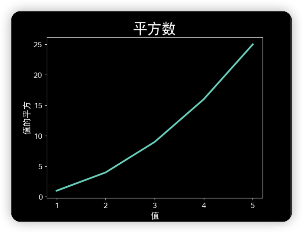
3. 校正图形
向polt()提供一系列数时,它假设第一个数据点对应的x坐标为0,但这里第一个点对应的x值为1,为了改变默认行为,可向plot()同时提供输入值和输出值。
import matplotlib.pyplot as plt
import matplotlib

# 把语言设置为黑体
matplotlib.rc("font", family='Hei')

imput_value = [1, 2, 3, 4, 5]
squares = [1, 4, 9, 16, 25]
fig, ax = plt.subplots()
ax.plot(imput_value, squares, linewidth=3)

# 设置图标标题并给坐标轴加上标签
ax.set_title('平方数', fontsize=24)
ax.set_xlabel('值', fontsize=14)
ax.set_ylabel('值的平方', fontsize=14)

# ax.plot(squares)
ax.tick_params(axis='both' , labelsize=14)
plt.show()
运行结果:

4. 使用内置样式
matplotlib提供了很多已经定义好的样式
查看有哪些样式,在console中输入
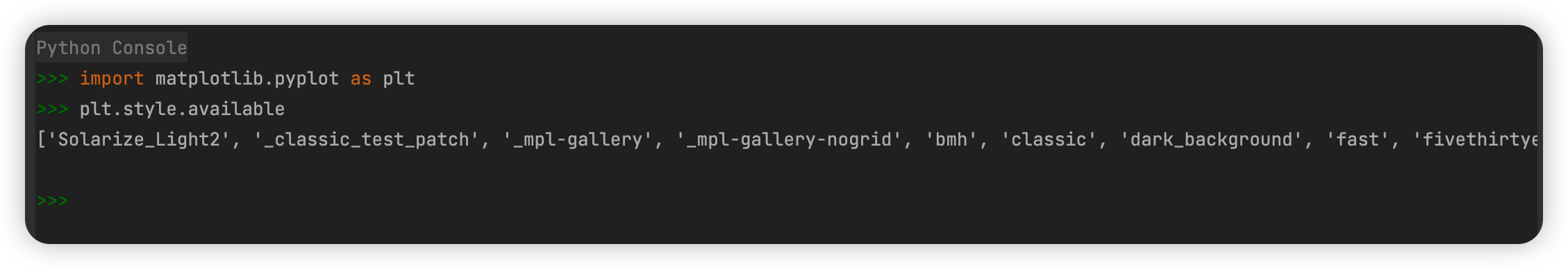
import matplotlib.pyplot as plt
plt.style.available
['Solarize_Light2', '_classic_test_patch', '_mpl-gallery', '_mpl-gallery-nogrid', 'bmh', 'classic', 'dark_background', 'fast', 'fivethirtyeight', 'ggplot', 'grayscale', 'seaborn-v0_8', 'seaborn-v0_8-bright', 'seaborn-v0_8-colorblind', 'seaborn-v0_8-dark', 'seaborn-v0_8-dark-palette', 'seaborn-v0_8-darkgrid', 'seaborn-v0_8-deep', 'seaborn-v0_8-muted', 'seaborn-v0_8-notebook', 'seaborn-v0_8-paper', 'seaborn-v0_8-pastel', 'seaborn-v0_8-poster', 'seaborn-v0_8-talk', 'seaborn-v0_8-ticks', 'seaborn-v0_8-white', 'seaborn-v0_8-whitegrid', 'tableau-colorblind10']
添加‘dark_background’样式后
import matplotlib.pyplot as plt
import matplotlib

# 把语言设置为黑体
matplotlib.rc("font", family='Hei')

imput_value = [1, 2, 3, 4, 5]
squares = [1, 4, 9, 16, 25]

plt.style.use('dark_background')
fig, ax = plt.subplots()
ax.plot(imput_value, squares, linewidth=3)

# 设置图标标题并给坐标轴加上标签
ax.set_title('平方数', fontsize=24)
ax.set_xlabel('值', fontsize=14)
ax.set_ylabel('值的平方', fontsize=14)

# ax.plot(squares)
ax.tick_params(axis='both' , labelsize=14)
plt.show()
运行结果:
5. 使用scatter()绘制散点图并设置样式
- 绘制单个点,可使用scatter(),传递一堆x坐标和y坐标,她将在制定位置绘制一个点
import matplotlib.pyplot as plt
import matplotlib

# 把语言设置为黑体
matplotlib.rc("font", family='Hei')

imput_value = [1, 2, 3, 4, 5]
squares = [1, 4, 9, 16, 25]

plt.style.use('fast')
fig, ax = plt.subplots()
ax.scatter(2, 4)
# ax.plot(imput_value, squares, linewidth=3)

# 设置图标标题并给坐标轴加上标签
ax.set_title('平方数', fontsize=24)
ax.set_xlabel('值', fontsize=14)
ax.set_ylabel('值的平方', fontsize=14)

# ax.plot(squares)
ax.tick_params(axis='both' , labelsize=14)
plt.show()
运行结果:

6. 设置绘制图形时使用的点的尺寸,ax.scatter(2, 4, s=2000)
import matplotlib.pyplot as plt
import matplotlib

# 把语言设置为黑体
matplotlib.rc("font", family='Hei')

imput_value = [1, 2, 3, 4, 5]
squares = [1, 4, 9, 16, 25]

plt.style.use('fast')
fig, ax = plt.subplots()
ax.scatter(2, 4, s=2000)
# ax.plot(imput_value, squares, linewidth=3)

# 设置图标标题并给坐标轴加上标签
ax.set_title('平方数', fontsize=24)
ax.set_xlabel('值', fontsize=14)
ax.set_ylabel('值的平方', fontsize=14)

# ax.plot(squares)
# 设置刻度标记的大小
ax.tick_params(axis='both', which='major', labelsize=14)
# ax.tick_params(axis='both',  labelsize=14)
plt.show()
运行结果:


 1516
1516


 被折叠的 条评论
为什么被折叠?
被折叠的 条评论
为什么被折叠?
 到【灌水乐园】发言


