


CSS的融合效果
首先我们来看一下效果(不会整动图!)
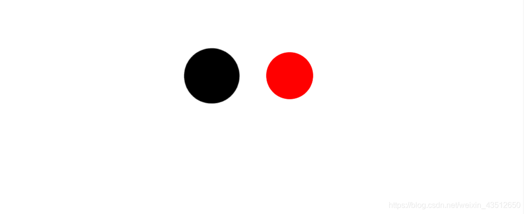

既然看完了效果我们就来实现一下吧!
原理:
用父物体作为画布添加 filter: contrast()
然后在需要实现的效果的子物体上添加filter:blur()
最终我们就能实现融合效果了。
代码:
  <!DOCTYPE html>
  <html lang="en">
  <head>
  <meta charset="utf-8">
      <title>融合效果</title>
      <style type="text/css">
      .wrap{
		  filter: contrast(20);
		  background: #fff;
		  overflow: hidden;
		  padding:10px;
		  }
		.left,.right{

		  width: 100px;
		  height: 100px;
		  border-radius: 50%;
		  filter: blur(6px);
		  }
      .left{
		  background-color: black;
		  position:absolute;
		  left:0;animation: move 10s infinite alternate;
		  }
     @keyframes move{
		 100%{
			 left:250px;
			 }
		 }
     .right{
		 background-color: red;
		 margin-left:120px;
		 }
     </style>
 </head>
 <body>
     <div class="wrap">
         <div class="left"></div>
         <div class="right"></div>
     </div>
 </body>
 </html>
最后说一个我自己碰到的坑,一定要记得给父物体加上background-color,不然达不到效果。


 扫一扫
扫一扫


 277
277

 被折叠的 条评论
为什么被折叠?
被折叠的 条评论
为什么被折叠?
 到【灌水乐园】发言


