


pyecharts 是为了与 Python 进行对接,方便在 Python 中直接使用数据生成图
.
使用pyecharts可以生成独立的网页,也可以在flask、django中集成使用
pyecharts 安装很简单:
pip install pyecharts
pyecharts_snapshot 图片导出功能:
pip install pyecharts_snapshot
pyecharts 同时兼容 Python2 和 Python3 的 Jupyter Notebook 环境。所有图表均可正常显示,与浏览器一致的交互体验,简直不要太强大。
在数据分析中最常用的3种图表就是柱形图,折线图和散点图了。下面我们就来看一下pyecharts绘制这3种常用图表的范例吧。
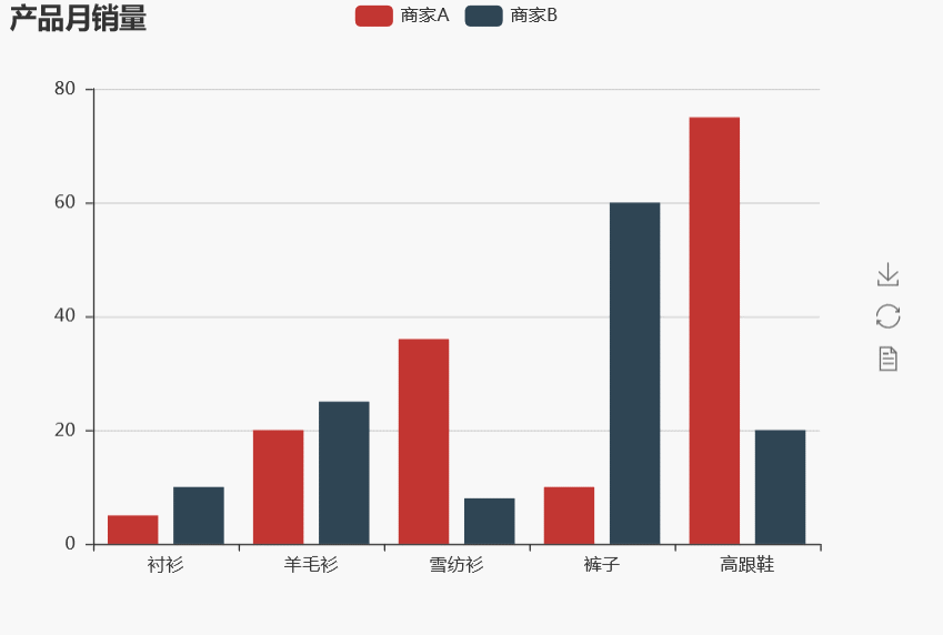
1、柱形图
柱形图适合表现几组数据之间的对比关系
from  pyecharts import Bar

x = ["衬衫", "羊毛衫", "雪纺衫", "裤子", "高跟鞋"]
y1 = [5, 20, 36, 10, 75]
y2 = [10, 25, 8, 60, 20]

bar = Bar(title = "产品月销量",width = 600,height = 420)
bar.add(name = "商家A", x_axis = x, y_axis = y1)
bar.add(name = "商家B", x_axis = x, y_axis = y2,is_xaxis_boundarygap =True)

# 导出绘图html文件,可直接用浏览器打开
bar.render('柱形图示范.html')
bar
 \
\
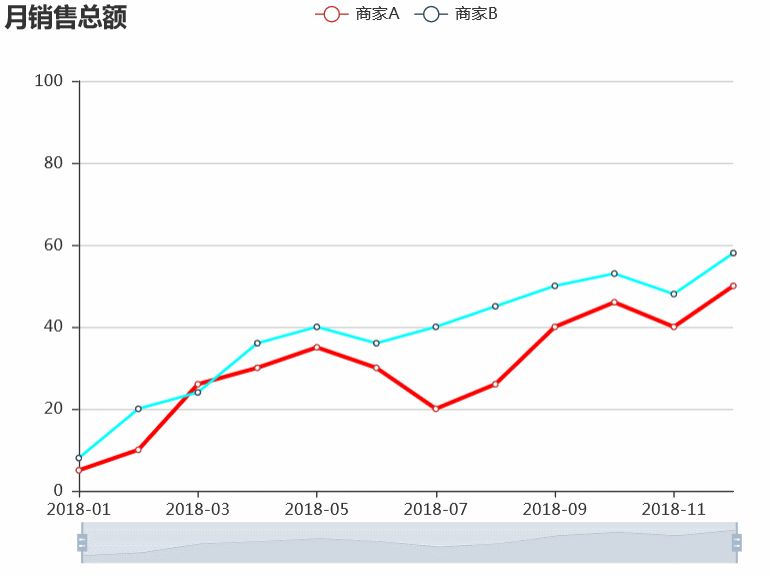
2、折线图
折线图适合描述两个变量之间的函数关系
from  pyecharts import Line

x = ['2018-{:0>2d}'.format(s) for s in range(1,13)]
y1 = [5,10,26,30,35,30,20,26,40,46,40,50]
y2 = [8,20,24,36,40,36,40,45,50,53,48,58]

line = Line(title = "月销售总额",width = 600,height = 420)

line.add(name = "商家A", x_axis = x, y_axis = y1,
         line_width = 3,line_color = 'red')
line.add(name = "商家B", x_axis = x, y_axis = y2,
         yaxis_min = 0,yaxis_max = 100,is_xaxis_boundarygap = False,
         is_datazoom_show =True,line_width = 2,line_color = 'cyan')

line.render('折线图示范.html')
line
3、散点图
散点图适合表现大量样本的多个属性的分布规律。
from pyecharts import Scatter
import pandas as pd

dfboy = pd.DataFrame()
dfboy['weight'] = [56,67,65,70,57,60,80,85,76,64]
dfboy['height'] = [162,170,168,172,168,172,180,176,178,170]

dfgirl = pd.DataFrame()
dfgirl['weight'] = [50,62,60,70,57,45,62,65,70,56]
dfgirl['height'] = [155,162,165,170,166,158,160,170,172,165]

scatter = Scatter(title = "体格数据",width = 600,height = 420)
scatter.add(name = "boy", x_axis = dfboy['weight'], y_axis = dfboy['height'])
scatter.add(name = "girl", x_axis = dfgirl['weight'], y_axis = dfgirl['height'],
           yaxis_min = 130,yaxis_max = 200,xaxis_min = 30,xaxis_max = 100)

scatter.render("散点图示范.html")
scatter

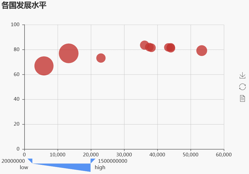
当样本属性维度多于2个时,散点图可以使用点的颜色或大小等方式来表达更多属性维度。下面示范使用点的大小表示第3个维度。
from pyecharts import Scatter
import pandas as pd

def custom_formatter(params):
    return (params.value[3] + ':' +
             str(params.value[0]) +','
             +str(params.value[1]) + ','
             +str(params.value[2]))

df = pd.DataFrame()
df['country'] = ["中国",'美国','德国','法国','英国','日本','俄罗斯','印度','澳大利亚','加拿大']
df['life-expectancy'] = [76.9,79.1,81.1,81.9,81.4,83.5,73.13,66.8,81.8,81.7]
df['capita-gdp'] = [13334,53354,44053,37599,38225,36162,23038,5903,44056,43294]
df['population'] = [1376048943,321773631,80688545,64395345,64715810,126573481,143456918,
                    1311050527,23968973,35939927]

scatter = Scatter(title = "各国发展水平",width = 600,height = 420)
scatter.add(name = '',
            x_axis = df['capita-gdp'],  # params.values[0]
            y_axis = df['life-expectancy'], # params.values[1]
            extra_data = df['population'].values.tolist(), # params.values[2]
            extra_name = df['country'].values.tolist(), # params.values[3]
            tooltip_formatter=custom_formatter,  #自定义提示框格式内容
            is_visualmap=True,
            visual_orient="horizontal",
            visual_type = 'size',  #可以是size或者color
            visual_dimension=2,
            visual_range=[20000000, 1500000000],
           )
scatter
4、箱型图
箱型图适合表现一组数据的统计分布规律,它能显示出一组数据的最大值、最小值、中位数、及上下四分位数。
箱型图的进阶版本是小提琴图,可以展示数据的密度估计曲线,可以用seaborn画出。
from pyecharts import Boxplot
x =['1班','2班','3班','4班']
y1=[78, 98, 56, 78, 90.0, 45, 78, 20, 87, 86, 74, 89, 94]
y2=[89, 82, 45, 67, 68, 78.0, 79, 98, 71, 56, 78, 81, 80]
y3=[90, 80, 60, 89, 76, 73.0, 72, 92, 89, 87, 65, 66, 76]
y4=[82, 72, 55, 100, 90.0, 78, 69, 67, 87, 66, 78, 71, 82]
box = Boxplot(title = '考试成绩箱型图',width = 600,height = 420)
# 预处理数据计算最大值,最小值,中位数以及上下四分位数
y_prepared = box.prepare_data([y1,y2,y3,y4])
box.add(name = '',x_axis = x,y_axis = y_prepared)

附:用seaborn 进行小提琴图的绘制
import seaborn as sns
%matplotlib inline
%config InlineBackend.figure_format = 'svg'

#设置风格
sns.set(style="white", context="notebook")
#处理中文问题
sns.set_style({'font.sans-serif':['simhei', 'Arial']})

dfdata = pd.DataFrame()
dfdata['score'] = y1 + y2 + y3 + y4
dfdata['class'] = ['1班']*len(y1)+['2班']*len(y2)+['3班']*len(y3)+['4班']*len(y4)

ax = sns.violinplot(x= 'class', y = 'score',data = dfdata,
            palette = 'hls', # 设置调色板
            inner = 'box'# 设置内部显示类型 → “box”, “quartile”, “point”, “stick”, None
           )

5、词云图
from pyecharts import WordCloud

words = ['python','jupyter','numpy','pandas','matplotlib','sklearn',
        'xgboost','lightGBM','simpy','keras','tensorflow',
         'hive','hadoop','spark']
counts = [100,90,65,95,50,60,70,70,20,70,80,80,60,60]

cloud = WordCloud(title = '数据算法常用工具',width = 600,height = 420)
cloud.add(name = 'utils',attr = words,value = counts,
          shape = "circle",word_size_range = (10,70))
cloud

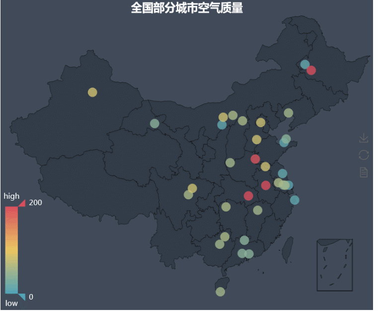
6、地理坐标系图
地理坐标系图适合表现和国家,省份,以及城市,经纬度位置相关联的数据分布规律。
pyecharts中Geo表达和城市关联的数据,Map表达和国家和省份关联的数据。
# 安装地图附属包
!pip install echarts-countries-pypkg
!pip install echarts-china-provinces-pypkg
!pip install echarts-china-cities-pypkg
全国城市地图示例
from pyecharts import Geo

data = [
    ("海门", 9),("鄂尔多斯", 12),("招远", 12),("舟山", 12),("齐齐哈尔", 14),("盐城", 15),
    ("惠州", 37),("江阴", 37),("蓬莱", 37),("韶关", 38),("嘉峪关", 38),("广州", 38),
    ("张家港", 52),("三门峡", 53),("锦州", 54),("南昌", 54),("柳州", 54),("三亚", 54),
    ("呼和浩特", 58),("成都", 58),("大同", 58),("镇江", 59),("桂林", 59),("张家界", 59),
    ("北京", 79),("徐州", 79),("衡水", 80),("包头", 80),("绵阳", 80),("乌鲁木齐", 84),
    ("菏泽", 194),("合肥", 229),("武汉", 273),("大庆", 279)]

geo = Geo(
    "全国部分城市空气质量",
    title_color="#fff",
    title_pos="center",
    width=800,
    height=600,
    background_color="#404a59",
)
attr, value = geo.cast(data)
geo.add(
    "",
    attr,
    value,
    visual_range=[0, 200],
    visual_text_color="#fff",
    symbol_size=15,
    is_visualmap=True,
)
geo
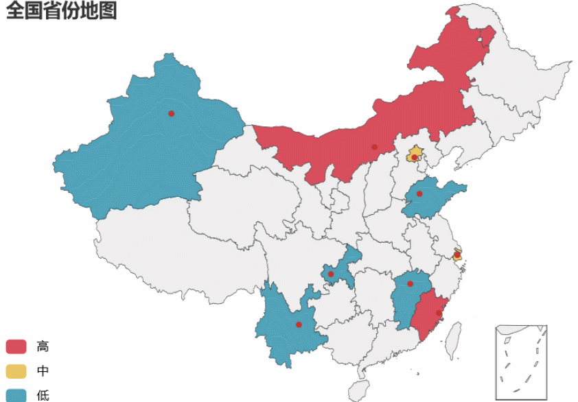
全国省份地图
from pyecharts import Map
value = [155, 10, 66, 78, 44, 38, 88, 50, 20]
attr = ["福建","山东","北京","上海","江西","新疆","内蒙古","云南","重庆"]
m = Map("全国省份地图", width=600, height=400)
m.add("", attr, value, maptype='china',
        is_visualmap=True,
        is_piecewise=True,
        visual_text_color="#000",
        visual_range_text=["", ""],
        pieces=[
            {"max": 160, "min": 81, "label": "高"},
            {"max": 80, "min": 51, "label": "中"},
            {"max": 50, "min": 0, "label": "低"},
        ])
m
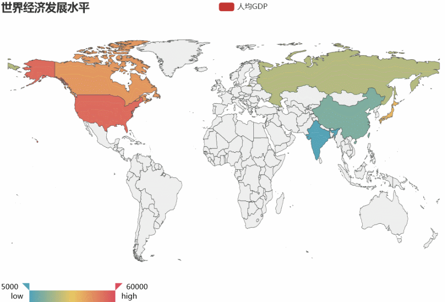
世界地图示例
from pyecharts import Map
countries= ["China", "Canada", "India", "Russia", "United States","Japan"]
capita_gdp = [13334, 43294, 5903, 23038, 53354,36162]
population = [1376048943, 35939927, 1311050527, 143456918, 321773631,126573481]
life_expectancy = [76.9,81.7,66.8,73.13,79.1,73.13]

m = Map("世界经济发展水平", width=800, height=500)
m.add(
    "人均GDP",
    attr = countries,
    value = capita_gdp,
    maptype="world",
    is_visualmap=True,
    visual_range = [5000,60000],
    visual_text_color="#000",
    is_map_symbol_show=False,
    visual_orient="horizontal"
)
m
上面是基本图表类型了,总得来说,这是一个非常强大的可视化库!


 530
530


 被折叠的 条评论
为什么被折叠?
被折叠的 条评论
为什么被折叠?
 到【灌水乐园】发言


