


实用网站
源码之家网站:https://www.mycodes.net/
渐变颜色网站:https://www.grabient.com/
文字抠图:https://www.remove.bg/zh
模板之家:http://www.cssmoban.com/
UI组件:https://element.eleme.cn/#/zh-CN
飞冰:https://ice.work/
Less:https://less.bootcss.com/
HTML和CSS动画:https://www.html5tricks.com/category/html5-demo/page/4
JavaScript动画:https://www.w3school.com.cn/js/js_animation.asp
1、什么是CSS
CSS:Cascading Style Sheet 层叠样式表
如何学习
1.CSS是什么
2.CSS怎么用
3.CSS选择器(重点+难点)
4.美化网页(文字、阴影、超链接、列表、渐变…)
5.盒子模型
6.浮动
7.定位
8.网页动画(特效)
HTML + CSS + Jscript
结构 + 表现+ 交互
2、初识选择器
语法格式
<head>
    <meta charset="UTF-8">
    <title>Title</title>

<!--规范. <style> 可以编写css代码
    语法:
    选择器{
        声明1;
        声明2;
    }
-->
    <style>
        h1{
            color:darkred;
        }
    </style>
</head>
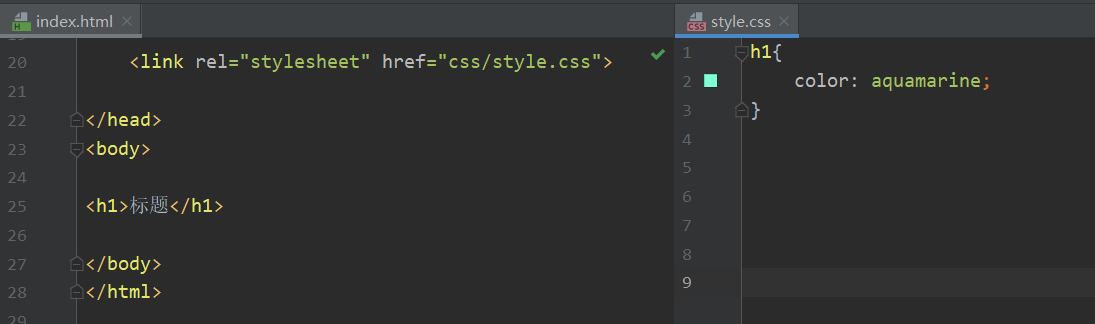
HTML与CSS分离
HTML文件:用link把css文件连接起来
<head>
<link rel="stylesheet" href="css/style.css">
</head>
CSS文件:在此文件下控制h1之类的参数
h1{
    color: aquamarine;
}
CSS优势:
1、内容与表现分离
2、网页结构表现统一,可以实现复用
3、样式十分丰富
4、利用SEO,容易被搜索引擎收录(容易被搜到)
CSS的3种导入方式
优先级(就近原则):
行内样式(body内)
内部样式(Style内)
外部样式(CSS文件内)
哪个离h1近,就显示哪个
HTML文件:
<head>
	<!--内部样式-->
    <style>
        h1{
            color:red;
        }
    </style>
</head>
<body>
<!--行内样式-->
<h1 style="color:rosybrown">标题</h1>
</body>
CSS文件:
/*外部样式*/
h1{
    color: blue;
}
扩展:
- 链接式:
<!--外部样式-->
<link rel="stylesheet" href="css/style.css">
- 导入式:(CSS 2.1 特有的)
<!--导入式-->
<style>
    @import url("css/style.css");
</style>
3、选择器
id选择器的id是唯一的
class选择器的class可以重复
标签选择器
<style>
  /*标签选择器,会选择到页面上所有的这个标签的元素*/
  h1{
    color: #2365a7;
    background: #60f1dc;
    border-radius: 60px;
  }

  p{
    font-size: 50px;
  }
</style>
类选择器
类选择器的样式
.class名{
}
<head>
    <meta charset="UTF-8">
    <title>Title</title>

  <style>

    .张书毓{
      color: rosybrown;
    }

    .zsy{
      color: aquamarine;
    }

  </style>

</head>
<body>

<h1 class="zsy">zsy</h1>
<h1 class="ZSY">ZSY</h1>
<p class="张书毓">张书毓</p>

</body>
</html>
id选择器
- id是唯一的
id选择器样式:
#id名{
}
<head>
    <meta charset="UTF-8">
    <title>Title</title>

  <style>

    #zsy{
      color: rosybrown;
    }
    #张书毓{
      color: aquamarine;
    }

  </style>

</head>
<body>

<h1 id="张书毓">张书毓</h1>
<h1 id="zsy">zsy</h1>

</body>
</html>
选择器优先级
id 选择器 > class 选择器 >标签选择器
4、层次选择器
1、后代选择器: body中的所有p标签有效
<style>
	body p{
  		color: #60f1dc;
	}
</style>
2、子选择器:body下的第一代有效
body>p{
}
<style>
	body>p{
  		background: darkred;
	}
</style>
3、相邻兄弟选择器:class类选择器的下一个P标签有效,显示p3
.class+p{
}
<head>
<style>
	.class+p{
      background: blueviolet;
    }
</style>
</head>

<body>
<p>p1</p>
<p class="class">p2</p>
<p>p3</p>
</body>
4、通用选择器
.class~p{
}
<head>
<style>
	.class~p{
      background: blueviolet;
    }
</style>
</head>

<body>
<p>p1</p>
<p class="class">p2</p>
<p>p3</p>
</body>
5、结构伪类选择器
所有带冒号:的就是伪类
选择第一个元素和最后一个元素
<style>
  ul li:first-child{
    background: #60f1dc;
  }

  ul li:last-child{
    background: rosybrown;
  }
</style>

<body>
<ul>
    <li>li1</li>
    <li>li2</li>
    <li>li3</li>
</ul>
</body>
- 选中当前p元素的父级元素,父级元素body的第3个子元素
p:nth-child(3){
  background: blueviolet;
}
- 选中父元素,父元素body中类型为p的第4个元素
p:nth-of-type(4){
  background: darkred;
}
- 鼠标悬停时的背景色
a:hover{
  background: coral;
}
- 鼠标按下未释放的状态
a:active{
  color: chartreuse;
}
<head>
    <meta charset="UTF-8">
    <title>Title</title>


  <style>
    ul li:first-child{
      background: #60f1dc;
    }

    ul li:last-child{
      background: rosybrown;
    }

    /*选中当前p元素的父级元素,父级元素body的第3个子元素*/
    p:nth-child(3){
      background: blueviolet;
    }

    /*选中父元素,父元素body中类型为p的第4个元素*/
    p:nth-of-type(4){
      background: darkred;
    }

    /*鼠标悬停时的背景色*/
    a:hover{
      background: coral;
    }


  </style>
</head>
<body>
<a href="">测试</a>
  <h1>h1</h1>
  <p>p1</p>
  <p>p2</p>
  <p>p3</p>
  <ul>
    <li>li1</li>
    <li>li2</li>
    <li>li3</li>
  </ul>
  <p>p7</p>
  <p>p8</p>

</body>

6、属性选择器==*==(常用)
^="字符串"		#以"字符串"为开头
$="字符串"		#以"字符串"为结尾
*="字符串"		#任意"字符串"
=
<head>
    <meta charset="UTF-8">
    <title>Title</title>

  <style>
    .class a{
      float: left;
      display: block;
      height: 50px;
      width: 50px;
      border-radius: 10px;
      background: #60f1dc;
      text-align: center;
      color: coral;
      text-decoration: none;
      margin-right: 5px;
      font: bold 20px/50px Arial;
    }

    /*选中id为"first"的标签*/
    a[id="first"]{
      background: cadetblue;
    }

    /*选择所有class中带有links的标签*/
    a[class*=links]{
      background: rosybrown;
    }

    /*选中href中以http开头的元素*/
    a[href^=http]{
      background: red ;
    }

    /*选中href中以pdf结尾的元素*/
    a[href$=pdf]{
      background: darkgoldenrod;
    }
  </style>
</head>
<body>


<p class="class">

  <a href="http://www.baidu.com" class="links" id="first">1</a>
  <a href="" class="links item active" target="_blank" title="test">2</a>
  <a href="images/123.html" class="it">3</a>
  <a href="images/123.png" class="it">4</a>
  <a href="images/123.jpg" class="it">5</a>
  <a href="avc.pdf" class="links it">6</a>
  <a href="/sa.pdf" class="links it">7</a>
  <a href="/xxx.doc" class="links last">8</a>

</p>
</body>

7、美化网页
span标签
<head>
    <meta charset="UTF-8">
    <title>Title</title>

    <style>
        #title1{
            font-size: 30px;
        }
    </style>

</head>
<body>
欢迎学习 <span id="title1">JAVA</span>
</body>
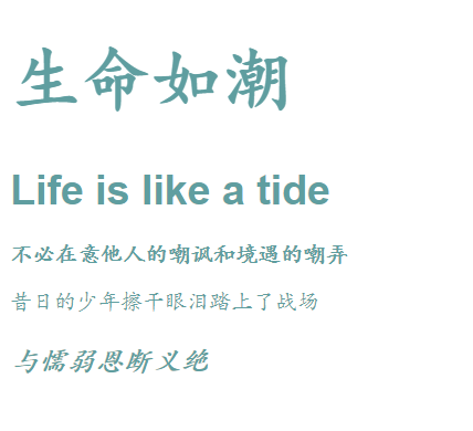
字体样式
font-family
font-size
font
font-weight
<head>
    <meta charset="UTF-8">
    <title>Title</title>

  <style>
    body{
      font-family: Arial, 楷体 ;
      color: cadetblue;
    }
    h1{
      font-size: 50px;
    }
    h1:nth-of-type(2){
      font-size: 30px;
    }
    p:nth-of-type(3){
      font: oblique bold 20px "华文楷体";
    }
    .p1{
      font-weight: bold;
    }

  </style>
</head>
<body>

<h1>生命如潮</h1>
<h1>Life is like a tide</h1>

<p class="p1">不必在意他人的嘲讽和境遇的嘲弄</p>
<p>昔日的少年擦干眼泪踏上了战场</p>
<p>与懦弱恩断义绝</p>

</body>
文本样式
rgb(xx,xx,xx)
rgba(xx,xx,xx,透明度)
文本居中:text-align: center
首行缩进:text-indent: 10em;
行高:line-height: 20px;
块的高度:height: 20px;
- 当行高与块的高度一致时,居中
下划线:text-decoration: underline;
中划线:text-decoration: line-through;
上划线:text-decoration: overline;
去掉超链接a标签的下划线
text-decoration: none;
超链接伪类
- p:hover
- p:active
<style>
/*鼠标悬停时的状态*/
p:hover {
  color:coral;
  font-size: 30px;
}
/*鼠标按下时未释放的状态*/
p:active{
  color:darkslategrey;
}
/* 阴影颜色 水平偏移 垂直偏移 阴影半径*/
#yin{
  text-shadow: #2365a7 10px 10px 2px;
}
</style>
阴影
text-shadow: #2365a7 10px 10px 2px;
(阴影颜色 水平偏移 垂直偏移 阴影半径)
列表样式
ul li中
去掉无序符号:list-style:none;
无序符号变成空心圆:list-style:circle;
无序列表变成有序列表:list-style:decimal;
无序符号变成正方形:list-style:square;
ul li{
    font-size: 30px;
    list-style: none;
}
HTML文件
<head>
<meta charset="UTF-8">
<title>列表样式</title>
<link rel="stylesheet" href="css/style.css">
</head>
<body>
<div id="nav">
<h2 class=title>全部商品分类</h2>
<ul>
<li>
<a href=#>图书</a>
<a href=#>音像</a>
<a href=#>数字商品</a>
</li>
<li>
<a href=#>家用电器</a>
<a href=#>手机</a>
<a href=#>数码</a>
</li>
<li>
<a href=#>电脑</a>
<a href=#>办公</a>
</li>
<li>
<a href=#>家居</a>
<a href=#>家装</a>
<a href=#>厨具</a>
</li>
<li>
<a href=#>服饰鞋帽</a>
<a href=#>个性化妆</a>
</li>
<li>
<a href=#>礼品箱包</a>
<a href=#>钟表</a>
<a href=#>珠宝</a>
</li>
<li>
<a href=#>食品饮料</a>
<a href=#>保健食品</a>
</li>
<li>
<a href=#>彩票</a>
<a href=#>旅行</a>
<a href=#>充值</a>
<a href=#>票务</a>
</li>
</ul>
</div>
</body>
CSS文件
.title{
    font-size: 45px;
    font-weight: bold;
    text-indent: 1em;
    line-height: 60px;
    text-align: center;
    background: olivedrab url("../images/右箭头.png") 450px 12px no-repeat;
}

#nav{
    width: 500px;
}

ul li{
    font-size: 30px;
    list-style: square;
    background: bisque url("../images/右箭头.png") 410px 0px no-repeat ;
}

a{
    text-decoration: none;
    color: black;
    font-weight: bolder;
    font-family: "微软雅黑 Light";
}

a:hover{
    color: rgb(22,85,156);
}
背景图像应用及渐变
渐变颜色网站:https://www.grabient.com/
background:颜色、图片路径、XY坐标、平铺方式

background: olivedrab url("../images/右箭头.png") 450px 12px  no-repeat;
border: 线条大小、实线/虚线、颜色

border: 1px solid/dashed rosybrown
<head>
    <meta charset="UTF-8">
    <title>列表样式</title>
    <link rel="stylesheet" href="css/style.css">

    <style>
        body{
            background-color: #8EC5FC;
            background-image: linear-gradient(62deg, #8EC5FC 0%, #E0C3FC 100%);
        }
        div{
      width: 1000px;
      height: 700px;
      border: 1px solid rosybrown;
      /*背景图片,默认是全部平铺*/
       background: olivedrab url("../images/右箭头.png") 450px 12px no-repeat;
    }
    /*repeat-x 平铺一行图片*/
    .div1{
      background-repeat: repeat-x;
    }
    /*no-repeat 只显示一张图片*/
    .div2{
      background-repeat: no-repeat;
    }

  </style>
</head>
<body>

<div class="div1"></div>
<div class="div2"></div>
<div class="div3"></div>

</body>
8、盒子模型
盒子

margin:外边距 (可用来居中某个元素)
-
margin:0 auto
表示上下都是0,左右是auto居中,页面居中
前提条件:标签在div下
padding:内边距
-
padding:0 0 0 0
上下左右都为0
border:边框
-
border: 2px solid/dashed darkslategrey;
线粗细、实线/虚线、边框颜色
内外边距
把默认的边距消除,进行初始化:
<style>
h1,ul,li,p,body{
    margin: 0;
    padding: 0;
    text-decoration: none;
}
</style>
- margin-top:外边距的上边距
<style>
h2{
        font-size: 16px;
        margin-top: 0;
        padding: 0 0 0 0;
   		margin:0 auto;
    }
</style>
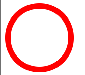
圆角边框
border-radius: 30px 40px 50px 60px
顺时针方向:
左上、右上、右下、左下
圆形:
宽度=高度
border-radius: 50px (半径)
<style>
    div{
        width: 100px;
        height: 100px;
        border: 10px solid red;
        border-radius: 50px;
    }
</style>
制作圆框头像
<head>
    <meta charset="UTF-8">
    <title>Title</title>

    <style>

        img{
            width: 300px;
            height: 300px;
            border-radius: 150px;
            border-radius: 100px 100px 100px 100px;
        }
    </style>
</head>
<body>

<div></div>
<br>
<img src="stone.jpg" alt="">

</body>

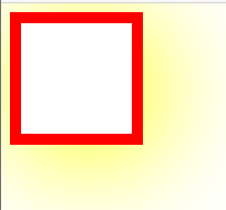
盒子阴影
- box-shadow
<style>
  div{
    width: 100px;
    height: 100px;
    border: 10px solid red;
    box-shadow: 10px 10px 100px yellow;
  }
</style>
图片阴影
<head>
    <meta charset="UTF-8">
    <title>阴影</title>

  <style>
    img{
        width: 200px;
        height: 200px;
        border-radius:100px ;
        box-shadow: 10px 10px 100px rosybrown;
    }
  </style>

</head>
<body>

<img src="1.jpg" alt="">

</body>
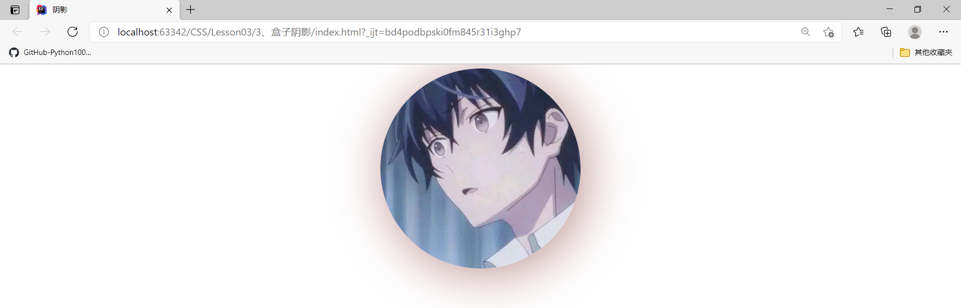
图片居中
把img的显示方式变成块,display:block
就可以使用margin:0 auto 的方式使图片居中
<head>
    <meta charset="UTF-8">
    <title>阴影</title>

  <style>
    img{
        border-radius:200px ;
        box-shadow: 10px 10px 100px rosybrown;
        margin: 0 auto;
        display: block;
    }
  </style>

</head>
<body>

<div >
    <img src="1.jpg" alt="">
</div>
</body>
9、display和浮动
块级元素与行内元素
块级元素:独占一行
- h1~h6
- p
- div
- 列表
**行内元素:**不独占一行
- span
- a
- img
- strong
块级元素可以包含行内元素
display
-
行内元素+块元素:属于块元素,但是可以内联,保持在一行
display: inline-block;
-
块元素:
display: block;
-
行内元素:
display: inline;
-
隐藏:
display: none;
注意:
1、body有默认的外边距
2、div有默认的外边距
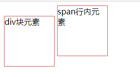
<head>
    <meta charset="UTF-8">
    <title>Title</title>

  <style>
    div{
      width: 100px;
      height: 100px;
      border: 1px solid indianred;
      display: inline-block;
    }
    span{
      width: 100px;
      height: 100px;
      border: 1px solid indianred;
      display: inline-block;
    }
  </style>

</head>
<body>
<div>div块元素</div>
<span>span行内元素</span>
浮动
独立于块元素
- float:right
- float:left
问题:
网页页面缩小导致浮动内容所在的网页边框塌陷
父级边框塌陷
- clear:right; 右侧不允许有浮动
- clear:left; 左侧不允许有浮动
- clear:both; 两侧不允许有浮动
解决方案:
1、增加父级元素的高度
#father{
    border: 1px solid #E0C3FC;
    height: 800px;
}
弊端:若元素有了固定高度,就会被限制
2、添加空div
html文件的div标签底部添加
<div id="father">
  <div class="lay1"><img src="images/1.jpg" alt=""> </div>
  <div class="lay2"><img src="images/2.jpg" alt=""> </div>
  <div class="lay3"><img src="images/3.jpg" alt=""> </div>
  <div class="lay4"><img src="images/4.jpg" alt=""> </div>
    <div class="clear"> </div>
</div>
css文件
.clear{
    clear: both;
    margin: 0;
    padding: 0;
}
弊端:代码中尽量避免空div
3、overflow
在父级元素中增加一个overflow:hidden
-
滚动条:
overflow: scroll;
#father{
    border: 1px solid #E0C3FC;
    overflow: hidden;
}
弊端:下拉的一些场景避免使用
4、父级添加一个伪类:after(推荐使用)
#father:after{
    content: '';
    display: block;
    clear: both;
}
总结
HTML文件
<!DOCTYPE html>
<html lang="en">
<head>
    <meta charset="UTF-8">
    <title>Title</title>

  <link rel="stylesheet" href="css/style.css">
</head>
<body>

<div id="father">
  <div class="lay1"><img src="images/1.jpg" alt=""> </div>
  <div class="lay2"><img src="images/2.jpg" alt=""> </div>
  <div class="lay3"><img src="images/3.jpg" alt=""> </div>
  <div class="lay4"><img src="images/4.jpg" alt=""> </div>
    <div class="clear"> </div>
</div>
</body>
</html>
CSS文件
div{
    margin: 10px;
    padding: 10px;
}

#father{
    border: 1px solid #E0C3FC;
    overflow: hidden;
}

#father:after{
    content: '';
    display: block;
    clear: both;
}


img{
    width:200px;
    height:200px;
    border-radius: 100px;
}

.lay1{
    border: 1px dashed #60f1dc;
    display: inline-block;
    float: left;
}

.lay2{
    border: 1px dashed #2365a7;
    display: inline-block;
    float: left;
}

.lay3{
    border: 1px dashed #8EC5FC;
    display: inline-block;
    float: right;
}

.lay4{
    border: 1px dashed olive;
    display: inline-block;
    float: right;
}

.clear{
    clear: both;
    margin: 0;
    padding: 0;
}
display与float对比
-
display
方向不可控制
-
float
浮动起来的话会脱离标准文档流,要解决父级边框塌陷的问题
10、定位
相对定位
-
position: relative
相对定位
-
top: -20px;
相对于上方,减少20px,相当于向上移
-
bottom:20px;
相对于下方,增加20px,相当于下移
-
left: 20px;
相对于左边,增加20px,相当于向右移
-
right: 20px;
相对于右边,增加20px,相当于向左移
定位方向:负号决定方向,多少px决定距离
#first{
position: relative;
top: -20px;
left: 20px;
bottom:20px;
}
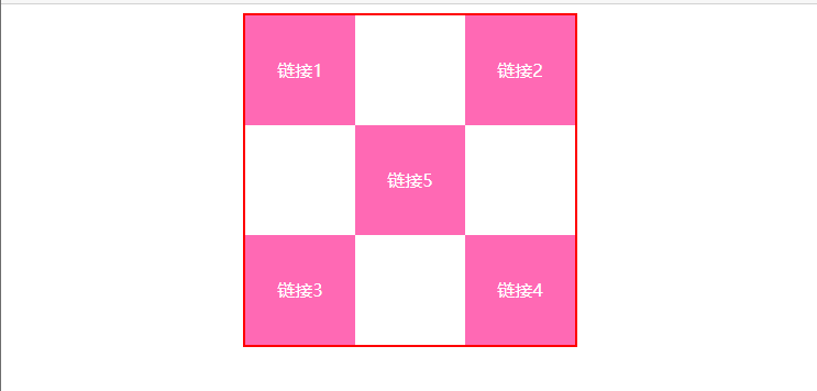
练习
HTML文件
<!DOCTYPE html>
<html lang="en">
<head>
    <meta charset="UTF-8">
    <title>Title</title>


  <link rel="stylesheet" href="css/style.css">
</head>
<body>
<div id="links">
  <a href="">链接1</a>
  <a href="">链接2</a>
  <a href="">链接3</a>
  <a href="">链接4</a>
  <a href="">链接5</a>
</div>
</body>
</html>
CSS文件
#links{
    border: 2px solid red;
    padding: 20px;
    width: 600px;
    height: 600px;
    margin: 0 auto;
}

a{
    font-size: 30px;
    text-decoration: none;
    background: hotpink;
    color: white;
    display: inline-block;
    text-align: center ;
    line-height: 200px;
}
a:nth-of-type(1){
    width: 200px;
    height: 200px;
    position: relative;
    left: -5px;
}

a:nth-of-type(2){
    width: 200px;
    height: 200px;
    position: relative;
    right: -200px;
}
a:nth-of-type(3){
    width: 200px;
    height: 200px;
    position: relative;
    bottom: -200px;
    left: -5px;
}
a:nth-of-type(4){
    width: 200px;
    height: 200px;
    position: relative;
    right: -200px;
    bottom: -200px;
}
a:nth-of-type(5){
    width: 200px;
    height: 200px;
    position: relative;
    right: -200px;
    top:-200px;
}
a:hover{
    background: #2365a7;
}
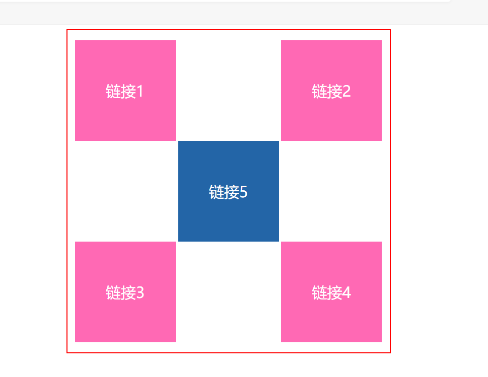
最简洁的方法:
1、红色外框线:
- 长宽:width、height
- 页面居中:margin:0 auto
- 大小为2px的红色实线:border:2px solid red
2、定义五个方块的公有属性:
- 去掉下划线:text-decoration:none
- 文字颜色、方块背景色:color、background
- 方块的大小:width、height:100px
- 行高=方块高度,使文字在垂直方向上居中:line-height:100px
- 使文字在水平方向居中:text-align:center
- 五个a标签是行内元素,要转换成块级元素显示:display:block
3、通过相对定位,把五个方块进行位移
- 相对定位:position:relative
- 位移:top、bottom、left、right
- 指定某个方块:a:nth-of-type(x)
<!DOCTYPE html>
<html lang="en">
<head>
    <meta charset="UTF-8">
    <title>Title</title>

    <style>
        #links{
            width: 300px;
            height: 300px;
            margin: 0 auto;
            border: 2px solid red;
        }
        a{
            text-decoration: none;
            color: white;
            background: hotpink;
            width: 100px;
            height: 100px;
            line-height: 100px;
            text-align: center;
            display: block;
        }
        a:nth-of-type(2),a:nth-of-type(4){
            position: relative;
            right: -200px;
            top: -100px;
        }
        a:nth-of-type(5){
            position: relative;
            right: -100px;
            top: -300px;
        }

    </style>
</head>
<body>
<div id="links">
    <a href="">链接1</a>
    <a href="">链接2</a>
    <a href="">链接3</a>
    <a href="">链接4</a>
    <a href="">链接5</a>
</div>
</body>
</html>
绝对定位与固定定位
绝对定位:position:absolute;
固定定位:position:fixed;
<!DOCTYPE html>
<html lang="en">
<head>
    <meta charset="UTF-8">
    <title>Title</title>

  <style>
    body{
      height: 1000px;
    }
    div:nth-of-type(1){
      /*相对于浏览器定位,绝对定位*/
      width: 100px;
      height: 100px;
      background: red;
      position: absolute;
      right: 0;
      bottom: 0;
    }

    div:nth-of-type(2){
      /*固定定位*/
      width: 50px;
      height: 50px;
      background: yellow;
      position: fixed;
      right: 0;
      bottom: 0;
    }
  </style>
</head>
<body>
<div>div1</div>
<div>div2</div>
</body>
</html>
z-index
层级的概念

z-index:默认是0,最高是无限999
相当于层级
-
999就是在最高层,元素就会浮在最上面
-
0就是最底层,一般用来当背景
去掉所有标签的边距
-
列表的无序符号也被消除
原本需要如下操作消除
ul,li{
	list-style:none
}
*{
    margin: 0px;
    padding: 0px;
}
总结
1、把所有标签的边距置0
*{
    margin: 0px;
    padding: 0px;
}
2、空的ul,li拿来当背景:
<li class="background"></li>
3、黑色外框实线,父级元素div,宽与图片width相同
#content{
    width: 400px;
    border: 1px solid black;
}
4、文字和背景进行绝对定位之前,以列表ul为相对定位
#content ul{
    position: relative;
}
5、文字和背景进行绝对定位,文字和背景处于同一行
- 绝对定位:position:absolute
- 背景宽度与图片宽度相同:width:400px
- 背景和文字距离列表ul的位置:top:228px;
.tip,.background{
    position: absolute;
    width: 400px;
    top:228px;
}
6、文字的层级在空背景的上面
- 调整文字为999层级:z-index: 999;
.tip{
    color: white;
    z-index: 999;
}
7、调整背景色的透明度
- 透明度为0.5:opacity: 0.5;
.background{
    background: black;
    opacity: 0.5;
}
HTML文件
<!DOCTYPE html>
<html lang="en">
<head>
    <meta charset="UTF-8">
    <title>Title</title>
    <link rel="stylesheet" href="css/style.css">
</head>
<body>
<div id="content">
    <ul>
        <li><img src="1.png" alt="" height="250px" width="400px"></li>
        <li class="tip">学习大前端,狂神说</li>
        <li class="background"></li>
        <li>时间:2050-01-01</li>
        <li>地点:火星一号基地</li>
    </ul>
</div>
</body>
</html>
CSS文件
*{
    margin: 0px;
    padding: 0px;
}
#content{
    width: 400px;
    border: 1px solid black;
}
#content ul{
    position: relative;
}
.tip,.background{
    position: absolute;
    width: 400px;
    top:228px;
}
.tip{
    color: white;
    z-index: 999;
}
.background{
    background: black;
    opacity: 0.5;
}
拿B站封面:
1、点进网页查看源代码
2、点击png文件
3、修改图片大小:1768*1080


 扫一扫
扫一扫
 5098
5098

 被折叠的 条评论
为什么被折叠?
被折叠的 条评论
为什么被折叠?
 到【灌水乐园】发言


