


上期说布局的时候往各种layout里面放了好多默认样式的按钮,按钮是最常用的控件,今天来定义一个漂亮的按钮。
个人不推荐用位图,很容易模糊的,这里就不说了...也不算很灵活。
先看第一种 定义qss样式表,这个我们直接新建一个类继承QPushButton类
cpp文件:
#include "custombutton.h"


    CustomButton::CustomButton(QWidget *parent) : QPushButton(parent) {
    // 在构造函数中设置按钮的样式
    setStyleSheet(R"(
        QPushButton {
            background-color: qlineargradient(spread:pad, x1:0, y1:0.5, x2:1, y2:0.5, stop:0 rgba(255, 0, 150, 204), stop:1 rgba(0, 204, 255, 204));
            font-family: 'Liberation Sans', Arial, sans-serif;  /* 仅设置字体 */
            color: white;
            border: none;
            border-radius: 15px;
            padding: 10px 20px;
            letter-spacing: 1.5px;
        }
        QPushButton:hover {
            background-color: qlineargradient(spread:pad, x1:0, y1:0.5, x2:1, y2:0.5, stop:0 rgba(255, 0, 150, 255), stop:1 rgba(0, 204, 255, 255));
        }
        QPushButton:pressed {
            background-color: qlineargradient(spread:pad, x1:0, y1:0.5, x2:1, y2:0.5, stop:0 rgba(235, 0, 150, 204), stop:1 rgba(0, 204, 255, 204));
        }
    )");
}
这里可以看到qss 其实和css有些相似
详细解释
1. 默认状态 (QPushButton { ... })
-
background-color: qlineargradient(...):- 使用线性渐变背景色。
spread:pad:设置渐变的填充模式,这里是pad,即渐变在边界外填充相同颜色。x1:0, y1:0.5, x2:1, y2:0.5:指定渐变的方向,从左到右。stop:0 rgba(255, 0, 150, 204), stop:1 rgba(0, 204, 255, 204):定义渐变的颜色起点和终点。stop:0 rgba(255, 0, 150, 204):渐变起点颜色为粉色,透明度为 204。stop:1 rgba(0, 204, 255, 204):渐变终点颜色为蓝色,透明度为 204。
-
font-family: 'Liberation Sans', Arial, sans-serif;:- 设置按钮的字体为
'Liberation Sans',如果该字体不可用,则使用Arial,最后使用系统的默认无衬线字体sans-serif。
- 设置按钮的字体为
-
color: white;:- 文本颜色设置为白色。
-
border: none;:- 去掉按钮的边框,使其看起来更现代。
-
border-radius: 15px;:- 设置圆角,使按钮边缘更柔和,半径为 15 像素。
-
padding: 10px 20px;:- 设置按钮内部的上下边距为 10 像素,左右边距为 20 像素,使按钮内容更居中。
-
letter-spacing: 1.5px;:- 增加字符间距,使文字更宽松,间距为 1.5 像素。
2. 悬停状态 (QPushButton:hover { ... })
background-color: qlineargradient(...):- 悬停时按钮背景色略微改变。渐变的透明度为 255,使颜色在悬停时更显眼,产生微妙的视觉反馈。
3. 按压状态 (QPushButton:pressed { ... })
background-color: qlineargradient(...):- 按钮被按下时背景色再次改变,渐变的颜色略微调整,呈现出轻微的按压效果,起点的粉色稍深。
h文件
#ifndef CUSTOMBUTTON_H
#define CUSTOMBUTTON_H

#include <QPushButton>

class CustomButton : public QPushButton {
    Q_OBJECT

public:
    explicit CustomButton(QWidget *parent = nullptr); // 构造函数声明
};

#endif // CUSTOMBUTTON_H
写好了咱们就直接用设计器拖拽一个按钮到窗口上 然后 提升这个默认按钮 为我们自定义的类
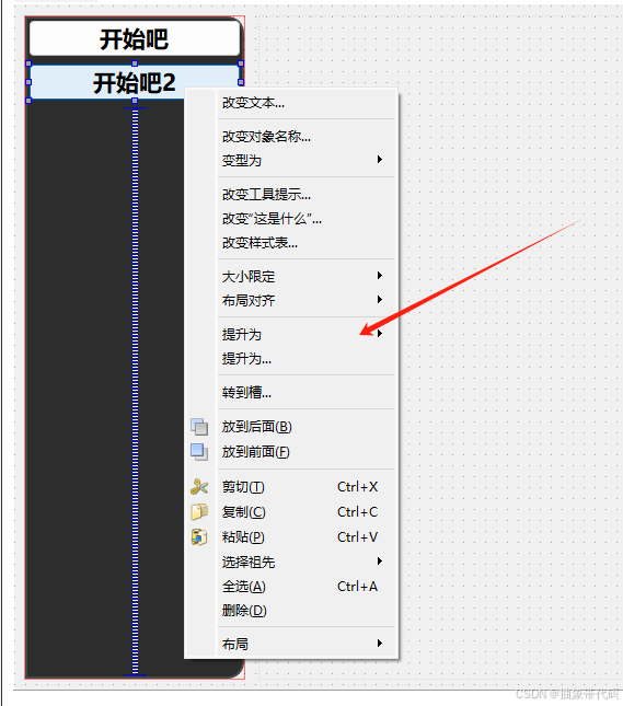
点这里输入咱们写好的类就好了,运行看看效果
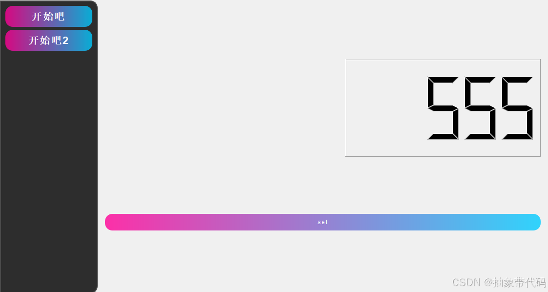
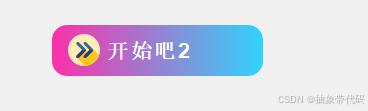
其他的按钮也提升了一下。效果还行。 实际开发中我们大概下面几种按钮就够用了
-
普通按钮(Default Button):
- 最常用的按钮类型,通常用于基本的交互操作,如“确定”、“取消”等。
- 样式通常简洁,通常带有默认的颜色、圆角或阴影效果,能清晰传达操作意图。
-
首选按钮/主要按钮(Primary Button):
- 在界面上用来表示主要操作(如“提交”、“保存”),通常是最常用的操作按钮。
- 样式上通常会加重(例如加深颜色、加大尺寸),或使用醒目的颜色来吸引用户的注意。
-
次级按钮(Secondary Button):
- 用于次要操作,通常与主要按钮配对出现,为用户提供次要操作选择(如“取消”、“返回”)。
- 通常采用不显眼的颜色或边框样式,避免与主要按钮混淆。
-
文本按钮(Text Button):
- 只有文本的按钮,不包含明显的边框或背景颜色。通常用于辅助性、轻量化操作,如“查看更多”或“编辑”。
- 鼠标悬停或点击时可能会改变文本颜色以提供交互反馈。
-
图标按钮(Icon Button):
- 以图标为主要内容,可能不带文本。适合空间有限、需要直观提示的场景(如“搜索”、“删除”)。
- 这种按钮的交互反馈通常体现在图标颜色或背景色的变化上。
-
带图标的文本按钮(Icon with Text Button):
- 图标和文字结合的按钮,通常用于增强按钮含义(如“上传文件”或“添加新项目”)。
- 样式上与普通按钮类似,但增加了图标来辅助说明操作。
-
危险按钮(Danger Button):
- 用于执行删除、清除等可能产生不可恢复的操作。
- 一般使用红色或其他醒目颜色,提示用户该按钮的操作可能不可逆。
-
不可用按钮(Disabled Button):
- 不可点击的按钮,通常用于不满足操作条件时禁用按钮。
- 样式上通常颜色较浅,用户悬停时无明显效果,提示按钮当前不可用。
-
切换按钮(Toggle Button):
- 具有“开/关”两种状态,用于需要切换状态的操作,如“启用/禁用”、“喜欢/不喜欢”。
- 样式上可能会通过背景色或图标变化来反映按钮的当前状态。
接下再讲一下svg的使用方法。
这里直接在之前的按钮样式的基础上添加一个图标
这里推荐一个开源svg网站SVG Viewer - View, edit, and optimize SVGs (不知道填这个会不会限流)
步骤
-
准备 SVG 文件:
- 确保 SVG 文件路径正确,可以是本地路径或资源文件中的路径。
- 如果使用资源文件(如
my_button.svg),则需要将 SVG 文件添加到.qrc资源文件中,然后使用路径:yourResourcePath/my_button.svg。
-
设置 QSS 样式表:
- 使用
background-image属性加载 SVG,并结合其他样式让按钮背景适应尺寸变化。
- 使用
#include "svgbutton.h"

SvgButton::SvgButton(QWidget *parent) : QPushButton(parent) {
    // 在构造函数中设置按钮的样式
    setStyleSheet(R"(
        QPushButton {

            background-image: url(E:/u3dtest/untitled11/svg/svgviewer-output.svg);  /* 使用本地文件路径 */
            background-repeat: no-repeat;                      /* 防止重复显示 */
            padding: 0px 0px 0px 16px; /* top - right - bottom - left */
            border: none;                                      /* 去除边框 */
            border-radius: 15px;
            background-position: left center;
            background-origin: content;
            color: white;                                     /* 设置字体颜色 */
            font-family: 'Liberation Sans', Arial, sans-serif;  /* 仅设置字体 */
            background-color: qlineargradient(spread:pad, x1:0, y1:0.5, x2:1, y2:0.5, stop:0 rgba(255, 0, 150, 204), stop:1 rgba(0, 204, 255, 204));
            letter-spacing: 1.5px;

        }
        QPushButton:hover {
            background-color: qlineargradient(spread:pad, x1:0, y1:0.5, x2:1, y2:0.5, stop:0 rgba(255, 0, 150, 255), stop:1 rgba(0, 204, 255, 255));
        }
        QPushButton:pressed {
            background-color: qlineargradient(spread:pad, x1:0, y1:0.5, x2:1, y2:0.5, stop:0 rgba(235, 0, 150, 204), stop:1 rgba(0, 204, 255, 204));
        }
    )");
}


 扫一扫
扫一扫


 2319
2319

 被折叠的 条评论
为什么被折叠?
被折叠的 条评论
为什么被折叠?
 到【灌水乐园】发言


