


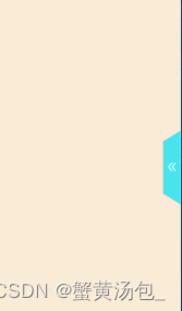
效果展示
1.收起时点击蓝色梯形按钮展开
2. 展开时点击蓝色按钮收起
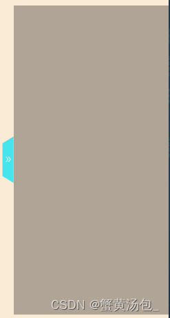
3.展开收起时需要过渡自然,有抽屉推拉效果
css
固定梯形按钮至抽屉面板中间
.toggle{
	position: absolute;
	left:-21px;
	top:0;
	bottom:0;
	margin: auto 0;
	z-index:100;
	width: 15px;
	height: 59px;
	line-height: 40px;
	color:#fff;
	font-size:14px;
	text-align: right;cursor:pointer;
	padding-left: 6px;
	.showInfo {
	font-size: 11px;margin-top: 23px;
	}
	.hiddenInfo {
	font-size: 11px;
	transform: rotate(180deg);
	margin-top:23px;
	}
}
梯形按钮css
.toggle::before {
	content: '';
	position: absolute;
	top:0;
	left:0;
	right:0;
	bottom:8;
	z-index:-1;
	background:#000;
	background-color:#47e4ee;
	color:#FFFFFF;
	border: 1px solid #47e4ee;
	-webkit-transform: perspective(0.3em)rotateY(-5deg)translateX(2.38px);
}
过渡动画
.task_status {
	/* 这里写抽屉面板样式*/
	transition:transform .3s cubic-bezier(.7,.3,.1,1);
	background-color:rgba(0,0, 0, 0.3);
}
.task_status_hidden {
	/* 这里写抽屉面板样式*/
	background-color:rgba(0,0, 0, 0);
	transform:translateX(100%);
	transition:transform .3s cubic-bezier(.7,.3,.1,1),background-color .3s cubic-bezier(.7,.3,.1,1);
}
transition对transform 和 background-color进行渐变动画形成抽屉滑动效果,其中cubic-bezier三次贝塞尔曲线控制速度是先快后慢还是先慢后快。
<div className={isShowInfo ? styles.task_status : styles.task_status_hidden}>
	<div className={styles.toggle}
	οnclick={()=>this.setstate({ isshowInfo: !isshowInfo })}>
		<Icon type="double-right" className={isShowInfo ? styles.showInfo : styles.hiddenInfo} />
	</div>
</div>


 扫一扫
扫一扫


 1532
1532

 被折叠的 条评论
为什么被折叠?
被折叠的 条评论
为什么被折叠?
 到【灌水乐园】发言


