


GradientDrawable
_A Drawable with a color gradient for buttons, backgrounds, etc. _
可用于按钮、背景等,拥有颜色渐变功能的图片资源
常用于xml file,由标签定义> for more information : > guide/topics/resources/drawable-resource.html
_
- 简单实现自定义View为button等组件作自定义形状效果
- 在xml定义使用 以xml文件名作drawable资源
                              <------官网代码解析------> 基本属性
<?xml version="1.0" encoding="utf-8"?>
<shape   作为标签定义GradientDrawable
    xmlns:android="http://schemas.android.com/apk/res/android"  资源文件引入
    android:shape=["rectangle" | "oval" | "line" | "ring"] 默认为矩形
     android:useLevel = "false">  默认为false,否则可能View不显示

    <corners   圆角大小配置 仅当形状为矩形配置生效
        android:radius="integer"  大于1圆角效果才明显,实际>0才会绘制圆角
        android:topLeftRadius="integer"
        android:topRightRadius="integer"
        android:bottomLeftRadius="integer"
        android:bottomRightRadius="integer" />
  如果要某一个角不同于其他,可先配radius 再覆盖配置具体位置。不需要圆角可为0

    <gradient 填充配置渐变颜色
        android:angle="integer" 必须为45°的倍数 0 从左往右 90 右往左 180 上下 270下上
        android:centerX="float"  (0-1)
        android:centerY="float"  (0-1)
        android:centerColor="integer"
        android:endColor="color" 渐变结束颜色
        android:gradientRadius="integer"
        android:startColor="color" 渐变开始颜色
        android:type=["linear" | "radial" | "sweep"]  渐变效果
        android:useLevel=["true" | "false"] />

    <padding
        android:left="integer"
        android:top="integer"
        android:right="integer"
        android:bottom="integer" />

    <size
        android:width="integer"
        android:height="integer" />
       当宽高相同时,oval绘制成圆

    <solid    填充颜色
        android:color="color" />

    <stroke       边框
        android:width="integer" 边框宽度
        android:color="color"
        android:dashWidth="integer"  虚线线宽   |
        android:dashGap="integer" />  虚线隔宽  |两个属性同时配置才生效
</shape>
代码动态使用
GradientDrawable drawable;
//创建使用
drawable = new GradientDrawable();
drawable.setShape(GradientDrawable.常量)
drawable.setCornerRadius(px)
drawable.setStroke(width,color)

//组件在xml已配置,代码中动态修改
drawable = 以xml为背景资源的组件实例.getBackground();
drawable.setColor(color)//填充颜色

动态修改可实现同一背景资源,各个组件自定义差异使用
- 使用场景,单独为简单图形背景,跟State结合组成StateDrawable实现按钮状态改变背景效果
- 填充图形以xml使用,边框图形动态创建 (资源复用率高的情况下)
tips: 作为资源背景,大小随组件变化;size在组件范围内,以属性显示
ShapeDrawable
shapeDrawable 与GradientDrawable同样使用标签在xml定义使用
shapeDrawable基于基础属性 GradientDrawable拥有shapeDrawable的所有属性,还增加了<gradient 标签
代码获取资源对象时,this will become Resource pointer to a [GradientDrawable](https://developer.android.com/reference/android/graphics/drawable/GradientDrawable).
即使用shape标签定义的资源对象,在代码中加载得到为GradientDrawable对象
_GradientDrawable的属性比ShapeDrawable更丰富:
绘制图形更多样(ShapeDrawble只能绘制Shape形状,无其他边框效果)
查看源码对比:
onDraw():
形状:ShapeDrawble 参数Shape实例 | GradientDrawable 内部注解常量
GradientDrawble涉及边框绘制,同时fill & stroke要采用Layer绘制
    final boolean useLayer = haveStroke && haveFill && st.mShape != LINE &&
                 currStrokeAlpha < 255 && (mAlpha < 255 || colorFilter != null);

        /*  Drawing with a layer is slower than direct drawing, but it
            allows us to apply paint effects like alpha and colorfilter to
            the result of multiple separate draws. In our case, if the user
            asks for a non-opaque alpha value (via setAlpha), and we're
            stroking, then we need to apply the alpha AFTER we've drawn
            both the fill and the stroke.
        */
        if (useLayer) {
            if (mLayerPaint == null) {
                mLayerPaint = new Paint();
            }
            mLayerPaint.setDither(st.mDither);
            mLayerPaint.setAlpha(mAlpha);
            mLayerPaint.setColorFilter(colorFilter);

            float rad = mStrokePaint.getStrokeWidth();
            canvas.saveLayer(mRect.left - rad, mRect.top - rad,
                             mRect.right + rad, mRect.bottom + rad,
                             mLayerPaint);

            // don't perform the filter in our individual paints
            // since the layer will do it for us
            mFillPaint.setColorFilter(null);
            mStrokePaint.setColorFilter(null);
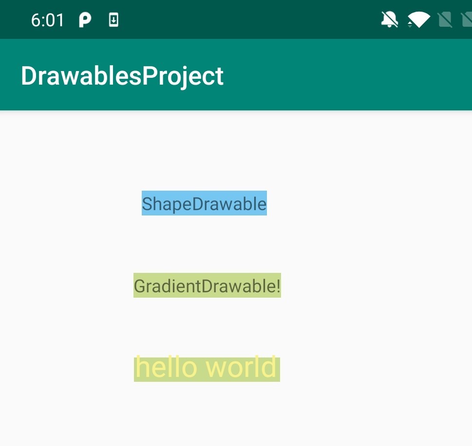
图1
ShapeDrawable drawable = new ShapeDrawable();
  drawable.setShape(new RectShape()); //RectShape,ovalShape...
 // If the color isn't set, the shape uses black as the default.
  drawable.getPaint().setColor(getResources().getColor(R.color.blue));
  view.setBackground(drawable);
图2
  GradientDrawable drawable = new GradientDrawable();
  drawable.setColor(getResources().getColor(R.color.green));
  view.setBackground(drawable);
结合自定义View使用
官方例子 : https://developer.android.com/guide/topics/graphics/drawables#shape-drawable
                      //官方例子简单运用
图3
public class ShapeView extends View {


    private ShapeDrawable drawable;
    int x = 10;
    int y = 10;
    int width = 300;
    int height = 50;

    public ShapeView(Context context) {
        super(context);
    }

    public ShapeView(Context context, @Nullable AttributeSet attrs) {
        super(context, attrs);
        setContentDescription(context.getResources().getString(
                R.string.app_name));
        drawable = new ShapeDrawable(new RectShape());
//        drawable = new GradientDrawable();
//        drawable.setShape(GradientDrawable.RECTANGLE);
//        drawable.setColor(0xff74AC23);
        // If the color isn't set, the shape uses black as the default.
        drawable.getPaint().setColor(Color.parseColor("#c8db8c"));
        // If the bounds aren't set, the shape can't be drawn.
        drawable.setBounds(x, y, x + width, y + height);
    }

    @Override
    protected void onMeasure(int widthMeasureSpec, int heightMeasureSpec) {
        super.onMeasure(widthMeasureSpec, heightMeasureSpec);
    }

    @Override
    protected void onDraw(Canvas canvas) {
        drawable.draw(canvas);
        Paint mPaint = drawable.getPaint();
        mPaint.setColor(Color.parseColor("#f9f28b"));
        mPaint.setTextSize(60);
        canvas.drawText("hello world", 12, 50, mPaint);
    }
}
由于ShapeDrawable可直接获取Paint对象使用,且提供已封装好绘制简单形状的方法,由此简化自定义View些少步骤。给实现自定义View提供多一个思路
效果图:图1、2、3


 扫一扫
扫一扫


 643
643

 被折叠的 条评论
为什么被折叠?
被折叠的 条评论
为什么被折叠?
 到【灌水乐园】发言


