


QML中QtQuick提供的文本编辑框控件包括 TextInput,TextField,TextEdit,TextArea。Textlnput 与 TextField 为行编辑控件,TextEdit 与 TextArea 为块编辑控件。
行编辑框中,TextInput没有默认边框需自行定义外框,使用起来没有TextField方便,项目中大多选用TextField,自定义TextField控件时,只需要定义其背景、字体、鼠标选中、文字位置等属性。自定义的控件具体见代码文件TextField.qml:
/*
* 自定义QML CheckBox
* Since:Qt 5.7 采用QtQuick.Controls 2.12库(2.0版)
*/

import QtQuick 2.12
import QtQuick.Controls 2.12
import QtQuick.Controls.impl 2.12
import QtQuick.Templates 2.12 as T

T.TextField {
    id: control;

    implicitWidth: implicitBackgroundWidth;
    implicitHeight: implicitBackgroundHeight;
    padding: 6; // TextField内部上下左右的距离
    leftPadding: padding + 4; // 文字距离左边界的距离

    color: "#333333";   // 字体颜色
    font.pixelSize: 12; // 字体大小
    font.family: "Microsoft YaHei"; // 字体
    selectByMouse: true;
    selectionColor: control.palette.highlight; // 鼠标选中文字的背景颜色
    selectedTextColor: control.palette.highlightedText; // 鼠标选中文字的字体颜色
    placeholderTextColor: Color.transparent(control.color, 0.5); // 预显示字体颜色(为正式字体的一半色彩)
    verticalAlignment: TextInput.AlignHCenter; // 文本水平对齐方式
    renderType: Text.NativeRendering;  // 字体渲染类型 与本地平台有关,此处可使字体更加清晰
    // 正则输入限制,此处表示不限制输入
    validator: RegExpValidator { regExp: /.*/ }

    // 占位符文本属性设置
    PlaceholderText {
        id: placeholder;
        x: control.leftPadding;
        y: control.topPadding;  // 文本渲染位置
        width: control.width - (control.leftPadding + control.rightPadding);
        height: control.height - (control.topPadding + control.bottomPadding);
        text: control.placeholderText;
        font: control.font;
        color: control.placeholderTextColor;
        verticalAlignment: control.verticalAlignment;
        visible: !control.length && !control.preeditText && (!control.activeFocus || control.horizontalAlignment !== Qt.AlignHCenter);
        elide: Text.ElideRight;
        renderType: control.renderType;
    }

    // 文本输入框背景属性设置
    background: Rectangle {
        radius: 3;
        implicitWidth: 120;
        implicitHeight: 30;
        color: control.readOnly ? "#EEEFF7" : "#FFFFFF";
        border.width: 1;
        border.color: "#E5E5E5";
    }

}
上面自定义代码中没有限制其正则输入,本文提供几种常用的正则限制,针对不同的输入框代码如下:
// 浮点数输入 如: 0.23 1.34E-5
validator: RegExpValidator { regExp: (/^[-\+]?\d*\.?\d+([Ee][-\+]?\d+)?/) }

// 整数输入 0 ~ 9999999位
validator: RegExpValidator { regExp: (/^\d{0,7}$/) }

// 汉字输入 和 - 只能输入120个
validator: RegExpValidator { regExp: (/[\w\s-]{1, 120}/) }

// A-Za-z0-9输入
validator: RegExpValidator { regExp: (/^[A-Za-z0-9]+$/) }

// 整数输入 0 ~ 9999999位
validator: RegExpValidator { regExp: (/^\w+([-+.]\w+)*@\w+([-.]\w+)*\.\w+([-.]\w+)*$/) }

// Email输入
validator: RegExpValidator { regExp: (/^\d{0,7}$/) }

// 日期输入
validator: RegExpValidator { regExp: (/^\d{4}-\d{1,2}-\d{1,2}/) }
自定义控件应用:
在main.qml中引入两种控件qml路径as成My,并使用此Controls具体见代码实现:
import QtQuick 2.0
import QtQuick.Window 2.0
import QtQuick.Controls 2.12
import "myControl" as My

Window {
    visible: true;
    width: 640;
    height: 480;
    title: qsTr("自定义Control");

    My.Label {
        anchors.top: parent.top;
        anchors.topMargin: 56;
        anchors.right: text1.left;
        anchors.rightMargin: 15;
        text: qsTr("汉字输入");
    }

    My.TextField {
        id: text1;
        width: 150;
        anchors.top: parent.top;
        anchors.topMargin: 50;
        anchors.left: parent.left;
        anchors.leftMargin: 100;
        placeholderText: qsTr("预显示字体");
    }

    My.Label {
        anchors.top: text1.bottom;
        anchors.topMargin: 56;
        anchors.right: text2.left;
        anchors.rightMargin: 15;
        text: qsTr("浮点数输入");
    }

    My.TextField {
        id: text2;
        width: 150;
        anchors.top: text1.bottom;
        anchors.topMargin: 50;
        anchors.left: parent.left;
        anchors.leftMargin: 100;
        text: qsTr("1.25e-5");
    }
}
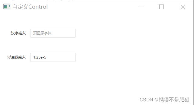
自定义控件展示:
如下图:


 670
670


 被折叠的 条评论
为什么被折叠?
被折叠的 条评论
为什么被折叠?
 到【灌水乐园】发言


