WPF实现一个combobox的style

一个Combobox其实是由如下部分组成的,每个单独的部分都可以设置边框,背景,文字颜色,鼠标滑过的效果等:
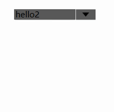
在这里插入图片描述
效果如下:
在这里插入图片描述
xaml代码如下:
其中<Window.Resources>与</Window.Resources>之间的就combobox的Style,编写了style之后,可以把界面上的任何一个combobox设置成这个样式,使用样式的方式见下面代码中 与之间的代码。

<Window x:Class="WpfApplication3.MainWindow"
        xmlns="http://schemas.microsoft.com/winfx/2006/xaml/presentation"
        xmlns:x="http://schemas.microsoft.com/winfx/2006/xaml"
        xmlns:d="http://schemas.microsoft.com/expression/blend/2008"
        xmlns:mc="http://schemas.openxmlformats.org/markup-compatibility/2006"
        xmlns:local="clr-namespace:WpfApplication3"
        mc:Ignorable="d"
        Title="MainWindow" Height="350" Width="525">
    <Window.Resources>
        <!--Combox右侧下拉按钮-->
        <Style TargetType="ToggleButton" x:Key="ComboxStyleBtn">
            <Setter Property="Template">
                <Setter.Value>
                    <ControlTemplate>
                        <!--下拉按钮内部背景色-->
                        <Border x:Name="Back" Background="#5A5A5A" BorderThickness="1,0,0,0">
                            <!--下拉按钮内边框-->
                            <Path Name="PathFill" Fill="Black"  Width="10" Height="6" StrokeThickness="0" Data="M5,0 L10,10 L0,10 z" RenderTransformOrigin="0.5,0.5" Stretch="Fill">
                                <Path.RenderTransform>
                                    <TransformGroup>
                                        <ScaleTransform/>
                                        <SkewTransform/>
                                        <RotateTransform Angle="180"/>
                                        <TranslateTransform/>
                                    </TransformGroup>
                                </Path.RenderTransform>
                            </Path>
                        </Border>
                        <ControlTemplate.Triggers>
                            <Trigger Property="IsMouseOver" Value="True">
                                <Setter TargetName="PathFill" Property="Fill" Value="White"></Setter>
                                <!--<Setter TargetName="Back" Property="Background" Value="#00CA4F"></Setter>
                                <Setter TargetName="Back" Property="BorderBrush" Value="#59CA4F"></Setter>-->
                            </Trigger>
                        </ControlTemplate.Triggers>
                    </ControlTemplate>
                </Setter.Value>
            </Setter>
        </Style>
        <!--Combox-->
        <Style TargetType="ComboBox" x:Key="ComboBoxStyle">
            <Setter Property="ItemContainerStyle">
                <Setter.Value>
                    <!--ComBoxItem-->
                    <Style TargetType="ComboBoxItem">
                        <Setter Property="MinHeight" Value="22"></Setter>
                        <Setter Property="MinWidth" Value="60"></Setter>
                        <Setter Property="Foreground" Value="White"/>
                        <Setter Property="Template">
                            <Setter.Value>
                                <ControlTemplate TargetType="ComboBoxItem">
                                    <Border Name="Back" Background="Transparent"  BorderThickness="0,0,0,0" BorderBrush="#81D779" >
                                        <ContentPresenter ContentSource="{Binding Source}" VerticalAlignment="Center" HorizontalAlignment="Left" Margin="10,0,0,0" ></ContentPresenter>
                                    </Border>
                                    <ControlTemplate.Triggers>
                                        <Trigger Property="IsMouseOver" Value="True">
                                            <Setter TargetName="Back" Property="Background" Value="LightGray"></Setter>
                                        </Trigger>
                                        <!--下拉框背景色-->
                                        <Trigger Property="IsHighlighted" Value="True">
                                            <Setter TargetName="Back" Property="Background" Value="Gray"></Setter>
                                        </Trigger>
                                    </ControlTemplate.Triggers>
                                </ControlTemplate>
                            </Setter.Value>
                        </Setter>
                    </Style>
                </Setter.Value>
            </Setter>
            <Setter Property="Template">
                <Setter.Value>
                    <ControlTemplate TargetType="ComboBox">
                        <Grid>
                            <Grid.ColumnDefinitions>
                                <ColumnDefinition Width="0.7*"/>
                                <ColumnDefinition Width="0.3*" MaxWidth="30"/>
                            </Grid.ColumnDefinitions>
                            <!--文字区域背景和边线样式-->
                            <TextBox Background="#5A5A5A"  Grid.Column="0" BorderThickness="0" IsReadOnly="True" Text="{TemplateBinding Text}"></TextBox>
                            <Border  Grid.Column="0" BorderThickness="1" BorderBrush="#5A5A5A" CornerRadius="1,0,0,1">
                            </Border>
                            <!--右侧下拉button设置-->
                            <Border Grid.Column="1" BorderBrush="#5A5A5A" CornerRadius="0,1,1,0">
                                <ToggleButton BorderThickness="3" BorderBrush="#5A5A5A" Style="{StaticResource ComboxStyleBtn}" IsChecked="{Binding Path=IsDropDownOpen, Mode=TwoWay, RelativeSource={RelativeSource TemplatedParent}}" ClickMode="Press"></ToggleButton>
                            </Border>
                            <!--弹出popup整体设置-->
                            <Popup IsOpen="{TemplateBinding IsDropDownOpen}" Placement="Bottom" x:Name="Popup" Focusable="False" AllowsTransparency="False" PopupAnimation="Slide" >
                                <!--弹出popup边框-->
                                <Border CornerRadius="1" BorderBrush="#5A5A5A" BorderThickness="1,0,1,1" MaxHeight="{TemplateBinding MaxDropDownHeight}" MinWidth="{TemplateBinding ActualWidth}" x:Name="DropDown" SnapsToDevicePixels="True">
                                    <Border.Effect>
                                        <DropShadowEffect Color="Gray" BlurRadius="2" ShadowDepth="0" Opacity="1"/>
                                    </Border.Effect>
                                    <!--下拉幕布边界背景设置 MaxHeight="{TemplateBinding MaxDropDownHeight}"-->
                                    <ScrollViewer Margin="0,0,0,0" Background="Gray"  SnapsToDevicePixels="True" HorizontalScrollBarVisibility="Auto" VerticalScrollBarVisibility="Auto" BorderBrush="Gray" BorderThickness="2" >
                                        <!--StackPanel 用于显示子级,方法是将 IsItemsHost 设置为 True-->
                                        <StackPanel IsItemsHost="True" KeyboardNavigation.DirectionalNavigation="Contained" Background="#5A5A5A" />
                                    </ScrollViewer>
                                </Border>
                            </Popup>
                        </Grid>
                    </ControlTemplate>
                </Setter.Value>
            </Setter>
        </Style>
    </Window.Resources>
    <Grid>
        <ComboBox Style="{StaticResource ComboBoxStyle}" Name="comboBox" HorizontalAlignment="Left" Margin="352,149,0,0" VerticalAlignment="Top" Width="120" IsSynchronizedWithCurrentItem="True">
        </ComboBox>

    </Grid>
</Window>

注意:如果要使用ComboBox的SelectedItem绑定代码中的数据的话,需要在的属性中添加下面这样代码:

SelectedItem="{Binding valueUnit,Mode=TwoWay,UpdateSourceTrigger=LostFocus}"

Mode=TwoWay表示代码中的数据源更新的话,界面显示数据也会更新;界面更新的话,数据源也会更新,是双向的。
UpdateSourceTrigger=LostFocus表示控件一失去焦点就更新代码中的数据源。如果不加这行有可能导致界面上用户已经改变了Combobox的Item,但代码中的数据却没随之更改!

  • 4
    点赞
  • 8
    收藏
    觉得还不错? 一键收藏
  • 打赏
    打赏
  • 1
    评论
以下是一个简单的 WPF ComboBox 样式示例: ```xml <Window.Resources> <Style x:Key="ComboBoxStyle" TargetType="{x:Type ComboBox}"> <Setter Property="Foreground" Value="Black"/> <Setter Property="Background" Value="White"/> <Setter Property="FontSize" Value="14"/> <Setter Property="Padding" Value="5,2"/> <Setter Property="Height" Value="30"/> <Setter Property="Width" Value="120"/> <Setter Property="Template"> <Setter.Value> <ControlTemplate TargetType="{x:Type ComboBox}"> <Grid> <ToggleButton x:Name="ToggleButton" BorderBrush="Gray" BorderThickness="1" Background="{TemplateBinding Background}" Foreground="{TemplateBinding Foreground}" Grid.Column="2" Focusable="false" IsChecked="{Binding Path=IsDropDownOpen, Mode=TwoWay, RelativeSource={RelativeSource TemplatedParent}}" > <ToggleButton.Template> <ControlTemplate> <Grid> <Grid.ColumnDefinitions> <ColumnDefinition /> <ColumnDefinition Width="20" /> </Grid.ColumnDefinitions> <Border x:Name="Border" Background="{TemplateBinding Background}" BorderThickness="0" CornerRadius="0" Grid.ColumnSpan="2" /> <Path x:Name="Arrow" Grid.Column="1" Fill="{TemplateBinding Foreground}" HorizontalAlignment="Center" VerticalAlignment="Center" Data="M 0 0 L 4 4 L 8 0 Z"/> </Grid> <ControlTemplate.Triggers> <Trigger Property="IsEnabled" Value="False"> <Setter TargetName="Border" Property="Background" Value="#EEE" /> <Setter TargetName="Border" Property="BorderBrush" Value="#AAA" /> <Setter Property="Foreground" Value="#AAA"/> <Setter TargetName="Arrow" Property="Fill" Value="#AAA" /> </Trigger> <Trigger Property="IsMouseOver" Value="True"> <Setter TargetName="Border" Property="Background" Value="#DDD" /> </Trigger> <Trigger Property="IsChecked" Value="True"> <Setter TargetName="Border" Property="Background" Value="#EEE" /> </Trigger> </ControlTemplate.Triggers> </ControlTemplate> </ToggleButton.Template> </ToggleButton> <Popup x:Name="Popup" Placement="Bottom" IsOpen="{TemplateBinding IsDropDownOpen}" AllowsTransparency="True" Focusable="False" PopupAnimation="Slide"> <Grid x:Name="DropDown" SnapsToDevicePixels="True" MinWidth="{TemplateBinding ActualWidth}" MaxHeight="{TemplateBinding MaxDropDownHeight}"> <Border x:Name="DropDownBorder" Background="White" BorderThickness="1" BorderBrush="Gray"/> <ScrollViewer Margin="4,6,4,6" SnapsToDevicePixels="True"> <ItemsPresenter SnapsToDevicePixels="True" /> </ScrollViewer> </Grid> <Popup.Style> <Style TargetType="{x:Type Popup}"> <Style.Triggers> <Trigger Property="HasDropShadow" Value="True"> <Setter Property="Margin" Value="0,0,5,5" /> </Trigger> </Style.Triggers> </Style> </Popup.Style> </Popup> </Grid> </ControlTemplate> </Setter.Value> </Setter> </Style> </Window.Resources> <StackPanel> <ComboBox Style="{StaticResource ComboBoxStyle}" ItemsSource="{Binding Items}" SelectedItem="{Binding SelectedItem}" /> </StackPanel> ``` 这个样式将 ComboBox 的默认外观替换为一个带有箭头的按钮,单击该按钮将显示一个下拉列表。你可以使用这个样式作为起点,自定义一些属性来满足你的需求。

“相关推荐”对你有帮助么?

  • 非常没帮助
  • 没帮助
  • 一般
  • 有帮助
  • 非常有帮助
提交
评论 1
添加红包

请填写红包祝福语或标题

红包个数最小为10个

红包金额最低5元

当前余额3.43前往充值 >
需支付:10.00
成就一亿技术人!
领取后你会自动成为博主和红包主的粉丝 规则
hope_wisdom
发出的红包

打赏作者

GreenHandBruce

你的鼓励将是我创作的最大动力

¥1 ¥2 ¥4 ¥6 ¥10 ¥20
扫码支付:¥1
获取中
扫码支付

您的余额不足,请更换扫码支付或充值

打赏作者

实付
使用余额支付
点击重新获取
扫码支付
钱包余额 0

抵扣说明:

1.余额是钱包充值的虚拟货币,按照1:1的比例进行支付金额的抵扣。
2.余额无法直接购买下载,可以购买VIP、付费专栏及课程。

余额充值