


核心代码:
.loop(@n) when (@n > 0){
    .loop(@n - 1);
    li:nth-child(@{n}) {
        left: ~`Math.random()*70+15+'px'`;
        top: 50%;
        transform: translate(-50%, -50%);
        @width: ~`Math.random()*15+15+'px'`;
        width: @width;
        height: @width;
        @s: ~`Math.random()`;
        animation: moveToTop @s*6+3s ease-in-out @s*5000/1000s infinite;
    }
}
.loop(15);
完整:
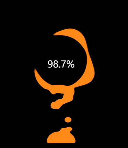
<div id="charge">
     <div class="g-container">
	    <div class="g-number">98.7%</div>
	    <div class="g-contrast">
	        <div class="g-circle"></div>
	        <ul class="g-bubbles">
	            <li></li>
	            <li></li>
	            <li></li>
	            <li></li>
	            <li></li>
	            <li></li>
	            <li></li>
	            <li></li>
	            <li></li>
	            <li></li>
	            <li></li>
	            <li></li>
	            <li></li>
	            <li></li>
	            <li></li>
	        </ul>
	    </div>
</div>
<style lang="less" scoped>
#charge {
    height: 100%;
    width: 100%;
    display: flex;
    background: #000;
    overflow: hidden;
}

.g-number {
    position: absolute;
    width: 300px;
    top: 27%;
    text-align: center;
    font-size: 32px;
    z-index: 10;
    color: #fff;
}

.g-container {
    position: relative;
    width: 300px;
    height: 400px;
    margin: auto;
}

.g-contrast {
    filter: contrast(10) hue-rotate(0);
    width: 300px;
    height: 400px;
    background-color: #000;
    overflow: hidden;
    animation: hueRotate 10s infinite linear;
}

.g-circle {
    position: relative;
    width: 300px;
    height: 300px;
    box-sizing: border-box;
    filter: blur(8px);

    &::after {
        content: "";
        position: absolute;
        top: 40%;
        left: 50%;
        transform: translate(-50%, -50%) rotate(0);
        width: 200px;
        height: 200px;
        background-color: #00ff6f;
        border-radius: 42% 38% 62% 49% / 45%;
        animation: rotate 10s infinite linear;
    }

    &::before {
        content: "";
        position: absolute;
        width: 176px;
        height: 176px;
        top: 40%;
        left: 50%;
        transform: translate(-50%, -50%);
        border-radius: 50%;
        background-color: #000;
        z-index: 10;
    }
}

.g-bubbles {
    position: absolute;
    left: 50%;
    bottom: 0;
    width: 100px;
    height: 40px;
    transform: translate(-50%, 0);
    border-radius: 100px 100px 0 0;
    background-color: #00ff6f;
    filter: blur(5px);
}
li{
    position: absolute;
    border-radius: 50%;
    background: #00ff6f;
}

.loop(@n) when (@n > 0){
    .loop(@n - 1);
    li:nth-child(@{n}) {
        left: ~`Math.random()*70+15+'px'`;
        top: 50%;
        transform: translate(-50%, -50%);
        @width: ~`Math.random()*15+15+'px'`;
        width: @width;
        height: @width;
        @s: ~`Math.random()`;
        animation: moveToTop @s*6+3s ease-in-out @s*5000/1000s infinite;
    }
}
.loop(15);
@keyframes rotate {
    50% {
        border-radius: 45% / 42% 38% 58% 49%;
    }
    100% {
        transform: translate(-50%, -50%) rotate(720deg);
    }
}

@keyframes moveToTop {
    90% {
        opacity: 1;
    }
    100% {
        opacity: .1;
        transform: translate(-50%, -180px);
    }
}

@keyframes hueRotate {
    100% {
        filter: contrast(15) hue-rotate(360deg);
    }
}

</style>


 1737
1737


 被折叠的 条评论
为什么被折叠?
被折叠的 条评论
为什么被折叠?
 到【灌水乐园】发言


