


使用的方案 lib-flexible-computer + px2remLoader + postcss-px2rem
lib-flexible:阿里可伸缩布局方案
px2rem-loader:px 转 rem
postcss-px2rem: 将代码中px自动转化成对应的rem的一个插件
	下面这个插件会代替lib-flexible 更好一些 适用于pc
	npm i lib-flexible-computer -S //根节点会根据页面视口变化而变化font-size大小
	安装这个的话就不需要下面flexible文件修改了
查阅的其他人的链接
http://www.codebaoku.com/it-js/it-js-205513.html
强推!!!https://javaforall.cn/127968.html
https://blog.csdn.net/waillyer/article/details/108239340
https://blog.csdn.net/qq_38902230/article/details/109024871
没用到 但是感觉有用
https://codeantenna.com/a/U8Sv11WUle
- 安装依赖
npm install px2rem-loader -D 【后续会卸载】
npm i lib-flexible-computer --save
npm install postcss-px2rem --save
- 引入
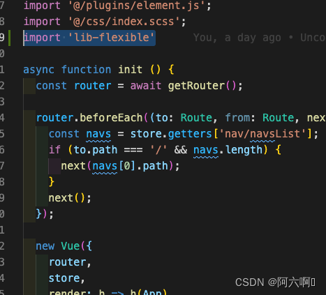
安装好了之后还需要在项目的入口文件 main.js 里引入 lib-flexible
// main.js
import 'lib-flexible-computer'
如下图所示
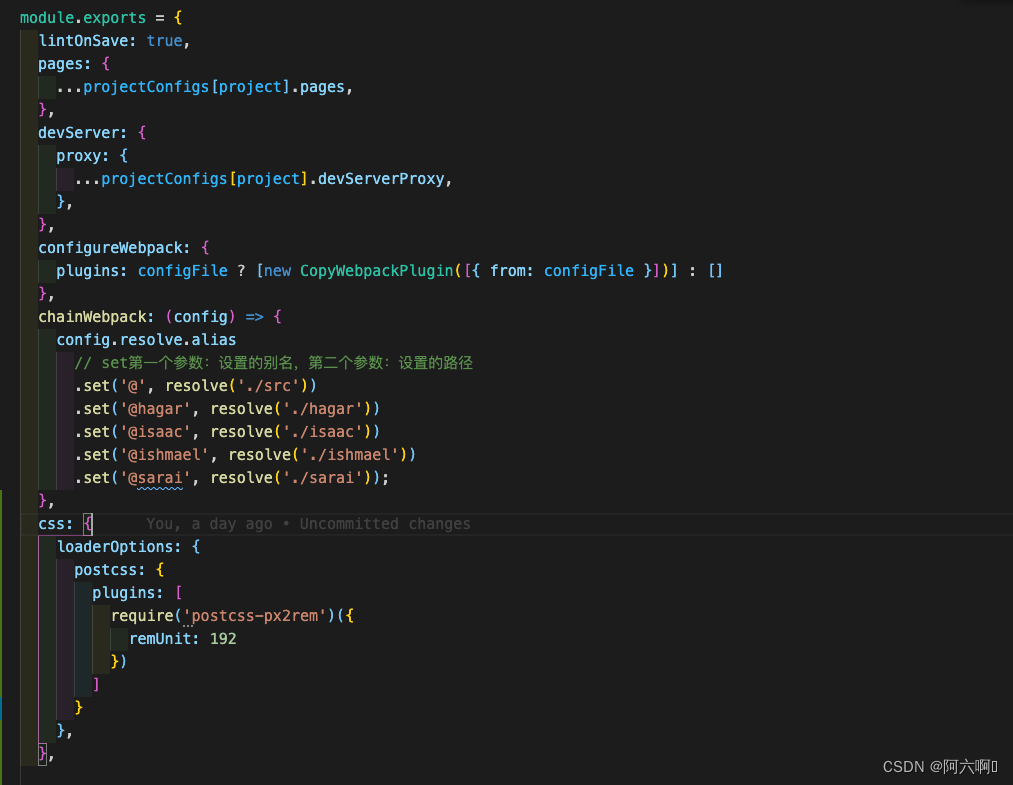
3. 配置px2rem
链接里面是下面截图这种,但是我重启之后 就会报错 config为定义;
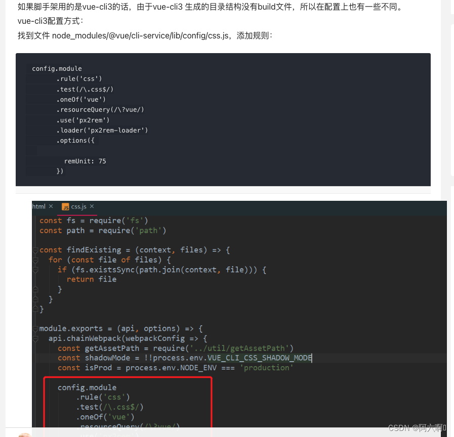
所以我查阅了其他文档
在vue.config.js中下方代码
css: {
    loaderOptions: {
      postcss: {
        plugins: [
          require('postcss-px2rem')({
            remUnit: 192 //设计图宽度/10
          })
        ]
      }
    },
  },
例如下图:
- font-size显示54px 也就是1rem=54px 是不对的
在node_moudles下lib-flexible下flexible.js修改
function refreshRem(){
      var width = docEl.getBoundingClientRect().width;
      if (width / dpr > 540) {
          width = width * dpr;
      }
      var rem = width / 10;
      docEl.style.fontSize = rem + 'px';
      flexible.rem = win.rem = rem;
  }
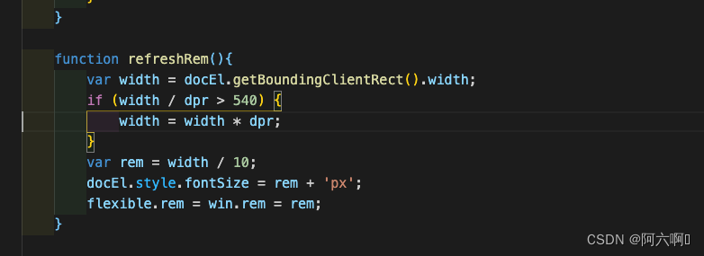
⚠️按照上面的方法修改之后,每次修改浏览器显示比% 大小的时候就会卡顿一下 ;
所以做了一下优化,顺便看到其他链接中也有写道 因为修改了flexible.js, 每次装依赖,都需要改动,这里提取出来就好:在utils目录下新建flexible.js文件;然后把node_moudles下lib-flexible下flexible.js复制出来 引入就可以了,可以将lib-flexible卸载了
-
将刚才修改的 flexible.js 文件 copy 到 scr/utils 目录(可随意放置) -
main.js 引入 lib-flexible import './utils/flexible.js' (路径为flexible.js放置路径)
关键代码
if (width / dpr < 1280) {
  width = 1280 * dpr;
}
flexible.js最终为
(function (win, lib) {
  const doc = win.document;
  const docEl = doc.documentElement;
  let metaEl = doc.querySelector('meta[name="viewport"]');
  const flexibleEl = doc.querySelector('meta[name="flexible"]');
  let dpr = 0;
  let scale = 0;
  let tid;
  const flexible = lib.flexible || (lib.flexible = {});

  if (metaEl) {
    console.warn('将根据已有的meta标签来设置缩放比例');
    const match = metaEl.getAttribute('content').match(/initial\-scale=([\d\.]+)/);
    if (match) {
      scale = parseFloat(match[1]);
      dpr = parseInt(1 / scale);
    }
  } else if (flexibleEl) {
    const content = flexibleEl.getAttribute('content');
    if (content) {
      const initialDpr = content.match(/initial\-dpr=([\d\.]+)/);
      const maximumDpr = content.match(/maximum\-dpr=([\d\.]+)/);
      if (initialDpr) {
        dpr = parseFloat(initialDpr[1]);
        scale = parseFloat((1 / dpr).toFixed(2));
      }
      if (maximumDpr) {
        dpr = parseFloat(maximumDpr[1]);
        scale = parseFloat((1 / dpr).toFixed(2));
      }
    }
  }

  if (!dpr && !scale) {
    const isAndroid = win.navigator.appVersion.match(/android/gi);
    const isIPhone = win.navigator.appVersion.match(/iphone/gi);
    const devicePixelRatio = win.devicePixelRatio;
    if (isIPhone) {
      // iOS下,对于2和3的屏,用2倍的方案,其余的用1倍方案
      if (devicePixelRatio >= 3 && (!dpr || dpr >= 3)) {
        dpr = 3;
      } else if (devicePixelRatio >= 2 && (!dpr || dpr >= 2)) {
        dpr = 2;
      } else {
        dpr = 1;
      }
    } else {
      // 其他设备下,仍旧使用1倍的方案
      dpr = 1;
    }
    scale = 1 / dpr;
  }

  docEl.setAttribute('data-dpr', dpr);
  if (!metaEl) {
    metaEl = doc.createElement('meta');
    metaEl.setAttribute('name', 'viewport');
    metaEl.setAttribute('content', 'initial-scale=' + scale + ', maximum-scale=' + scale + ', minimum-scale=' + scale + ', user-scalable=no');
    if (docEl.firstElementChild) {
      docEl.firstElementChild.appendChild(metaEl);
    } else {
      const wrap = doc.createElement('div');
      wrap.appendChild(metaEl);
      doc.write(wrap.innerHTML);
    }
  }

  function refreshRem () {
    let width = docEl.getBoundingClientRect().width;
    if (width / dpr < 1280) {
      width = 1280 * dpr;
    }
    if (width / dpr > 1920) {
      width = 1920 * dpr;
    }
    const rem = width / 10;
    docEl.style.fontSize = rem + 'px';
    flexible.rem = win.rem = rem;
  }

  win.addEventListener('resize', function () {
    clearTimeout(tid);
    tid = setTimeout(refreshRem, 300);
  }, false);
  win.addEventListener('pageshow', function (e) {
    if (e.persisted) {
      clearTimeout(tid);
      tid = setTimeout(refreshRem, 300);
    }
  }, false);

  if (doc.readyState === 'complete') {
    doc.body.style.fontSize = 12 * dpr + 'px';
  } else {
    doc.addEventListener('DOMContentLoaded', function (e) {
      doc.body.style.fontSize = 12 * dpr + 'px';
    }, false);
  }

  refreshRem();

  flexible.dpr = win.dpr = dpr;
  flexible.refreshRem = refreshRem;
  flexible.rem2px = function (d) {
    let val = parseFloat(d) * this.rem;
    if (typeof d === 'string' && d.match(/rem$/)) {
      val += 'px';
    }
    return val;
  };
  flexible.px2rem = function (d) {
    let val = parseFloat(d) / this.rem;
    if (typeof d === 'string' && d.match(/px$/)) {
      val += 'rem';
    }
    return val;
  };
})(window, window.lib || (window.lib = {}));
结合自己实际中代码如下所示:
// 首先是一个立即执行函数,执行时传入的参数是window和document
(function (win, lib) {
  const doc = win.document;
  const docEl = doc.documentElement;// 返回文档的root元素
  let metaEl = doc.querySelector('meta[name="viewport"]');
  let dpr = 0;
  let scale = 0;
  let tid;
  const flexible = lib.flexible || (lib.flexible = {});

  if (metaEl) {
    console.warn('将根据已有的meta标签来设置缩放比例');
    const match = metaEl.getAttribute('content').match(/initial\-scale=([\d\.]+)/);
    if (match) {
      scale = parseFloat(match[1]);
      dpr = parseInt(1 / scale);
    }
  }

  if (!dpr && !scale) {
    dpr = 1;
    scale = 1 / dpr;
  }

  docEl.setAttribute('data-dpr', dpr);
  if (!metaEl) {
    metaEl = doc.createElement('meta');
    metaEl.setAttribute('name', 'viewport');
    metaEl.setAttribute('content', 'initial-scale=' + scale + ', maximum-scale=' + scale + ', minimum-scale=' + scale + ', user-scalable=no');
    if (docEl.firstElementChild) {
      docEl.firstElementChild.appendChild(metaEl);
    } else {
      const wrap = doc.createElement('div');
      wrap.appendChild(metaEl);
      doc.write(wrap.innerHTML);
    }
  }

  function refreshRem () {
    let width = docEl.getBoundingClientRect().width;
    if (width / dpr < 1280) {
      width = 1280 * dpr;
    }
    if (width / dpr > 1920) {
      width = 1920 * dpr;
    }
    const rem = width / 10;
    docEl.style.fontSize = rem + 'px';
    flexible.rem = win.rem = rem;
  }

  win.addEventListener('resize', function () {
    clearTimeout(tid);
    tid = setTimeout(refreshRem, 300);
  }, false);
  win.addEventListener('pageshow', function (e) {
    if (e.persisted) {
      clearTimeout(tid);
      tid = setTimeout(refreshRem, 300);
    }
  }, false);

  if (doc.readyState === 'complete') {
    doc.body.style.fontSize = 12 * dpr + 'px';
  } else {
    doc.addEventListener('DOMContentLoaded', function (e) {
      doc.body.style.fontSize = 12 * dpr + 'px';
    }, false);
  }

  refreshRem();

  flexible.dpr = win.dpr = dpr;
  flexible.refreshRem = refreshRem;
  flexible.rem2px = function (d) {
    let val = parseFloat(d) * this.rem;
    if (typeof d === 'string' && d.match(/rem$/)) {
      val += 'px';
    }
    return val;
  };
  flexible.px2rem = function (d) {
    let val = parseFloat(d) / this.rem;
    if (typeof d === 'string' && d.match(/px$/)) {
      val += 'rem';
    }
    return val;
  };
})(window, window.lib || (window.lib = {}));
对于不想被转换的样式,可在其后添加 /no/ 保证不被转换
font-size: 18px;/*no*/
和奇怪的是 莫名其妙不好使了 后来看了一下代码 把px写成大些PX 就又可以啦!!
我在过程中遇到的问题
- 查看自己的脚手架版本号
vue -V
聊一聊 这个原理 这个是我在公众号 前端之神 看到的 正好补充在这里
核心原理
简单的一句概括就是:flexible.js帮我们计算出1rem 等于多少px。
怎么计算的?
很简单,就是1rem = 屏幕宽度的1/10
	let width = docEl.getBoundingClientRect().width;
    const rem = width / 10;
    docEl.style.fontSize = rem + 'px';
    flexible.rem = win.rem = rem;
我们知道rem的大小是根据html节点的font-size的相对值
例如设计图的屏幕宽度为1920px,因此1rem === 192px。
分为两部:等比画饼【flexible帮你解决】+将设计稿分成10等份【配合postcss-px2rem】
vue3版本
我的框架是vue3+ts+vite
主要说一下在vite.config.ts中的变化
css: {
    preprocessorOptions: {
      scss: {
        // 全局引入变量// 给导入的路径最后加上 ;
        additionalData: `
        @import '@/assets/css/variable.scss';
      `
      }
    },
    postcss: {
      plugins: [
        postCssPxToRem({
          rootValue: 196,
          propList: ['*']
        })
      ]
    }
  },


 1801
1801


 被折叠的 条评论
为什么被折叠?
被折叠的 条评论
为什么被折叠?
 到【灌水乐园】发言


