


【需求描述】
在接口401处,需要实现全局提示并弹出自定义模态框的功能。考虑到uni-app内置的模态框和app原生提示框的自定义能力有限,我决定自行封装全局自定义的模态框,以此为应用程序提供更加统一且个性化的界面。
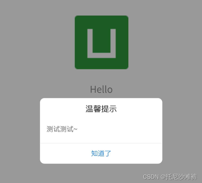
【效果图】
【封装】
主要是dom树&css样式
<template>
<view @click="close" class="mask">
<!-- @click.stop="onClick" -->
<view class="content">
<div class="title box">
{{ options.title }}
</div>
<div class="content2 box">
<u--text :lines="3" :size="36" align="center" :text="options.content"></u--text>
<!-- {{ }} -->
</div>
<div class="button box" @click.stop="onClick">确定</div>
</view>
</view>
</template>
<script>
export default {
data() {
return {
options: [],
};
},
onLoad(options) {
// 获取配置
this.options = options;
},
methods: {
onClick(e) { // 点击确定触发
uni.removeStorageSync("token");
uni.reLaunch({
url: "../index/index",
});
uni.setStorageSync("isLogin", "yes");
console.log(e);
// #ifdef APP-NVUE
e.stopPropagation();
// #endif
},
close() { // 点击遮罩层触发
//为了防止401后再继续调用弹窗
uni.setStorageSync("isLogin", "no");
// uni.navigateBack();
// uni.setStorageSync("isLogin", "yes");
console.log("弹窗蒙版");
},
},
};
</script>
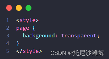
<style>
page {
background: transparent;
}
</style>
<style lang="scss" scoped>
.mask {
position: fixed;
left: 0;
top: 0;
right: 0;
bottom: 0;
/* #ifndef APP-NVUE */
display: flex;
/* #endif */
justify-content: center;
align-items: center;
background-color: rgba(0, 0, 0, 0.4);
}
.content {
border-radius: 10px;
width: 360px;
height: 180px;
background-color: #fff496;
display: flex;
flex-direction: column;
padding: 10px;
.box {
display: flex;
justify-content: center;
align-items: center;
}
.title {
height: 25%;
font-size: 18px;
font-weight: 600;
}
.content2 {
height: 50%;
font-size: 16px;
}
.button {
height: 25%;
border-top: 1px solid white;
font-size: 18px;
color: #1890ff;
}
}
</style>
【引用】
使用isLogin == 'yes’来防止401重复弹出
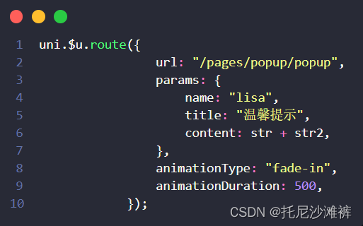
let isLogin = uni.getStorageSync('isLogin')
if (args.statusCode == 401 && isLogin == 'yes' && !isRefreshing) {
			uni.$u.route({
				url: "/pages/popup/popup",
				params: {
					name: "lisa",
					title: "温馨提示",
					content: '你的内容',
				},
				animationType: "fade-in",
				animationDuration: 500,
			});

		}
【总结】
-
全局自定义的模态框是一种通用的UI组件,它可以在应用程序的任何位置被触发并弹出来。这个模态框可以包含任何类型的内容,比如文本、图片、视频等。
-
开发者可以根据自己的需求,设计出符合应用程序整体风格的模态框,包括颜色、字体、布局等。
-
通过封装全局自定义的模态框,开发者可以大大提高应用程序的用户体验。
-
用户可以更加直观地看到应用程序中的重要信息,并且可以根据提示进行操作。同时,全局自定义的模态框还可以帮助开发者提高应用程序的统一性和品牌形象,增强用户的忠诚度和满意度。


 445
445


 被折叠的 条评论
为什么被折叠?
被折叠的 条评论
为什么被折叠?
 到【灌水乐园】发言


