


文章目录
一、基础css
1、CSS简介
① 网页分成三个部分:
- 结构(HTML)
- 表现(CSS)
- 行为(JavaScript)
CSS:层叠样式表(用来设置网页中元素的样式 )
网页实际上是一个多层的结构,通过CSS可以分别为网页的每一个层来设置样式,而最终我们能看到只是网页的最上边一层
②使用CSS来修改元素的样式
[1]第一种方式(内联样式,行内样式):
在标签内部通过style属性来设置元素的样式
<p style="color:red; font-size: 60px;">少小离家老大回,乡音无改鬓毛衰</p>
问题:
- 内联样式,样式只能对一个标签生效,
- 当样式发生变化时,必须要一个一个的修改
[2]第二种方式(内部样式表)
将样式编写到head中的style标签里,然后通过CSS的选择器来选中元素并为其设置各种样式
可以同时为多个标签设置样式,并且修改时只需要修改一处即可全部应用
<style>
    p{
        color: green;
        font-size: 50px;
    }
</style>
问题:
- 样式不能跨页面进行复用
[3]第三种方式 (外部样式表) 最佳实践
可以将CSS样式编写到一个外部的CSS文件中,然后通过link标签来引入外部的CSS文件
- 外部样式表需要通过link标签进行引入, 使样式可以在不同页面之间进行复用
- 可以使用到浏览器的缓存机制,从而加快网页的加载速度,提高用户的体验。
<link rel="stylesheet" href="./style.css">
2、语法
①注释
/*css中的注释*/
②基本语法
选择器 声明块
- 选择器:选中指定元素
- p :选中所有的p元素
- 声明块:指定要设置的样式
- 由一个一个的声明组成
- 名和值之间以:连接,以;结尾
p {
    color: red;
    font-size: 40px;
}

h1 {
    color: green;
}
3、常用选择器
①元素选择器
- 作用:根据标签名来选中指定的元素
- 语法:标签名{}
- 例子:p{} h1{} div{}
p {
    color: red;
}
h1 {
    color: green;
}
②id选择器
- 作用:根据元素的id属性值选中一个元素
- 语法:#id属性值{}
- 例子:#box{} #red{}
#red {
    color: red;
}
<h1 class="blue abc">我是标题</h1>
③类选择器
- 作用:根据元素的class属性值选中一组元素
- 语法:.class属性值
.blue {
    color: blue;
}

.abc {
    font-size: 20px;
}
<p class="blue">秋水共长天一色</p>
<p class="blue">落霞与孤鹜齐飞</p>
class 是一个标签的属性,它和id类似,不同的是class可以重复使用
可以同时为一个元素指定多个class属性
④通配选择器
- 作用:选中页面中的所有元素
- 语法: *
 * {
    color: red;
}
4、复杂选择器
①交集选择器
- 作用:选中同时复合多个条件的元素
- 语法:
选择器1选择器2选择器3选择器n{}
注意点:
交集选择器中如果有元素选择器,必须使用元素选择器开头
div.red{
    font-size: 30px;
}
.a.b.c{
    color: blue
}
②并集选择器
- 作用:同时选择多个选择器对应的元素
- 语法:
选择器1,选择器2,选择器3,选择器n{}
 h1, span{
    color: green
}
③关系选择器
父元素
- 直接包含子元素的元素叫做父元素
子元素
- 直接被父元素包含的元素是子元素
祖先元素
- 直接或间接包含后代元素的元素叫做祖先元素
- 一个元素的父元素也是它的祖先元素
后代元素
- 直接或间接被祖先元素包含的元素叫做后代元素
- 子元素也是后代元素
兄弟元素
- 拥有相同父元素的元素是兄弟元素
<div class="box">
    我是一个div
    <p>
        我是div中的p元素
        <span>我是p元素中的span</span>
    </p>
    <div></div>
    <span>我是div中的span元素</span>
    <span>我是div中的span元素</span>
    <span>我是div中的span元素</span>
    <span>我是div中的span元素</span>
</div>

<span>
    我是div外的span
</span>
子元素选择器
- 作用:选中指定父元素的指定子元素
- 语法:父元素 > 子元素
div.box > span{
    color: orange;
}
后代元素选择器
- 作用:选中指定元素内的指定后代元素
- 语法:祖先 后代
div span{
    color: skyblue
}
选择下一个兄弟
- 语法:前一个 + 下一个
p + span{
    color: red;
}
选择下边所有的兄弟
- 语法:兄 ~ 弟
p ~ span{
    color: red;
}
④属性选择器
<p title="abc">少小离家老大回</p>
<p title="abcdef">乡音无改鬓毛衰</p>
<p title="helloabc">儿童相见不相识</p>
<p>笑问客从何处来</p>
<p>秋水共长天一色</p>
<p>落霞与孤鹜齐飞</p>
[属性名]选择 含有指定属性 的元素
p[title]{
	color: orange;
}
[属性名=属性值]选择 含有指定属性和属性值 的元素
p[title=abc]{
	color: orange;
}
[属性名^=属性值]选择 属性值以指定值开头 的元素
p[title^=abc]{
	color: orange;
}
[属性名$=属性值]选择 属性值以指定值结尾 的元素
p[title$=abc]{
	color: orange;
}
[属性名*=属性值]选择 属性值中含有某值的元素 的元素
p[title*=e]{
    color: orange;
}
⑤伪类选择器
<ul>
	<span>我是一个span</span>
	<li>第〇个</li>
	<li>第一个</li>
	<li>第二个</li>
	<li>第三个</li>
	<li>第四个</li>
	<li>第五个</li>
</ul>
伪类(不存在的类,特殊的类)
伪类用来描述一个元素的特殊状态
- 比如:第一个子元素、被点击的元素、鼠标移入的元素…
伪类一般情况下都是使用:开头
- :first-child 第一个子元素
- :last-child 最后一个子元素
- :nth-child() 选中第n个子元素
特殊值:
n 第n个 n的范围0到正无穷
2n 或 even 表示选中偶数位的元素
2n+1 或 odd 表示选中奇数位的元素以上这些伪类都是根据所有的子元素进行排序
- :first-of-type
- :last-of-type
- :nth-of-type()
这几个伪类的功能和上述的类似,不通点是他们是在同类型元素中进行排序
- 第一个指定子元素
ul > li:first-child{
    color: red;
}
- 最后一个指定子元素
ul > li:last-child{
    color: red;
}
- 指定位置元素
ul > li:nth-child(even){
    color: red;
}

ul > li:nth-child(2n+1){
    color: red;
}
- 同类型元素中的第一个
ul > li:first-of-type{
    color: red;
}
- 否定伪类
ul > li:not(:nth-of-type(3)){
    color: yellowgreen;
}
补充:超链接伪类
    <a href="https://www.baidu.com">访问过的链接</a>

    <br><br>

    <a href="https://www.baidu123.com">没访问过的链接</a>
- :link 用来表示没访问过的链接(正常的链接)
a:link{
    color: red;

}
- :visited 用来表示访问过的链接
由于隐私的原因,所以visited这个伪类只能修改链接的颜色
a:visited{
    color: orange;
    /* font-size: 50px;   */
}
- :hover 用来表示鼠标移入的状态
a:hover{
    color: aqua;
    font-size: 50px;
}
- :active 用来表示鼠标点击
a:active{
    color: yellowgreen;
}
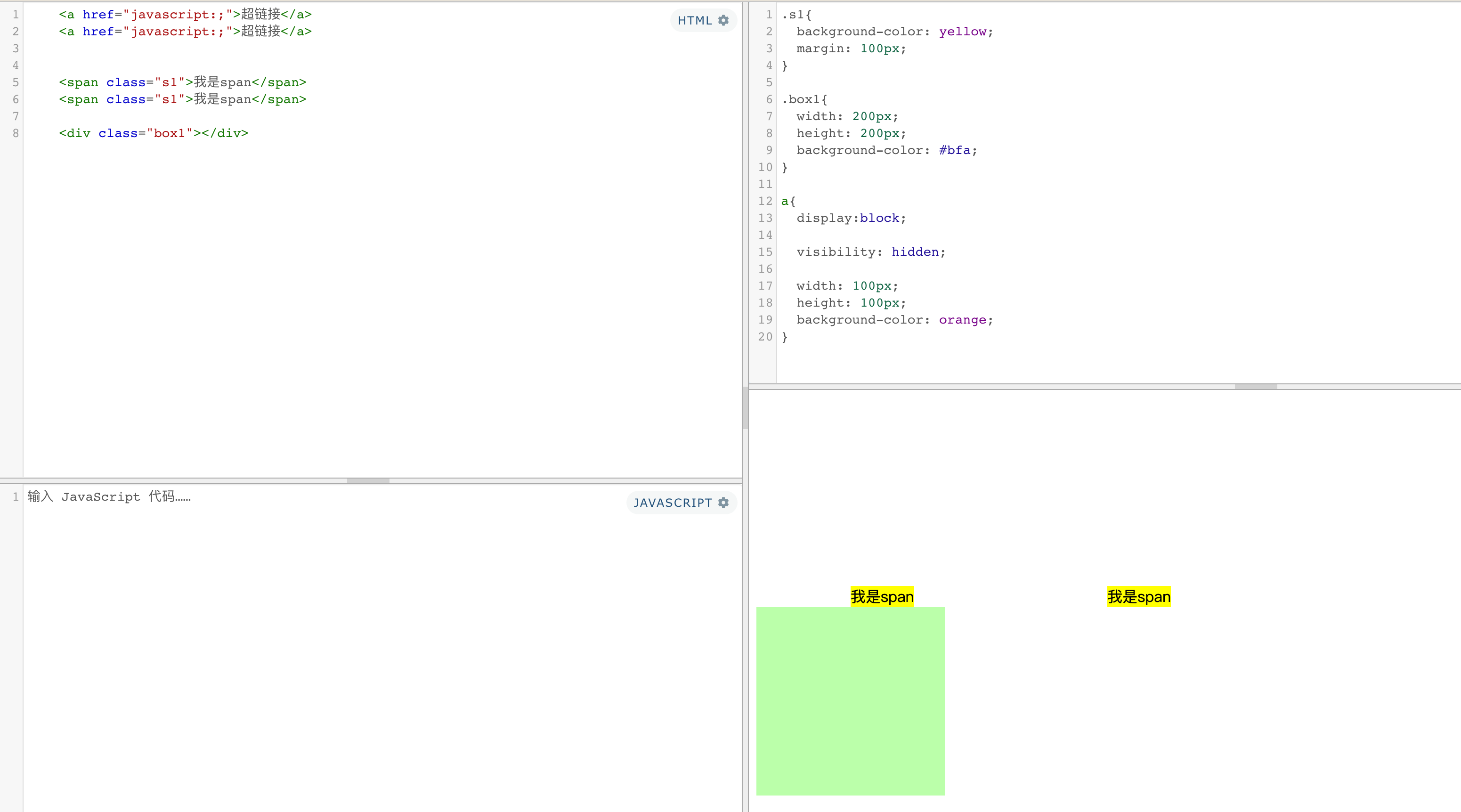
⑥伪元素选择器
<!-- <q>hello</q> -->
<div>Hello Hello How are you</div>

<p>
    Lorem ipsum dolor sit amet consectetur adipisicing elit. Atque velit modi veniam nisi veritatis tempore laborum nemo ipsa itaque optio. Id odit consequatur mollitia excepturi, minus saepe nostrum vel porro.
</p>
伪元素,表示页面中一些特殊的并不真实的存在的元素(特殊的位置)
伪元素使用 :: 开头
| 代码 | 含义 |
|---|---|
::first-letter | 表示第一个字母 |
::first-line | 表示第一行 |
::selection | 表示选中的内容 |
::before | 元素的开始 |
::after | 元素的最后 |
before 和 after 必须结合content属性来使用
- ::first-letter :第一个元素
p::first-letter{
    font-size: 50px;
}
- ::first-line :第一行元素
p::first-line{
    background-color: yellow;
}
- ::selection :选中的元素(光标选中的内容)
p::selection{
    background-color: greenyellow;
}
- ::before :元素的最开始位置
div::before{
    content: 'abc';
    color: red;
}
- ::after :元素的最结尾位置
div::after{
    content: 'haha';
    color: blue;
}
5、继承
样式继承: 为一个元素设置样式,会应用到它的后代元素上。
- 作用:方便我们的开发
- 可以将一些通用的样式统一设置到共同的祖先元素上,这样只需设置一次即可让所有的元素都具有该样式
- ⚠️注意:并不是所有的样式都会被继承:
- 比如 背景相关的,布局相关等的这些样式都不会被继承。
p{
    color: red;
    background-color: orange;
}
div{
    color: yellowgreen
}
<p>
    我是一个p元素
    <span>我是p元素中的span</span>
</p>
<span>我是p元素外的span</span>
<div>
    我是div
    <span>
        我是div中的span
        <em>我是span中的em</em>
    </span>
</div>
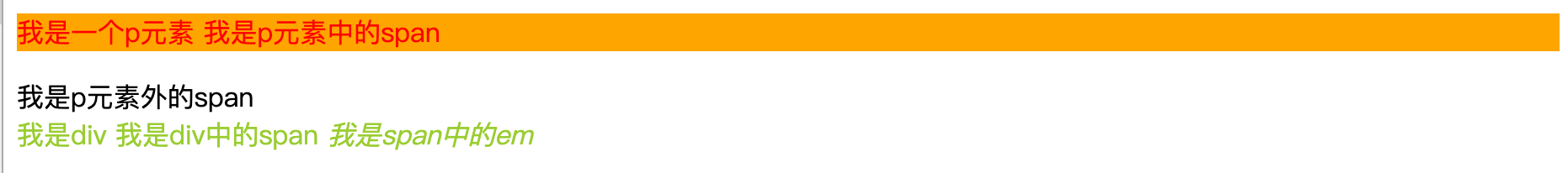
能继承的属性
- 字体系列属性:font、font-family、font-weight、font-size、font-style;
- 文本系列属性:
- 内联元素:color、line-height、word-spacing、letter-spacing、text-transform;
- 块级元素:text-indent、text-align;
- 元素可见性:visibility
- 表格布局属性:caption-side、border-collapse、border-spacing、empty-cells、table-layout;
- 列表布局属性:list-style
不能继承的属性
- display:规定元素应该生成的框的类型;
- 文本属性:vertical-align、text-decoration、text-shadow、white-space、unicode-bidi;
- 盒子模型的属性:width、height、margin 、border、padding;
- 背景属性:background、background-color、background-image;
- 定位属性:float、clear、position、top、right、bottom、left、min-width、min-height、max-width、max-height、overflow、clip、z-index;
6、选择器权重
样式的冲突
当我们通过不同的选择器,选中相同的元素,并且为相同的样式设置不同的值时,此时就发生了样式的冲突。
发生样式冲突时,应用哪个样式由选择器的权重(优先级)决定
选择器的权重
| 样式 | 权重 |
|---|---|
| 内联样式 | 1,0,0,0 |
| id选择器 | 0,1,0,0 |
| 类和伪类选择器 | 0,0,1,0 |
| 元素选择器 | 0,0,0,1 |
| 通配选择器 | 0,0,0,0 |
| 继承的样式 | 没有优先级 |
比较优先级时,将所有的选择器的优先级相加,最后优先级越高,则越优先显示(分组选择器是单独计算的)
-
选择器的累加不会超过其最大的数量级,类选择器在高也不会超过id选择器
-
如果优先级计算后相同,此时则优先使用靠下的样式
-
在某一个样式的后边添加 !important ,此时该样式会获取到最高的优先级,甚至超过内联样式
<div id="box1" class="red d1 d2 d3 d4" style="background-color: chocolate;">我是一个div <span>我是div中的span</span></div>
.d1{
    background-color: purple !important;
}
.red{
    background-color: red;
    /* font-size: 20px; */
}

*{
    font-size: 50px;
}

div{
    font-size: 20px;
}

7、单位
长度单位
| 单位 | 说明 |
|---|---|
| 像素 | 像素越小的屏幕显示的效果越清晰 |
| 百分比 | 也可以将属性值设置为相对于其父元素属性的百分比 设置百分比可以使子元素跟随父元素的改变而改变 |
| em | em是相对于元素的字体大小来计算的 1em = 1font-size em会根据字体大小的改变而改变 |
| rem | rem是相对于根元素的字体大小来计算 |
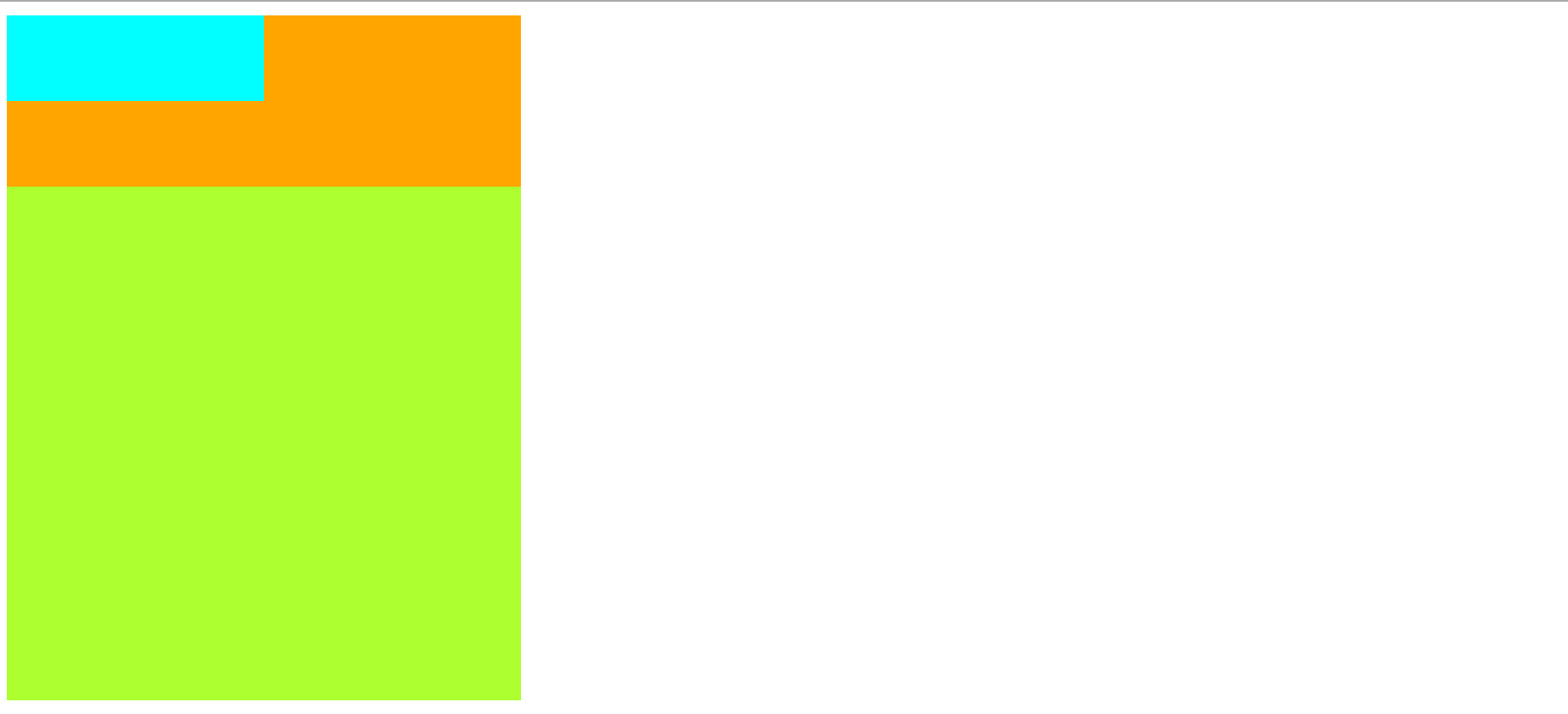
<div class="box1">

    <div class="box2"></div>

</div>

<div class="box3"></div>
/*rem:相对于根字体大小*/
html{
    font-size: 30px;
}
/*px:像素*/
.box1{
    width:300px;
    height: 100px;
    background-color: orange;
}
/*% : 根据父元素大小计算*/
.box2{
    width: 50%;
    height: 50%;
    background-color:aqua;
}

.box3{
	/*em相对于自身的字体大小*/
    font-size: 50px;
    /* width: 10em;
    height: 10em; */
    width: 10rem;
    height: 10rem;
    background-color: greenyellow;
}
8、颜色
颜色单位:
| RGB值 | RGB通过三种颜色的不同浓度来调配出不同的颜色 R red,G green ,B blue 每一种颜色的范围在 0 - 255 (0% - 100%) 之间 语法: RGB(红色,绿色,蓝色) |
| RGBA | 就是在rgb的基础上增加了一个a表示不透明度 需要四个值,前三个和rgb一样,第四个表示不透明度 1表示完全不透明 0表示完全透明 .5半透明 |
| 十六进制的RGB值 | 语法:#红色绿色蓝色颜色浓度通过 00-ff 如果颜色两位两位重复可以进行简写 #aabbcc --> #abc |
| HSL值/HSLA值 | H 色相(0 - 360 deg) S 饱和度,颜色的浓度 0% - 100% L 亮度,颜色的亮度 0% - 100% |
background-color: red;

background-color: rgb(255, 0, 0);
background-color: rgb(0, 255, 0);
background-color: rgb(0, 0, 255);
background-color: rgb(255,255,255);
background-color: rgb(106,153,85);

background-color: rgba(106,153,85,.5);

background-color: #ff0000;
background-color: #ffff00;
background-color: #ff0;
background-color: #bbffaa;
background-color: #9CDCFE;

background-color: hsla(98, 48%, 40%, 0.658);

hsl(240deg 30% 28% / 25%)
240deg: 色相
30%:饱和度
28%:亮度
25%:透明度
二、布局css
1、 文档流
网页是一个多层的结构,一层摞着一层,通过CSS可以分别为每一层来设置样式,作为用户来讲只能看到最顶上一层。
这些层中,最底层称为文档流,文档流是网页的基础,我们所创建的元素默认都是在文档流中进行排列
元素在文档流中有什么特点:
-
块元素
- 在页面中
独占一行(自上向下垂直排列) - 默认宽度是
父元素的全部(会把父元素撑满) - 默认高度是被
内容撑开(子元素)
- 在页面中
-
行内元素
- 只占
自身的大小 - 在页面中从左向右
水平排列,如果一行之中不能容纳下所有的行内元素,则元素会换到第二行继续自左向右排列(书写习惯一致) - 行内元素的默认
宽度和高度都是被内容撑开
- 只占
2、盒模型
盒模型、盒子模型、框模型(box model)
CSS将页面中的所有元素都设置为了一个矩形的盒子
将元素设置为矩形的盒子后,对页面的布局 就变成 将不同的盒子摆放到不同的位置
每个盒子的部分组成:
- 内容区(content)
- 内边距(padding)
- 边框(border)
- 外边距(margin)
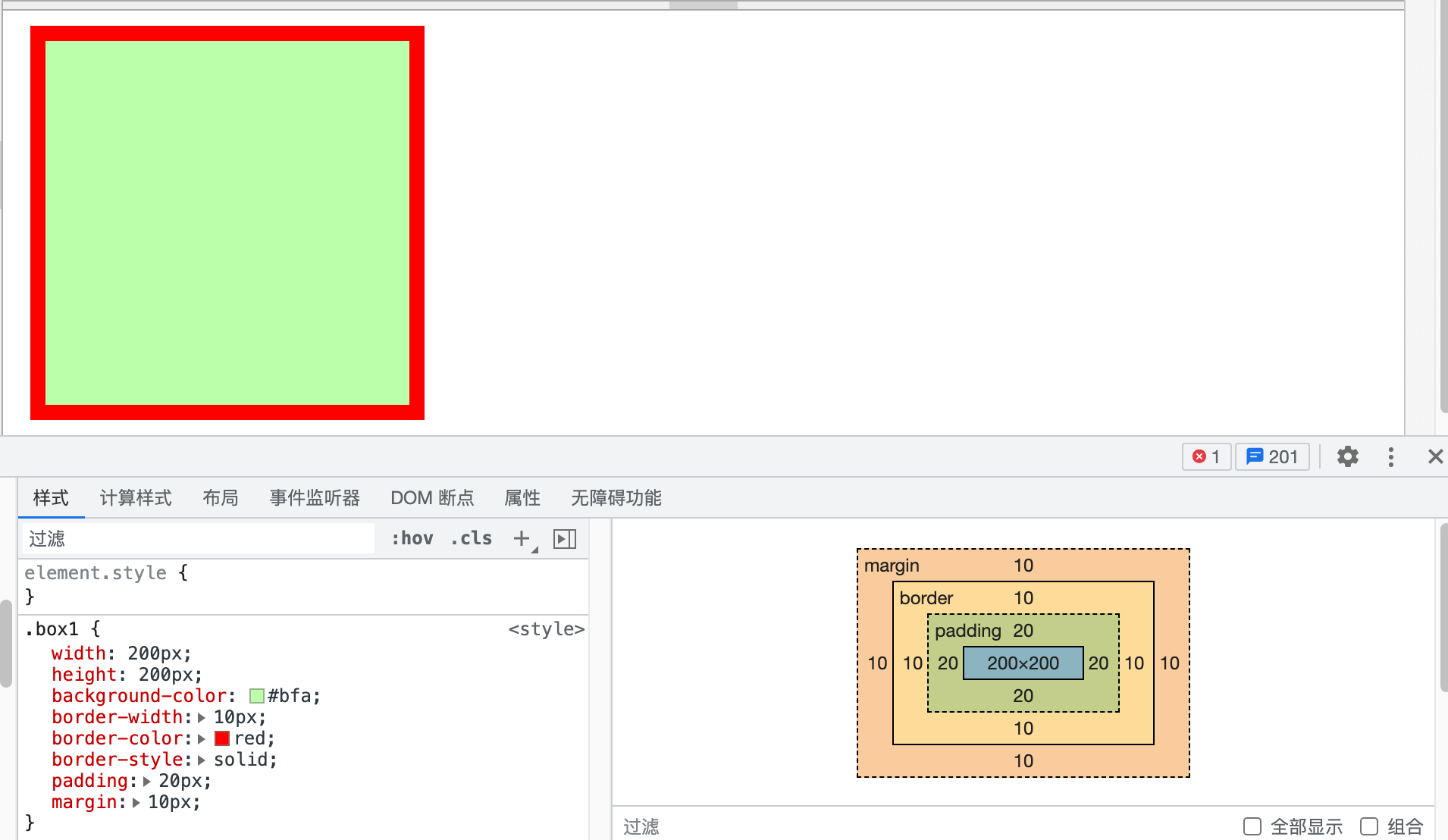
<div class="box1"></div>
 .box1{
	width: 200px;
	height: 200px;
	background-color: #bfa;

	border-width: 10px;
	border-color: red;
	border-style: solid;
	padding: 20px;
	margin:10px;
}
-
①边框(border):边框属于盒子边缘,边框里盒子内部,出了边框都是盒子的外部- 边框的大小
会影响到整个盒子的大小 - 要设置边框,需要至少设置三个样式:
1、边框的宽度 border-width (有默认值2~3px)
- 1个值:
上下左右 - 2个值:
上下左右 - 3个值:
上左右下 - 4个值:
上右下左 border-xxx-widthxxx(top、bottom、left、right):单独指定某条边
2、边框的颜色 border-color (不指定默认使用color前景色的值)
- 规则同上
3、边框的样式 border-style(none 默认值、solid 实线、dotted 点虚线、dashed 虚线、double 双线)
- 规则同上
简写格式:
border: 10px solid red;
同理: border-xxx: 单边设置简写格式 - 1个值:
- 边框的大小
-
②内边距(padding): 内容区和边框之间的距离是内边距-
内边距的设置会影响到盒子的大小 -
背景颜色会延伸到内边距上
-
一共有四个方向的内边距:
padding-top
padding-right
padding-bottom
padding-left
padding 内边距的简写属性,规则同上
-
-
③外边距(margin)- 外边距
不会影响盒子可见框的大小,但是外边距会影响盒子的位置(实际占用空间) -
一共有四个方向的外边距:
margin-top:上外边距,设置一个正值,元素会向下移动
margin-left:左外边距,设置一个正值,元素会向右移动
margin-right: 默认情况下设置margin-right不会产生任何效果,
margin-bottom:下外边距,设置一个正值,其下边的元素会向下移动
margin也可以设置负值,如果是负值则元素会向相反的方向移动
元素在页面中是按照自左向右的顺序排列的,所以默认情况下如果我们设置的
左和上外边距则会移动元素自身,而设置下和右外边距会移动其他元素
- 外边距
-
④内容区(content):元素中的所有的子元素和文本内容都在内容区中排列内容区的大小由width 和 height两个属性来设置
- width 设置内容区的宽度
- height 设置内容区的高度
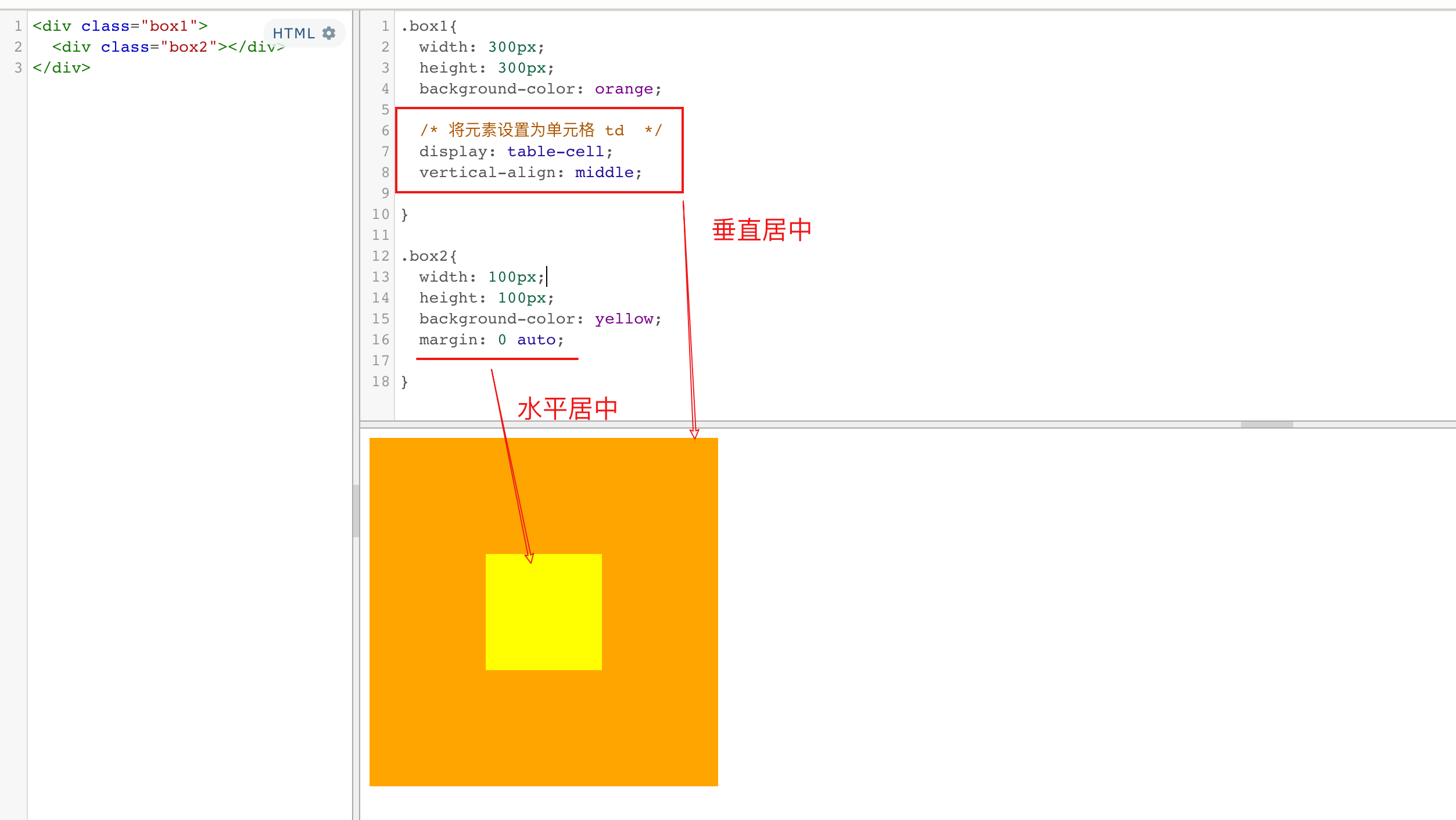
①水平方向的布局
元素在其父元素中水平方向的位置由以下几个属性共同决定“
margin-left
border-left
padding-left
width
padding-right
border-right
margin-right
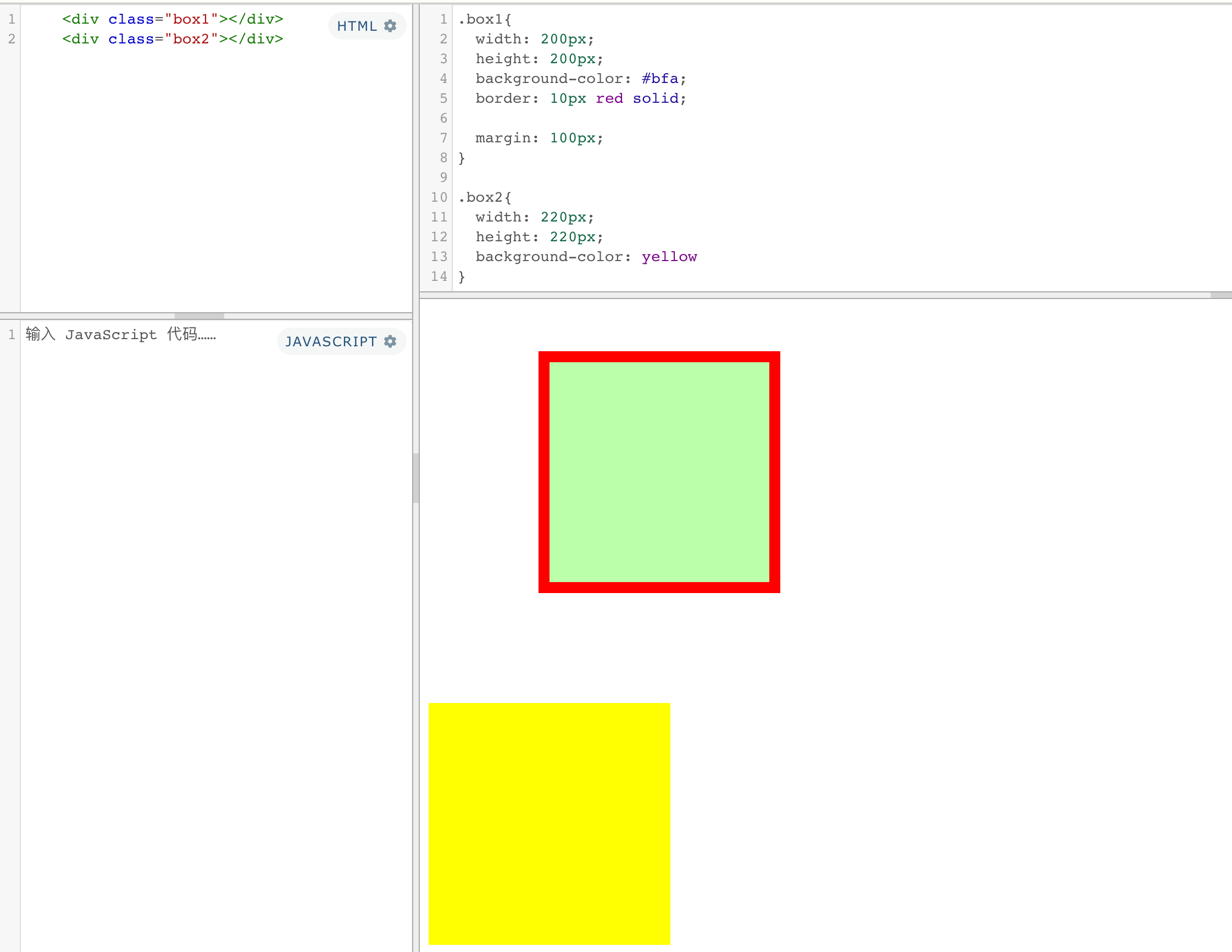
一个元素在其父元素中,水平布局必须要满足以下的等式
margin-left+border-left+padding-left+width+padding-right+border-right+margin-right = 其父元素内容区的宽度 (必须满足)
如
0 + 0 + 0 + 200 + 0 + 0 + 0 = 800(不满足)

如果相加结果使等式不成立,则称为 过度约束,则等式会自动调整

浏览器会自动调整
	如果这七个值中没有为 auto 的情况,则浏览器会自动调整margin-right值以使等式满足
	0 + 0 + 0 + 200 + 0 + 0 + 600 = 800

	有三个值可设置auto
		width
		margin-left
		maring-right

	如果某个值为auto,则会自动调整为auto的那个值以使等式成立
		1. 只有一个值设置了auto
			如
			0 + 0 + 0 + auto + 0 + 0 + 0 = 800  auto = 800
			0 + 0 + 0 + auto + 0 + 0 + 200 = 800  auto = 600
			200 + 0 + 0 + auto + 0 + 0 + 200 = 800  auto = 400
		2. 多个auto
			a. width,和一个外边距:外边距都是0,宽度最大
			b. 两个外边距: 将外边距设置为相同的值 (利用这个特点来使一个元素在其父元素中水平居中)
			c. width,和两个外边距: 外边距都是0,宽度最大
补充: 文字居中和盒子居中
text-align: center; /*  文字 行内元素 行内块元素水平居中 */
margin: 10px auto;  /* 块级盒子水平居中  左右margin 改为 auto 就阔以了 上下margin都可以 */
②垂直方向的布局
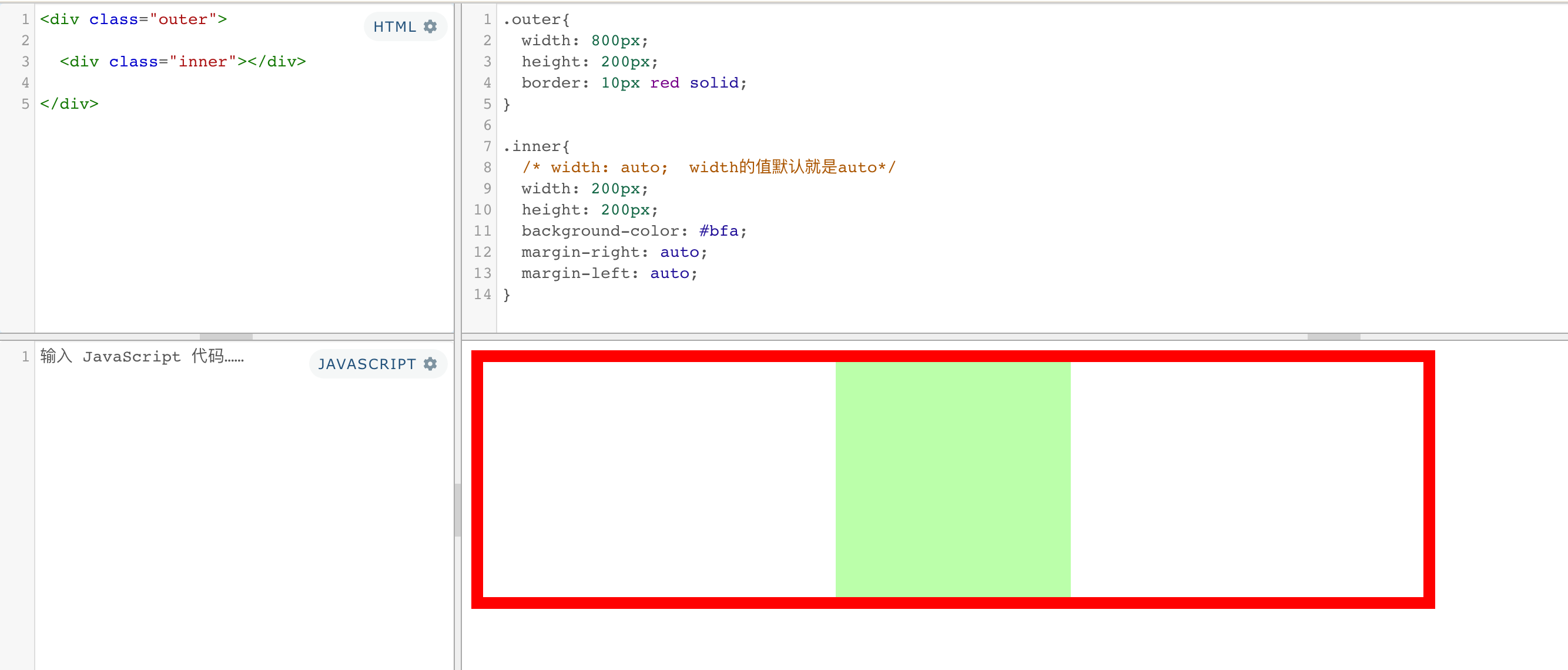
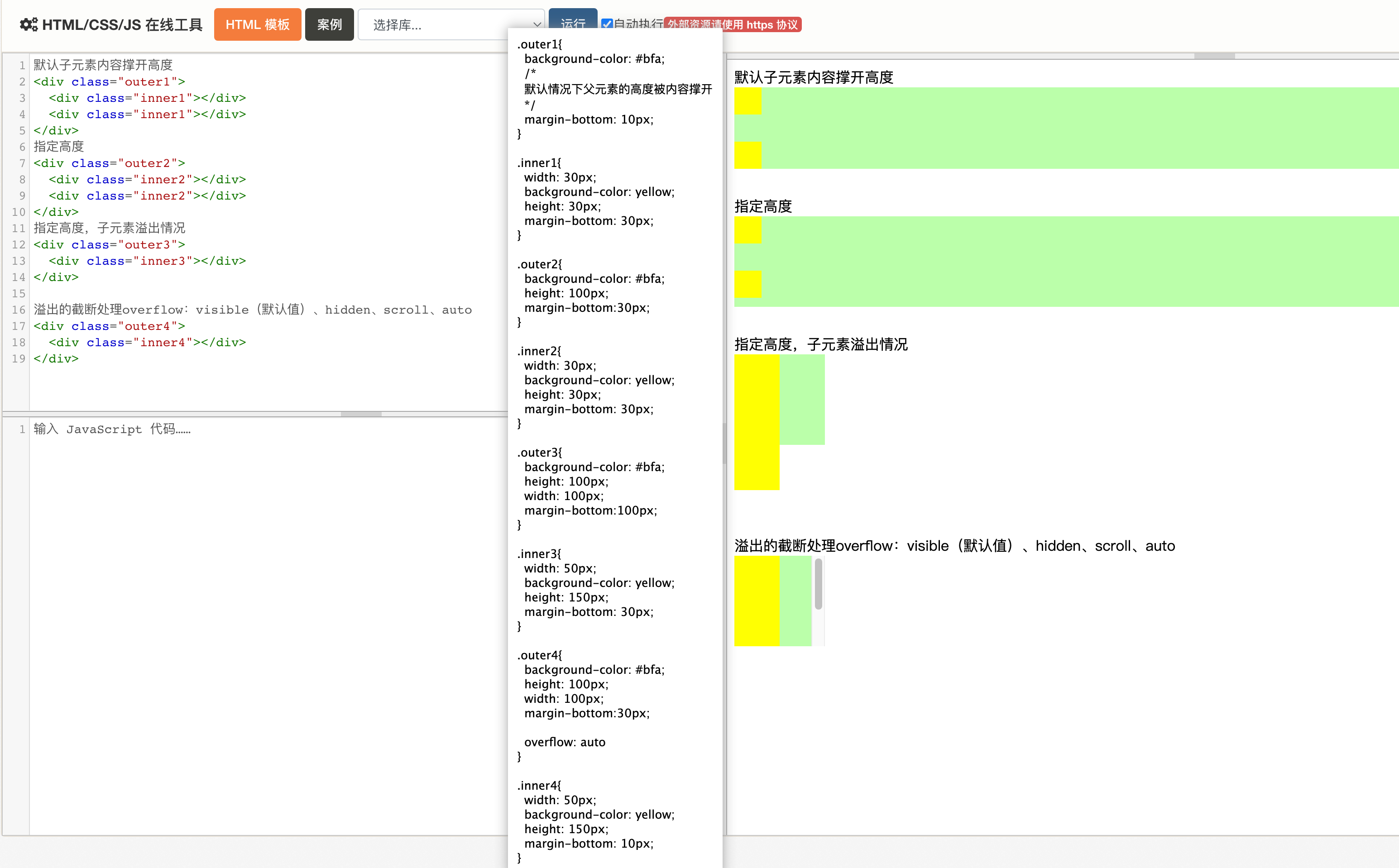
默认情况下父元素的高度被内容撑开
子元素是在父元素的内容区中排列的,
- 如果子元素的大小超过了父元素,则子元素会从父元素中溢出
- 使用 overflow 属性来设置父元素如何处理溢出的子元素
可选值:- visible,默认值 子元素会从父元素中溢出,在父元素外部的位置显示
- hidden 溢出内容将会被裁剪不会显示
- scroll 生成两个滚动条,通过滚动条来查看完整的内容
- auto 根据需要生成滚动条
单向溢出处理:
overflow-x:
overflow-y:
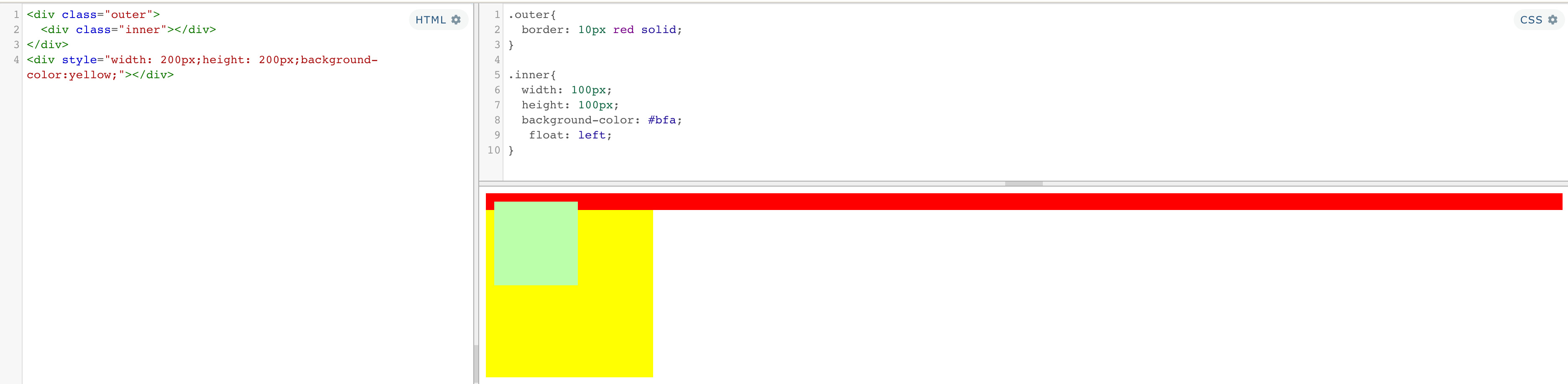
③外边距折叠
垂直外边距的重叠(折叠)
①兄弟元素
- 兄弟元素间的相邻垂直外边距会取两者之间的较大值(两者都是正值)
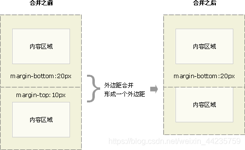
- 如果相邻的外边距一正一负,则取两者的和
- 如果相邻的外边距都是负值,则取两者中绝对值较大的
解决方案:尽量给只给一个盒子添加margin值。
②父子元素
- 父子元素间相邻外边距,子元素的会传递给父元素(上外边距)
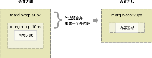
- 父子外边距的折叠会影响到页面的布局,必须要进行处理
解决方案:(让两个边距不相邻)
-
可以为父元素定义上边框。(盒子会变形)
-
可以为父元素定义上内边距
-
可以为父元素添加overflow:hidden。
-
比如浮动、固定、绝对定位的盒子不会有问题
④行内元素的盒模型
不支持设置宽度和高度,就是被内容撑开的- 可以设置padding、border、margin,
垂直方向不会影响布局
display 用来设置元素显示的类型
| 可选值 | 说明 |
|---|---|
| inline | 行内元素 |
| block | 块元素 |
| inline-block | 行内块元素 既可以设置宽度和高度 又 不会独占一行(有缺点) |
| table | 表格 |
| none | 元素不在页面中显示,不占据空间 |
行内块缺点
- 多个相邻行内块之间有间隙(空隙产生的原因:当元素有行内元素的特性时,元素间的空白符都会被解析,回车换行会被解析成一个空白符,如果字体不为零那么就会占一定的宽度,并且这些间距会随字体的大小而变化)
- 里面的文本行数不一致时会出现盒子塌陷
visibility 隐藏元素显示状态
| 可选值 | 说明 |
|---|---|
| visible | 默认值,元素在页面中正常显示 |
| hidden | 元素在页面中隐藏 不显示,但是依然占据页面的位置 |
⑤盒子大小
默认情况下,盒子可见框的大小由内容区、内边距和边框共同决定
box-sizing:用来设置盒子尺寸的计算方式(设置width和height的作用)
| 可选值 | 说明 |
|---|---|
| content-box | 默认值,宽度和高度用来设置内容区的大小 |
| border-box | 宽度和高度用来设置整个盒子可见框的大小 |
⑥轮廓、圆角、阴影
1、outline 用来设置元素的轮廓线,用法和border一模一样
轮廓和边框不同的点,就是轮廓不会影响到可见框的大小
outline: 10px red solid;
2、border-radius 用来设置圆角 圆角设置的圆的半径大小
border-radius 可以分别指定四个角的圆角
- 四个值 左上 右上 右下 左下
- 三个值 左上 右上/左下 右下
- 两个个值 左上/右下 右上/左下
/* 将元素设置为一个圆形 */
border-radius: 50%;

border-radius: 20px / 40px;

左上
border-top-left-radius:
右上
border-top-right-radius:
左下
border-bottom-left-radius:
右下
border-bottom-right-radius:

border-top-left-radius:50px 100px;
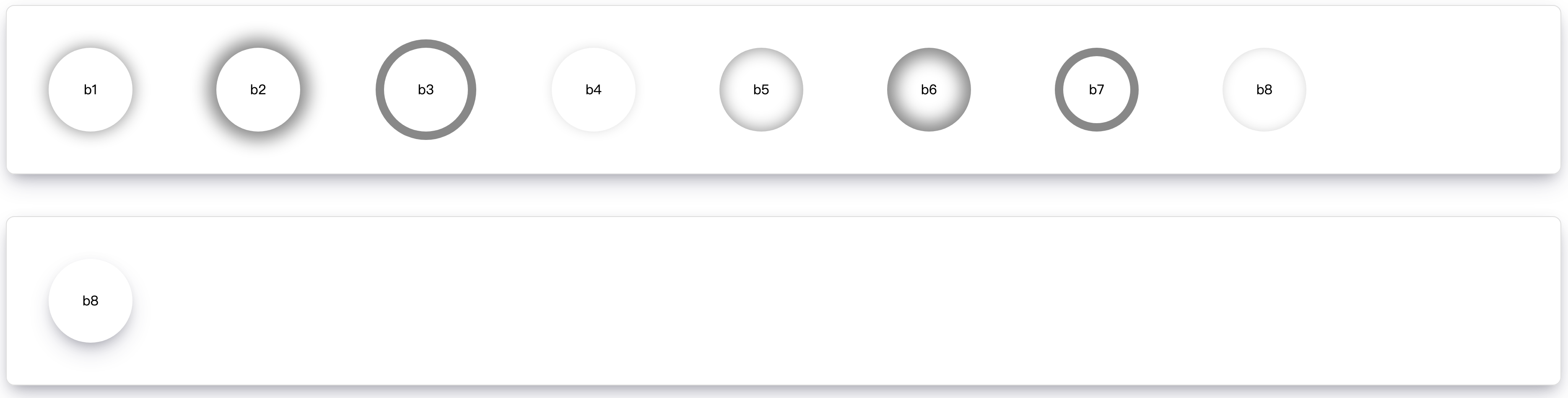
3、box-shadow 属性用来给元素添加阴影,该属性值是由逗号分隔的一个或多个阴影列表。不会影响页面布局
inset内阴影(默认不加)offset-x(阴影的水平偏移量),offset-y(阴影的垂直偏移量),blur-radius模糊半径 (可选,权重高)spread-radius扩展半径 (可选)color
其中 blur-radius 和 spread-radius 是可选的。
可以通过逗号分隔每个 box-shadow 元素的属性来添加多个 box-shadow。
当只有4个值时,选定的是模糊半径
box-shadow: 0px 0px 50px rgba(0, 0, 0, .3) ;
<!-- box-shadow: 0px 0px 20px #888 -->
<div class="card">
  <div class="ball b1">b1</div>
  <div class="ball b2">b2</div>
  <div class="ball b3">b3</div>
  <div class="ball b4">b4</div>
  <div class="ball b5">b5</div>
  <div class="ball b6">b6</div>
  <div class="ball b7">b7</div>
  <div class="ball b8">b8</div>
</div>

<div class="card">
  <div class="ball c1">b8</div>
</div>
.ball {
  height: 100px;
  width: 100px;
  border-radius: 50% 50%;
  margin: 50px;
  display: inline-block;
  float: left;

  text-align: center;
  line-height: 100px;
}

.b1 {
  box-shadow: 0px 0px 20px #888;
}

.b2 {
  box-shadow: 0px 0px 20px 10px #888;
}

.b3 {
  box-shadow: 0px 0px 0px 10px #888;
}

.b4 {
  box-shadow: 0px 0px 20px -10px #888;
}

.b5 {
  box-shadow: inset 0px 0px 20px #888;
}

.b6 {
  box-shadow: inset 0px 0px 20px 10px #888;
}

.b7 {
  box-shadow: inset 0px 0px 0px 10px #888;
}

.b8 {
  box-shadow: inset 0px 0px 20px -10px #888;
}
.card {
  border: 1px solid #ddd;
  border-radius: 10px;
  overflow:hidden;
  margin-bottom: 50px;

  box-shadow: 0 13px 27px -5px hsl(240deg 30% 28% / 25%),0 8px 16px -8px hsl(0deg 0% 0% / 30%), 0 -6px 16px -6px hsl(0deg 0% 0% / 3%);
}

.c1 {
	box-shadow: 0 13px 27px -5px hsl(240deg 30% 28% / 25%),0 8px 16px -8px hsl(0deg 0% 0% / 30%), 0 -6px 16px -6px hsl(0deg 0% 0% / 3%);
}
3、浏览器默认样式
通常情况,浏览器都会为元素设置一些默认样式
默认样式的存在会影响到页面的布局
通常情况下编写网页时必须要去除浏览器的默认样式(PC端的页面)
ul{
   margin: 0;
   padding: 0;
   /* 去除项目符号 * /
   list-style:none;
}

*{
   margin: 0;
   padding: 0;
}
重置样式表:专门用来对浏览器的样式进行重置的
reset.css 直接去除了浏览器的默认样式
normalize.css 对默认样式进行了统一
reset.css
/* v2.0 | 20110126
  http://meyerweb.com/eric/tools/css/reset/
  License: none (public domain)
*/
html, body, div, span, applet, object, iframe,
h1, h2, h3, h4, h5, h6, p, blockquote, pre,
a, abbr, acronym, address, big, cite, code,
del, dfn, em, img, ins, kbd, q, s, samp,
small, strike, strong, sub, sup, tt, var,
b, u, i, center,
dl, dt, dd, ol, ul, li,
fieldset, form, label, legend,
table, caption, tbody, tfoot, thead, tr, th, td,
article, aside, canvas, details, embed,
figure, figcaption, footer, header, hgroup,
menu, nav, output, ruby, section, summary,
time, mark, audio, video {
	margin: 0;
	padding: 0;
	border: 0;
	font-size: 100%;
	font: inherit;
	vertical-align: baseline;
}
/* HTML5 display-role reset for older browsers */
article, aside, details, figcaption, figure,
footer, header, hgroup, menu, nav, section {
	display: block;
}
body {
	line-height: 1;
}
ol, ul {
	list-style: none;
}
blockquote, q {
	quotes: none;
}
blockquote:before, blockquote:after,
q:before, q:after {
	content: '';
	content: none;
}
table {
	border-collapse: collapse;
	border-spacing: 0;
}
html{line-height:1.15;-webkit-text-size-adjust:100%;}body{margin:0;}main{display:block;}h1{font-size:2em;margin:0.67em 0;}hr{box-sizing:content-box;height:0;overflow:visible;}pre{font-family:monospace,monospace;font-size:1em;}a{background-color:transparent;}abbr[title]{border-bottom:none;text-decoration:underline;text-decoration:underline dotted;}b,strong{font-weight:bolder;}code,kbd,samp{font-family:monospace,monospace;font-size:1em;}small{font-size:80%;}sub,sup{font-size:75%;line-height:0;position:relative;vertical-align:baseline;}sub{bottom:-0.25em;}sup{top:-0.5em;}img{border-style:none;}button,input,optgroup,select,textarea{font-family:inherit;font-size:100%;line-height:1.15;margin:0;}button,input{overflow:visible;}button,select{text-transform:none;}button,[type="button"],[type="reset"],[type="submit"]{-webkit-appearance:button;}button::-moz-focus-inner,[type="button"]::-moz-focus-inner,[type="reset"]::-moz-focus-inner,[type="submit"]::-moz-focus-inner{border-style:none;padding:0;}button:-moz-focusring,[type="button"]:-moz-focusring,[type="reset"]:-moz-focusring,[type="submit"]:-moz-focusring{outline:1px dotted ButtonText;}fieldset{padding:0.35em 0.75em 0.625em;}legend{box-sizing:border-box;color:inherit;display:table;max-width:100%;padding:0;white-space:normal;}progress{vertical-align:baseline;}textarea{overflow:auto;}[type="checkbox"],[type="radio"]{box-sizing:border-box;padding:0;}[type="number"]::-webkit-inner-spin-button,[type="number"]::-webkit-outer-spin-button{height:auto;}[type="search"]{-webkit-appearance:textfield;outline-offset:-2px;}[type="search"]::-webkit-search-decoration{-webkit-appearance:none;}::-webkit-file-upload-button{-webkit-appearance:button;font:inherit;}details{display:block;}summary{display:list-item;}template{display:none;}[hidden]{display:none;}
练习
1、图片列表
<ul class="img-list">
  <li>
    <a href="javascript:;">
      <img src="https://img1.baidu.com/it/u=2087918055,1142827879&fm=253&fmt=auto&app=120&f=JPEG?w=1280&h=800" alt="">
    </a>
  </li>

  <li>
    <a href="javascript:;">
      <img src="https://img1.baidu.com/it/u=2087918055,1142827879&fm=253&fmt=auto&app=120&f=JPEG?w=1280&h=800" alt="">
    </a>
  </li>

  <li>
    <a href="javascript:;">
      <img src="https://img1.baidu.com/it/u=2087918055,1142827879&fm=253&fmt=auto&app=120&f=JPEG?w=1280&h=800" alt="">
    </a>
  </li>
</ul>
html,body,div,span,applet,object,iframe,h1,h2,h3,h4,h5,h6,p,blockquote,pre,a,abbr,acronym,address,big,cite,code,del,dfn,em,img,ins,kbd,q,s,samp,small,strike,strong,sub,sup,tt,var,b,u,i,center,dl,dt,dd,ol,ul,li,fieldset,form,label,legend,table,caption,tbody,tfoot,thead,tr,th,td,article,aside,canvas,details,embed,figure,figcaption,footer,header,hgroup,menu,nav,output,ruby,section,summary,time,mark,audio,video{margin:0;padding:0;border:0;font-size:100%;font:inherit;vertical-align:baseline;}article,aside,details,figcaption,figure,footer,header,hgroup,menu,nav,section{display:block;}body{line-height:1;}ol,ul{list-style:none;}blockquote,q{quotes:none;}blockquote:before,blockquote:after,q:before,q:after{content:'';content:none;}table{border-collapse:collapse;border-spacing:0;}

body{
  background-color: #444;
}

/* 设置外部ul的样式 */
.img-list{
  /* 设置ul的宽度 */
  width: 190px;
  /* 使ul在页面中居中(实际示例中不需要这么写) */
  margin: 50px auto;
  background-color: #F4F4F4;
}

.img-list li:not(:last-child){
  margin-bottom: 2px;
}


/* 设置图片的大小 */
.img-list img{
  width: 100%;
  vertical-align: middle;
}
<!-- 创建一个外部的容器 nav(div) div(div) ul(li) -->
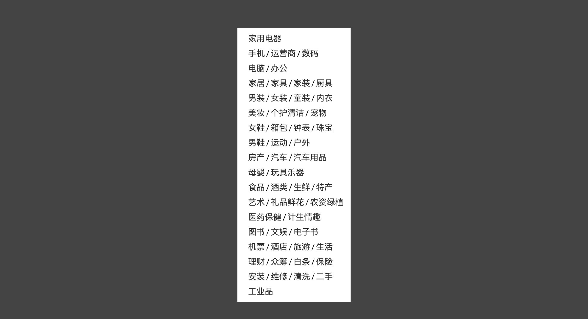
<nav class="left-nav">
<div class="item">
<a href="#">家用电器</a>
</div>
<div class="item">
<a href="#">手机</a><span class='line'>/</span><a href="#">运营商</a><span class='line'>/</span><a href="#">数码</a>
</div>
<div class="item">
<a href="#">电脑</a><span class='line'>/</span><a href="#">办公</a>
</div>
<div class="item">
<a href="#">家居</a><span class='line'>/</span><a href="#">家具</a><span class='line'>/</span><a href="#">家装</a><span class='line'>/</span><a href="#">厨具</a>
</div>
<div class="item">
<a href="#">男装</a><span class='line'>/</span><a href="#">女装</a><span class='line'>/</span><a href="#">童装</a><span class='line'>/</span><a href="#">内衣</a>
</div>
<div class="item">
<a href="#">美妆</a><span class='line'>/</span><a href="#">个护清洁</a><span class='line'>/</span><a href="#">宠物</a>
</div>
<div class="item">
<a href="#">女鞋</a><span class='line'>/</span><a href="#">箱包</a><span class='line'>/</span><a href="#">钟表</a><span class='line'>/</span><a href="#">珠宝</a>
</div>
<div class="item">
<a href="#">男鞋</a><span class='line'>/</span><a href="#">运动</a><span class='line'>/</span><a href="#">户外</a>
</div>
<div class="item">
<a href="#">房产</a><span class='line'>/</span><a href="#">汽车</a><span class='line'>/</span><a href="#">汽车用品</a>
</div>
<div class="item">
<a href="#">母婴</a><span class='line'>/</span><a href="#">玩具乐器</a>
</div>
<div class="item">
<a href="#">食品</a><span class='line'>/</span><a href="#">酒类</a><span class='line'>/</span><a href="#">生鲜</a><span class='line'>/</span><a href="#">特产</a>
</div>
<div class="item">
<a href="#">艺术</a><span class='line'>/</span><a href="#">礼品鲜花</a><span class='line'>/</span><a href="#">农资绿植</a>
</div>
<div class="item">
<a href="#">医药保健</a><span class='line'>/</span><a href="#">计生情趣</a>
</div>
<div class="item">
<a href="#">图书</a><span class='line'>/</span><a href="#">文娱</a><span class='line'>/</span><a href="#">电子书</a>
</div>
<div class="item">
<a href="#">机票</a><span class='line'>/</span><a href="#">酒店</a><span class='line'>/</span><a href="#">旅游</a><span class='line'>/</span><a href="#">生活</a>
</div>
<div class="item">
<a href="#">理财</a><span class='line'>/</span><a href="#">众筹</a><span class='line'>/</span><a href="#">白条</a><span class='line'>/</span><a href="#">保险</a>
</div>
<div class="item">
<a href="#">安装</a><span class='line'>/</span><a href="#">维修</a><span class='line'>/</span><a href="#">清洗</a><span class='line'>/</span><a href="#">二手</a>
</div>
<div class="item">
<a href="#">工业品</a>
</div>
</nav>
html,body,div,span,applet,object,iframe,h1,h2,h3,h4,h5,h6,p,blockquote,pre,a,abbr,acronym,address,big,cite,code,del,dfn,em,img,ins,kbd,q,s,samp,small,strike,strong,sub,sup,tt,var,b,u,i,center,dl,dt,dd,ol,ul,li,fieldset,form,label,legend,table,caption,tbody,tfoot,thead,tr,th,td,article,aside,canvas,details,embed,figure,figcaption,footer,header,hgroup,menu,nav,output,ruby,section,summary,time,mark,audio,video{margin:0;padding:0;border:0;font-size:100%;font:inherit;vertical-align:baseline;}article,aside,details,figcaption,figure,footer,header,hgroup,menu,nav,section{display:block;}body{line-height:1;}ol,ul{list-style:none;}blockquote,q{quotes:none;}blockquote:before,blockquote:after,q:before,q:after{content:'';content:none;}table{border-collapse:collapse;border-spacing:0;}

/* 设置body */
body{
  /* 设置一个网页的背景,以使我们方便查看 */
  background-color: #bfa;
}

/* 设置菜单外部容器 */
.left-nav{
  /* 设置宽度 */
  width: 190px;
  /* 设置高度 */
  height: 450px;
  /* 设置padding */
  padding: 5px 0px;
  /* 设置一个背景颜色 */
  background-color: #fff;

  margin: 50px auto;
}

/* 设置菜单内部的item */
.left-nav .item{
  height: 25px;
  /* 要让一个文字在父元素中垂直居中,只需将父元素的line-height设置为一个和父元素height一样的值 */
  line-height: 25px;
  /* 设置item的右内边距,将文字向内移动  */
  padding-left: 18px;
  /* 设置字体大小 */
  font-size: 12px;
}

/* 设置/的距离 */
.item .line{
  padding: 0 2px;
}


/* 设置超链接的样式 */
.item a{
  /* 设置字体大小 */
  font-size: 14px;
  /* 设置字体的颜色 */
  color: #333;
  /* 去除下划线 */
  text-decoration: none;
}


/* 为item设置一个鼠标移入的状态 */
.item:hover{
  background-color: #d9d9d9;
}
/* 设置超链接的hover的样式 */
.item a:hover{
  color: #c81623;
}
2、垂直导航
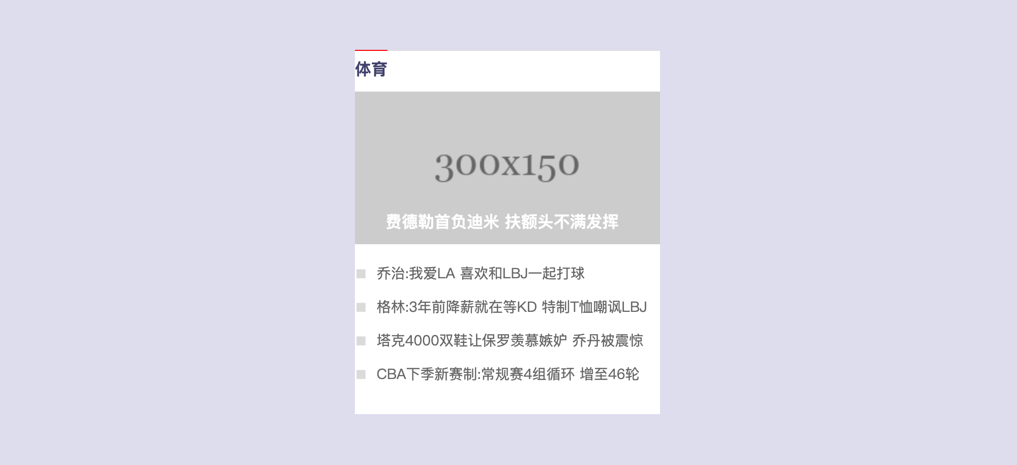
3、 新闻卡片
<!-- 创建新闻列表的外侧的容器 -->
<div class="news-wrapper">
  <!-- 创建一个标题标签 -->
  <h2 class="news-title">
    <a href="#">体育</a>
  </h2>

  <!-- 创建一个图片的容器 -->
  <div class="news-img">
    <a href="#">
      <img src="http://iph.href.lu/300x150" alt="费德勒">
      <!-- 创建图片标题 -->
      <h3 class="img-title">
        费德勒首负迪米 扶额头不满发挥
      </h3>
    </a>
  </div>

  <!-- 新闻列表 -->
  <ul class="news-list">
    <li>
      <a href="#">乔治:我爱LA 喜欢和LBJ一起打球</a>
    </li>
    <li>
      <a href="#">格林:3年前降薪就在等KD 特制T恤嘲讽LBJ</a>
    </li>
    <li>
      <a href="#">塔克4000双鞋让保罗羡慕嫉妒 乔丹被震惊</a>
    </li>
    <li>
      <a href="#">CBA下季新赛制:常规赛4组循环 增至46轮</a>
    </li>
  </ul>
</div>
html,body,div,span,applet,object,iframe,h1,h2,h3,h4,h5,h6,p,blockquote,pre,a,abbr,acronym,address,big,cite,code,del,dfn,em,img,ins,kbd,q,s,samp,small,strike,strong,sub,sup,tt,var,b,u,i,center,dl,dt,dd,ol,ul,li,fieldset,form,label,legend,table,caption,tbody,tfoot,thead,tr,th,td,article,aside,canvas,details,embed,figure,figcaption,footer,header,hgroup,menu,nav,output,ruby,section,summary,time,mark,audio,video{margin:0;padding:0;border:0;font-size:100%;font:inherit;vertical-align:baseline;}article,aside,details,figcaption,figure,footer,header,hgroup,menu,nav,section{display:block;}body{line-height:1;}ol,ul{list-style:none;}blockquote,q{quotes:none;}blockquote:before,blockquote:after,q:before,q:after{content:'';content:none;}table{border-collapse:collapse;border-spacing:0;}


a{
  /* 去除下划线 */
  text-decoration: none;
}

/* 设置容器的样式 */
/* 设置容器的样式 */
/* 设置容器的样式 */
.news-wrapper{
  width: 300px;
  height: 357px;
  /*设置居中  */
  margin: 50px auto;
  /* 设置背景颜色,显示轮廓 */
  background-color: #fff;

  /* 设置上边框 */
  border-top: 1px solid #ddd;
}


/* 设置news-title */
/* 设置news-title */
/* 设置news-title */
.news-title{
  /* 为了边框和文字宽度一致,需要将h2转换为行内块元素 */
  display: inline-block;
  /* 设置高度 */
  height: 30px;
  /* 设置上边框  */
  border-top: 1px red solid;
  /* 通过margin-top将h2上移,盖住上边框 */
  margin-top: -1px;

  padding-top: 10px;
}

/* 设置title中超链接的样式 */
.news-title a{
  /* 设置颜色 */
  color: #40406B;
  /* 设置文字的加粗效果 */
  font-weight: bold;
}


/* 设置图片容器的高度  */
/* 设置图片容器的高度  */
/* 设置图片容器的高度  */
.news-img{
  height: 150px;
}

/* 设置图片的文字效果 */
.news-img .img-title{
  /* 向上移动文字 */
  margin-top: -30px;
  /* 设置字体颜色 */
  color: #fff;
  /* 设置加粗 */
  font-weight: bold;
  /* 设置padding */
  padding-left: 30px;
}

/* 设置新闻列表 */
/* 设置新闻列表 */
/* 设置新闻列表 */
.news-list{
  /* 设置上外边距 */
  margin-top: 20px;
  /* 设置左侧的padding */
  /* padding-left: 14px; */

  /* 设置项目符号 */
  /* list-style: square; */
}

/* 设置li */
.news-list li{
  /*设置下外边距  */
  margin-bottom: 17px;
}

/* 通过before伪元素,来为每一个li添加项目符号 */
.news-list li::before{
  content: '■';
  color: rgb(218, 218, 218);
  font-size: 12px;
  margin-right: 4px;
}

/* 设置li中文字 */
.news-list li a{
  /* 设置字体大小 */
  font-size: 14px;
  /* 设置字体颜色 */
  color: #666;
}


/* 设置超链接的鼠标移入的样式 */
.news-list li a:hover{
  color: red;
}
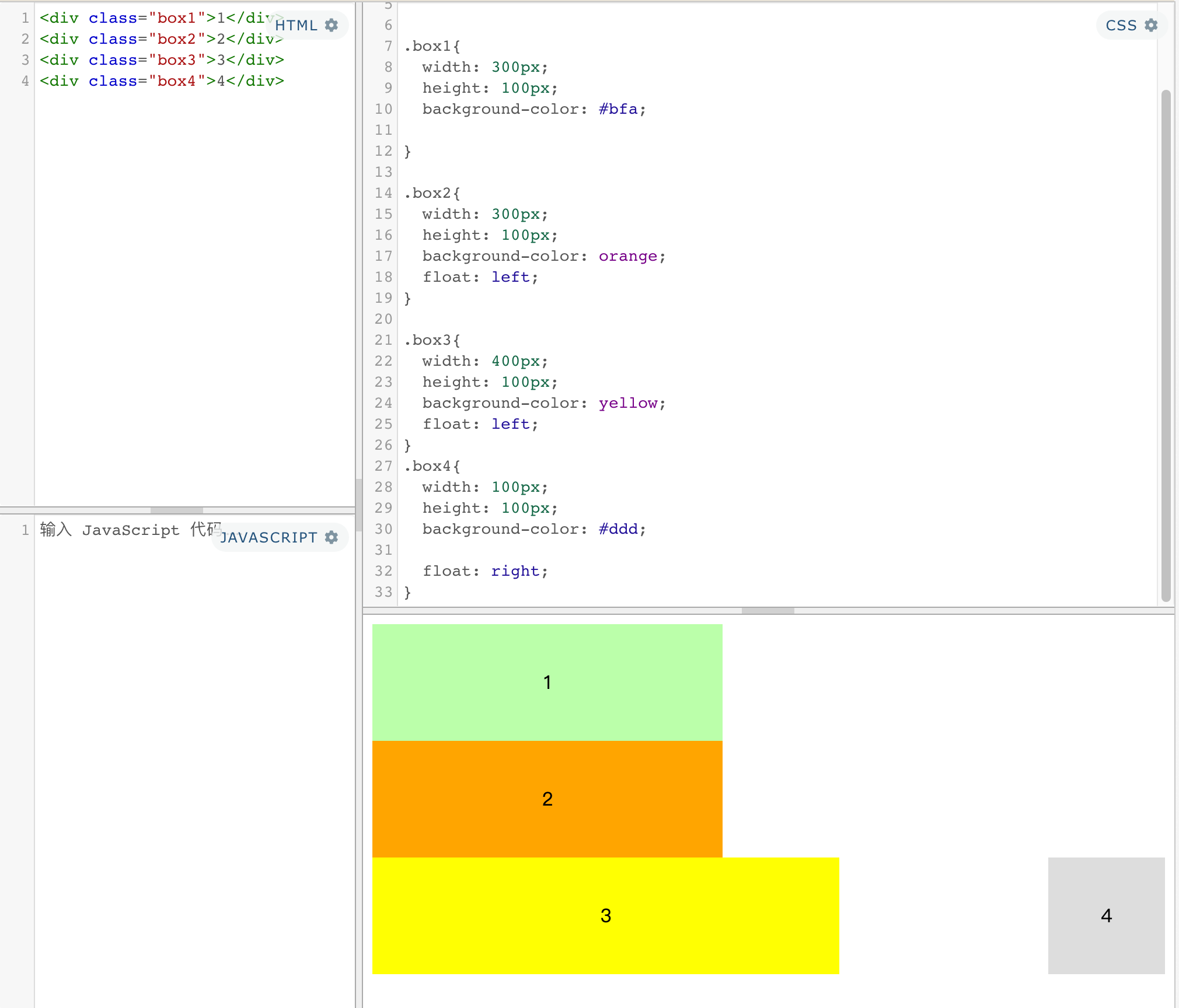
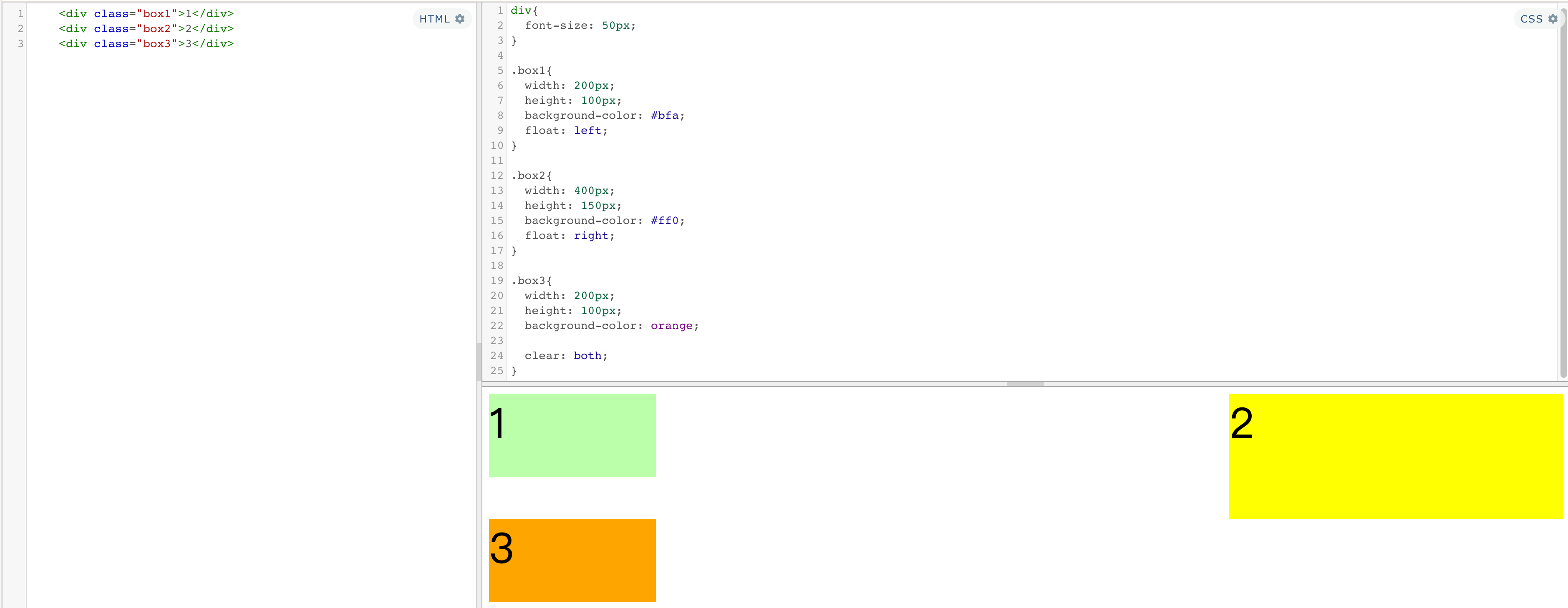
4、浮动
浮动目前来讲它的主要作用就是让页面中的元素可以水平排列,通过浮动可以制作一些水平方向的布局
-
浮动使用
通过浮动可以使一个元素向其父元素的左侧或右侧移动
float 属性来设置于元素的浮动可选值 说明 none 默认值 ,元素不浮动 left 元素向左浮动 right 元素向右浮动 ⚠️注意:
- 水平布局的等式便不需要强制成立
- 会完全从文档流中脱离,不再占用文档流的位置
- 元素下边的还在文档流中的元素会自动向上移动
-
浮动特点
- 浮动元素会完全
脱离文档流,不再占据文档流中的位置,浮动元素不会盖住文字块元素:- 块元素不在独占页面的一行,
- 脱离文档流以后,块元素的宽度和高度默认都被内容撑开
行内元素:- 行内元素脱离文档流以后会变成块元素,特点和块元素一样
- 设置浮动以后元素会
向父元素的左侧或右侧移动 - 浮动元素默认
不会从父元素中移出 - 浮动元素向左或向右移动时,
不会超过它前边的其他浮动元素 - 如果浮动元素的
上边是一个没有浮动的块元素,则浮动元素无法上移 - 浮动元素
不会超过它上边的浮动的兄弟元素,最多最多就是和它一样高
- 浮动元素会完全
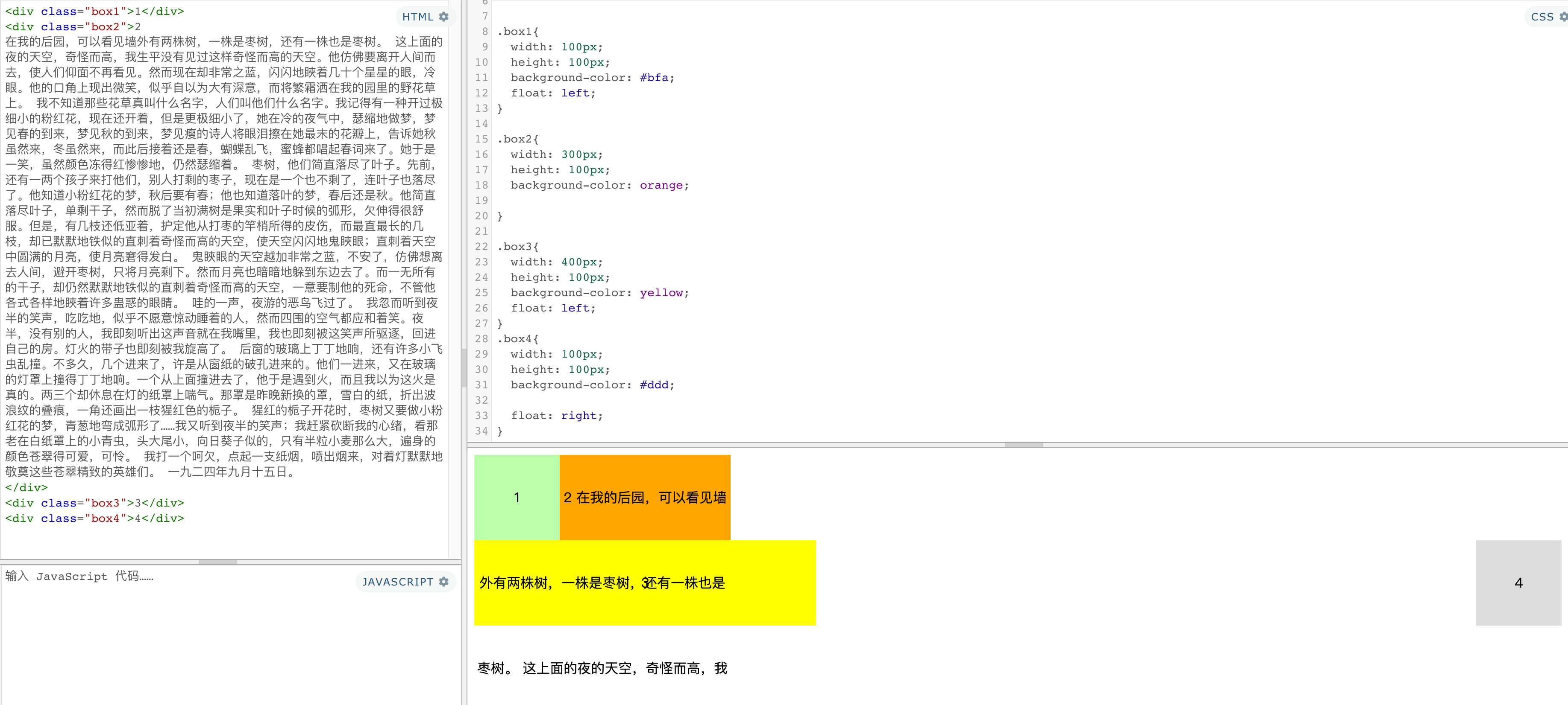
练习:浮动导航
<!-- 创建导航条的结构 -->
<div class="container">
  <ul class="nav">
    <li>
      <a href="#">HTML/CSS</a>
    </li>
    <li>
      <a href="#">Browser Side</a>
    </li>
    <li>
      <a href="#">Server Side</a>
    </li>
    <li>
      <a href="#">Programming</a>
    </li>
    <li>
      <a href="#">XML</a>
    </li>
    <li>
      <a href="#">Web Building</a>
    </li>
    <li>
      <a href="#">Reference</a>
    </li>
  </ul>
</div>
html,body,div,span,applet,object,iframe,h1,h2,h3,h4,h5,h6,p,blockquote,pre,a,abbr,acronym,address,big,cite,code,del,dfn,em,img,ins,kbd,q,s,samp,small,strike,strong,sub,sup,tt,var,b,u,i,center,dl,dt,dd,ol,ul,li,fieldset,form,label,legend,table,caption,tbody,tfoot,thead,tr,th,td,article,aside,canvas,details,embed,figure,figcaption,footer,header,hgroup,menu,nav,output,ruby,section,summary,time,mark,audio,video{margin:0;padding:0;border:0;font-size:100%;font:inherit;vertical-align:baseline;}article,aside,details,figcaption,figure,footer,header,hgroup,menu,nav,section{display:block;}body{line-height:1;}ol,ul{list-style:none;}blockquote,q{quotes:none;}blockquote:before,blockquote:after,q:before,q:after{content:'';content:none;}table{border-collapse:collapse;border-spacing:0;}

.container {
    width: 1210px;
  	margin: 0 auto;
}

/* 设置nav的大小 */
.nav{

  /* 设置宽度和高度 */
  display: inline-block;
  height: 48px;
  /* 设置背景颜色 */
  background-color: #E8E7E3;

  margin:100px auto;

}


/* 设置nav中li */
.nav li{
  /* 设置li向左浮动,已使菜单横向排列 */
  float: left;
  /* 设置li的高度 */
  /* height: 48px; */
  /* 将文字在父元素中垂直居中 */
  line-height: 48px;

}

/* 设置a的样式 */
.nav a{
  /* 将a转换为块元素 */
  display: block;
  /* 去除下划线 */
  text-decoration: none;
  /* 设置字体颜色 */
  color: #777777;
  /* 修改字体大小 */
  font-size: 18px;

  padding: 0 40px;
}


/* 设置鼠标移入的效果 */
.nav a:hover{
  background-color: #3F3F3F;
  color: #E8E7E3;
}
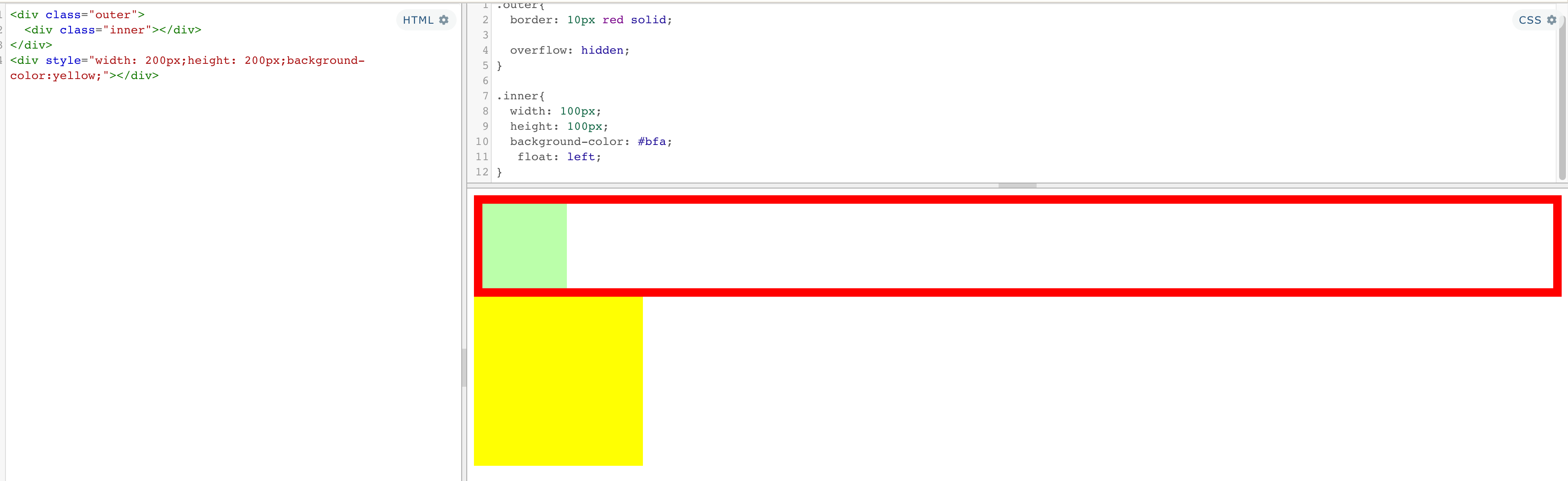
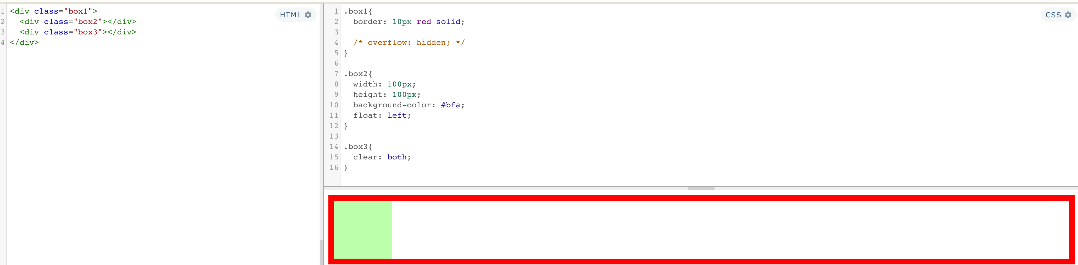
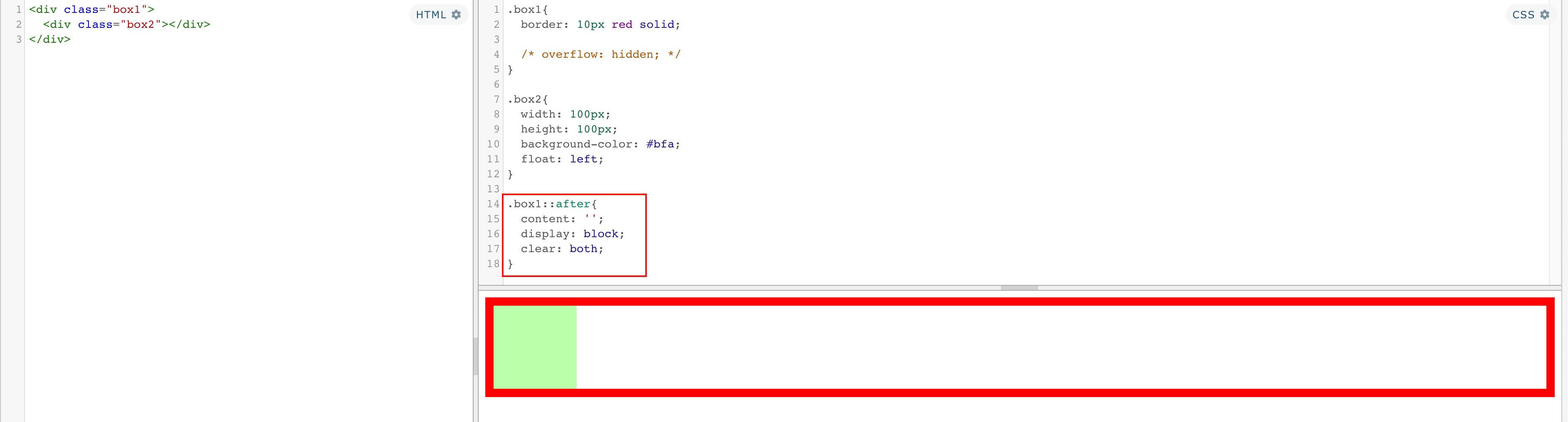
浮动带来的高度塌陷问题
①问题
子元素浮动后,父元素高度塌陷
父元素高度丢失以后,其下的元素会自动上移,导致页面的布局混乱
高度塌陷是浮动布局中比较常见的一个问题,这个问题我们必须要进行处理!
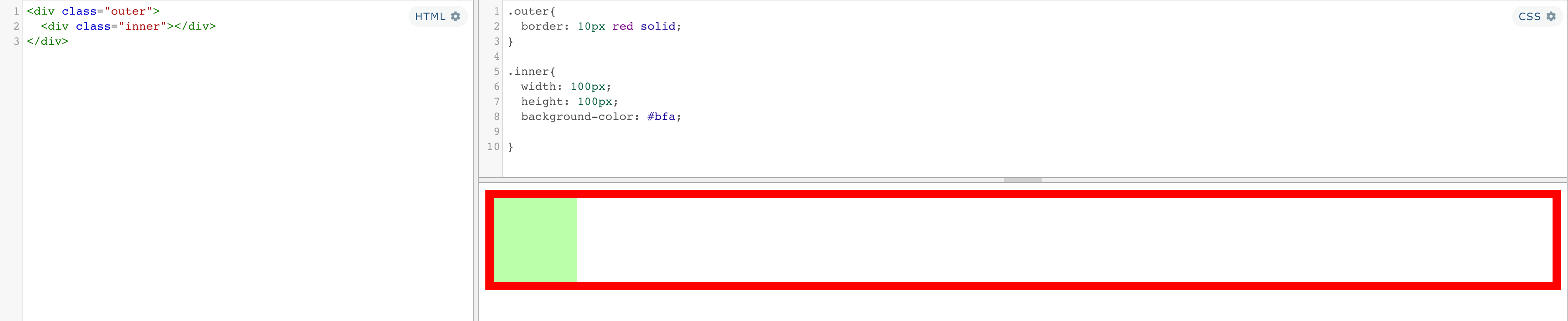
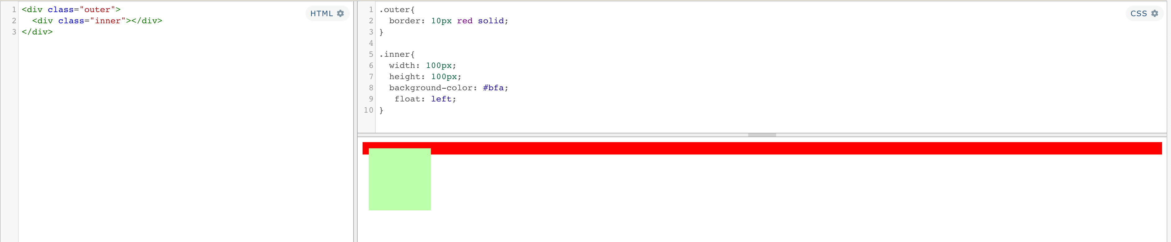
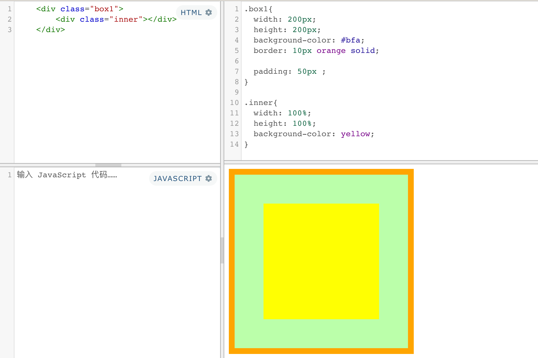
②BFC (block formatting context)
块级格式化环境:BFC(Block Formatting Context)
BFC是一个CSS中的一个
隐含的属性,可以为一个元素开启BFC
开启BFC该元素会变成一个独立的布局区域
开启BFC后的特点:
不会被浮动元素所覆盖子元素和父元素外边距不会重叠可以包含浮动的子元素
可以通过一些特殊方式来开启元素的BFC:
设置元素的浮动(不推荐): 脱离文档流,丢失宽度- 将元素
设置为行内块元素(不推荐):不适合作为外部的布局容器,丢失宽度 - 将元素的
overflow设置为一个非visible的值
[1]overflow:hidden;开启BFC,解决高度塌陷问题
常用的方式 为元素设置 overflow:hidden 开启其BFC 以使其可以包含浮动元素
③clear
作用:清除浮动元素对当前元素所产生的影响
| 可选值 | 说明 |
|---|---|
| left | 清除左侧浮动元素对当前元素的影响 |
| right | 清除右侧浮动元素对当前元素的影响 |
| both | 清除两侧中最大影响的那侧 |
原理:设置清除浮动以后,浏览器会自动为元素添加一个上外边距,以使其位置不受其他元素的影响
[2]clear:清除浮动影响,解决高度塌陷问题
解决问题:通过伪元素添加清除
.box1{
  border: 10px red solid;

  /* overflow: hidden; */
}

.box2{
  width: 100px;
  height: 100px;
  background-color: #bfa;
  float: left;
}

.box1::after{
  content: '';
  display: block;
  clear: both;
}
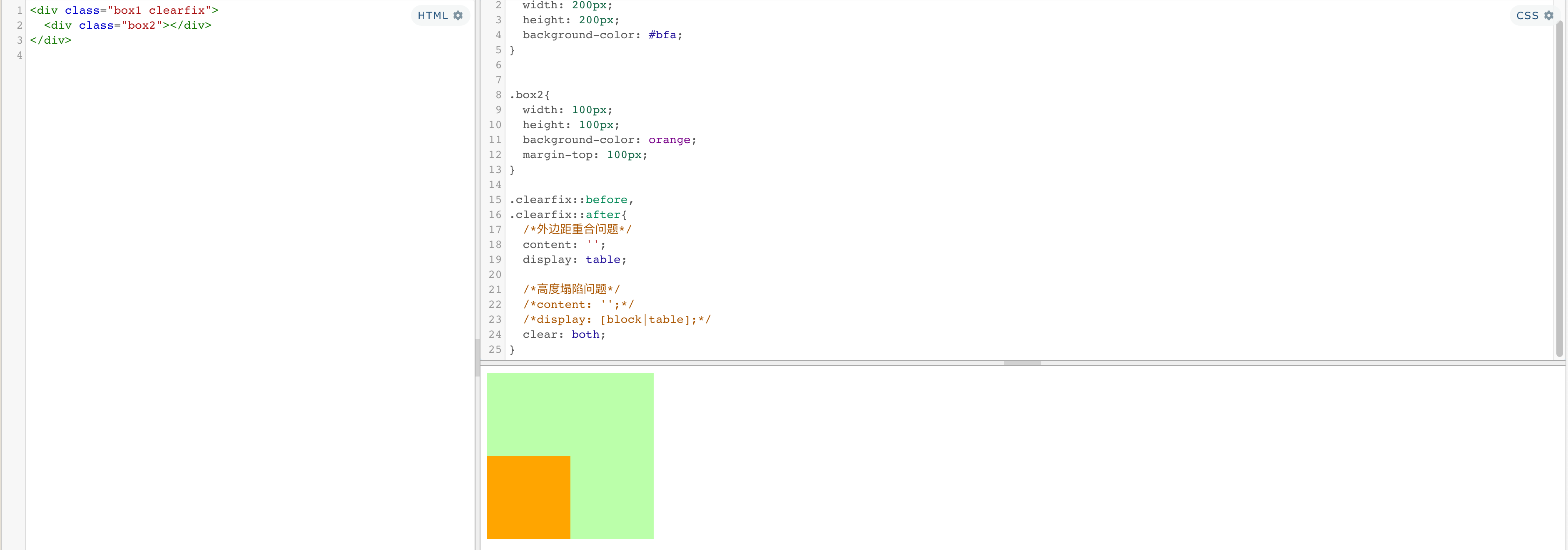
[3]clearfix:解决高度塌陷问题、外边距重叠问题
外边距重叠就是要在父子元素之间添加一个挡板
<div class="box1 clearfix">
  <div class="box2"></div>
</div>
.box1{
  width: 200px;
  height: 200px;
  background-color: #bfa;
}


.box2{
  width: 100px;
  height: 100px;
  background-color: orange;
  margin-top: 100px;
}

.clearfix::before,
.clearfix::after{
  /*外边距重合问题*/
  content: '';
  display: table;

  /*高度塌陷问题*/
  /*content: '';*/
  /*display: [block|table];*/
  clear: both;
}
5、定位
定位(position):定位是一种更加高级的布局手段
通过定位可以将元素摆放到页面的任意位置
| 可选值 | 说明 |
|---|---|
| static | 默认值,元素是静止的没有开启定位 |
| relative | 相对定位 |
| absolute | 绝对定位 |
| fixed | 固定定位 |
| sticky | 粘滞定位 |
偏移量(offset)
当元素开启了定位以后,可以通过偏移量来设置元素的位置
| 属性 | 说明 |
|---|---|
| top | 定位元素和定位位置上边的距离 |
| bottom | 定位元素和定位位置下边的距离定位元素垂直方向的位置由top和bottom两个属性来控制 通常情况下我们只会使用其中一
|
| left | 定位元素和定位位置的左侧距离 |
| right | 定位元素和定位位置的右侧距离定位元素水平方向的位置由left和right两个属性控制 通常情况下只会使用一个
|
①相对定位(relative)
相对定位的特点:
不设置偏移量元素不会发生任何的变化- 参照元素在
文档流中的位置进行定位的 会提升元素的层级不会使元素脱离文档流不会改变元素的性质块还是块,行内还是行内
补充:
水平布局满足 9 值等式
left + margin-left + border-left + padding-left + width + padding-right + border-right + margin-right + right = 包含块的内容区的宽度
水平方向的布局等式就需要添加left 和 right 两个值
- 因为left 和 right的值默认是auto,所以如果不指定left和right
则等式不满足时,会自动调整这两个值- 可设置auto的值
margin width left right- 当发生过度约束:
如果9个值中没有 auto 则自动调整right值以使等式满足
如果有auto,则自动调整auto的值以使等式满足
垂直方向布局的等式的也必须要满足
top + margin-top/bottom + padding-top/bottom + border-top/bottom + height = 包含块的高度
水平居中,垂直居中
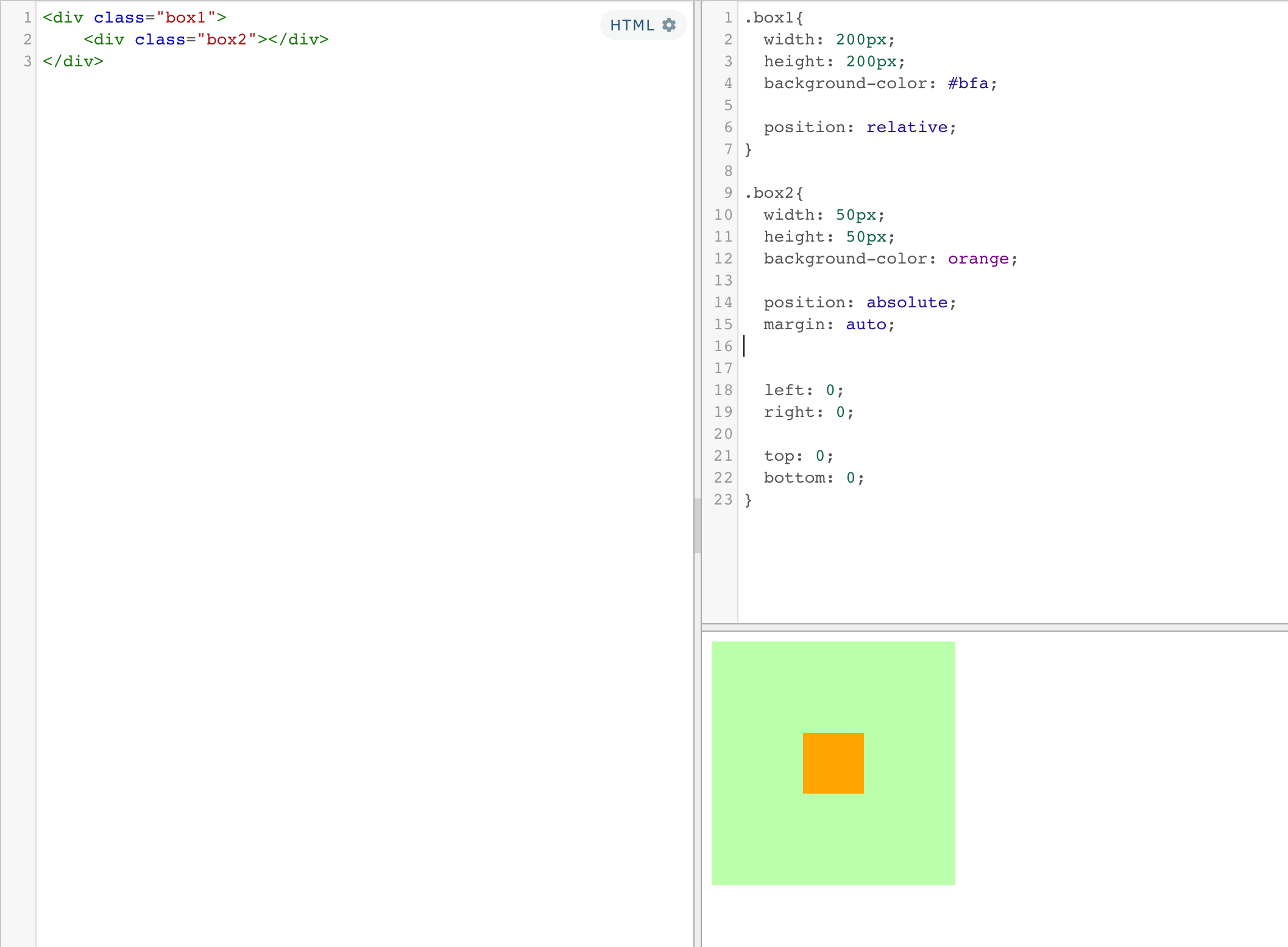
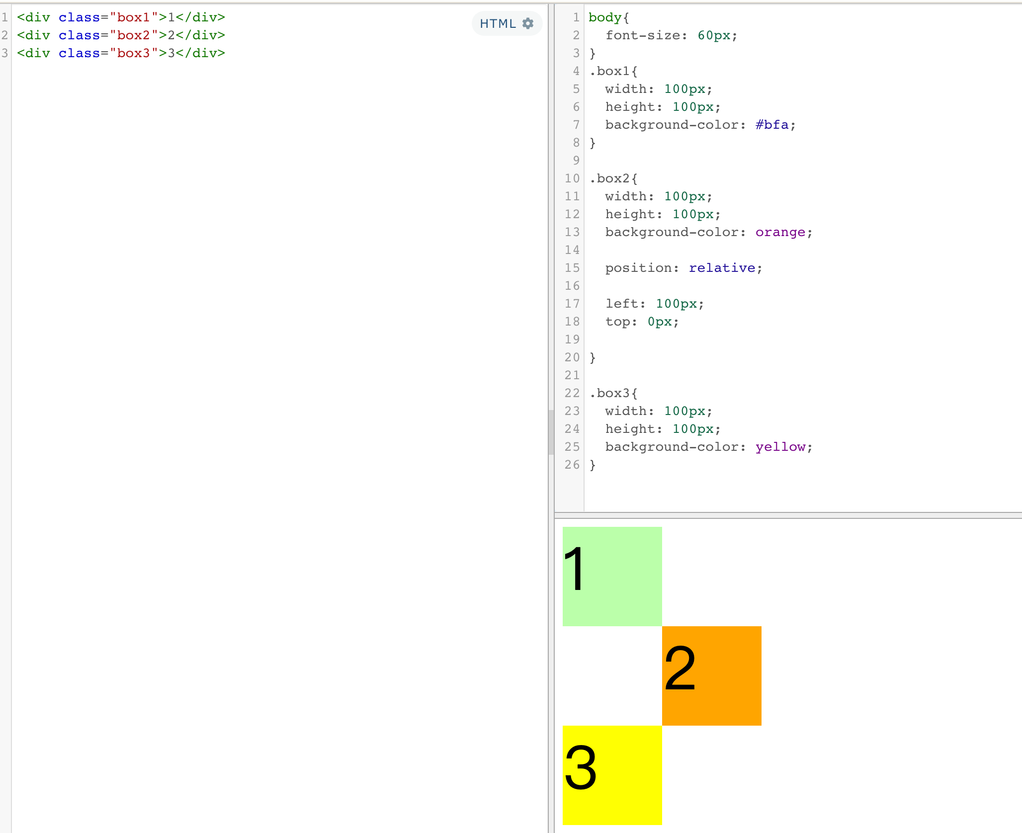
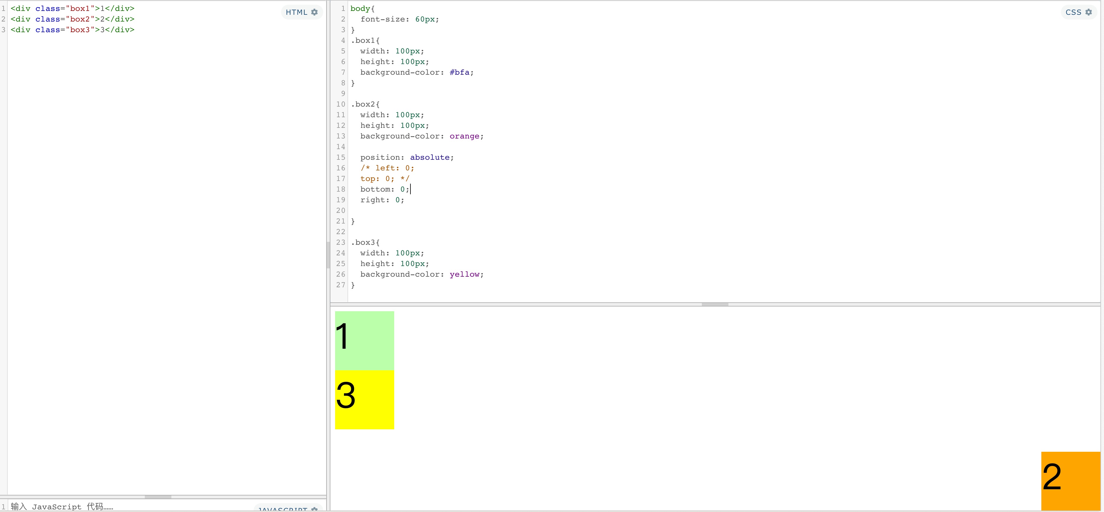
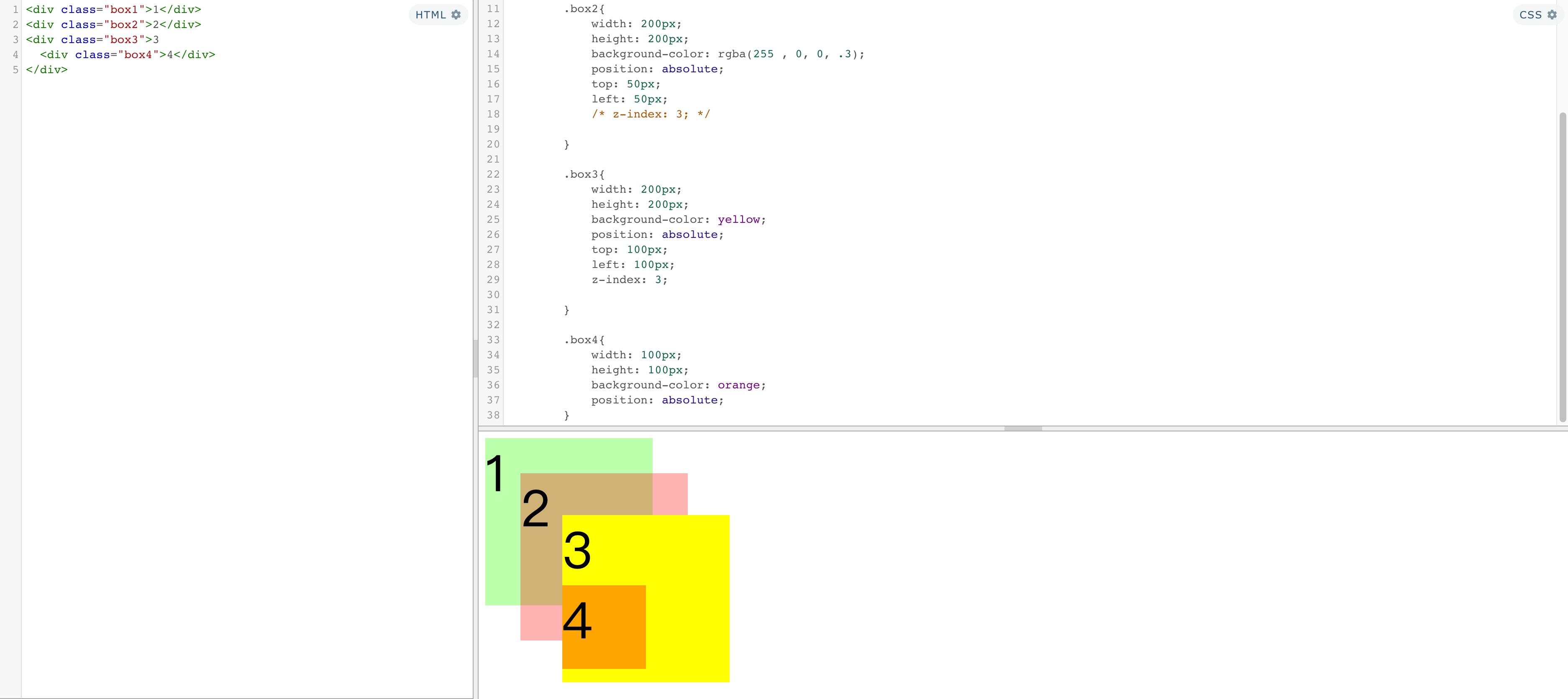
②绝对定位(absolute)
绝对定位的特点:
- 不设置偏移量元素的位置不会发生变化
- 元素会
从文档流中脱离 - 会改变元素的性质,
行内变成块,块的宽高被内容撑开 - 会使元素
提升一个层级 - 绝对定位元素是
相对于其包含块进行定位的
包含块( containing block )
- 正常情况下:包含块就是离当前元素最近的祖先块元素
- 绝对定位的包含块:
包含块就是离它最近的开启了定位的祖先元素,
如果所有的祖先元素都没有开启定位则根元素就是它的包含块 - html(根元素、初始包含块)
③固定定位(fixed)
- 固定定位
也是一种绝对定位,所以固定定位的大部分特点都和绝对定位一样 - 唯一不同的是
固定定位永远参照于浏览器的视口进行定位 - 固定定位的元素
不会随网页的滚动条滚动
④粘滞定位(sticky) :兼容性不好
- 粘滞定位和相对定位的特点基本一致
- 不同的是粘滞定位可以在元素到达某个位置时将其固定
层级
对于开启了定位元素,可以通过z-index属性来指定元素的层级
z-index需要一个整数作为参数,值越大元素的层级越高
元素的层级越高越优先显示- 如果元素的
层级一样,则优先显示靠下的元素 祖先的元素的层级再高也不会盖住后代元素
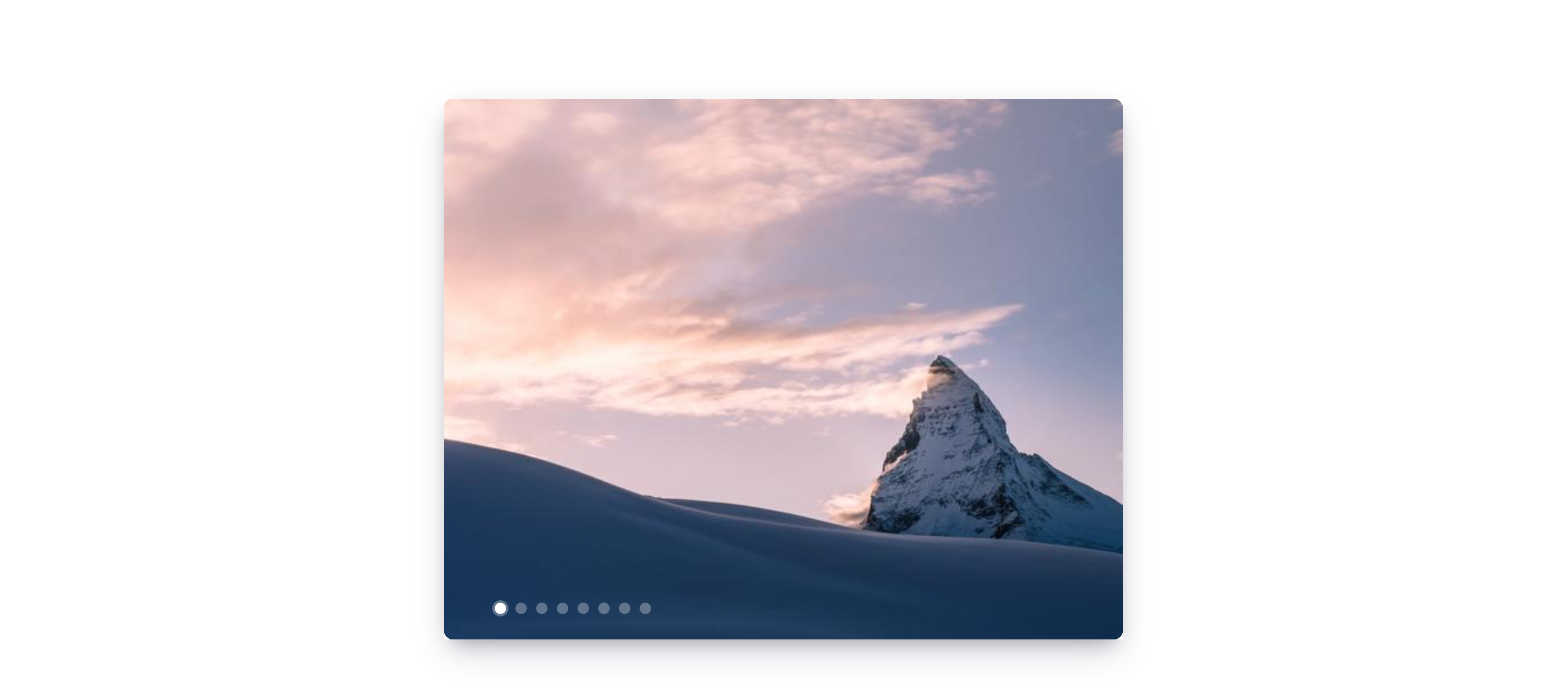
练习:轮播图小点定位
<ul class="img-list">
  <li>
    <a href="javascript:;">
      <img src="https://picsum.photos/590/470">
    </a>
  </li>
  <li>
    <a href="javascript:;">
      <img src="https://picsum.photos/590/470">
    </a>
  </li>
    <li>
    <a href="javascript:;">
      <img src="https://picsum.photos/590/470">
    </a>
  </li>
    <li>
    <a href="javascript:;">
      <img src="https://picsum.photos/590/470">
    </a>
  </li>
    <li>
    <a href="javascript:;">
      <img src="https://picsum.photos/590/470">
    </a>
  </li>
    <li>
    <a href="javascript:;">
      <img src="https://picsum.photos/590/470">
    </a>
  </li>
    <li>
    <a href="javascript:;">
      <img src="https://picsum.photos/590/470">
    </a>
  </li>
    <li>
    <a href="javascript:;">
      <img src="https://picsum.photos/590/470">
    </a>
  </li>


  <div class="pointer">
    <a class="active" href="javascript:;"></a>
    <a href="javascript:;"></a>
    <a href="javascript:;"></a>
    <a href="javascript:;"></a>
    <a href="javascript:;"></a>
    <a href="javascript:;"></a>
    <a href="javascript:;"></a>
    <a href="javascript:;"></a>
  </div>
</ul>
html,body,div,span,applet,object,iframe,h1,h2,h3,h4,h5,h6,p,blockquote,pre,a,abbr,acronym,address,big,cite,code,del,dfn,em,img,ins,kbd,q,s,samp,small,strike,strong,sub,sup,tt,var,b,u,i,center,dl,dt,dd,ol,ul,li,fieldset,form,label,legend,table,caption,tbody,tfoot,thead,tr,th,td,article,aside,canvas,details,embed,figure,figcaption,footer,header,hgroup,menu,nav,output,ruby,section,summary,time,mark,audio,video{margin:0;padding:0;border:0;font-size:100%;font:inherit;vertical-align:baseline;}article,aside,details,figcaption,figure,footer,header,hgroup,menu,nav,section{display:block;}body{line-height:1;}ol,ul{list-style:none;}blockquote,q{quotes:none;}blockquote:before,blockquote:after,q:before,q:after{content:'';content:none;}table{border-collapse:collapse;border-spacing:0;}


img {
  max-width: 100%;
  height: auto;
  border-radius: 8px;
}


.img-list{
  width: 590px;
  height: 470px;
  margin: 100px auto;

  /*
  为ul开启相对定位,目的是使ul中的pointer可以相对于ul定位而不是相对于初始包含块(html)去定位
  */
  position: relative;

    box-shadow:
    0 13px 27px -5px hsl(240deg 30% 28% / 25%),
    0 8px 16px -8px hsl(0deg 0% 0% / 30%),
    0 -6px 16px -6px hsl(0deg 0% 0% / 3%);
}


/* 设置li */
.img-list li{
  position: absolute;
}

/* 通过修改元素的层级来显示指定的图片 */
.img-list li:nth-child(5){
  z-index: 1;
}


/* 设置导航点的样式 */
.pointer{
  position: absolute;
  z-index: 9999;
  bottom: 20px;
  left: 40px;
}

.pointer a{
  /* 设置元素向左浮动 */
  float: left;
  width: 10px;
  height: 10px;
  margin: 0px 2px;
  border-radius: 50%;
  background-color: rgba(255, 255, 255, .3);
  /* 将背景颜色值设置到内容区,边框和内边距不在有背景颜色 */
  background-clip: content-box;
  border: 2px solid transparent;
}

.pointer a.active,
.pointer a:hover{
  background-color: #fff;
  border: 2px solid  rgba(255, 255, 255, .3);
}
练习:浮动元素居中方法
方法一:浮动
<div class="content">
  <div class="left">
    方法一
  </div>
</div>
.left {
  float:left;
  width: 100px;
  height: 100px;
  background-color: #bfa;
}

.content {
  width: 100px;
  margin: 0 auto;
  overflow: hidden;
}
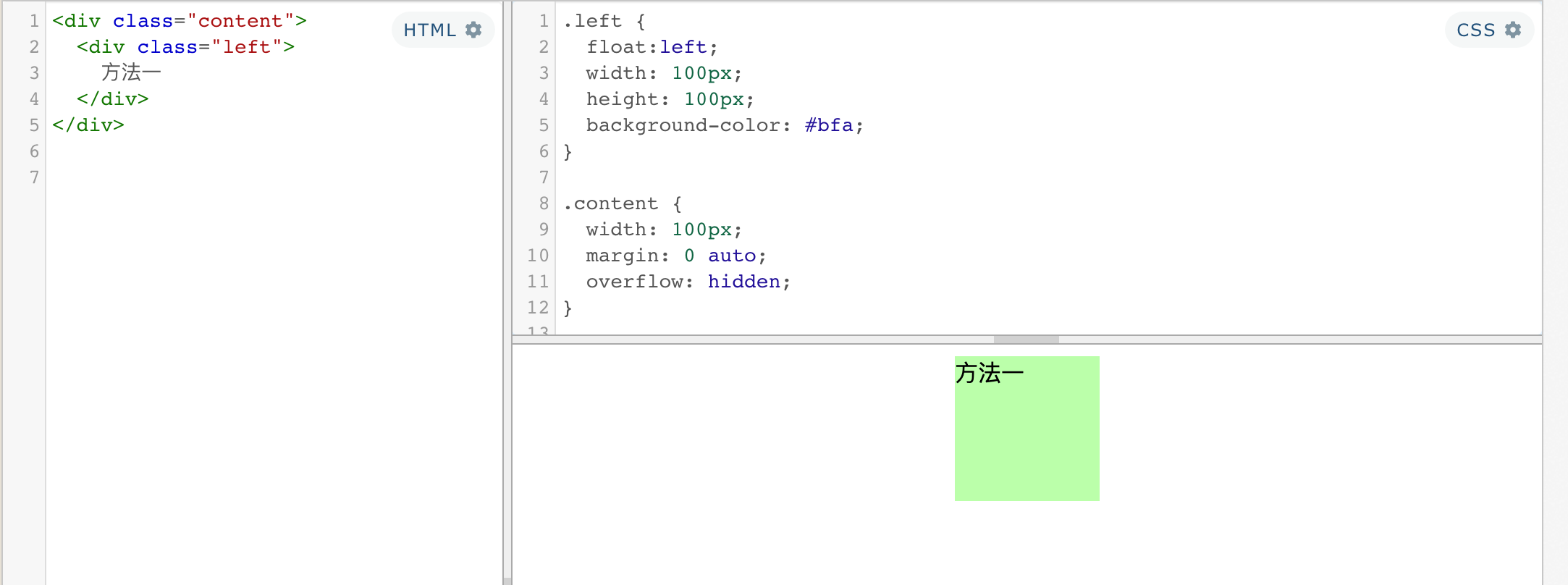
在要浮动的元素外 添加一层div,并设置宽度与浮动元素宽度相同,再设置一下margin即可
方法二:浮动 + 定位 (利用元素溢出)
.left {
  float: left;
  background: #bfa;

  width: 100px;
  height: 100px;
  position: relative;
  left:-50%;
}
.content {
  float: left;
  position:relative;
  left: 50%;
}
<div class="content">
  <div class="left">
    方法二
  </div>
</div>
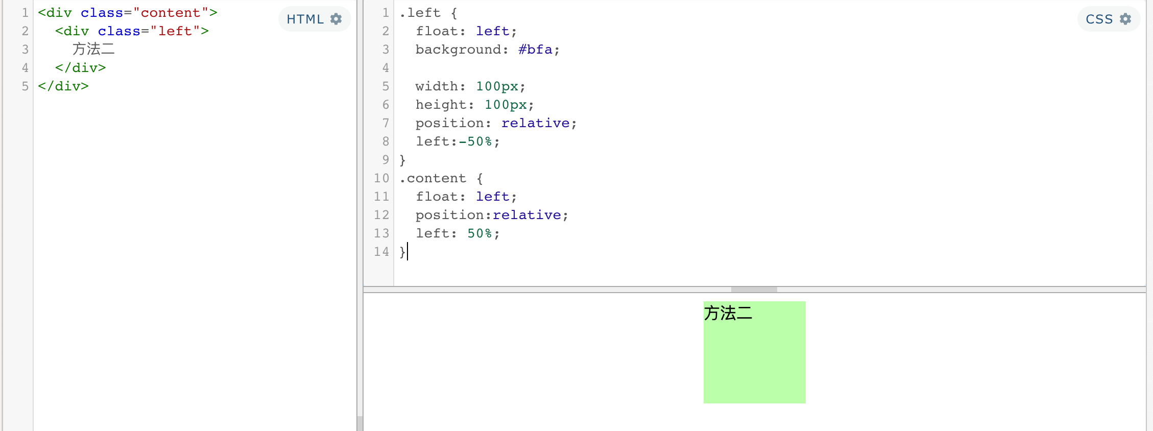
    border: 1px solid red;

    float: left;

    position: absolute;

    width: 200px;

    height: 100px;

    left: 50%;

    top: 50%;

    margin: -50px 0 0 -100px;
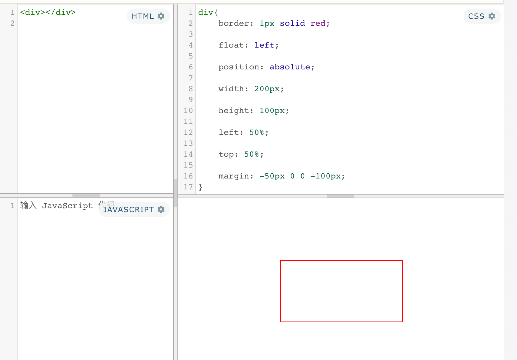
特点:浮动元素以及外面嵌套的那一层都变成行内块元素了
方法三:定位 + 浮动 + margin
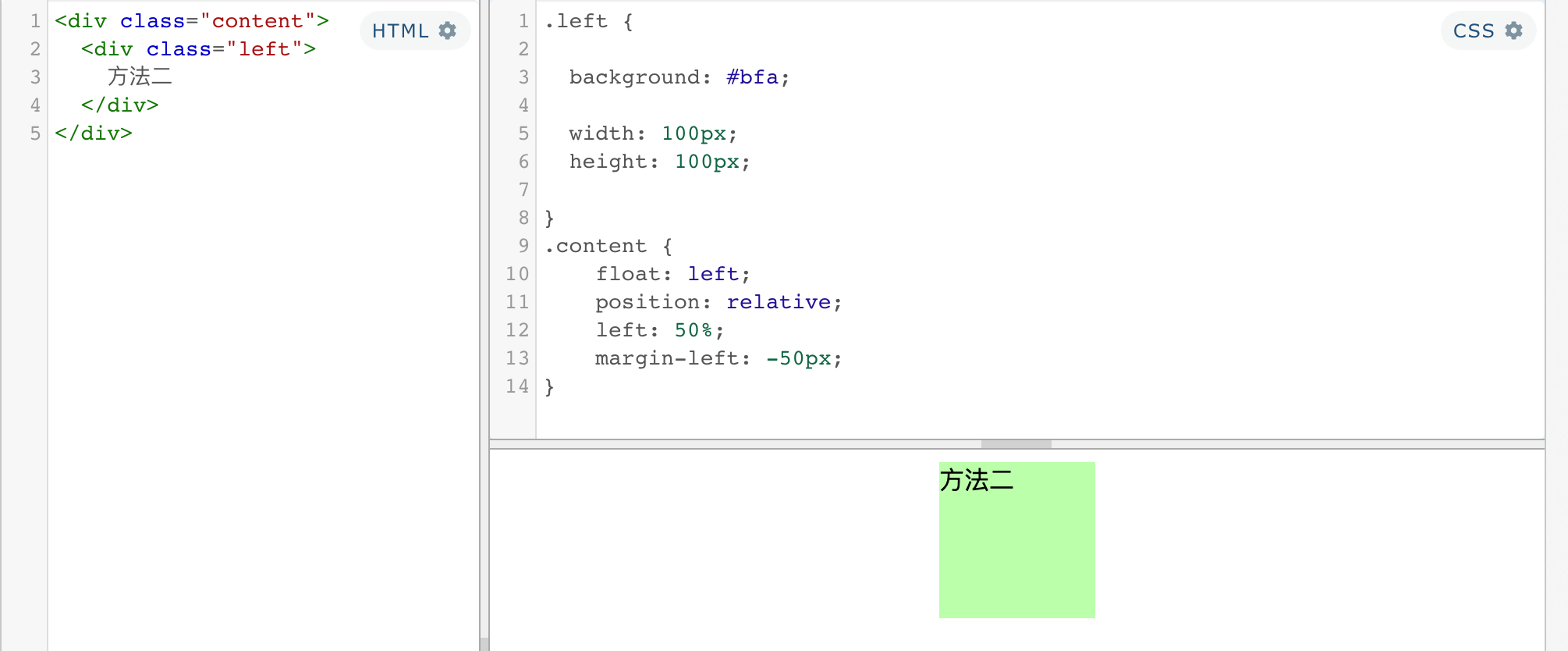
特点:不需要浮动外面添加元素,需要设置宽度
总结:一、三:需要设置宽度,二不需要设置宽度
练习:定位实现居中
https://blog.csdn.net/renxinzhewudi/article/details/55805261
三、字体&背景
1、文字(颜色、大小、字体)
- color
- font-size
- font-family
font-family 字体族(字体的格式)
字体分类
- serif 衬线字体
- sans-serif 非衬线字体
- monospace 等宽字体
font-family 可以同时指定多个字体,多个字体间使用,隔开
字体生效时优先使用第一个,第一个无法使用则使用第二个 以此类推
Microsoft YaHei,Heiti SC,tahoma,arial,Hiragino Sans GB,“\5B8B\4F53”,sans-serif
服务器字体
/*
font-face可以将服务器中的字体直接提供给用户去使用
    问题:
        1.加载速度
        2.版权
        3.字体格式

*/
@font-face {
        /* 指定字体的名字 */
    font-family:'myfont' ;
    /* 服务器中字体的路径 */
    src: url('./font/ZCOOLKuaiLe-Regular.ttf') format("truetype");
}


font-family: myfont;
[1] 图标字体
图标字体(iconfont)
在网页中经常需要使用一些图标,可以通过图片来引入图标
但是图片大小本身比较大,并且非常的不灵活
所以在使用图标时,我们还可以将图标直接设置为字体,
然后通过font-face的形式来对字体进行引入
这样我们就可以通过使用字体的形式来使用图标
fontawesome 使用步骤
- 下载 https://fontawesome.com/
- 将css和webfonts移动到项目中
- 将all.css引入到网页中
- 直接通过类名来使用图标字体
- class=“fas fa-bell”
- class=“fab fa-accessible-icon”
①通过类引入
<head>
    <link rel="stylesheet" href="./fa/css/all.css">
</head>
<body>
    <i class="fas fa-bell" style="font-size:80px; color:red;"></i>
    <i class="fas fa-bell-slash"></i>
    <i class="fab fa-accessible-icon"></i>
    <i class="fas fa-otter" style="font-size: 160px; color:green;"></i>
</body>
其原理就是利用自定义字体的方式
②通过伪元素引用
    <link rel="stylesheet" href="./fa/css/all.css">
    <style>
        li{
            list-style: none;
        }

        li::before{
            /*
                通过伪元素来设置图标字体
                    1.找到要设置图标的元素通过before或after选中
                    2.在content中设置字体的编码
                    3.设置字体的样式
                        fab
                        font-family: 'Font Awesome 5 Brands';

                        fas
                        font-family: 'Font Awesome 5 Free';
                        font-weight: 900;

            */
            content: '\f1b0';
            /* font-family: 'Font Awesome 5 Brands'; */
            font-family: 'Font Awesome 5 Free';
            font-weight: 900;
            color: blue;
            margin-right: 10px;
        }
    </style>

    <ul>
        <li>锄禾日当午</li>
        <li>汗滴禾下土</li>
        <li>谁知盘中餐</li>
        <li>粒粒皆辛苦</li>
    </ul>
③通过实体引用
<!--
通过实体来使用图标字体:
&#x图标的编码;
-->
<span class="fas"></span>
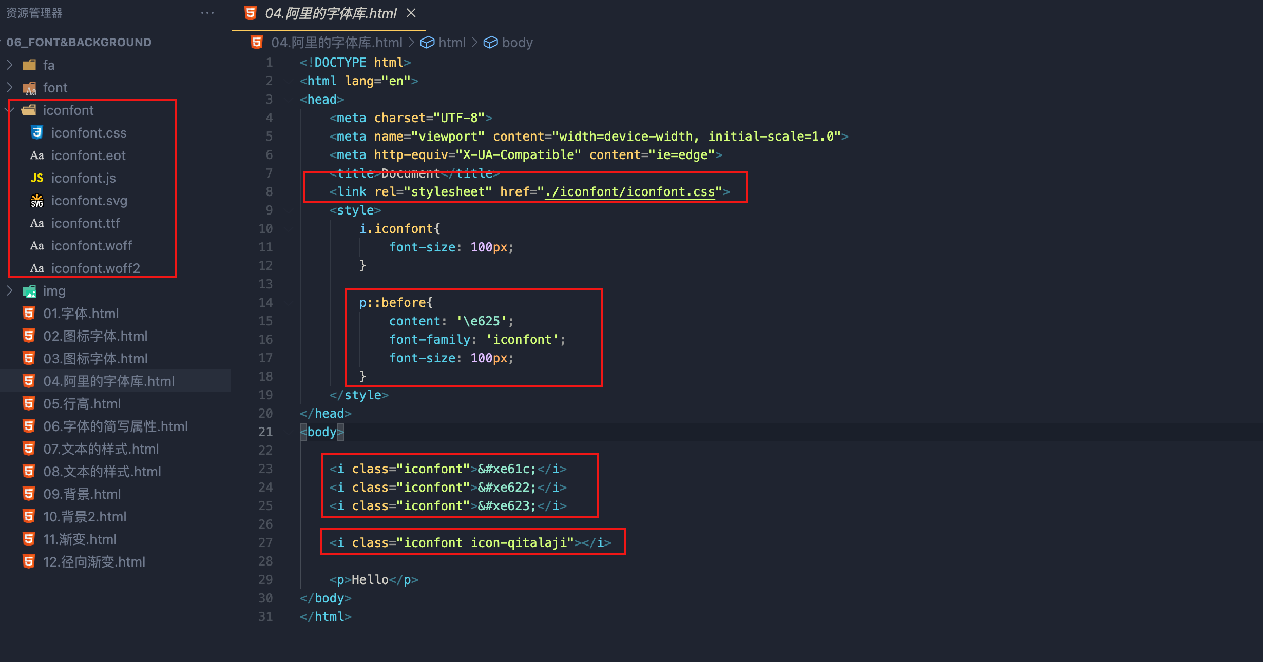
[2]iconfont
图标字体是单色的,所以对于彩色图标,还是只有下载图片
加入购物车
添加至项目
查看项目
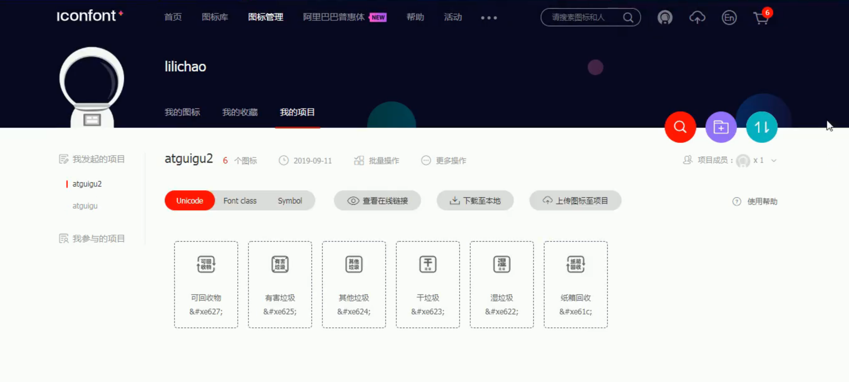
下载图标字体
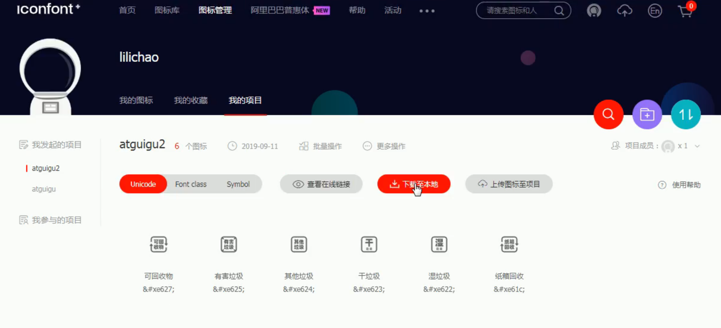
使用文档
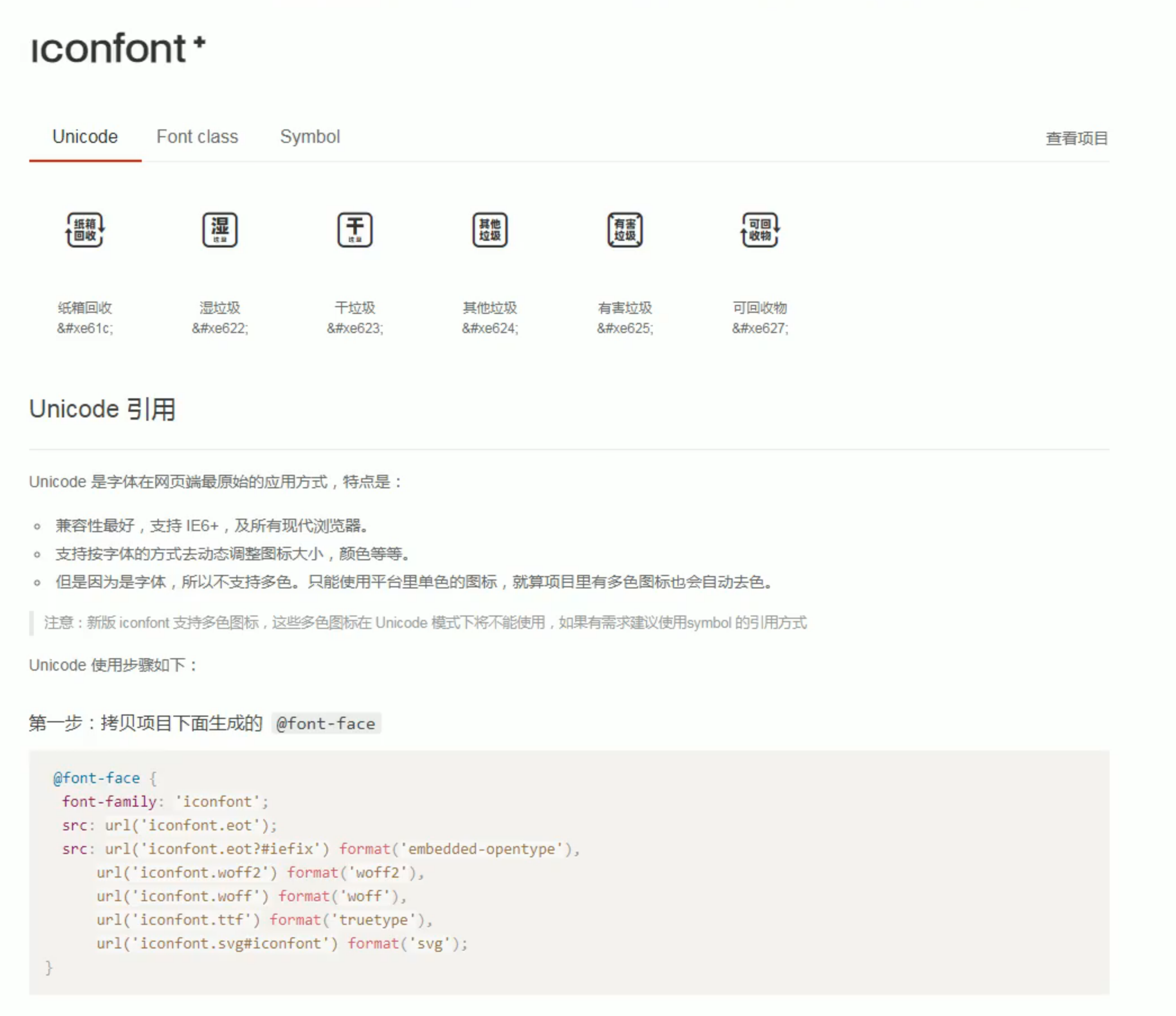
还是三种用法
2、 行高
行高指的是文字占有的实际高度,可以通过line-height来设置行高
- 行高可以直接指定一个大小(px em)
- 也可以直接为行高设置一个整数,如果是一个整数的话,行高将会是字体的指定的倍数
- 行高经常还用来
设置文字的行间距(行间距 = 行高 - 字体大小) - 可以将
行高设置为和高度一样的值,使单行文字在一个元素中垂直居中
字体框 :字体框就是字体存在的格子,设置font-size实际上就是在设置字体框的高度
3、font简写属性
font 可以设置字体相关的所有属性
- font: 字体大小/行高 字体族
行高 可以省略不写 如果不写使用默认值
font-weight 字重 字体的加粗
- normal 默认值 不加粗
- bold 加粗
- 100-900 九个级别(没什么用)
font-style 字体的风格
- normal 正常的
- italic 斜体
font-size: 50px;

font-family: 'Times New Roman', Times, serif;

font-weight: bold;

font-style: italic;

font: bold italic 50px/2  微软雅黑, 'Times New Roman', Times, serif;
4、文本水平对其 & 垂直对其
text-align 文本的水平对齐
- left 左侧对齐
- right 右对齐
- center 居中对齐
- justify 两端对齐
vertical-align 设置元素垂直对齐的方式
- baseline 默认值
基线对齐 - top
顶部对齐 - bottom
底部对齐 - middle
居中对齐 - 指定值
作为替换元素,即行内块元素对其方式是与文字相同,默认为基线对其
通过设置为非基线对其来解决其对布局的影响
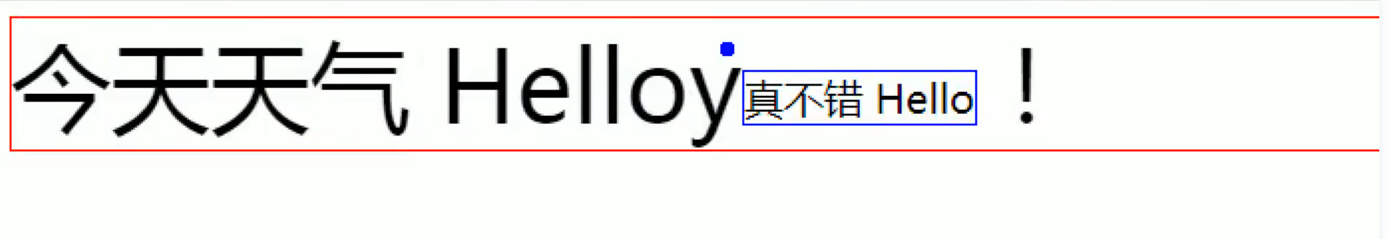
5、 文本修饰
text-decoration 设置文本修饰
- none 什么都没有
- underline 下划线
- line-through 删除线
- overline 上划线
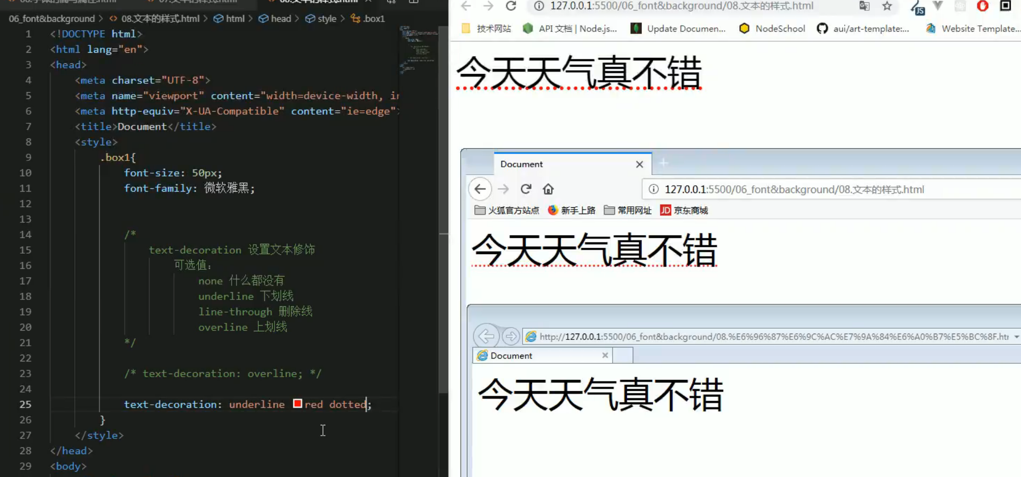
ie不支持对线设置样式text-decoration: underline red dotted;
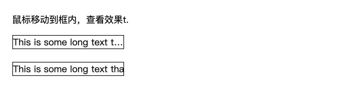
white-space 设置网页如何处理空白
- normal 正常
- nowrap 不换行
- pre 保留空白
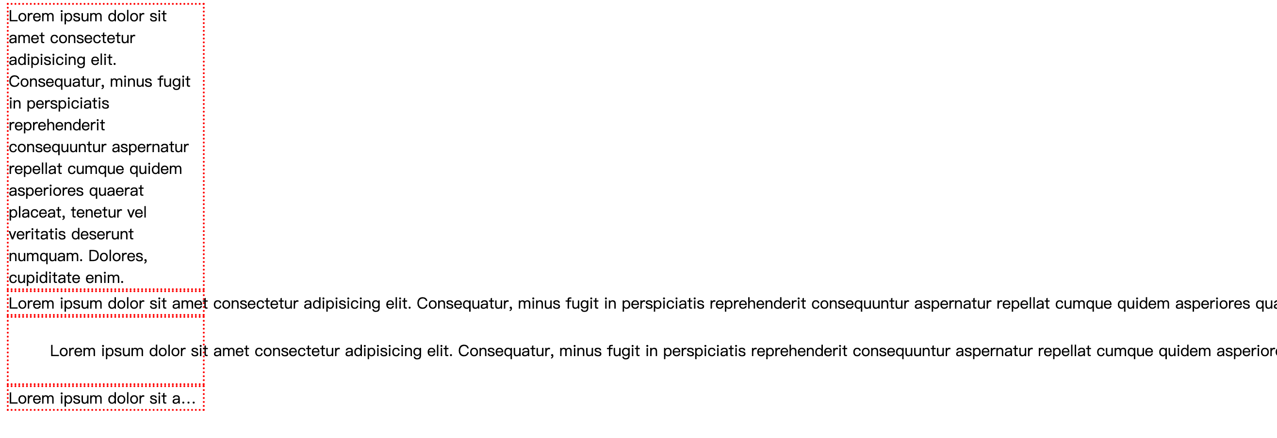
text-overflow: clip|ellipsis|string|initial|inherit;
- clip 剪切文本。
ellipsis 显示省略符号 ... 来代表被修剪的文本。- string 使用给定的字符串来代表被修剪的文本。
- initial 设置为属性默认值。阅读关于 initial
- inherit 从父元素继承该属性值。 阅读关于 inherit
text-overflow 需要配合以下两个属性使用:
- white-space: nowrap;
- overflow: hidden;
div {
    width: 200px;
    border: 2px dotted red;
    /* float: left; */
}

.box1{
    white-space: normal;
}
.box2{
    white-space: nowrap;
}
.box3{
    white-space: pre;
}
.box4{
    white-space: nowrap;
    overflow: hidden;
    text-overflow: ellipsis;
}
<div class="box1">
    Lorem ipsum dolor sit amet consectetur adipisicing elit. Consequatur, minus fugit in perspiciatis reprehenderit consequuntur aspernatur repellat cumque quidem asperiores quaerat placeat, tenetur vel veritatis deserunt numquam. Dolores, cupiditate enim.
</div>
<div class="box2">
    Lorem ipsum dolor sit amet consectetur adipisicing elit. Consequatur, minus fugit in perspiciatis reprehenderit consequuntur aspernatur repellat cumque quidem asperiores quaerat placeat, tenetur vel veritatis deserunt numquam. Dolores, cupiditate enim.
</div>
<div class="box3">
    Lorem ipsum dolor sit amet consectetur adipisicing elit. Consequatur, minus fugit in perspiciatis reprehenderit consequuntur aspernatur repellat cumque quidem asperiores quaerat placeat, tenetur vel veritatis deserunt numquam. Dolores, cupiditate enim.
</div>
<div class="box4">
    Lorem ipsum dolor sit amet consectetur adipisicing elit. Consequatur, minus fugit in perspiciatis reprehenderit consequuntur aspernatur repellat cumque quidem asperiores quaerat placeat, tenetur vel veritatis deserunt numquam. Dolores, cupiditate enim.
</div>
练习:导航条
<!DOCTYPE html>
<html lang="en">
<head>
<meta charset="UTF-8">
<meta name="viewport" content="width=device-width, initial-scale=1.0">
<meta http-equiv="X-UA-Compatible" content="ie=edge">
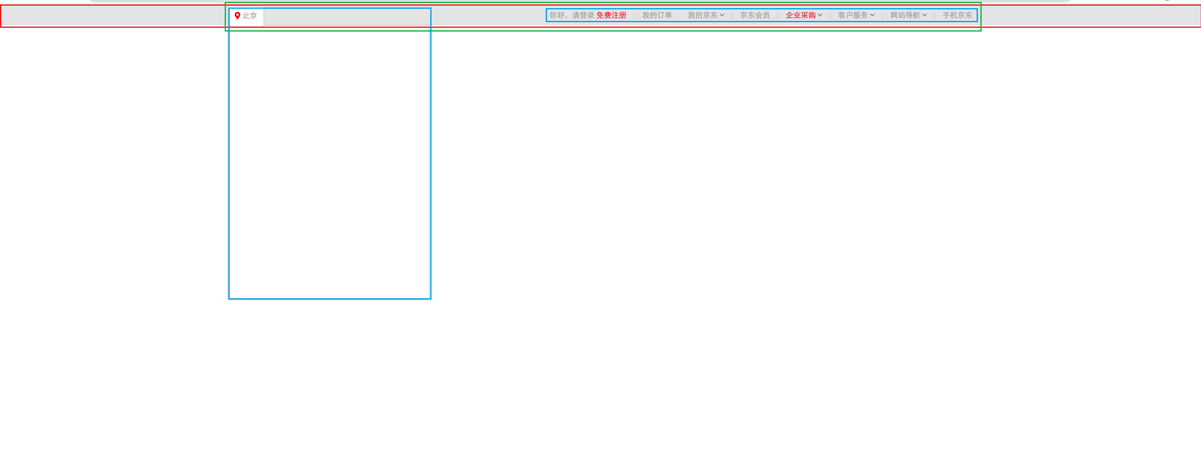
<title>京东顶部导航条</title>
<!-- 引入重置样式表 -->
<link rel="stylesheet" href="./css/reset.css">
<!-- 引用图标字体 -->
<link rel="stylesheet" href="./fa/css/all.css">
<style>
.clearfix::before,
.clearfix::after{
content: '';
display: table;
clear: both;
}
body{
/* 设置字体 */
font:12px/1.5 Microsoft YaHei,Heiti SC,tahoma,arial,Hiragino Sans GB,"\5B8B\4F53",sans-serif;
}
/* 设置外部容器的样式 */
.top-bar-wrapper{
/* 设置宽度 */
width: 100%;
/* 设置背景颜色 */
background-color: #E3E4E5;
height: 30px;
/* 设置行高,没有设置高度 使文字垂直居中 */
line-height: 30px;
/* 设置下边框 */
border-bottom: 1px #ddd solid
}
/* 设置内部容器的样式 */
.top-bar{
/* 固定宽度 */
width: 1190px;
/* 设置水平居中 */
margin: 0 auto;
position: relative;
}
/* 设置字体样式 */
.top-bar a ,
.top-bar span,
.top-bar i{
color: #999;
text-decoration: none;
}
.top-bar a:hover,
.top-bar a.highlight{
color: #f10215;
}
/* 设置location */
.location{
float: left;
}
/* 设置location下的小图标 */
.location .fas{
color: #f10215;
}
/* 设置城市列表的效果 */
.location .city-list{
display: none;
width: 320px;
height: 436px;
background-color: white;
border: 1px solid rgb(204, 204, 204);
/* 设置绝对定位,使其不占据页面的位置 */
position: absolute;
top:31px;
z-index: 999;
box-shadow: 0 2px 2px rgba(0, 0, 0, .2)
}
/* 当鼠标移入到location时,让city-list显示 */
.location:hover .city-list{
display: block;
}
.current-city{
padding: 0 10px;
border: 1px solid transparent;
border-bottom: none;
position: relative;
z-index: 9999;
}
/* 设置current-city的移入的效果 */
.location:hover .current-city{
background-color: white;
border: 1px solid rgb(204, 204, 204);
border-bottom: none;
padding-bottom: 1px;
}
/* 设置shortcut */
.shortcut{
float: right;
}
/* 设置分割线 */
.shortcut .line{
width: 1px;
height: 10px;
background-color: rgb(204, 202, 202);
margin: 12px 12px 0;
}
/* 设置li */
.shortcut li{
float: left;
}
</style>
</head>
<body>
<!-- 创建外围的容器 -->
<div class="top-bar-wrapper">
<!-- 创建内部容器 -->
<div class="top-bar clearfix">
<!-- 左侧的菜单 -->
<div class="location">
<div class="current-city">
<i class="fas fa-map-marker-alt"></i>
<a href="javascript:;">北京</a>
</div>
<!-- 放置城市列表的div -->
<div class="city-list">
</div>
</div>
<!-- 右侧的菜单 -->
<ul class="shortcut clearfix">
<li>
<a href="javascript:;">你好,请登录</a>
<a class="highlight" href="javascript:;">免费注册</a>
</li>
<!-- 分割线 -->
<li class="line"></li>
<li><a href="javascript:;">我的订单</a></li>
<li class="line"></li>
<li>
<a href="javascript:;">我的京东</a>
<i class="fas fa-angle-down"></i>
</li>
<li class="line"></li>
<li><a href="javascript:;">京东会员</a></li>
<li class="line"></li>
<li>
<a class="highlight" href="javascript:;">企业采购</a>
<i class="fas fa-angle-down"></i>
</li>
<li class="line"></li>
<li>
<span>客户服务</span>
<i class="fas fa-angle-down"></i>
</li>
<li class="line"></li>
<li>
<span>网站导航</span>
<i class="fas fa-angle-down"></i>
</li>
<li class="line"></li>
<li>
<span>手机京东</span>
</li>
</ul>
</div>
</div>
</body>
</html>
6、背景
[1]背景颜色
.box1{
    width: 500px;
    height: 500px;

    background-color: #bfa;
}
背景图片
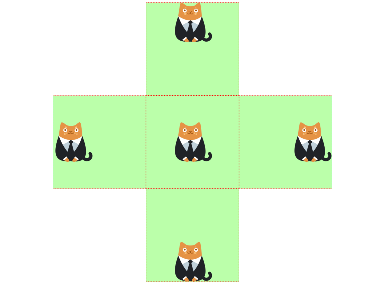
[2]background-image 设置背景图片
- 可以同时设置背景图片和背景颜色,这样背景颜色将会成为图片的背景色
- 如果背景的图片小于元素,则背景图片会自动在元素中平铺将元素铺满
- 如果背景的图片大于元素,将会一个部分背景无法完全显示
- 如果背景图片和元素一样大,则会直接正常显示
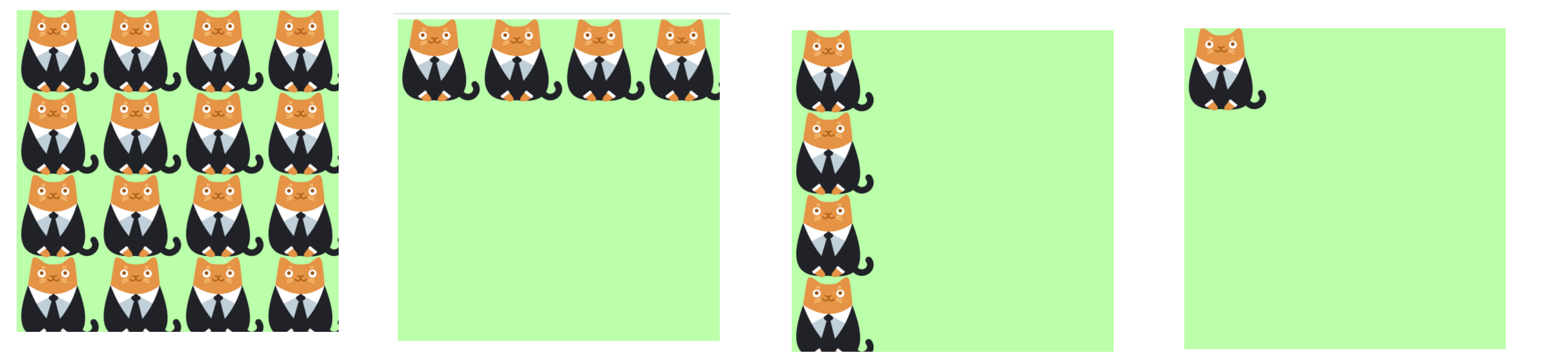
[3]background-repeat 用来设置背景的重复方式
| 可选值 | 说明 |
|---|---|
| repeat | 默认值 , 背景会沿着x轴 y轴双方向重复 |
| repeat-x | 沿着x轴方向重复 |
| repeat-y | 沿着y轴方向重复 |
| no-repeat | 背景图片不重复 |
.box1{
    width: 500px;
    height: 500px;

    background-color: #bfa;
    background-image: url("./img/1.png");

    background-repeat: repeat-y;
}
[4]background-position 设置背景图片的位置
设置方式:
-
通过
topleftrightbottomcenter几个表示方位的词来设置背景图片的位置
使用方位词时必须要同时指定两个值,如果只写一个则第二个默认就是center -
通过偏移量来指定背景图片的位置:水平方向的偏移量 垂直方向变量
    <style>
        .box {
            width: 300px;
            height: 300px;
            border: 1px dotted red;

            background-color: #bfa;
            background-image: url("./img/1.png");
            background-repeat: no-repeat;

            float: left;

            position: relative;
            left: -50%;
        }

        .clomn {
            /* width: 300px; */
            /* margin: 0 auto; */
            float: left;
            position: relative;
            left: 50%;
        }

        .box1 {
            background-position: top;
        }

        .box2 {
            background-position: left;
        }

        .box3 {
            background-position: right;
        }

        .box4 {
            background-position: bottom;
        }

        .box5 {
            background-position: center;
        }

        .layout {
            overflow: hidden;
        }
    </style>

<body>
    <div class="layout">
        <div class="clomn">
            <div class="box box1"></div>
        </div>
    </div>
    <div class="layout">
        <div class="clomn">
            <div class="box box2"></div>
            <div class="box box5"></div>
            <div class="box box3"></div>
        </div>
    </div>
    <div class="layout">
        <div class="clomn">
            <div class="box box4"></div>
        </div>
    </div>
</body>
设置背景的范围
[5]background-clip : 背景颜色的范围
| 可选值 | 说明 |
|---|---|
| border-box | 默认值,背景会出现在边框的下边 |
| padding-box | 背景不会出现在边框,只出现在内容区和内边距 |
| content-box | 背景只会出现在内容区 |
[6]background-origin 背景图片的偏移量计算的原点
| 可选值 | 说明 |
|---|---|
| padding-box | 默认值,background-position从内边距处开始计算 |
| content-box | 背景图片的偏移量从内容区处计算 |
| border-box | 背景图片的变量从边框处开始计算 |
背景图大小 & 是否移动
[7]background-size 设置背景图片的大小
- 第一个值表示宽度
- 第二个值表示高度
- 如果只写一个,则第二个值默认是 auto
- cover 图片的比例不变,将元素铺满
- contain 图片比例不变,将图片在元素中完整显示
background-size: 100% auto;
[8]background-attachment:设置图片是否固定
- scroll 默认值 背景图片会跟随元素移动
- fixed 背景会固定在页面中,不会随元素移动
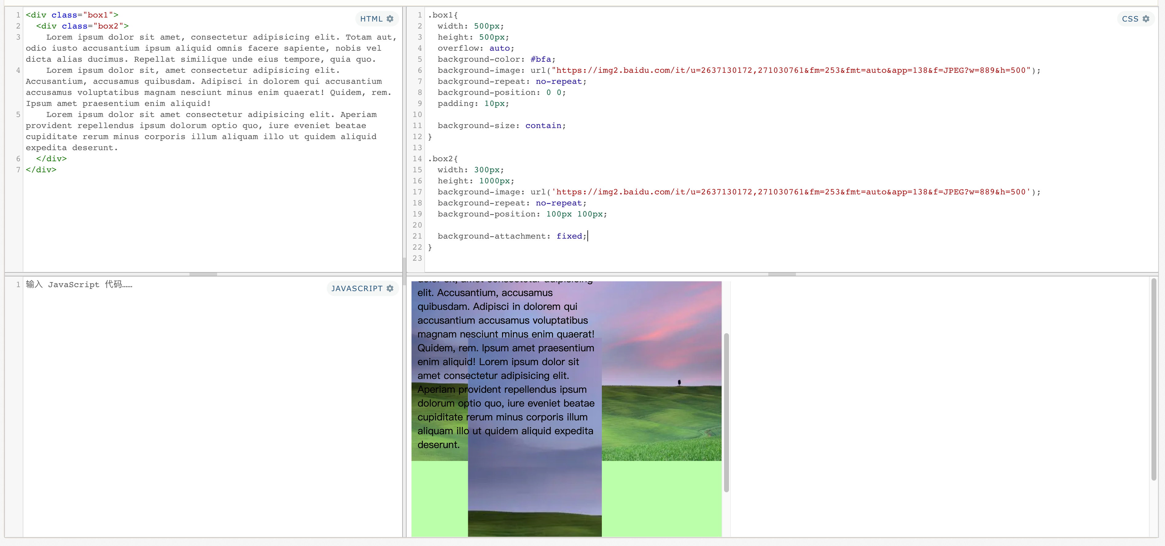
<div class="box1">
  <div class="box2">
    Lorem ipsum dolor sit amet, consectetur adipisicing elit. Totam aut, odio iusto accusantium ipsum aliquid omnis facere sapiente, nobis vel dicta alias ducimus. Repellat similique unde eius tempore, quia quo.
    Lorem ipsum dolor sit, amet consectetur adipisicing elit. Accusantium, accusamus quibusdam. Adipisci in dolorem qui accusantium accusamus voluptatibus magnam nesciunt minus enim quaerat! Quidem, rem. Ipsum amet praesentium enim aliquid!
    Lorem ipsum dolor sit amet consectetur adipisicing elit. Aperiam provident repellendus ipsum dolorum optio quo, iure eveniet beatae cupiditate rerum minus corporis illum aliquam illo ut quidem aliquid expedita deserunt.
  </div>
</div>

<style>
.box1{
  width: 500px;
  height: 500px;
  overflow: auto;
  background-color: #bfa;
  background-image: url("https://img2.baidu.com/it/u=2637130172,271030761&fm=253&fmt=auto&app=138&f=JPEG?w=889&h=500");
  background-repeat: no-repeat;
  background-position: 0 0;
  padding: 10px;

  background-size: contain;
}

.box2{
  width: 300px;
  height: 1000px;
  background-image: url('https://img2.baidu.com/it/u=2637130172,271030761&fm=253&fmt=auto&app=138&f=JPEG?w=889&h=500');
  background-repeat: no-repeat;
  background-position: 100px 100px;

  background-attachment: fixed;
}

</style>
简写属性
  background-color
  background-image
  background-repeat
  background-position
  background-size
  background-origin
  background-clip
  background-attachment
backgound 背景相关的简写属性,所有背景相关的样式都可以通过该样式来设置
- 局部有序,无不写属性
- 注意:
background-size必须写在background-position的后边,并且使用/隔开background-position/background-size background-origin background-clip两个样式 ,orgin要在clip的前边
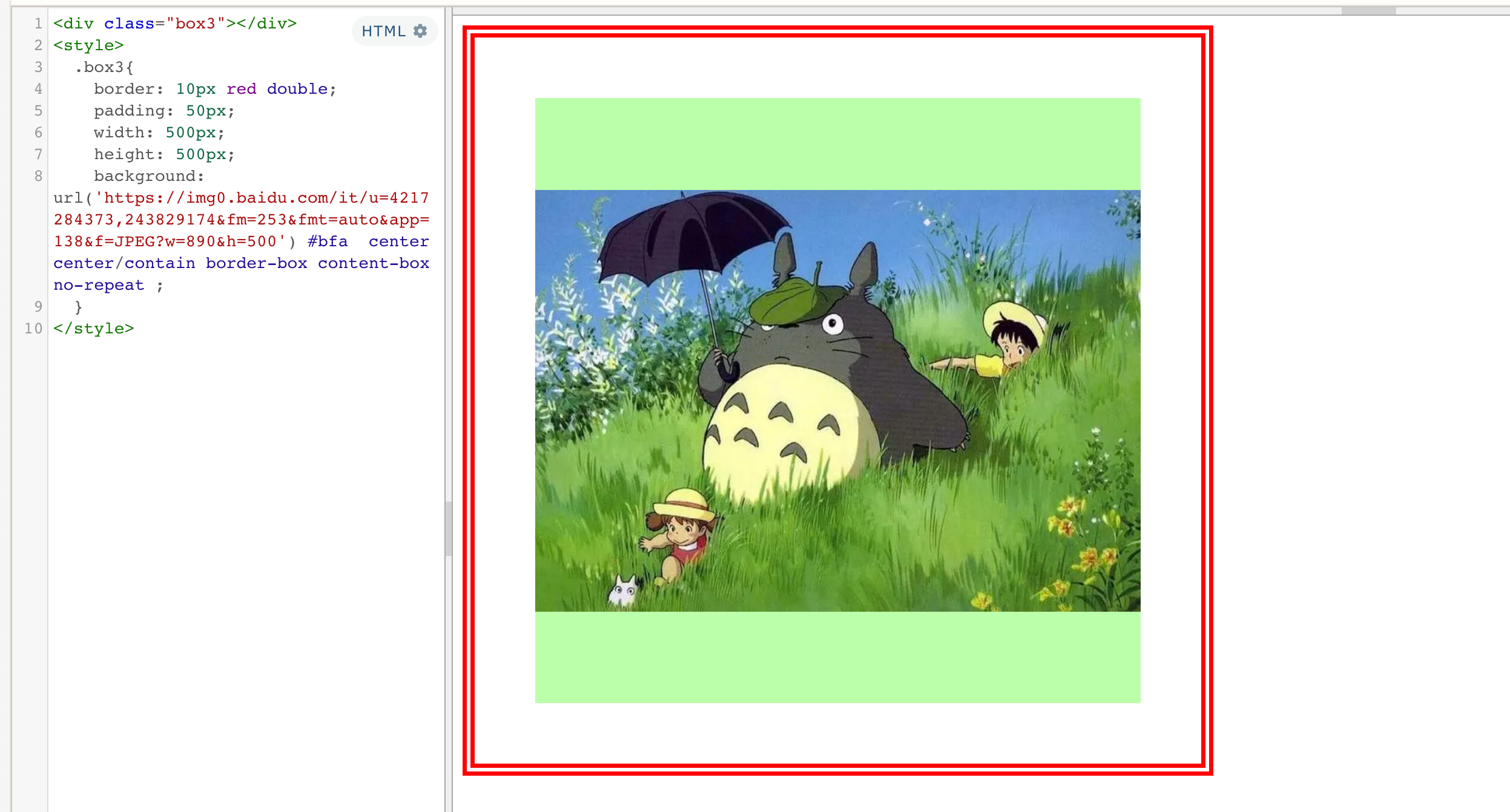
<div class="box3"></div>
<style>
  .box3{
    border: 10px red double;
    padding: 50px;
    width: 500px;
    height: 500px;
    background: url('https://img0.baidu.com/it/u=4217284373,243829174&fm=253&fmt=auto&app=138&f=JPEG?w=890&h=500') #bfa  center center/contain border-box content-box no-repeat ;
  }
</style>
练习: 图片重复

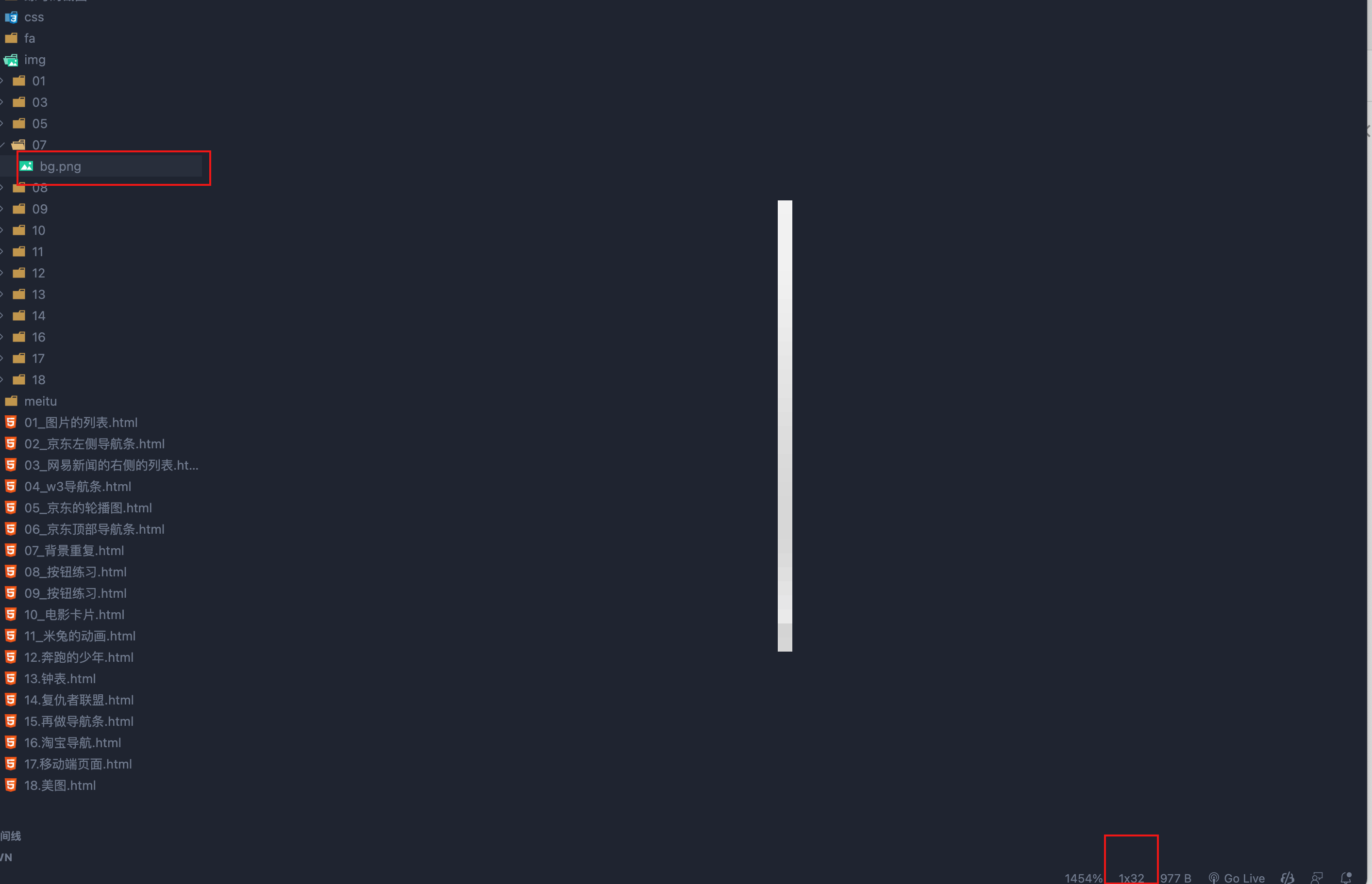
<style>
    .box1{
        width: 990px;
        height: 32px;
        margin: 0 auto;
        /* background-image: url('./img/07/bg.png');
        background-repeat: repeat-x; */
        background: url('./img/07/bg.png') repeat-x;
    }
</style>
<div class="box1"></div>
练习:按钮图片状态
<style>
	a:link{
	    display: block;
	    width: 93px;
	    height: 29px;
	    background-image: url('./img/08/link.png')
	}

	a:hover{
	    background-image: url('./img/08/hover.png')
	}

	a:active{
	    background-image: url('./img/08/active.png')
	}
	/*
	    图片属于网页中的外部资源,外部资源都需要浏览器单独发送请求加载,
	        浏览器加载外部资源时是按需加载的,用则加载,不用则不加载
	        像我们上边的练习link会首先加载,而hover和active会在指定状态触发时才会加载
	  */
</style>
<a href="javascript:;"></a>
解决图片闪烁的问题:
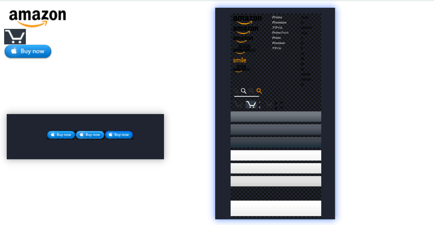
- 可以将多个小图片统一保存到一个大图片中,然后通过调整background-position来显示的图片
- 这样图片会同时加载到网页中 就可以有效的避免出现闪烁的问题
- 这个技术在网页中应用十分广泛,被称为CSS-Sprite,这种图我们称为雪碧图/精灵图
雪碧图的使用步骤:
- 先确定要使用的图标
- 测量图标的大小
- 根据测量结果创建一个元素
- 将雪碧图设置为元素的背景图片
- 设置一个偏移量以显示正确的图片
雪碧图的特点:
一次性将多个图片加载进页面,降低请求的次数,加快访问速度,提升用户的体验
<style>
    a:link{
        display: block;
        width: 93px;
        height: 29px;
        background-image: url('./img/09/btn.png')
    }

    a:hover{
        background-position: -93px 0;
    }

    a:active{
        background-position: -186px 0;
    }


    .box1{
        width: 128px;
        height: 46px;
        background-image: url('./img/09/amazon-sprite_.png');
        background-position:0 0;
    }

    .box2{
        width: 42px;
        height: 30px;
        background-image: url('./img/09/amazon-sprite_.png');
        background-position: -58px -338px;
    }
</style>


<div class="box1"></div>
<div class="box2"></div>
<a href="javascript:;"></a>
7、渐变
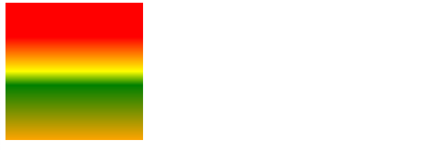
通过渐变可以设置一些复杂的背景颜色,可以实现从一个颜色向其他颜色过渡的效果
!!渐变是图片,需要通过background-image来设置
线性渐变,颜色沿着一条直线发生变化
linear-gradient()
- linear-gradient(red,yellow) 红色在开头,黄色在结尾,中间是过渡区域
- 线性渐变的开头,我们可以指定一个渐变的方向
to left
to right
to bottom
to top
deg deg表示度数
turn 表示圈 - 渐变可以同时指定多个颜色,多个颜色默认情况下平均分布,
也可以手动指定渐变的分布情况
从上到下渐变
background-image: repeating-linear-gradient(red, yellow);


指定渐变方向(从左到右)
background-image: repeating-linear-gradient(to right ,red, yellow);
旋转180度渐变方向
background-image: repeating-linear-gradient(180deg ,red, yellow);
转.5圈渐变方向
background-image: repeating-linear-gradient(.5turn ,red, yellow);


多颜色渐变(平均分布)
background-image: repeating-linear-gradient(red, yellow,orange,green);
指定红色从50px开始渐变,黄色从100px位置结束渐变(手动指定分布)
background-image: repeating-linear-gradient(red 50px, yellow 100px);
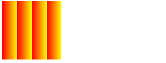
repeating-linear-gradient() 可以平铺的线性渐变
background-image: repeating-linear-gradient(to right ,red, yellow 50px);
background-repeat 不会有效果
径向渐变
radial-gradient() 径向渐变(放射性的效果)
- 默认情况下径向渐变的形状根据元素的形状来计算的
正方形 --> 圆形
长方形 --> 椭圆形- 我们也可以手动指定径向渐变的大小
circle
ellipse
- 我们也可以手动指定径向渐变的大小
- 也可以指定渐变的位置
radial-gradient(大小 at 位置, 颜色 位置 ,颜色 位置 ,颜色 位置)
大小:
circle 圆形
ellipse 椭圆
closest-side 近边
closest-corner 近角
farthest-side 远边
farthest-corner 远角
位置:
top right left center bottom
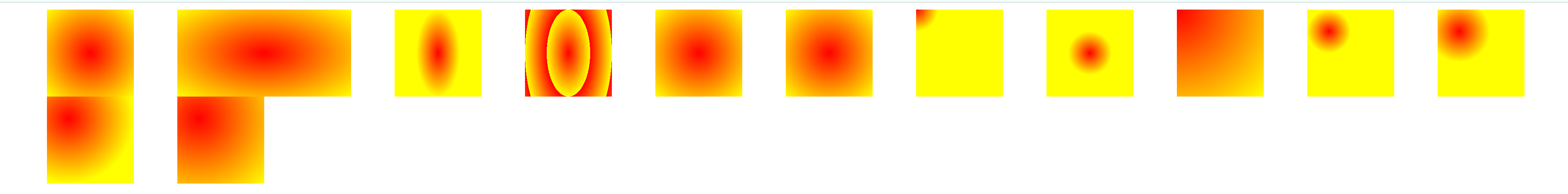
    <style>
        div {
            width: 100px;
            height: 100px;

            float: left;
            margin-left: 50px;
        }
        .box1{
             background-image: radial-gradient(red,yellow);
        }

        .box2{
            width: 200px;
            background-image: radial-gradient(red,yellow);
        }

        .box3{
            background-image: radial-gradient(25px 50px,red,yellow);
        }

        .box4{
            background-image: repeating-radial-gradient(25px 50px,red,yellow);
        }

        .box5{
            background-image: radial-gradient(circle,red,yellow);
        }

        .box6{
            background-image: radial-gradient(ellipse,red,yellow);
        }

        .box7{
            background-image: radial-gradient(25px 25px at 0px 0px,red,yellow);
        }

        .box8{
            background-image: radial-gradient(25px 25px at center center,red,yellow);
        }

        .box9{
            background-image: radial-gradient(at 0 0,red,yellow);
        }

        .box10{
            background-image: radial-gradient(closest-side at 25px 25px,red,yellow);
        }

        .box11{
            background-image: radial-gradient(closest-corner at 25px 25px,red,yellow);
        }

        .box12{
            background-image: radial-gradient(farthest-side at 25px 25px,red,yellow);
        }

        .box13{
            background-image: radial-gradient(farthest-corner at 25px 25px,red,yellow);
        }
    </style>

    <div class="box1"></div>
    <div class="box2"></div>
    <div class="box3"></div>
    <div class="box4"></div>
    <div class="box5"></div>
    <div class="box6"></div>
    <div class="box7"></div>
    <div class="box8"></div>

    <div class="box9"></div>
    <div class="box10"></div>
    <div class="box11"></div>
    <div class="box12"></div>
    <div class="box13"></div>
练习:卡片
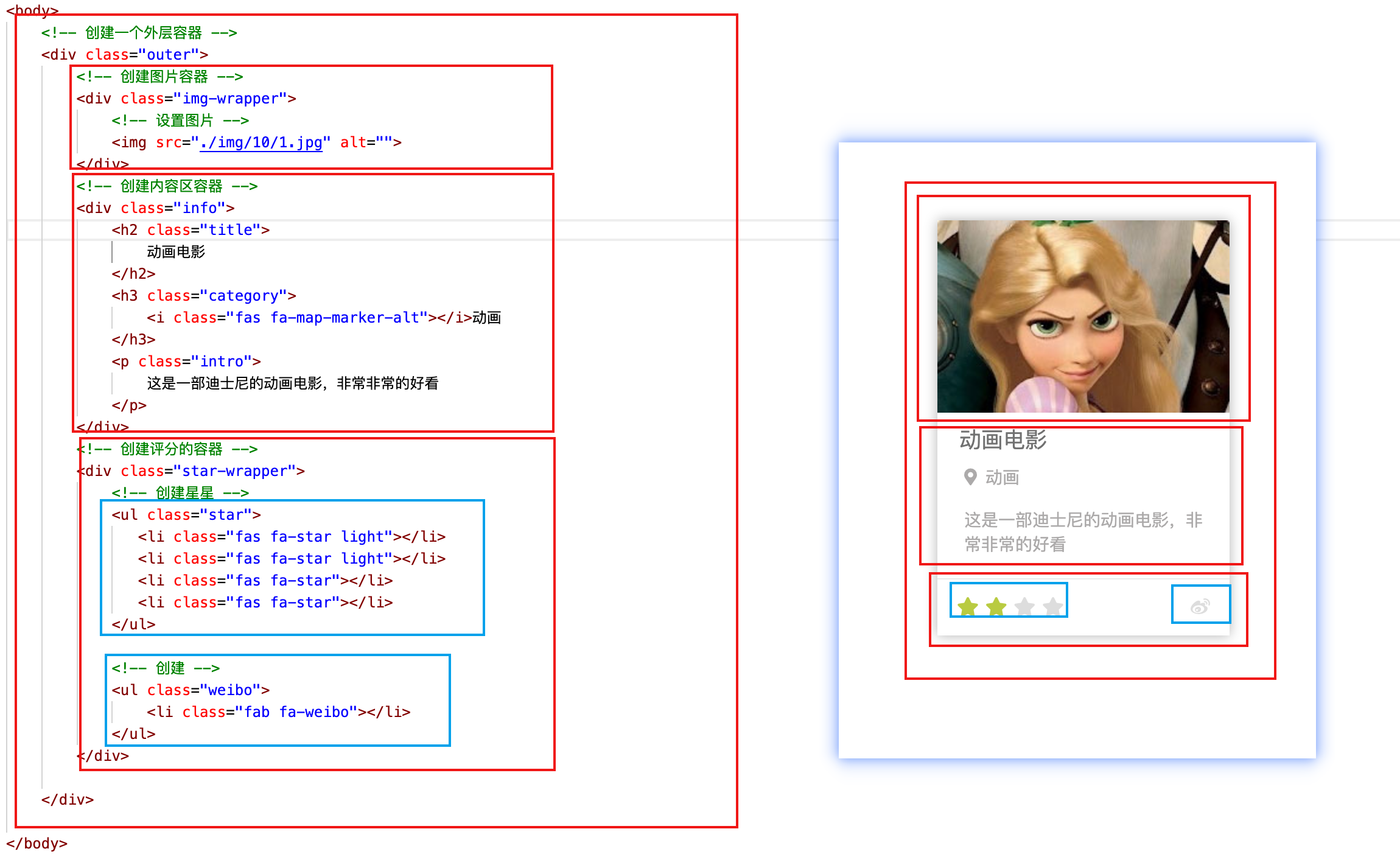
    <!-- 创建一个外层容器 -->
    <div class="outer">
        <!-- 创建图片容器 -->
        <div class="img-wrapper">
            <!-- 设置图片 -->
            <img src="./img/10/1.jpg" alt="">
        </div>
        <!-- 创建内容区容器 -->
        <div class="info">
            <h2 class="title">
                动画电影
            </h2>
            <h3 class="category">
                <i class="fas fa-map-marker-alt"></i>动画
            </h3>
            <p class="intro">
                这是一部迪士尼的动画电影,非常非常的好看
            </p>
        </div>
        <!-- 创建评分的容器 -->
        <div class="star-wrapper">
            <!-- 创建星星 -->
            <ul class="star">
               <li class="fas fa-star light"></li>
               <li class="fas fa-star light"></li>
               <li class="fas fa-star"></li>
               <li class="fas fa-star"></li>
            </ul>

            <!-- 创建 -->
            <ul class="weibo">
                <li class="fab fa-weibo"></li>
            </ul>
        </div>
    </div>
    <link rel="stylesheet" href="./css/reset.css">
    <link rel="stylesheet" href="./fa/css/all.css">
    <style>
        /* 设置外层容器 */
        /* 设置外层容器 */
        /* 设置外层容器 */
        .outer{
            width: 240px;
            margin: 100px auto;
            /* 设置阴影 */
            box-shadow: 0 0 10px rgba(0, 0, 0, .3);
        }

        /* .img-wrapper{
            border: 1px red solid;
        } */

        /* 设置图片 */
        /* 设置图片 */
        .img-wrapper img{
            width: 100%;
            vertical-align: bottom;
        }


        /* 标题:内容描述容器 */
        /* 标题:内容描述容器 */
        .info{
            padding: 0 18px;
            color: #acaaaa;
            font-size: 14px;
        }

        /* 设置标题 */
        .info .title{
            color: #717171;
            font-size: 18px;
            margin: 13px 0 15px 0;
        }

        /* 设置副标题 */
        .info .category i{
            margin-left: 4px;
            margin-right: 7px;
        }

        /* 设置简介的样式 */
        .info .intro{
            margin: 18px 4px;
            line-height: 20px;
        }

        /* 设置下边的内容 */
        /* 设置下边的内容 */
        /* 设置下边的内容 */
        .star-wrapper{
            height: 46px;
            line-height: 46px;
            border-top: 1px solid #e9e9e9;
            color: #ddd;
            padding: 0 16px;
        }

        /* 设置星星的样式 */
        .star-wrapper .star{
            float: left;

        }

        .star-wrapper .light{
            color: #b9cb41;
        }

        .star-wrapper .weibo{
            float: right;
        }

    </style>
四、表格(HTML补充)
1、html
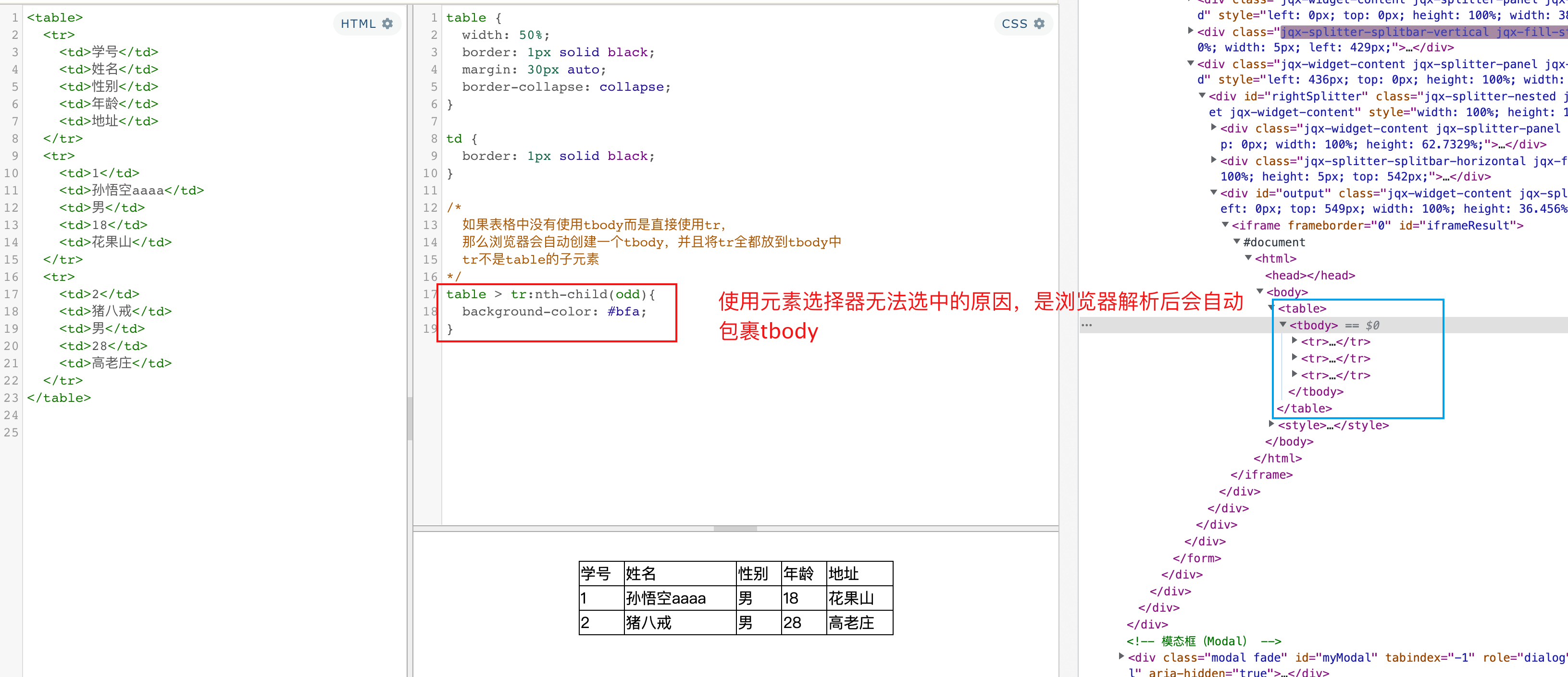
我们通过table标签来创建一个表格
属性
- border
- width
- align
td 属性
- colspan
- rowspan
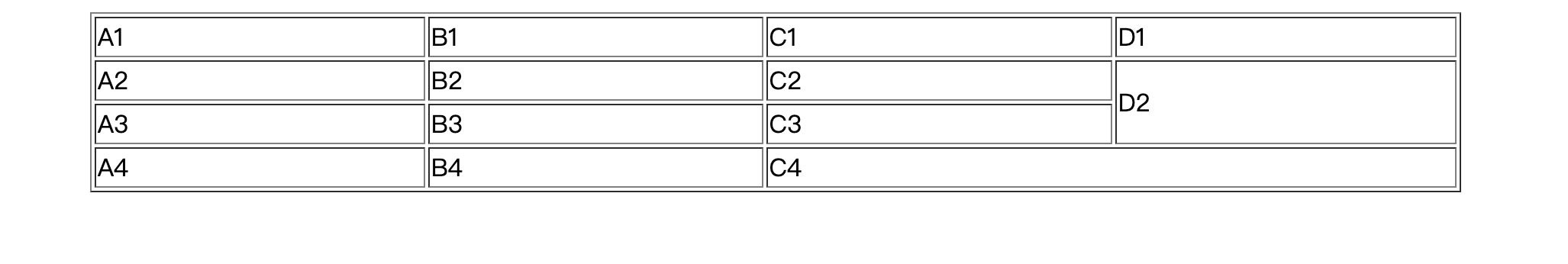
    <table border="1" width='50%' align="center">
        <!-- 在table中使用tr表示表格中的一行,有几个tr就有几行 -->
        <tr>
            <!-- 在tr中使用td表示一个单元格,有几个td就有几个单元格 -->
            <td>A1</td>
            <td>B1</td>
            <td>C1</td>
            <td>D1</td>
        </tr>
        <tr>
            <td>A2</td>
            <td>B2</td>
            <td>C2</td>
            <!-- rowspan 纵向的合并单元格 -->
            <td rowspan="2">D2</td>
        </tr>
        <tr>
            <td>A3</td>
            <td>B3</td>
            <td>C3</td>
        </tr>
        <tr>
            <td>A4</td>
            <td>B4</td>
            <!--
                colspan 横向的合并单元格
             -->
            <td colspan="2">C4</td>
        </tr>
    </table>
可以将一个表格分成三个部分:
thead
tbody
tfoot
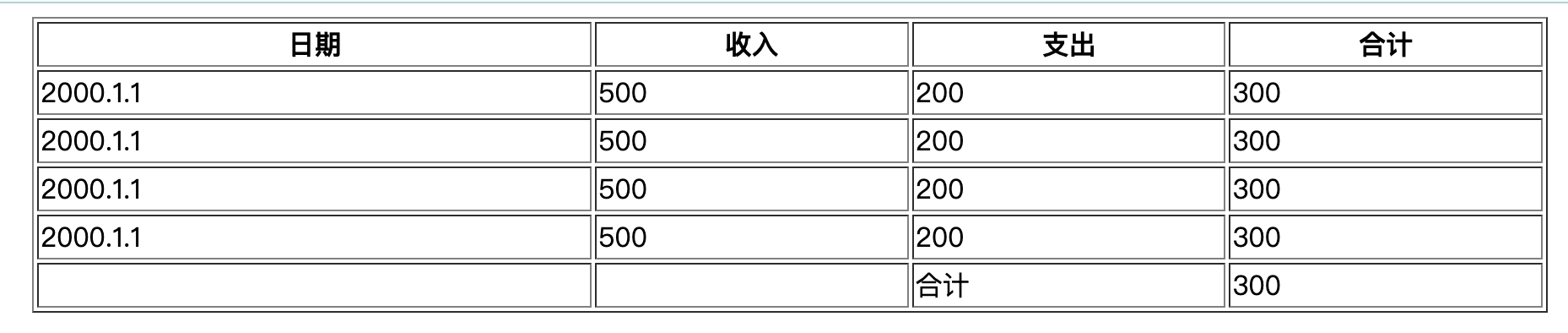
<body>
    <table border="1" width='50%' align="center">
        <!--
            可以将一个表格分成三个部分:
                头部 thead
                主体 tbody
                底部 tfoot

                th 表示头部的单元格
         -->
        <thead>
            <tr>
                <th>日期</th>
                <th>收入</th>
                <th>支出</th>
                <th>合计</th>
            </tr>
        </thead>
        <tbody>
            <tr>
                <td>2000.1.1</td>
                <td>500</td>
                <td>200</td>
                <td>300</td>
            </tr>
            <tr>
                <td>2000.1.1</td>
                <td>500</td>
                <td>200</td>
                <td>300</td>
            </tr>
            <tr>
                <td>2000.1.1</td>
                <td>500</td>
                <td>200</td>
                <td>300</td>
            </tr>
            <tr>
                <td>2000.1.1</td>
                <td>500</td>
                <td>200</td>
                <td>300</td>
            </tr>
        </tbody>
        <tfoot>
            <tr>
                <td></td>
                <td></td>
                <td>合计</td>
                <td>300</td>
            </tr>
        </tfoot>

    </table>
</body>
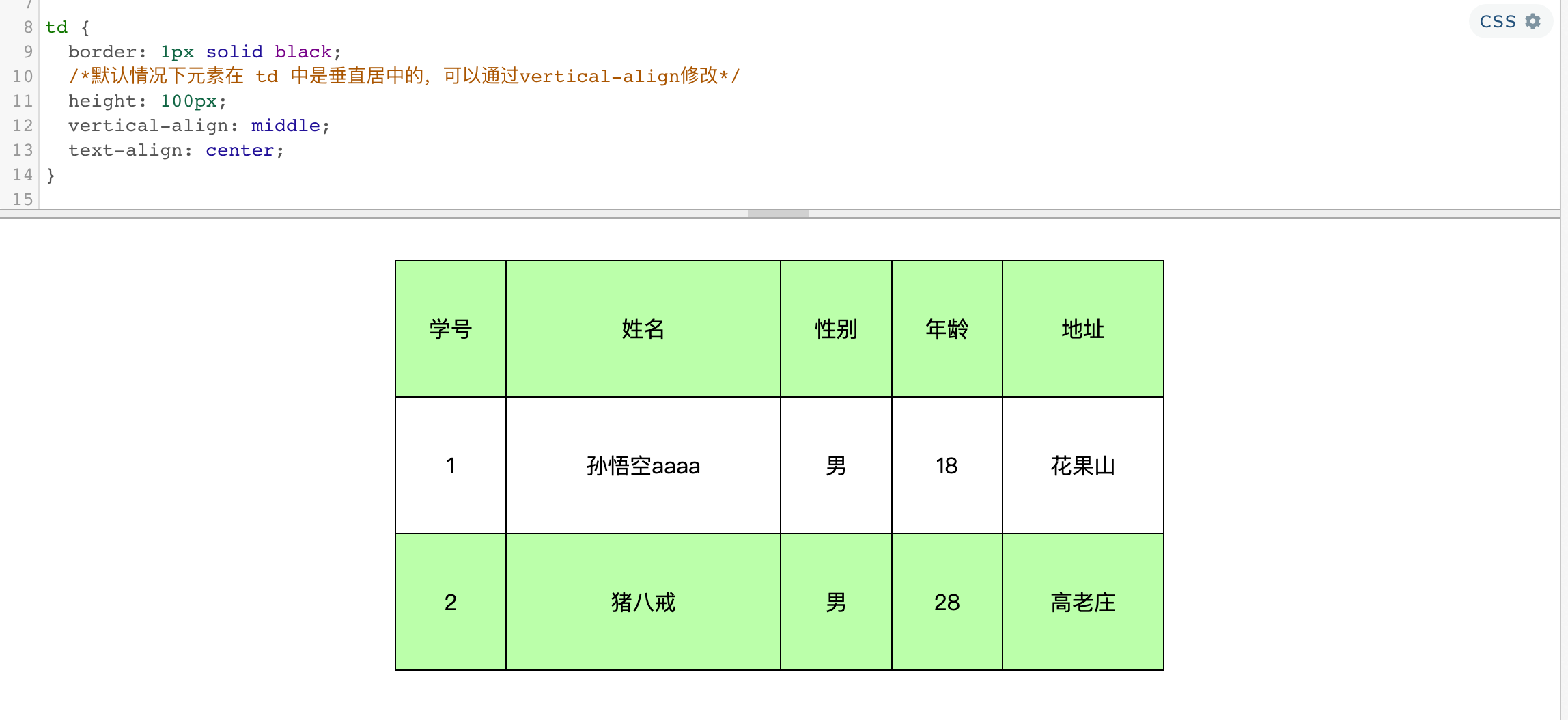
2、表格样式
默认情况下table的宽度是被内容撑开的
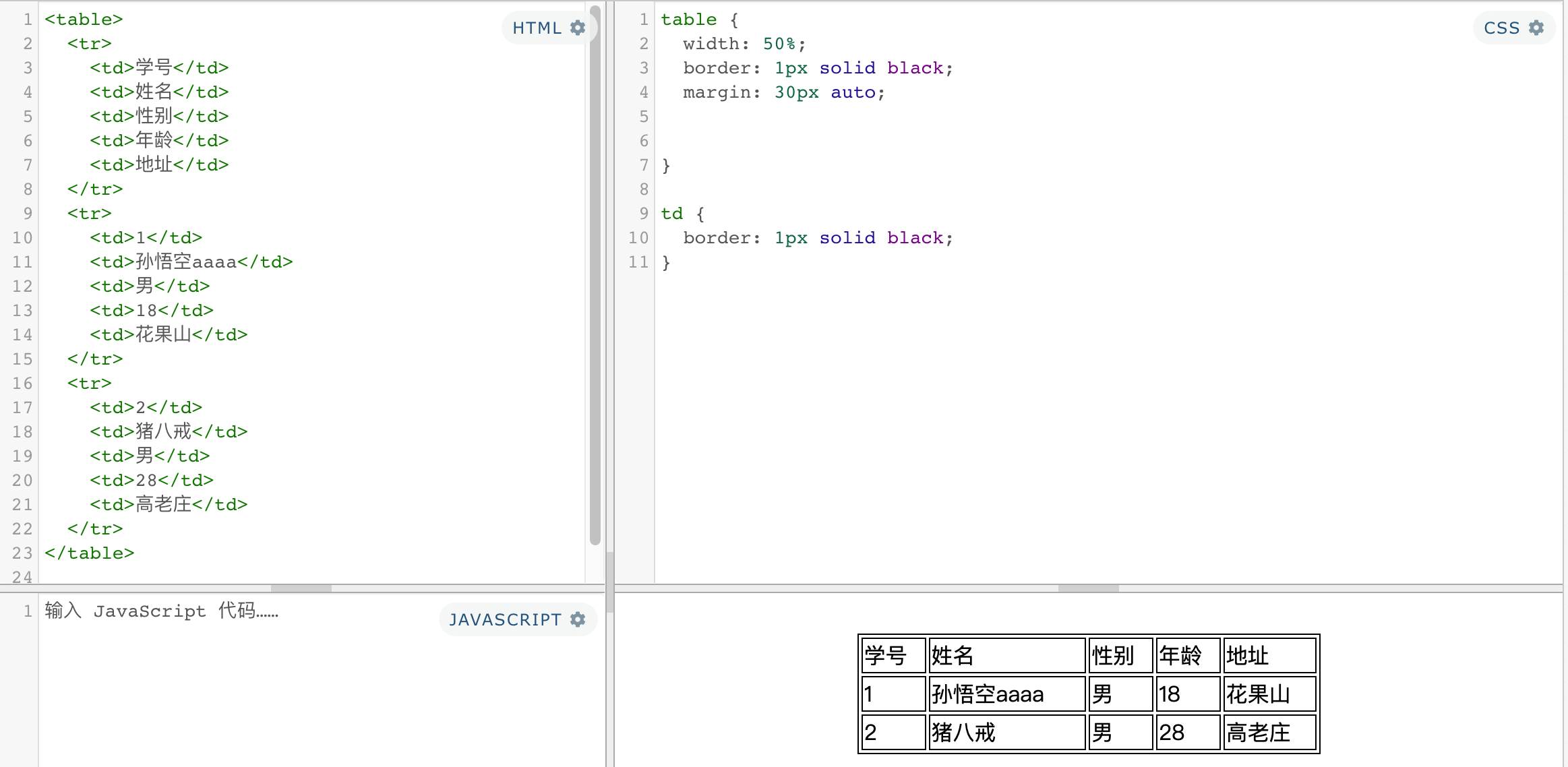
table
- border-spacing: 指定边框之间的距离
- border-collapse: collapse; 设置边框的合并
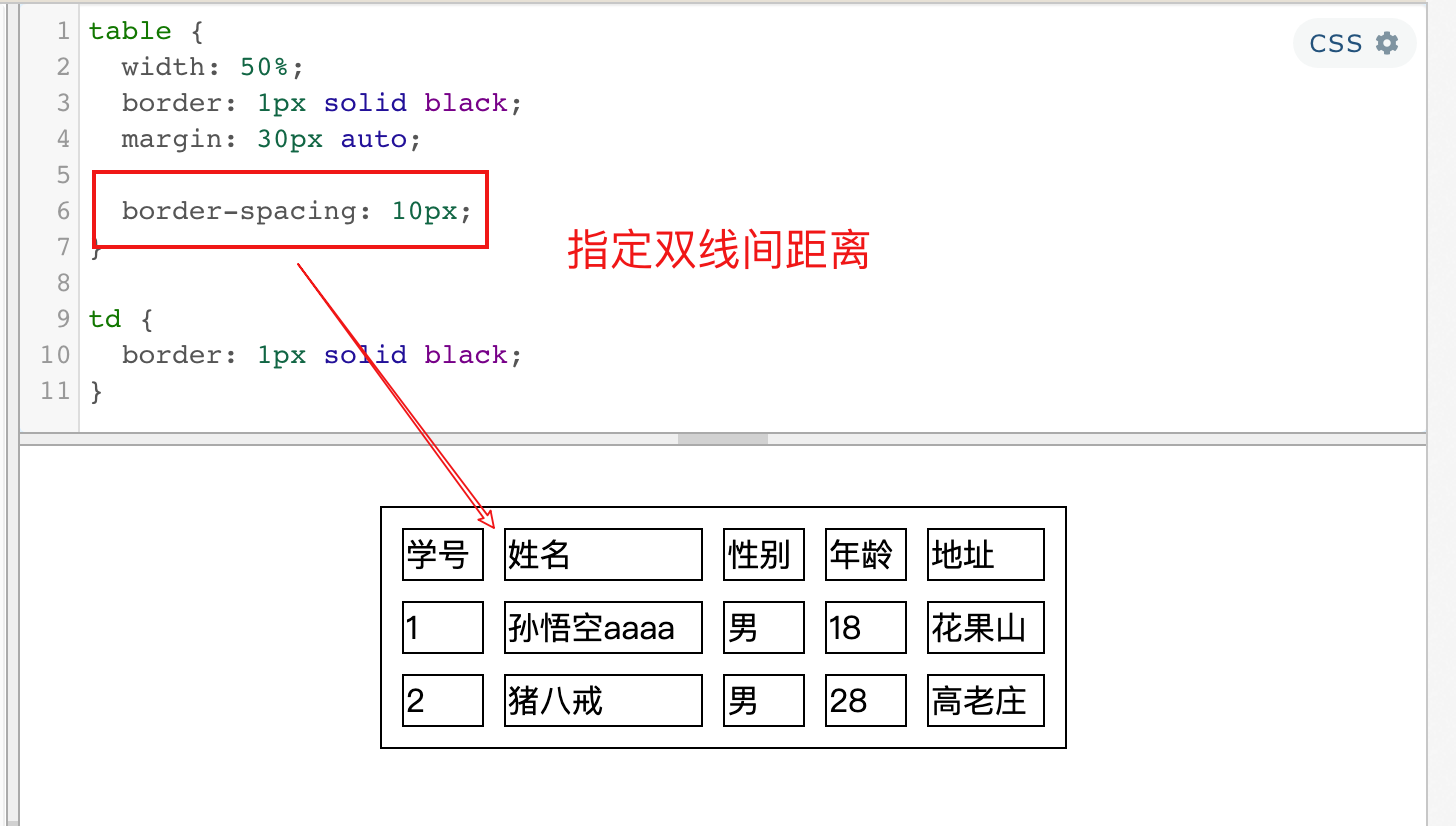
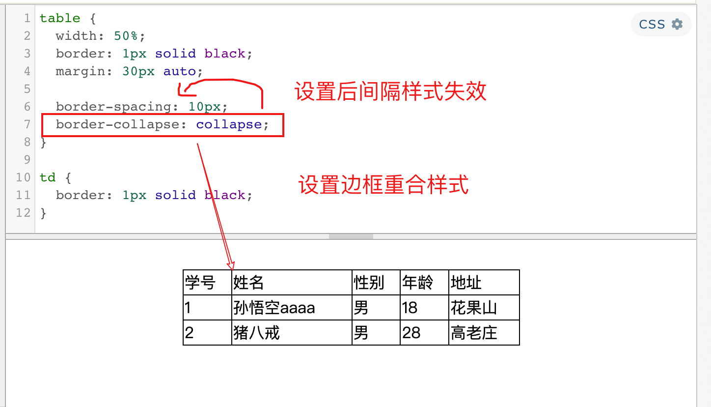
tr
- 设置各行变色
td
- td 默认情况是垂直居中的
- vertical-align: middle; 设置垂直居中
可以作为一种垂直居中的方式之一 - text-align: center; 水平居中
五、表单(HTML补充)
1、form
表单:
- 在现实生活中表单用于提交数据
- 在网页中也可以使用表单,网页中的表单用于将本地的数据提交给远程的服务器
- 使用form标签来创建一个表单,声明一个表单区域
form的属性
- action 表单要提交的服务器的地址
- method 提交方式
<form action="action_page.php" method="POST">
2、input
- 数据要想提交到服务器,需要添加
name属性值 - 指定值需要使用
value指定 - 单选按钮
name指定为同一值才会有单选效果,value提交参数值 - 多选框
name提交的参数名,value提交的参数值checked选中状态 - 下拉列表
selectoption选项,selected选中状态,value提交参数值
常用属性
- autocomplete=“off” 关闭自动补全,可以放在form上
- readonly 将表单项设置为只读,数据会提交
- disabled 将表单项设置为禁用,数据不会提交
- autofocus 设置表单项自动获取焦点
文本框
<input type="text" name="username">

<!-- <input type="color"> -->
<!-- <input type="email"> -->

提交按钮:按钮默认文字为提交,value指定文字
<input type="submit" value="注册">
<!-- 重置按钮 -->
<input type="reset">
<!-- 普通的按钮 -->
<input type="button" value="按钮">

<button type="submit">提交</button>
<button type="reset">重置</button>
<button type="button">按钮</button>

密码框
<input type="password" name="password">

单选按钮
<input type="radio" name="hello" value="a">
<input type="radio" name="hello" value="b" checked>

多选框 <input type="checkbox" name="test" value="1">
<input type="checkbox" name="test" value="2">
<input type="checkbox" name="test" value="3" checked>


下拉列表
<select name="haha">
    <option value="i">选项一</option>
    <option selected value="ii">选项二</option>
    <option value="iii">选项三</option>
</select>
大练习(首页)
六、动画
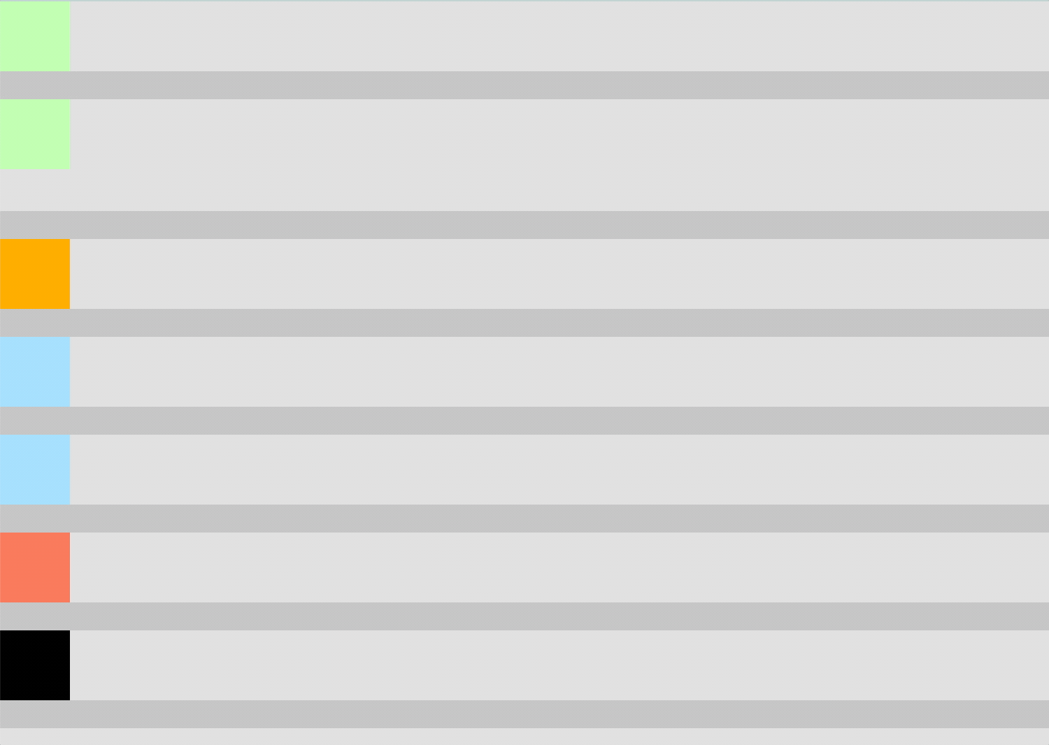
1、过度(transition)
通过过渡可以指定一个属性发生变化时的切换方式
通过过渡可以创建一些非常好的效果,提升用户的体验
transition-property: 指定要执行过渡的属性
- 多个属性间使用,隔开
- 如果所有属性都需要过渡,则使用all关键字
- 大部分属性都支持过渡效果,注意过渡时必须是从一个有效数值向另外一个有效数值进行过渡
| 属性 | 说明 |
|---|---|
| transition-property | 指定要执行过度的属性 |
| transition-duration | 指定过度效果持续时间 |
| transition-timing-function | 指定过度函数
|
| transition-delay | 过渡效果的延迟,等待一段时间后在执行过渡 |
| transition | (局部有序)两个时间中第一个是持续时间,第二个是延迟 |
<!DOCTYPE html>
<html lang="en">
<head>
    <meta charset="UTF-8">
    <meta name="viewport" content="width=device-width, initial-scale=1.0">
    <meta http-equiv="X-UA-Compatible" content="ie=edge">
    <title>Document</title>

    <style>
        /*布局样式*/
        *{
            margin: 0;
            padding: 0;
        }

        .box{
            width: 750px;
            height: 800px;
            background-color: silver;
            overflow: hidden;
        }
        .box div{
            width: 50px;
            height: 50px;
            /*margin-bottom: 100px;*/
            margin-left: 0;
        }

        /*列布局*/
        .box ul {
            background-color: #1bc4fb;
            margin-bottom: 20px;
        }
        .box ul li {
            height: 50px;
            background-color: #ddd;
            overflow: hidden;
        }
        .box ul  li.b2 {
            height: 80px;
            background-color: #ddd;
            overflow: hidden;
        }

        /*hover 样式设定*/
        .box:hover div{
            /* width: 200px;
            height: 200px; */
            /* background-color: orange; */
            margin-left: 700px;
            /*margin-top: 10px;*/
        }
        .box:hover div.b2{
            margin-top: 30px;
            background-color: skyblue;
        }

        /*各盒子过度样式设置*/
        .b1 {
            background-color: #bfa;
            transition: margin-left 2s;
        }
        .b2 {
            background-color: #bfa;
            transition: all 2s;
        }
        .b3{
            background-color: orange;
            /*
                transition-property: height , width;
                transition-duration: 指定过渡效果的持续时间
                    时间单位:s 和 ms  1s = 1000ms
            */
            transition-property: all;
            transition-duration: 2s;
        }

        .b4 {
            /*
                transition-timing-function: 过渡的时序函数
                    指定过渡的执行的方式
                    可选值:
                        ease 默认值,慢速开始,先加速,再减速
                        linear 匀速运动
                        ease-in 加速运动
                        ease-out 减速运动
                        ease-in-out  先加速 后减速
                        cubic-bezier() 来指定时序函数
                        https://cubic-bezier.com
            */
            background-color: #9CDCFE;
            transition: margin-left 2s linear;
            transition-timing-function: cubic-bezier(.24,.95,.82,-0.88);
        }

        .b5 {
            /*
                steps() 分步执行过渡效果
                可以设置一个第二个值:
                    end , 在时间结束时执行过渡(默认值)
                    start , 在时间开始时执行过渡
            */
            background-color: #9CDCFE;
            transition: margin-left 2s linear;
            transition-timing-function: steps(20, end);
        }

        .b6 {
            /*
                 transition-delay: 过渡效果的延迟,等待一段时间后在执行过渡
            */

            background-color: #f97053;
            transition: margin-left 2s;
            transition-timing-function: steps(20, end);
            transition-delay: 1s;
        }

        .b7{
            background-color: black;
             /*
                transition 可以同时设置过渡相关的所有属性,
                    只有一个要求,如果要写延迟,则两个时间中第一个是持续时间,第二个是延迟
             */
             transition:2s margin-left 1s cubic-bezier(.24,.95,.82,-0.88);
        }
    </style>

</head>
<body>

    <div class="box">
        <ul>
            <li>
                <div class="b1"></div>
            </li>
        </ul>
        <ul>
            <li class="b2">
                <div class="b2"></div>
            </li>
        </ul>
        <ul>
            <li>
                <div class="b3"></div>
            </li>
        </ul>
        <ul>
            <li>
                <div class="b4"></div>
            </li>
        </ul>
        <ul>
            <li>
                <div class="b5"></div>
            </li>
        </ul>
        <ul>
            <li>
                <div class="b6"></div>
            </li>
        </ul>
        <ul>
            <li>
                <div class="b7"></div>
            </li>
        </ul>
        <ul>
            <li>
                <div class="b8"></div>
            </li>
        </ul>
    </div>
</body>
</html>
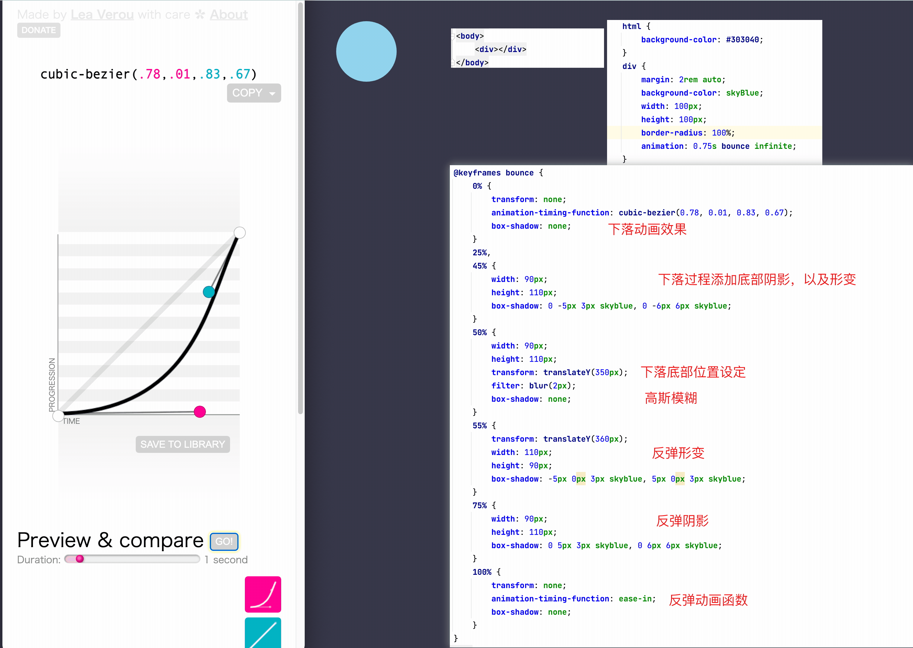
2、动画(animation)
过渡需要在某个属性发生变化时才会触发
动画可以自动触发动态效果
设置动画效果,必须先要设置一个关键帧,关键帧设置了动画执行每一个步骤
@keyframes test {
    /* from表示动画的开始位置 也可以使用 0% */
    from{
        margin-left: 0;
        background-color: orange;
    }

    /* to动画的结束位置 也可以使用100%*/
    to{
        background-color: red;
        margin-left: 700px;
    }
}
-
animation-name: 要对当前元素生效的关键帧的名字
animation-name: test; -
animation-duration: 动画的执行时间 */
animation-duration: 4s; -
动画的延时
animation-delay: 2s; -
动画的函数
animation-timing-function: ease-in-out; -
animation-iteration-count 动画执行的次数
animation-iteration-count: 1;执行一次
animation-iteration-count:infinite无限执行 -
animation-direction
normal默认值 从 from 向 to运行 每次都是这样
reverse从 to 向 from 运行 每次都是这样
alternate从 from 向 to运行 重复执行动画时反向执行
alternate-reverse从 to 向 from运行 重复执行动画时反向执行 -
animation-play-state: 设置动画的执行状态
running 默认值 动画执行
paused 动画暂停 -
animation-fill-mode: 动画的填充模式
none默认值 动画执行完毕元素回到原来位置
forwards动画执行完毕元素会停止在动画结束的位置
backwards动画延时等待时,元素就会处于开始位置
both结合了forwards 和 backwards -
animation: test 2s 2 1s alternate;
关键帧
<!DOCTYPE html>
<html lang="en">
<head>
    <meta charset="UTF-8">
    <title>Title</title>

    <style>
        html {
            background-color: #303040;
        }
        div {
            margin: 2rem auto;
            background-color: skyBlue;
            width: 100px;
            height: 100px;
            border-radius: 100%;
            animation: 0.75s bounce infinite;
        }

        html:hover div {
            animation-play-state: paused;
        }

        @keyframes bounce {
            0% {
                transform: none;
                animation-timing-function: cubic-bezier(0.78, 0.01, 0.83, 0.67);
                box-shadow: none;
            }
            25%,
            45% {
                width: 90px;
                height: 110px;
                box-shadow: 0 -5px 3px skyblue, 0 -6px 6px skyblue;
            }
            50% {
                width: 90px;
                height: 110px;
                transform: translateY(350px);
                    filter: blur(2px);
                box-shadow: none;
            }
            55% {
                transform: translateY(360px);
                width: 110px;
                height: 90px;
                box-shadow: -5px 0px 3px skyblue, 5px 0px 3px skyblue;
            }
            75% {
                width: 90px;
                height: 110px;
                box-shadow: 0 5px 3px skyblue, 0 6px 6px skyblue;
            }
            100% {
                transform: none;
                animation-timing-function: ease-in;
                box-shadow: none;
            }
        }
    </style>
</head>
<body>
    <div></div>
</body>
</html>
<!DOCTYPE html>
<html lang="en">
<head>
<meta charset="UTF-8">
<title>Title</title>
<style>
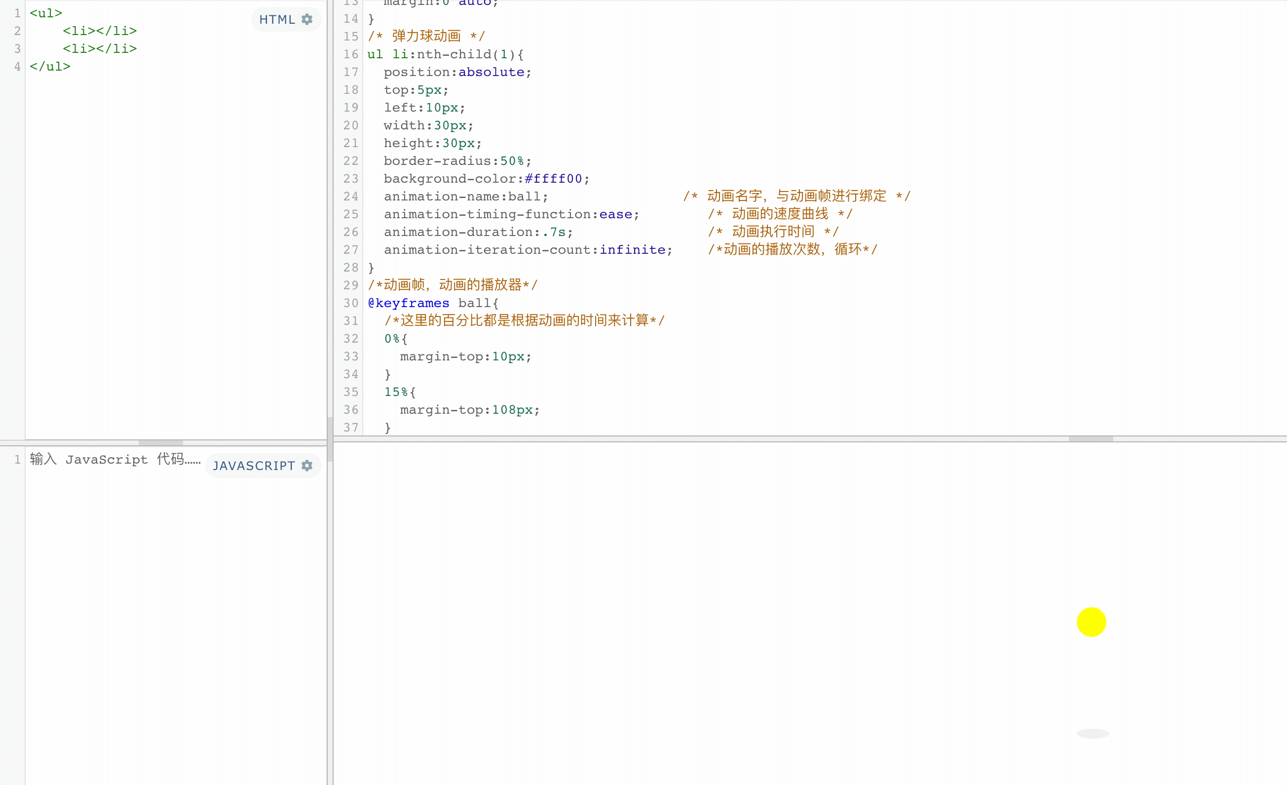
ul,ol{
padding:0;
list-style:none;
}
body,p,h1,h2,h3,h4,h5,h6,ul,ol,dl,dt{
margin:0;
}
ul{
position:relative;
top:150px;
width:50px;
height:150px;
margin:0 auto;
}
/* 弹力球动画 */
ul li:nth-child(1){
position:absolute;
top:5px;
left:10px;
width:30px;
height:30px;
border-radius:50%;
background-color:#ffff00;
animation-name:ball; /* 动画名字,与动画帧进行绑定 */
animation-timing-function:ease; /* 动画的速度曲线 */
animation-duration:.7s; /* 动画执行时间 */
animation-iteration-count:infinite; /*动画的播放次数,循环*/
}
/*动画帧,动画的播放器*/
@keyframes ball{
/*这里的百分比都是根据动画的时间来计算*/
0%{
margin-top:10px;
}
15%{
margin-top:108px;
}
100%{
margin-top:10px;
}
}
/* 弹力球影子动画 */
ul li:nth-child(2){
position:absolute;
bottom:0;
left:10px;
width:33px;
height:10px;
border-radius:50%;
background-color:#f0f0f0;
animation-name:ball-shadow; /* 动画名字,与动画帧进行绑定 */
animation-timing-function: ease; /* 动画的速度曲线 */
animation-duration:.7s; /* 动画执行时间 */
animation-iteration-count:infinite; /*动画的播放次数,循环*/
}
/*动画帧,动画的播放器*/
@keyframes ball-shadow{
/*这里的百分比都是根据动画的时间来计算*/
0%{
}
15%{
width:31px;
height:9px;
background-color:#d3d3d3;
}
100%{
}
}
</style>
</head>
<body>
<ul>
<li></li>
<li></li>
</ul>
</body>
</html>
<!DOCTYPE html PUBLIC "-//W3C//DTD XHTML 1.0 Transitional//EN" "http://www.w3.org/TR/xhtml1/DTD/xhtml1-transitional.dtd">
<html xmlns="http://www.w3.org/1999/xhtml">
<head>
<meta http-equiv="Content-Type" content="text/html; charset=utf-8" />
<title>小球掉落依次排列动画</title>
<style type="text/css">
body,div,footer,p{
	margin:0;
	padding:0;}
body{
	font:1em "microsoft Yahei";
	background-color:#eee;}
#wrap{
	position:absolute;
	left:0;
	right:0;
	top:0;
	bottom:0;
	width:580px;
	height:143px;
	margin:auto;
	}
#wrap img{
	width:160px;
	}
#wrap div{
	float:left;
	margin-right:50px;}
#wrap div:last-child{
	margin-right:0;}
.tu1,.tu2,.tu3{
	position:absolute;
	left:50%;
	margin-left:-80px;
	}
.tu1{
	z-index:1;
	animation:tiantiao1 0.5s ease-in 1 forwards,tiantiao2 0.2s ease-out 0.5s 1 forwards,tiantiao3 0.2s ease-in 0.7s 1 forwards,tiantiao4 0.15s ease-out 0.9s 1 forwards,tiantiao5 0.15s ease-in 1.05s 1 forwards,leftMove 0.4s ease-out 1.2s 1 forwards,rotate 1s linear 1.6s infinite;
	}
.tu2{
	z-index:2;
	animation:tiantiao1 0.5s ease-in 1 forwards,tiantiao2 0.2s ease-out 0.5s 1 forwards,tiantiao3 0.2s ease-in 0.7s 1 forwards,tiantiao4 0.15s ease-out 0.9s 1 forwards,tiantiao5 0.15s ease-in 1.05s 1 forwards,middle 0.4s ease-out 1.2s 1 forwards;
	}
.tu3{
	z-index:3;
	animation:tiantiao1 0.5s ease-in 1 forwards,tiantiao2 0.2s ease-out 0.5s 1 forwards,tiantiao3 0.2s ease-in 0.7s 1 forwards,tiantiao4 0.15s ease-out 0.9s 1 forwards,tiantiao5 0.15s ease-in 1.05s 1 forwards,rightMove 0.4s ease-out 1.2s 1 forwards;}
footer{
	position:absolute;
	bottom:20px;
	left:50%;
	margin-left:-104px;
	}
footer p{
	text-align:center;
	margin-bottom:.7em;}
footer a{
	color:#666;
	text-decoration:none;}
footer a:hover{
	color:#333;}

@keyframes tiantiao1{
	0%{
		transform:translateY(-500px);
		}
	100%{
		transform:translateY(0);}
	}
@keyframes tiantiao2{
	0%{
		transform:translateY(0);}
	100%{
		transform:translateY(-100px);}}
@keyframes tiantiao3{
	0%{
		transform:translateY(-100px);}
	100%{
		transform:translateY(0);}}
@keyframes tiantiao4{
	0%{
		transform:translateY(0px);}
	100%{
		transform:translateY(-50px);}}
@keyframes tiantiao5{
	0%{
		transform:translateY(-50px);}
	100%{
		transform:translateY(0);}
		}
@keyframes leftMove{
	0%{
		transform:translateX(0);}
	100%{
		transform:translateX(-300px) scale(1.6);

		}}
@keyframes rightMove{
	0%{
		transform:translateX(0);}
	100%{
		transform:translateX(300px) scale(1.6);

		}}
@keyframes middle{
	0%{
		transform:translateX(0);
		}
	100%{
		transform:translateX(0) scale(1.6);

		}}

</style>
</head>

<body>
<div id="wrap">
	<div class="tu1"><img src="https://t7.baidu.com/it/u=498237783,2762934359&fm=193&f=GIF" /></div>
    <div class="tu2"><img src="https://t7.baidu.com/it/u=498237783,2762934359&fm=193&f=GIF" /></div>
    <div class="tu3"><img src="https://t7.baidu.com/it/u=498237783,2762934359&fm=193&f=GIF" /></div>
</div>
<footer>
     <p>脚本之家</p>
     <p><a href="https://www.jb51.net" target="_blank">www.jb51.net</a></p>
</footer>
</body>
</html>
3、变形
变形就是指通过CSS来改变元素的形状或位置
变形不会影响到页面的布局
transform 用来设置元素的变形效果
①平移:
- translateX() 沿着x轴方向平移
- translateY() 沿着y轴方向平移
- translateZ() 沿着z轴方向平移
- 平移元素,百分比是相对于自身计算的
.box3{
    background-color: orange;
    position: absolute;
    /*
        这种居中方式,只适用于元素的大小确定
    top: 0;
    left: 0;
    bottom: 0;
    right: 0;
    margin: auto; */

    left: 50%;
    top: 50%;
    transform: translateX(-50%) translateY(-50%);
}
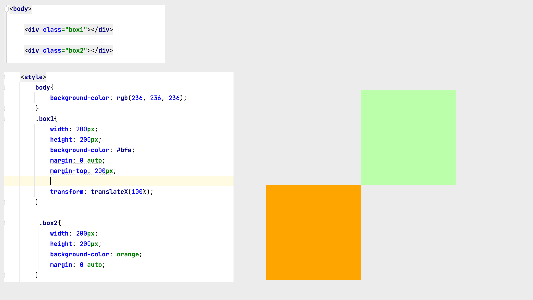
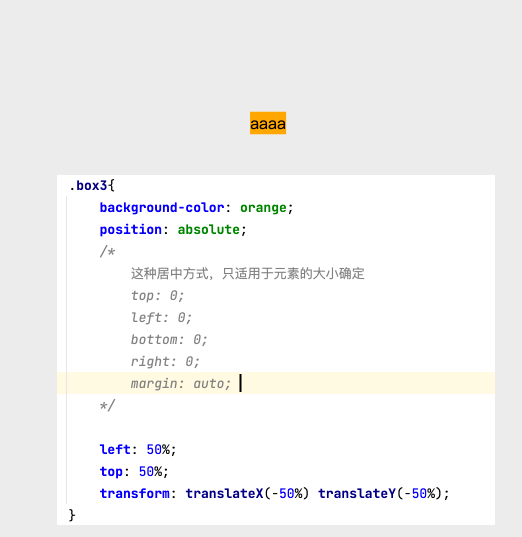
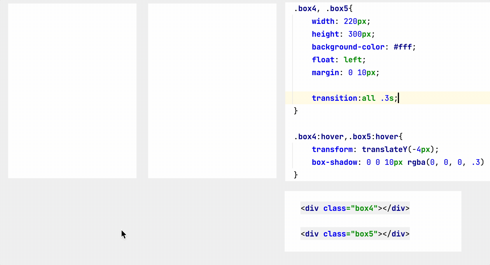
②y轴平移
调整元素在z轴的位置,正常情况就是调整元素和人眼之间的距离,距离越大,元素离人越近
z轴平移属于立体效果(近大远小),默认情况下网页是不支持透视,如果需要看见效果,必须要设置网页的视距
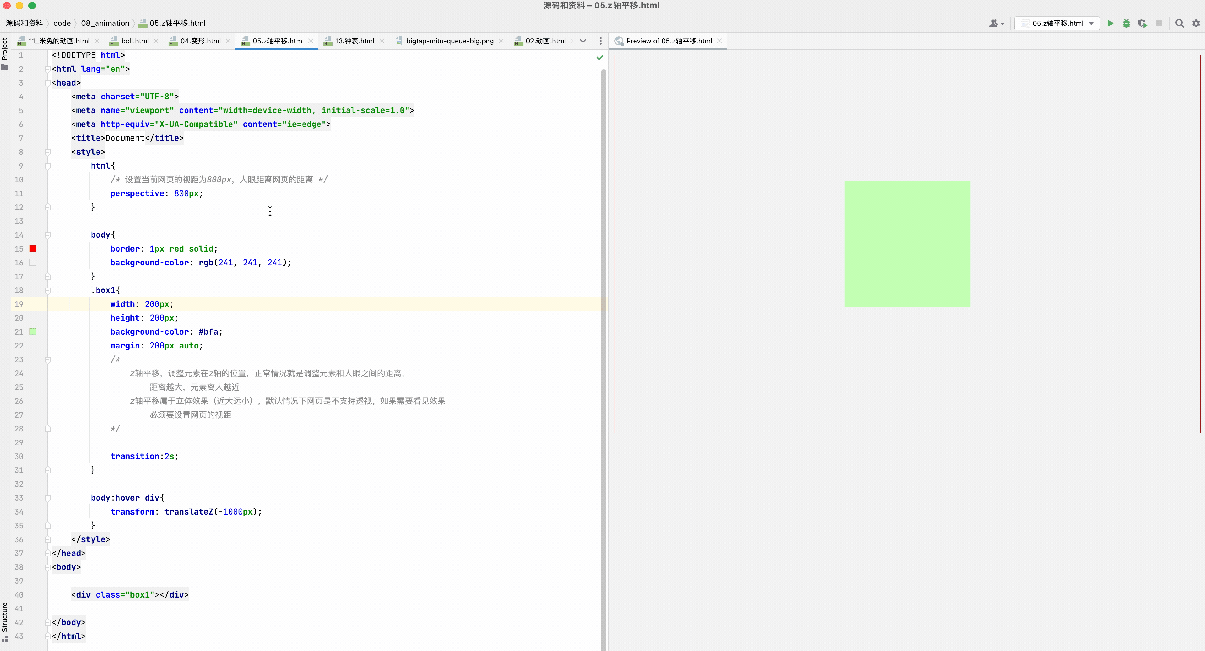
③旋转
通过旋转可以使元素沿着x y 或 z旋转指定的角度
rotateX()
rotateY()
rotateZ()
<!DOCTYPE html>
<html lang="en">
<head>
    <meta charset="UTF-8">
    <meta name="viewport" content="width=device-width, initial-scale=1.0">
    <meta http-equiv="X-UA-Compatible" content="ie=edge">
    <title>Document</title>
    <style>
        body{
            border: 1px red solid;
            background-color: rgb(241, 241, 241);
            perspective: 800px;
        }
        div{
            width: 120px;
            height: 120px;
            background-color: #bfa;
            margin: 10px auto;
            transition:2s;
        }
        img {
            width: 100%;
        }

        body:hover .box1{

            /*
                通过旋转可以使元素沿着x y 或 z旋转指定的角度
                    rotateX()
                    rotateY()
                    rotateZ()
            */
             transform: rotateZ(.25turn);
        }
        /*先旋转,再平移*/
        body:hover .box2{
            transform: rotateY(180deg) translateZ(400px);
        }
        /*先平移,再旋转*/
        body:hover .box3{
            transform: translateZ(400px) rotateY(180deg) ;
        }
        body:hover .box4{
            /* 是否显示元素的背面 */
            backface-visibility: hidden;
            transform: translateZ(400px) rotateY(180deg) ;
        }

    </style>
</head>
<body>

    <div class="box1">
        <img src="an.jpg" alt="">
    </div>
    <div class="box2">
        <img src="an.jpg" alt="">
    </div>
    <div class="box3">
        <img src="an.jpg" alt="">
    </div>
    <div class="box4">
        <img src="an.jpg" alt="">
    </div>


</body>
</html>
练习:钟表
<!DOCTYPE html>
<html lang="en">

<head>
    <meta charset="UTF-8">
    <meta name="viewport" content="width=device-width, initial-scale=1.0">
    <meta http-equiv="X-UA-Compatible" content="ie=edge">
    <title>Document</title>
    <style>
        * {
            margin: 0;
            padding: 0;
        }

        /* 设置表的样式 */
        .clock {
            width: 500px;
            height: 500px;
            margin: 0 auto;
            margin-top: 100px;
            border-radius: 50%;
            /* border: 10px solid black; */
            position: relative;
            background-image: url(./img/13/bg3.jpg);
            background-size: cover;
        }

        .clock>div {
            position: absolute;
            top: 0;
            left: 0;
            bottom: 0;
            right: 0;
            margin: auto;
        }

        /* 设置时针 */
        .hour-wrapper {
            height: 70%;
            width: 70%;
            animation: run 7200s linear infinite;
        }

        .hour {
            height: 50%;
            width: 6px;
            background-color: #000;
            margin: 0 auto;

        }

        /* 设置分针 */
        .min-wrapper {
            height: 80%;
            width: 80%;
            animation: run 600s steps(60) infinite;
        }

        .min {
            height: 50%;
            width: 4px;
            background-color: #000;
            margin: 0 auto
        }

         /* 设置秒针 */
         .sec-wrapper {
            height: 90%;
            width: 90%;
            animation: run 10s steps(60) infinite;
        }

        .sec {
            height: 50%;
            width: 2px;
            background-color: #f00;
            margin: 0 auto
        }


/*
        旋转的关键帧
*/
        @keyframes run {
            from {
                transform: rotateZ(0);
            }

            to {
                transform: rotateZ(360deg);
            }
        }
    </style>
</head>

<body>

    <!-- 创建表的容器 -->
    <div class="clock">
        <!-- 创建时针 -->
        <div class="hour-wrapper">
            <div class="hour"></div>
        </div>

        <!-- 创建分针 -->
        <div class="min-wrapper">
            <div class="min"></div>
        </div>

        <!-- 创建秒针 -->
        <div class="sec-wrapper">
            <div class="sec"></div>
        </div>

    </div>
</body>

</html>
练习:正方体
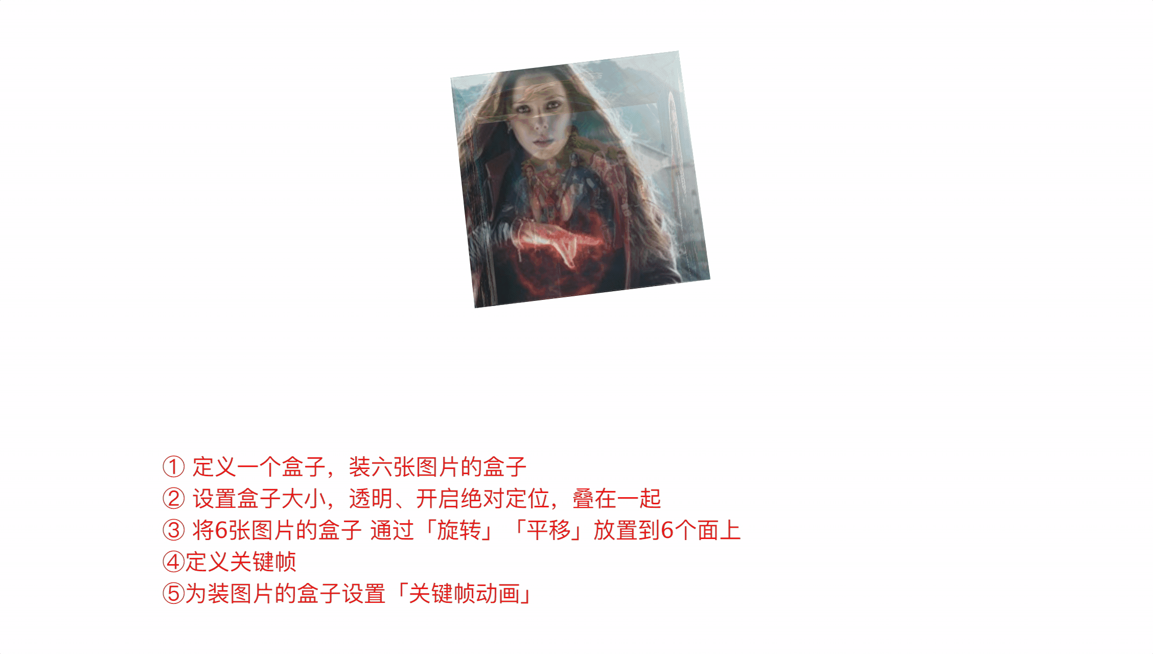
<!DOCTYPE html>
<html lang="en">

<head>
    <meta charset="UTF-8">
    <meta name="viewport" content="width=device-width, initial-scale=1.0">
    <meta http-equiv="X-UA-Compatible" content="ie=edge">
    <title>Document</title>

    <style>
        html {
            perspective: 800px
        }

        .cube {
            width: 200px;
            height: 200px;
            /* background-color: #bfa; */
            margin: 100px auto;
            /* 设置3d变形效果 */
            transform-style: preserve-3d;
            /* transform: rotateX(45deg) rotateZ(45deg); */
            animation: rotate 10s infinite linear;
            /* transform:rotateY(45deg) scaleZ(2); */
        }

        .cube>div {
            width: 200px;
            height: 200px;
            /* 为元素设置透明效果 */
            opacity: 0.7;
            position: absolute;
        }

        img {
            vertical-align: top;
        }

        .box1 {
            transform: rotateY(90deg) translateZ(100px);
        }

        .box2 {
            transform: rotateY(-90deg) translateZ(100px);
        }

        .box3 {
            transform: rotateX(90deg) translateZ(100px);
        }

        .box4 {
            transform: rotateX(-90deg) translateZ(100px);
        }

        .box5 {
            transform:rotateY(180deg) translateZ(100px);
        }

        .box6 {
            transform: rotateY(0deg) translateZ(100px);
        }

        @keyframes rotate {
            form{
                transform:rotateX(0) rotateZ(0)
            }

            to{
                transform:rotateX(1turn) rotateZ(1turn)
            }
        }
    </style>
</head>

<body>

    <!-- 创建一个外部的容器 -->
    <div class="cube">
        <!-- 引入图片 -->
        <div class="box1">
            <img src="./img/14/1.jpg">
        </div>

        <div class="box2">
            <img src="./img/14/2.jpg">
        </div>

        <div class="box3">
            <img src="./img/14/3.jpg">
        </div>

        <div class="box4">
            <img src="./img/14/4.jpg">
        </div>

        <div class="box5">
            <img src="./img/14/5.jpg">
        </div>

        <div class="box6">
            <img src="./img/14/6.jpg">
        </div>
    </div>
</body>

</html>
④缩放
对元素进行缩放的函数
scaleX() 水平方向缩放
scaleY() 垂直方向缩放
scaleZ() 垂直方向缩放
scale() 双方向的缩放
变形的原点 默认值 center*
transform-origin:20px 20px;
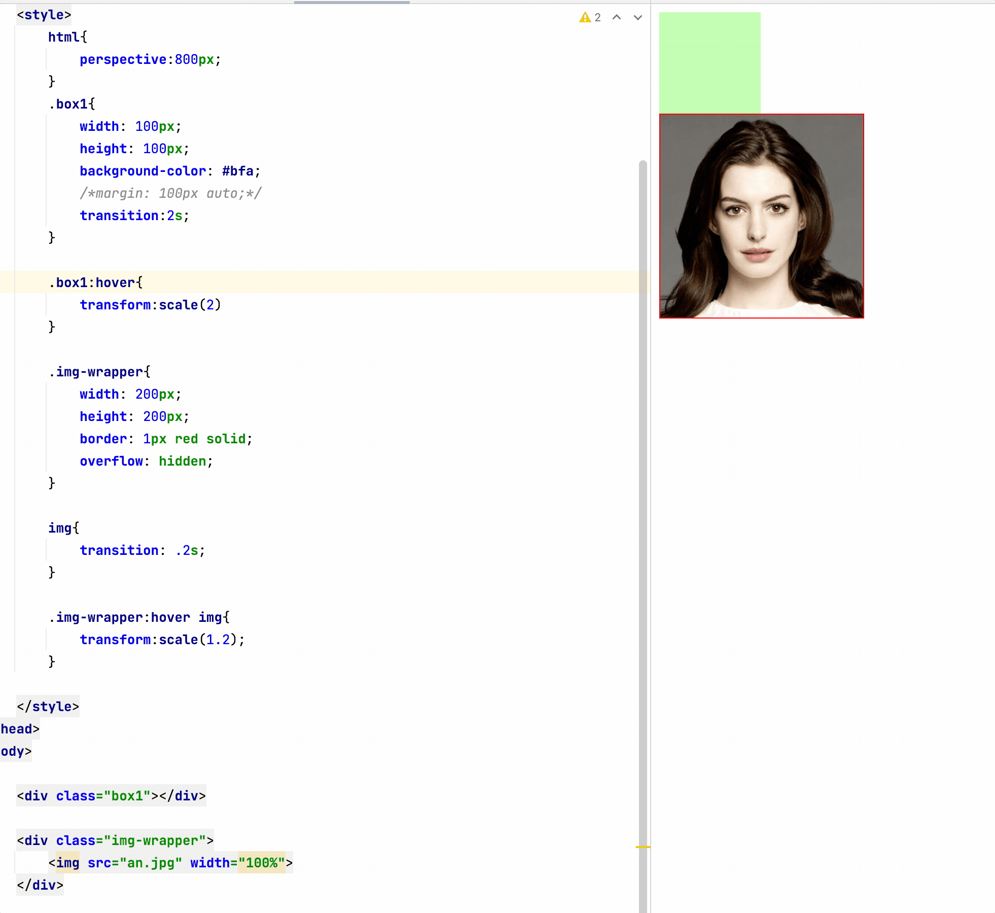
七、less
css 说明:原生变量定义,计算等兼容性极差
html{
    /* css原生也支持变量的设置 */
    --color:#ff0;
    --length:200px;
}

.box1{
    /* calc()计算函数 */
    width: calc(200px*2);
    height: var(--length);
    background-color: var(--color);
}
less是一门css的预处理语言
- less是一个css的增强版,通过less可以编写更少的代码实现更强大的样式
- 在less中添加了许多的新特性:像对变量的支持、对mixin的支持… …
- less的语法大体上和css语法一致,但是less中增添了许多对css的扩展,
所以浏览器无法直接执行less代码,要执行必须向将less转换为css,然后再由浏览器执行
vscode中安装 Easy Less
webstrom中配置tools
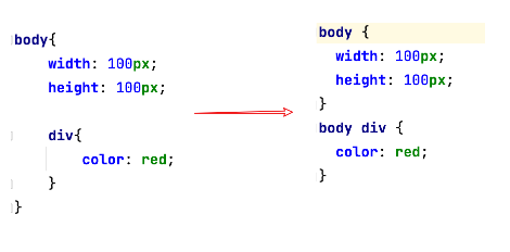
less语法
①变量
// less中的单行注释,注释中的内容不会被解析到css中

/*
    css中的注释,内容会被解析到css文件中
*/
.box1{
    background-color: #bfa;

    .box2{
        background-color: #ff0;

        .box4{
            color: red;
        }
    }

    .box3{
        background-color: orange;
    }
}
//变量,在变量中可以存储一个任意的值
// 并且我们可以在需要时,任意的修改变量中的值
// 变量的语法: @变量名
@a:200px;
@b:#bfa;
@c:box6;

.box5{
    //使用变量是,如果是直接使用则以 @变量名 的形式使用即可
    width: @a;
    color:@b;
}
//作为类名,或者一部分值使用时必须以 @{变量名} 的形式使用
.@{c}{
    width: @a;
    background-image: url("@{c}/1.png");
}
@d:200px;
@d:300px;

div{
    // 变量发生重名时,会优先使用比较近的变量
    @d:115px;
    width: @d;
    height: @e;
}
div{
    // 变量发生重名时,会优先使用比较近的变量
    @d:115px;
    width: @d;
    height: @e;
}

//可以在变量声明前就使用变量
@e:335px;
div{
    width: 300px;
    //直接对属性引用
    height: $width;
}
②父元素和扩展
.box1{
	//后代选择器
    .box2{
        color: red;
    }
	//子元素选择器
    >.box3{
        color: red;
		//
        &:hover{
            color: blue;
        }
    }

    //为box1设置一个hover
    //& 就表示外层的父元素
    &:hover{
        color: orange;
    }

    div &{
        width: 100px;
    }
}
扩展
.p1{
    width: 100px;
    height: 200px;
}

//:extend() 对当前选择器扩展指定选择器的样式(选择器分组)
.p2:extend(.p1){
    color: red;
}


.p3{
    //直接对指定的样式进行引用,这里就相当于将p1的样式在这里进行了复制
    //mixin 混合
    .p1();
}

// 使用类选择器时可以在选择器后边添加一个括号,这时我们实际上就创建了一个mixins
.p4(){
    width: 100px;
    height: 100px;
}
.p5{
    .p4;
}
③混合函数
//混合函数 在混合函数中可以直接设置变量
.test(@w:100px,@h:200px,@bg-color:red){
    width: @w;
    height: @h;
    border: 1px solid @bg-color;
}

div{
    //调用混合函数,按顺序传递参数
    // .test(200px,300px,#bfa);
    .test(300px);
    // .test(@bg-color:red, @h:100px, @w:300px);
}

span{
    color: average(red,blue);
}


html{
    width: 100%;
    height: 100%;
}
body {
    width: 100%;
    height: 100%;
    background-color: #bfa;
}

body:hover{
    background-color: darken(#bfa,50%);
}
④运算
.box1{
    // 在less中所有的数值都可以直接进行运算
    // + - * /
    width: 100px + 100px;
    height: 100px/2;
    background-color: #bfa;

}
⑤导入
//import用来将其他的less引入到当前的less
//可以通过import来将其他的less引入到当前的less中
@import "syntax2.less";
此处vscode需要手动配置添加sourcemap
webstrom配置完成后就有该功能
八、弹性盒子
flex(弹性盒、伸缩盒)
是CSS中的又一种布局手段,它主要用来代替浮动来完成页面的布局
flex可以使元素具有弹性,让元素可以跟随页面的大小的改变而改变
基本概念
①弹性容器
要使用弹性盒,必须先将一个元素设置为弹性容器
我们通过 display 来设置弹性容器
- display:flex 设置为块级弹性容器
- display:inline-flex 设置为行内的弹性容器
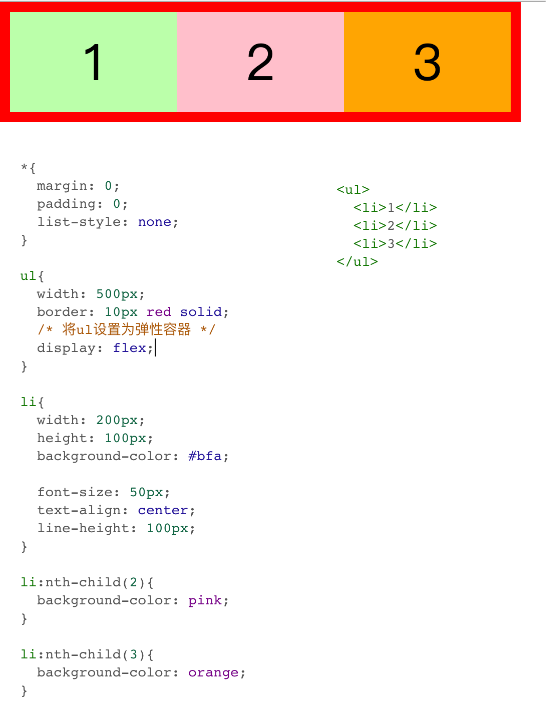
② 弹性元素
- 弹性容器的子元素是弹性元素(弹性项)
- 弹性元素可以同时是弹性容器
③ flex-direction (容器属性)
指定容器中弹性元素的排列方式
- row 默认值,弹性元素在容器中水平排列(左向右)
主轴 自左向右 - row-reverse 弹性元素在容器中反向水平排列(右向左)
主轴 自右向左 - column 弹性元素纵向排列(自上向下)
- column-reverse 弹性元素方向纵向排列(自下向上)
主轴:弹性元素的排列方向称为主轴
侧轴:与主轴垂直方向的称为侧轴
④ 弹性元素的属性
-
flex-grow 指定弹性元素的伸展的系数
- 当父元素有多余空间的时,子元素如何伸展
- 父元素的剩余空间,会按照比例进行分配
-
flex-shrink 指定弹性元素的收缩系数
- 当父元素中的空间不足以容纳所有的子元素时,如果对子元素进行收缩
练习: 弹性导航条
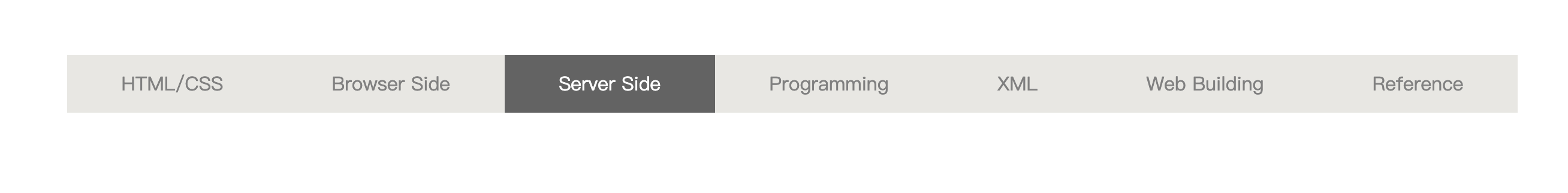
<!DOCTYPE html>
<html lang="en">
<head>
    <meta charset="UTF-8">
    <meta name="viewport" content="width=device-width, initial-scale=1.0">
    <meta http-equiv="X-UA-Compatible" content="ie=edge">
    <title>Document</title>
    <link rel="stylesheet" href="css/reset.css">
    <style>
        .nav{
            width: 1210px;
            height: 48px;
            line-height: 48px;
            margin: 50px auto;
            background-color: #E8E7E3;
            /* 设置为弹性容器 */
            display: flex;
        }

        .nav li{
            /* 设置增长系数 */
            flex-grow: 1;
        }

        .nav a{
            display: block;
            color: #808080;
            text-decoration: none;
            font-size: 16px;
            text-align: center;

        }

        .nav a:hover{
            background-color: #636363;
            color: #fff;
        }
    </style>
</head>
<body>
    <ul class="nav">
        <li><a href="#">HTML/CSS</a></li>
        <li><a href="#">Browser Side</a></li>
        <li><a href="#">Server Side</a></li>
        <li><a href="#">Programming</a></li>
        <li><a href="#">XML</a></li>
        <li><a href="#">Web Building</a></li>
        <li><a href="#">Reference</a></li>
    </ul>
</body>
</html>
⑤容器样式
flex-wrap、flex-flow
 设置弹性元素是否在弹性容器中自动换行
 可选值:
     nowrap 默认值,元素不会自动换行
     wrap 元素沿着辅轴方向自动换行
     wrap-reverse 元素沿着辅轴反方向换行

     flex-wrap: wrap-reverse;

 flex-flow:  wrap 和 direction 的简写属性
     flex-flow: row wrap;
justify-content (主轴)
- 如何分配主轴上的空白空间(主轴上的元素如何排列)
- 可选值:
    flex-start 元素沿着主轴起边排列
    flex-end 元素沿着主轴终边排列
    center 元素居中排列
    space-around 空白分布到元素两侧
    space-between 空白均匀分布到元素间
    space-evenly 空白分布到元素的单侧
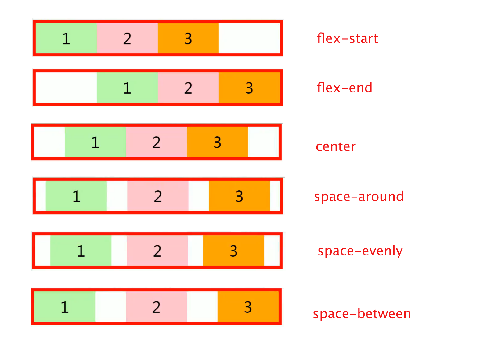
align-items
    - 元素在辅轴上如何对齐
    - 元素间的关系
        - 可选值:
            stretch 默认值,将元素的长度设置为相同的值
            flex-start 元素不会拉伸,沿着辅轴起边对齐
            flex-end 沿着辅轴的终边对齐
            center 居中对齐
            baseline 基线对齐
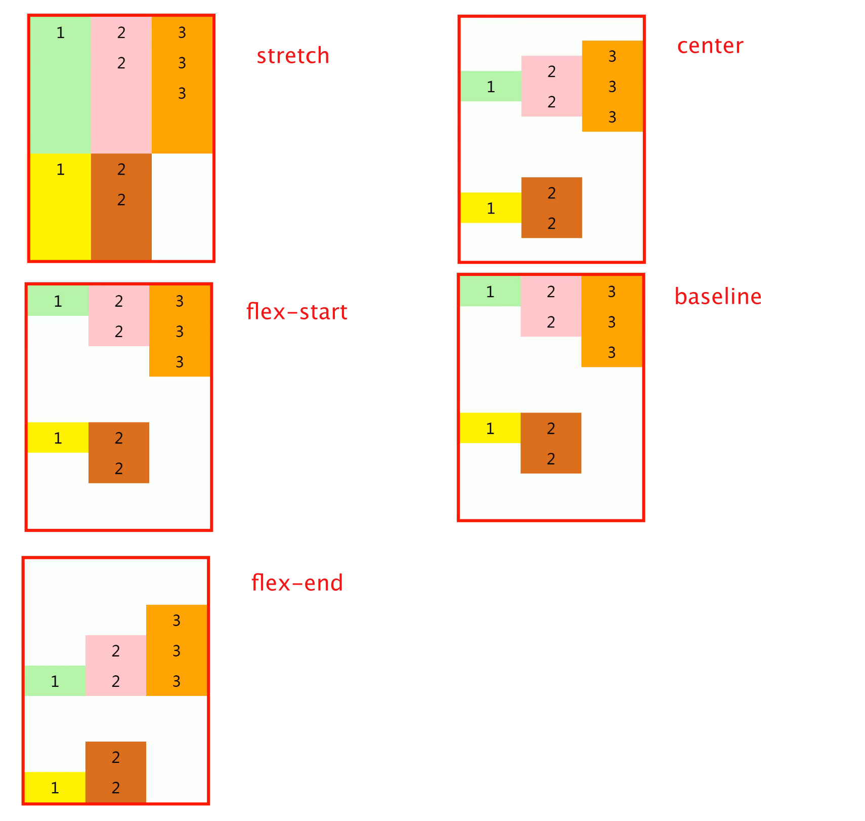
align-content(辅轴)
- 如何分配辅轴上的空白空间(辅轴上的元素如何排列)
- 可选值:
    flex-start 元素沿着辅轴起边排列
    flex-end 元素沿着辅轴终边排列
    center 元素居中排列
    space-around 空白分布到元素两侧
    space-between 空白均匀分布到元素间
    space-evenly 空白分布到元素的单侧
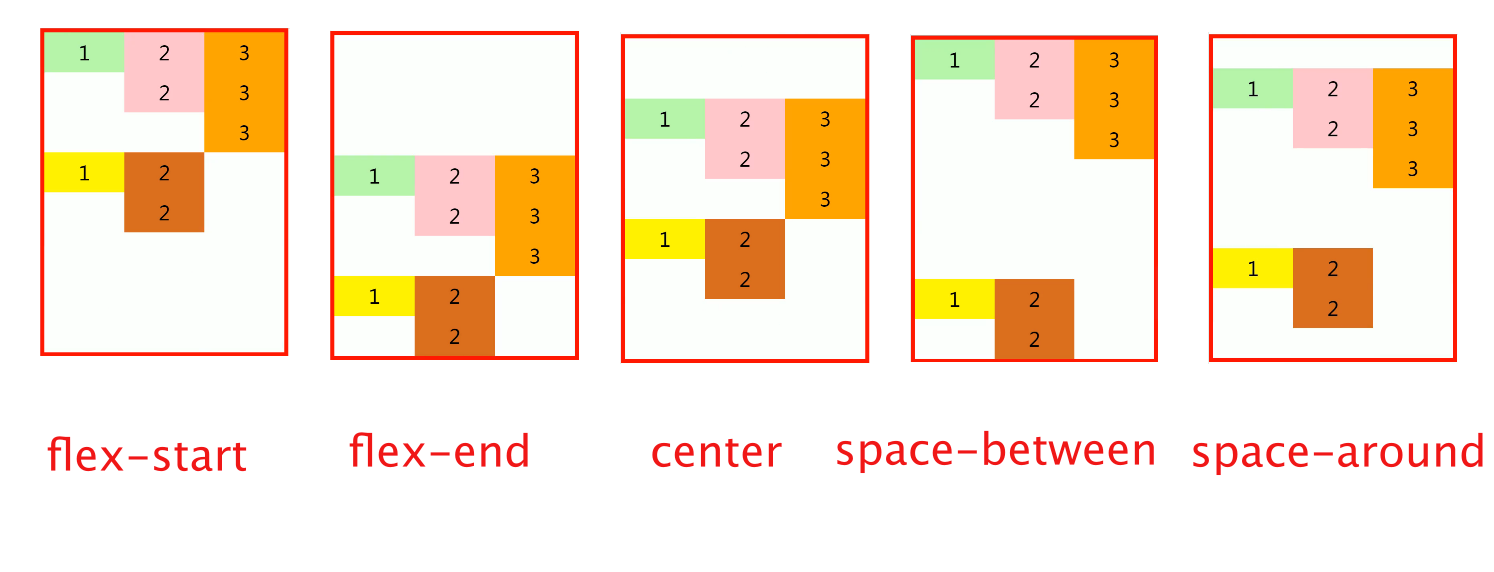
align-self (弹性元素样式)
用来覆盖当前弹性元素上的align-items
   li:nth-child(1){
       /* align-self: 用来覆盖当前弹性元素上的align-items */
       align-self: stretch;
   }
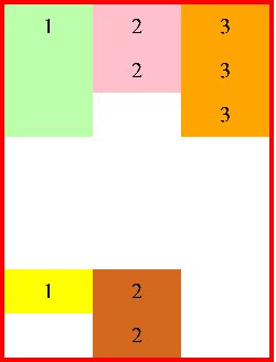
⑥元素样式
flex-grow
flex-grow: 1;
flex-shrink
缩减多少是根据 缩减系数 和 元素大小来计算
flex-basis
指定的是元素在主轴上的基础长度
- 如果主轴是 横向的 则 该值指定的就是元素的宽度
- 如果主轴是 纵向的 则 该值指定的是就是元素的高度
- 默认值是 auto,表示参考元素自身的高度或宽度
- 如果传递了一个具体的数值,则以该值为准
flex
可以设置弹性元素所有的三个样式
flex 增长 缩减 基础;
- initial “flex: 0 1 auto”.
- auto “flex: 1 1 auto”
- none “flex: 0 0 auto” 弹性元素没有弹性
order
决定弹性元素的排列顺序
练习:手机导航
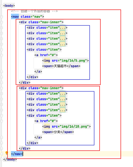
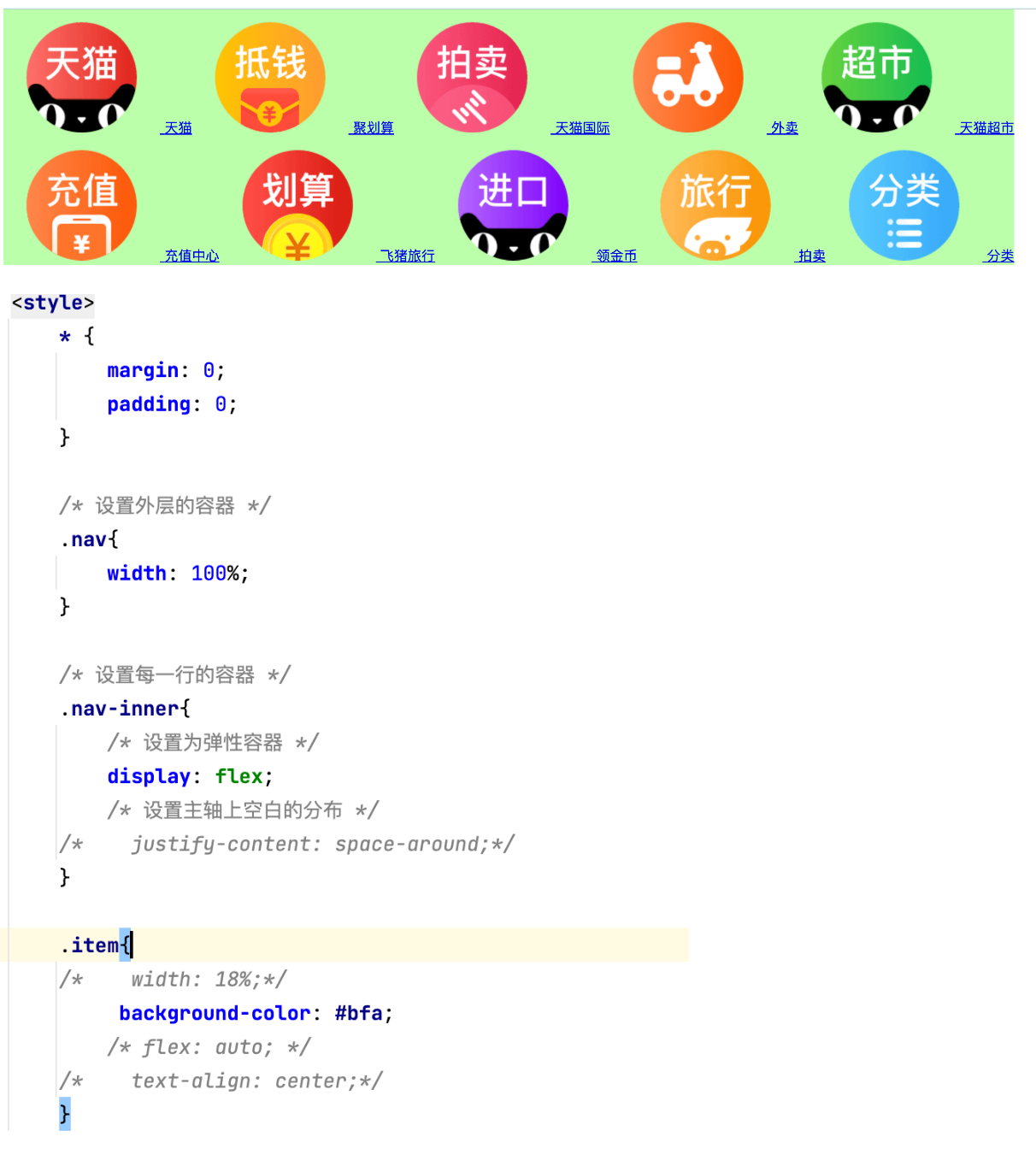
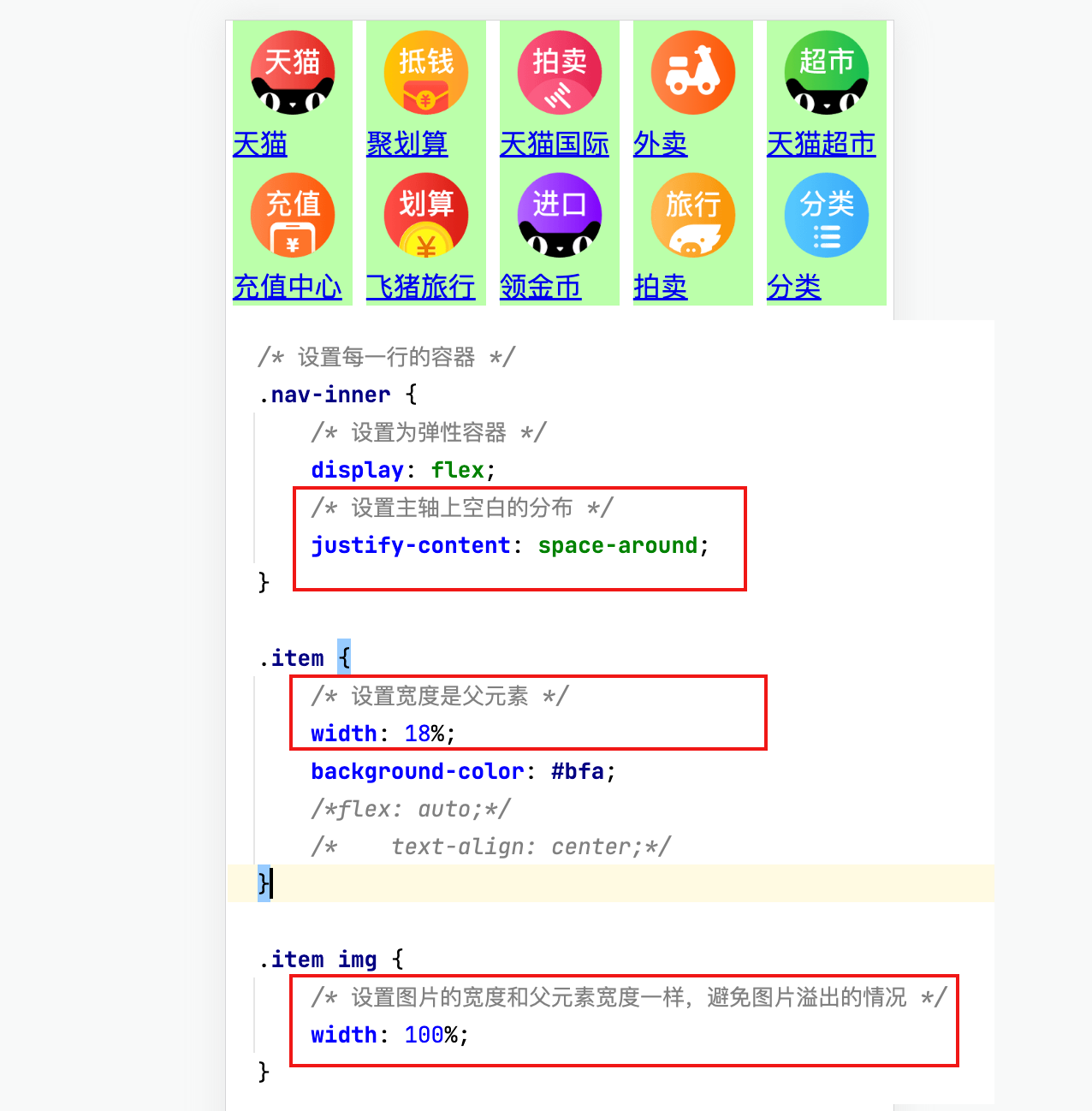
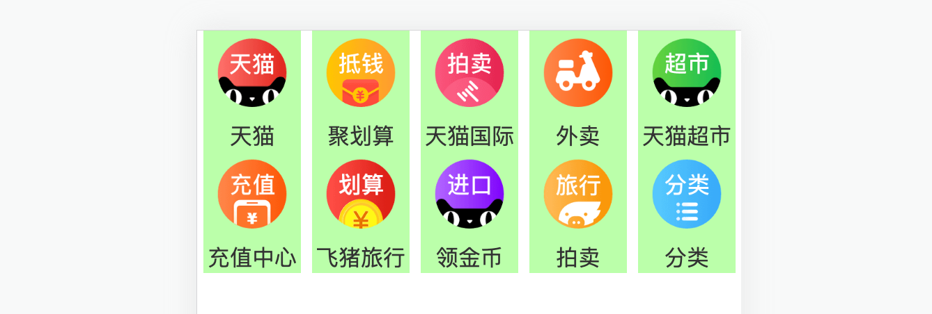
九
像素
①像素
屏幕是由一个一个发光的小点构成,这一个个的小点就是像素
分辨率:1920 x 1080 说的就是屏幕中小点的数量
在前端开发中像素要分成两种情况讨论:CSS像素 和 物理像素
- 物理像素,上述所说的小点点就属于物理像素
- CSS像素,编写网页时,我们所用像素都是CSS像素
- 浏览器在显示网页时,需要将CSS像素转换为物理像素然后再呈现
- 一个css像素最终由几个物理像素显示,由浏览器决定:
默认情况下在pc端,一个css像素 = 一个物理像素
② 视口(viewport)
 - 视口就是屏幕中用来显示网页的区域
 - 可以通过查看视口的大小,来观察CSS像素和物理像素的比值
 - 默认情况下:
     视口宽度 1920px(CSS像素)
             1920px(物理像素)
             - 此时,css像素和物理像素的比是 1:1

 - 放大两倍的情况:
     视口宽度 960px(CSS像素)
             1920px(物理像素)
             - 此时,css像素和物理像素的比是1:2

 - 我们可以通过改变视口的大小,来改变CSS像素和物理像素的比值
③移动端
 在不通的屏幕,单位像素的大小是不同的,像素越小屏幕会越清晰
     24寸 1920x1080
     i6 4.7寸 750 x 1334

     智能手机的像素点 远远小于 计算机的像素点
问题:一个宽度为900px的网页在iphone6中要如何显示呢?
默认情况下,移动端的网页都会将视口设置为980像素(css像素)
以确保pc端网页可以在移动端正常访问,但是如果网页的宽度超过了980,
移动端的浏览器会自动对网页缩放以完整显示网页
所以基本大部分的pc端网站都可以在移动端中正常浏览,但是往往都不会有一个好的体验,
为了解决这个问题,大部分网站都会专门为移动端设计网页
移动端
完美视口
移动端默认的视口大小是980px(css像素),
默认情况下,移动端的像素比就是 980/移动端宽度 (980/750)
如果我们直接在网页中编写移动端代码,这样在980的视口下,像素比是非常不好,
导致网页中的内容非常非常的小
编写移动页面时,必须要确保有一个比较合理的像素比:
1css像素 对应 2个物理像素
1css像素 对应 3个物理像素
可以通过meta标签来设置视口大小
每一款移动设备设计时,都会有一个最佳的像素比,一般我们只需要将像素比设置为该值即可得到一个最佳效果
将像素比设置为最佳像素比的视口大小我们称其为完美视口
将网页的视口设置为完美视口
<meta name="viewport" content="width=device-width, initial-scale=1.0">
结论:以后再写移动端的页面,就把上边这个玩意先写上
VW单位
    不同的设备完美视口的大小是不一样的
        iphone6 -- 375
        iphone6plus -- 414

    由于不同设备视口和像素比不同,所以同样的375个像素在不同的设备下意义是不一样,
        比如在iphone6中 375就是全屏,而到了plus中375就会缺一块

    所以在移动端开发时,就不能再使用px来进行布局了

    vw 表示的是视口的宽度(viewport width)
        - 100vw = 一个视口的宽度
        - 1vw = 1%视口宽度

        vw这个单位永远相当于视口宽度进行计算

        设计图的宽度
            750px 1125px

        设计图
            750px

        使用vw作为单位
            100vw

        创建一个 48px x 35px 大小的元素

        100vw = 750px(设计图的像素) 0.1333333333333333vw = 1px
        6.4vw = 48px(设计图像素)
        4.667vw = 35px


            网页中字体大小最小是12px,不能设置一个比12像素还小的字体
                如果我们设置了一个小于12px的字体,则字体自动设置为12

            0.1333333vw = 1px

            5.3333vw = 40px

            rem
                - 1 rem = 1 html的字体大小
                - 1 rem = 40 px(设计图)
媒体查询
响应式布局
- 网页可以根据不通的设备或窗口大小呈现出不同的效果
- 使用响应式布局,可以使一个网页适用于所有设备
- 响应布局的关键就是 媒体查询
- 通过媒体查询,可以为不通的设备,或设备不同状态来分别设置样式
使用媒体查询 语法: @media 查询规则{}
媒体类型:
- all 所有设备
- print 打印设备
- screen 带屏幕的设备
- speech 屏幕阅读器
可以使用,连接多个媒体类型,这样它们之间就是一个或的关系
可以在媒体类型前添加一个only,表示只有。
only的使用主要是为了兼容一些老版本浏览器
 @media print,screen{
    body{
        background-color: #bfa;
    }
}


@media only screen {
    body{
        background-color: #bfa;
    }
}
媒体特性:
-
width 视口的宽度
-
height 视口的高度
min-width 视口的最小宽度(视口大于指定宽度时生效)
max-width 视口的最大宽度(视口小于指定宽度时生效)
样式切换的分界点,我们称其为断点,也就是网页的样式会在这个点时发生变化
一般比较常用的断点
- 小于768 超小屏幕 max-width=768px
- 大于768 小屏幕 min-width=768px
- 大于992 中型屏幕 min-width=992px
- 大于1200 大屏幕 min-width=1200px
//, 是或的关系 and 是且的关系
@media only screen and (min-width: 500px) and (max-width:700px){
    body{
       background-color: #bfa;
    }
}


 816
816


 被折叠的 条评论
为什么被折叠?
被折叠的 条评论
为什么被折叠?
 到【灌水乐园】发言


