效果总览
盒子阴影
基本样式
<!DOCTYPE html>
<html lang="en">
<head>
    <meta charset="UTF-8">
    <title>阴影特效</title>
    <style>
        .box {
            position: relative;
            width: 300px;
            height: 300px;
            background-color: rgb(254, 211, 48);
        }
    </style>
</head>
<body>
    <div class="box box-shadow1"></div>
</body>
</html>
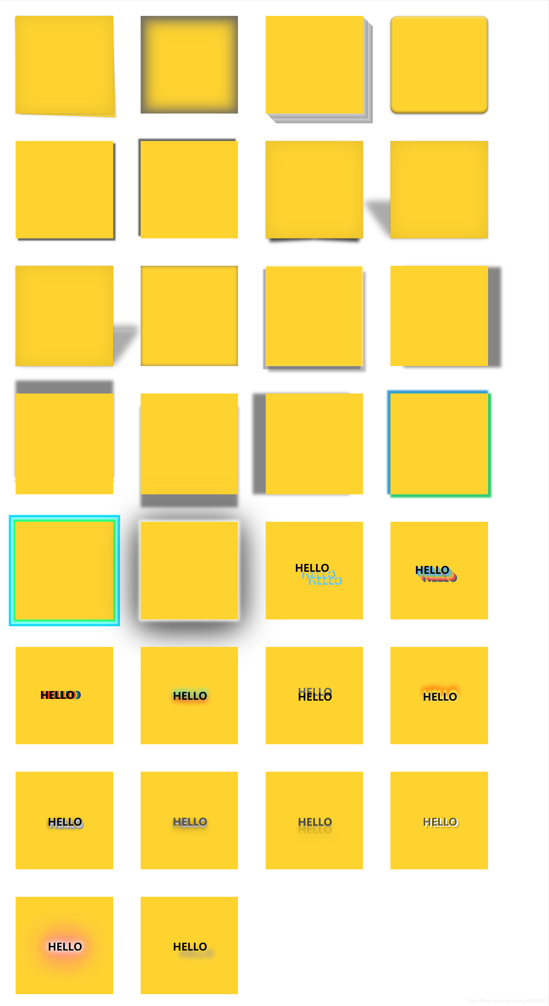
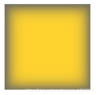
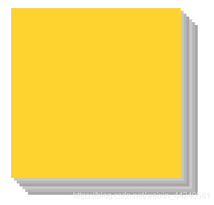
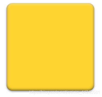
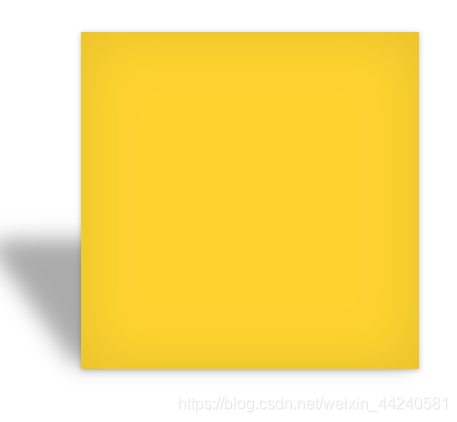
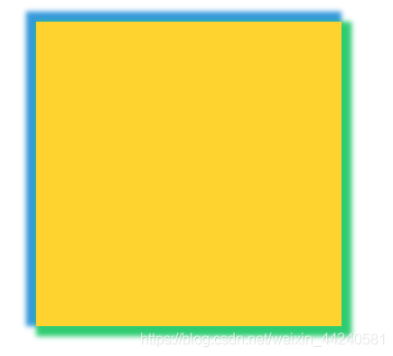
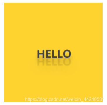
阴影1
	<style>
        .box-shadow1{
           box-shadow:
                0 1px 5px rgba(0,0,0,0.25),
                0 0 50px rgba(0,0,0,0.1) inset;
        }
        .box-shadow1:before {
            z-index: -1;
            position: absolute;
            content: "";
            width: 98%;
            height: 96%;
            bottom: 0;
            right: 0;
            background-color: rgb(254, 211, 48);
            border: 1px solid #ccc;
            box-shadow: 1px 1px 8px rgba(0, 0, 0, 0.1);
            -webkit-transform: skew(2deg, 2deg) translate(3px, 8px);
            -moz-transform: skew(2deg, 2deg) translate(3px, 8px);
            -ms-transform: skew(2deg, 2deg) translate(3px, 8px);
            -o-transform: skew(2deg, 2deg) translate(3px, 8px);
            transform: skew(2deg, 2deg) translate(3px, 8px);
        }
        .box-shadow1:after {
            z-index: -1;
            position: absolute;
            content: "";
            width: 98%;
            height: 96%;
            bottom: 0;
            right: 0;
            background-color: rgb(254, 211, 48);
            border: 1px solid #ccc;
            box-shadow: 0 0 8px rgba(0, 0, 0, 0.1);
            -webkit-transform: skew(2deg, 2deg) translate(-1px, 2px);
            -moz-transform: skew(2deg, 2deg) translate(-1px, 2px);
            -ms-transform: skew(2deg, 2deg) translate(-1px, 2px);
            -o-transform: skew(2deg, 2deg) translate(-1px, 2px);
            transform: skew(2deg, 2deg) translate(-1px, 2px);
        }
    </style>
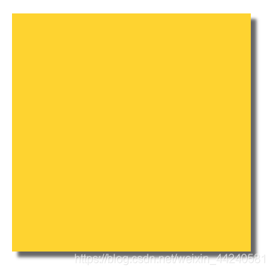
阴影2
<style>
	.box-shadow2 {
            background-color: rgb(254, 211, 48);
            box-shadow:
                2px 2px 15px 5px rgba(102,102,102,.6) inset,
                2px 2px 30px 10px rgba(102,102,102,.6) inset,
                2px 2px 45px 15px rgba(102,102,102,.6) inset;
        }
</style>
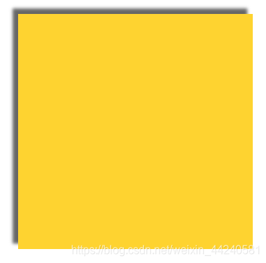
阴影3
<style>
	.box-shadow3 {
            background-color: rgb(254, 211, 48);
            box-shadow:
                5px 5px 0 rgb(200,200,200),
                10px 10px 0 rgb(184,184,184),
                15px 15px 0 rgb(168,168,168),
                20px 20px 0 rgb(200,200,200),
                25px 25px 0 rgb(184,184,184),
                30px 30px 0 rgb(168,168,168);
        }
</style>
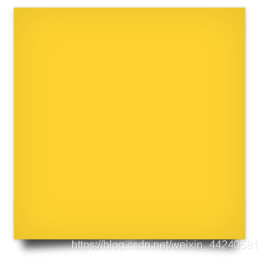
阴影4
<style>
	.box-shadow4 {
            background-color: rgb(254, 211, 48);
            border-radius: 20px;
            box-shadow:
                inset rgba(0,0,0,.6) 0 -3px 8px,
                inset rgba(252,255,255,.7) 0 3px 8px,
                rgba(0,0,0,.8) 0 3px 8px -3px;

        }
</style>
阴影5
<style>
	.box-shadow5 {
            background-color: rgb(254, 211, 48);
            box-shadow: 7px 7px 4px #666;
        }
</style>
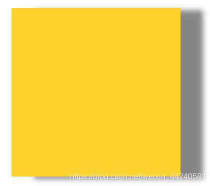
阴影6
<style>
	.box-shadow6 {
            background-color: rgb(254, 211, 48);
            box-shadow: -7px -7px 4px #666;
        }
</style>
阴影7
<style>
	.box-shadow7 {
            background-color: rgb(254, 211, 48);
            box-shadow:
                0 1px 5px rgba(0,0,0,0.25),
                0 0 50px rgba(0,0,0,0.1) inset;
         }
        .box-shadow7:before {
            content: '';
            position: absolute;
            z-index: -1;
            bottom: 8px;
            left: 10px;
            width: 46%;
            height: 20%;
            box-shadow: 0 15px 10px rgba(0, 0, 0, 0.7);
            -webkit-transform: rotate(-3deg) skew(-0deg);
            -moz-transform: rotate(-3deg) skew(-0deg);
            -ms-transform: rotate(-3deg) skew(-0deg);
            -o-transform: rotate(-3deg) skew(-0deg);
            transform: rotate(-3deg) skew(-0deg);
        }
        .box-shadow7:after {
            content: '';
            position: absolute;
            z-index: -1;
            bottom: 8px;
            right: 10px;
            width: 46%;
            height: 20%;
            box-shadow: 0 15px 10px rgba(0, 0, 0, 0.7);
            -webkit-transform: rotate(3deg) skew(0deg);
            -moz-transform: rotate(3deg) skew(0deg);
            -ms-transform: rotate(3deg) skew(0deg);
            -o-transform: rotate(3deg) skew(0deg);
            transform: rotate(3deg) skew(0deg);
        }
</style>
阴影8
<style>
	.box-shadow8 {
            background-color: rgb(254, 211, 48);
            box-shadow:
                0 1px 5px rgba(0,0,0,0.25),
                0 0 50px rgba(0,0,0,0.1) inset;
        }
        .box-shadow8:before {
            position: absolute;
            left: 80px;
            bottom: 5px;
            width: 100%;
            height: 37%;
            border-radius: 10% 0 0 0;
            z-index: -1;
            content: "";
            box-shadow: -86px 0 17px rgba(0,0,0,0.33);
            -webkit-transform: skew(36deg);
            -moz-transform: skew(36deg);
            -ms-transform: skew(36deg);
            -o-transform: skew(36deg);
            transform: skew(36deg);
            -webkit-transform-origin: 0 100%;
            -moz-transform-origin: 0 100%;
            -ms-transform-origin: 0 100%;
            -o-transform-origin: 0 100%;
            transform-origin: 0 100%;
        }
</style>
阴影9
<style>
	.box-shadow9 {
            background-color: rgb(254, 211, 48);
            box-shadow:
                0 1px 5px rgba(0,0,0,0.25),
                0 0 50px rgba(0,0,0,0.1) inset;
        }
        .box-shadow9:before {
            position: absolute;
            right: 80px;
            bottom: 5px;
            width: 100%;
            height: 37%;
            border-radius: 0 10% 0 0;
            z-index: -1;
            content: "";
            box-shadow: 86px 0 17px rgba(0,0,0,0.33);
            -webkit-transform: skew(-36deg);
            -moz-transform: skew(-36deg);
            -ms-transform: skew(-36deg);
            -o-transform: skew(-36deg);
            transform: skew(-36deg);
            -webkit-transform-origin: 0 100%;
            -moz-transform-origin: 0 100%;
            -ms-transform-origin: 0 100%;
            -o-transform-origin: 0 100%;
            transform-origin: 0 100%;
        }
</style>
阴影10
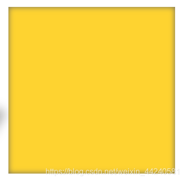
<style>
	.box-shadow10 {
            background-color: rgb(254, 211, 48);
            -moz-box-shadow: inset 0 0 10px #666;
            -webkit-box-shadow: inset 0 0 10px #666;
            box-shadow: inset 0 0 10px #666;
        }
</style>
阴影11
<style>
	.box-shadow11 {
            background-color: rgb(254, 211, 48);
            box-shadow:
                inset -1px 1px 5px 0 rgba(255,255,255,1),
                8px 18px 7px 0 rgba(50, 50, 50, 0.35),
                -8px 10px 3px 0 rgba(50, 50, 50, 0.4);
        }
</style>
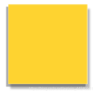
阴影12
<style>
	.box-shadow12 {
            background-color: rgb(254, 211, 48);
            -webkit-box-shadow: 40px 4px 10px 0 rgba(102, 102, 102, 0.8);
            -moz-box-shadow: 40px 4px 10px 0 rgba(102, 102, 102, 0.8);
            box-shadow: 40px 4px 10px 0 rgba(102, 102, 102, 0.8);
        }
</style>
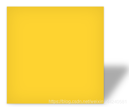
阴影13
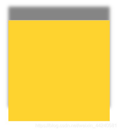
<style>
	.box-shadow13 {
            background-color: rgb(254, 211, 48);
            -webkit-box-shadow: 0 -40px 10px 0 rgba(102, 102, 102, 0.8);
            -moz-box-shadow: 0 -40px 10px 0 rgba(102, 102, 102, 0.8);
            box-shadow: 0 -40px 10px 0 rgba(102, 102, 102, 0.8);
        }
</style>
阴影14
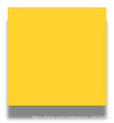
<style>
	.box-shadow14 {
            background-color: rgb(254, 211, 48);
            -webkit-box-shadow: 0 40px 10px 0 rgba(102, 102, 102, 0.8);
            -moz-box-shadow: 0 40px 10px 0 rgba(102, 102, 102, 0.8);
            box-shadow: 0 40px 10px 0 rgba(102, 102, 102, 0.8);
        }
</style>
阴影15
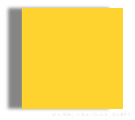
<style>
	.box-shadow15 {
            background-color: rgb(254, 211, 48);
            -webkit-box-shadow: -40px 0 10px 0 rgba(102, 102, 102, 0.8);
            -moz-box-shadow: -40px 0 10px 0 rgba(102, 102, 102, 0.8);
            box-shadow: -40px 0 10px 0 rgba(102, 102, 102, 0.8);
        }
</style>
阴影16
<style>
	.box-shadow16 {
            background-color: rgb(254, 211, 48);
            box-shadow:
                5px 5px 5px 5px rgb(46, 204, 113),
                -5px -5px 5px 5px rgb(52, 152, 219);
        }
</style>
阴影17
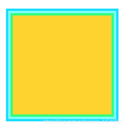
<style>
	.box-shadow17 {
            background-color: rgb(254, 211, 48);
            box-shadow:
                0 0 0 7px rgb(50, 255, 126),
                0 0 0 14px rgb(126, 255, 245),
                0 0 0 21px rgb(24, 220, 255);
        }
</style>
阴影18
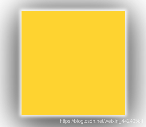
<style>
	.box-shadow18 {
            background-color: rgb(254, 211, 48);
            -webkit-box-shadow: 0 0 10px 5px white, 0 0 80px grey, 0 20px 100px black;
            -mox-box-shadow: 0 0 10px 5px white, 0px 0px 80px gray, 0px 20px 100px black;
            box-shadow: 0 0 10px 5px white, 0 0 80px grey, 0 20px 100px black;
        }
</style>
文字阴影
基本样式
<!DOCTYPE html>
<html lang="en">
<head>
    <meta charset="UTF-8">
    <title>阴影特效</title>
    <style>
        .box {
            position: relative;
            width: 300px;
            height: 300px;
            background-color: rgb(254, 211, 48);
        }
    </style>
</head>
<body>
    <div class="box">
        <h1 class="text-shadow1">Hello</h1>
    </div>
</body>
</html>
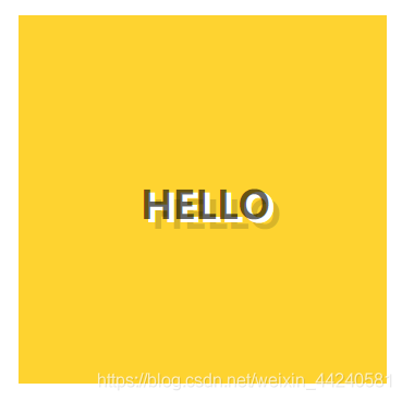
阴影1
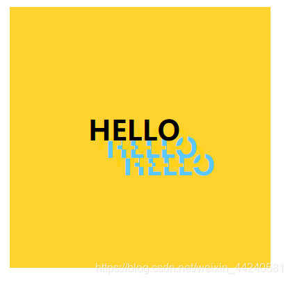
	<style>
	 .text-shadow1 {
            position: absolute;
            top: 33%;
            left: 30%;
            text-transform: uppercase;
            text-shadow: 10px 10px 0 #ffd217, 20px 20px 0 #5ac7ff, 30px 30px 0 #ffd217, 40px 40px 0 #5ac7ff;
        }
	</style>
阴影2

<style>
	.text-shadow2 {
            position: absolute;
            top: 35%;
            left: 25%;
            text-transform: uppercase;
            text-shadow:
                1px 1px #61b4de,
                2px 2px #61b4de,
                3px 3px #61b4de,
                4px 4px #61b4de,
                5px 5px #61b4de,
                6px 6px #91c467,
                7px 7px #91c467,
                8px 8px #91c467,
                9px 9px #91c467,
                10px 10px #91c467,
                11px 11px #f3a14b,
                12px 12px #f3a14b,
                13px 13px #f3a14b,
                14px 14px #f3a14b,
                15px 15px #f3a14b,
                16px 16px #e84c50,
                17px 17px #e84c50,
                18px 18px #e84c50,
                19px 19px #e84c50,
                20px 20px #e84c50,
                21px 21px #4e5965,
                22px 22px #4e5965,
                23px 23px #4e5965,
                24px 24px #4e5965,
                25px 25px #4e5965;
        }
</style>
阴影3

<style>
	.text-shadow3 {
            position: absolute;
            top: 35%;
            left: 25%;
            text-transform: uppercase;
            text-shadow:
                3px 0 0 #d91f26,
                6px 0 0 #e25b0e,
                9px 0 0 #f5dd08,
                12px 0 0 #059444,
                15px 0 0 #0287ce,
                18px 0 0 #044d91,
                21px 0 0 #2a1571;
        }
</style>
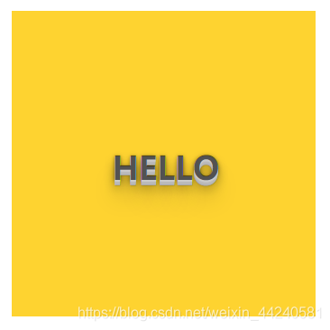
阴影4
	<style>
		.text-shadow4 {
		     position: absolute;
		      top: 36%;
		      left: 33%;
		      text-transform: uppercase;
		      text-shadow:
		          0 -0.2em 0.5em rgb(0, 255, 255),
		          0 0.2em 0.5em rgb(255, 0, 0);
	        }
	</style>
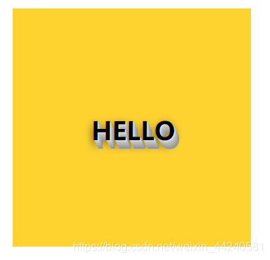
阴影5

<style>
	.text-shadow5 {
            position: absolute;
            top: 37%;
            left: 33%;
            text-transform: uppercase;
            text-shadow: 0 -15px 0 #666;
        }
</style>
阴影6
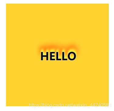
<style>
	.text-shadow6 {
            position: absolute;
            top: 37%;
            left: 33%;
            text-transform: uppercase;
            text-shadow:
                0 0 4px #ccc,
                0 -5px 4px #ff3,
                2px -10px 6px #fd3,
                -2px -15px 11px #f80,
                2px -18px 18px #f20;
        }
</style>
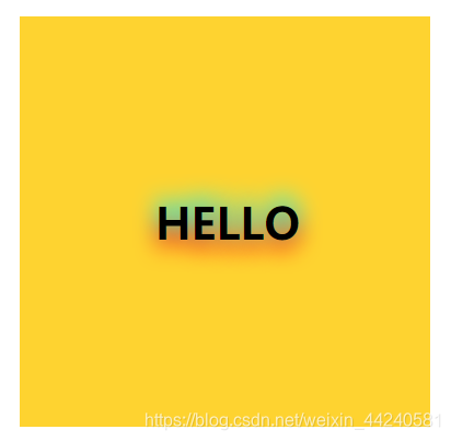
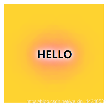
阴影7
<style>
	 .text-shadow7 {
            position: absolute;
            top: 37%;
            left: 33%;
            text-transform: uppercase;
            text-shadow:
                1px 1px 0 #e3e3e3,
                2px 3px 0 #c9c9c9,
                3px 5px 0 #b8b8b8,
                4px 7px 0 #ababab,
                5px 9px 0 #a1a1a1,
                6px 11px 0 #969696,
                0 0 10px rgba(0,0,0,0.15),
                0 4px 10px rgba(0,0,0,0.25),
                0 8px 10px rgba(0,0,0,0.45);
        }
</style>
阴影8
<style>
	.text-shadow8 {
            position: absolute;
            top: 37%;
            left: 33%;
            color: rgba(0,0,0,0.6);
            text-transform: uppercase;
            text-shadow:
                0 1px 0 #ccc,
                0 2px 0 #c9c9c9,
                0 3px 0 #bbb,
                0 4px 0 #b9b9b9,
                0 5px 0 #aaa,
                0 6px 1px rgba(0,0,0,.1),
                0 0 5px rgba(0,0,0,.1),
                0 1px 3px rgba(0,0,0,.3),
                0 3px 5px rgba(0,0,0,.2),
                0 5px 10px rgba(0,0,0,.25),
                0 10px 10px rgba(0,0,0,.2),
                0 20px 20px rgba(0,0,0,.15);
        }
</style>
阴影9
<style>
	.text-shadow9 {
            position: absolute;
            top: 37%;
            left: 33%;
            color: rgba(0,0,0,0.6);
            text-transform: uppercase;
            text-shadow:
                0 3px 0 #b2a98f,
                0 14px 10px rgba(0,0,0,0.15),
                0 24px 2px rgba(0,0,0,0.1),
                0 34px 30px rgba(0,0,0,0.1);
        }
</style>
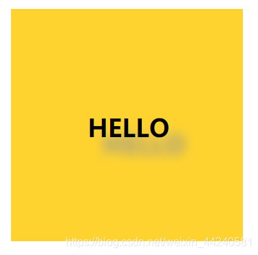
阴影10
<style>
	.text-shadow10 {
            position: absolute;
            top: 37%;
            left: 33%;
            color: rgba(0,0,0,0.6);
            text-transform: uppercase;
            text-shadow:
                4px 3px 0 #fff,
                9px 8px 0 rgba(0,0,0,0.15);
        }
</style>
阴影11
<style>
	.text-shadow11 {
            position: absolute;
            top: 37%;
            left: 33%;
            text-transform: uppercase;
            text-shadow:
                0 0 10px #fff,
                0 0 20px #fff,
                0 0 30px #fff,
                0 0 40px #ff00de,
                0 0 70px #ff00de,
                0 0 80px #ff00de,
                0 0 100px #ff00de,
                0 0 150px #ff00de;
        }
</style>
阴影12
<style>
	.text-shadow12 {
            position: absolute;
            top: 37%;
            left: 33%;
            text-transform: uppercase;
            text-shadow: 20px 21px 14px rgba(150, 150, 150, 1);
        }
</style>
完整代码
码云


 1万+
1万+


 被折叠的 条评论
为什么被折叠?
被折叠的 条评论
为什么被折叠?
 到【灌水乐园】发言


