


一、引入css
<link rel="stylesheet" href="https://cdnjs.cloudflare.com/ajax/libs/animate.css/4.1.1/animate.min.css">二、实现效果
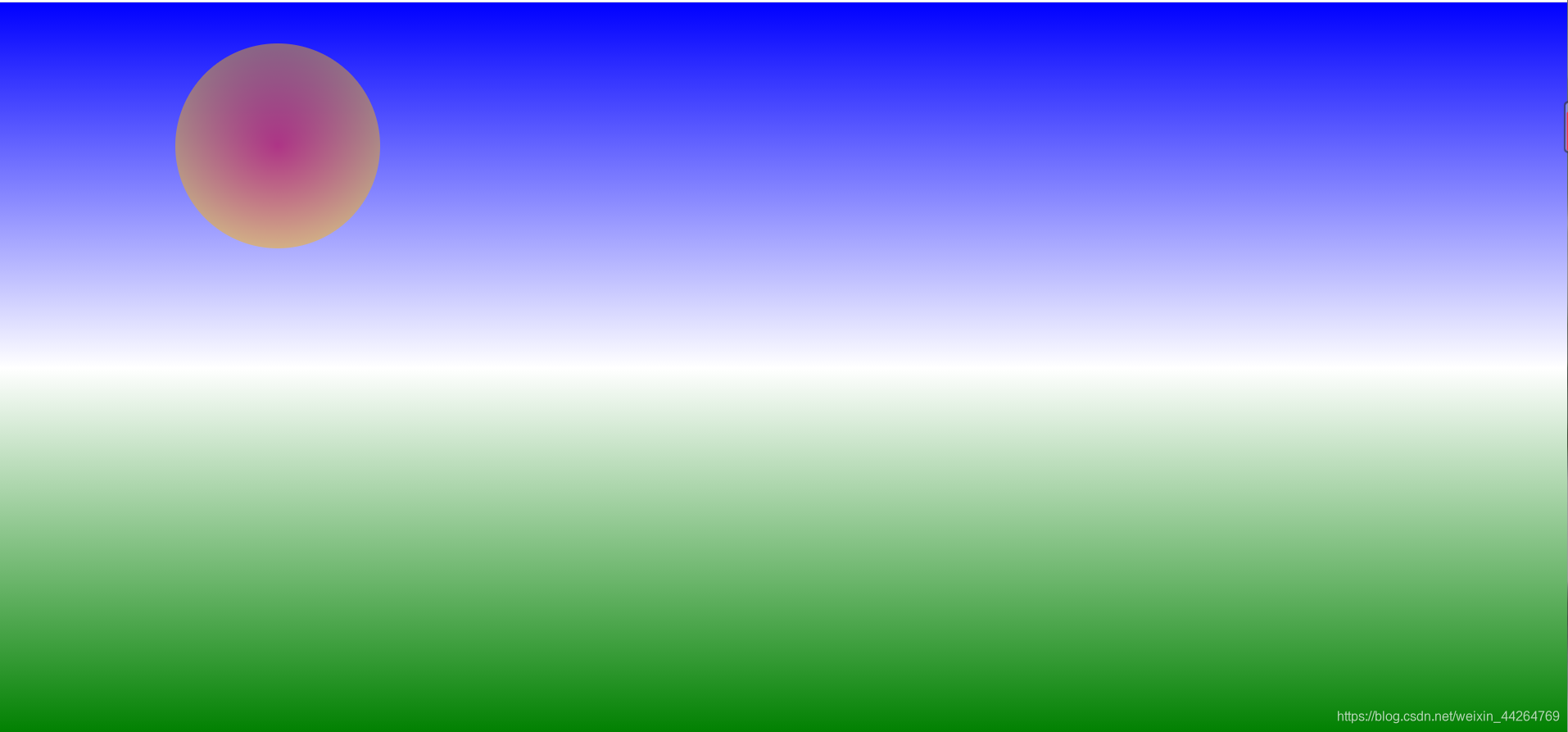
三、具体代码
<style>
    *{
        margin: 0;
        padding: 0;
    }
    html,body{
        width: 100%;
        height: 100%;
        background: -webkit-linear-gradient( blue,white,green);
        position: relative;
        overflow: hidden;
    }
    .box3{
        width: 200px;
        height: 200px;
        border-radius: 50%;
        background: -webkit-radial-gradient(red,yellow);
        position: absolute;
        left: 0;
        right: 0;
        margin: 15px auto 0;
        animation: run 3s infinite;
    }
    @keyframes run{
        0%{
            top: 0;
        }
        30%{
            top:calc(100% - 200px);
            opacity: 0.8;
            left: 50%;
        }
        60%{
            top: 0;
            opacity: 0.5;
            right: 80%;

        }
        100%{
            top:calc(100% - 200px);
            opacity: 0;
        }
    }
</style>
<body>
    <div class = "box3">
        <div class = "circle"></div>
    </div>
</body>
这是一个简单的效果,想了解其他的可以看animate官网!


 扫一扫
扫一扫


 792
792

 被折叠的 条评论
为什么被折叠?
被折叠的 条评论
为什么被折叠?
 到【灌水乐园】发言


