


弹性布局(flex-direction.html)
display:flex 给容器设置弹性布局
1. flex-derection 决定项目的排列方向 flex-direction: row | row-reverse | column | column-reverse;
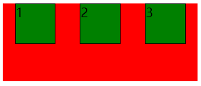
2. flex-wrap 如果一条轴线排不下自动换行 flex-wrap: nowrap | wrap | wrap-reverse;
3. flex-float direction和wrap 合起来一起写 flex-flow: <flex-direction> <flex-wrap>;
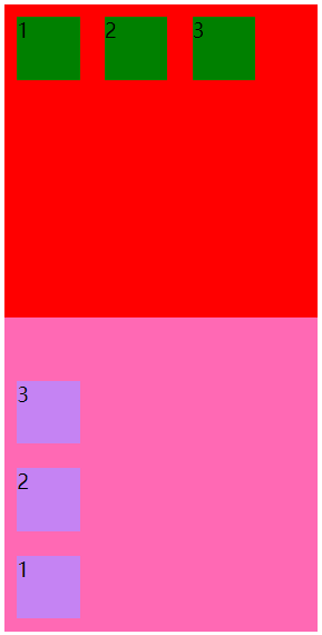
<!DOCTYPE html>
<html lang="en">
<head>
    <meta charset="UTF-8">
    <meta http-equiv="X-UA-Compatible" content="IE=edge">
    <meta name="viewport" content="width=device-width, initial-scale=1.0">
    <title>弹性布局</title>
    <style>
        #box1 {
            width: 250px;
            height: 250px;
            background: red;
            /* 弹性布局,一般做手机端 */
            display: flex;
            flex-direction: row;/* 按照行排列从左到右*/
            /* flex-direction: row-reverse; 按照行从右到左推进 */
        }
        #box1 div {
            width: 50px;
            height: 50px;
            background: green;
            margin: 10px;
        }
        #box2 {
            width: 250px;
            height: 250px;
            background: hotpink;
            display: flex;
            flex-direction: column-reverse;
            /* flex-direction: column; */
        }
        #box2 div{
            width: 50px;
            height: 50px;
            background: rgb(197, 131, 243);
            margin: 10px;
        }
    </style>
</head>
<body>
    <div id="box1">
        <div>1</div>
        <div>2</div>
        <div>3</div>
    </div>
    <div id="box2">
        <div>1</div>
        <div>2</div>
        <div>3</div>
    </div>

</body>
</html>
flex-wrap

<!DOCTYPE html>
<html lang="en">
<head>
    <meta charset="UTF-8">
    <meta http-equiv="X-UA-Compatible" content="IE=edge">
    <meta name="viewport" content="width=device-width, initial-scale=1.0">
    <title>如果一条轴线排不下自动换行</title>
    <style>
        #box1 {
            width: 250px;
            height: 250px;
            background: red;
            display: flex;
            flex-wrap: wrap;
            /*flex-wrap: wrap-reverse;*/
        }
        #box1 div {
            width: 50px;
            height: 50px;
            background: green;
            margin: 10px;
        }
    </style>
</head>
<body>
    <div id="box1">
        <div>1</div>
        <div>2</div>
        <div>3</div>
        <div>4</div>
        <div>5</div>

    </div>

</body>
</html>
flex-float
justify-content
项目在主轴上的对齐方式
- flex-start(默认值):左对齐
- flex-end:右对齐
- center: 居中
- space-between:两端对齐,项目之间的间隔都相等。
- space-around:每个项目两侧的间隔相等。所以,项目之间的间隔比项目与边框的间隔大一倍。 等价于 margin:0 10px;


align-content
align-content属性定义了多根轴线的对齐方式。如果项目只有一根轴线,该属性不起作用。
align-content: flex-start | flex-end | center | space-between | space-around | stretch;
- flex-start:与交叉轴的起点对齐。
- flex-end:与交叉轴的终点对齐。
- center:与交叉轴的中点对齐。
- space-between:与交叉轴两端对齐,轴线之间的间隔平均分布。
- space-around:每根轴线两侧的间隔都相等。所以,轴线之间的间隔比轴线与边框的间隔大一倍。
- stretch(默认值):轴线占满整个交叉轴。


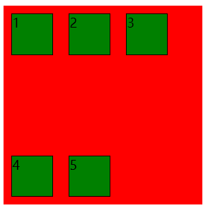
<!DOCTYPE html>
<html lang="en">
<head>
    <meta charset="UTF-8">
    <meta http-equiv="X-UA-Compatible" content="IE=edge">
    <meta name="viewport" content="width=device-width, initial-scale=1.0">
    <title>多根轴线的对齐方式</title>
    <style>
        #box1 {
            width: 250px;
            height: 250px;
            background: red;
            display: flex;
            flex-wrap: wrap;
           /* align-content:flex-start; */
            /* align-content:flex-end; */
            /* align-content: center;  */
            /* align-content: space-between; */
            /* align-content: space-around; */
        }
        #box1 div {
            width: 50px;
            height: 50px;
            background: green;
            border: 1px solid;
            margin: 10px;
        }
    </style>
</head>
<body>
    <div id="box1">
        <div>1</div>
        <div>2</div>
        <div>3</div>
        <div>4</div>
        <div>5</div>
    </div>
</body>
</html>
 两个一起写垂直水平居中


 被折叠的 条评论
为什么被折叠?
被折叠的 条评论
为什么被折叠?
 到【灌水乐园】发言


