


 本文总结了单列布局中的水平居中、垂直居中以及水平垂直全部居中的实现方法,包括使用inline-block、text-align、margin:0 auto、flex布局等技巧,详细介绍了各种方法的优缺点及代码示例。
单列布局
1.水平居中
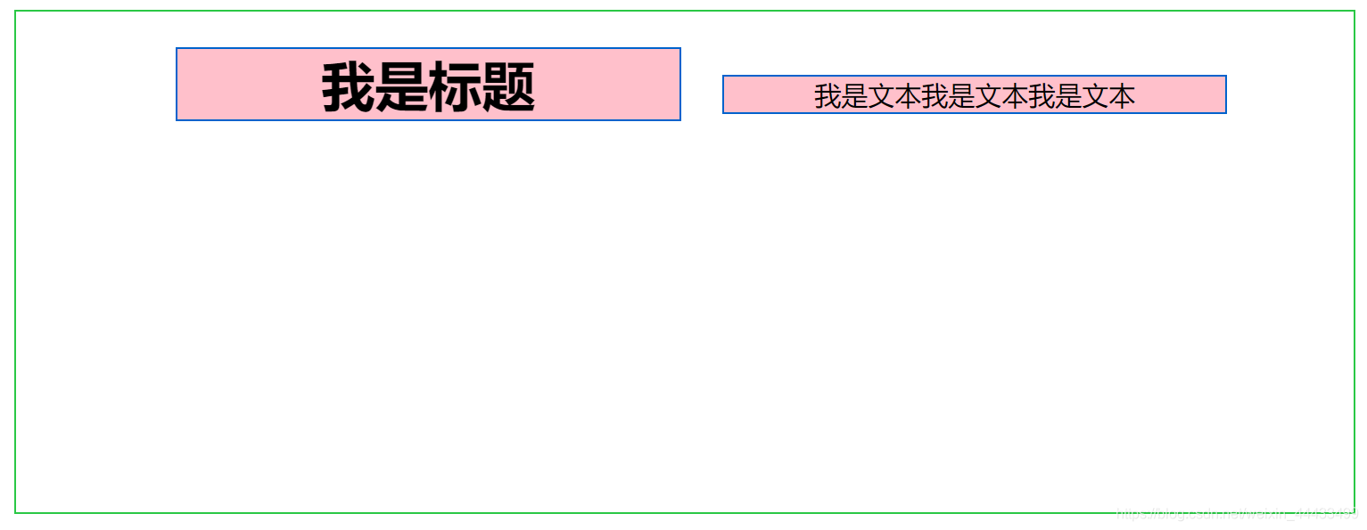
水平居中的页面布局中最为常见的一种布局形式,多出现于标题,以及内容区域的组织形式,下面介绍四种实现水平居中的方法(注:下面各个实例中实现的是child元素的对齐操作,child元素的父容器是parent元素)
使用inline-block 和 text-align实现
.parent{text-align: center;}
.child{display: inline-block;}
优点:兼容性好;
不足:需要同时设置子元素和父元素
例子:
<style>

	.parent {
		height: 300px;
		width: 800px;
		border: solid 1px #2AC845;
		float: right;
		/* text-align: center; */ //设置父元素
	}

	 .children {
	     width:300px;
		 background-color: pink;
		 margin-left: 20px;
		 border: solid 1px #0062CC;
		 /* display: inline-block; */ //设置子元素
	 }

	</style>

放开注释代码效果。
使用margin:0 auto来实现
.child{width:200px;margin:0 auto;}
优点:兼容性好
缺点: 需要指定宽度
代码
.children1 {
/* 		 width: 200px;
		 margin: 0 auto; */ //使用margin:0px auto 实现水平居中
		 height: 200px;
		 background-color: pink;
	 }

放开注释代码效果:

实用flex布局实现
/第一种方法/
.parent{display:flex;justify-content:center;}
/第二种方法/
.parent{display:flex;}
.child{margin:0 auto;}
缺点:兼容性差,如果进行大面积的布局可能会影响效率
 代码
代码
.parent {
		height: 300px;
		width: 800px;
		border: solid 1px #2AC845;
		display: flex;
		justify-content: center;
	}

     .children1 {
 		 width: 500px;
		 height: 200px;
		 background-color: pink;
	 }
flex效果:
2.垂直居中
vertical-align
/第一种方法/
.parent{display:table-cell;vertical-align:middle;height:20px;}
/第二种方法/
.parent{display:inline-block;vertical-align:middle;line-height:20px;}
.parent {
		height: 300px;
		width: 800px;
		border: solid 1px #2AC845;
		display: table-cell; //垂直居中
		justify-content: center;
		vertical-align:middle
	}

     .children1 {
 		 width: 500px;
		 height: 200px;
		 background-color: pink;
		 /* margin: 0 auto; */ //水平居中

	 }
效果图:

.parent {
		height: 300px;
		width: 800px;
		border: solid 1px #2AC845;
		display: inline-block;
		justify-content: center;
		vertical-align:middle;
		line-height: 300px;
	}
效果图:

实用绝对定位
.parent{position:relative;}
.child{positon:absolute;top:50%;transform:translate(0,-50%);}
实用flex实现
.parent{display:flex;align-items:center;}
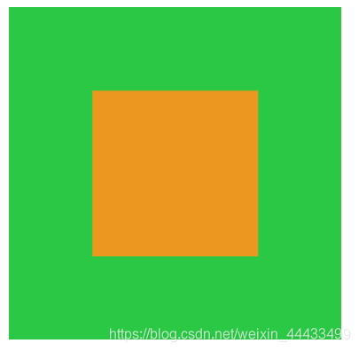
3.水平垂直全部居中
利用vertical-align,text-align,inline-block实现
代码
.parent {
			display: table-cell;
			vertical-align: middle;
			text-align: center;
			width: 200px;
			height: 200px;
			background-color: #2AC845;
		}

		.children1 {
			display: inline-block;
			background-color: #EC971F;
			height: 100px;
			width: 100px;
		}

利用绝对定位实现
代码
	.parent {
			/* 绝对定位实现垂直居中 */
			position: relative;
			width: 200px;
			height: 200px;
			background-color: #2AC845;
		}

		.children1 {
            position: absolute;
			top: 50%;
			left: 50%;
			transform: translate(-50%,-50%);
			background-color: #EC971F;
			height: 100px;
			width: 100px;
		}
利用flex实现垂直居中
.parent {
			/* flex实现垂直居中 */
			display: flex;
			justify-content: center;
			align-items: center;
			width: 200px;
			height: 200px;
			background-color: #2AC845;
		}

		.children1 {
			background-color: #EC971F;
			height: 100px;
			width: 100px;
		}


 扫一扫
扫一扫


 1349
1349

 被折叠的 条评论
为什么被折叠?
被折叠的 条评论
为什么被折叠?
 到【灌水乐园】发言


