


CSS
一、CSS优势
- 内容和表现分离
- 网页结构表现统一,可以实现复用
- 样式多样丰富
- 建议使用独立于HTML的CSS文件
- 利用SEO,容易被搜索引擎收录
二、CSS语法格式
2.1 CSS导入方式
-
内部样式表:可在HTML的head标签内编写CSS代码
<!DOCTYPE html> <html lang="en"> <head> <meta charset="UTF-8"> <title>Title</title> <!--规范:<style>可以编写CSS的代码,每一个声明最好使用;结尾 语法: 选择器{ 声明1; 声明2; } --> <style> h1{ color: blue; } </style> </head> <body> <h1> 我是标题 </h1> </body> </html> -
外部样式表:规范是HTML和CSS分离,在head中链接
<!-- 链接式--> <link rel="stylesheet" href="css/style.css">、 <!-- 导入式css2.1使用--> <style> @import url("css/style.css") </style> -
行内样式:在标签元素中编写一个style属性,编写样式即可
<h1 style="color:blue">
    我是标题
</h1>
2.2 优先级
- 就近原则
三、选择器
- 作用:选择页面上某一个或者某一类元素
3.1 基本选择器
- 标签选择器
h1{
	/*样式属性*/
}
- 类选择器
/*类选择器的模式  .class的名称{ }
	可以多个标签归类,是同一个class可以复用

*/
- id选择器
/* #id名称{

	}
		id必须全局唯一
*/
- 优先级:id选择器 > class选择器 > 标签选择器
3.2 层次选择器
- 后代选择器:在某个元素后面的所有
body p{
    background: red;
}
- 子选择器:只有一代
body>p{
    background: green;
}
- 相邻弟选择器:只有一个,向下相邻
.class + p{
    background:blue;
}
- 通用选择器:当前选中的元素的向下的所有兄弟元素(不包括自己)
.class~p{
		background-color: green;
	}
3.3 结构伪类选择器
- 伪类
<!DOCTYPE html>
<html>
	<head>
		<meta charset="utf-8">
		<title>结构伪类选择器</title>
		<!-- 避免使用class,id选择器 -->
		<style>
		/* ul的第一个子元素 */
		ul li:first-child{
			color: blue;
		}
		/* ul的最后一个子元素 */
		ul li:last-child{
			color: blue;
		}
		/* 选中p1:定位到父元素p,选择当前的第一个元素 按顺序
		即选中当前该元素的父级元素,选中父级元素的第一个
		并且是当前元素才生效
		父元素:****{
			属性赋值
		}
		*/
		p:nth-child(1){
			color: red;
		}

		/* 选中父元素下的p元素的第二个 按类型*/
		p:nth-of-type(2){
			color: yellow;
		}
		a:hover{
			background-color: #FF0000;
		}
		</style>
	</head>
	<body>
		<a href="">点击跳转</a>
		<h1>h1</h1>
		<p>p1</p>
		<p>p2</p>
		<p>p3</p>
		<ul>
			<li>li1</li>
			<li>li2</li>
			<li>li3</li>
		</ul>
	</body>
</html>
3.4 属性选择器
- 结合id+class选择器
- = 绝对等于
- *= 包含等于
- ^= 以此开头等于
- $= 以此结尾等于
<!DOCTYPE html>
<html>
	<head>
		<meta charset="utf-8">
		<title>属性选择器</title>
	<style type="text/css">
		.demo a{
			float: left;
			display: block;
			height: 3.125rem;
			width: 3.125rem;
			border-radius: 0.625rem;
			background-color: #0000FF;
			text-align: center;
			color: #000000;
			text-decoration: none;
			margin-right: 0.3125rem;
			font: bold 1.25rem/3.125rem arial;
		}

		/* 存在ID属性的元素	a[]{ } */
		/* a[id]{
			属性;
		}
		 */
		a[id="first"]{
			background-color: #FF0000;
		}

		/* class中有links的元素 */
		a[class*=links]{
			background-color: #FFFF00;
		}

		/* 选中href中以http开头的元素 */
		a[href^=http]{
			background-color: aqua;

		}
		/* 选中href中以pdf开头的元素 */
		a[href$=pdf]{
			background-color: brown;
		}
	</style>

	</head>


	<body>
		<p class="demo">
			<a href="" id="first">1</a>
			<a href="" class="links items second">2</a>
			<a href="http://www.baidu.com">3</a>
			<a href="123.pdf">4</a>
			<a href="">5</a>
			<a href="">6</a>
			<a href="">7</a>
			<a href="">8</a>
			<a href="">9</a>
			<a href="" class="links items last">10</a>
		</p>
	</body>
</html>
效果图:

四、美化网页
4.1 span标签
- 突出显示重点信息
<!DOCTYPE html>
<html>
	<head>
		<meta charset="utf-8">
		<title></title>
	<style>
		#first{
			font-size: 50px;
		}
	</style>
	</head>
	<body>
		欢迎学习<span id="first">java</span>
	</body>
</html>
4.2 字体样式
<!DOCTYPE html>
<html>
	<head>
		<meta charset="utf-8">
		<title></title>

		<style type="text/css">
			body{
				/* 字体风格 */
				font-family: 楷体;
				/* 字体颜色 */
				color: maroon;
			}
			h1{
				/* 字体大小 */
				font-size: 3.125rem;
			}
			.p1{
				/* 粗体显示 */
				font-weight: bold;
			}
			.p2{
				/* 斜体 粗细 大小 风格 */
				font: oblique bolder 20px "宋体";
			}
		</style>
	</head>
	<body>
		<h1>人工智能</h1>
		<p class="p1">人工智能是计算机科学的一个分支,它企图了解智能的实质,并生产出一种新的能以人类智能相似的方式做出反应的智能机器,
		该领域的研究包括机器人、语言识别、图像识别、自然语言处理和专家系统等。</p>
		<p class="p2">人工智能从诞生以来,理论和技术日益成熟,应用领域也不断扩大,可以设想,未来人工智能带来的科技产品,将会是人类智慧的“容器”。</p>
		<p class="p3">人工智能可以对人的意识、思维的信息过程的模拟。人工智能不是人的智能,但能像人那样思考、也可能超过人的智能。</p>

		<p></p>
	</body>
</html>
4.3 文本样式
- 颜色、文本对齐方式、首行缩进、行高、装饰
<!DOCTYPE html>
<html>
	<head>
		<meta charset="utf-8">
		<title></title>
		<style>

		h1{
			/* 颜色
				RGB 0~F  红绿蓝
				RGBA  A:0~1  红绿蓝透明度
			 */
			color: rgba(0,255,0,0.7);
			/* text-align  排版
			行高和块的高度一致就可以上下居中
			*/
			text-align: center;
		}
		p{
			/* 首行缩进 */
			text-indent: 2em;
		}
		.p1{
			/* 下划线 */
			text-decoration: underline;
		}
		.p2{
			/* 删除线 */
			text-decoration: line-through;
		}
		.p3{
			/* 上划线 */
			text-decoration: overline;
		}

		</style>
	</head>
	<body>
		<h1>人工智能</h1>
		<p class="p1">人工智能是计算机科学的一个分支,它企图了解智能的实质,并生产出一种新的能以人类智能相似的方式做出反应的智能机器,该领域的研究包括机器人、语言识别、图像识别、自然语言处理和专家系统等。</p>
		<p class="p2">人工智能从诞生以来,理论和技术日益成熟,应用领域也不断扩大,可以设想,未来人工智能带来的科技产品,将会是人类智慧的“容器”。</p>
		<p class="p3">人工智能可以对人的意识、思维的信息过程的模拟。人工智能不是人的智能,但能像人那样思考、也可能超过人的智能。</p>
	</body>
</html>
效果图:

4.4 超链接伪类
- a:hover
<!DOCTYPE html>
<html>
	<head>
		<meta charset="utf-8">
		<title>超链接伪类</title>
		<style>
		a{
			/* 默认颜色 */
			text-decoration: none;
			color: #000000;
		}
		/* 鼠标悬浮颜色 */
		a:hover{
			color: #FF0000;
		}
		/* 鼠标选中未释放颜色 */
		a:active{
			color: green;
			font-size: 30px;
		}
		/* 访问过的颜色 */
		a:visited{
			color: black;
		}
		#name{
		/* text-shadow:阴影颜色 水平偏移 垂直偏移 阴影半径 */
			text-shadow:10px 10px #FF0000;
		}
		</style>
	</head>

	<body>
		<a href="">
	<img src="../img/图书馆.jpg" alt="" height="200px" >
		</a>
		<p id="name">
			<a href="#">图书馆</a>
		</p>
		<p>
			<a href="">XPU</a>
		</p>
	</body>
</html>
4.5 文本阴影
/* text-shadow:阴影颜色 水平偏移 垂直偏移 阴影半径*/
#id{
    text-shadow:...
}
4.6 列表
ul li{
    /*
    list-style
    none 无圆点
    circle 空心圆
    decimal 有序列表
    square 正方形

    */
}
4.7 背景
- 背景颜色
- 背景图片
.div1{
			/* 水平平铺 */
			background-repeat: repeat-x;
		}
		.div2{
			/* 垂直平铺 */
			background-repeat: repeat-y;
		}
		.div3{
			/* 不平铺 */
			background-repeat:no-repeat;
		}
4.8 渐变
- www.grabint.com
background-color: #4158D0;
background-image: linear-gradient(243deg, #4158D0 0%, #C850C0 46%, #FFCC70 100%);
4.9 盒子模型及边框
-
margin:外边距,居中元素—>margin: 0 auto;
-
padding:内边距
-
border:边框
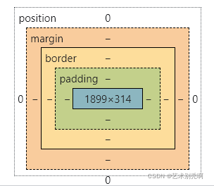
-
盒子的计算方式:你这个元素到底多大?
- margin+border+padding+内容宽度
<!DOCTYPE html>
<html>
	<head>
		<meta charset="utf-8">
		<title>登录</title>

	<style>
	body{
		/* body存在默认外边距,置零 */
		margin: 0px;
	}
	h2{
		color: white;
		font-size: 16px;
		background-color: #00FFFF;
		line-height: 30px;
	}
	#app{
		width: 300px;
		border: 1px solid red;
	}
	form{
		background-color: #00FFFF;
	}
		div:nth-of-type(1) input{
			border: 1px solid black;
		}

	</style>
	</head>
	<body>
		<div id="app">
			<h2>登录</h2>
			<form action="#" method="">
				<div>
					<span>
						姓名:
					</span>
					<input type="text">
				</div>
				<div>
					<span>
						密码:
					</span>
					<input type="text">
				</div>
				<div>
					<span>
						邮箱:
					</span>
					<input type="text">
				</div>
			</form>
		</div>
	</body>
</html>
4.10 圆角边框及阴影
- 圆角边框
<!DOCTYPE html>
<html>
	<head>
		<meta charset="utf-8">
		<title>圆角边框</title>
		<style>
		div{
			width: 500px;
			height: 500px;
			border: 10px solid red;
			/*
			border-radius:圆角边框
			单个属性,默认四个角
			两个属性,先主对角、后副对角
			四个属性,左上开始、顺时针
			*/
			border-radius: 250px 250px ;
		}
		img{
			/* 也可以使用百分比更方便 */
			border-radius: 50%;
		}
		</style>
	</head>
	<body>
		<div>
		</div>
		<img src="../img/111.jpg" alt="">
	</body>
</html>
- 阴影
<!DOCTYPE html>
<html>
	<head>
		<meta charset="utf-8">
		<title>阴影</title>
	<style>
	img{
		/* 将img内联元素设置为块元素,使用margin0auto居中 */
		display: block;
		/* 居中前提:位于有限固定大小的块元素中 */
		margin: 0 auto;
		border: 50px;
		/* 圆形处理 */
		border-radius: 50%;
		/* 盒子阴影 */
		box-shadow:10px 10px 200px yellow;
	}
	</style>
	</head>

	<body>
			<img src="../img/111.jpg" alt=""  >
	</body>
</html>

五、浮动
5.1 display
- 块级元素:独占一行
- h、p、div、列表…
- 行内元素:不独占一行
- span、a、img…
行内元素可以被包含在块级元素中,反之不可以
- 是实现行内元素排列的一种方式,但是大多数时候使用float
<!DOCTYPE html>
<html>
	<head>
		<meta charset="utf-8">
		<title></title>
		<style>
		/*
		 block 块元素
		 inline 行内元素
		 inline-block 保持块元素的本身特性,但可在一行
		 none
		 */
		div{
			width: 100px;
			height: 100px;
			border: 1px solid red;
			display: inline;
		}
		span{
			width: 100px;
			height: 100px;
			border: 1px solid red;
			display: inline-block;
		}
		</style>
	</head>
	<body>
		<div>
			div块元素
		</div>
		<span>
			span行内元素
		</span>
	</body>
</html>
5.2 float
<!--float:左右浮动-->
5.3父级边框塌陷
- clear属性
/*
	clear: left; 左侧不允许有浮动元素
	clear: right; 右侧不允许有浮动元素
	clear: both; 两侧不允许有浮动元素
	clear: none;
*/
解决方案
- 增加父级元素高度 #father{ }
#father{
    /*增加高度*/
}
- 增加一个空的div,清除其浮动
<html>
	<head>
		<style>
		.clear{
			clear: both;
			margin: 0;
			padding: 0;
		}
		</style>
	</head>
<body>
		<div>
			<img src="../img/111.jpg" alt="">
		</div>
		<div class="clear"></div>
</body>
</html>
- 在父级元素中增加overflow属性
#father{
    /*overflow*/
    /*
		overflow: hidden;修剪隐藏
		overflow: scroll;滚动条
	*/
}
- 在父类添加一个伪类(:after)
#father:after{
    content:'';
    display:block;
    clear:both;
}
小结:
- 浮动元素后面增加空div,简单但是尽量避免增加空div
- 设计父级元素的高度,简单但元素假设设定了固有高度就会被限制
- overflow,简单但很丑
- 父类添加伪类,推荐使用
5.4 对比
-
display
- 方向不可以控制
-
float
- 浮动起来会脱离标准文档流,要解决父级边框塌陷问题
六、定位
6.1 相对定位
- 相对定位仍然在标准文档流中,原来的位置被保留
<!DOCTYPE html>
<html>
	<head>
		<meta charset="utf-8">
		<title></title>

		<style>
		/*
		 position: relative; 相对定位
		相对于自己原来的位置进行制定的偏移
		 top、bottom、left、right
		 */
		div{
			margin: 10px;
			padding: 5px;
			font-size: 12px;
			line-height: 25px;
		}
		#father{

			border: 1px solid #666;
		}
		#first{
			background-color: #00FFFF;
			border: 1px dashed #b27530;
			/* 相对定位 */
			position: relative;
			top: -20px;
			left: 20px;
		}
		#second{
			background-color: #00FF99;
			border: 1px dashed #255066;

		}
		#third{
			background-color: #00FF66;
			border: 1px dashed #1c6615;
		}
		</style>
	</head>
	<body>
		<div id="father">
			<div id="first">
				第一个盒子
			</div>
			<div id="second">
				第二个盒子
			</div>
			<div id="third">
				第三个盒子
			</div>
		</div>
	</body>
</html>
练习
如图,使用div和a标签采用相对定位设计
[外链图片转存失败,源站可能有防盗链机制,建议将图片保存下来直接上传(img-j8YlBNji-1644393184790)(C:\Users\Administrator\AppData\Roaming\Typora\typora-user-images\image-20220209115306087.png)]
<!DOCTYPE html>
<html>
	<head>
		<meta charset="utf-8">
		<title></title>
		<style>
		a{
			display: block;
			text-decoration: none;
			background: #FF24cf;
			line-height: 200px;
			text-align: center;
			color: white;
			display: block;
		}
		a:hover{
			background: #00FFFF;
		}
		#father{
			border: 1px solid red;
			width:600px;
			height: 600px;
		}
		#first{
			width: 200px;
			height: 200px;
		}
		#second{
			width: 200px;
			height: 200px;
			position: relative;
			top: -200px;
			right: -400px;
		}
		#third{
			width: 200px;
			height: 200px;
		}
		#fourth{
			width: 200px;
			height: 200px;
			position: relative;
			top:-200px;
			right: -400px;
		}
		#fiveth{
			width: 200px;
			height: 200px;
			position: relative;
			top:-600px;
			right: -200px;
		}
		</style>
	</head>
	<body>
		<div id="father" >
				<a href="" id="first">链接1</a>
				<a href="" id="second">链接2</a>
				<a href="" id="third" >链接3</a>
				<a href="" id="fourth">链接4</a>
				<a href="" id="fiveth">链接5</a>
		</div>
	</body>
</html>
6.2 绝对定位
- 定位:基于xxx定位,上下左右
- 父级元素没有定位的前提下,相对于浏览器定位
- 父级元素有定位的前提下,相对于父级元素定位
- 在父级元素范围内移动
- 相对于父级或者浏览器的位置进行指定的偏移,绝对定位后,不在标准文档流中,原来的位置不保留
position:absolute;
6.3 固定定位fixed
position:fixed;
例:返回顶部属于固定定位
6.4 z-index
-
图层,层级
-
z-index:默认是0(最下层),最高无上限
-
透明度:opacity


 605
605


 被折叠的 条评论
为什么被折叠?
被折叠的 条评论
为什么被折叠?
 到【灌水乐园】发言


