


为了定义应用程序的布局,可以使用派生自Panel基类的类。布局容器要完成两个主要任务:测量和排列。在测量时,容器要求其子控件有合适的大小。因为控件的整体大小不一定合适,所以容器需要确定和排列其子控件的大小和位置。
StackPanel栈式面板
Window可以只包含一个元素,作为其内容。如果要在其中包含多个元素,就可以将StackPanel用作Window的一个子元素,并在StackPanel的内容中添加元素。StackPanel是一个简单的容器控件,只能逐个地显示元素。StackPanel的方向可以是水平或垂直。当移除一个元素后,后面的元素会自动向前填充空缺。ToolBarPanel类派生自StackPanel。
特点:每个元素各占一行或一列
适用场合:
同类元素需要紧凑排列(如制作菜单和列表)。
移除其中的元素后能够自动补缺的布局或动画
<Window x:Class="MeDemo.Window2"
xmlns="http://schemas.microsoft.com/winfx/2006/xaml/presentation"
xmlns:x="http://schemas.microsoft.com/winfx/2006/xaml"
Title="窗口2" Height="500" Width="700">
<StackPanel Orientation="Vertical">
<Label>Lable</Label>
<TextBox>TextBox</TextBox>
<CheckBox>CheckBox</CheckBox>
<CheckBox>CheckBox</CheckBox>
<ListBox>
<ListBoxItem Content="ListBoxItem One"/>
<ListBoxItem Content="ListBoxItem Two"/>
</ListBox>
<Button>Button</Button>
</StackPanel>
</Window>
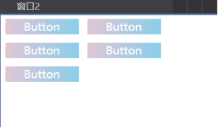
如图所示:可以看到StackPanel垂直显示的子控件

WrapPanel:自动折行面板
WrapPanel将子元素自左向右逐个排列,若一个水平行中放不下,就排在下一行。面板的方向可以是水平或垂直,类似于Html中的流式布局
Window x:Class="MeDemo.Window2"
xmlns="http://schemas.microsoft.com/winfx/2006/xaml/presentation"
xmlns:x="http://schemas.microsoft.com/winfx/2006/xaml"
Title="窗口2" Height="300" Width="300">
<WrapPanel>
<Button Width="100" Margin="5" Content="Button"/>
<Button Width="100" Margin="5" Content="Button"/>
<Button Width="100" Margin="5" Content="Button"/>
<Button Width="100" Margin="5" Content="Button"/>
<Button Width="100" Margin="5" Content="Button"/>
</WrapPanel>
</Window>
如图所示:
Canvas:画布
Canvas是一个允许显式指定控件位置的面板。它定义了相关的Left、Right、Top和Bottom属性,这些属性可以由子元素在面板中定位时使用,内部元素可以使用以像素为单位的绝对坐标进行定位,类似于Windows Form的布局方式。
Window x:Class="MeDemo.Window2"
xmlns="http://schemas.microsoft.com/winfx/2006/xaml/presentation"
xmlns:x="http://schemas.microsoft.com/winfx/2006/xaml"
Title="窗口2" Height="300" Width="300">
<Canvas Background="White">
<Label Canvas.Top="30" Canvas.Left="20" Content="Enter here:"/>
<TextBox Canvas.Top="30" Canvas.Left="120" Width="100"/>
<Button Canvas.Top="70" Canvas.Left="130" Content="Click Me!" Padding="5"/>
</Canvas>
</Window>
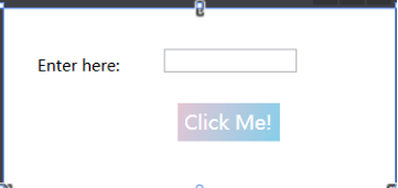
如图所示:显示了Canvas面板的结果,其中定位了子元素Lable、TextBox和Button
注意:Canvas内的子控件不能使用两个以上的Canvas附加属性,如果同时设 置Canvas.Left和Canvas.Right
DockPanel:泊靠式面板
DockPanel非常类似于Windows窗体的停靠功能。DockPanel可以指定排列子控件的区域。DockPanel定义了相关的Dock属性,可以在控件的子控件中将它设置为Left、Right、Top和Bottom。
适用场合:填充整个剩余空间
<Window x:Class="MeDemo.Window2"
xmlns="http://schemas.microsoft.com/winfx/2006/xaml/presentation"
xmlns:x="http://schemas.microsoft.com/winfx/2006/xaml"
Title="窗口2" Height="300" Width="300">
<DockPanel>
<Border Height="25" Background="AliceBlue" DockPanel.Dock="Top">
<TextBlock Text="Menu"/>
</Border>
<Border Height="30" Background="LightSteelBlue" DockPanel.Dock="Bottom">
<TextBlock Text="Status"/>
</Border>
<Border Height="80" Background="Azure" DockPanel.Dock="Left">
<TextBlock Text="Left Side"/>
</Border>
<Border Background="White">
<TextBlock Text="Remaining Part"/>
</Border>
</DockPanel>
</Window>
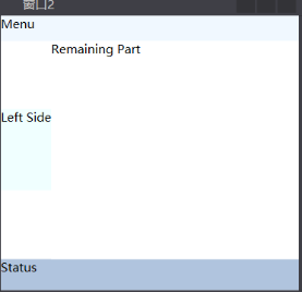
如图所示:
Grid:网格
使用Grid,可以在行和列中排列控件。对于每一列,可以指定一个ColumnDefinition;对于每一行,可以指定一个RowDefinition。下面的示例显示两列和三行。在每一行和每一列中,都可以指定宽度和高度。ColumnDefinition有一个Width依赖属性,RowDefinition有一个Height依赖属性。可以以像素、厘米、英寸或点为单位定义高度和宽度,或者把他们设置为Auto,根据内容来确定其大小。Grid还允许根据具体情况指定大小,即根据可用的空间以及与其它行和列的相对位置,计算行和列的的相对,近似Heml中的table。
特点:(1)可以定义任何数量的行和列,非常灵活。
- 行的高度和列的宽度可以使用绝对值、相对比例或自动调整的方式进行精确设定,并可以设置最大和最小值。
- 内部元素可以设置自己所在的行和列,还可以设置自己纵向跨几行,横向跨几列。
- 可以设置Children元素的对齐方向。
使用场合:
- UI布局的大框架设计
- 大量UI元素需要成行或成列对齐的情况
- UI尺寸改变的时候,元素需要保留固有的宽度和高度比例
下面的Grid布局包含了几个Label和TextBox控件,因为这些控件的父控件是Grid,所以可以设置相关的Column、ColumnSpan、Row和RowSpan属性。
Window x:Class="MeDemo.Window2"
xmlns="http://schemas.microsoft.com/winfx/2006/xaml/presentation"
xmlns:x="http://schemas.microsoft.com/winfx/2006/xaml"
Title="窗口2" Height="500" Width="700">
<Grid ShowGridLines="True">
<Grid.ColumnDefinitions>
<ColumnDefinition/>
<ColumnDefinition/>
</Grid.ColumnDefinitions>
<Grid.RowDefinitions>
<RowDefinition/>
<RowDefinition/>
<RowDefinition/>
</Grid.RowDefinitions>
<Label Grid.Column="0" Grid.Row="1" VerticalAlignment="Center" Content="Firstname:" Margin="10"/>
<TextBox Grid.Column="1" Grid.Row="1" Width="100" Height="30" />
<Label Grid.Column="0" Grid.Row="2" VerticalAlignment="Center" Content="LastName:" Margin="10"/>
<TextBox Grid.Column="1" Grid.Row="2" Width="100" Height="30" />
</Grid>
如图所示:


 4327
4327


 被折叠的 条评论
为什么被折叠?
被折叠的 条评论
为什么被折叠?
 到【灌水乐园】发言


