


1.transform方式实现轮播图
1.1 实现效果

1.2 实现原理
- 一个包含轮播内容的容器,超出容器部分隐藏
- 容器内多个子元素,flex布局
- 子元素在固定时间内移动固定距离
1.3 代码示例
<!DOCTYPE html>
<html lang="en">

<head>
    <meta charset="UTF-8">
    <meta http-equiv="X-UA-Compatible" content="IE=edge">
    <meta name="viewport" content="width=device-width, initial-scale=1.0">
    <title>轮播图</title>
    <style>
        li {
            list-style: none;
        }

        .swiper {
            width: 400px;
            height: 400px;
            display: flex;
            border: 1px solid #f98;
            margin: 10vh auto;
            padding-left: 0;
            overflow: hidden;
        }
        .swiper-switch-item{
            display: inline-block;
            width: 40px;
            height: 40px;
            background: rgba(0,0,0,0.3);
            font-size: 32px;
            color: yellow;
            text-align: center;
            line-height: 40px;
            cursor: pointer;
        }

        .swiper-item-img {
            display: inline-block;
            width: 400px;
            height: 400px;
            object-fit: cover;
        }
    </style>
</head>

<body>
    <ul class="swiper">
        <li class="swiper-item">
            <img class="swiper-item-img" src="./assets/冥想.jpg" alt="">
        </li>
        <li class="swiper-item">
            <img class="swiper-item-img" src="./assets/拍摄.jpeg" alt="">
        </li>
        <li class="swiper-item">
            <img class="swiper-item-img" src="./assets/骗你是小狗.jpeg" alt="">
        </li>
        <li class="swiper-item">
            <img class="swiper-item-img" src="./assets/earthPic.jpeg" alt="">
        </li>
        <li class="swiper-item">
            <img class="swiper-item-img" src="./assets/moon.jpeg" alt="">
        </li>
    </ul>

    <script>
        window.onload = initSwiper();
        let i = 1;
        var timer;
        // 启动轮播图
        function initSwiper() {
            timer = setInterval(() => {
                move();
                i++;
                if(i>4){
                    clearInterval(timer);
                }
            }, 2000)
        }
        // 图片移动方式
        function move() {
            const allSwiper = document.getElementsByClassName('swiper-item')
            const newArr = Array.from(allSwiper)
            newArr.forEach(element => {
                let moveDistance = i * 400
                console.log(moveDistance,"移动距离")
                element.style = `transform:translateX(-${moveDistance}px);transition:1s linear;`
            });
        }
    </script>
</body>

</html>
2.scrollLeft实现轮播图
2.1 实现效果

2.1 实现原理
- 包含轮播内容的容器
- 超出容器部分scroll滚动
- 容器在固定时间内修改scroll值
- 若想实现循环播放的效果,可以将包含轮播内容的容器复制双份,第二份只包含轮播的第一个内容即可
- 若是弹幕类型,一页显示三个这种进行滚动,那么第二份就要至少包含一页内容的个数,1不是固定值,只是因为在该实例中,恰好一张图片就是一个页面内容
- 当scroll距离超出第一个容器的scrollWidth时,令scroll值归0
- 隐藏滚动条
2.3 代码示例
<!DOCTYPE html>
<html lang="en">

<head>
    <meta charset="UTF-8">
    <meta http-equiv="X-UA-Compatible" content="IE=edge">
    <meta name="viewport" content="width=device-width, initial-scale=1.0">
    <title>轮播图</title>
    <style>
        li {
            list-style: none;
        }
        .container{
            width: 400px;
            height: 400px;
            display: flex;
            border: 1px solid #f98;
            padding-left: 0;
            overflow: scroll;
            scrollbar-width: none; /* Firefox */
            -ms-overflow-style: none; /* IE 10+ */

        }
        .container::-webkit-scrollbar {
                display: none; /* Chrome Safari */
        }

        .swiper{
            padding-left: 0;
            margin: 0;
            display: flex;
        }
        .swiper-switch-item{
            display: inline-block;
            width: 40px;
            height: 40px;
            background: rgba(0,0,0,0.3);
            font-size: 32px;
            color: yellow;
            text-align: center;
            line-height: 40px;
            cursor: pointer;
        }

        .swiper-item-img {
            display: inline-block;
            width: 400px;
            height: 400px;
            object-fit: cover;
        }
    </style>
</head>

<body>
    <div class="container">
        <ul class="swiper">
            <li class="swiper-item">
                <img class="swiper-item-img" src="./assets/冥想.jpg" alt="">
            </li>
            <li class="swiper-item">
                <img class="swiper-item-img" src="./assets/拍摄.jpeg" alt="">
            </li>
            <li class="swiper-item">
                <img class="swiper-item-img" src="./assets/骗你是小狗.jpeg" alt="">
            </li>
            <li class="swiper-item">
                <img class="swiper-item-img" src="./assets/earthPic.jpeg" alt="">
            </li>
            <li class="swiper-item">
                <img class="swiper-item-img" src="./assets/moon.jpeg" alt="">
            </li>
        </ul>
        <ul class="swiper">
            <li class="swiper-item">
                <img class="swiper-item-img" src="./assets/冥想.jpg" alt="">
            </li>
        </ul>
    </div>


    <script>
        window.onload = initSwiper();
        // 启动轮播图
        function initSwiper() {
            setInterval(() => {
                move();
            }, 10)
        }
        // 图片移动方式
        function move() {
            const container = document.getElementsByClassName('container')[0]
            const firstSwiper = document.getElementsByClassName('swiper')[0]
            if(container.scrollLeft === firstSwiper.scrollWidth){
                container.scrollLeft = 0
            }else{
                container.scrollLeft += 10;
            }
        }
    </script>
</body>

</html>
3.垂直弹幕
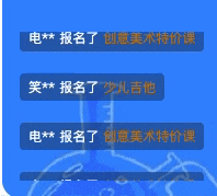
3.1 实现效果
- 循环滚动十条固定数据,无缝衔接
3.2 实现原理
- 包含轮播内容的容器
- 超出容器部分scroll滚动
- 容器在固定时间内修改scroll值
- 若想实现循环播放的效果,可以将包含轮播内容的容器复制双份,第二份只包含轮播的第一个内容即可
- 若是弹幕类型,一页显示三个这种进行滚动,那么第二份就要至少包含一页内容的个数,1不是固定值,只是因为在该实例中,恰好一张图片就是一个页面内容
- 当scroll距离超出第一个容器的scrollWidth时,令scroll值归0
- 隐藏滚动条
- 若想要从空白屏幕逐渐出现弹幕,可以在上面加一个block,定义显示内容的高度,再次scrollTop时,不想从空白开始,就从定义高度开始即可
3.3 代码示例
<template>
  <div class="tbtcContainer">
    <div class="tbtcContainer-scroll">
      <div class="tbtcContainer-scroll-positionBlock"/>
      <ul class="tbtcContainer-scroll-list">
        <BulletScreenItem
          v-for="(item,index) in bulletScreenData"
          :key="index"
          :name="item.name"
          :courses-name="item.coursesName"
        />
      </ul>
      <ul class="tbtcContainer-scroll-list">
        <BulletScreenItem
          v-for="(item,index) in bulletScreenData.slice(0,4)"
          :key="index"
          :name="item.name"
          :courses-name="item.coursesName"
        />
      </ul>
    </div>
    <div class="tbtcContainer-overlay"></div>
  </div>
</template>
<style scoped lang="less">
.tbtcContainer {
  position: absolute;
  left: 16px;
  top: 230px;

  &-scroll {
    height: 136px;
    overflow: scroll;
    scrollbar-width: none;
    -ms-overflow-style: none;

    &-positionBlock {
      height: 136px;
    }

  }

  &-scroll::-webkit-scrollbar {
    display: none;
  }

  &-overlay {
    position: absolute;
    top: 0;
    left: 0;
    width: 100%;
    height: 136px;
  }
}
</style>
<script>
import BulletScreenItem from "@/components/common/BulletScreen/BulletScreenItem";

export default {
  components: {
    BulletScreenItem,
  },
  data() {
    return {
      btocInterval: null,
    }
  },
  props: {
    bulletScreenData: {
      type: Array
    }
  },
  methods: {
    // 开启动画效果
    initBtocInterval() {
      // 获取滚动容器
      const container = document.getElementsByClassName('tbtcContainer-scroll')[0];
      // 获取总计高度,可以计算,或者在上面增加相应的高度,用于替换下面的315
      const firstChild = document.getElementsByClassName('tbtcContainer-scroll-list')[0];
      this.btocInterval = setInterval(() => {
        if (container.scrollTop === firstChild.scrollHeight + 20 + 25 + 20 + 25 + 20 + 25 + 20) {
          console.log(container.scrollTop)
          console.log(firstChild.scrollHeight)
          container.scrollTop = 136;
        } else {
          container.scrollTop++;
        }
      }, 10)
    },
  },
  mounted() {
    this.initBtocInterval();
  }
}
</script>
4.水平弹幕
4.1 实现效果

4.2 实现原理
原理同垂直方向,只不过属性不同
4.3 代码示例
<template>
  <div class="trtlContainer">
    <div class="trtlContainer-first">
      <div  class="trtlContainer-first-block">1</div>
      <ul class="trtlContainer-first-list">
        <BulletScreenItem
          v-for="(item,index) in bulletScreenData"
          :key="index"
          :name="item.name"
          :courses-name="item.coursesName"
        />
      </ul>
      <ul class="trtlContainer-first-list">
        <BulletScreenItem
          v-for="(item,index) in bulletScreenData"
          :key="index"
          :name="item.name"
          :courses-name="item.coursesName"
        />
      </ul>
    </div>
    <div class="trtlContainer-second">
      <div class="trtlContainer-second-block">2</div>
      <ul class="trtlContainer-second-list">
        <BulletScreenItem
          v-for="(item,index) in reverseBulletScreenData"
          :key="index"
          :name="item.name"
          :courses-name="item.coursesName"
        />
      </ul>
      <ul class="trtlContainer-second-list">
        <BulletScreenItem
          v-for="(item,index) in reverseBulletScreenData"
          :key="index"
          :name="item.name"
          :courses-name="item.coursesName"
        />
      </ul>
    </div>
    <div class="trtlContainer-overlay"/>
  </div>
</template>
<style scoped lang="less">

.trtlContainer {
  position: absolute;
  width: 100%;
  scrollbar-width: none;
  -ms-overflow-style: none;
  top: 0;

  & ::-webkit-scrollbar {
    display: none;
  }

  &-first {
    display: flex;
    width: 100%;
    overflow: scroll;
    flex-wrap: nowrap;
    white-space: nowrap;

    &-block{
      width: 1080px;
      flex-shrink: 0;
    }


    &-list {
      display: flex;
      flex-shrink: 0;

      & /deep/ .bulletScreenItem {
        margin: 8px 60px;
      }
    }
  }

  &-second {
    display: flex;
    width: 100%;
    overflow: scroll;
    flex-wrap: nowrap;
    white-space: nowrap;

    &-block{
      width: 1080px;
      flex-shrink: 0;
    }


    &-list {
      display: flex;
      flex-shrink: 0;

      & /deep/ .bulletScreenItem {
        margin: 8px 50px;
      }

      & /deep/ .bulletScreenItem:first-child {
        margin-left: 16px;
      }
    }
  }

  &-overlay {
    position: absolute;
    left: 0;
    top: 0;
    width: 100%;
    height: 80px;
  }

}
</style>
<script>
import BulletScreenItem from "@/components/common/BulletScreen/BulletScreenItem";

export default {
  components: {
    BulletScreenItem,
  },
  data() {
    return {
      rtlTopInterval: null,
      rtlBotInterval: null,
      bulletScreenData: [],
      reverseBulletScreenData: [],
    }
  },
  methods: {
    // 获取轮播数据
    async getBulletData() {
      const {data} = await this.$get('customers/latest', {
        count: 10
      })
      this.bulletScreenData = data;
      this.reverseBulletScreenData = data.slice().reverse();

      if (this.bulletScreenData.length) {
        await this.initRtLIntervalTop();
        await this.initRtLIntervalBot();
      }
    },
    // 轮播右至左上部分
    async initRtLIntervalTop() {
      // 第一个滑动容器
      const firstContainer = document.getElementsByClassName('trtlContainer-first')[0];
      // 第一个滑动容器中的第一个ul,下面的1080 与该值联动上
      const firstContainerChild = document.getElementsByClassName('trtlContainer-first-list')[0];
      this.rtlTopInterval = setInterval(() => {
        if (firstContainer.scrollLeft === firstContainerChild.scrollWidth + 1080) {
          firstContainer.scrollLeft = 1080;
        } else {
          firstContainer.scrollLeft++;
        }
      }, 4)
    },
    // 轮播右至左下部分
    async initRtLIntervalBot() {
      // 第二个滑动容器
      const secondContainer = document.getElementsByClassName('trtlContainer-second')[0];
      // 第二个滑动容器中的第一个ul
      const secondContainerChild = document.getElementsByClassName('trtlContainer-second-list')[0];
      this.rtlBotInterval = setInterval(() => {
        if (secondContainer.scrollLeft === secondContainerChild.scrollWidth + 1080) {
          secondContainer.scrollLeft = 1080;
        } else {
          secondContainer.scrollLeft++;
        }
      }, 2)
    }
  },
  beforeDestroy() {
    window.clearInterval(this.rtlTopInterval);
    window.clearInterval(this.rtlBotInterval);
  },
  mounted() {
    this.getBulletData();
  }
}
</script>
5.效果优化requestAnimationFrame
当我们在使用scrollTop、scrollLeft方式配合setInterval处理动画时,发现当窗口切换一段时间时回来会有很多内容卡顿在同一位置或看起来有抖动的情况,此时我们可以通过使用window.requestAnimationFrame方式来设置动画,避免这个问题
    animationEffect() {
      // 获取滚动容器
      const container = document.getElementsByClassName('tbtcContainer-scroll')[0];
      // 获取总计高度
      const firstChild = document.getElementsByClassName('tbtcContainer-scroll-list')[0];
      // 155 = 20 + 25 + 20 + 25 + 20 + 25 + 20
      if (container.scrollTop === firstChild.scrollHeight + 155) {
        container.scrollTop = 136;
        window.requestAnimationFrame(this.animationEffect);
      } else {
        // container.scrollTop++;
        container.scrollTop = container.scrollTop+1;
        window.requestAnimationFrame(this.animationEffect);
      }
    },
    // 开启动画效果,调用window.requestAnimationFrame,传入一个callback函数
    initBtocInterval() {
      window.requestAnimationFrame(this.animationEffect);
    },
- 我们发现无论是initBtocInterval方法还是animationEffect里面都调用了
window.requestAnimationFrame,若不在animationEffect中调用,则动画只会执行一次,只有在回调函数中调用,才能源源不断的执行。
这是我在解决问题时看到有关讲解window.requestAnimationFrame的文章,觉得特别好,分享给你
总结用法,希望可以帮助到你,
我是Ably,你无须超越谁,只要超越昨天的自己就好~


 1576
1576


 被折叠的 条评论
为什么被折叠?
被折叠的 条评论
为什么被折叠?
 到【灌水乐园】发言


