引入
npm i element-plus
npm i formpage-vue3
思路介绍
本组件是基于element-UI进行快速搭建表单页的依赖,为前端静态逻辑处理,方便基础表单的渲染,将栅格属性,基础校验交由组件内部进行实现
最简示例
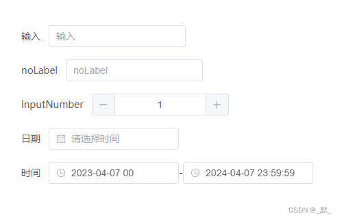
<template>
  <FormPage :formConfig="searchConfig" v-model="formData" />
</template>

<script setup>
import FormPage from './FormPage/index.js'
import componentsText from './componentsText.vue'
import { ref, markRaw } from 'vue'
const formData = ref({})
const searchConfig = ref([
  {
    label: '输入',
    type: 'input',
    key: 'test',
  },
  {
    label: 'noLabel',
    type: 'ElInput',
    key: 'noLabel',
  },
  {
    label: 'inputNumber',
    key: 'zh',
    type: 'el-input-number',
    defaultValue: 1,
  },
  {
    label: '日期',
    key: 'rq',
    type: 'date-picker',
    bind: {
      type: 'date',
      valueFormat: 'YYYY年MM月DD日',
      format: 'YYYY年MM月DD日',
    },
  },
  {
    label: '时间',
    type: 'times',
    startDefaultValue: '2023-04-07 00',
    endDefaultValue: '2024-04-07 23:59:59',
    startBind: {
      label: '时间',
      valueFormat: 'YYYY-MM-DD HH',
      format: 'YYYY-MM-DD HH',
    },
    endBind: {
      label: '结束时间',
    },
  },
])
</script>
TablePage-vue3 API汇总
属性
| 属性名 | 说明 | 类型 | 默认值 |
|---|
| modelValue | 双向绑定,表单数据 | Object | {} |
| formConfig | 表单项配置,详见formConfig-type | Array | [] |
| span | 表单栅格占据的列数(24栅格布局) | [Number, String] | 24 |
| validateHandle | 外部校验函数,返回String时,该String将作为异常抛出,返回Array<String>时,每个String都作为单独异常进行抛出 | Function | () => ‘’ |
| showText | 非表单模式,仅显示内容,不渲染表单输入 | Boolean | - |
插槽
| 插槽名 | 说明 |
|---|
| [你设定的slotName] | 本组件内部使用了大量的动态组件,方便配置,可阅读文档自行设置插槽名 |
Exposes
自定义对象
formConfig(array<object> 类型)
| 属性名 | 说明 | 类型 | 默认值 |
|---|
| key | 字段key值,该值将作用于表单modelValue的key值,当type为times时详见当type=times时 | String | - |
| type | 详见下文 formConfig-type | String/vue3Component | ‘input’ |
| label | 表单标签文本 | String | - |
| noLabel | 搜索表单无标签文本标识,为true时将不显示标签文本 | Boolean | false |
| bind | 表单搜索项属性绑定,将直接作用于表单筛选框的绑定,当type为times时详见当type=times时 | Object | 默认值可详见当type不为时间类型时 bind默认值 与 当type为时间类型时 bind默认值 |
| defaultValue | 默认参数,当type为times时详见当type=times时 | String | - |
| slotName | 插槽名称 将整个搜索项暴露给父页面进行使用 | String | - |
| childSlot | 子插槽名,当组件结构为<el-select><el-option><\el-option></el-select>时,可将type设置为 select,通过子插槽渲染option | String | - |
| notNull | 必填项声明,填写时将对该项是否填写进行校验 | Boolean | - |
| isInt | 整数填写声明,填写时将对该项是否为整数进行校验 | Boolean | - |
| isNumber | 数值【仅正数】填写声明(小数),填写时将对该项是否为数值进行校验,当接受参数为数字时,该数字将被作为小数位数参与校验,当为true时,小数位数长度不限制 | [Boolean,Number] | - |
| isMinusNumber | 数值【可负数】填写声明(小数),填写时将对该项是否为数值进行校验,当接受参数为数字时,该数字将被作为小数位数参与校验,当为true时,小数位数长度不限制 | [Boolean,Number] | - |
当type=times时
| 属性名 | 说明 | 类型 | 默认值 |
|---|
| key | 字段key值,该值将作用于表单搜索时向接口所发送的字段key,当type=times时字段固定 | 无法修改 | startTime,endTime |
| startDefaultValue | 开始时间默认参数 | String | - |
| endDefaultValue | 结束时间默认参数 | String | - |
| startBind | 开始时间属性绑定 | Object | 详见 当type为时间类型时 bind默认值 |
| endBind | 结束时间属性绑定 | Object | 详见 当type为时间类型时 bind默认值 |
当type不为时间类型时的 bind默认值(Object类型)
| 属性名 | 默认值 |
|---|
| placeholder | label的值 |
| clearable | true |
| style | width: 200px |
当type为时间类型时的 bind默认值(Object类型)
| 属性名 | 默认值 |
|---|
| style | width: 190px |
| type | datetime |
| placeholder | 请选择时间 |
| format | YYYY-MM-DD HH:mm:ss |
| valueFormat | YYYY-MM-DD HH:mm:ss |


 685
685

 被折叠的 条评论
为什么被折叠?
被折叠的 条评论
为什么被折叠?
 到【灌水乐园】发言


