


使用Scatter函数可以绘制线形图与散点图,主要参数如下。
● connectgaps:布尔变量,用于连接缺失数据。
● dx、dy:x、y坐标轴的步进值,默认值是1。
● error_x、error_y:x、y出错信息。
● fillcolor:填充颜色。
● fill:填充模式,包括格式、颜色等。
● hoverinfo:当用户与图形互动时,鼠标指针显示的参数,包括 x、y、z坐标数据,以及 text(文字信息)、name(图形名称)等参数的 组合,可使用+、all、none和skip(忽略)作为组合连接符号,默认是 all(全部消失)。
● hoveron:当用户与图形互动时,鼠标指针显示的模式,包括 points(点图)、fills(填充图)和points+fills(点图+填充图)三种模 式。
● ids:在动画图表中,数据点和图形key键的列表参数。
● legendgroup:图例参数,默认是空字符串。
● line:线条参数,包括线条宽度、颜色、格式。
● marker:数据节点参数,包括大小、颜色、格式等。
● mode:图形格式,包括lines(线形图)、markers(散点图)和 text(文本),使用+或none等符号进行模式组合。
● name:名称参数。
● opacity:透明度参数,范围是0~1。
● rsrc、xsrc、ysrc、tsrc、idssrc、textsrc、textpositionsrc:字符串源 数组列表,可作为Plotly网格标识符,用于设置特殊图表所需的r参数、 x参数、y参数、t参数、ids参数、text(文本)参数和textposition(文本 位置)参数。
● r、t:仅用于极坐标图,r用于设置径向坐标(半径),t用于设置 角坐标。
● showlegend:布尔变量,用于切换图标显示。
● stream:数据流,用于实时显示数据图表。
● textfont:文本字体参数,包括字体名称、颜色、大小等。
● textposition:“文本”元素的位置参数,包括top left(左上)、top center(中上)、top right(右上)、middle left(左中)、middle center(中心)、middle right(右中)、bottom left(左下)、bottom center(中下)、bottom right(右下)模式,默认是middle center(中
心)模式。
● text:文本数据,设置与每个“(x,y)对”关联的文本元素和数 组列表格式,默认是空字符串。
● type:数据显示模式,包括constant(常数)、percent(百分 比)、sqrt(平方根)、array(数组)模式。
● x0、y0:坐标轴起点坐标。
● xaxis,yaxis:x、y 坐标参数。
● xcalendar、ycalendar:坐标时间参数的格式,默认是公历 (gregorian),支持gregorian、chinese、coptic、discworld、ethiopian、 hebrew、islamic、julian、mayan、nanakshahi、nepali、persian、jalali、 taiwan、thai和 ummalqura 格式。
● x,y:设置x、y轴的坐标数据。
# -*- coding: utf-8 -*-
import pandas as pd
import pandas as pd
import plotly as py
import plotly.graph_objs as pygo
# ----------pre def
pd.set_option('display.width', 450)
pyplt = py.offline.plot
# ----------code
df = pd.read_csv('dat/tk01_m15.csv')
df9 = df[:10];
print(df9)
#
idx = df9['xtim']
xd0 = (df9['close'] - 27) * 50
df2 = df9
df2['xd1'] = xd0 - 10
df2['xd2'] = xd0
df2['xd3'] = xd0 + 10
print('xd2\n', df2);
# --------
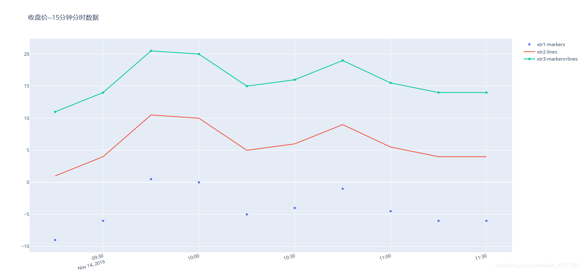
xtr1 = pygo.Scatter(
x=idx,
y=df2['xd1'],
mode='markers', # xtr1,散点图
name='xtr1-markers',
)
xtr2 = pygo.Scatter(
x=idx,
y=df2['xd2'],
mode='lines', # xtr2,曲线图
name='xtr2-lines',
)
xtr3 = pygo.Scatter(
x=idx,
y=df2['xd3'],
mode='markers+lines', # xtr3,曲线+散点组合
name='xtr3-markers+lines',
)
xdat = pygo.Data([xtr1, xtr2, xtr3])
layout = pygo.Layout(
title='收盘价--15分钟分时数据',
xaxis=pygo.XAxis(tickangle=-15),
)
fig = pygo.Figure(data=xdat, layout=layout)
pyplt(fig,filename=r'tmp\scatter_apply.html')
#
print('ok')


 5155
5155


 被折叠的 条评论
为什么被折叠?
被折叠的 条评论
为什么被折叠?
 到【灌水乐园】发言


