


需求:可选时间范围为一个月
<el-date-picker v-model="startEnd" type="daterange" :popper-class="popperClass" :unlink-panels="props.unlinkPanels" :editable="props.editable" range-separator="~" :start-placeholder="props.placeholder[0]" :end-placeholder="props.placeholder[1]" :format="props.format" :value-format="props.valueFormat" :clearable="props.clearable" @change="dateChange" prefix-icon="prefix-icon-class" @calendar-change="calendarChange" @visible-change="visibleChange" :disabled-date="disabledFn" />
import dayjs from 'dayjs'
import $ from 'jquery'
import { computed, nextTick, ref, watch } from 'vue'
const emit = defineEmits(['update:modelValue', 'change'])
const props = defineProps({
    width: {
        // 宽度
        type: String,
        default: '140px',
    },
    isDisabled: {
        // 是否禁用
        type: Boolean,
        default: false,
    },
    modelValue: {
        // 绑定的开始结束日期值
        type: Array,
        default: () => ['', ''],
    },
    inputSize: {
        // size 大小
        type: String,
        default: '',
    },
    dateType: {
        // 组件类型
        type: String,
        default: 'date',
    },
    valueFormat: {
        // 格式
        type: String,
        default: 'YYYY-MM-DD',
    },
    format: {
        // 格式
        type: String,
        default: 'YYYY-MM-DD',
    },
    clearable: {
        // 是否可清除
        type: Boolean,
        default: false,
    },
    msg: {
        // 格式
        type: String,
        default: '',
    },
    placeholder: {
        type: Array,
        default: () => ['开始日期', '结束日期'],
    },
    disableDay: {
        // 可选时间范围
        type: Number,
        default: 30,
    },
    size: {
        type: String,
        default: '',
    },
    editable: {
        // 文本框可输入-嵌套入app时不弹出键盘
        type: Boolean,
        default: false,
    },
    unlinkPanels: {
        // 在范围选择器里取消两个日期面板之间的联动-嵌套入app时只展示左边面板
        type: Boolean,
        default: false,
    },
})

let startEnd = ref<any[]>(['', ''])
watch(
    () => props.modelValue,
    newValue => {
        startEnd.value = newValue
    },
    { immediate: true }
)

watch(
    () => props.size,
    () => {
        nextTick(() => {
            const keyNode = document.querySelector('.el-range__icon')
            let iNode = document.createElement('i')
            if (props.size === 'small') iNode.setAttribute('class', 'iconfont icon-Calendar font-11')
            else iNode.setAttribute('class', 'iconfont icon-Calendar')
            if (keyNode) keyNode.appendChild(iNode)
        })
    },
    { immediate: true }
)

function dateChange() {
    const value = [startEnd.value[0] || '', startEnd.value[1] || '']
    emit('update:modelValue', value)
    emit('change', value)
}
const startVal = ref(null)
const calendarChange = (e: any) => {
    if (e[0] && !e[1]) {
        startVal.value = e[0]
    }
}

const visibleChange = (e: any) => {
    if (e) {
        startVal.value = null
    }
    if (props.unlinkPanels) {
        // 嵌套入app时,左边面板下一个月,下一年样式事件
        $('.d-arrow-right').removeAttr('disabled')
        $('.arrow-right').removeAttr('disabled')
        $('.arrow-right').removeClass('is-disabled')
        $('.d-arrow-right').removeClass('is-disabled')
    }
}

const popperClass = computed(() => {
    return props.unlinkPanels ? 'unlinkDate' : ''
})

const disabledFn = (current: any) => {
    if (!startVal.value) return false
    let range = [dayjs(startVal.value).subtract(0, 'day'), dayjs(startVal.value).add(props.disableDay, 'day')]
    let cur = dayjs(current)
    return cur < range[0] || cur > range[1]
}
<style lang="scss" scoped>
.prefix-icon-class {
display: none;
}
.d-flex {
display: flex;
}
.ml-5 {
margin-left: 5px;
}
.mr-5 {
margin-right: 5px;
}
.font-14 {
font-size: 14px;
}
.a-center {
align-items: center;
}
.j-center {
justify-content: center;
}
.flex-nowrap {
flex-wrap: nowrap;
}
v-deep.el-dropdown {
.el-button--medium {
padding: 10px !important;
}
}
</style>
<style lang="scss">
.unlinkDate {
/* 设置整体日期面板的宽度 */
.el-date-range-picker {
width: 322px;
/* 左边日期面板宽度 */
.el-picker-panel__content {
width: 63% !important;
}
/* 隐藏右边日期面板 */
.el-date-range-picker__content.is-right {
display: none;
}
/* 隐藏中间线段 */
.el-date-range-picker__content.is-left {
border-right: none;
}
}
// .el-picker-panel__content
}
</style>
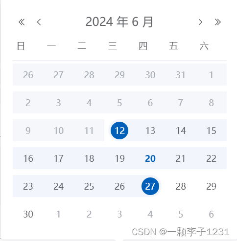
unlinkPanels为false的效果:

unlinkPanels为true的效果:


 488
488

 被折叠的 条评论
为什么被折叠?
被折叠的 条评论
为什么被折叠?
 到【灌水乐园】发言


