


实现场景:
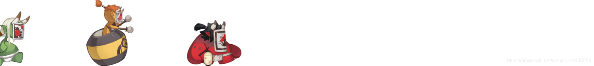
问题描述:
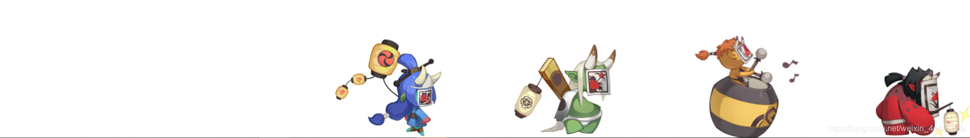
- 显而易见,实现这种功能需要用到了两个动画,平移与打字机效果的动画(steps)
- 每一个人物之间存在一定距离,可以通过动画开始时间animation-delay控制
- 从左到右的运动是慢慢移动的,而不是一下子呈现出来的,人物事先所处的位置(起始点)应该在屏幕的0的位置的左边,eg:-200px处
- 但是尽管如此仍然出现小bug,如下图所示:
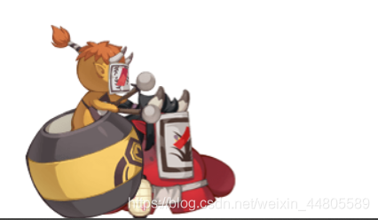
原因分析:
即使动画的初始状态时把人物设置在-200px处,但是由于div盒子标签仍然占据位置,肉眼仍能看见。从第二个人物开始,他们都是要等待一定时间才开始的,在等待开始的这段时间里,他们会继续占着当前标签的位置,呈现的效果会很难看。当他们开始做动画,会突然跳到-200px处再开始,呈现效果难看。而第一个虽然不受影响,但是之后的人物收到严重的影响。
解决方案:
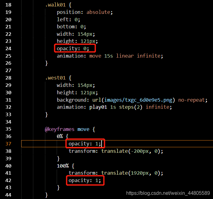
在初始的盒子标签中增加opacity: 0;属性,通过设置透明度达成视觉上的看不见,在动画里面再修改为opacity: 1;使这个动画从-200px处,正常的移动出来。
全部代码:
    <div class="box">
        <!-- 两个盒子一个控制距离,一个控制原地走  -->
        <div class="walk01">
            <div class="west01"></div>
        </div>
        <div class="walk02">
            <div class="west02"></div>
        </div>
        <div class="walk03">
            <div class="west03"></div>
        </div>
        <div class="walk04">
            <div class="west04"></div>
        </div>
    </div>
<style>
.box {
position: fixed;
width: 100%;
height: 175px;
left: 0;
bottom: 0;
}
.walk01 {
position: absolute;
left: 0;
bottom: 0;
width: 154px;
height: 121px;
opacity: 0;
animation: move 15s linear infinite;
}
.west01 {
width: 154px;
height: 121px;
background: url(images/txgc_6d0e9e5.png) no-repeat;
animation: play01 1s steps(2) infinite;
}
@keyframes move {
0% {
opacity: 1;
transform: translate(-200px, 0);
}
100% {
transform: translate(1920px, 0);
opacity: 1;
}
}
@keyframes play01 {
0% {
background-position: 0 0;
}
100% {
background-position: -308px 0;
}
}
.walk02 {
position: absolute;
left: 0;
bottom: 0;
width: 170px;
height: 176px;
opacity: 0;
animation: move 15s linear infinite;
animation-delay: 2s;
}
.west02 {
width: 170px;
height: 176px;
background: url(images/txgh_fee2457.png) no-repeat;
animation: play02 1s steps(2) infinite;
}
@keyframes play02 {
0% {
background-position: 0 0;
}
100% {
background-position: -334px 0;
}
}
.walk03 {
position: absolute;
left: 0;
bottom: 0;
width: 176px;
height: 149px;
opacity: 0;
animation: move 15s linear infinite;
animation-delay: 4s;
}
.west03 {
width: 176px;
height: 149px;
background: url(images/txgl_c15cfd8.png) no-repeat;
animation: play03 1s steps(2) infinite;
}
@keyframes play03 {
0% {
background-position: 0 0;
}
100% {
background-position: -322px 0;
}
}
.walk04 {
position: absolute;
left: 0;
bottom: 0;
width: 185px;
height: 157px;
opacity: 0;
animation: move 15s linear infinite;
animation-delay: 6s;
}
.west04 {
width: 185px;
height: 157px;
background: url(images/txgq_d281c9b.png) no-repeat;
animation: play04 1s steps(2) infinite;
}
@keyframes play04 {
0% {
background-position: 0 0;
}
100% {
background-position: -342px 0;
}
}
</style>


 扫一扫
扫一扫


 277
277

 被折叠的 条评论
为什么被折叠?
被折叠的 条评论
为什么被折叠?
 到【灌水乐园】发言


