


目录
第16章 下载数据
16.1 CSV文件格式
CSV文件对人来说阅读起来比较麻烦,但程序可轻松提取并处理其中的值,有助于加快数据分析的过程。
16.1.1 分析CSV文件头
import csv

filename = 'sitka_weather_07-2018_simple.csv'
with open(filename) as f:
    reader = csv.reader(f)
    header_row = next(reader)
    print(header_row)
['STATION', 'NAME', 'DATE', 'PRCP', 'TAVG', 'TMAX', 'TMIN']
16.1.2 打印文件头及其位置
import csv

filename = 'sitka_weather_07-2018_simple.csv'
with open(filename) as f:
    reader = csv.reader(f)
    header_row = next(reader)

    for index, column_header in enumerate(header_row):
        print(index, column_header)
0 STATION
1 NAME
2 DATE
3 PRCP
4 TAVG
5 TMAX
6 TMIN
16.1.3 提取并读取数据
import csv

filename = 'sitka_weather_07-2018_simple.csv'
with open(filename) as f:
    reader = csv.reader(f)
    header_row = next(reader)

    # 从文件中获取最高温度
    highs = []
    for row in reader:
        high = int(row[5])
        highs.append(high)

print(highs)
[62, 58, 70, 70, 67, 59, 58, 62, 66, 59, 56, 63, 65, 58, 56, 59, 64, 60, 60, 61, 65, 65, 63, 59, 64, 65, 68, 66, 64, 67, 65]
16.1.4 绘制温度图表
# 根据最高温度绘制图形。
plt.style.use('seaborn')
fig, ax = plt.subplots()
ax.plot(highs, c='red')

# 设置图形的格式。
ax.set_title('2018年7月每日最高温度', fontsize=24)
ax.set_xlabel('', fontsize=16)
ax.set_ylabel('温度(F)', fontsize=16)
ax.tick_params(axis='both', which='major', labelsize=16)

plt.show()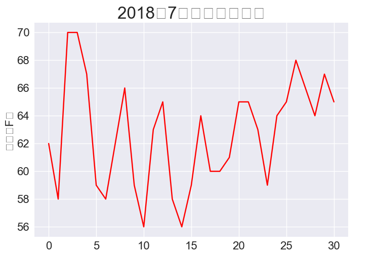
16.1.5 模块datetime
from datetime import datetime

first_date = datetime.strptime('2018-07-01', '%Y-%m-%d')
print(first_date)
2018-07-01 00:00:00

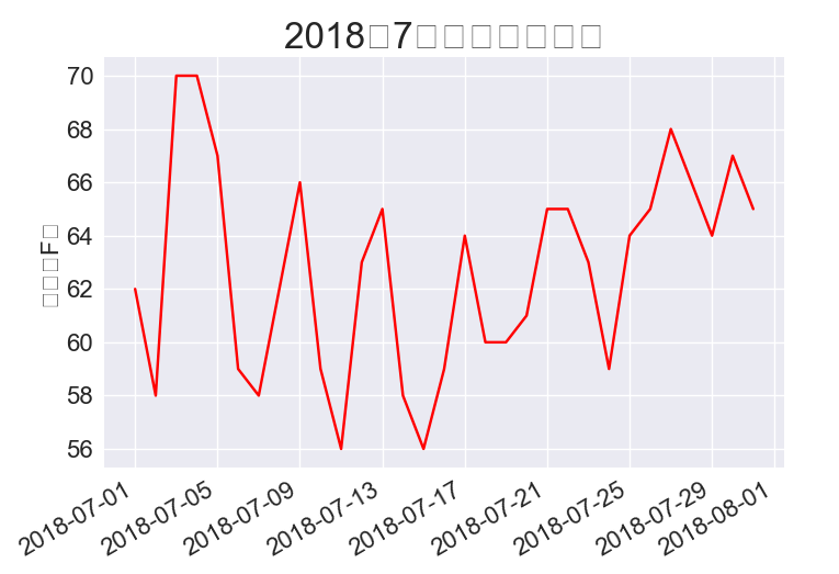
16.1.6 在图表中添加日期
import csv
from datetime import datetime
import matplotlib.pyplot as plt

filename = 'sitka_weather_07-2018_simple.csv'
with open(filename) as f:
    reader = csv.reader(f)
    header_row = next(reader)

    # 从文件中获取日期和最高温度。
    dates, highs = [], []
    for row in reader:
        current_date = datetime.strptime(row[2], '%Y-%m-%d')
        high = int(row[5])
        dates.append(current_date)
        highs.append(high)

# 根据最高温度绘制图形。
plt.style.use('seaborn')
fig, ax = plt.subplots()
ax.plot(dates, highs, c='red')

# 设置图形的格式
ax.set_title('2018年7月每日最高温度', fontsize=24)
ax.set_xlabel('', fontsize=16)
fig.autofmt_xdate()
ax.set_ylabel('温度(F)', fontsize=16)
ax.tick_params(axis='both', which='major', labelsize=16)

plt.show()
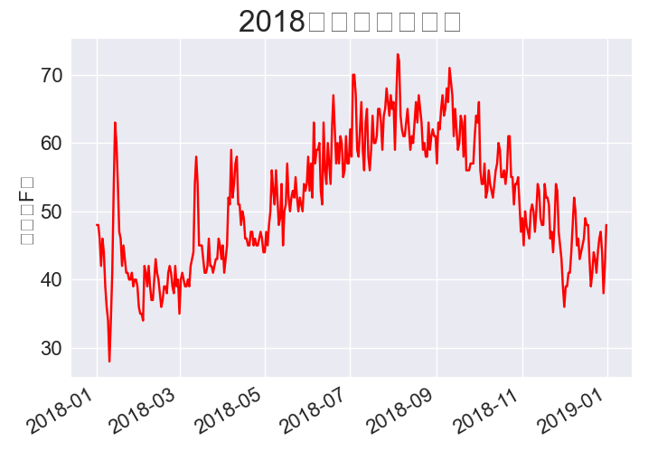
16.1.7 涵盖更长的时间
import csv
from datetime import datetime
import matplotlib.pyplot as plt

filename = 'sitka_weather_2018_simple.csv'
with open(filename) as f:
    reader = csv.reader(f)
    header_row = next(reader)

    # 从文件中获取日期和最高温度。
    dates, highs = [], []
    for row in reader:
        current_date = datetime.strptime(row[2], '%Y-%m-%d')
        high = int(row[5])
        dates.append(current_date)
        highs.append(high)

# 根据最高温度绘制图形。
plt.style.use('seaborn')
fig, ax = plt.subplots()
ax.plot(dates, highs, c='red')

# 设置图形的格式
ax.set_title('2018年每日最高温度', fontsize=24)
ax.set_xlabel('', fontsize=16)
fig.autofmt_xdate()
ax.set_ylabel('温度(F)', fontsize=16)
ax.tick_params(axis='both', which='major', labelsize=16)

plt.show()
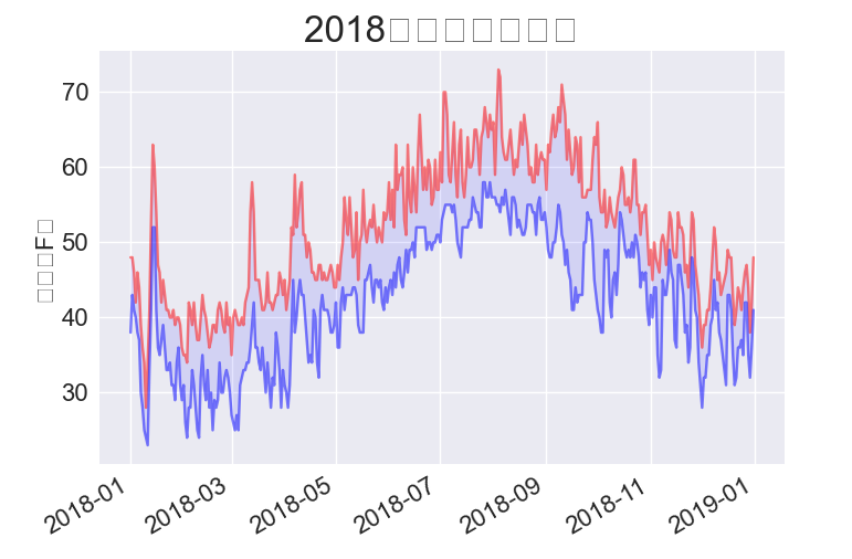
16.1.8 再绘制一个数据系列
import csv
from datetime import datetime
import matplotlib.pyplot as plt

filename = 'sitka_weather_2018_simple.csv'
with open(filename) as f:
    reader = csv.reader(f)
    header_row = next(reader)

    # 从文件中获取日期和最高温度。
    dates, highs,lows = [], [], []
    for row in reader:
        current_date = datetime.strptime(row[2], '%Y-%m-%d')
        high = int(row[5])
        low = int(row[6])
        dates.append(current_date)
        highs.append(high)
        lows.append(low)

# 根据最高温度绘制图形。
plt.style.use('seaborn')
fig, ax = plt.subplots()
ax.plot(dates, highs, c='red')
ax.plot(dates, lows, c='blue')

# 设置图形的格式
ax.set_title('2018年每日最高温度', fontsize=24)
ax.set_xlabel('', fontsize=16)
fig.autofmt_xdate()
ax.set_ylabel('温度(F)', fontsize=16)
ax.tick_params(axis='both', which='major', labelsize=16)

plt.show()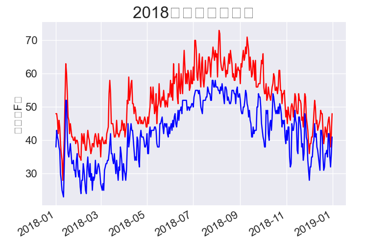
# 根据最高温度绘制图形。
plt.style.use('seaborn')
fig, ax = plt.subplots()
ax.plot(dates, highs, c='red', alpha=0.5)
ax.plot(dates, lows, c='blue', alpha=0.5)
ax.fill_between(dates, highs, lows, facecolor='blue', alpha=0.1)
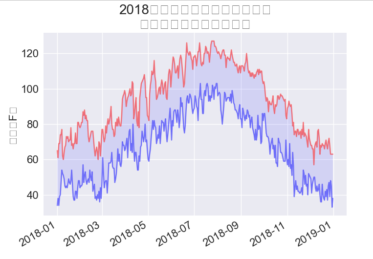
16.1.10 错误检查
import csv

filename = 'death_valley_2018_simple.csv'
with open(filename) as f:
    reader = csv.reader(f)
    header_row = next(reader)

    for index, column_header in enumerate(header_row):
        print(index, column_header)
0 STATION
1 NAME
2 DATE
3 PRCP
4 TMAX
5 TMIN
6 TOBS
import csv
from datetime import datetime
import matplotlib.pyplot as plt
filename = 'death_valley_2018_simple.csv'
with open(filename) as f:
reader = csv.reader(f)
header_row = next(reader)
# 从文件中获取日期和最高温度。
dates, highs,lows = [], [], []
for row in reader:
current_date = datetime.strptime(row[2], '%Y-%m-%d')
try:
high = int(row[4])
low = int(row[5])
except ValueError:
print(f"Missing data for {current_date}")
else:
dates.append(current_date)
highs.append(high)
lows.append(low)
# 根据最高温度绘制图形。
plt.style.use('seaborn')
fig, ax = plt.subplots()
ax.plot(dates, highs, c='red', alpha=0.5)
ax.plot(dates, lows, c='blue', alpha=0.5)
ax.fill_between(dates, highs, lows, facecolor='blue', alpha=0.1)
# 设置图形的格式
title = '2018年每日最高温度和最低温度\n美国加利福尼亚州死亡谷'
ax.set_title(title, fontsize=20)
ax.set_xlabel('', fontsize=16)
fig.autofmt_xdate()
ax.set_ylabel('温度(F)', fontsize=16)
ax.tick_params(axis='both', which='major', labelsize=16)
plt.show()
16.1.11 自己手动下载数据
略
16.2 制作全球地震散点图:JSON格式
16.2.1 地震数据
略
16.2.2 查看JSON数据
import json

# 探索数据的结构。
filename = 'eq_data_1_day_m1.json'
with open(filename) as f:
    all_eq_data = json.load(f)
    # print(all_eq_data)

readable_file = 'readable_eq_data.json'
with open(readable_file, 'w') as f:
    json.dump(all_eq_data, f, indent=4)
16.2.3 创建地震列表
import json

# 探索数据的结构。
filename = 'eq_data_1_day_m1.json'
with open(filename) as f:
    all_eq_data = json.load(f)

all_eq_dicts = all_eq_data['features']
print(len(all_eq_dicts))
16.2.4 提取地震
mags = []
for eq_dict in all_eq_dicts:
    mag = eq_dict['properties']['mag']
    mags.append(mag)

print(mags[:10])
16.2.5 提取位置数据
import json

# 探索数据的结构。
filename = 'eq_data_1_day_m1.json'
with open(filename) as f:
    all_eq_data = json.load(f)

all_eq_dicts = all_eq_data['features']
print(len(all_eq_dicts))

mags, titles, lons, lats = [], [], [], []
for eq_dict in all_eq_dicts:
    mag = eq_dict['properties']['mag']
    title = eq_dict['properties']['title']
    lon = eq_dict['geometry']['coordinates'][0]
    lat = eq_dict['geometry']['coordinates'][1]
    mags.append(mag)
    titles.append(title)
    lons.append(lon)
    lats.append(lat)

print(mags[:10])
print(titles[:2])
print(lons[:5])
print(lats[:5])
16.2.6 绘制震级散点图
import plotly.express as px
import json

# 探索数据的结构。
filename = 'eq_data_1_day_m1.json'
with open(filename) as f:
    all_eq_data = json.load(f)

all_eq_dicts = all_eq_data['features']
# print(len(all_eq_dicts))

mags, titles, lons, lats = [], [], [], []
for eq_dict in all_eq_dicts:
    mag = eq_dict['properties']['mag']
    title = eq_dict['properties']['title']
    lon = eq_dict['geometry']['coordinates'][0]
    lat = eq_dict['geometry']['coordinates'][1]
    mags.append(mag)
    titles.append(title)
    lons.append(lon)
    lats.append(lat)

fig = px.scatter(
    x=lons,
    y=lats,
    labels={'x': '经度', 'y': '纬度'},
    range_x=[-200, 200],
    range_y=[-90, 90],
    width=800,
    height=800,
    title='全球地震散点图'
)

fig.write_html('global_earthquakes.html')
fig.show()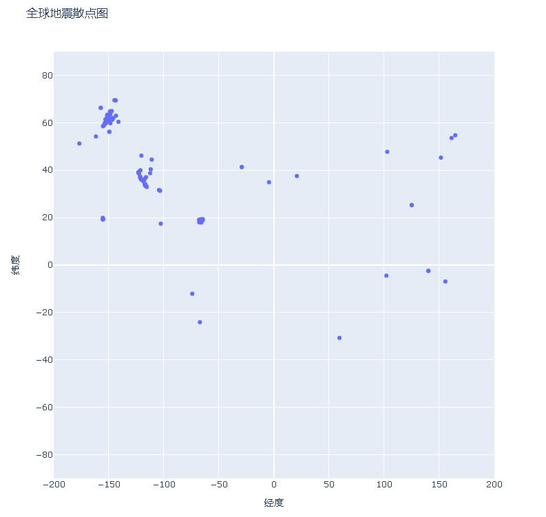
16.2.7 另一种指定图表数据的方式
import plotly.express as px
import json
import pandas as pd

# 探索数据的结构。
filename = 'eq_data_1_day_m1.json'
with open(filename) as f:
    all_eq_data = json.load(f)

all_eq_dicts = all_eq_data['features']
# print(len(all_eq_dicts))

mags, titles, lons, lats = [], [], [], []
for eq_dict in all_eq_dicts:
    mag = eq_dict['properties']['mag']
    title = eq_dict['properties']['title']
    lon = eq_dict['geometry']['coordinates'][0]
    lat = eq_dict['geometry']['coordinates'][1]
    mags.append(mag)
    titles.append(title)
    lons.append(lon)
    lats.append(lat)

data = pd.DataFrame(
    data=zip(lons, lats, titles, mags), columns=['经度', '纬度', '位置', '震级']
)
data.head()

fig = px.scatter(
    data,
    x='经度',
    y='纬度',
    range_x=[-200, 200],
    range_y=[-90, 90],
    width=800,
    height=800,
    title='全球地震散点图'
)

fig.write_html('global_earthquakes.html')
fig.show()
16.2.8 定制标记的尺寸
fig = px.scatter(
    data,
    x='经度',
    y='纬度',
    range_x=[-200, 200],
    range_y=[-90, 90],
    width=800,
    height=800,
    title='全球地震散点图',
    size='震级',
    size_max=10,
)

fig.write_html('global_earthquakes.html')
fig.show()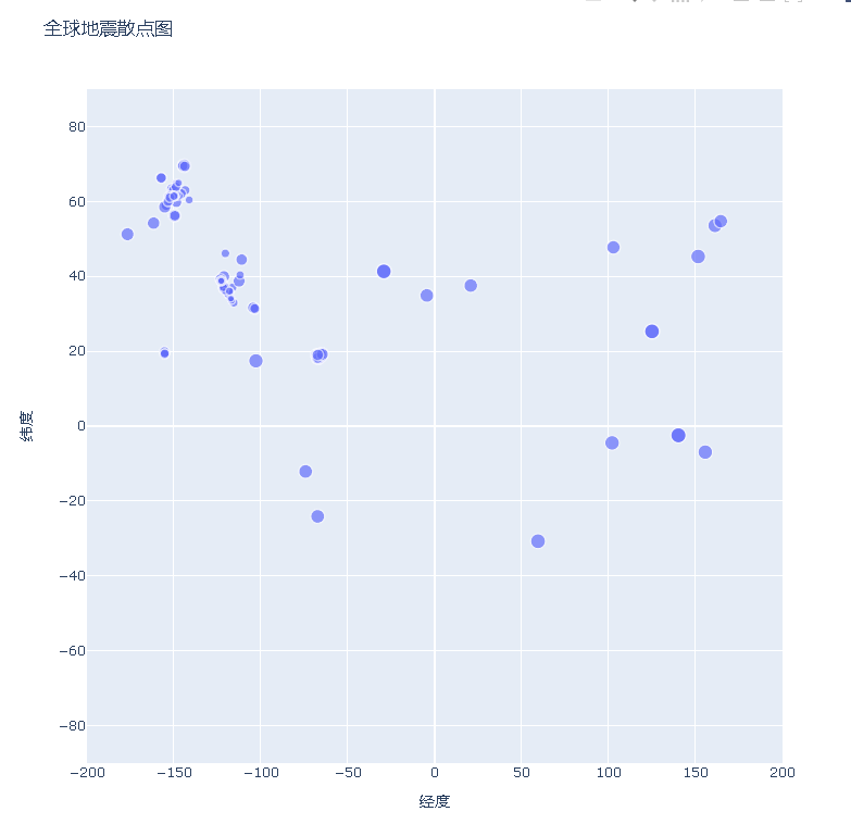
16.2.9 定制标记的颜色
import plotly.express as px
import json
import pandas as pd

# 探索数据的结构。
filename = 'eq_data_30_day_m1.json'
with open(filename) as f:
    all_eq_data = json.load(f)

all_eq_dicts = all_eq_data['features']
# print(len(all_eq_dicts))

mags, titles, lons, lats = [], [], [], []
for eq_dict in all_eq_dicts:
    mag = eq_dict['properties']['mag']
    title = eq_dict['properties']['title']
    lon = eq_dict['geometry']['coordinates'][0]
    lat = eq_dict['geometry']['coordinates'][1]
    mags.append(mag)
    titles.append(title)
    lons.append(lon)
    lats.append(lat)

data = pd.DataFrame(
    data=zip(lons, lats, titles, mags), columns=['经度', '纬度', '位置', '震级']
)
data.head()

fig = px.scatter(
    data,
    x='经度',
    y='纬度',
    range_x=[-200, 200],
    range_y=[-90, 90],
    width=800,
    height=800,
    title='全球地震散点图',
    size='震级',
    size_max=10,
    color='震级'
)

fig.write_html('global_earthquakes.html')
fig.show()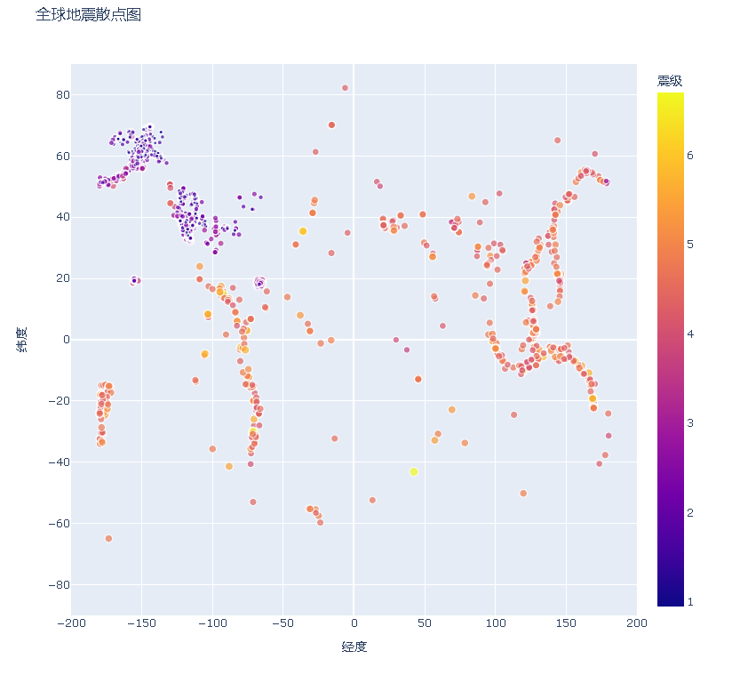
16.2.10 其他渐变
import plotly.express as px

for key in px.colors.named_colorscales():
    print(key)
aggrnyl
agsunset
blackbody
bluered
blues
blugrn
bluyl
brwnyl
bugn
bupu
burg
burgyl
cividis
darkmint
electric
emrld
gnbu
greens
greys
hot
inferno
jet
magenta
magma
mint
orrd
oranges
oryel
peach
pinkyl
plasma
plotly3
pubu
pubugn
purd
purp
purples
purpor
rainbow
rdbu
rdpu
redor
reds
sunset
sunsetdark
teal
tealgrn
turbo
viridis
ylgn
ylgnbu
ylorbr
ylorrd
algae
amp
deep
dense
gray
haline
ice
matter
solar
speed
tempo
thermal
turbid
armyrose
brbg
earth
fall
geyser
prgn
piyg
picnic
portland
puor
rdgy
rdylbu
rdylgn
spectral
tealrose
temps
tropic
balance
curl
delta
oxy
edge
hsv
icefire
phase
twilight
mrybm
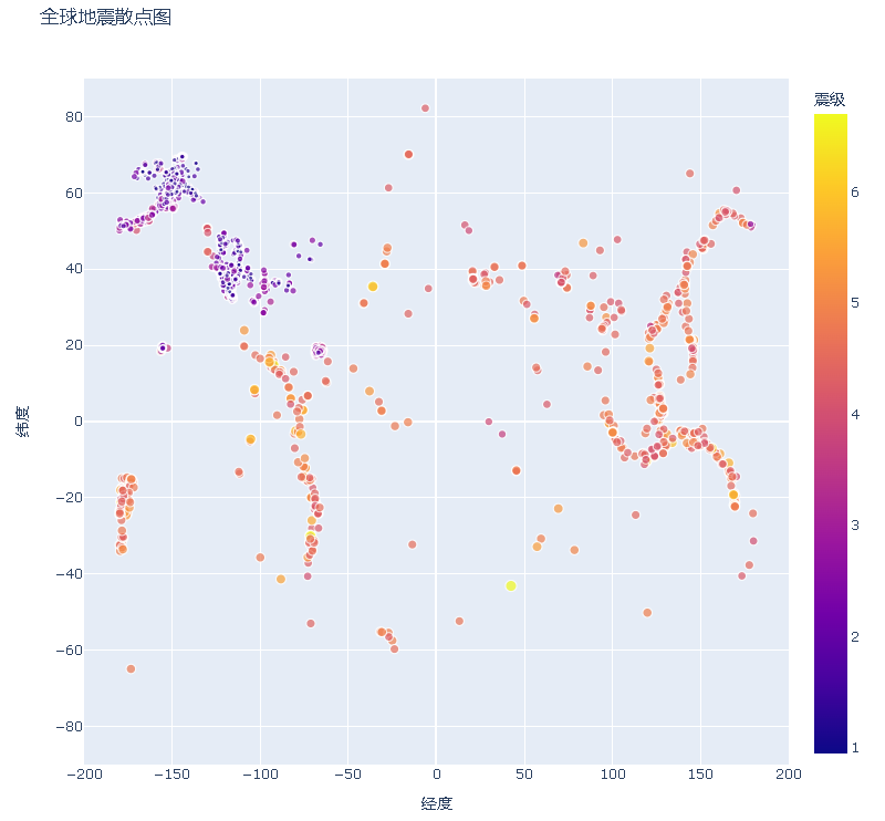
mygbm16.2.11 添加鼠标指向时显示的文本
fig = px.scatter(
    data,
    x='经度',
    y='纬度',
    range_x=[-200, 200],
    range_y=[-90, 90],
    width=800,
    height=800,
    title='全球地震散点图',
    size='震级',
    size_max=10,
    color='震级',
    hover_name='位置'
)


 4845
4845


 被折叠的 条评论
为什么被折叠?
被折叠的 条评论
为什么被折叠?
 到【灌水乐园】发言


