


目录
1.基于rem单位的屏幕等比例缩放
自适应布局
rem的含义
rem是浏览器描述长度的单位,含义为:相对于 `html` 的字体大小的单位。`1rem = html 根节点上1个字符的宽度`
rem的作用
使用 `rem` 单位设置的元素尺寸,会在不同的设备屏幕宽度下(例如:手机屏幕和平板屏幕)等比例缩放
应用场景
当页面元素需要在不同屏幕宽度下保证元素的比例大小不变时,则可以使用 `rem`
应用步骤
1. 确立参考系,定义标准设备的屏幕宽度和字体大小
2. 比例公式(等式左右两边比例尺相同,从而达到等比例缩放的目的):标准屏幕宽度 / 标准字体大小 = 新的屏幕宽度 / 新的屏幕字体大小
3. 将页面样式中的 `px` 单位换算并替换为 `rem`,方法是 `?rem = 元素的尺寸 / 标准字体大小`
4. 绑定窗口的 `resize` 和 `load` 事件,触发事件时计算出新的屏幕宽度时的字体大小,设置 `html` 的字体大小
<!DOCTYPE html>
<html lang="en" style="font-size:20px ;">
<head>

    <style>
        .box{
            background-color: peru;
            /* width: 300px;
            height: 300px; */
            width: 15rem;
            height: 15rem;
        }
    </style>
</head>

<body>
    <div class="box"></div>
</body>
<script>
    /*
    1. 确立参考系,定义标准设备的屏幕宽度和字体大小
        -定义标准屏幕宽度为600px,字体为20px
    2. 比例公式(等式左右两边比例尺相同,从而达到等比例缩放的目的):
    标准屏幕宽度 / 标准字体大小 = 新的屏幕宽度 / 新的屏幕字体大小
        - 600px/20px = html的宽度/x
        - x=html的屏幕宽度/(600px/20px)
    3. 将页面样式中的 `px` 单位换算并替换为 `rem`,方法是 `?rem = 元素的尺寸 / 标准字体大小`
        - 我设定的原来的宽高是300px,换成rem为单位就是 xrem=300px / 20px = 15rem
    4. 绑定窗口的 `resize` 和 `load` 事件,触发事件时计算出新的屏幕宽度时的字体大小,设置 `html` 的字体大小
        - resize 拖动页面宽度时触发该事件
        - load 页面加载完后触发该事件

    */
//    获取根元素
   let html = document.querySelector('html')
//    设置新的屏幕字体大小
    let newFont = window.innerWidth / (600/20)
    // 重新计算字体大小
    function size (){
        let newFont = window.innerWidth / (600/20)
        html.style.fontSize = `${newFont}px`
    }
    // 绑定窗口尺寸变化和页面加载时间
    window.addEventListener('resize',size);
    window.addEventListener('load',size)

</script>

</html>
2.元素的固定宽高比等比例缩放
如何按比例设置元素的宽高
原理是:
一个父元素中的第一个子元素,其padding-top的百分比大小是参考的父元素的宽度
例如: padding-top: 25%,则子元素上侧内边距就是父元素宽度的25%
如此以来只要不设置父元素高度,则父元素的高度就是第一个子元素的高度,从而让父元素宽高成比例
具体操作步骤如下:
1. 创建一个等比例的比例盒,作为要填充元素的父元素使用
2. 创建不同比例尺的维元素例如: .box_3x4::before 并在其中使用 padding-top 来达成固定高宽比
3. 给所有 box 的子元素添加定位和宽高
4. 给 box 填入需要固定宽高比的子元素
<!DOCTYPE html>
<html lang="en">

<head>

    <style>
        .box {
            width: 100%;
            background-color: pink;
            position: relative;
        }

        /* 把box里的元素移动到盒子的左上角
            并使得这个元素占满整个盒子
        */
        .box>* {
            position: absolute;
            top: 0;
            left: 0;
            width: 100%;
            height: 100%;
        }

        /* 创建不同比例尺的维元素例如: .box_3x4::before
        并在其中使用 padding-top 来达成固定高宽比 */
        .box_3x4::before {
            content: '';
            display: block;
            /* 3:4的比例 */
            padding-top: 75%;
        }

        /* 给父元素设置宽度 */
        .box-container {
            /* 即300px,默认字体宽度为16px */
            width: 18.75rem;
        }
    </style>
</head>

<body>
    <!-- 制作一个3:4的图片,并自适应 -->
    <div class="box-container">
        <div class="box box_3x4">
            <img src="./img/11.jpg" alt="">
        </div>
    </div>
</body>
<script>
    let html = document.querySelector('html')
    function size() {
        let size = innerWidth / (600 / 16)
        html.style.fontSize = `${size}px`

    }
    window.addEventListener('resize', size)
    window.addEventListener('load', size)
</script>

</html>
3.布局
响应式布局
响应式布局就是根据屏幕宽度,切换不同页面布局的一种布局方式,这里可以查看 bootstrap 官网在不同屏幕宽度下的表现
bootstrap 是使用断点来完成响应式布局的
断点
断点是 bootstrap 面向不同屏幕宽度,预制好的媒体查询
通常的讲,断点,代表的就是不同的屏幕宽度
bootstrap 中如何体现断点,在class中,添加不同断点的名称,可以采用不同断点的样式
布局容器
通常是页面的根节点,使用 `class="container"` 来设置布局容器
布局容器受断点影响,可以设置不同断点上的容器,具体可查表:
<https://getbootstrap.com/docs/5.0/layout/containers/>
网格布局
将内容进行行列分布的布局方式就叫网格布局
bootstrap中网格布局的灵魂样式就是 行:`row`,列:`col`
4.container布局
| Extra small <576px | Small ≥576px | Medium ≥768px | Large ≥992px | X-Large ≥1200px | XX-Large ≥1400px | |
|---|---|---|---|---|---|---|
.container | 100% | 540px | 720px | 960px | 1140px | 1320px |
.container-sm | 100% | 540px | 720px | 960px | 1140px | 1320px |
.container-md | 100% | 100% | 720px | 960px | 1140px | 1320px |
.container-lg | 100% | 100% | 100% | 960px | 1140px | 1320px |
.container-xl | 100% | 100% | 100% | 100% | 1140px | 1320px |
.container-xxl | 100% | 100% | 100% | 100% | 100% | 1320px |
.container-fluid | 100% | 100% | 100% | 100% | 100% | 100% |
参考:Containers · Bootstrap v5.2
<!DOCTYPE html>
<html lang="en">

<head>
    <meta charset="UTF-8">
    <meta http-equiv="X-UA-Compatible" content="IE=edge">
    <!-- 使用bootstrap的容器进行响应式布局的话,需要在head标签中加入此meta -->
    <meta name="viewport" content="width=device-width, initial-scale=1.0">
    <title>Document</title>
    <link rel="stylesheet" href="./css/bootstrap.min.css" />
    <style>
        .content {
            width: 100%;
            height: 100px;
            background-color: violet;
            color: #fff;
            display: flex;
            justify-content: center;
            align-items: center;
            font-size: 64px;
        }
    </style>
</head>

<body>
    <div class="container">
        <div class="content">container</div>
    </div>
    <div class="container-sm">
        <div class="content">container-sm</div>
    </div>
    <div class="container-md">
        <div class="content">container-md</div>
    </div>
    <div class="container-lg">
        <div class="content">container-lg</div>
    </div>
    <div class="container-xl">
        <div class="content">container-xl</div>
    </div>
    <div class="container-xxl">
        <div class="content">container-xxl</div>
    </div>
    <div class="container-fluid">
        <div class="content">container-fluid</div>
    </div>
</body>

</html>
display显示方式
参考:https://getbootstrap.com/docs/5.2/utilities/display/
语法: breakpoints为断点的意思,即中间可以跟一个其他的样式一起展示
在 xs 断点下: d-{value}
xs 以上: d-{breakpoints}-{value}
<!DOCTYPE html>
<html lang="en">
<head>
    <meta charset="UTF-8">
    <meta http-equiv="X-UA-Compatible" content="IE=edge">
    <!-- 使用bootstrap的容器进行响应式布局的话,需要在head标签中加入此meta -->
    <meta name="viewport" content="width=device-width, initial-scale=1.0">
    <title>Document</title>
    <link rel="stylesheet" href="./css/bootstrap.min.css" />
    <style>
        .box {
            display: flex;
        }
    </style>
</head>

<body>
    <!-- 当屏幕宽度小于 sm 时显示 -->
    <div class="container d-block d-sm-none">小于 sm</div>
    <!-- 当屏幕宽度为 md 时 显示 -->
    <div class="container d-none d-sm-block d-md-none">md</div>
    <!-- 当屏幕宽度大于 lg 时 显示 -->
    <div class="container d-none d-md-block">大于 lg</div>
</body>

</html>
float和position和flex的boot布局
float
float参考资料:https://getbootstrap.com/docs/5.2/utilities/float/
常用的:float-start左浮、float-end右浮、clearfix清除浮动
<body>
    <div class="clearfix">
        <!-- 左浮动的2个盒子 -->
        <div class="box bg-warning float-start"></div>
        <div class="box bg-success float-start"></div>
        <!-- 右浮动 -->
        <div class="box bg-danger float-end"></div>

    </div>
</body>
position
position参考: https://getbootstrap.com/docs/5.2/utilities/position/
语法:
position-{value}
value: absolute relative fixed sticky
<body>
    <div style="height: 600px;" class="d-flex justify-content-center">
        <!-- 相对定位 -->
        <div style="width:600px;height: 500px" class="border position-relative">
            <!-- 里面的每个小盒子都是绝对定位 -->
            <!-- top之类的值 只有0-50-100的选项 -->
            <!-- translate-middle-y相对于盒子本身偏移盒子本身的一半 y竖直偏移 -->
            <div class="box bg-danger position-absolute top-50 translate-middle-y"></div>
            <div class="box bg-danger position-absolute start-50 translate-middle-x"></div>
            <div class="box bg-danger position-absolute end-0 top-50 translate-middle-y"></div>
            <div class="box bg-danger position-absolute start-50 bottom-0 translate-middle-x"></div>
            <div class="box bg-danger position-absolute start-0 top-0"></div>
            <div class="box bg-danger position-absolute end-0 top-0"></div>
            <div class="box bg-danger position-absolute start-0 bottom-0"></div>
            <div class="box bg-danger position-absolute end-0 bottom-0"></div>
            <div class="box bg-danger position-absolute start-50 top-50 translate-middle"></div>
        </div>
    </div>
</body>
</html>
flex
flex 的使用基本上就是把所有flex的属性变成了class类
 <div style="height: 400px;" class="bg-success d-flex justify-content-end align-items-center align-content-center">
        <div class="box bg-warning flex-grow-1"></div>
        <div class="box bg-primary"></div>
        <div class="box bg-primary align-self-end flex-shrink-0"></div>
        <div class="box bg-primary"></div>
        <div class="box bg-primary"></div>
        <div class="box bg-primary"></div>
    </div>
gird网格
<!DOCTYPE html>
<html lang="en">

<head>
    <meta charset="UTF-8">
    <meta http-equiv="X-UA-Compatible" content="IE=edge">
    <meta name="viewport" content="width=device-width, initial-scale=1.0">
    <title>Document</title>
    <link rel="stylesheet" href="./css/bootstrap.css">
</head>

<body>
    <!-- https://getbootstrap.com/docs/5.2/layout/grid/ -->

    <h1>网格布局基本用法</h1>

    <div class="container">
        <!-- 行 -->
        <div class="row">
            <!-- 列
                col 语法: col-{breakpoints}-{value}
                例如: col-sm-3 col-lg-12
                value: 范围在 1~12
                bootstrap 中 一行 row 被等分为 12 分 那么col的value值代表的是占多少份
                例如: col-3 此单元格占 12分之3份
            -->
            <div class="col">
                <div class="bg-primary">1</div>
            </div>
            <div class="col">
                <div class="bg-primary">2</div>
            </div>
            <div class="col">
                <div class="bg-primary">3</div>
            </div>
        </div>
        <div class="row">
            <div class="col-8">
                <div class="bg-primary">1</div>
            </div>
            <div class="col">
                <div class="bg-primary">2</div>
            </div>
            <div class="col">
                <div class="bg-primary">3</div>
            </div>
        </div>
    </div>

    <h1>纵向排列方式</h1>
    <div class="container">
        <!-- 在 row 上可以使用flex 的 align-items 来进行竖直方向的排列 -->
        <div class="row border border-3 align-items-center" style="height: 300px;">
            <div class="col">
                <div class="bg-success">1</div>
            </div>
            <div class="col">
                <div class="bg-success">2</div>
            </div>
            <div class="col">
                <div class="bg-success">3</div>
            </div>
        </div>
    </div>

    <h1>横向排列方式</h1>
    <div class="container">
        <!-- 在 row 上可以使用 flex 的 justify-content 来进行水平方向的排列 -->
        <div class="row border border-3 justify-content-between">
            <div class="col-2">
                <div class="bg-warning">1</div>
            </div>
            <div class="col-2">
                <div class="bg-warning">2</div>
            </div>
            <div class="col-2">
                <div class="bg-warning">3</div>
            </div>
        </div>
    </div>

    <h1>单元格偏移</h1>
    <div class="container">
        <div class="row border border-3">
            <!-- offset 设置单元格左侧的偏移量 数字代表的含义和 col 相同 -->
            <div class="col-3 offset-3">
                <div class="bg-danger">1</div>
            </div>
            <div class="col-3 offset-3">
                <div class="bg-danger">2</div>
            </div>
        </div>
    </div>

    <h1>单元格间距</h1>
    <div class="container">
        <!-- 添加单元格间距使用 gutter 首字母为 g
            可以使用 g-{value} 或 gx-{value} gy-{value}
            g-{value} 水平和竖直间距
            gx-{value} 水平间距
            gy-{value} 竖直间距
        -->
        <div class="row text-light g-5 border border-3">
            <div class="col-4">
                <div class="bg-info">1-1</div>
            </div>
            <div class="col-4">
                <div class="bg-info">1-2</div>
            </div>
            <div class="col-4">
                <div class="bg-info">1-3</div>
            </div>
            <div class="col-4">
                <div class="bg-info">2-1</div>
            </div>
            <div class="col-4">
                <div class="bg-info">2-2</div>
            </div>
            <div class="col-4">
                <div class="bg-info">2-3</div>
            </div>
        </div>
    </div>

    <h1>可以指定每一行显示多少列</h1>
    <div class="container">
        <!-- row-cols-{breakpoints}-{value} 让一行显示多少列 -->
        <div class="text-light row row-cols-1 row-cols-md-2 row-cols-lg-3">
            <div class="col">
                <div class="bg-dark">1</div>
            </div>
            <div class="col">
                <div class="bg-dark">2</div>
            </div>
            <div class="col">
                <div class="bg-dark">3</div>
            </div>
            <div class="col">
                <div class="bg-dark">4</div>
            </div>
            <div class="col">
                <div class="bg-dark">5</div>
            </div>
            <div class="col">
                <div class="bg-dark">6</div>
            </div>
            <div class="col">
                <div class="bg-dark">7</div>
            </div>
            <div class="col">
                <div class="bg-dark">8</div>
            </div>
            <div class="col">
                <div class="bg-dark">9</div>
            </div>
            <div class="col">
                <div class="bg-dark">10</div>
            </div>
            <div class="col">
                <div class="bg-dark">11</div>
            </div>
            <div class="col">
                <div class="bg-dark">12</div>
            </div>
        </div>
    </div>
</body>

</html>
背景色、文本色
背景色 https://getbootstrap.com/docs/5.2/utilities/background/
文本色 https://getbootstrap.com/docs/5.2/utilities/colors/
文本+背景色 https://getbootstrap.com/docs/5.2/helpers/color-background/
<body>
  <h1>背景色</h1>
    <!-- bg-{value} -->
    <div class="bg-primary">1</div>
    <div class="bg-secondary">1</div>
    <div class="bg-success">1</div>
    <div class="bg-danger">1</div>
    <div class="bg-warning">1</div>
    <div class="bg-info">1</div>
    <div class="bg-light">1</div>
    <div class="bg-dark">1</div>

    <h1>文本色</h1>
    <!-- text-{value} -->
    <div class="text-primary">hello world</div>
    <div class="text-secondary">hello world</div>
    <div class="text-success">hello world</div>
    <div class="text-danger">hello world</div>
    <div class="text-warning">hello world</div>
    <div class="text-info">hello world</div>
    <div class="text-light">hello world</div>
    <div class="text-dark">hello world</div>

    <h1>文本+背景色</h1>
    <!-- text-bg-{value} -->
    <div class="text-bg-primary">hello world</div>
    <div class="text-bg-secondary">hello world</div>
    <div class="text-bg-success">hello world</div>
    <div class="text-bg-danger">hello world</div>
    <div class="text-bg-warning">hello world</div>
    <div class="text-bg-info">hello world</div>
    <div class="text-bg-light">hello world</div>
    <div class="text-bg-dark">hello world</div>
</body>
size和space和stack
size

<body>
    <h1>元素大小</h1>
    <!-- 数字以百分号作为单位 -->
    <h2>宽度</h2>
    <div class="text-bg-primary w-25">25%</div>
    <div class="text-bg-secondary w-50">50%</div>
    <div class="text-bg-success w-75">75%</div>
    <div class="text-bg-warning w-100">100%</div>
    <div class="text-bg-danger w-auto">auto</div>
    <h2>高度</h2>
    <!-- 这里设了容器的高度作为上限限制,不然撑满页面高度 -->
    <div class="container d-flex" style="height:300px;">
        <div class="text-bg-primary h-25">25%</div>
        <div class="text-bg-secondary h-50">50%</div>
        <div class="text-bg-success h-75">75%</div>
        <div class="text-bg-warning h-100">100%</div>
        <div class="text-bg-danger h-auto">auto</div>
    </div>
    <!-- vh vw 是相对于视口的宽高 -->
    <!-- <div class="vh-100 vw-100 bg-danger"></div> -->
</body>
space内外边距
<body>
    <h1>内边距外边距</h1>
    <!-- 内边距 使用 p- 开头
        p-{value}: 设置四周的内边距
        p{dir}-{value}: 设置指定的一边的方向
        dir 取值为 t b s e 分别代表 上下左右
    -->
    <h3>设置不同方向的内边距</h3>
    <div class="box bg-warning pt-3">设置了上内边距</div>
    <div class="box bg-info pb-3">设置了下内边距</div>
    <div class="box bg-success ps-3">设置了左内边距</div>
    <div class="box bg-warning pe-3">设置了右内边距</div>
    <!-- p{axis}-{value}: 设置水平或竖直轴上的内边距
        axis: 取值为 x y 分别代表 水平和竖直
    -->
    <h3>同时设置左右或者上下内边距</h3>
    <div class="box bg-success px-3">设置了左右内边距</div>
    <div class="box bg-info py-3">设置了上下内边距</div>

    <h3>外边距</h3>
    <div class="box bg-warning m-2">上下左右外边距</div>
    <div class="box bg-warning mt-2">上外边距</div>
    <div class="box bg-warning mb-2">下外边距</div>
    <div class="box bg-warning ms-2">左外边距</div>
    <div class="box bg-warning me-2">右外边距</div>
    <div class="box bg-warning mx-2">左右外边距</div>
    <div class="box bg-warning my-2">上下外边距</div>
</body>
</html>


stack元素间的间距

<body>
    <!--
        vstack 竖直方向产生间距,gap间距的大小
     -->
     <h2>水平间距</h2>
    <div class="vstack gap-1">
        <div class="box bg-success">↓↓↓↓↓↓↓↓</div>
        <div class="box bg-success"></div>
        <div class="box bg-success"></div>
    </div>

    <h2>竖直间距</h2>
    <!-- hstack 水平方向产生间距 -->
    <div class="hstack gap-2" style="border: 2px solid red">
        <div class="box bg-success"></div>
        <div class="box bg-success"></div>
        <div class="box bg-success"></div>

    </div>
</body>

</html>
文本样式
<!DOCTYPE html>
<html lang="en">
<head>
<meta charset="UTF-8">
<meta http-equiv="X-UA-Compatible" content="IE=edge">
<meta name="viewport" content="width=device-width, initial-scale=1.0">
<title>text文本样式</title>
<link rel="stylesheet" href="./css/bootstrap.css">
</head>
<body>
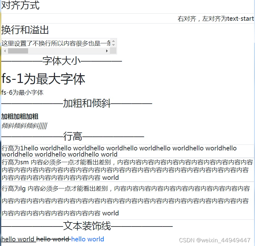
<h3>对齐方式</h3>
<div class="border text-end">右对齐,左对齐为text-start</div>
<h3>换行和溢出</h3>
<div style="width: 300px" class="border text-nowrap overflow-scroll">这里设置了不换行所以内容很多也是一条哦 hello worldhello worldhello
worldhello worldhello worldhello worldhello worldhello worldhello worldhello
worldhello worldhello world</div>
<h3>————字体大小————</h3>
<div class="fs-1">fs-1为最大字体</div>
<div class="fs-6">fs-6为最小字体</div>
<h3>——————加粗和倾斜————</h3>
<div class="fw-bolder">加粗加粗加粗</div>
<div class="fst-italic">倾斜倾斜倾斜|||||</div>
<h3>——————行高——————</h3>
<!--
lh-{value}
value: 取值范围 1 sm base lg
-->
<div class="border lh-1">行高为1hello worldhello worldhello worldhello worldhello worldhello worldhello worldhello
worldhello worldhello
world</div>
<div class=" border lh-sm">行高为sm
内容必须多一点才能看出差别,内容内容内容内容内容内容内容内容内容内容内容内容内容内容内容内容内容内容内容内容内容内容内容内容内容内容内容内容内容内容内容内容内容内容内容内容内容内容内容
world</div>
<div class=" border lh-lg">行高为lg
内容必须多一点才能看出差别,内容内容内容内容内容内容内容内容内容内容内容内容内容内容内容内容内容内容内容内容内容内容内容内容内容内容内容内容内容内容内容内容内容内容内容内容内容内容内容
world</div>
<h3>——————文本装饰线——————</h3>
<div class="d-inline text-decoration-underline">
hello world
</div>
<div class="d-inline text-decoration-line-through">
hello world
</div>
<a class="text-decoration-none" href="#">hello world</a>
</body>
</html>
表单元素form-control(很重要!布局经常用!)
<body class="d-flex flex-column align-items-center">
    <!-- label 与 表单元素上下排列 -->
    <div class="card p-3" style="width: 300px;">
        <div class="vstack gap-2">
            <div>
                <label class="form-label">姓名</label>
                <input class="form-control" type="text" />
            </div>

            <div>
                <label class="form-label">年龄</label>
                <!-- 设置大小 -->
                <input class="form-control form-control-sm" type="number" />
                <input class="form-control form-control-lg" type="number" />
                <!-- 禁用 disabled -->
                <input class="form-control" type="number" disabled />
                <!-- 只读 readonly -->
                <input class="readonly form-control" type="number" readonly />
            </div>

            <div>
                <label class="form-label">邮箱</label>
                <!-- 朴素输入框 form-control-plaintext -->
                <input class="form-control form-control-plaintext" type="text" readonly value="xxx@xxx.com" />
            </div>

            <div>
                <label class="form-label">简介</label>
                <!-- form-control 相关样式都可以用在文本域上 -->
                <textarea disabled rows="4" class="form-control" type="text"></textarea>
            </div>
        </div>
    </div>

    <!-- label 与 表单元素 左右排列 -->
    <div class="card p-3" style="width: 500px">
        <div class="row">
            <label class="col-3 col-form-label">姓名</label>
            <div class="col">
                <input class="form-control" type="text">
            </div>
        </div>
    </div>
</body>
后续有用到但是比较容易忘记的点:朴素输入框form-control-plaintext(用于显示内容,可以当做显示器显示信息用),各式input的type的值:file、radio(单选)、checked(多选)、date(日历)
checks And Radios(单选和多选)
<body class="d-flex justify-content-center">
    <!-- https://getbootstrap.com/docs/5.2/forms/checks-radios/ -->
    <div class="card p-3" style="width: 500px;">
        <div class="row">
            <label class="col-3 col-form-label">性别</label>
            <div class="col">
                <!-- 单选按钮 -->
                <div class="form-check">
                    <input class="form-check-input" id="male" type="radio" name="sex" value="male">
                    <label class="form-check-label" for="male">男</label>
                </div>
                <div class="form-check">
                    <input class="form-check-input" id="female" type="radio" name="sex" value="female">
                    <label class="form-check-label" for="female">女</label>
                </div>
                <div class="form-check">
                    <input class="form-check-input" id="other" type="radio" name="sex" value="other">
                    <label class="form-check-label" for="other">其他</label>
                </div>
            </div>
        </div>
        <div class="row">
            <label class="col-3 col-form-label">爱好</label>
            <div class="col d-flex align-items-center">
                <!-- form-check-inline 让选项排列在一行之中 -->
                <div class="form-check-inline">
                    <input class="form-check-input" id="dlq" type="checkbox" name="hobbies" value="dlq">
                    <label class="form-check-label" for="dlq">打篮球</label>
                </div>
                <div class="form-check-inline">
                    <input class="form-check-input" id="tzq" type="checkbox" name="hobbies" value="tzq">
                    <label class="form-check-label" for="tzq">踢足球</label>
                </div>
                <div class="form-check-inline">
                    <input class="form-check-input" id="ymq" type="checkbox" name="hobbies" value="ymq">
                    <label class="form-check-label" for="ymq">羽毛球</label>
                </div>
            </div>
        </div>
        <div class="row">
            <label class="col-3 col-form-label">不确定按钮</label>
            <div class="col">
                <div class="form-check">
                    <!-- 不确定的checkbox 需要给输入框添加 indeterminate 属性
                        但是该属性无法在html标签上直接添加
                        只能使用js添加
                    -->
                    <input indeterminate id="indeterminate" class="form-check-input" type="checkbox">
                    <label class="form-check-label">全选</label>
                </div>
            </div>
        </div>
        <div class="row">
            <label class="col-3 col-form-label">你同意吗</label>
            <div class="col">
                <!-- form-switch 是开关 只要给普通的 checkbox 添加该类名即可 -->
                <div class="form-check form-switch">
                    <input class="form-check-input" type="checkbox">
                    <label class="form-check-label">某某协议</label>
                </div>
            </div>
        </div>
        <div class="row">
            <label class="col-3 col-form-label">类似按钮的单选或多选按钮</label>
            <div class="col">
                <!-- <div class="form-check-inline">
                    <input id="a" class="btn-check" type="checkbox" value="a" name="btn">
                    <label for="a" class="btn btn-outline-success">a</label>
                </div>
                <div class="form-check-inline">
                    <input id="b" class="btn-check" type="checkbox" value="bg-light" name="btn">
                    <label for="b" class="btn btn-outline-success">b</label>
                </div> -->

                <div class="form-check-inline">
                    <!-- input 中添加 btn-check -->
                    <input id="a" class="btn-check" type="radio" value="a" name="btn">
                    <!-- label 中添加 btn btn-outline-{color} -->
                    <!-- 注意: 为了能够勾选成功 必须给label添加for 给 input 添加id -->
                    <label for="a" class="btn btn-outline-warning">a</label>
                </div>
                <div class="form-check-inline">
                    <input id="b" class="btn-check" type="radio" value="bg-light" name="btn">
                    <label for="b" class="btn btn-outline-warning">b</label>
                </div>
            </div>
        </div>
    </div>
</body>
<script>
    let inp = document.querySelector('#indeterminate')
    // indeterminate 属性是一个 bool 值
    inp.indeterminate = true
</script>
select下拉菜单
<body>
    <!-- 参考:https://getbootstrap.com/docs/5.2/forms/select/ -->
    <div class="card p-3" style="width: 300px;">
        <div>
            <label class="form-label">班级</label>
            <select class="form-select">
                <option value="" disabled selected>请选择</option>
                <option value="1">一班</option>
                <option value="2">二班</option>
                <option value="3">三班</option>
            </select>
        </div>
        <div>
            <label class="form-label">班级</label>
            <!-- 输入框用 list 属性关联 datalist -->
            <input list="clazz" type="text" class="form-control">
            <!-- 通过datalist 给输入框添加待选项 -->
            <datalist id="clazz">
                <option value="1">一班</option>
                <option value="2">二班</option>
                <option value="3">三班</option>
            </datalist>
        </div>
    </div>
</body>
原生的表单验证
表单验证:通常来说一个用户填写的表单数据都需要进行一个验证,因为用户的输入是不可信的,所以说在表单输入的时候需要对用户的输入做验证
应用场景:用户产生输入的时候
参考:https://developer.mozilla.org/zh-CN/docs/Learn/Forms/Form_validation
约束校验api:https://developer.mozilla.org/zh-CN/docs/Learn/Forms/Form_validation#%E7%BA%A6%E6%9D%9F%E6%A0%A1%E9%AA%8C%E7%9A%84_api
表单验证步骤
1. 给表单添加 novalidate 屏蔽自动验证报告
2. 对每个元素的 validity 属性进行验证
3. 根据每个元素的验证结果设置自定义异常 setCustomValidity
4. 提交验证报告
5. 根据验证结果执行后续网络操作
input 的验证属性
required
pattern
minlength maxlength
min max
type
novalidate 屏蔽html自带的验证报告
input 的 validity 属性
validity.valueMissing
validity.patternMismatch
validity.rangeOverflow
validity.rangeUnderflow
validity.tooLong
validity.tooShort
validity.valid
自定义提示信息
input.setCustomValidity
form 或 input 的 checkValidity
显示验证报告
form.reportValidity()
<body class="d-flex justify-content-center">
    <!-- novalidate 屏蔽默认的表单提交时的验证报告
        屏蔽掉自动的验证报告的目的 是为了我们自己好去控制验证报告
    -->
    <form class="card p-3" style="width: 500px;" onsubmit="return false" novalidate>
        <div class="vstack gap-3">
            <div class="row">
                <label class="col-3 col-form-label">姓名</label>
                <div class="col">
                    <!-- required 必填 -->
                    <!-- <input name="name" required type="text" class="form-control"> -->
                    <!-- pattern 正则表达式 -->
                    <!-- <input name="name" pattern="[\s\S]*张三[\s\S]*" type="text" class="form-control"> -->
                    <!-- minlength 最小长度 maxlength 最大长度 -->
                    <!-- <input name="name" minlength="2" maxlength="10" type="text" class="form-control"> -->
                    <!-- min 最小值 max 最大值 -->
                    <input name="name" min="0" max="200" type="number" class="form-control">
                    <!-- type 类型验证 -->
                    <!-- <input type="email" class="form-control"> -->
                </div>
            </div>
            <div class="row">
                <div class="col-3"></div>
                <div class="col">
                    <button class="btn btn-primary w-100">提交</button>
                </div>
            </div>
        </div>
    </form>

    <!-- 1. 添加 novalidate -->
    <form class="form2 card p-3" style="width: 500px;" onsubmit="return false" novalidate>
        <div class="vstack gap-3">
            <div class="row">
                <label class="col-3 col-form-label">姓名</label>
                <div class="col">
                    <input required minlength="2" maxlength="10" name="name" type="text" class="form-control">
                </div>
            </div>
            <div class="row">
                <label class="col-3 col-form-label">年龄</label>
                <div class="col">
                    <input required min="0" max="150" name="age" type="number" class="form-control">
                </div>
            </div>
            <div class="row">
                <div class="col-3"></div>
                <div class="col">
                    <button class="btn2 btn btn-primary w-100">提交</button>
                </div>
            </div>
        </div>
    </form>
</body>

<script>
    let btn = document.querySelector('button')
    let form = document.querySelector('form')
    let nameInp = document.querySelector('input[name=name]')

    let form2 = document.querySelector('.form2')
    let btn2 = document.querySelector('.btn2')
    let nameInp2 = document.querySelector('.form2 input[name=name]')
    let ageInp = document.querySelector('.form2 input[name=age]')

    btn.addEventListener('click', () => {
        // 可以在此处通过代码验证用户的输入

        // 可以通过输入框的 validity 属性 来判断用户是否输入正确

        // validity.valueMissing -> required 用户没填数据时为 true
        // validity.patternMismatch -> pattern 用户输入不满足正则 true
        // validity.rangeOverflow -> max 用户输入超过最大值 true
        // validity.rangeUnderflow -> min 用户输入小于最小值 true
        // validity.tooLong -> maxlength 用户输入超出长度 不会触发 true
        // validity.tooShort -> minlength 用户输入小于了指定长度 true
        // validity.valid -> 输入没有问题 验证通过 true

        // console.log(nameInp.validity);

        // if(nameInp.validity.tooShort) {
        //     console.log('姓名长度不够');
        // }

        if (nameInp.validity.rangeOverflow) {
            // 手动设置错误提示
            nameInp.setCustomValidity('年龄不能大于200')
        } else if (nameInp.validity.rangeUnderflow) {
            nameInp.setCustomValidity('年龄不能小于0')
        } else {
            console.log(nameInp.validity);
            // 若验证没有问题时应当设置为 空字符串
            nameInp.setCustomValidity('')
        }

        // checkValidity 检测是否表单输入有效
        // 若返回true 代表输入有效 否则为false

        if (!form.checkValidity()) {
            // 显示验证报告
            form.reportValidity()
        } else {
            // 若表单没有问题 输入都有效 则可以执行后续的代码
            // 后续代码写在此处 例如 发送网络请求
            console.log('验证通过');
        }
    })

    // 总结表单验证
    btn2.addEventListener('click', () => {
        // 2. 验证所有表单项
        if (nameInp2.validity.valueMissing) {
            // 3. 设置错误信息
            nameInp2.setCustomValidity('请输入姓名')
        } else if (nameInp2.validity.tooShort) {
            nameInp2.setCustomValidity('请输入至少2个字的姓名')
        } else {
            nameInp2.setCustomValidity('')
        }

        if (ageInp.validity.valueMissing) {
            ageInp.setCustomValidity('请输入年龄')
        } else if (ageInp.validity.rangeOverflow) {
            ageInp.setCustomValidity('请输入不超过150的年龄')
        } else if (ageInp.validity.rangeUnderflow) {
            ageInp.setCustomValidity('请输入不低于0的年龄')
        } else {
            ageInp.setCustomValidity('')
        }

        if (!form2.checkValidity()) {
            // 4. 发起验证报告
            form2.reportValidity()
        } else {
            // 5. 验证通过 执行后续逻辑
            console.log('验证通过');
        }
    })
</script>

bootstrap自动表单验证
<body class="d-flex justify-content-center">
    <!-- 给form添加类名 was-validated 就可以开启验证效果 -->
    <form class="card p-3" style="width: 500px" onsubmit="return false" novalidate>
        <div class="vstack gap-3">
            <div>
                <label class="form-label">姓名</label>
                <input required type="text" class="form-control">
                <!-- 验证的提示需要写在被验证的输入框下面 -->
                <!-- valid-feedback 验证通过的提示文本 -->
                <div class="valid-feedback">
                    ok
                </div>
                <div class="invalid-feedback">
                    请输入姓名
                </div>
            </div>
            <div>
                <label class="form-label">年龄</label>
                <input min="0" max="150" type="number" class="form-control">
                <div class="valid-feedback">
                    ok
                </div>
                <div class="invalid-feedback">
                    请输入0~150的年龄
                </div>
            </div>
            <div>
                <button class="btn btn-primary w-100">提交</button>
            </div>
        </div>
    </form>
</body>

<script>
    let btn = document.querySelector('button')
    let form = document.querySelector('form')
    btn.addEventListener('click', () => {
        form.classList.add('was-validated')
    })
</script> 
bootstrap手动表单验证
<body class="d-flex justify-content-center">
    <form class="card p-3" style="width: 500px" onsubmit="return false" novalidate>
        <div class="vstack gap-3">
            <div class="row">
                <label class="col-3 col-form-label">姓名</label>
                <div class="col">
                    <input name="name" type="text" class="form-control">
                    <div class="valid-feedback">ok</div>
                    <div class="invalid-feedback">error</div>
                </div>
            </div>
            <div class="row">
                <label class="col-3 col-form-label">年龄</label>
                <div class="col">
                    <input name="age" type="number" class="form-control">
                    <div class="valid-feedback">ok</div>
                    <div class="invalid-feedback">error</div>
                </div>
            </div>
            <div class="row">
                <div class="col-3"></div>
                <div class="col"><button class="btn btn-primary w-100">提交</button></div>
            </div>
        </div>
    </form>
</body>

<script>
    let nameInp = document.querySelector('input[name=name]')
    let ageInp = document.querySelector('input[name=age]')
    // 查询错误提示的元素
    let nameErrTip = document.querySelector('input[name=name]~.invalid-feedback')
    let ageErrTip = document.querySelector('input[name=age]~.invalid-feedback')

    let btn = document.querySelector('button')

    btn.addEventListener('click', () => {
        // 手动通过代码进行验证

        // 清空所有的 is-valid 和 is-invalid
        nameInp.classList.remove('is-valid', 'is-invalid')
        ageInp.classList.remove('is-valid', 'is-invalid')

        // 定义一个代表验证通过的变量
        let nameValid = true
        if (nameInp.value.trim() === '') {
            nameErrTip.textContent = '请输入姓名'
            nameValid = false
        } else if (nameInp.value.trim().length < 2 || nameInp.value.trim().length > 10) {
            nameErrTip.textContent = '请输入2~10个字的姓名'
            nameValid = false
        }

        let ageValid = true
        if (Number(ageInp.value) < 0 || Number(ageInp.value) > 150) {
            ageErrTip.textContent = '请输入0~150之间的年龄'
            ageValid = false
        }

        nameInp.classList.add(nameValid ? 'is-valid' : 'is-invalid')
        ageInp.classList.add(ageValid ? 'is-valid' : 'is-invalid')

        if (nameValid && ageValid) {
            // 整个表单输入正确的情况
            // 可以执行后续的网络请求
            console.log('验证通过');
        }
    })
</script>
其他组件和工作类
除了布局和表单元素等基础功能外,`bootstrap` 还提供了一系列的开箱即用的功能
例如组件(`Component`)和工具类(`Utilities` 和 `Helper`),这些东西需要开发者在需要时,按需引入
https://getbootstrap.com/docs/5.1/components/accordion/
其中,部分组件包含动画,若要使用带动画的组件,请引入 `bootstrap.js` 文件,并参考文档中的 `via JavaScript` 部分进行函数调用
react
1.react 简介
中文官网:https://zh-hans.reactjs.org/
`react` 是一个 **js核心库**,如同 `jquery` 一样,具有大量 `react` 生态(围绕 `react` 核心开发的库)
特点:
- 声明式
- 也就是js中的数据决定页面最终渲染的结果
- 声明式不是响应式,但往往都是同时出现共同作用页面
- 响应式:数据变化页面会立即更新
- 组件化
- 一个包含所有外观和行为的,独立可运行的模块,称为组件
- 组件化的思想可以将复杂页面,化繁为简的进行设计
- 组件可提高代码复用性
- 一次学习,跨平台编写
- 使用 `react` 可以开发 桌面web页面,移动端页面,移动app,桌面app等
2.环境搭建
<script src="https://unpkg.com/babel-standalone@6/babel.min.js"></script>在 body 中加入如下代码:
<body>
    <div id="root"></div>

    <!-- 采用 jsx 语法 需要在 type 处加上 text/babel -->
    <script type="text/babel">

        ReactDOM.render(
            <h1>Hello World</h1>,
            document.getElementById('root')
        );

    </script>
</body>
这里需要介绍几个概念:
- react.js 这是框架核心库,用于解析 react 语法
- react-dom.js 这个库是用于 react 元素(也就是react的文档对象模型)的创建
- babel.js 这个库用来将 jsx 语法翻译为普通的 js
> 注意:此处为了学习 react 的语法引入了 jsx,在真实项目中不会在页面上直接使用 babel
3.jsx语法
// 声明一个 react-dom
const element = <h1>Hello World</h1>
若 react-dom 标签有多行,可以用圆括号包裹
const element = (
    <h1>
        Hello World
    </h1>
)
每一给 react-dom 只能有一个根节点(一般来讲,就算写入两个根节点,也会报错无法进行后续代码写入)
const element = (
    <h1>
        Hello World
    </h1>
    // h1 和 h2 都是根节点 这个写法是错误的
    <h2>
        222
    </h2>
)
插值用{},花括号内的插值部分可以写入任何有效的 js 表达式,需要注意的是 style 属性必须用花括号来插入值,不是所有的html属性名都是原始名称,例如 class 应该写为 className 并采用驼峰式命名方法 而不是html的短横线。因为本质上这里的标签是js代码
const msg = 'hello world !!!'
const element = <h1>{msg}</h1>
使用函数创建对象
// 可以使用函数创建 react-dom 对象
const element = React.createElement(
  'h1',
  {className: 'greeting'},
  'Hello, world!'
);

// 等价于
const element = (
  <h1 className="greeting">
    Hello, world!
  </h1>
);
> 注意:jsx 中的 react-dom 内容,本质上会被 babel 翻译成 React.createElement 函数
<!DOCTYPE html>
<html lang="en">
<head>
    <meta charset="UTF-8">
    <meta http-equiv="X-UA-Compatible" content="IE=edge">
    <meta name="viewport" content="width=device-width, initial-scale=1.0">
    <title>Title</title>
    <script src="js/babel.min.js"></script>
    <script src="js/react.development.js"></script>
    <script src="js/react-dom.development.js"></script>
    <style>
        .box {
            width: 200px;
            height: 100px;
            background: #000;
        }

        .box.active {
            background: #ff0;
        }
    </style>
</head>
<body>
<div id="app"></div>
</body>
<script type="text/babel">

    const root = ReactDOM.createRoot(document.querySelector('#app'));

    // 使用jsx创建一个react-dom对象
    // react-dom 是 react 封装的类似 dom 对象的对象
    // 作用: 用于描述页面元素
    const h1 = <h1>hello world</h1>

    // jsx 使用 圆括号 声明多行的 react-dom 对象
    const box = (
        <div className="box">
            <span>hello box</span>
        </div>
    )

    const element = (
        <div>
            root1
        </div>
        // react-dom 中只能有一个根节点
        // <div>
        //     root2
        // </div>
    )


    let now = new Date()

    // 插值
    const chazhi = (
        <div>
            { /*使用花括号进行插值 插值的内容可以是js表达式*/}
            {'当前时间: ' + now.toLocaleString()}
        </div>
    )

    let id = 'thisIsMyId'

    // 定义样式对象
    let myStyle = {
        width: '100px',
        height: '100px',
        backgroundColor: '#f00'
    }

    // 插值 html 属性
    const htmlAttr = (
        <div>
            {/* 插值id */}
            <div id={id}>
                hello attr
            </div>
            {/* 插值 style */}
            {/* style 属性无法直接赋值一个字符串如下: */}
            {/*<div style="width: 100px; height: 100px; background-color: #f00"></div>*/}
            <div style={myStyle}></div>

            {/* 插值 class */}
            <div className="box active"></div>
        </div>
    )

    // 使用函数创建react-dom对象
    const fnDom = React.createElement(
        // 标签名
        'div',
        // 标签上的属性
        {id: 'myFunctionDom', className: 'my-dom', style: {width: '500px', height: '50px', backgroundColor: '#00f'}},
        // 子元素数组 或 标签体字符串
        [
            // 此处的第三个参数就是一个普通的字符串充当 span 标签的标签体
            React.createElement('span', {key: '1'}, 'hello world'),
            // 若此处 createElement 第三个参数是一个数组的话,需要给元素添加 key 属性
            // key 属性是一个唯一值 不重复即可
            React.createElement('span', {key: '2'}, 'hello world')
        ]
    )

    // root.render 函数可以渲染一个 react-dom 对象
    root.render((
        <div className="container">
            {/* 插值的内容 若是 react-dom 对象 那么就会被页面显示出来 */}
            {h1}
            {box}
            {element}
            {chazhi}
            {htmlAttr}
            {fnDom}
        </div>
    ))

</script>
</html>
4.元素渲染
<!DOCTYPE html>
<html lang="en">
<head>
    <meta charset="UTF-8">
    <meta http-equiv="X-UA-Compatible" content="IE=edge">
    <meta name="viewport" content="width=device-width, initial-scale=1.0">
    <title>Title</title>
    <script src="js/babel.min.js"></script>
    <script src="js/react.development.js"></script>
    <script src="js/react-dom.development.js"></script>
</head>
<body>
<div id="root"></div>
</body>
<script type="text/babel">
    let root = ReactDOM.createRoot(document.querySelector('#root'))

    // 初始化渲染
    let now = new Date()
    root.render((
        <div>
            <div className="now">当前时间:</div>
            <div className="time">
                {now.toLocaleString()}
            </div>
        </div>
    ))

    // 渲染循环
    let timer = setInterval(() => {
        // 修改渲染逻辑
        now = new Date()

        // 渲染内容
        root.render((
            <div>
                <div className="now">当前时间:</div>
                {/* react 在每次更新的时候,都会去对比每一个 react-dom 节点
                    只有发现该被对比的节点有变化时(标签体变化 子节点数量变化 节点元素变化等) 才会更新节点
                 */}
                <div className="time">
                    {now.toLocaleString()}
                </div>
            </div>
        ))
    }, 1000)
</script>
</html>
5.条件渲染
<body>
<div id="root"></div>
</body>
<script type="text/babel">
    let sex = 'male'

    ReactDOM.createRoot(document.querySelector('#root')).render((
        <div>
            {/* 使用 && 进行短路运算 前一个表达式为true时 就显示后面表达式的内容 */}
            {sex === 'male' && <div style={{color: '#00f'}}>男</div>}
            {sex === 'female' && <div style={{color: 'pink'}}>女</div>}
            {sex === 'other' && <div style={{color: '#ff0'}}>其他</div>}

            {/* 使用三元运算符 按条件显示不同的内容 */}
            {sex === 'male' ? <div style={{color: '#00f'}}>男</div> :
                sex === 'female' ? <div style={{color: 'pink'}}>女</div> :
                    <div style={{color: '#ff0'}}>其他</div>
            }
        </div>
    ))
</script>
6.循环渲染
<body>
<div id="root"></div>
</body>
<script type="text/babel">
    let students = [
        {
            name: '张三',
            sex: 'male',
            age: 17
        },
        {
            name: '李四',
            sex: 'female',
            age: 24
        },
        {
            name: '隔壁老王',
            sex: 'other',
            age: 30
        },
    ]

    ReactDOM.createRoot(document.querySelector('#root')).render((
        <div>
            <ul>
                {/* 循环渲染,使用一个数组的map函数 返回一个由 react-dom 充当成员形成的一个新数组
                    循环渲染一定要添加 key
                */}
                {students.map((item,index) => <li key={index}>姓名: {item.name}; 性别: {item.sex === 'male' ? '男' :
                    item.sex === 'female' ? '女' : '不详'
                }; 年龄: {item.age}</li>)}
            </ul>
        </div>
    ))
</script>
7.受控组件
什么是受控组件?
被 react 的 state 控制显示和输入的表单元素称为受控组件,受控组件的数据来自 state 而不是表单元素自身,react 中 所有的事件都不能通过 return false 来屏蔽默认事件
声明 input[type=text] 、select 和 textarea 的受控组件
声明 input[type=radio] input[type=checkbox] 的受控组件
<body>
<div id="root"></div>
</body>
<script type="text/babel">
    function App() {
        const [name, setName] = React.useState('')
        const [clazz, setClazz] = React.useState('')
        const [desc, setDesc] = React.useState('')
        const [sex, setSex] = React.useState('other')
        const [hobbies, setHobbies] = React.useState(['dlq', 'ymq'])

        function submit(ev) {
            ev.preventDefault()
            console.log(name)
            console.log(clazz)
            console.log(desc)
            console.log(sex)
            console.log(hobbies)
        }

        function onNameInput(ev) {
            console.log(ev)
            console.log(ev.target.value)
            // 由于此处的输入框是受控组件
            // 所以若不改变状态, name 值不发生改变,页面就不会更新
            setName(ev.target.value)
        }

        function onClazzChange(ev) {
            console.log(ev.target.value)
            setClazz(ev.target.value)
        }

        function onDescInput(ev) {
            console.log(ev.target.value)
            setDesc(ev.target.value)
        }

        function onSexChange(ev) {
            console.log(ev.target.value)
            setSex(ev.target.value)
        }

        function onHobbiesChange(ev) {
            console.log(ev.target.value)
            if (hobbies.includes(ev.target.value)) {
                // 若已经包含就了删除
                setHobbies(_hobbies => {
                    let i = _hobbies.findIndex(item => item === ev.target.value)
                    _hobbies.splice(i, 1)
                    return [..._hobbies]
                })
            } else {
                // 不存在时 就添加进数组
                setHobbies(_hobbies => {
                    _hobbies.push(ev.target.value)
                    return [..._hobbies]
                })
            }
        }

        return (
            <div>
                <form>
                    <div>
                        <label>
                            姓名:
                            <input type="text" value={name} onInput={onNameInput}/>
                        </label>
                    </div>
                    <div>
                        <label>
                            班级:
                            <select value={clazz} onChange={onClazzChange}>
                                <option value="" disabled>请选择</option>
                                <option value="1">一班</option>
                                <option value="2">二班</option>
                                <option value="3">三班</option>
                            </select>
                        </label>
                    </div>
                    <div>
                        <label>
                            简介:
                            <textarea rows="4" value={desc} onInput={onDescInput}></textarea>
                        </label>
                    </div>
                    <div>
                        <label>
                            性别:
                            <label><input onChange={onSexChange} checked={sex === 'male'} type="radio" value="male"/>男</label>
                            <label><input onChange={onSexChange} checked={sex === 'female'} type="radio"
                                          value="female"/>女</label>
                            <label><input onChange={onSexChange} checked={sex === 'other'} type="radio" value="other"/>其他</label>
                        </label>
                    </div>
                    <div>
                        <label>
                            爱好:
                            <label><input onChange={onHobbiesChange} checked={hobbies.includes('dlq')} type="checkbox"
                                          value="dlq"/>打篮球</label>
                            <label><input onChange={onHobbiesChange} checked={hobbies.includes('tzq')} type="checkbox"
                                          value="tzq"/>踢足球</label>
                            <label><input onChange={onHobbiesChange} checked={hobbies.includes('ymq')} type="checkbox"
                                          value="ymq"/>羽毛球</label>
                        </label>
                    </div>
                    <div>
                        <button onClick={submit}>提交</button>
                    </div>
                </form>
            </div>
        )
    }

    ReactDOM.createRoot(document.querySelector('#root')).render(<App/>)
</script>
8.状态提升
什么是状态提升?
组件向上级组件汇报自己状态的过程叫做状态提升
应用场景
1. 在父组件中需要读取子组件状态时,可以让子组件状态提升给父组件
2. 子组件需要发出某个事件,且事件将携带参数时
如何实现?
理论原理:
组件可以利用自身的 props 属性将自身状态提升到上级组件
表现形式类似于触发事件
上级组件只要绑定事件(本质是提供一个回调函数)接收参数即可
操作方法:
1. 父组件中,给子组件添加 props 属性,并分配一个函数值,该函数接收子组件的状态值为参数
2. 子组件中,在适当时机调用父组件提供的 props,并将自身状态作为参数传入父组件提供的函数
<body>
<div id="root"></div>
</body>
<script type="text/babel">
    function Child(props) {
        const [count, setCount] = React.useState(0);
        function increase() {
            setCount(_c => _c + 1)
        }
        // 监视 count 的变化
        React.useEffect(() => {
            // count 发生变化
            // 通知父组件
            // 将状态值作为参数传入
            props.countChange(count)
        }, [count])

        return (
            <div>
                <div>count: {count}</div>
                <div>
                    <button onClick={increase}>+</button>
                </div>
            </div>
        )
    }

    function App() {

        // 此函数的参数用于接收子组件状态
        function onCountChange(args) {
            console.log(args)
        }
        return (
            <div>
                {/* 给子组件分配一个函数 用于接收组件状态 */}
                <Child countChange={onCountChange}></Child>
            </div>
        )
    }
    ReactDOM.createRoot(document.querySelector('#root')).render(<App/>)
</script>
9.组件通信
什么是组件通信
父组件和子组件相互传递参数的过程,就是组件间的通信
应用场景
子组件的状态依赖于父组件传入的 props,由于 props 是只读的,所以要修改 props 子组件只能通知父组件更新数据, 这个过程就会用到组件间的通信方法
通信方法:
1. 父组件将自身 state 作为参数传入子组件 props
2. 子组件依赖 props 显示内容
3. 子组件内希望修改 props 中的值,则发出一个事件
4. 父组件绑定子组件发出的事件并接收参数
5. 父组件接收事件后更新自身 state,此时 react 会自动更新子组件 props
<body>
<div id="root"></div>
</body>
<script type="text/babel">
    class MyTr extends React.Component {
        onNameInput(ev) {
            console.log(ev.target.value)
            // 若想修改 this.props.name
            // 那么只能通过通知父组件,让父组件修改
            // this.props.onNameInput(this.props.listId, ev.target.value)
            console.log(this)
        }

        render() {
            return (
                <tr>
                    <td>{this.props.listId}</td>
                    <td><input type="text" value={this.props.name} onInput={this.onNameInput.bind(this)}/></td>
                    <td>{this.props.sex}</td>
                    <td>{this.props.age}</td>
                    <td>
                        <button>删除</button>
                    </td>
                </tr>
            )
        }
    }

    function App() {
        const [list, setList] = React.useState([
            {
                id: 0,
                name: '张三',
                sex: 'male',
                age: 17
            },
            {
                id: 1,
                name: '李四',
                sex: 'female',
                age: 24
            },
            {
                id: 2,
                name: '老王',
                sex: 'other',
                age: 30
            },
        ]);

        // 父组件接收子组件的状态提升
        function onNameInput(listId, newValue) {
            console.log(listId, newValue)
            // 修改父组件的状态
            // 从而更新子组件
            setList(_list => {
                // 查找id相同的对象索引
                let i = _list.findIndex(item => item.id === listId)
                // 赋值新的值
                _list[i].name = newValue
                return [..._list]
            })
        }

        return (
            <div>
                <table border="true">
                    <thead>
                    <tr>
                        <th>id</th>
                        <th>姓名</th>
                        <th>性别</th>
                        <th>年龄</th>
                        <th>操作</th>
                    </tr>
                    </thead>
                    <tbody>
                    {list.map(item => <MyTr onNameInput={onNameInput} key={item.id} listId={item.id} name={item.name}
                                            sex={item.sex}
                                            age={item.age}></MyTr>)}
                    </tbody>
                </table>
            </div>
        )
    }

    ReactDOM.createRoot(document.querySelector('#root')).render(<App/>)
</script>
10.错误边界(异常处理)
什么是错误边界
react 的错误边界类似 js 的 catch
错误边界是一个 react 组件,其内部的子组件一旦发生异常就会触发错误边界
应用场景
需要对页面异常做出更友好的提示的时候,可以使用错误边界
如何使用?
1. 错误边界需要是一个 class 组件(函数组件不能充当错误边界)
2. 错误边界需要声明一个 hasError 状态
3. 错误边界需要实现生命周期钩子函数: static getDerivedStateFromError(error) 该函数返回要修改的状态,通常是{hasError: true} ; componentDidCatch(error, errorInfo) [该函数非必要]
4. 错误边界的渲染函数的内容,根据 hasError 状态进行调整
5. 使用错误边界的时候,在错误边界的标签体中嵌入其他子组件
6. 子组件生命周期任何阶段发生异常,都会被错误边界捕获到,从而显示错误的提示
<body>
<div id="root"></div>
</body>
<script type="text/babel">
    // 使用 类组件声明错误边界
    class ErrorBoundary extends React.Component {
        state = {
            // hasError 状态值用于指示 错误边界 内的子组件是否有错误
            hasError: false
        }

        // 当组件发生异常时,在调用 render 函数前先会调用此函数
        // error 当前正被触发的异常对象
        static getDerivedStateFromError(error) {
            console.log('getDerivedStateFromError')
            console.log(error)
            // 此处在渲染之前修改 hasError 状态为 true 代表产生了异常
            return {hasError: true}
        }

        // 此为非必填函数
        // 该生命周期将在捕获异常完成并渲染完成后触发
        componentDidCatch(error, errorInfo) {
            console.log('componentDidCatch')
            console.log(error)
            console.log(errorInfo)
        }

        render() {
            // render 函数通过 hasError 判断应该显示什么内容
            // 没有异常就显示 ErrorBoundary 的标签体里的内容 否则显示一个友好的错误提示
            return this.state.hasError ? <div>错误时候看到的内容</div> :
                <div>{this.props.children}</div>
        }
    }

    class Child extends React.Component {
        render() {
            // 子组件中任意位置出现异常 则会被错误边界捕获到
            abc.ok()

            return (
                <div>
                    this is child
                </div>
            )
        }
    }

    function App() {
        return (
            <div>
                {/* 使用错误边界包裹正常显示的内容,此处的显示内容为 Child组件
                    那么当 Child 组件抛出异常时 则 ErrorBoundary 就显示友好的提示
                 */}
                <ErrorBoundary>
                    <Child></Child>
                </ErrorBoundary>
            </div>
        )
    }

    ReactDOM.createRoot(document.querySelector('#root')).render(<App/>)
</script>
11.元素分组Fragments
React.Fragment 内置组件起到一个给元素分组的作用,最终不会显示到页面上,作用类似小程序中的 <block> 标签
<div>
                {list.map((item, i) => (
                    <React.Fragment key={i}>
                        <div>{item.name}</div>
                        <div>{item.sex}</div>
                    </React.Fragment>
                ))}
            </div>
12.Context上下文
什么是 context?
context 是一对 组件,用于向后代组件提供参数
注意: context 的数据是只读的
应用场景
在一个典型的 React 应用中,数据是通过 props 属性自上而下(由父及子)进行传递的
但此种用法对于某些类型的属性而言是极其繁琐的
(例如:地区偏好,UI 主题,因为他们是全局属性,每个和ui相关组件都应该读取其值)
所以:很多不同层级的组件需要访问一些同样的数据,可以考虑使用 context
概念
context 提供了一对组件 如下:
Provider(供应商) 提供数据的组件
Consumer(消费者) 消费数据的组件
使用方法
1. 创建 context
语法:const MyContext = React.createContext(defaultValue);
defaultValue 若组件找不到对应 context 时会获取默认值
context 的值可以是一个对象
2. 页面中将 MyContext.Provider 作为父节点使用,并传入 value 参数作为 Provider 提供的数据
3. 子组件接收 Provider 提供的数据
3.1 类组件接收方法:
1. 给类名的 contextType 赋值 context 对象,例如:
MyClassComponent.contextType = MyContext
2. 在组件内使用 this.context 访问 Provider 提供的数据
3.2 函数组件接收方法:
1. 在页面中,给要使用数据的函数组件套上一个 Consumer 父组件
2. 在 Consumer 内 通过工厂函数返回要接收 Provider 数据的函数组件,工厂函数接收一个 value 参数,该参数即为 Provider 提供的数据
3. 函数组件通过 props 接收 value 参数
例如:
<MyContext.Consumer>
{value => <FunctionComponent theme={value}></FunctionComponent>}
</MyContext.Consumer>
Provider 提供一个动态可变的值
绑定多个 Context
官网:https://zh-hans.reactjs.org/docs/context.html#consuming-multiple-contexts
重点在于利用多重嵌套的 Context.Consumer,来实现绑定多个 Context
<body>
<div id="root"></div>
</body>
<script type="text/babel">
    // 创建 context 上下文
    // 默认值什么时候会被使用?
    // 读取上下文的组件不在上下文中时 会用到默认值
    const ThemeContext = React.createContext('dark');

    class ClazzComponent extends React.Component {
        render() {
            return (
                // 类组件中可以使用 this.context 来访问 Provider 提供的 value
                <div style={{
                    height: '100px',
                    backgroundColor: this.context === 'light' ? '#ff0' : '#000',
                    color: this.context === 'light' ? '#000' : '#fff'
                }}>
                    <h1>类组件</h1>
                </div>
            )
        }
    }

    function FnComponent(props) {
        return (
            // 函数组件通过 props 读取 context 赋值的内容
            <div style={{
                height: '100px',
                backgroundColor: props.theme === 'light' ? '#ff0' : '#000',
                color: props.theme === 'light' ? '#000' : '#fff'
            }}>
                <h1>函数组件</h1>
            </div>
        )
    }

    // 给组件指定对应的上下文对象
    ClazzComponent.contextType = ThemeContext


    function App() {
        // 保存主题的状态
        const [theme, setTheme] = React.useState('light');

        function changeTheme() {
            setTheme(_t => {
                return _t === 'light' ? 'dark' : 'light'
            })
        }

        return (
            <div>
                {/* 若组件在 Provider 的外部 则context将使用默认值 */}
                <ClazzComponent></ClazzComponent>
                <button onClick={changeTheme}>{theme}</button>
                {/* 声明供应商 value 属性就是供应商要提供给消费者的数据 */}
                <ThemeContext.Provider value={theme}>
                    <ClazzComponent></ClazzComponent>
                    <ThemeContext.Consumer>
                        {/* 函数组件使用 Consumer 进行包裹
                            要使用一个工厂函数返回一个函数组件
                            工厂函数的参数value就代表着 Provider 提供的value
                            通过函数组件的props将value设置进去
                        */}
                        {value => <FnComponent theme={value}></FnComponent>}
                    </ThemeContext.Consumer>
                </ThemeContext.Provider>
            </div>
        )
    }

    ReactDOM.createRoot(document.querySelector('#root')).render(<App/>)
</script>
13.refs转发
什么是转发?
转发(ref) 的作用是获取组件中的 dom 或 一个组件
应用场景
1. 在 react 项目中 若希望通过 document.querySelector 获取某个元素时,我们应该使用 ref 替代
2. 当需要获取某个子组件的状态或调用组件的方法的时候
注意:函数组件上 不能添加 ref
使用方法:
类组件使用 React.createRef()
函数组件使用 React.useRef()
通用方法 使用箭头函数 el => { temp = el }
React.forwardRef
<body>
<div id="root"></div>
</body>
<script type="text/babel">
    class ClazzComponent extends React.Component {

        // 创建一个 ref 对象 并保存到组件属性中
        inpRef = React.createRef()

        inpEl

        // 声明属性保存子组件
        child
        child2

        onClick() {
            // 可以通过 this.inpRef.current 来获取 input 元素
            // console.log(this.inpRef.current.value)

            console.log(this.inpEl.value)
        }

        onClick2() {
            // 获取子组件
            console.log(this.child)
            // 调用子组件的属性
            console.log(this.child.state)
            // 调用子组件的方法
            this.child.clear()

            console.log(this.child2.value)
        }

        render() {
            return (
                <div>
                    <h1>类组件</h1>
                    {/* 给元素的 ref 属性 赋值一个 ref 对象 */}
                    {/*<input ref={this.inpRef} type="text"/>*/}
                    {/* 此处 el 代表的就是当前元素 input  */}
                    <input ref={el => {
                        this.inpEl = el
                    }} type="text"/>
                    <button onClick={this.onClick.bind(this)}>读取输入框的值</button>
                    {/* 注意: ref 属性可以写在 类组件上 但不可以写在函数组件上 */}
                    <Child ref={child => {
                        this.child = child
                    }}></Child>
                    <Child2 ref={child2 => {
                        this.child2 = child2
                    }}></Child2>
                    <button onClick={this.onClick2.bind(this)}>清空child的输入框</button>
                </div>
            )
        }
    }

    function FnComponent() {

        // 函数组件内使用 useRef 来创建ref 对象
        const inpRef = React.useRef()

        const [inpEl, setInpEl] = React.useState(null)

        function onClick() {
            // 此处的 inpRef 和类组件相同
            // 可以使用 inpRef.current 读取元素
            // console.log(inpRef.current.value)

            console.log(inpEl.value)
        }

        return (
            <div>
                <h1>函数组件</h1>
                {/*<input ref={inpRef} type="text"/>*/}
                <input ref={el => {
                    setInpEl(el)
                }} type="text"/>
                <button onClick={onClick}>读取输入框的值</button>
            </div>
        )
    }

    class Child extends React.Component {
        state = {
            value: ''
        }

        // 清空输入框
        clear() {
            this.setState({value: ''})
        }

        render() {
            return (
                <div>
                    <h3>child</h3>
                    <input value={this.state.value} onInput={ev => {
                        this.setState({value: ev.target.value})
                    }} type="text"/>
                </div>
            )
        }
    }

    // 函数组件上无法使用 ref
    // function Child2() {
    //     return (
    //         <div>child2</div>
    //     )
    // }

    // 我们可以使用 React.forwardRef 来创建一个函数组件
    // React.forwardRef 创建的函数组件就可以使用ref
    // props: 函数组件的 props
    // ref: ref对象
    // 返回值: 函数组件
    const Child2 = React.forwardRef((props, ref) => {
        // 此处的内容就是函数组件的内容

        const [value, setValue] = React.useState('');

        return (
            <div>
                <h3>child2</h3>
                <input ref={ref} value={value} onInput={ev => {
                    setValue(ev.target.value)
                }} type="text"/>
            </div>
        )
    })

    function App() {
        return (
            <div>
                <ClazzComponent></ClazzComponent>
                <FnComponent></FnComponent>
            </div>
        )
    }

    ReactDOM.createRoot(document.querySelector('#root')).render(<App/>)
</script>
14.Portals传送门
什么是传送门
传送门是 react 通过 ReactDOM.createPortal 方法创建的一个特殊的 react-dom
传送门的内容可以显示到 html 文档的任何位置 甚至是 react 根节点外面
应用场景
制作模态等脱离自身组件结构的内容
注意:传送门的使用必须配合无状态的函数组件,class组件是无法使用的
使用方法:
1. 创建一个函数组件充当传送门组件(该函数组件不能有状态)
2. 函数组件内使用 ReactDOM.createProtal 方法创建传送门
ReactDOM.createPortal 函数将返回一个可以被渲染到页面的一组html元素
第一个参数:要传送的 react-dom
第二个参数:传送门的目标节点,最后元素将渲染到该节点
传送门组件:传送门组件必须是函数组件 且不能包含状态
<script type="text/babel">
function Portal(props) {
        // 使用 props.show 属性来指示传送门是否显示
        return props.show ? ReactDOM.createPortal((
            <div>
                <h3>这是传送们的内容</h3>
                <div>我是传送门</div>
            </div>
        ), document.querySelector('#other')) : null
    }

    function App() {

        // 声明一个传送门当前显示状态
        const [show, setShow] = React.useState(false);

        // 开关函数
        function switchPortal() {
            setShow(_s => !_s)
        }

        return (
            <div>
                <h1>App</h1>
                <button onClick={switchPortal}>开关传送门</button>
                {/* 插入一个传送门组件 */}
                <Portal show={show}></Portal>
            </div>
        )
    }

    ReactDOM.createRoot(document.querySelector('#root')).render(<App/>)
</script>
15.Pofiler检测器
Profiler 探测器:探测器是一个用于优化页面检测页面运行效率的工具,在生产环境下禁用,因为他会带来额外的开销。
<body>
<div id="app"></div>
</body>
<script type="text/babel">
    function MyDate() {
        const [date, setDate] = React.useState(new Date())

        React.useEffect(() => {
            setInterval(() => {
                setDate(new Date())
            }, 1000)
            return () => {
            }
        }, [])

        return (
            <React.Fragment>
                {date.toLocaleString()}
            </React.Fragment>
        )
    }

    function App() {
        return (
            <div>
                <MyDate/>
            </div>
        )
    }

    ReactDOM.createRoot(document.querySelector('#app')).render((
        <React.Profiler id="App" onRender={appCallback}>
            <App/>
        </React.Profiler>
    ))

    function appCallback(
        id,
        phase,
        actualDuration,
        baseDuration,
        startTime,
        commitTime,
        interactions
    ) {
        console.log(id)
        console.log(phase)
        console.log(actualDuration)
        console.log(baseDuration)
        console.log(startTime)
        console.log(commitTime)
        console.log(interactions)
    }
</script>


 6493
6493

 被折叠的 条评论
为什么被折叠?
被折叠的 条评论
为什么被折叠?
 到【灌水乐园】发言


