


box-shadow详解
box-shadow:x轴偏移 y轴偏移 模糊半径 扩散半径 颜色 inset(内阴影)
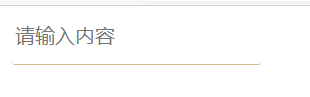
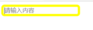
要求:点击表单时,显示边框
<form action="">
  <input type="text" placeholder="请输入内容">

	input{
	      border: none;
	      outline: none;
	      border-bottom: 1px solid burlywood;
	      padding-bottom: 10px;
	    }
	    input:focus{
	      border: none;
	      padding-bottom: 0;
	      box-shadow: 0 0 0 5px yellow;
	    }
	</form>
效果如下:
下面进行知识的扩展
要求:图片加上内阴影

inset直接设置在img标签上是没有效果的,我们可以在img标签包裹一层div标签,把边框设置在div标签上,这个时候还是没有效果,因为img标签挡住了div标签;因此我们需要设置position:relative让img标签允许重叠,再设置z-index把图片设置在底部
    img{
         box-shadow: inst 0 0 0px 50px purple;
    }

改为:
   div{
          margin-top: 100px;
          text-align: center;
          height: 200px;
          width: 320px;
          box-shadow: 0 0 0px 50px purple;

      }
    img{
    }

再改为:
  div{
          margin-top: 100px;
          text-align: center;
          height: 200px;
          width: 320px;
          box-shadow: inset 0 0 0px 50px purple;

      }
    img{
        position: relative;
        z-index: -1;
    }
 为了美化可以设置透明度
要求:实现双边框
 img{
        box-shadow: inset 0 0 0px 10px purple,
                    -30px -30px #ff9595,            /* 设置左上阴影 */
                    30px 30px #ff9595              /* 设置右下阴影 */
    }
在中间加一层边框用于遮挡
img{
        width: 314px;
        box-shadow: inset 0 0 0px 10px purple,
                    0 0 0 20px white,                  /* 中间加上边框用于遮挡 */
                    -30px -30px #ff9595,            /* 设置左上阴影 */
                    30px 30px #ff9595              /* 设置右下阴影 */
    }
实现双层边框,效果如下


 339
339


 被折叠的 条评论
为什么被折叠?
被折叠的 条评论
为什么被折叠?
 到【灌水乐园】发言


