


文章目录
背景描述
项目组开发的后台管理系统,虽然公司有推出一些公用组件,但是这些组件不能满足一些业务上的使用场景,而当时公司的架构部门忙得不能处理我们业务组件的需求,所以,整合了当前项目的业务需求,基于element-UI开发了一套试用于当前项目的列表分页组件,后续也陆陆续续被其他项目组使用,不过也是后话了。
组件构思
其实最开始封装的表格组件是一个基于折叠面板的折叠表格分页组件,后面发现普通的表格分页组件需求也是很大,所以也是进行提取。
因为该组件是基于element-ui二次封装的以满足公司项目的业务场景。所以基本上所有的props都和element ui的官方文档上内容一致。
组件结构
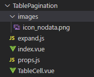
酱酱酱,以上就是这个组件的所有组成文件了,咋们来一起看看每个文件的细节。如果有优化意见可以提出来,自己也慢慢的优化了很多
images //列表无数据占位图,ui统一设计的,后面就忽略不讲了哈
expand.js //扩展列表函数组件
  export default {
	  name: 'TableExpand',
	  functional: true,
	  props: {
	    row: Object,
	    render: Function,
	    index: Number,
	    column: {
	      type: Object,
	      default: null,
	    },
	  },
	  render: (h, ctx) => {
	    // 为渲染的列中的params添加column属性,
	    const params = {
	      column: ctx.props.column,
	      row: ctx.props.row,
	      index: ctx.props.index,
	    };
	    if (ctx.props.column) params.column = ctx.props.column;
	    return ctx.props.render(h, params);
	  },
	};
index.vue //列表组件入口文件
文件内主要是将el-table和el-pagination关联在一起
	<template>
	  <div class="table-pagination">
	    <!-- 表格内容展示 -->
	    <el-table
	      ref="tablePagination"
	      :data="data"
	      :height="tableOptions.height"
	      :max-height="tableOptions.maxHeight"
	      :stripe="tableOptions.stripe"
	      :border="tableOptions.border"
	      :size="tableOptions.size"
	      :fit="tableOptions.fit"
	      :show-header="tableOptions.showHeader"
	      :highlight-current-row="tableOptions.highlightCurrentRow"
	      :current-row-key="tableOptions.currentRowKey"
	      :lazy="tableOptions.lazy"
	      :indent="tableOptions.indent"
	      :row-class-name="tableOptions.rowClassName"
	      :row-style="tableOptions.rowStyle"
	      :cell-class-name="tableOptions.cellClassName"
	      :cell-style="tableOptions.cellStyle"
	      :header-row-class-name="tableOptions.headerRowClassName"
	      :header-row-style="tableOptions.headerRowStyle"
	      :header-cell-class-name="tableOptions.headerCellClassName"
	      :header-cell-style="tableOptions.headerCellStyle"
	      :row-key="tableOptions.rowKey"
	      :empty-text="tableOptions.emptyText"
	      :default-expand-all="tableOptions.defaultExpandAll"
	      :expand-row-keys="tableOptions.expandRowKeys"
	      :default-sort="tableOptions.defaultSort"
	      :tooltip-effect="tableOptions.tooltipEffect"
	      :show-summary="tableOptions.showSummary"
	      :sum-text="tableOptions.sumText"
	      :summary-method="tableOptions.summaryMethod"
	      :select-on-indeterminate="tableOptions.selectOnIndeterminate"
	      :span-method="tableOptions.spanMethod"
	      :load="tableOptions.load"
	      :tree-props="tableOptions.treeProps"
	      @select="_select"
	      @select-all="_selectAll"
	      @selection-change="_selectionChange"
	      @cell-mouse-enter="_cellMouseEnter"
	      @cell-mouse-leave="_cellMouseLeave"
	      @cell-click="_cellClick"
	      @cell-dblclick="_cellDBLclick"
	      @row-click="_rowClick"
	      @row-contextmenu="_rowContextmenu"
	      @row-dblclick="_rowDBLclick"
	      @header-click="_headerClick"
	      @header-contextmenu="_headerContextmenu"
	      @sort-change="_sortChange"
	      @filter-change="_filterChange"
	      @current-change="_currentChange"
	      @header-dragend="_headerDragend"
	      @expand-change="_expandChange"
	    >
	      <tableColumn
	        v-for="(tableItem, tableKey) in tableColumns"
	        :key="tableKey"
	        :column="tableItem"
	        :column-empty-text="columnEmptyText"
	      >
	      </tableColumn>
	      <div slot="empty">
	        <template v-if="!emptySlot">
	          <!-- 默认暂无数据显示 -->
	          <div class="prompt-message">
	            <img class="icon_nodata-img" src="./images/icon_nodata.png" />
	            <p class="no-more">暂无数据</p>
	          </div>
	        </template>
	        <template v-else>
	          <!-- 提供插槽修改表格内容为空时的展示 -->
	          <slot name="empty"></slot>
	        </template>
	      </div>
	    </el-table>
	    <!-- 分页区域 -->
	    <el-pagination
	      background
	      :current-page="currentPage"
	      :page-sizes="paginationOptions.pageSizes"
	      :page-size="pageNum"
	      :layout="paginationOptions.paginationOption"
	      :total="totalCount"
	      @current-change="handleCurrentChange"
	      @size-change="handleSizeChange"
	    ></el-pagination>
	  </div>
	</template>
原方法是将el-table的Table Attributes,Table Methods,Table Events全部写在文件里面,以保证传参和事件调用的正确性


自知感觉这种写法不太友好,写得不够灵活,但是目前没有想到合适的其他方案处理。有没有大佬指点一二,助我破局。
props.js //存放列表和单元格的props
文件内包含两组变量,table对象,用于接受table的props。tableColumn对象,用于接收tableColumn的props。

TableCell.vue // 列表单元格处理文件
主要分开处理三类单元格
第一类:‘expand’, ‘isrender’
第二类:‘selection’, ‘index’
第三类:除第一类和第二类之外的单元格类型
当传入的单元格类型为第一类时处理方式为
<template slot-scope="scope">
  <cell :column="scope.column" :row="scope.row" :index="scope.$index" :render="column.render" />
</template>

import cell from '../TablePagination/expand';
传入类型为第二类时不做特殊处理
传入类型为第三类时,我们只做空数据时的占位符处理
<template slot-scope="scope">
 {{ scope.row[column.prop] || columnEmptyText }}
</template>
组件使用
适配场景丰富,对于普通字符展示,判断展示,事件触发,组件插入,都能很好的支持。分页逻辑在组件内部处理好了。所以,只需要监听分页组件触发的事件就可啦。一般和搜索组件配套使用。
<template>
  <table-pagination
    ref="tablePagination"
    :data="list"
    :tableColumns="tableColumns"
    :totalCount="totalCount"
    :pageSize="limit"
    :tableOptions="tableOptions"
    v-loading="tableLoading"
    @refresh="refreshTable"
    @sort-change="sortList"
  >
  </table-pagination>
</template>
<script>
import TablePagination from '@/components/TablePagination';
export default {
  name: 'Course',
  components:{
    TablePagination
  },
  data() {
    return {
      start:1,
      limit:10,
      list:[],//表格数据
      totalCount: 0, //列表数据分页展示条件
      tableOptions:{
        headerRowClassName:'row-name'
      },
      tableLoading:false,//表格加载动画
      isAsc:'',//是否升序
      orderBy:"",//依照什么排序
    };
  },
  mounted() {},
  methods: {
    /**
     * @description 渲染列表数据
     * */
    initTable(){
      //to do
    },
    /**
     * @description 分頁事件刷新列表
     * @param {param} 分页页码修改和每页条数修改之后,返回当前页码和每页条数
     * */
    refreshTable(param){
      this.start = param.start;
      this.limit = param.limit;
      this.initTable();
    },
    /**
     * @description 当表格的排序条件发生变化的时候会触发该事件
     * */
    sortList(column, prop, order){
      // ascending升序  descending降序
      this.isAsc = column.order?column.order == 'ascending'?true:false:undefined;
      this.orderBy = column.order?column.prop:undefined;
      // 修改样式 rortAscending
      this.initTable();
    },
    /**
     * 查看详情明细弹窗
     * @param {param} 必填参数,获取明细详情
     * */
    viewDetails(param) {
      //to do
    },
  },
  computed:{
    tableColumns(){
      return [
        {
          type:'index',
          label: '排序',
          width: '60px',
        },
        {
          prop: 'getTime',
          label: '获取时间',
          width: '180px',
          tooltipWidth:180,
          sortable:"custom",
          labelClassName: this.isAsc,
        },
        {
          prop: 'proPlateNodeCount',
          label: '审批节点',
        },
        {
          prop: '',
          type: 'isrender',
          label: '状态',
          render: (h, scope) => {
            return (
              <el-switch
                v-model={scope.row.switchStatus}
                active-color="#4974F5"
                onchange={(state) => {
                  this.changeRowStatus(state, scope.row, scope.index);
                }}
                inactive-color="#BFBFBF"></el-switch>
            );
          },
        },
        {
          prop: 'isAdopt',
          label: '微信添加是否通过',
          minWidth: '130px',
          type: 'isrender',
          render: (h, scope) => {
            return <span> {scope.row.isAdopt?"已通过":"未通过"}</span>;
          },
        },
        {
          prop: 'pictureAddress',
          label: '微信截图',
          type: 'isrender',
          minWidth: '130px',
          render: (h, scope) => {
            return scope.row.pictureAddress?
              <el-image
                style="width: 100px; height: 100px"
                src={scope.row.pictureAddress}
                preview-src-list={[scope.row.pictureAddress]}>
              </el-image>
              :<span>-</span>
          },
        },{
          prop: 'createTime',
          label: '操作',
          width: '80px',
          type: 'isrender',
          render: (h, scope) => {
            return (
              <el-button
                type="text"
                onclick={(e) => {
                  this.viewDetails(scope.row);
                }}>
                查看
              </el-button>
            );
          },
        },
      ]
    }
  }
};
</script>


 1724
1724


 被折叠的 条评论
为什么被折叠?
被折叠的 条评论
为什么被折叠?
 到【灌水乐园】发言


