


效果:
实现页面字幕从屏幕外向上缓缓移动的动效,动效完成后,实现下部分固定,上部分(为了观察效果,特意用粉色框圈住部分)可滚动scroll的效果。
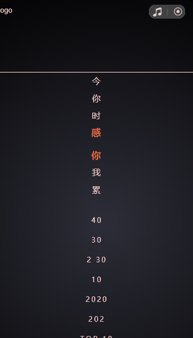
效果一览:
难点:主要是字幕动效完成后,将文字部分压缩在content中时:需要始终保持字幕部分最后一行字:【贺卡】,保持它在动画最后一幕那个位置不变动。
知识:
代码:
<template>
  <div class="huojiang_box">
    <div class="main_box">
      <!-- 整个大的移动区域 -->
      <div class="main" :class="{ 'slide-up': sliding, 'height-fixed': heightFixed }">
        <!-- 移动结束后,文字可滚动部分 -->
        <div class="content" ref="content" @touchstart.stop @touchmove.stop @touchend.stop >
          <ul class="firstul">
            <li>今</li>
            <li>你</li>
            <li>时</li>
            <li style="margin-bottom:10px"><span>感</span></li>
            <li><span>你</span></li>
            <li>我</li>
            <li>累</li>
          </ul>
          <ul class="secondul">
            <li>40</li>
            <li>30</li>
            <li>2 30</li>
            <li>10</li>
            <li>2020</li>
            <li>202</li>
            <li>TOP 10</li>
            <li>TOP 50</li>
            <li>TOP 40</li>
            <li>TOP 50</li>
          </ul>
          <ul class="thirdul" style="margin:20px 0">
            <li>一</li>
            <li style="margin-bottom:10px">我们</li>
            <li><span>新</span></li>
            <li>感恩</li>
            <li><span>「贺卡」</span></li>
          </ul>
        </div>
        <!-- 移动结束后,底部固定部分 -->
        <div class="bottom">
          <img src="@/common/imgs/16-btn@2x.png" alt="" class="btn" @click="click"/>
        </div>
      </div>
    </div>
  </div>
</template>

<script>
export default {
  data() {
    return {
      sliding: false, // 是否运动
      heightFixed: false // 高度是否固定
    };
  },
  mounted() {
    setTimeout(() => {  // 进入之后100毫秒字幕开始移动
      this.sliding = true;
    }, 100);
    this.$nextTick(() => {
      const height = this.$refs.content.clientHeight; // 获取content一开始的可视高度
      setTimeout(() => {
        this.heightFixed = true; // 将main部分压缩
        this.$nextTick(() => {
          const el = this.$refs.content;  // 压缩之后的content
          el.scrollTop = height - el.clientHeight; // 压缩之后的content元素的内容垂直滚动的像素数。 = 一开始的高度 - 压缩之后的可视高度
        });
      }, 7000); // 7秒之后
    });
  },
};
</script>

<style lang="scss" scoped>
.huojiang_box {
  width: 100%;  height: 100vh;
  background: url(~@/common/imgs/16-bg@2x.png); background-size: cover;
  display: flex;   flex-direction: column;
}
.main_box {
  height: 100%;  margin-top: 120px;
  overflow: hidden; position: relative;
}
.main {
  position: absolute; width: 100%; overflow: hidden;
  display: flex; flex-direction: column;
  // animation: slideUp 7s 1 linear forwards; // 也可以采用动画的方式实现
  transition: bottom 7s linear .5s; // transition过渡效果,在检测到bottom变化时,执行这个过渡设置
  bottom: -100%; // bottom一开始的值
  &.slide-up {
    bottom: 0; // bottom最后的值
  }
  &.height-fixed {
    height: 100%; // 将高度设置为100%,让其可以有滚动条
  }
  .content {
    border: 2px solid pink;
    flex: 1;   overflow: scroll; // 可滚动
    padding: 0 40px;  text-align: center;  color: #fbd9ce;
    .firstul{ 略 }  .secondul{ 略 } .thirdul { 略 }  ul {略}  span{略}
  }
  .bottom {
    width: 100%; height: 518px;  text-align: center;
 	background: url(~@/common/imgs/16-thanks@2x.png) no-repeat; background-size: cover;
    .btn { 略}
  }
}
@keyframes slideUp {
  0% {
    bottom: -100%;
  }
  25% {
    bottom: -75%;
  }
  50% {
    bottom: -50%;
  }
  75% {
    bottom: -25%;
  }
  100% {
    bottom: -0%;
  }
}
</style>


 1110
1110


 被折叠的 条评论
为什么被折叠?
被折叠的 条评论
为什么被折叠?
 到【灌水乐园】发言


